One of the main problems faced by the tropical plantation industry is decrease or decline in soil productivity. The decrease is resulting in diminished crop yields, affecting the economic viability of agricultural operations and threatening the livelihood of farmers and plantation owners. Surge is here to solve this problem.
Surge is an agricultural company that aims to revolutionize the tropical plantation industry by focusing on increasing soil productivity. They specialize in implementing innovative techniques and sustainable practices to optimize soil health, enhance crop yields, and promote environmental stewardship. They are committed to transforming traditional agricultural practices and driving positive change in the industry.
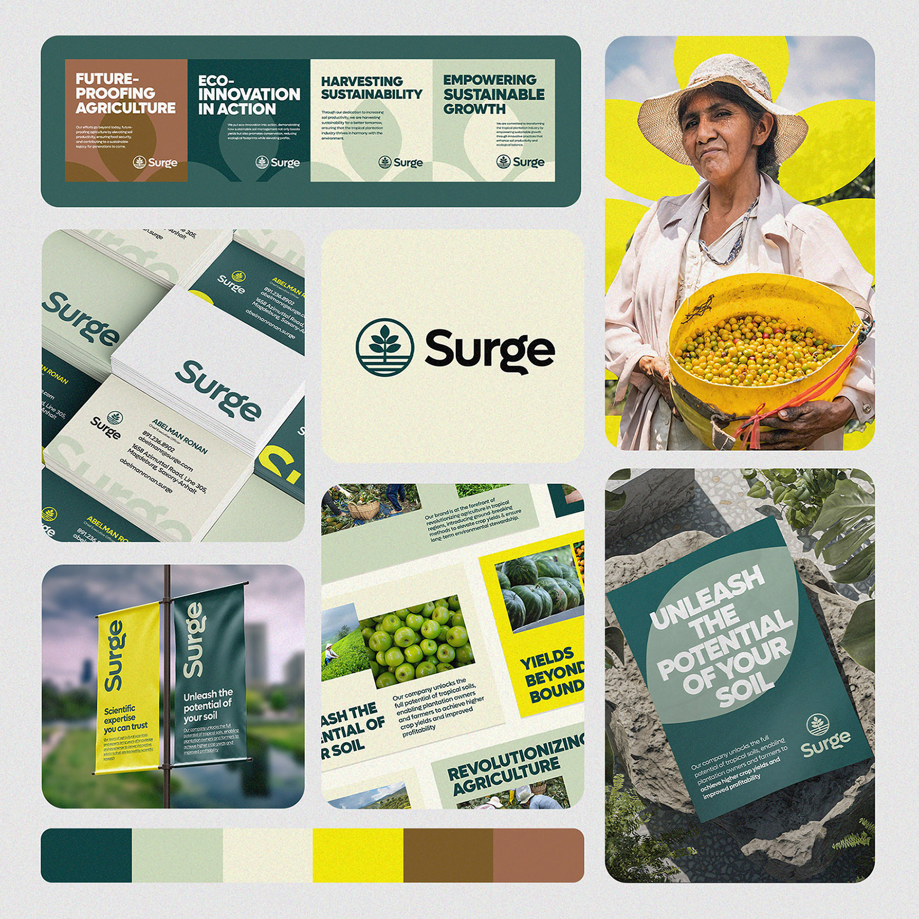
The Logo: The challenge was to develop a modern, green and professional visual identity that reflect their commitment to sustainability, innovation and soil productivity. The logo for Surge, a tropical agriculture brand, is a visual representation of dynamic growth from increased soil productivity, agricultural innovation, sustainability, collaboration and environmental counsciousness.
The focal point of the logo is a stylized palm tree with uneven leaves, made with minimalist shapes. The palm tree symbolizes growth and vitality while the roots represent the tropical environment and the brand’s emphasis on soil health and productivity. The interplay between the palm tree and the roots signifies the intergral connection between thriving plants and nourishing soil.
The circle, as a continuous and unbroken shape, represents the cyclical nature of sustainability, a harmonous balance between natural systems and human intervention. Just as ecosystems operate in circles, the circle in the logo symbolizes Surge’s dedication to sustainable practices that ensure long-term soil and environmental health.
Colour and Typography: In the crafting of Surge’s brand identity, the choice of greens and browns as brand colours holds profound significance, strategically conveying the brand’s core values and mission. These colours were deliberately selected to resonate with the brand’s identity, create visual cohesion and evoke specific emotions that align with its vision.
The greens featured in the colour palette represents the lushness and vitality of tropical landscapes. These shades evoke feelings of growth, freshness, and harmony with nature – all fundamental aspects of Surge’s commitment to sustainable agriculture and soil productivity enhancement. The greens also symbolizes the brand’s role in driving positive change within the tropical agriculture sector.
The browns in the color palette mirror the earthly tones found in fertile soil connecting directly to Surge’s specialization in soil productivity. These colours embody stability, rootedness, and the foundation upon which thriving agricultural practices are built. The browns signify the brand’s dedication to nurturing the very essence of growth (the soil) while also representing its emphasis on environmental responsibility and sustainable practices.
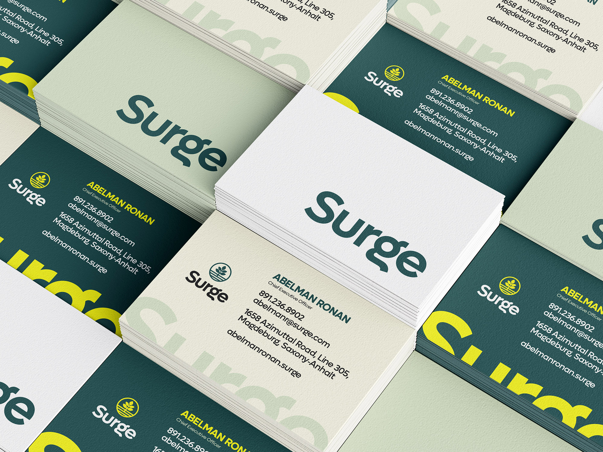
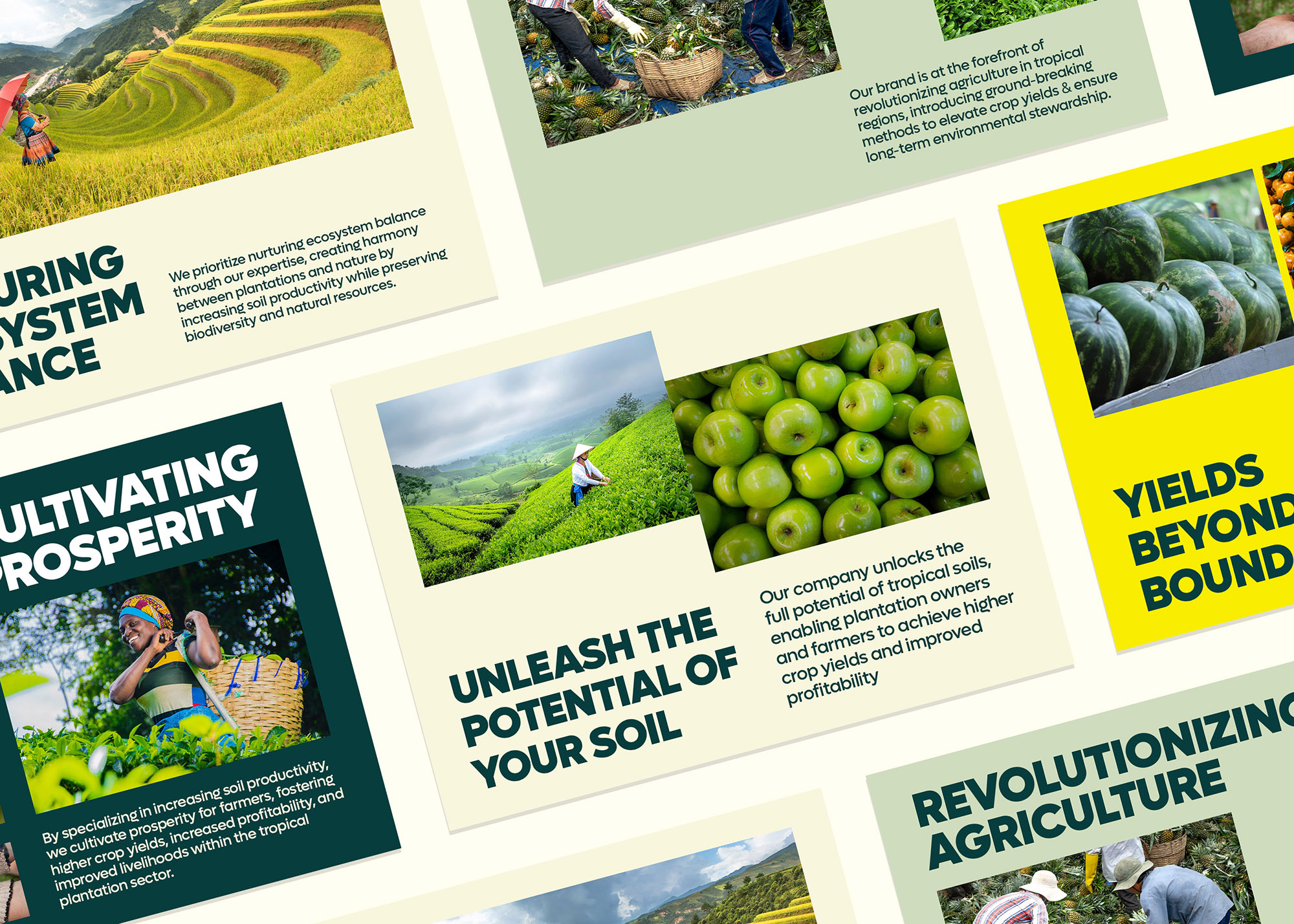
Consistency in color application is essential in establishing brand recognition. By maintaining a consistent use of greens and browns across various touchpoints ensures its visual identity remains cohesive and recognizable. This consistency reinforces the brand’s values and message, making a lasting impression on its audience.
Colours evoke emotion, and the choice of greens and browns in Surge’s identity aims to evoke feelings of trust, growth, and sustainability.
The decision to integrate the Lufga typeface into Surge’s identity was grounded in its unique attributes that harmonize with the brand’s core principles. Lufga’s geometric, elegant yet approachable letterforms convey a sense of sophistication that resonates with brand’s commitment to innovation and transformation within the tropical agriculture sector.
The unique characteristics of Lufga set Surge apart, making its content recognizable. Lufga distinct letterforms reflect the brand’s commitment to breaking boundaries in tropical agriculture and embracing innovative solutions while also highlighting its dedication to maintaining a strong and memorable presence.
By consistently using the Lufga typeface across various touchpoints, Surge ensures that its communication maintains a cohesive and unified look. This not only reinforces the brand values, but also contributes to brand recall and recognition.




CREDIT
- Agency/Creative: KehindeBK
- Article Title: Surge Brand Design
- Organisation/Entity: Freelance
- Project Type: Identity
- Project Status: Published
- Agency/Creative Country: Nigeria
- Agency/Creative City: Lagos, Nigeria
- Market Region: Global
- Project Deliverables: Brand Design, Brand Identity, Branding, Design, Graphic Design
- Industry: Agriculture
- Keywords: Agriculture, Soil Productivity, Innovation, Technology, Tropical plantation, Tropical Agriculture, Green.
-
Credits:
Brand Designer: Kehinde Baasit Kehinde


