” Our work on Lyme Bay’s English Sparkling Wine range directly resulted in their sales doubling, as well as helping to secure desirable and prestigious retail contracts.
The story began with a phone call; Liam, the Head Winemaker, wanted to create a new label for their award winning English Sparkling offering – We took on the challenge and went above and beyond – resulting in an entire redesign of the bottles that reconnects the brand, and it’s audience, with the richness and authenticity of an extraordinary product.
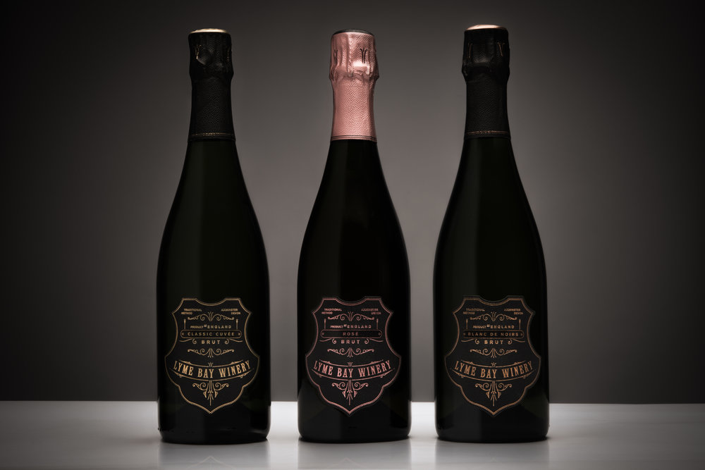
We successfully invigorated one of England’s most revered Sparkling Wine producers and the company have experienced immediate results from the redesign. After the much anticipated release of the their Classic Cuvée, Blanc De Noirs, Rosé and Reserve, they are now able to enforce their rightfully dominant presence with a unique and distinctive set of labels that are beautifully considered and produced – epitomising the English Sparkling wine within.
Sparkling Wine has a notoriously traditional look. Whilst Lyme Bay are also traditional in appearance, at their root, the winery is incredibly innovative, forward thinking, and give exceptional attention to detail. We believe that there are only a few brands able (and brave enough) to leave the status-quo and achieve their true character in their packaging. Lyme Bay sought to combine the classic and timeless look of the traditional sparkling wine trend with a perfectly executed and considered design approach.
Our intention for this project was to created a marked contrast to the previous product identity.
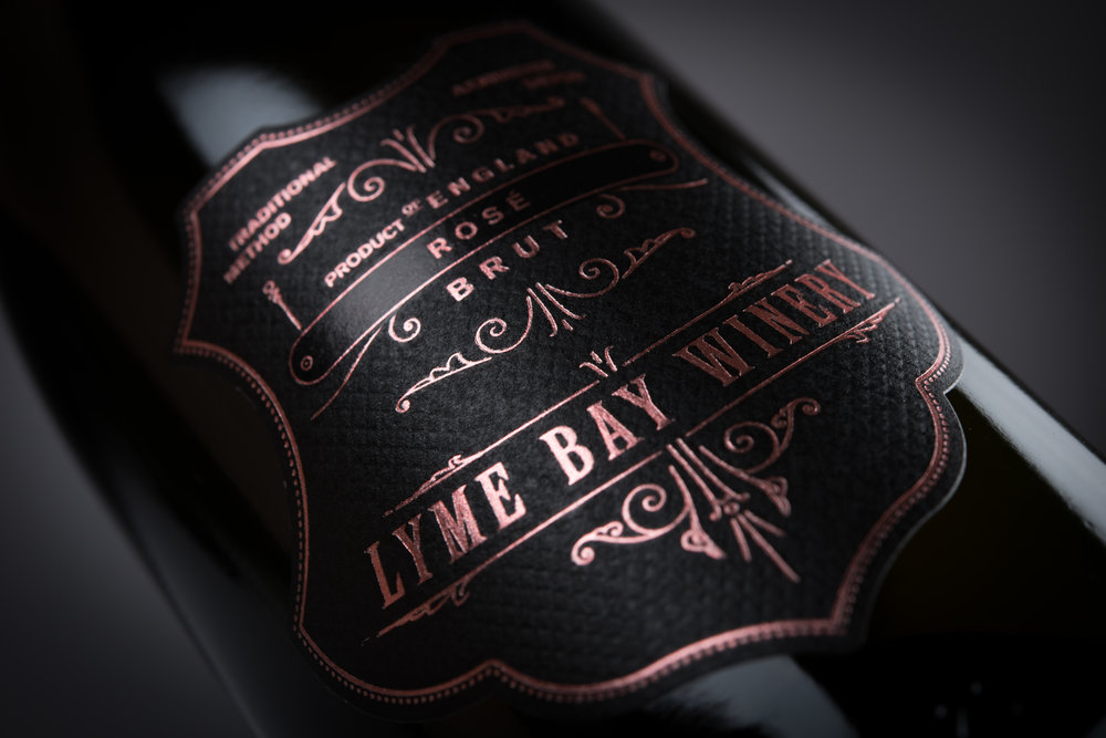
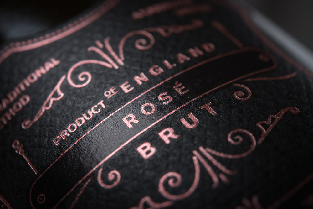
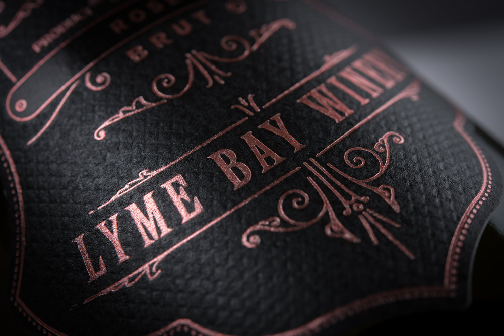
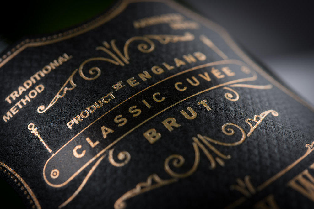
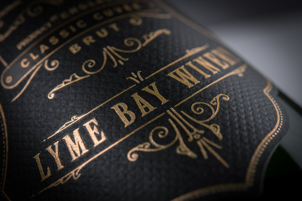
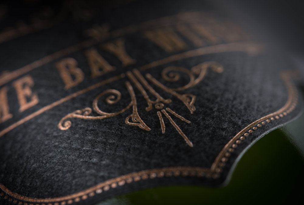
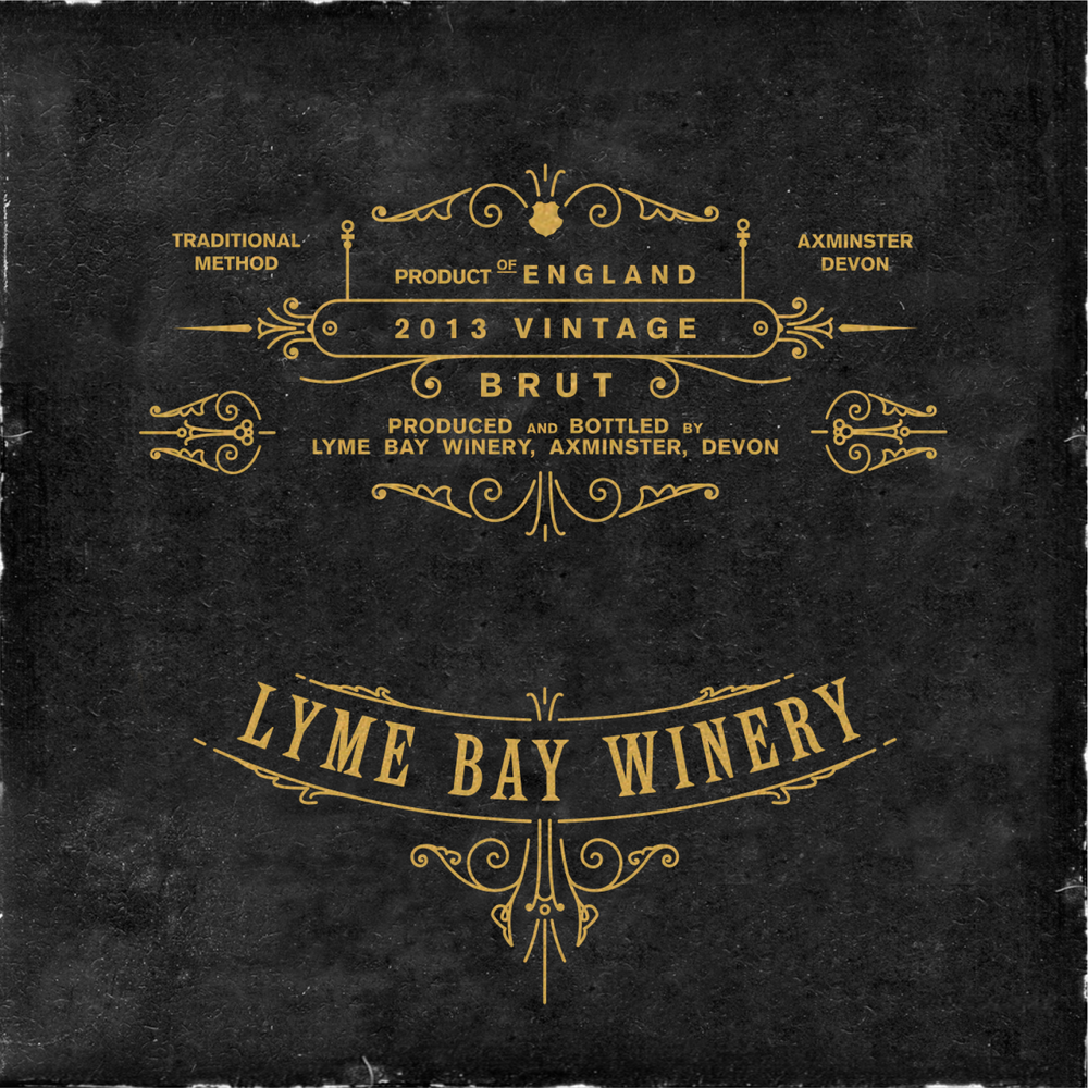
We wanted this to be particularly apparent when the bottle was fully dressed; our working designs included exploration of fine printing details and typographical history, using very rare vintage wood cut typefaces and hand-drawn flourishes and bars.
As part of our approach and execution, we also explored Lyme Bay’s brand architecture to ensure that our solution provided a flexible platform from which to create brand cohesion across all existing and future product offerings.
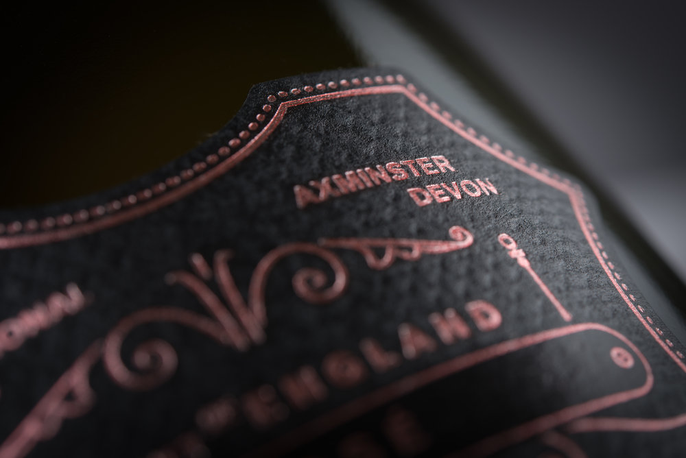
Our design epitomises the core brand identity of the winery. Every element echoes the passion, knowledge and care that goes into the making of the wine; from the tactile quality of the paper through to the the intricate foils, careful pillow embossing and hand-drawn details. The packaging now visually represents the company as an icon and an ornament – the quality of the product now mirrored in its presentation and appearance, allowing itself to be dramatically distinctive from it’s competitors.”
” Client feedback
“Our time working with Supreme–DBA has been invaluable. They not only revolutionised the look of our sparkling wine, but also opened our eyes to the potential of the product, and our brand as a whole. We had high expectations and they went above and beyond. We have seen immediate and overwhelmingly positive outcomes as a result of working together. Throughout the project, Justin and the team were flexible, efficient and dedicated to meeting the brief. The whole thing was executed with a sharp attention to detail. Supreme–DBA proved time and time again that they are a great agency who really care about delivering a very high standard of work and communication.”
Liam Idzikowski
Head Winemaker
CREDIT
- Agency/Creative: Supreme—DBA
- Article Title: Supreme—DBA – Lyme Bay Winery English Sparkling Wine
- Project Type: Packaging
- Format: Bottle
- Substrate: Pulp Paper


