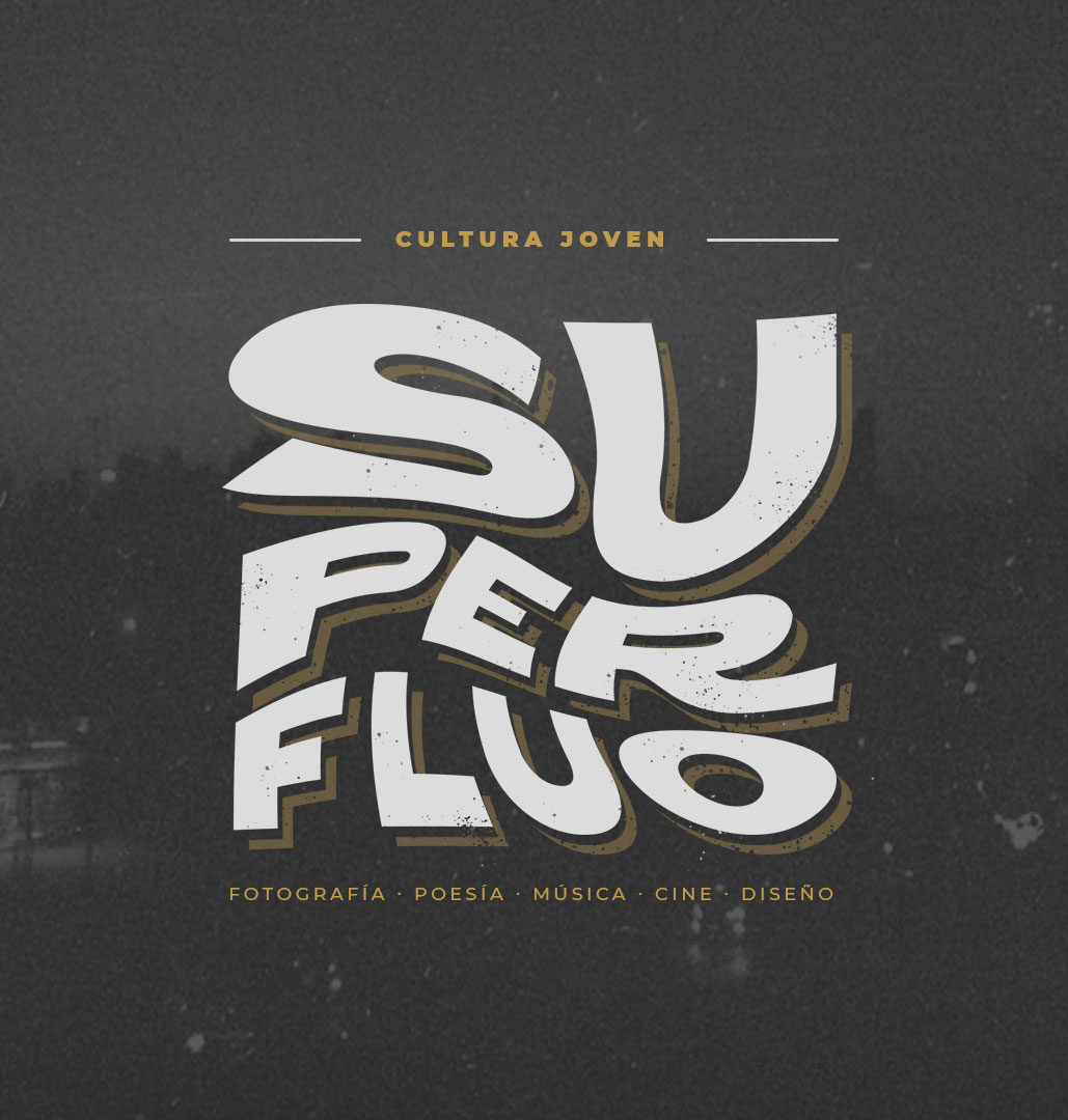
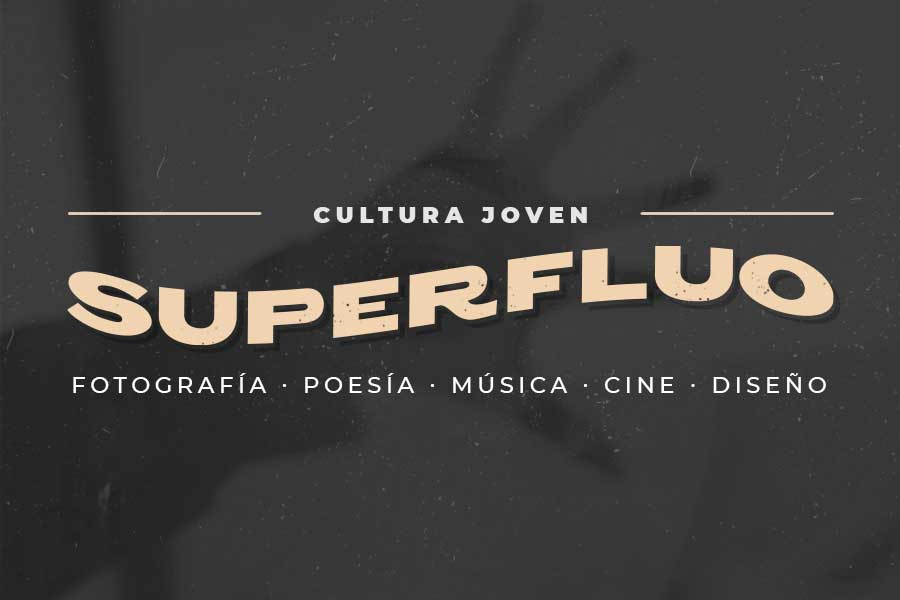
Superfluo invites to know and experience the young Uruguayan art; shortening distances between both digital and printed cultures.
The Challenges
• Starting from the ground up, with no previous research whatsoever. Building each and every aspect of the organization and its strategy. This proved both a challenge and an opportunity.
• We needed to work on defining the brand’s personality with no real artist’s work since the magazine was being kept a secret.
• Finding a differentiated identity according to the profile of Superfluo that at no time obscures the work of the artists.
The Process
• We started with a series of strategic meetings, ranging from intangible aspects of its essence to technical details of the magazine (points of sale, printing specs, etc.)
• We conducted an exploration phase regarding style since this was an important factor regarding its primary customers (young adults, entrepreneurs).
• Created a proposal for potential investors showing issue #0 of the magazine (a dummy).
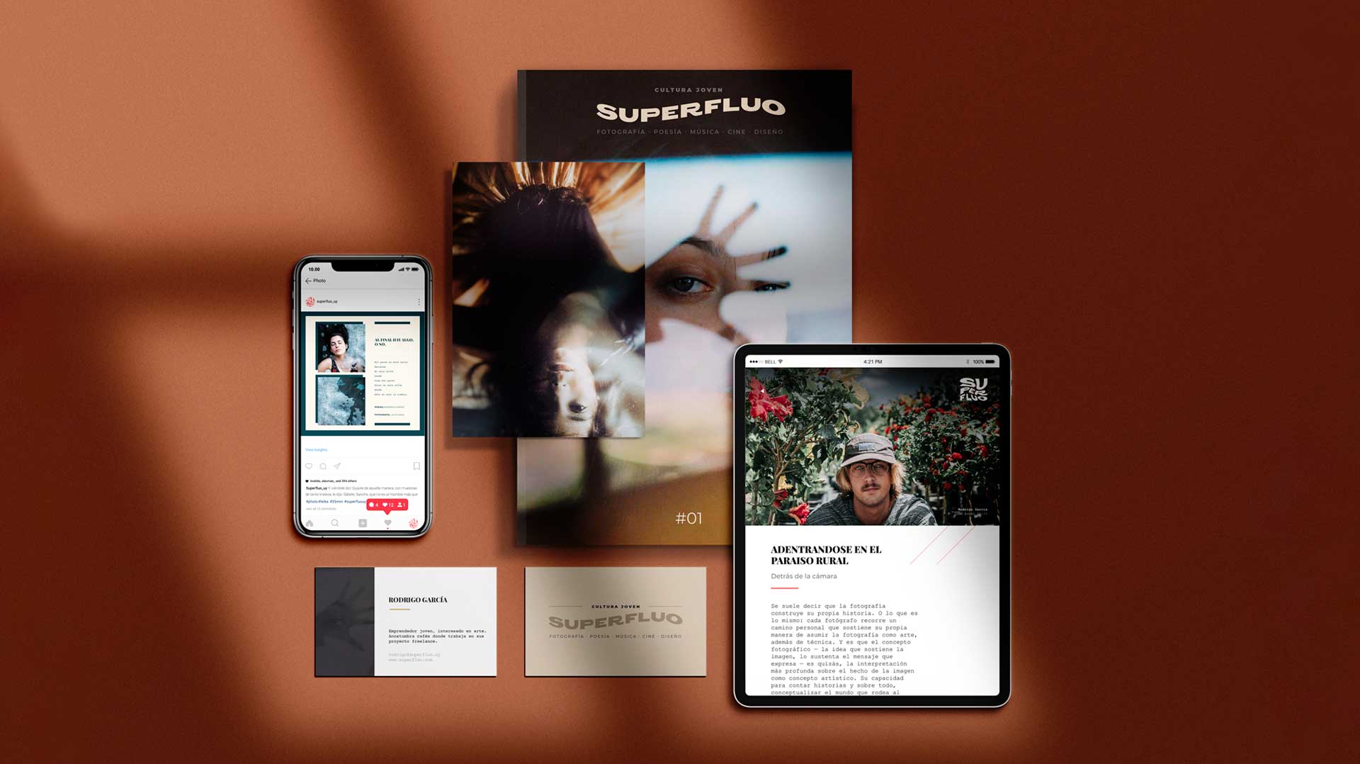
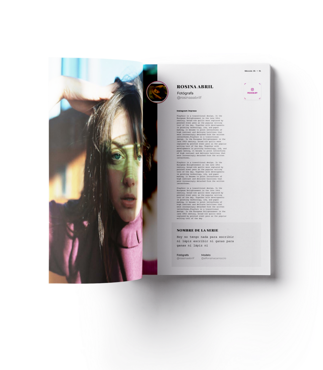
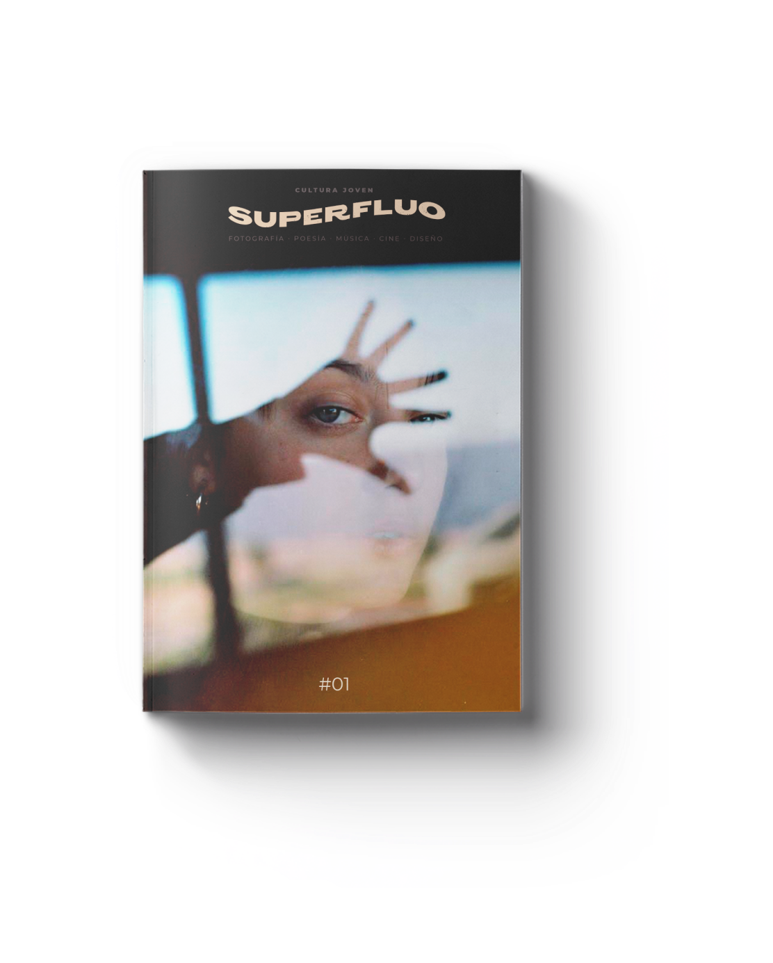
CREDIT
- Agency/Creative: Pesto
- Article Title: Superfluo – Young Art Magazine Editorial and Branding
- Organisation/Entity: In-house, Published Self Promotional Design
- Project Type: Identity
- Agency/Creative Country: Uruguay
- Market Region: South America
- Project Deliverables: Brand Advertising, Brand Architecture, Brand Creation, Brand Design, Brand Identity, Brand Naming, Brand Strategy, Brand World, Branding, Graphic Design, Identity System, Illustration, Product Architecture, Product Naming, Research, Tone of Voice
- Industry: Retail
- Keywords: Young art, magazine, editorial design, dark, modern, responsive logo


