


Olievo. The light and colors of nature in balance
Olievo is an olive oil created by combining the best of tradition with modern technology to produce a truly unique product. Olive oil has been produced and consumed for more than 3,000 years, yet today it presents itself as more innovative than ever. Modern society demands excellence in quality, transparency in origin and processes, and values creativity in flavors and packaging that meet its needs. Our main variety is “Picual,” and under the designation “Origen Sierra de Cazorla,” our oils undergo rigorous quality controls that ensure authenticity and prestige.
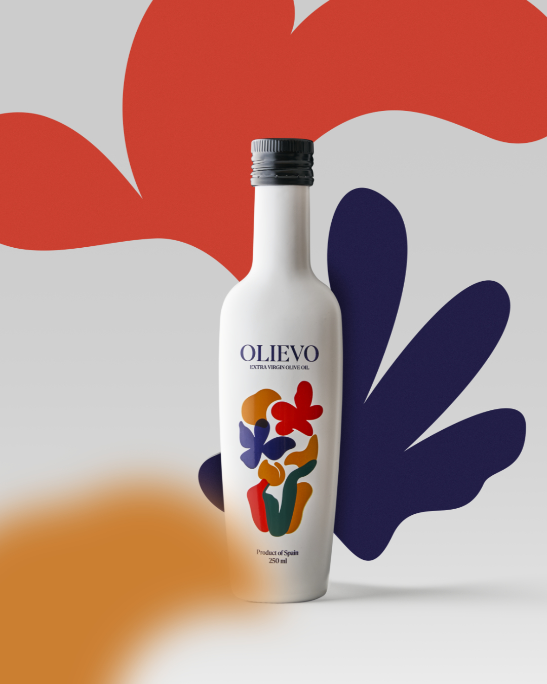
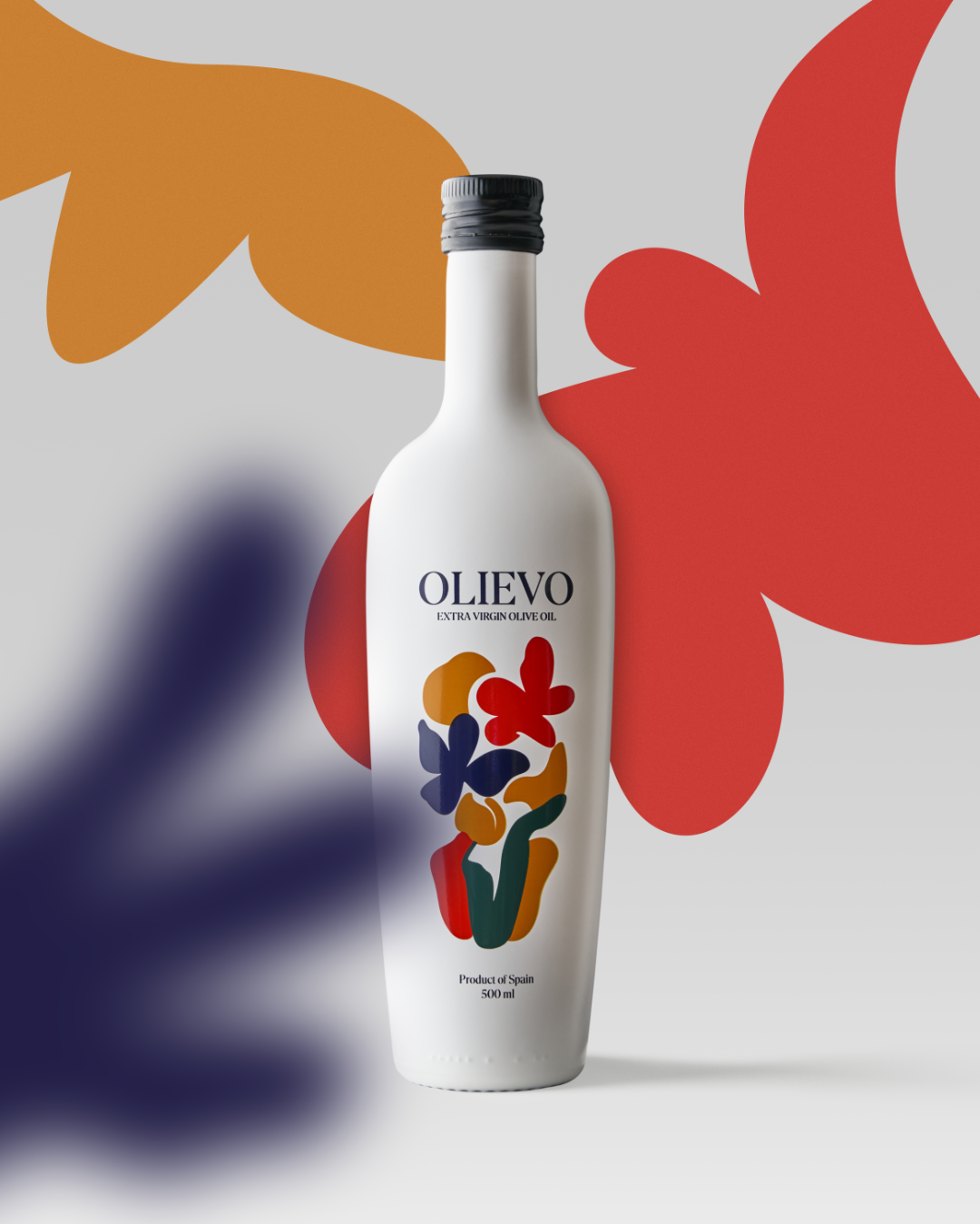
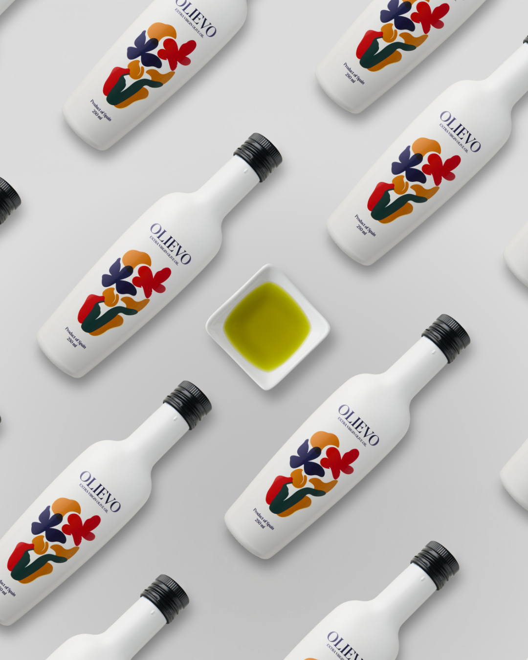
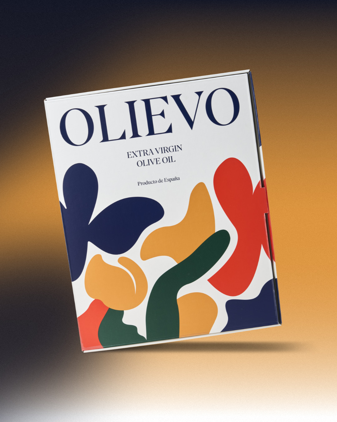
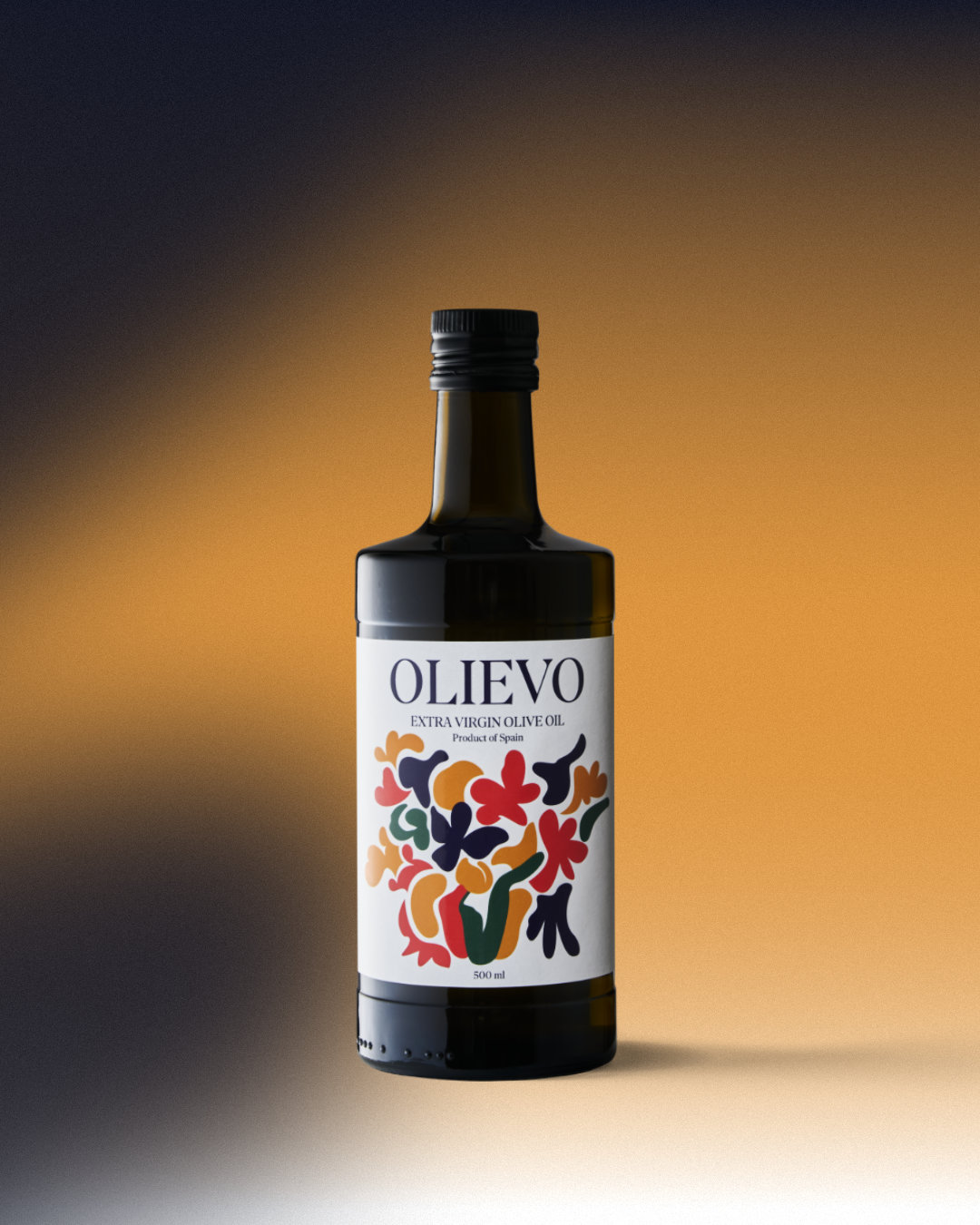
The light and colors of nature, represented in balance, create a visual language that transcends mere decoration. Every element of the design has been carefully crafted to reflect the harmony found in nature. The spontaneity of flowers, leaves, and vegetation in constant bloom is expressed through flat, colorful silhouettes. The whiteness of the bottle is not just a background; it represents light itself, the essential energy that allows nature to display all its beauty in full splendor. This light offers the space for shapes to breathe, creating a canvas where color becomes the true protagonist.
The shape of the container integrates organically into the overall composition. Far from being a neutral object, it becomes an active element of the design, balancing the vitality of colors with its pure and serene form. The oval shape of the bottle creates a contrast between volume and flat form, resulting in packaging that feels both timeless and contemporary, elegant and simple. A design that speaks of sensitivity, balance, and the dialogue between light and color.
CREDIT
- Agency/Creative: Superfluido
- Article Title: Superfluido Creates Olievo as a Tribute to Natural Harmony and Purity
- Organisation/Entity: Agency
- Project Type: Packaging
- Project Status: Published
- Agency/Creative Country: Spain
- Agency/Creative City: Superfluido/Úbeda
- Market Region: Europe
- Project Deliverables: Advertising Photography
- Format: Bottle
- Industry: Food/Beverage
- Keywords: WBDS Creative Design Awards 2025/26 , #branding #brandidentity #naming #packagingdesign
-
Credits:
Photo: Juan Antonio Partal
Screen printing: IBICROM


