


SunRise Visual Identity & Packaging Design
For this, I designed the full visual identity and packaging for SunRise Cafe, a brand focused on awakening to the warmth, hope, and joy of mornings. The design inspiration draws from those first calming rituals of morning: the aroma of the freshly ground coffee, the crunch of buttery croissant, and the refreshing warm light of sunrise. Together, they create a sensory story that marries taste, texture, and mood into a cohesive brand experience.
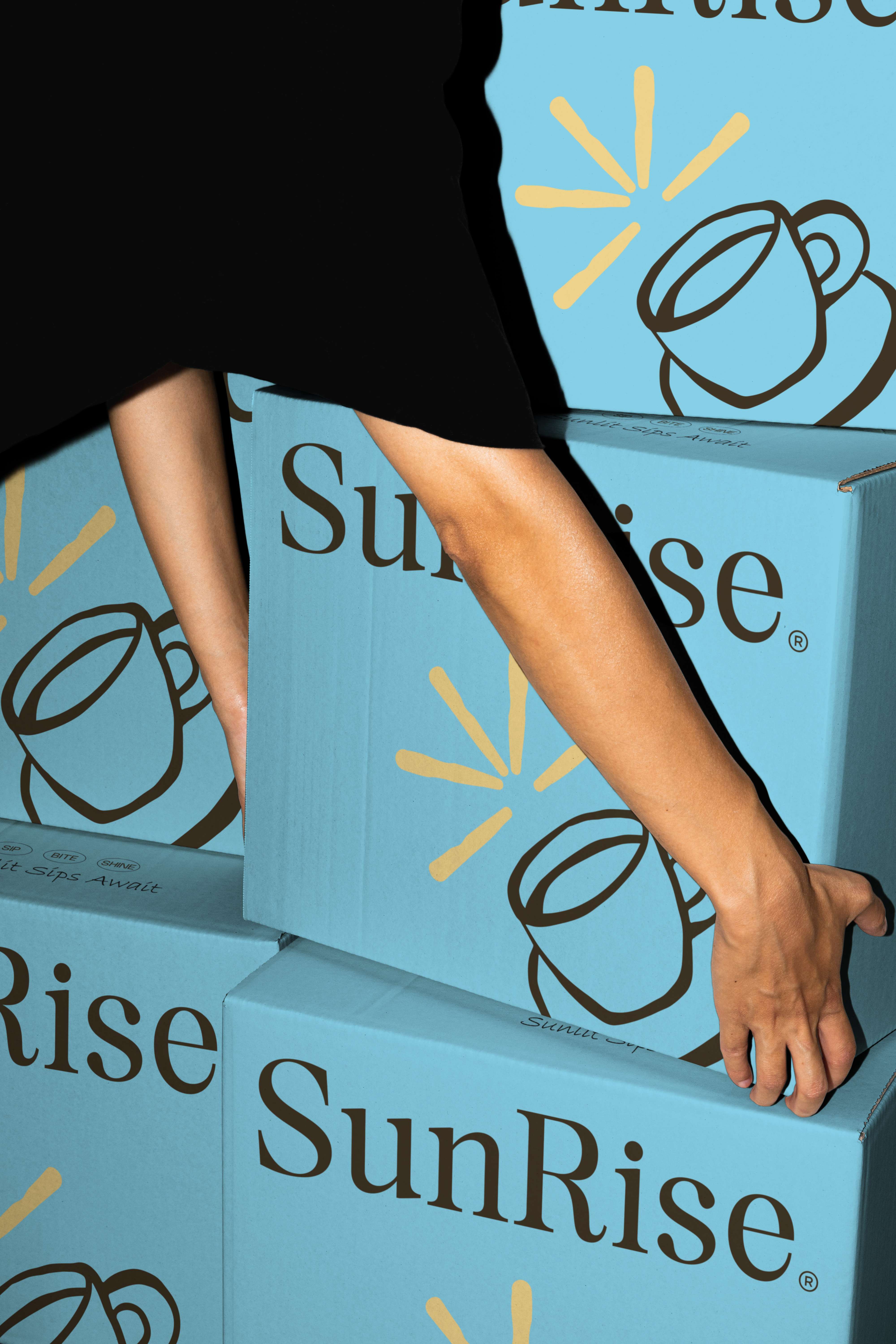
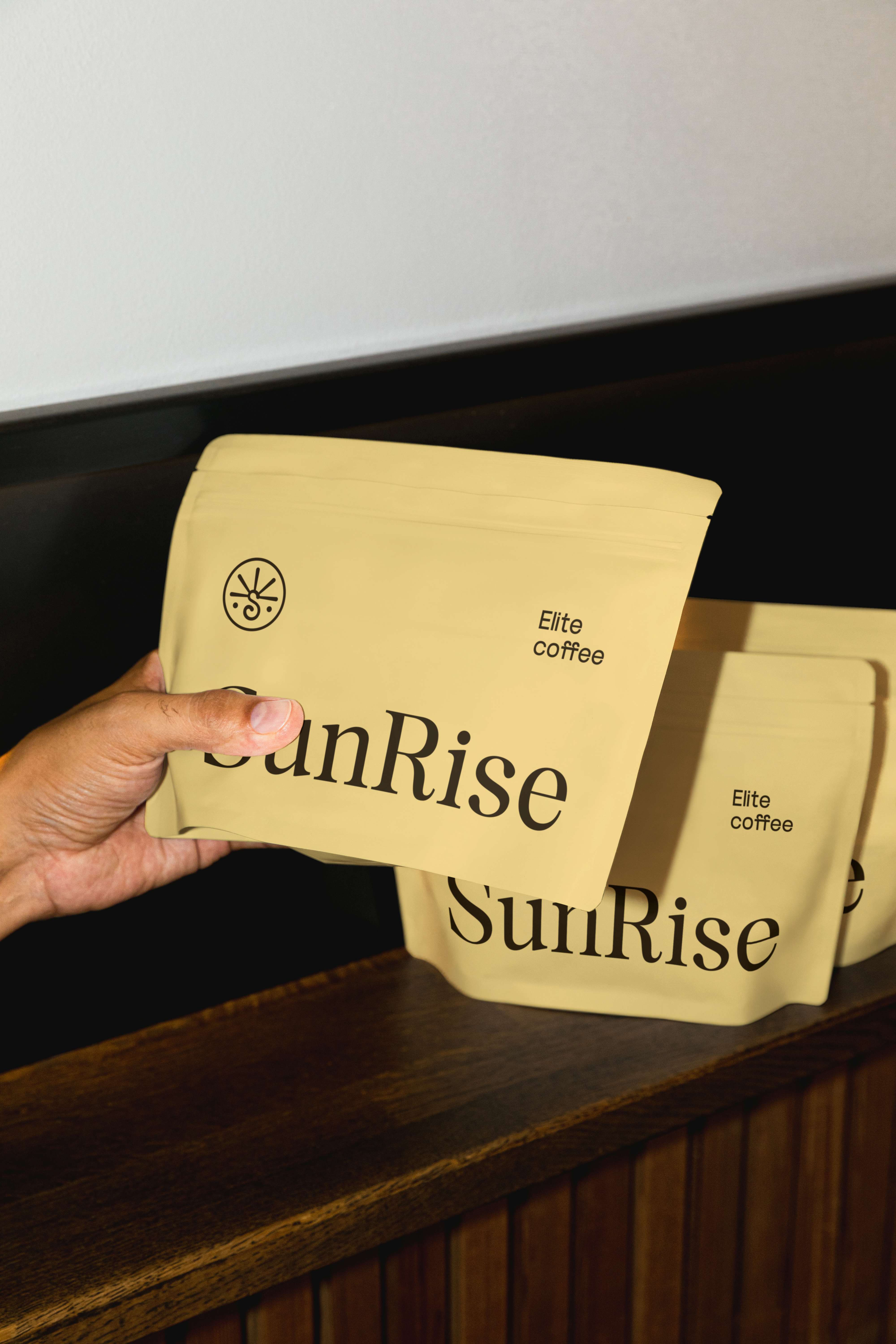
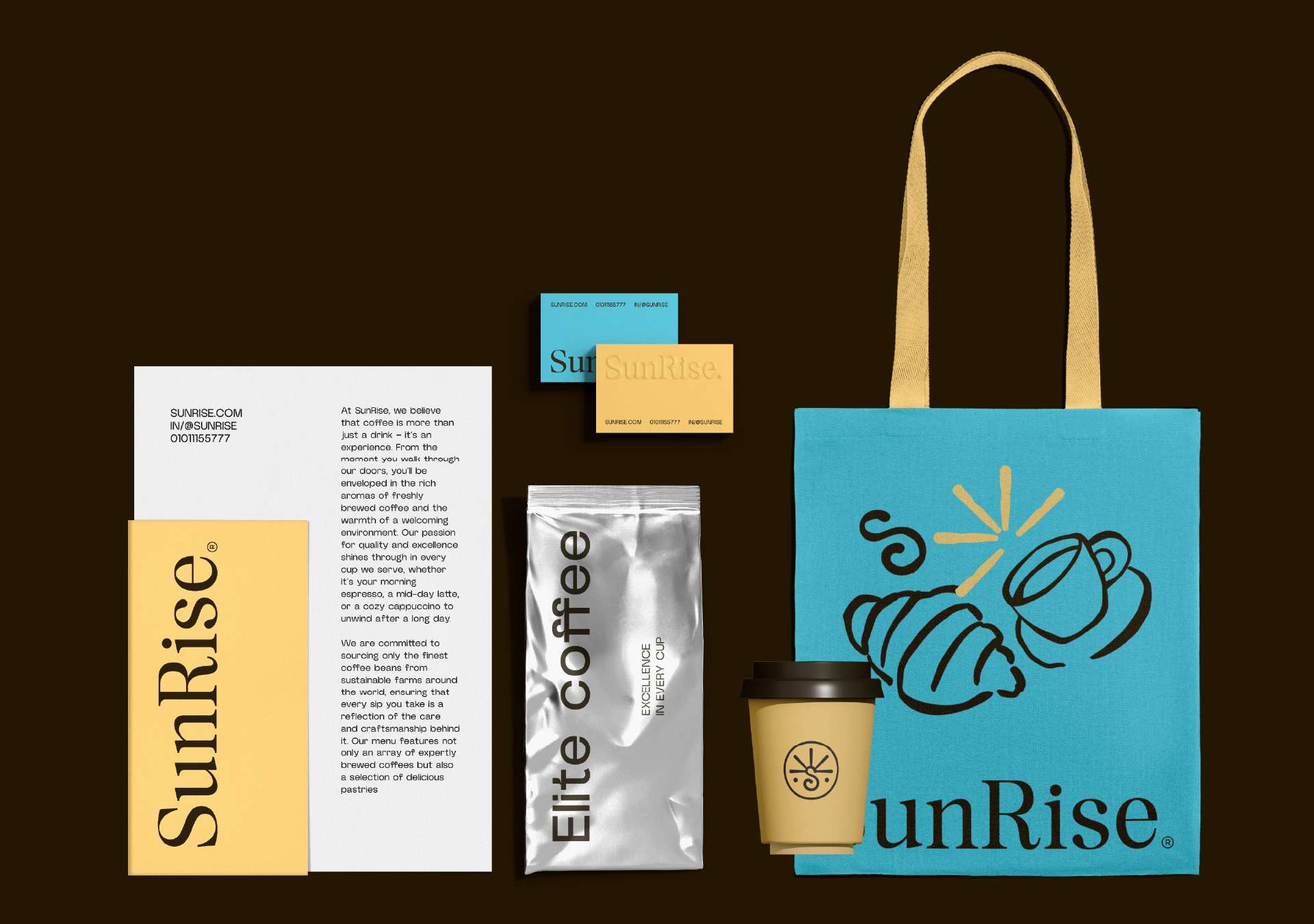
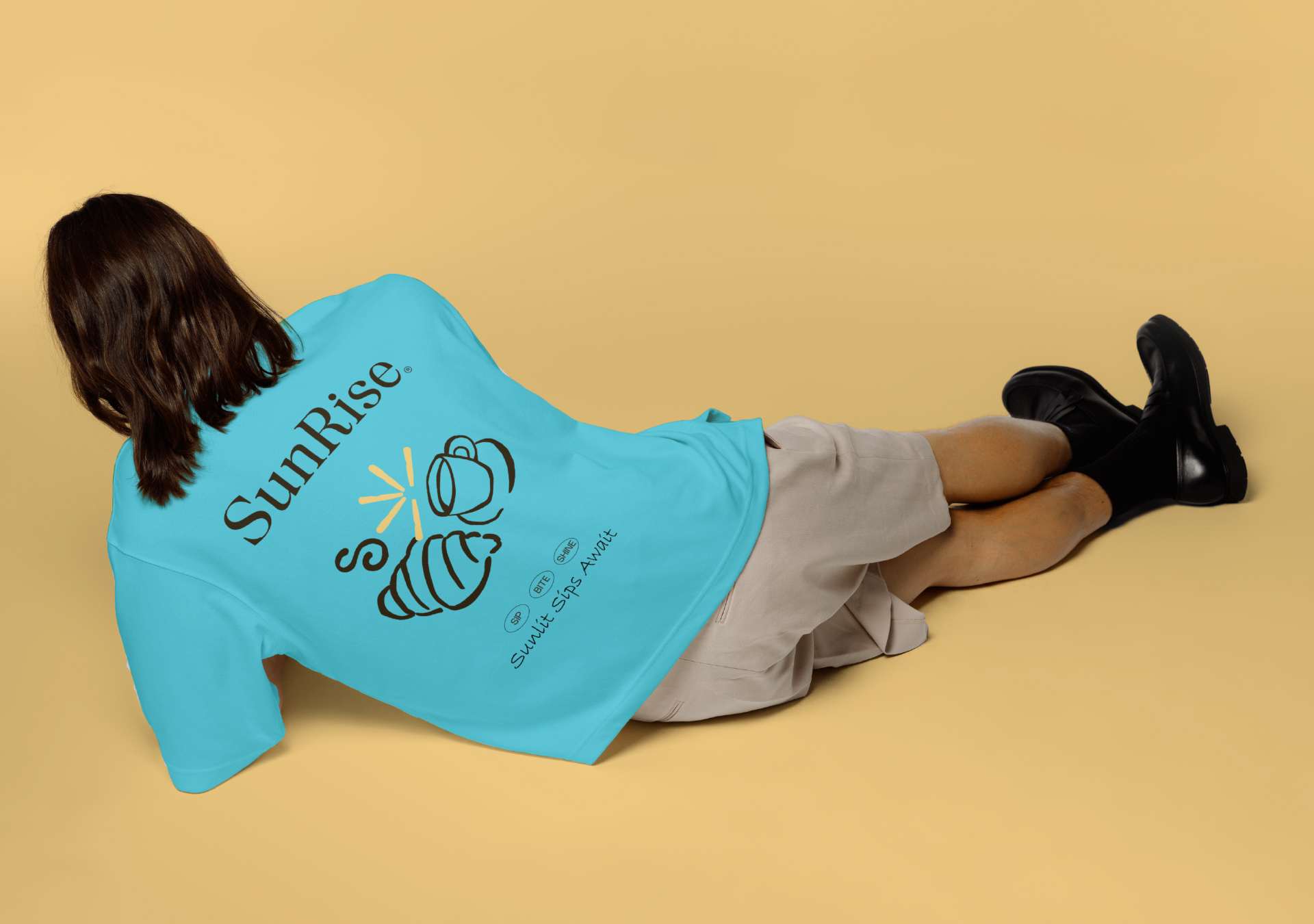
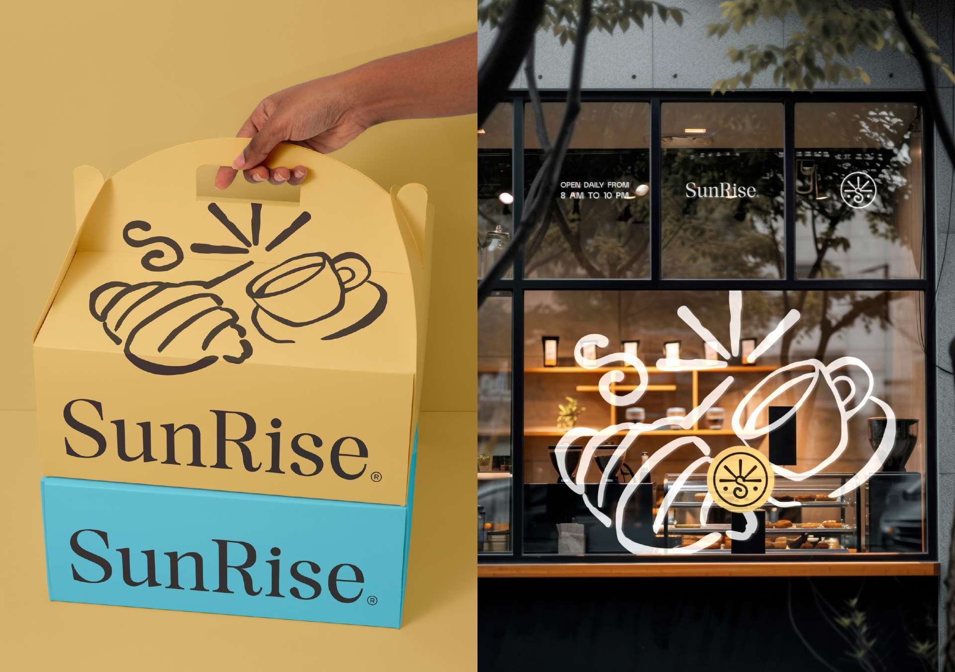
Even the packaging is hand-drawn, emphasizing authenticity and artistry. Each package contains a detailed illustration of a cup of coffee and a croissant set against a stylized sunrise, and the letter “S” strategically placed within the scene. This homemade feel avoids overly mechanical precision, instead inducing a sense of personalized, welcoming warmth that is appropriate for the café’s value proposition of community and comfort. Customers don’t perceive so much as a logo, but an open welcome to stay awhile, unwind, and start the day off in warm fashion.
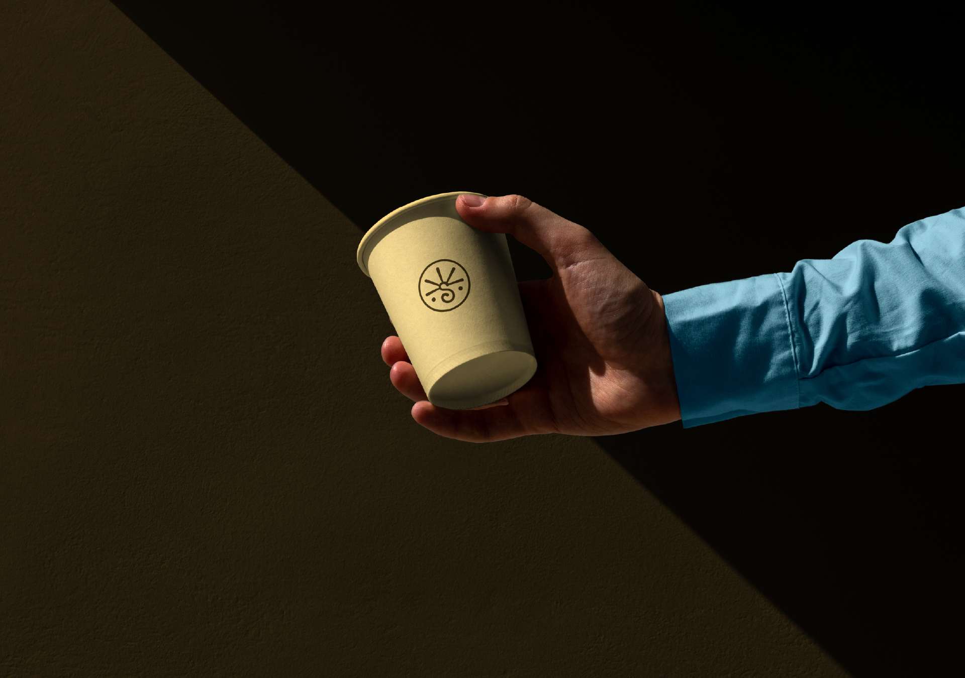
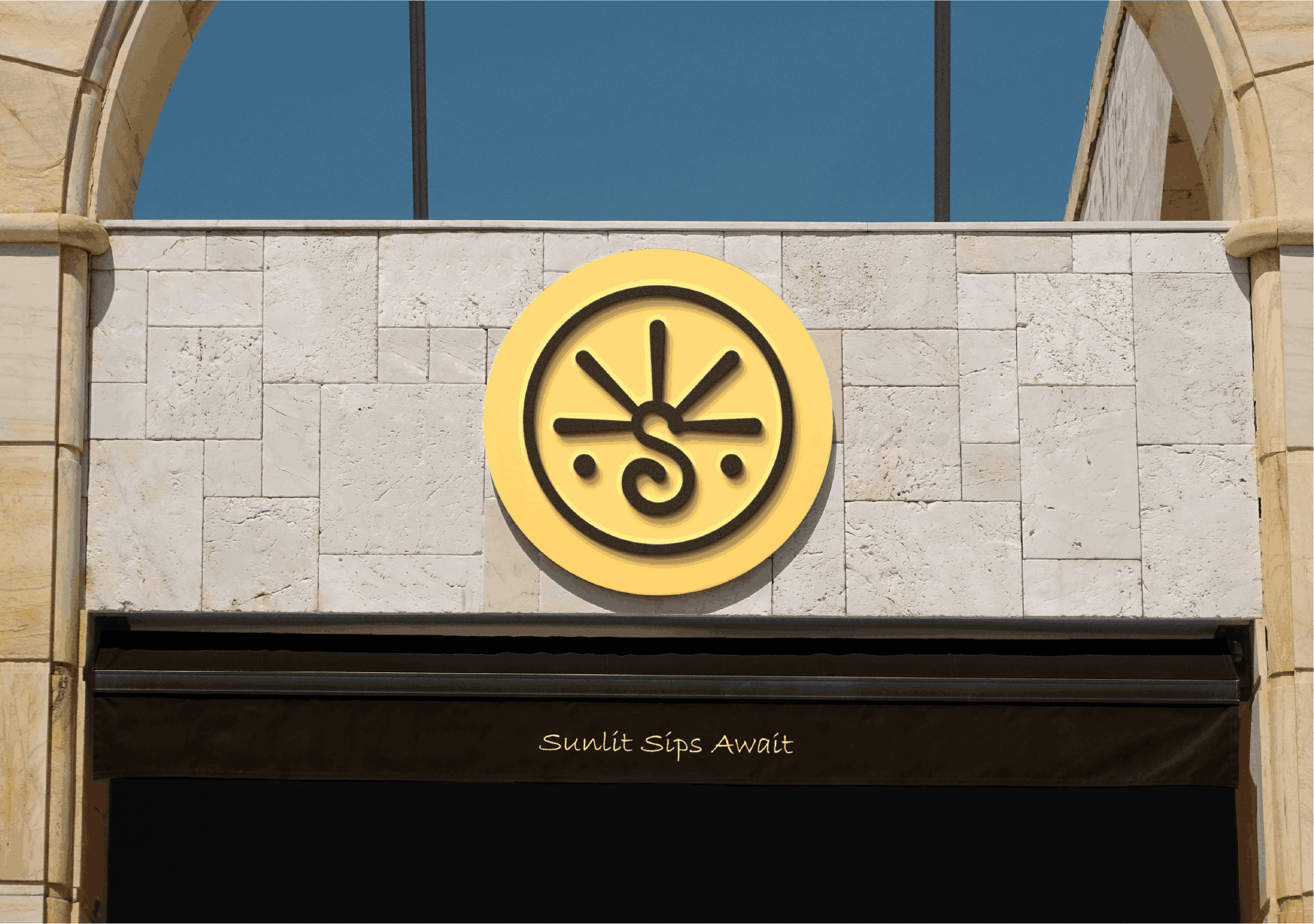
The logo itself is an exercise in combining symbolism and functionality. The upper arc takes its cue from the rising sun, a universal sign of rebirth and energy, and the lower curve of the “S” becomes a fluid design feature—suggestions of melting coffee, curling steam, and the twisted fold of a croissant alike. The dualism serves to make the mark recognizable and emotionally engaging.
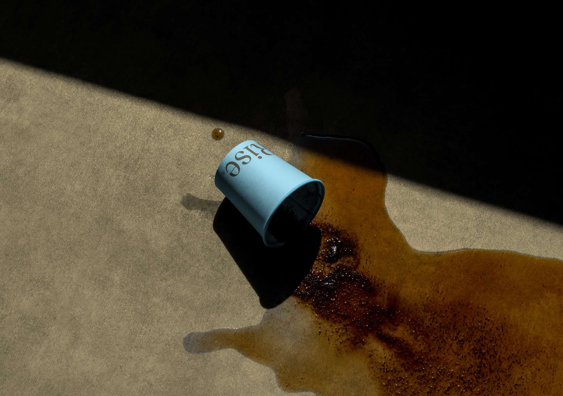
The color palette ties the system as a whole together. Rich, earthy brown dark evokes richness, earthiness, and the aroma of coffee. Yellow bright conveys energy and the burst of morning light. Blue sky adds balance, calm, and clarity—a clean horizon that invites possibilities. Combined, they create a visual identity that is both energizing and soothing, modern and timeless.
Beyond packaging, the design system, of course, extends to menus, signs, merchandise, and digital touchpoints. Every touchpoint is carefully harmonized to tell the same morning routine narrative. The result is an identity that not only dresses up products, but builds a unified emotional relationship with shoppers—inviting them to begin their day with SunRise.

CREDIT
- Agency/Creative: Awami Studio
- Article Title: SunRise Café: More Than Coffee, It’s a Sunrise in Your Day
- Organisation/Entity: Freelance
- Project Type: Identity
- Project Status: Published
- Agency/Creative Country: Egypt
- Agency/Creative City: Cairo
- Market Region: Africa
- Project Deliverables: Branding
- Industry: Food/Beverage
- Keywords: Branding, Visual Identity, Coffee,Pastries
-
Credits:
Branding Designerr: Ibrahim El Awami


