


Independent brand design agency Sunhouse has helped Simple elevate its portfolio with the design of a new range of daily booster serums.
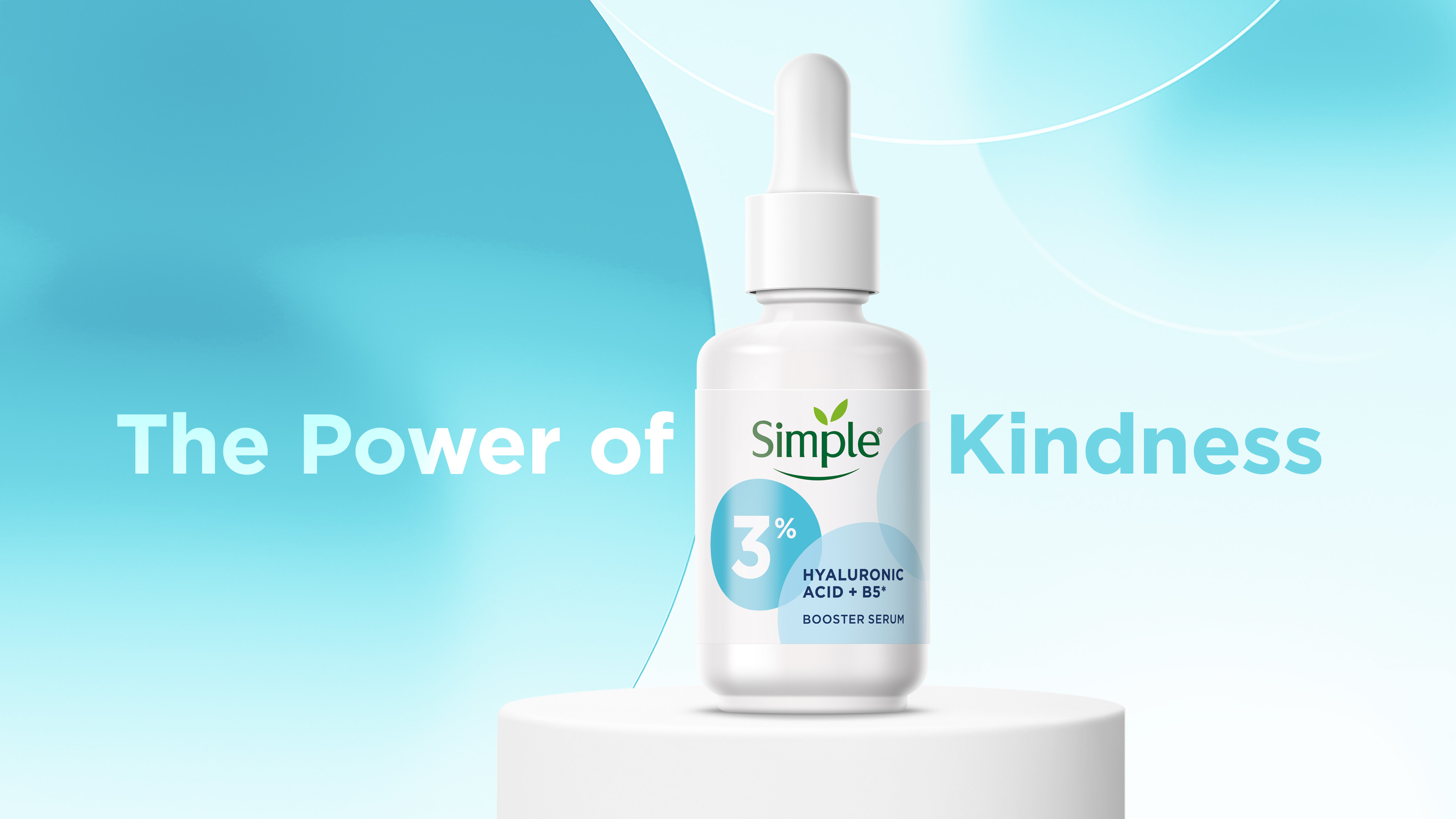
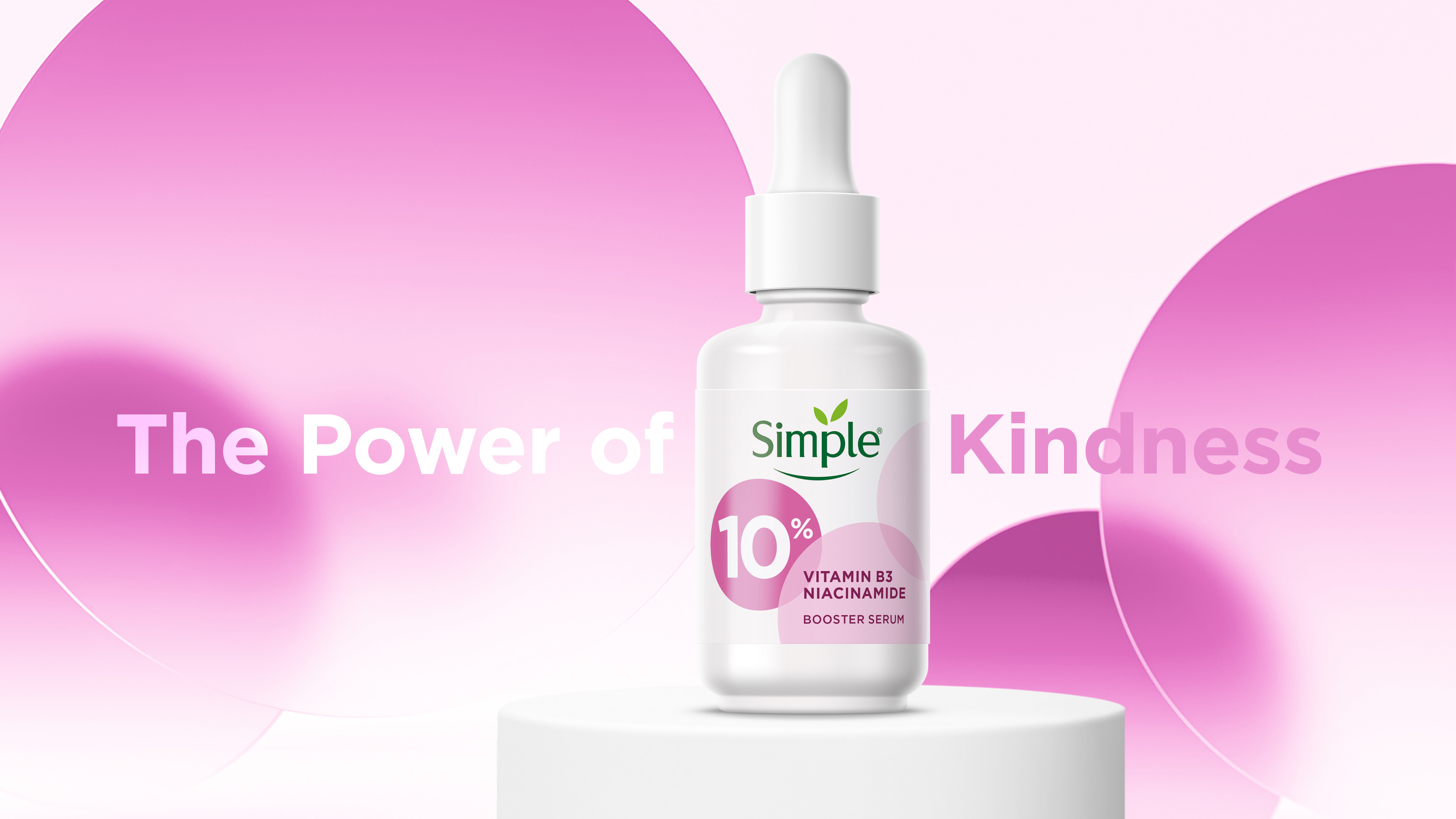
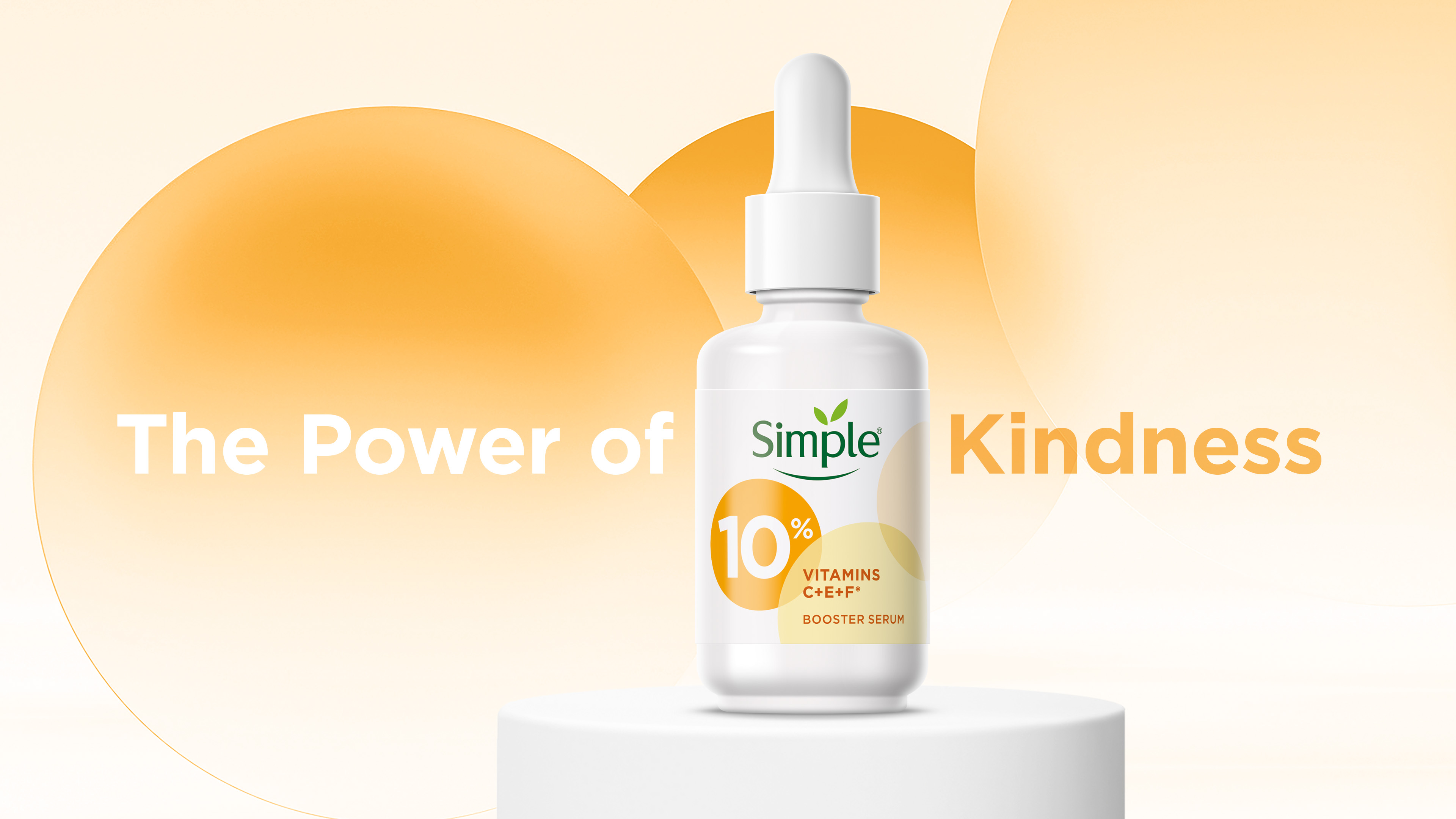
Over the past 60 years, Simple has built a reputation for being ‘kind to skin’, becoming the UK’s No. 1 facial beauty brand as well as a leading skincare brand globally. To meet the category demand for more efficacious products, Simple developed a range of face serums formulated with potent active ingredients to supercharge everyday skincare routines. The Unilever-owned brand then turned to Sunhouse to create a premium identity for the range that ‘Unlocked the Power of Kindness’, and in doing so, broaden the appeal of Simple to consumers that recognise the need and value of kindness, not only in regards to their skincare, but also in a wider world context.
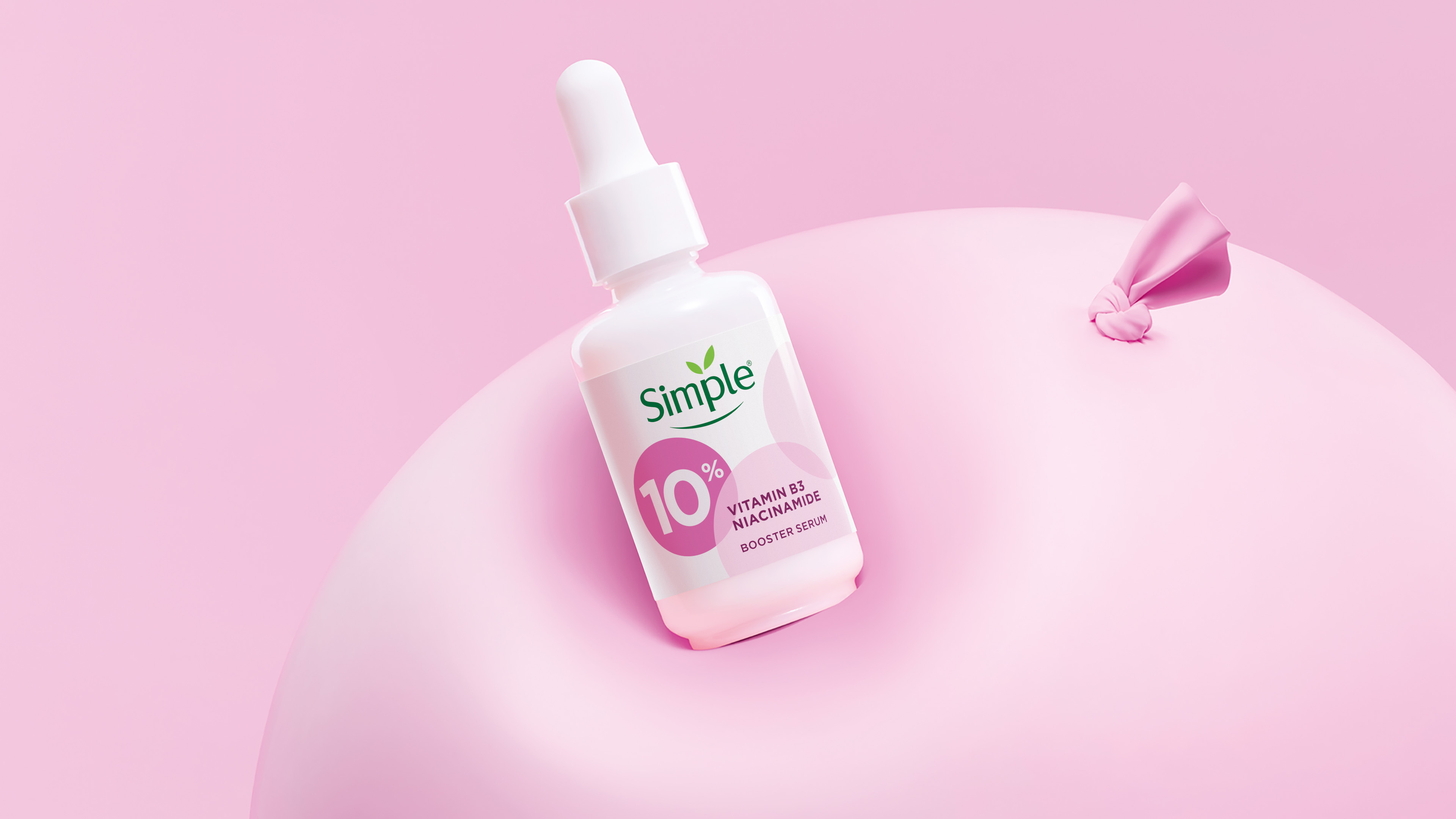
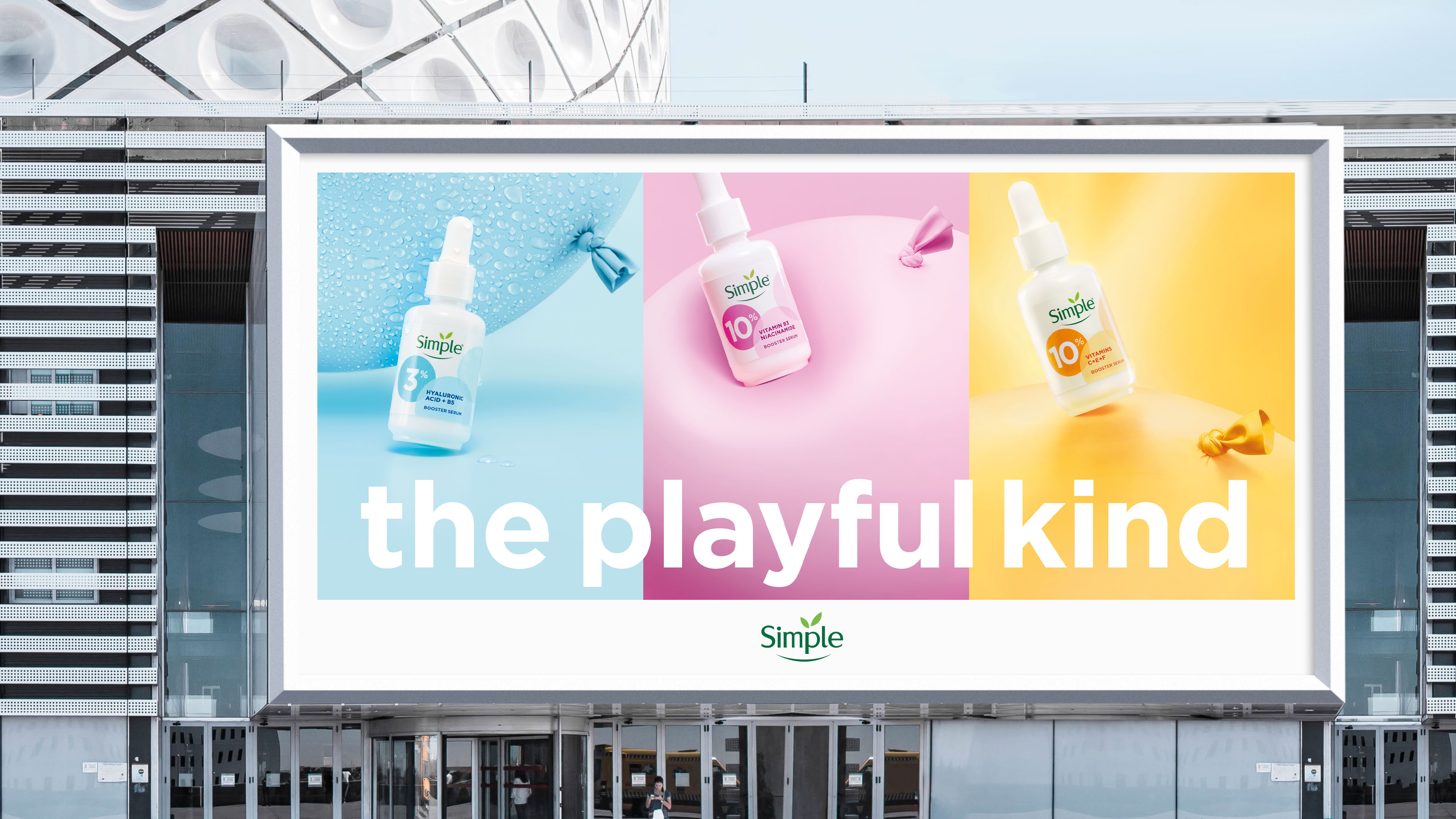
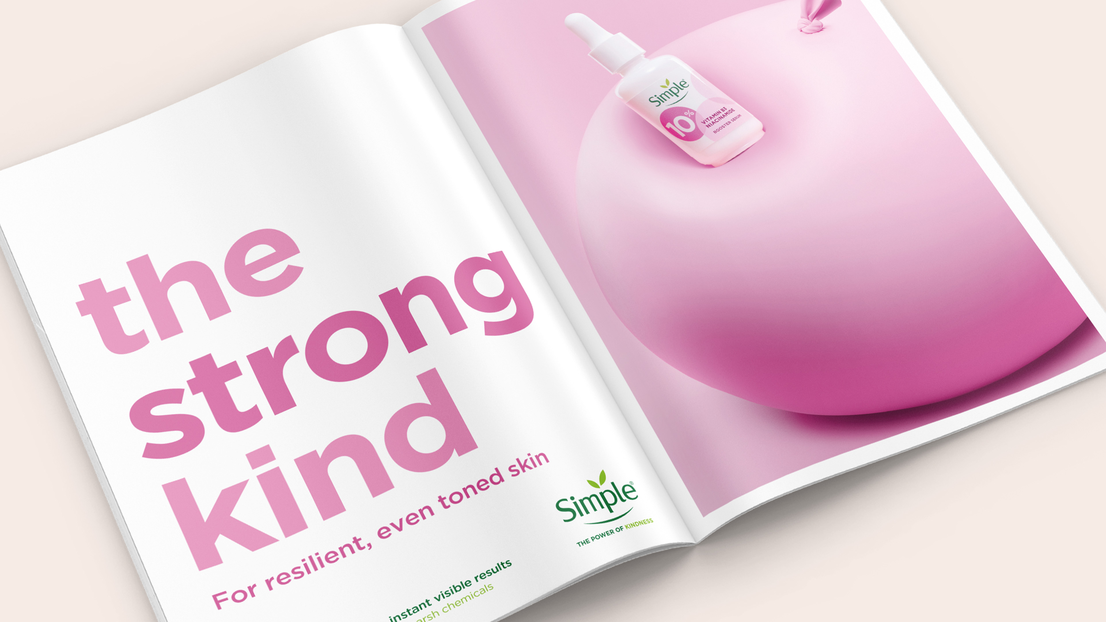
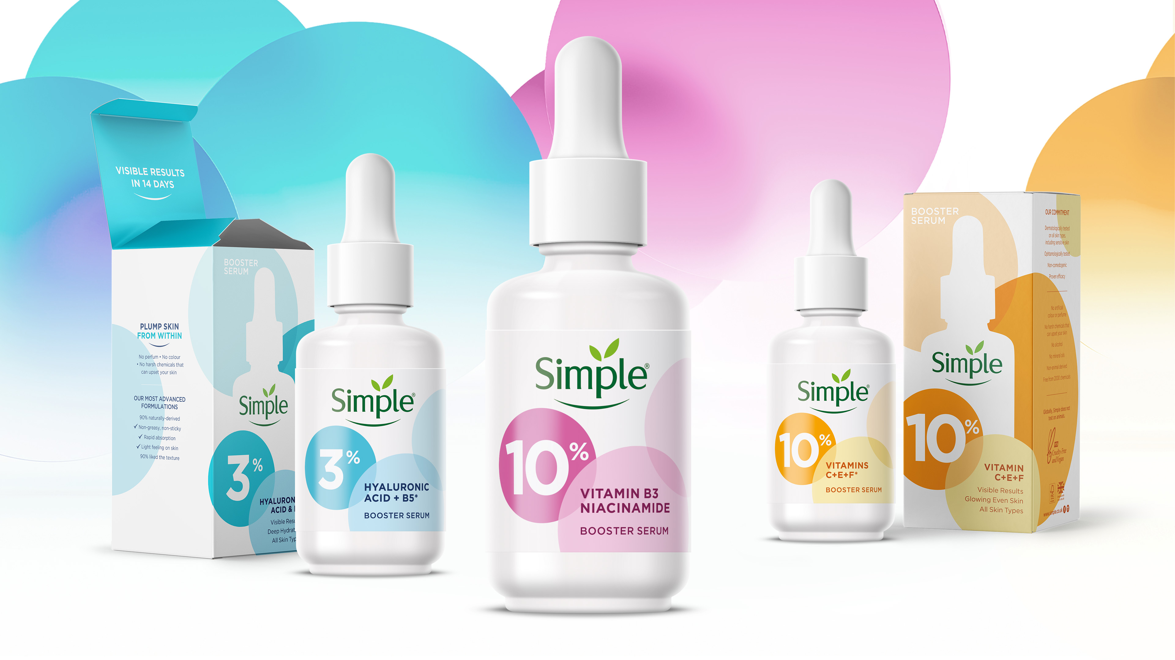
Striking the right balance between confidence and care, the creative powerfully communicates efficacy whilst also allowing the strength of Simple’s inherent kindness to shine through. The introduction of circular shapes drives visual distinction of the new range, confidently reflecting the brand’s newfound gravitas in a playfully modern way. The interaction and overlap of these shapes add depth and dimension to the design, whilst reinforcing brand equities by mirroring the leaf motif from Simple’s logo.
“It wasn’t about reinventing Simple’s identity, but rather, bringing the brand’s innate character to the fore with a fresh, contemporary feel,” comments James Giles, Creative Director at Sunhouse. “There’s a simplicity and visual calmness to the circles that connects to the clean aesthetic of Simple’s core offering, but also a joyfulness and a flexibility that taps into modern cosmetic codes, giving the brand more to play with across communications.”
In addition to packaging design, Sunhouse worked with creative photographer Kelly French on the development of key visuals for an activation campaign to launch the new range. Capturing a sense of lightness and play, the serums are featured alongside balloons, which not only echo the circular graphics on the packaging, but also serve as a visual link to skin, providing the perfect canvas to showcase the unique skin and beauty benefit of each product.
“Sunhouse’s creative delivers the premium proposition of our new booster serums range in a dynamic way that amplifies efficacy without compromising Simple’s kindness,” comments Magali Giupponi, Unilever’s Senior Global Brand Director of Simple. “The visual language that the agency has created gets under the skin of what the power of kindness truly means. That it is not simply a matter of being nice, but rather about putting kindness into action, finding opportunities for it, even in the most challenging of times. Kindness is more relevant than ever, and Simple is committed to championing the power of kindness in our products and in our principles.”
CREDIT
- Agency/Creative: Sunhouse
- Article Title: Sunhouse Unlocks The ‘Power of Kindness’ With The Design of Simple’s New Range
- Organisation/Entity: Agency
- Project Type: Identity
- Project Status: Published
- Agency/Creative Country: United Kingdom
- Agency/Creative City: Bath/UK
- Market Region: Global
- Project Deliverables: 2D Design, Advertising, Brand Design, Graphic Design, Packaging Design
- Industry: Health Care
- Keywords: personal care, beauty, skincare, design, packaging design, identity design, range identity, key visuals
-
Credits:
Creative Director: James Giles


