


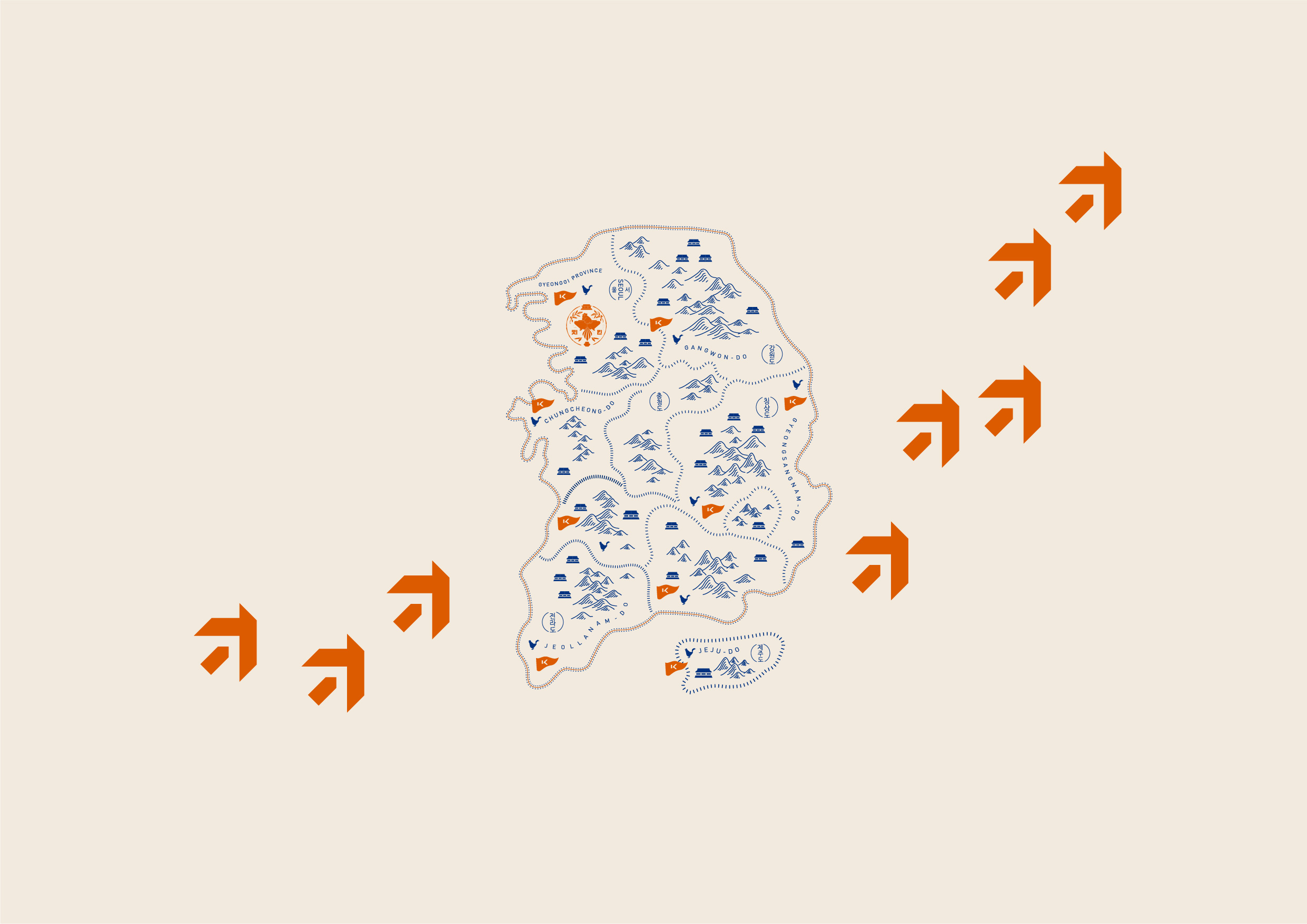
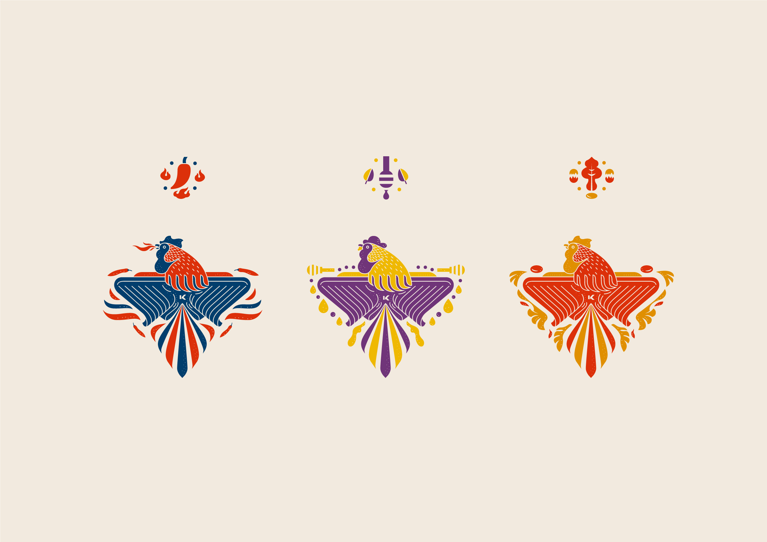
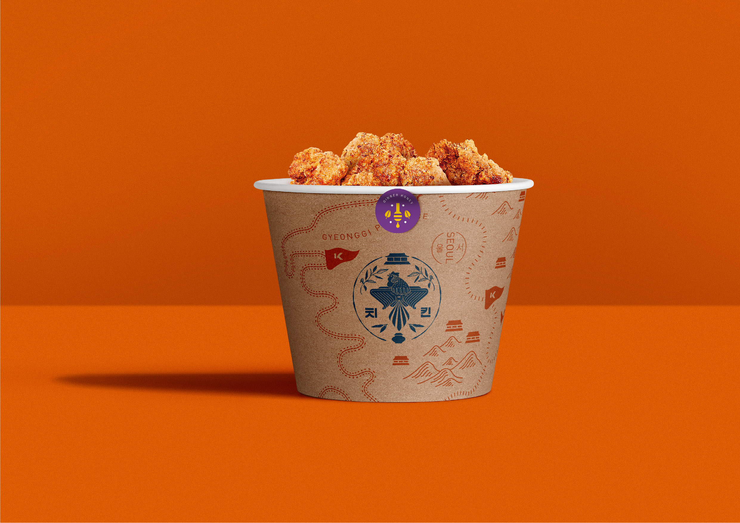
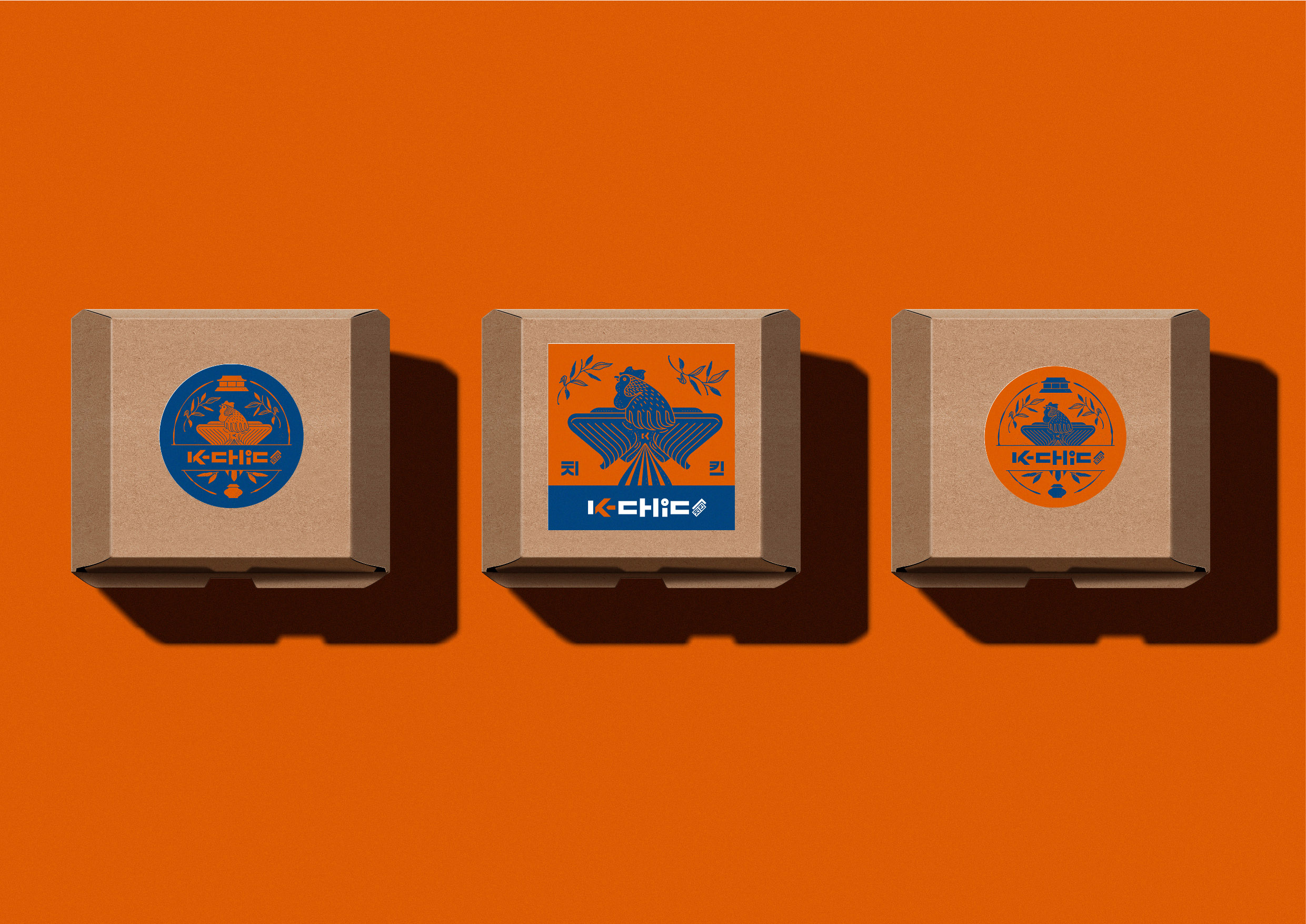
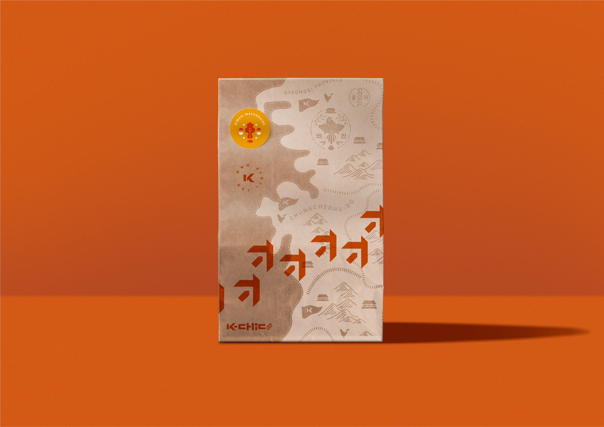
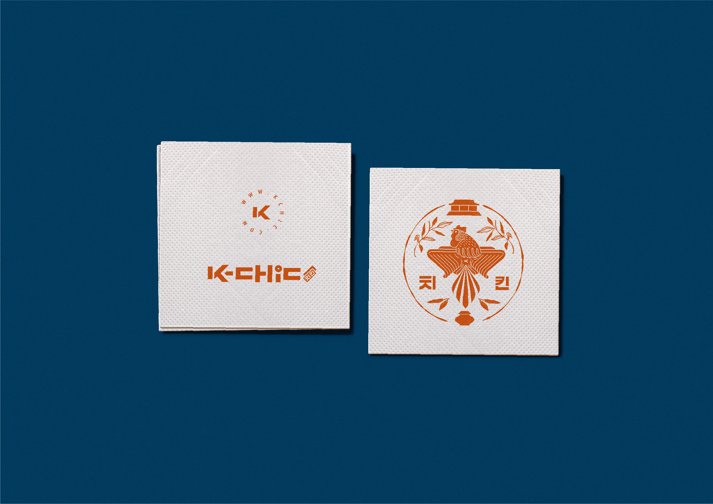
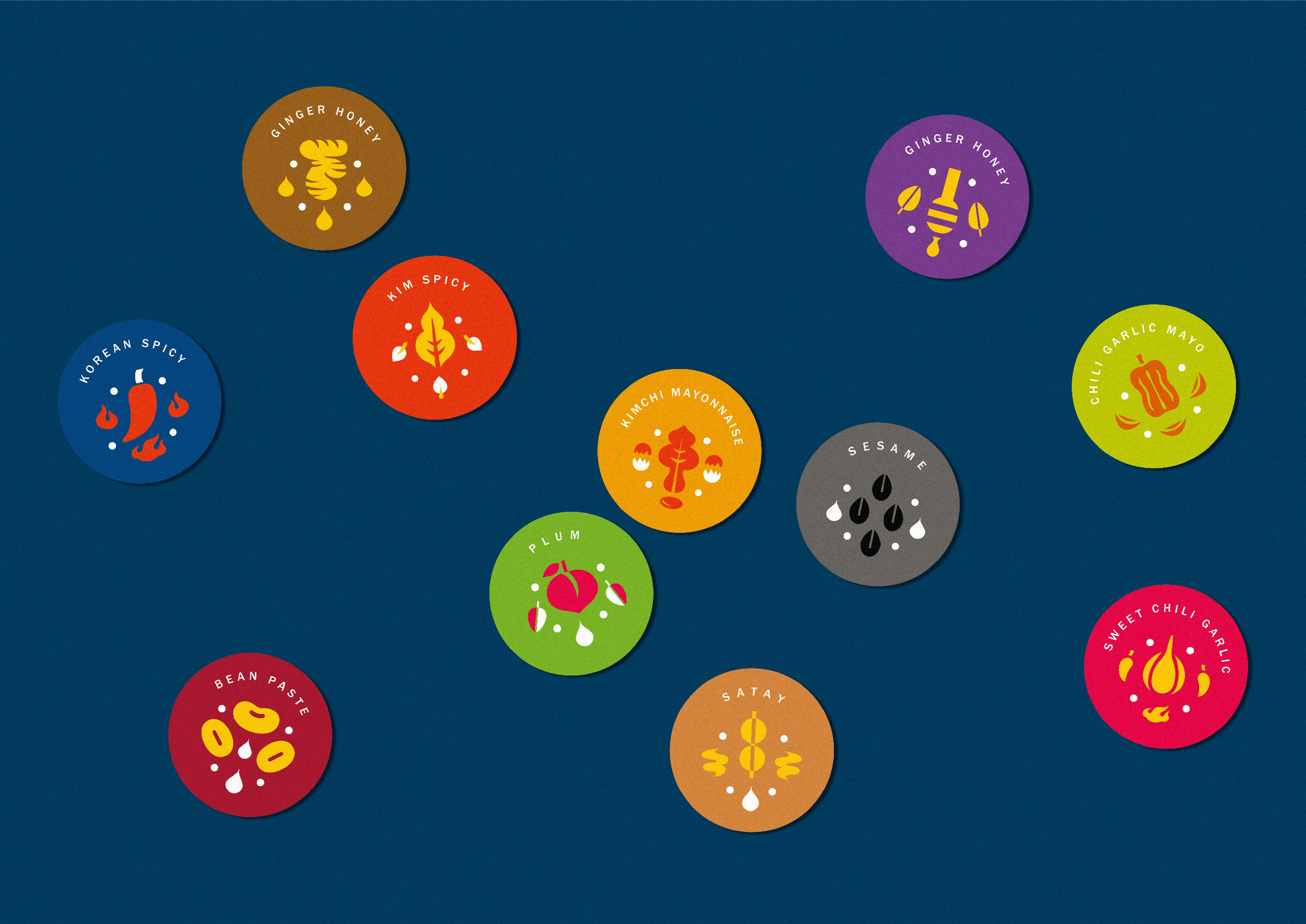
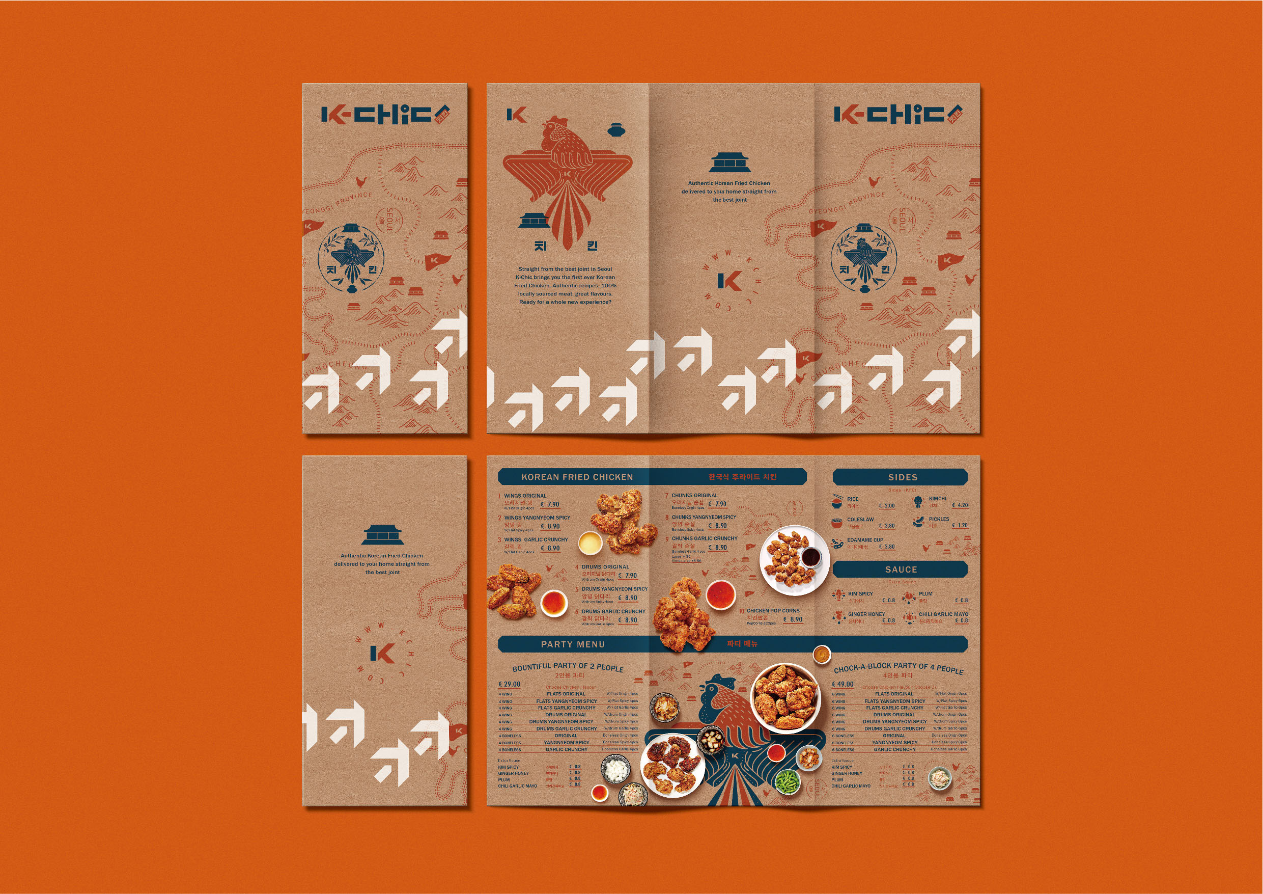
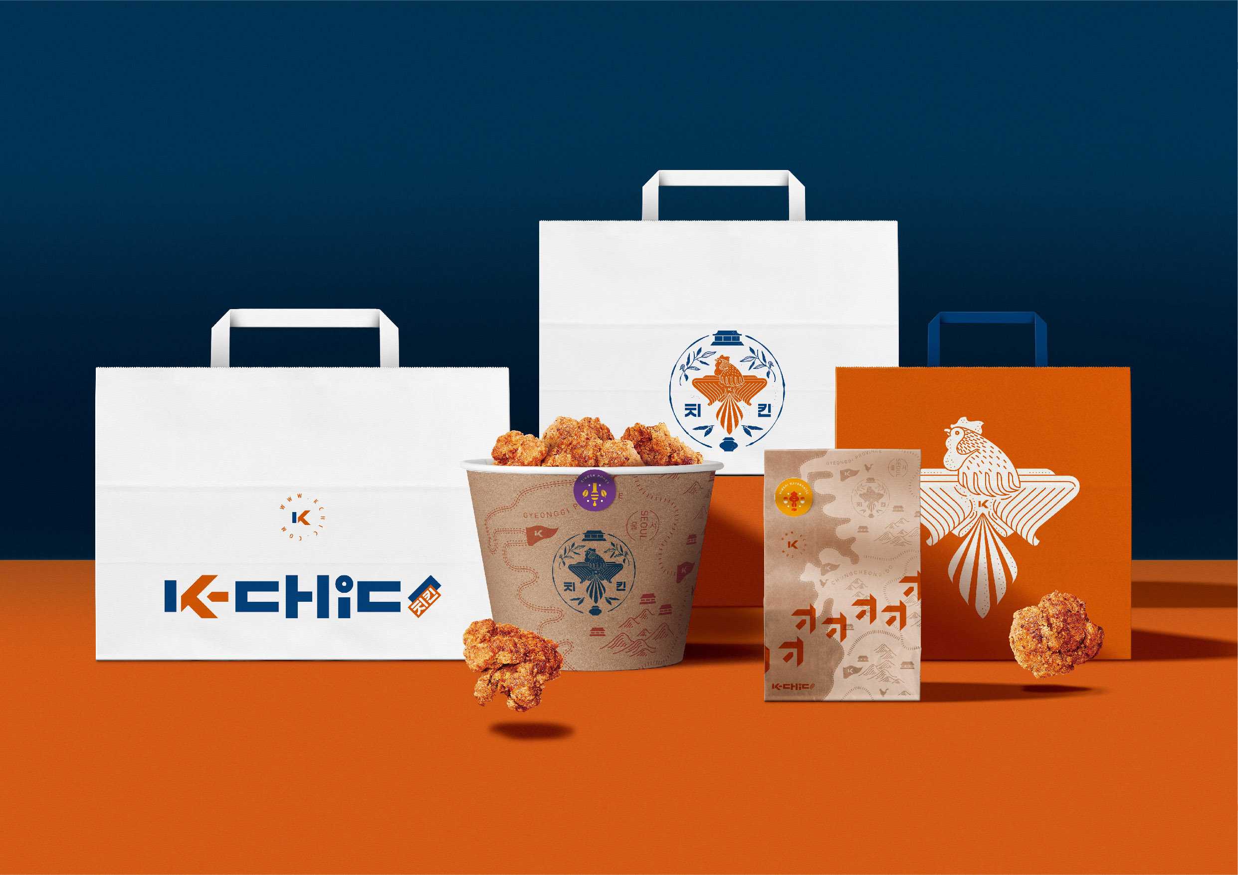
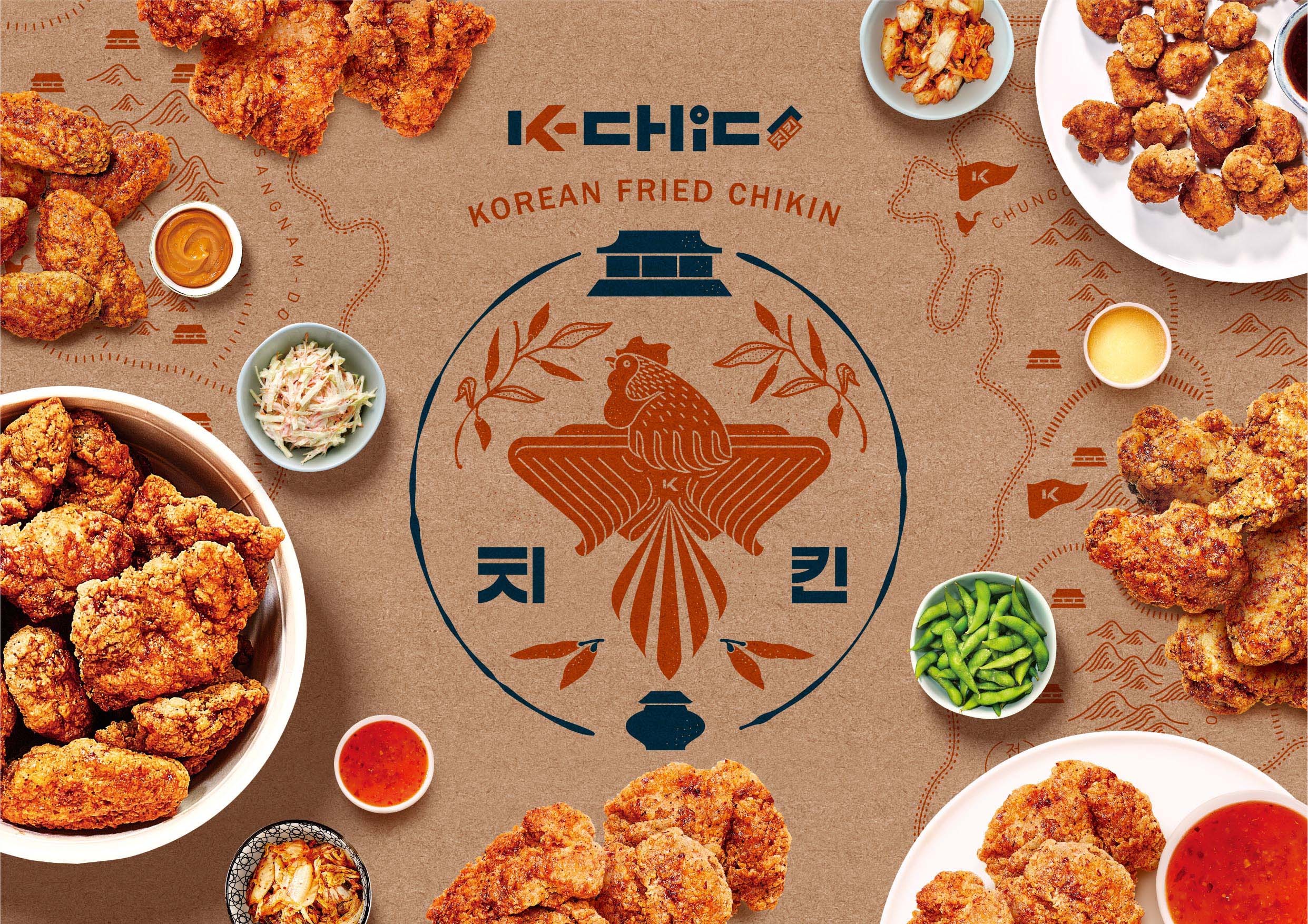
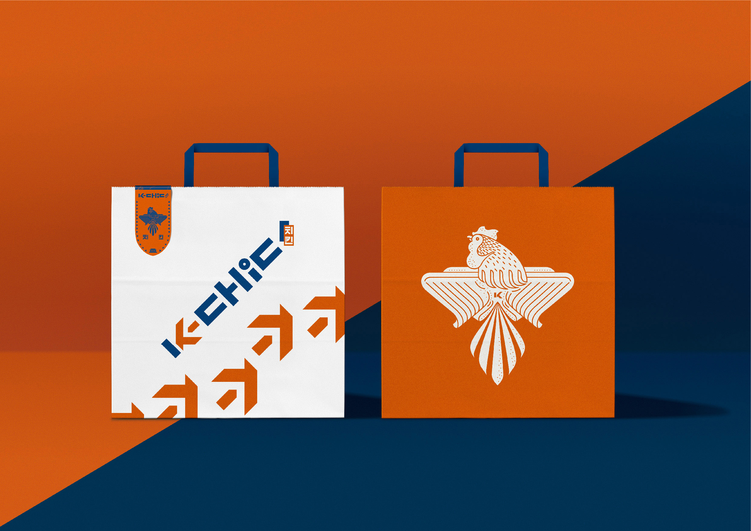
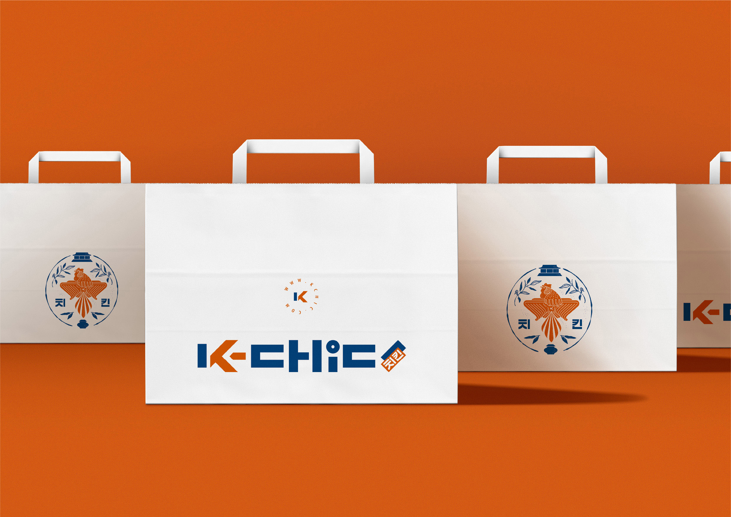
K-Chic, the Korean Fried Chicken in Belgium, specializes in authentic Korean-style Fried Chicken and focuses on the meal delivery market. Just move your fingers to get a delicious Korean Fried Chicken from K-Chic. Moreover, the client regards the Korean-style Fried Chicken as a young and vivid Korean boy in neat figure. During European racing season, K-Chic will be a new choice for the male consumers to eat while watching ball games. The designer proposed the concept of the Korean warrior expedition after an internal discussion. The designer utilizes the element of warrior to symbolize the delicious fried chicken to be healthy and tender chicken. The zesty Korean Fried Chicken conquers the taste buds of consumers from the imagination of a Korean expedition to Europe. The identification mark uses K combined with the footprint of the chicken to symbolize the meaning of expedition. The font part uses the font style of Korean retro advertisements, which is designed to imitate the Korean text, and has the visual image of the shouting slogan, which expresses the image of the warrior’s righteous ardor. The auxiliary graphics use Korean warrior expedition ideas, and are designed with the elements such as the battle flags, ancient maps, and chicken warriors, bringing in the different flavors, making the brand’s main axis more complete, reflecting the richness of flavors, and conveying the spirit of authentic Korean flavors. The main visual uses a map expression technique to integrate the fried chicken into the picture to enhance the appetite and arouse the desire for consumption. The stickers are designed with the concept of military emblems combined with the tastes, with the rich colors, so that food and packaging materials can enhance the appetite.The zesty Korean Fried Chicken conquers the taste buds of consumers from the imagination of a Korean expedition to Europe. During European racing season, K-Chic will be a new choice for the male consumers to eat while watching ball games.


CREDIT
- Agency/Creative: Sump Design
- Article Title: Sump Design Creates K-Chic Korean Fried Chicken Brand and Packaging Design
- Organisation/Entity: Agency, Published Commercial Design
- Project Type: Identity
- Project Status: Published
- Agency/Creative Country: Taiwan
- Market Region: Europe
- Project Deliverables: Brand Identity, Brand Strategy, Branding, Graphic Design, Illustration, Packaging Design, Research / Insight
- Keywords: Korean Fried Chicken


