


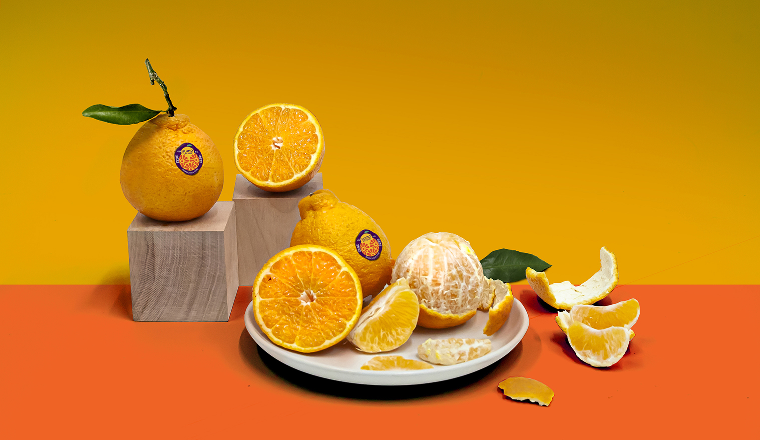
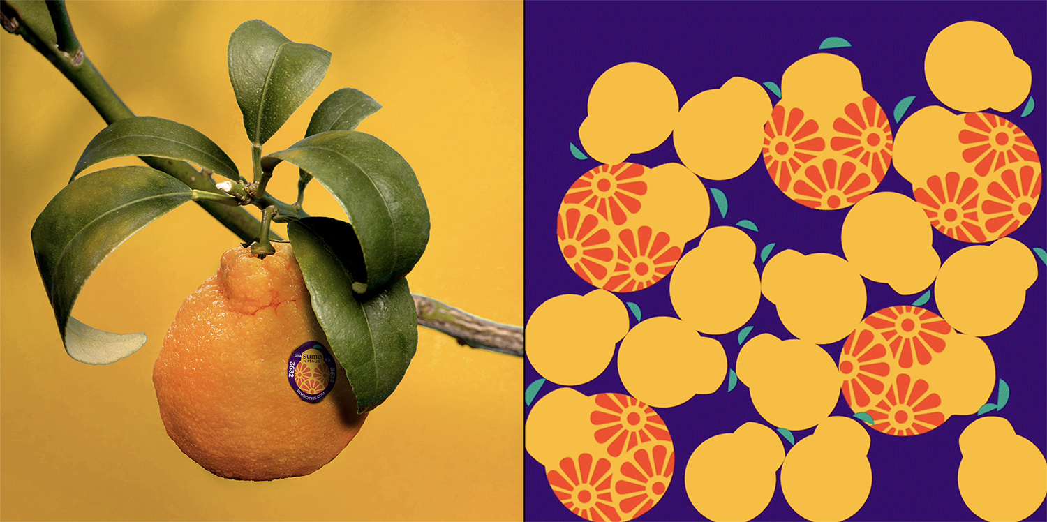
Sumo Citrus is one of the world’s largest and sweetest mandarins, celebrated for its incredible taste and distinct looks. This rare seedless variety was originally cultivated in Japan in the 1970s by a grower who set out to develop the ultimate citrus experience. This variety was dubbed the “dekopon” in Japan and has been prized by those in the know ever since. Seedlings were first imported into the US in 1998, but because the Sumo Citrus is one of the most challenging varieties to grow, it wasn’t until 2011 that they became available to the public. There is no doubt that it is the most difficult citrus to cultivate. The fruit’s extremely delicate skin is easily bruised and sunburned
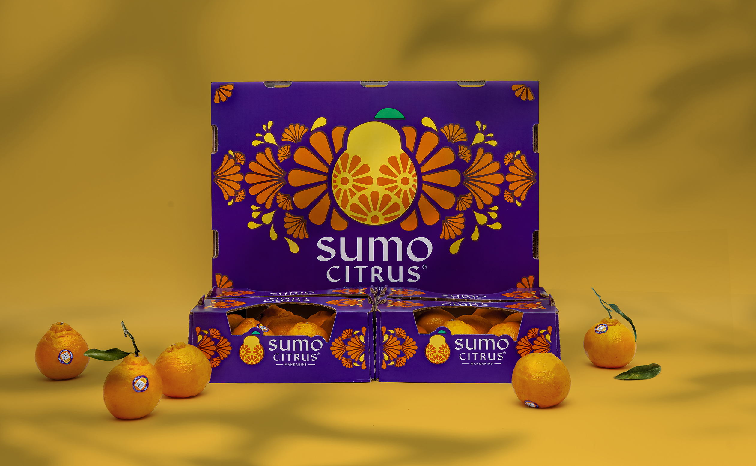
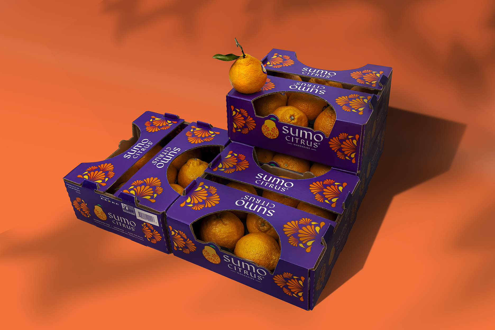
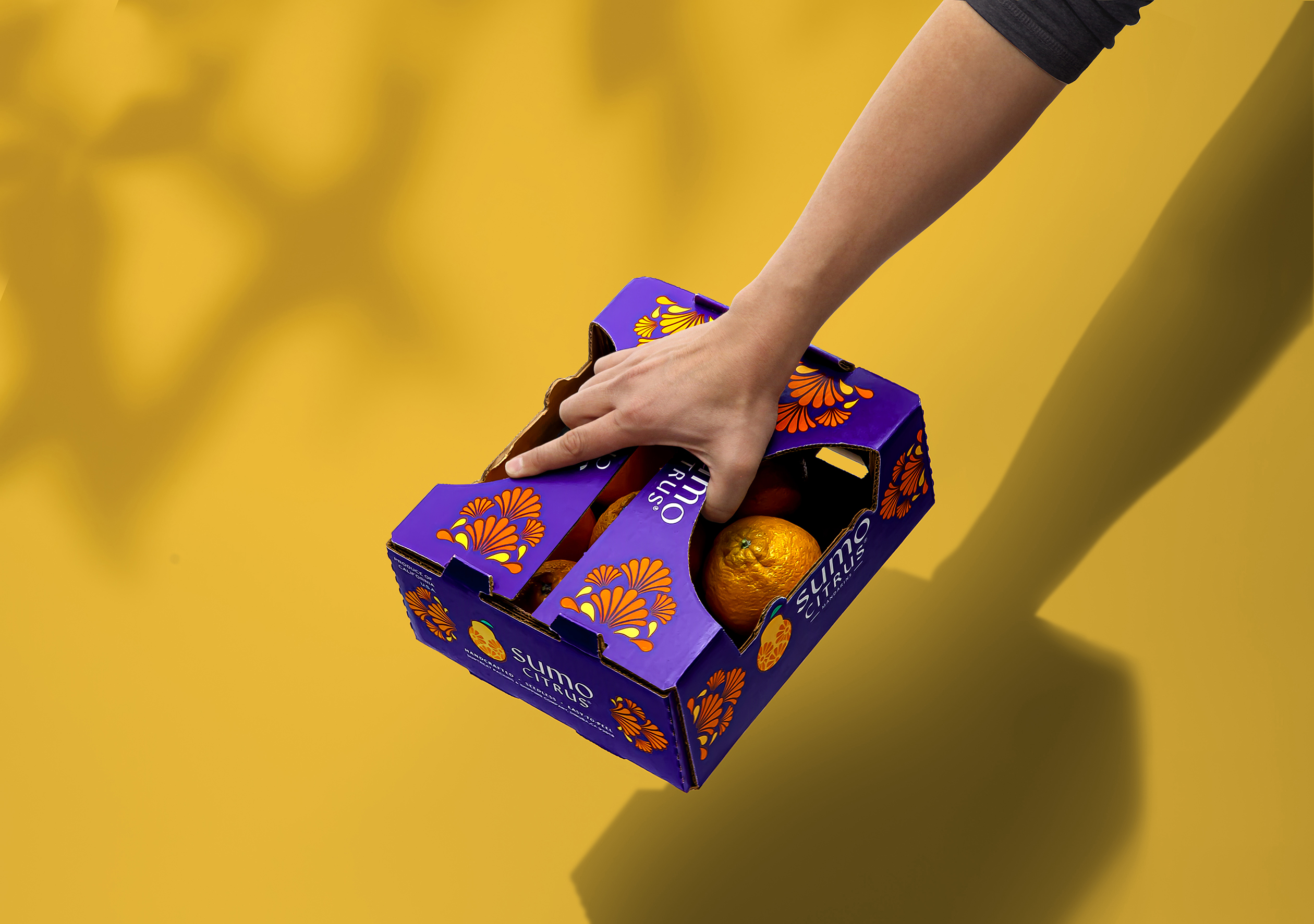
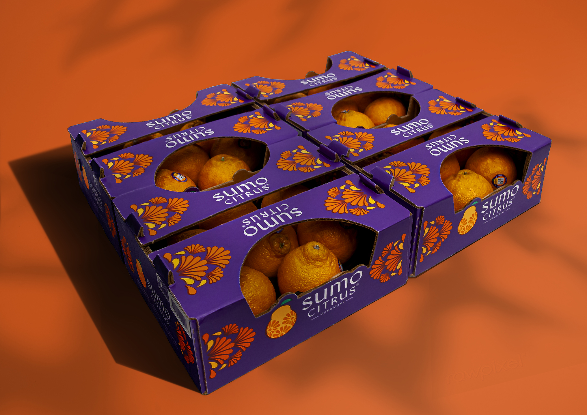
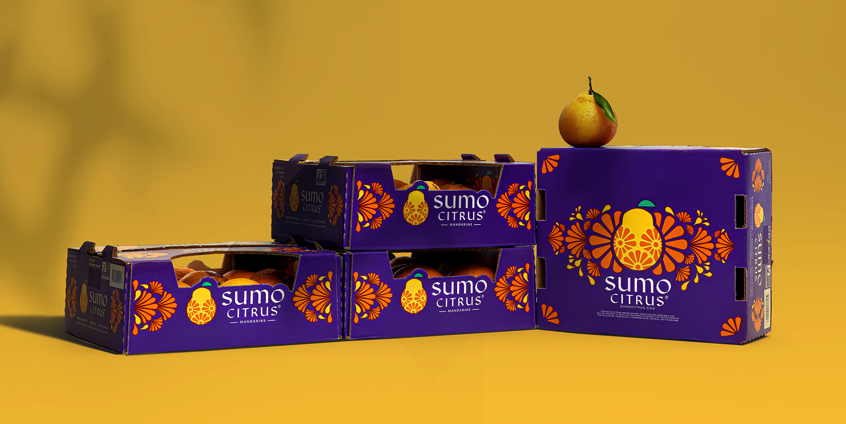
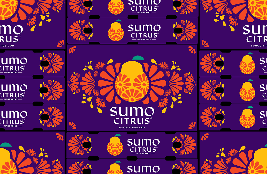
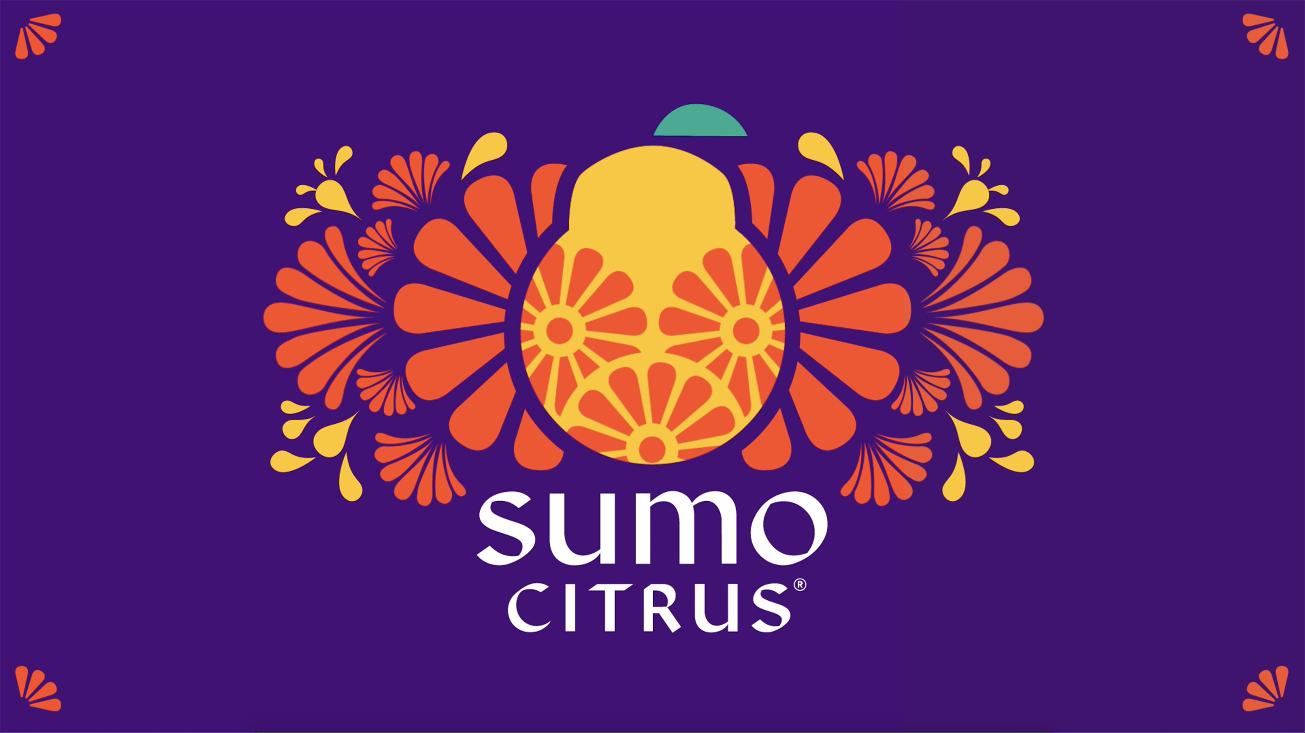
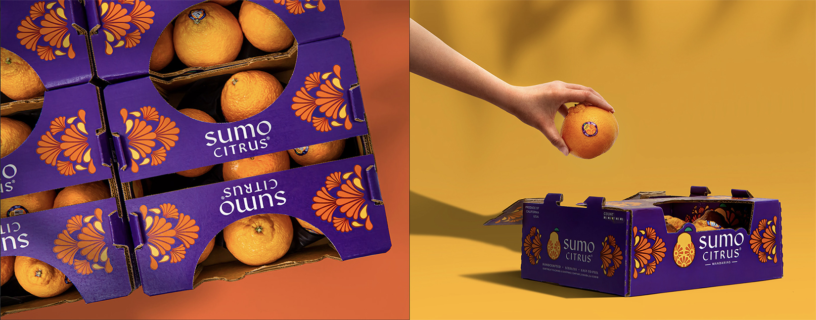
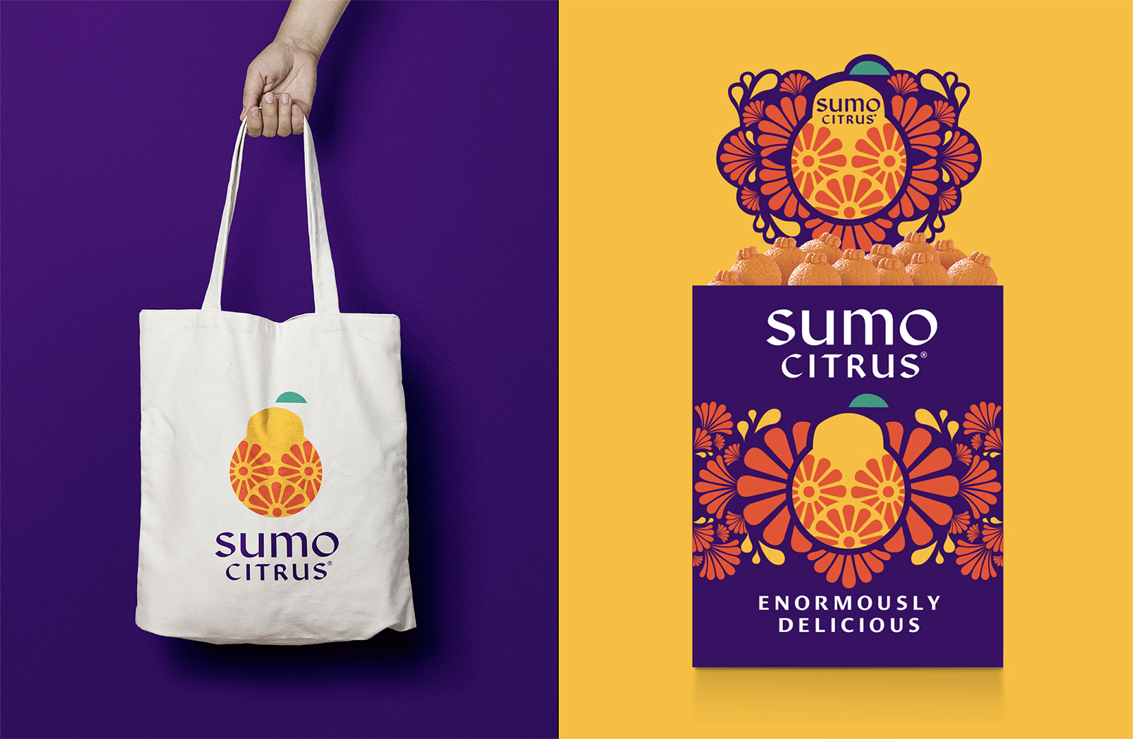
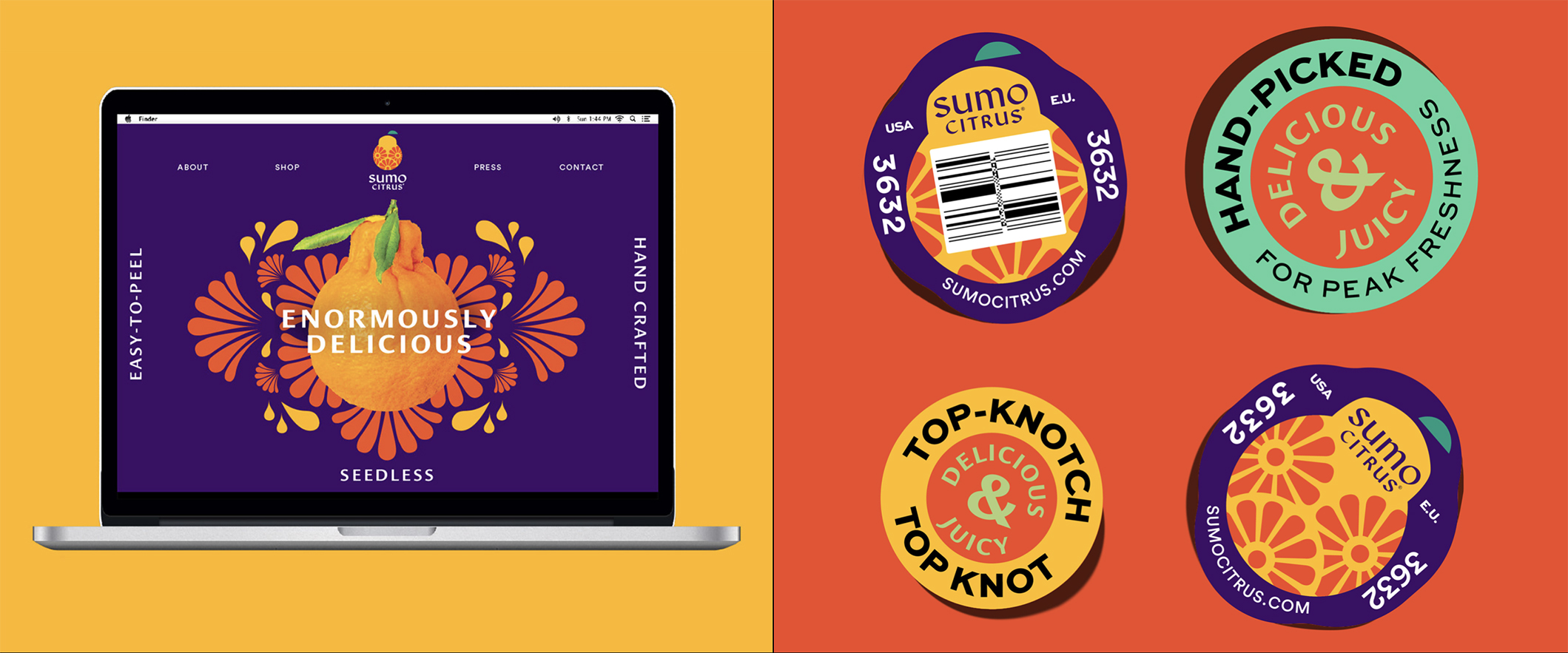
With a bold logo design inspired from the unique shape of the fruit and the Japanese pattern, Sumo Citrus stands out in the supermarket. Playing with the stacking system, the brand truly packs a punch from afar. With that in mind, people are drawn in by the joyful colors and its Japanese heritage storytelling. The edgy custom logo type combined with the editorial look play off sophistication and premium quality for the brand.
Demonstrating a feeling of sweetness and juiciness from the graphic, Sumo Citrus creates an unbelievable censorial experience.
CREDIT
- Agency/Creative: HATCH
- Article Title: Sumo Citrus Rebrand
- Organisation/Entity: Agency, Published Commercial Design
- Project Type: Packaging
- Agency/Creative Country: United States
- Market Region: North America
- Project Deliverables: Brand Creation, Brand Guidelines, Brand Identity, Brand Redesign, Brand Strategy, Branding, Graphic Design, Identity System, Packaging Design, Rebranding, Retail Brand Design
- Format: Box, Tray
- Substrate: Pulp Board


