


Summer Breeze Project: The Effervescence of Lifestyle in Design
Strategic Context and Introduction
The Ready-to-Drink (RTD) market demands more than mere functionality; it requires an emotional connection and instant visual impact. The Summer Breeze project was born from this premise, positioning itself as a line of Fizzy Wine Coolers that transcends casual consumption to celebrate contemporary lightness and freshness. The challenge entrusted to We&CO was to materialize the sensation of effervescence—of both the liquid and the drinking occasion—into a vibrant, proprietary, and disruptive identity for the category.
The Concept: Synesthesia and Movement
The core concept of the project lies in the harmony of contrasts: the crispness of sparkling wine paired with the intensity of fruits. We translated this duality through a visual language that borders on synesthesia. It is not just a label; it is a graphic representation of the sound of bubbles, the rhythm of the tides, and solar energy. Summer Breeze was designed to be the visual icon of “golden hour” moments, using design as a bridge between the palate and the consumer’s lifestyle.
Visual Identity and Graphic Language
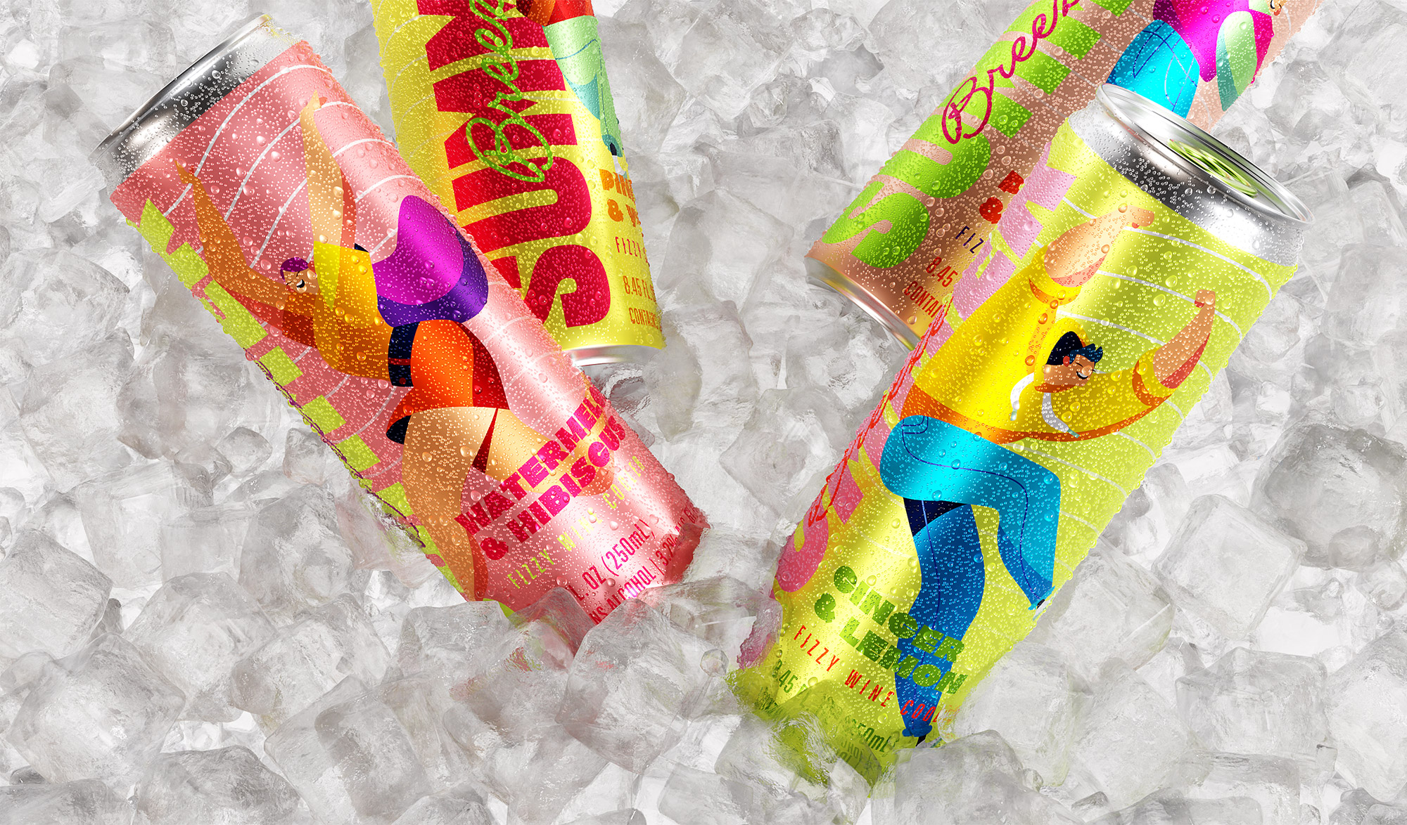
The visual identity explores the balance between strength and fluidity. The central design element features organic waves flowing across the labels. These shapes are not merely decorative; they symbolize the rhythm of sound and the dynamism of the liquid in motion. This technical choice creates a fluid visual system that adapts across various touchpoints, ensuring the brand maintains a bold and recognizable presence from a distance. The typography was carefully selected to support this modernity, offering legibility and a sophisticated yet accessible personality.
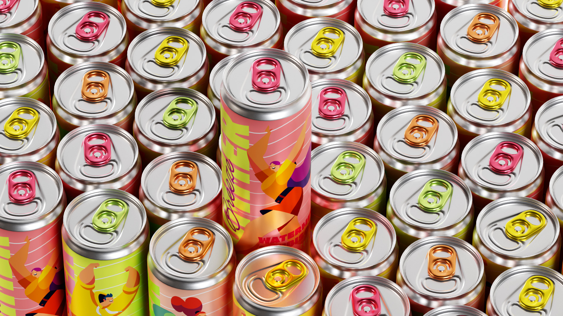
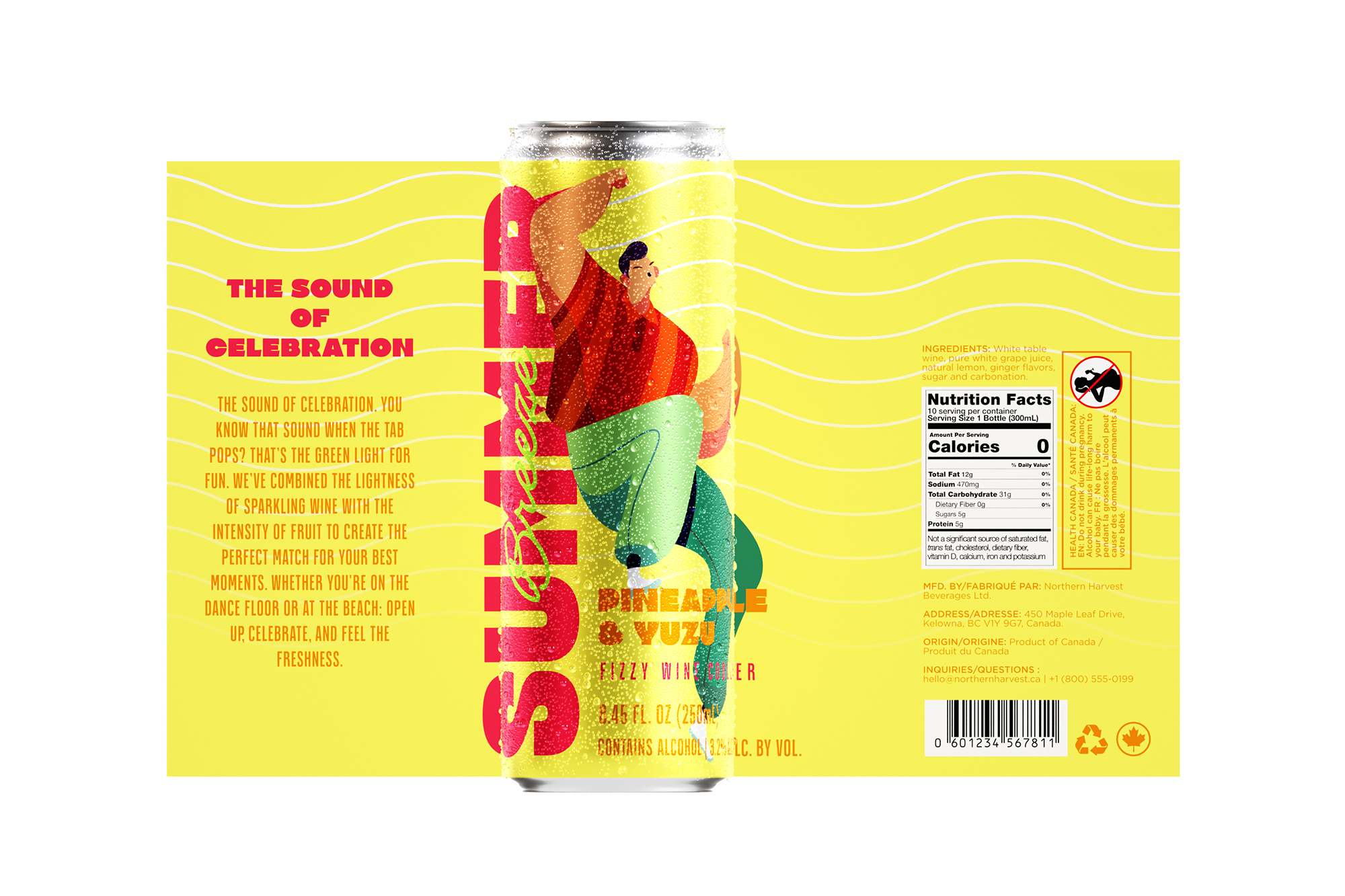
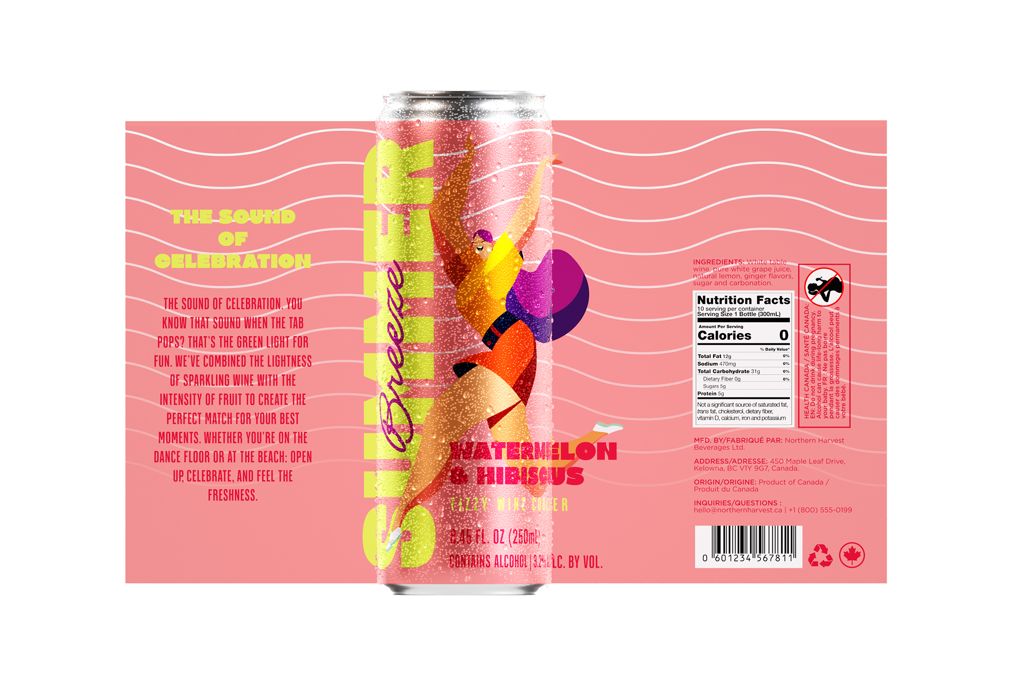
Illustrations and Color System (Appetite Appeal)
Each variant in the line is personified by exclusive illustrations that strive for maximum appetite appeal. We developed a system of saturated, vibrant colors to ensure clear differentiation at the Point of Sale (POS), facilitating consumer navigation between flavors:
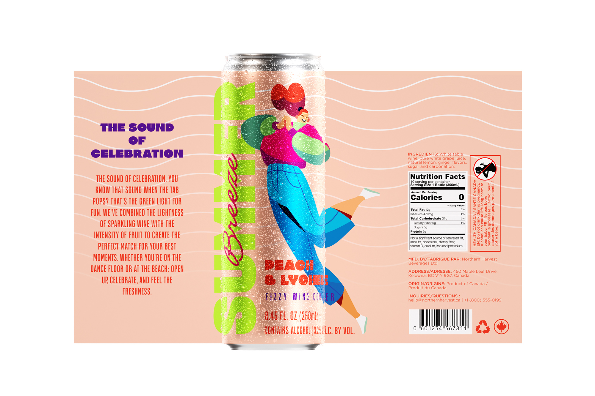
Watermelon & Hibiscus: Deep pink tones that evoke botanical intensity and fruit freshness.
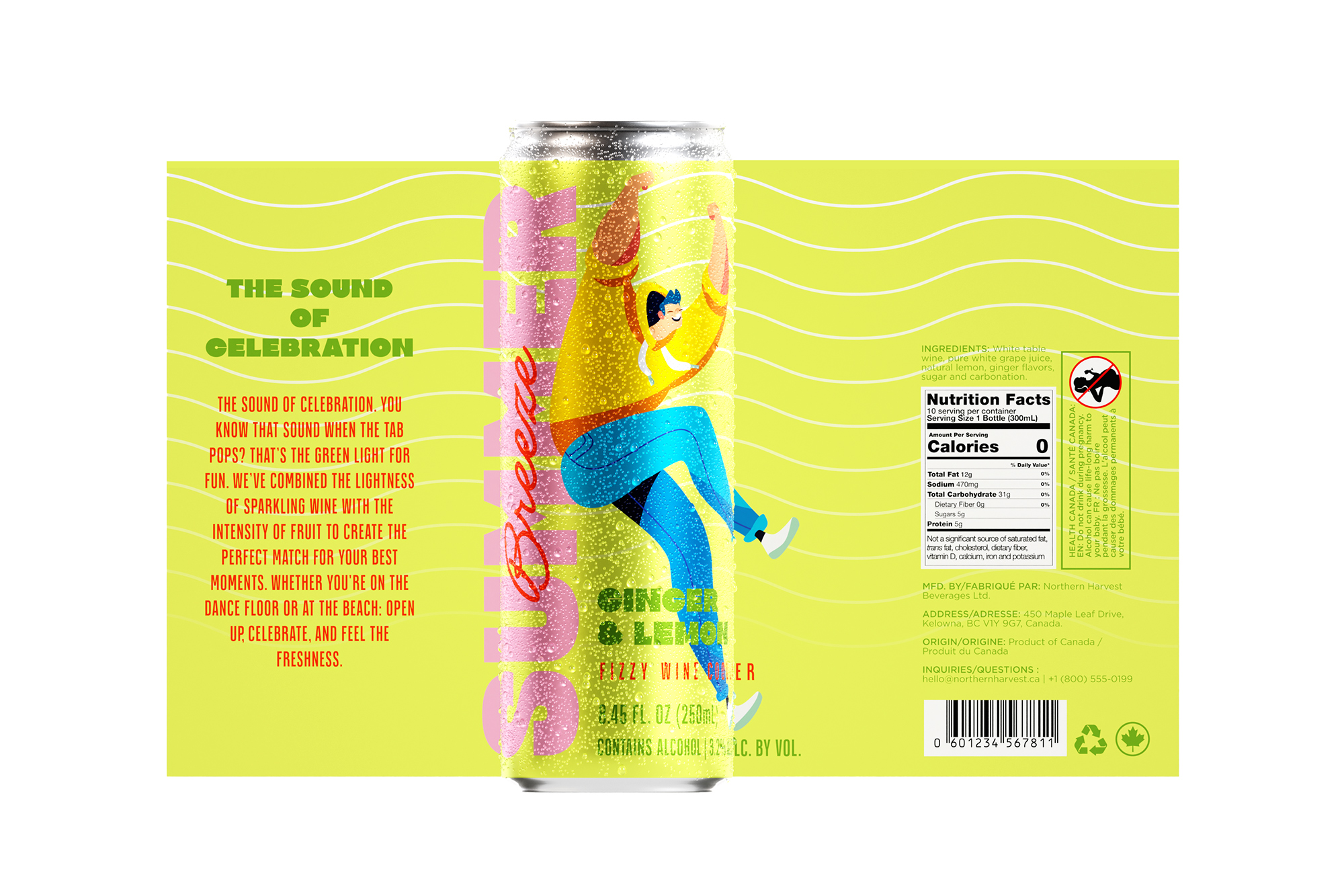
Ginger & Lemon: An explosion of citric energy translated into vibrant greens and solar yellows.
Pineapple & Yuzu: Pure sunlight, using contrast to highlight refreshing acidity.
Peach & Lychee: A soft, sophisticated palette referring to velvety sweetness and the delicacy of the blend.
Technical Execution and Delivery
Leveraging advanced 3D modeling and rendering (Blender), We&CO elevated the product presentation to a level of realism that anticipates the consumer’s sensory experience. The final result is a project that balances refined technique with artistic sensitivity, resulting in a product line that does more than just occupy shelf space—it sets a new aesthetic standard for Wine Coolers.
CREDIT
- Agency/Creative: We&Co Creative Studio
- Article Title: Summer Breeze Branding and Packaging Design by We&Co Creative Studio
- Organisation/Entity: Agency
- Project Type: Packaging
- Project Status: Published
- Agency/Creative Country: Brazil
- Agency/Creative City: São Paulo
- Market Region: South America
- Project Deliverables: 3D Design, Illustration, Packaging Design
- Format: Can
- Industry: Food/Beverage
- Keywords: can packaging design, wine, packaging, sparkling drink
-
Credits:
Creative Director: Wellington Pereti


