Sulista is an ode to Portugal and to the best it has. It was long forgotten, yet, never reneged and now rejuvenated!
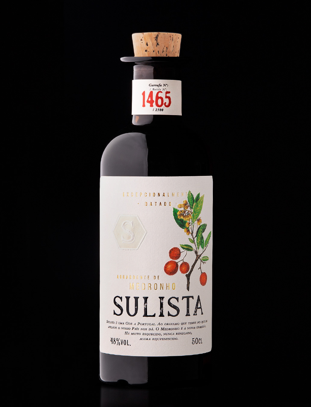
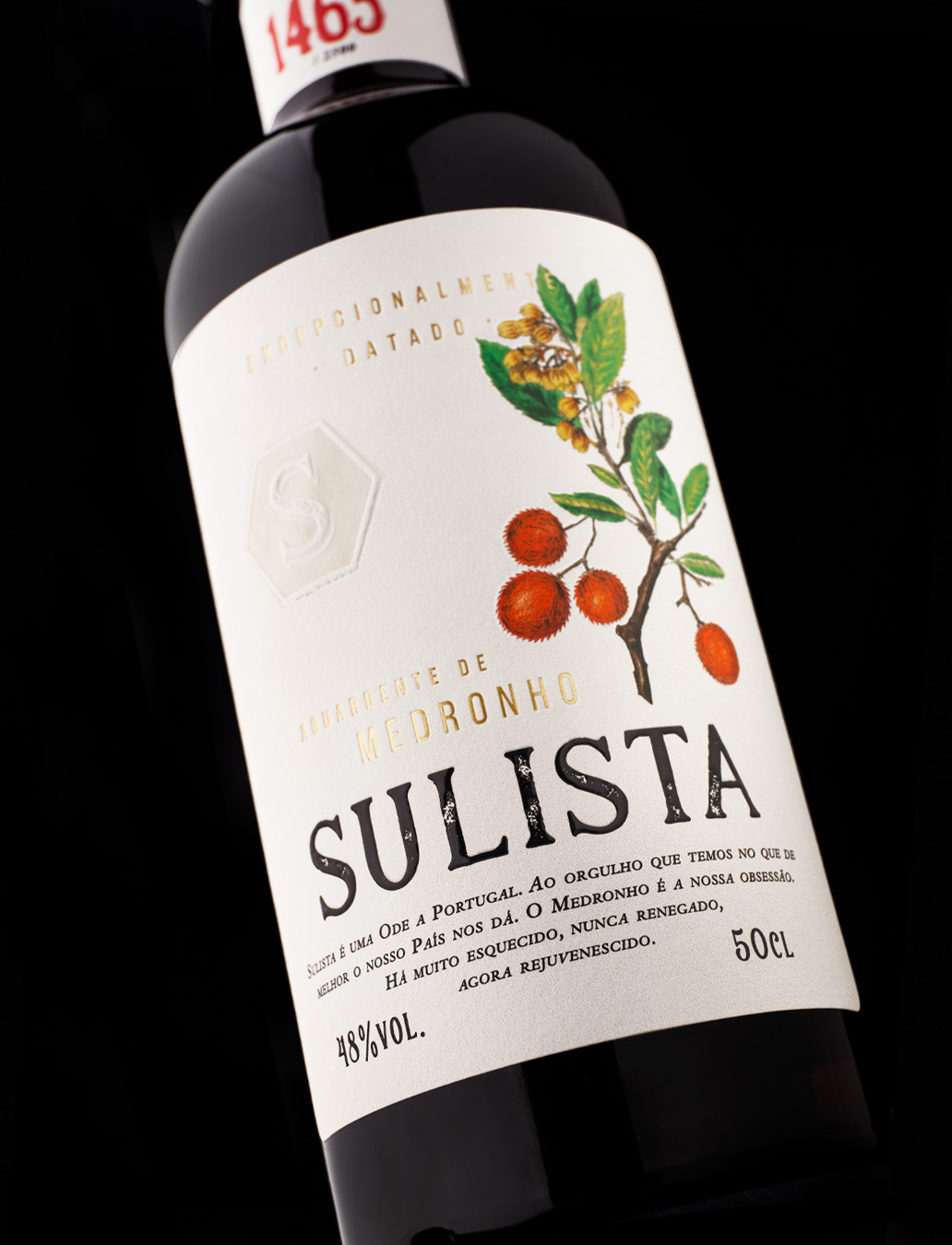
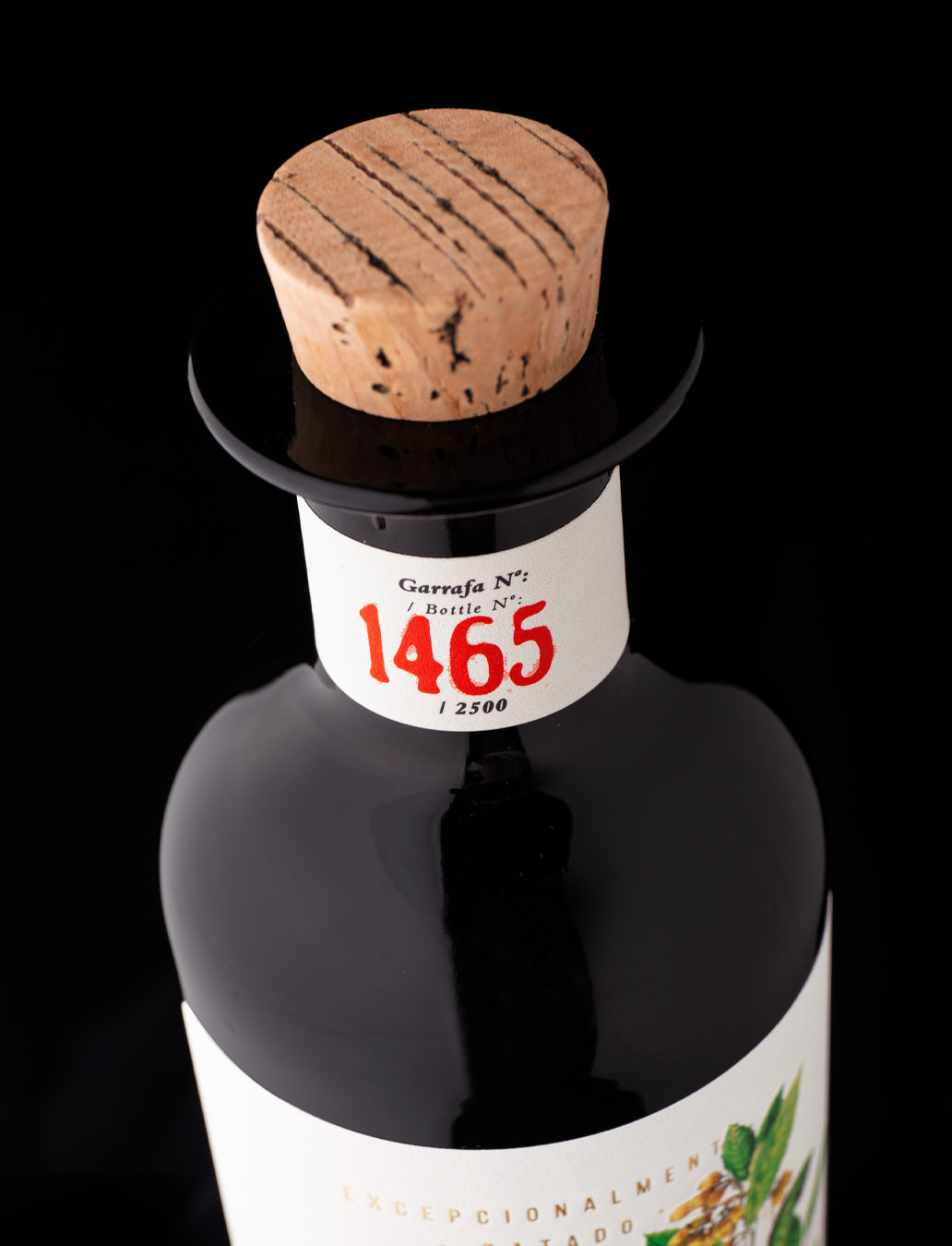
Sulista is an exceptionally dated brandy of medronho and a proudly Portuguese product. A limited-edition of 2500 bottles, made exclusively with the ripe fruits of the ‘strawberry tree’, scientific name Arbutus Unedo. The tree’s fruits look like strawberries, hence the common name of ‘strawberry tree’, grow in bunches, and are ready for picking when they are a rich orange and red colour. It grows wild in the rocky soil of the Mediterranean Region, but in Portugal, it grows notably in the Alentejo and the Algarve, and the tree itself grows to an average of 6 m high by as much broad.
Handcrafted according to traditional customs it ensures unparalleled quality combined with a focus on protecting the environment.
The arbutus is selected and harvested by hand between the months of October and November, to prevent frost and rain from spoiling the delicate fruit. It is then fermented in stainless steel, and after the fermentation process, which is then distilled in copper alembic stills.
All ingredients are uniquely national and recyclable, minimizing carbon emissions derived from the production and transport process.
Focused on conveying these values, we created a familiar and captivating image, drawing the ripe fruit of the medronho. Through the rustic typography and vibrant colours of the fruit, we underlined the authenticity of this authentic Portuguese brandy.


CREDIT
- Agency/Creative: RitaRivotti®
- Article Title: Sulista Label Design by RitaRivotti
- Organisation/Entity: Agency
- Project Type: Packaging
- Project Status: Published
- Agency/Creative Country: Portugal
- Agency/Creative City: Lisboa
- Market Region: Europe
- Project Deliverables: Label Design
- Format: Bottle
- Substrate: Glass Bottle
- Industry: Food/Beverage
- Keywords: #branding #identity #packagingdesign #winedesign #ritarivotti #design #wine #packaging
-
Credits:
CEO & Creative Director: Rita Rivotti


