


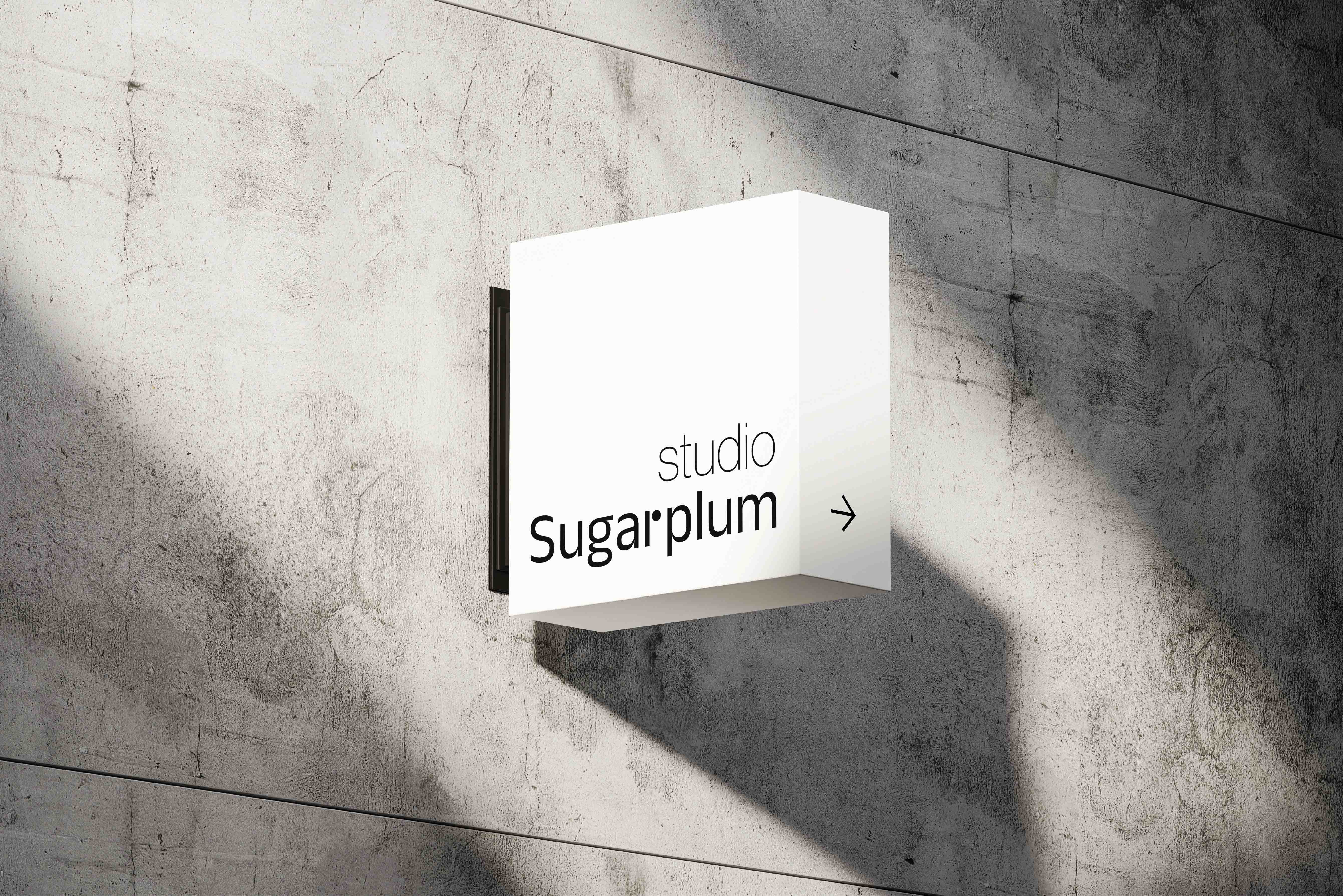
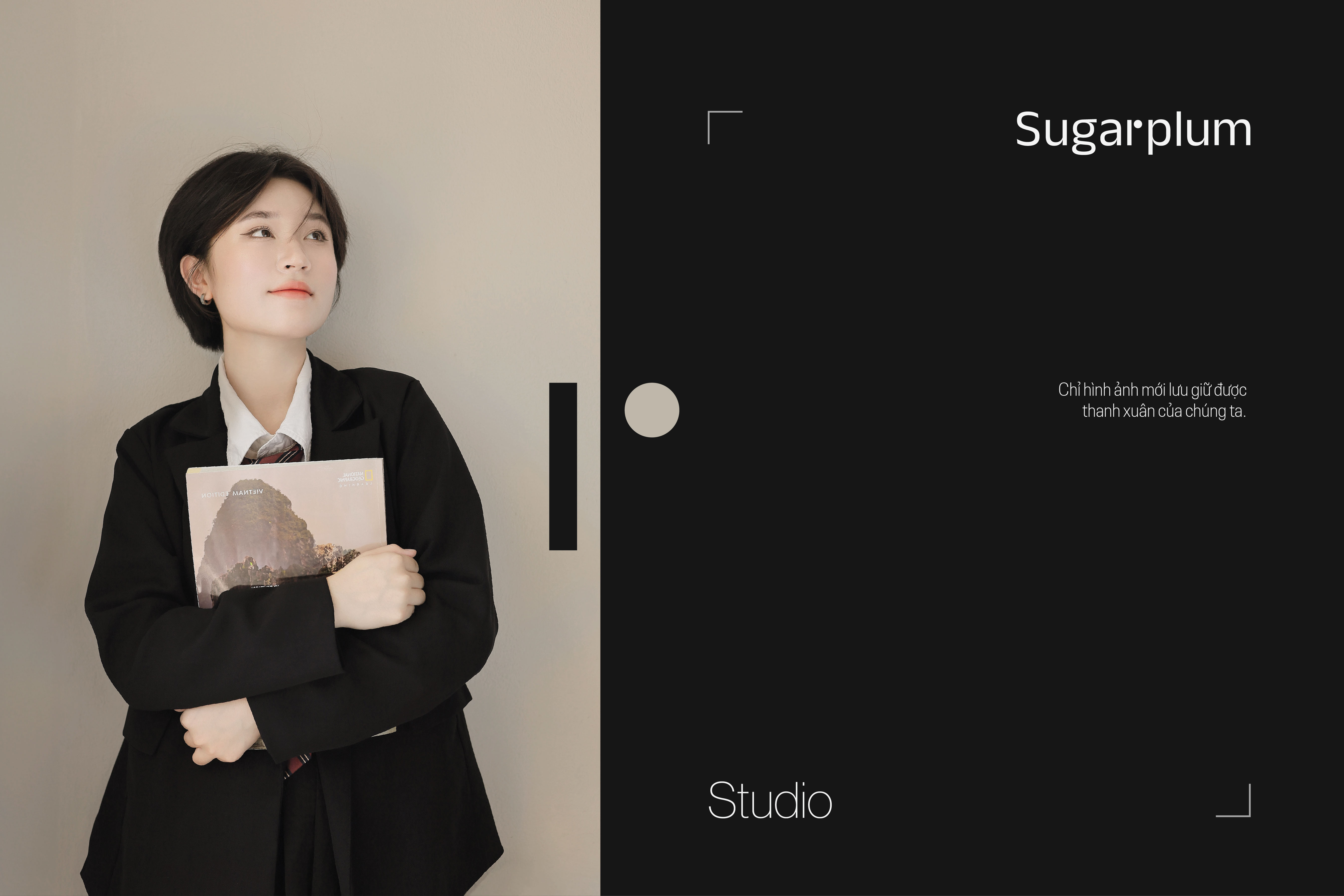
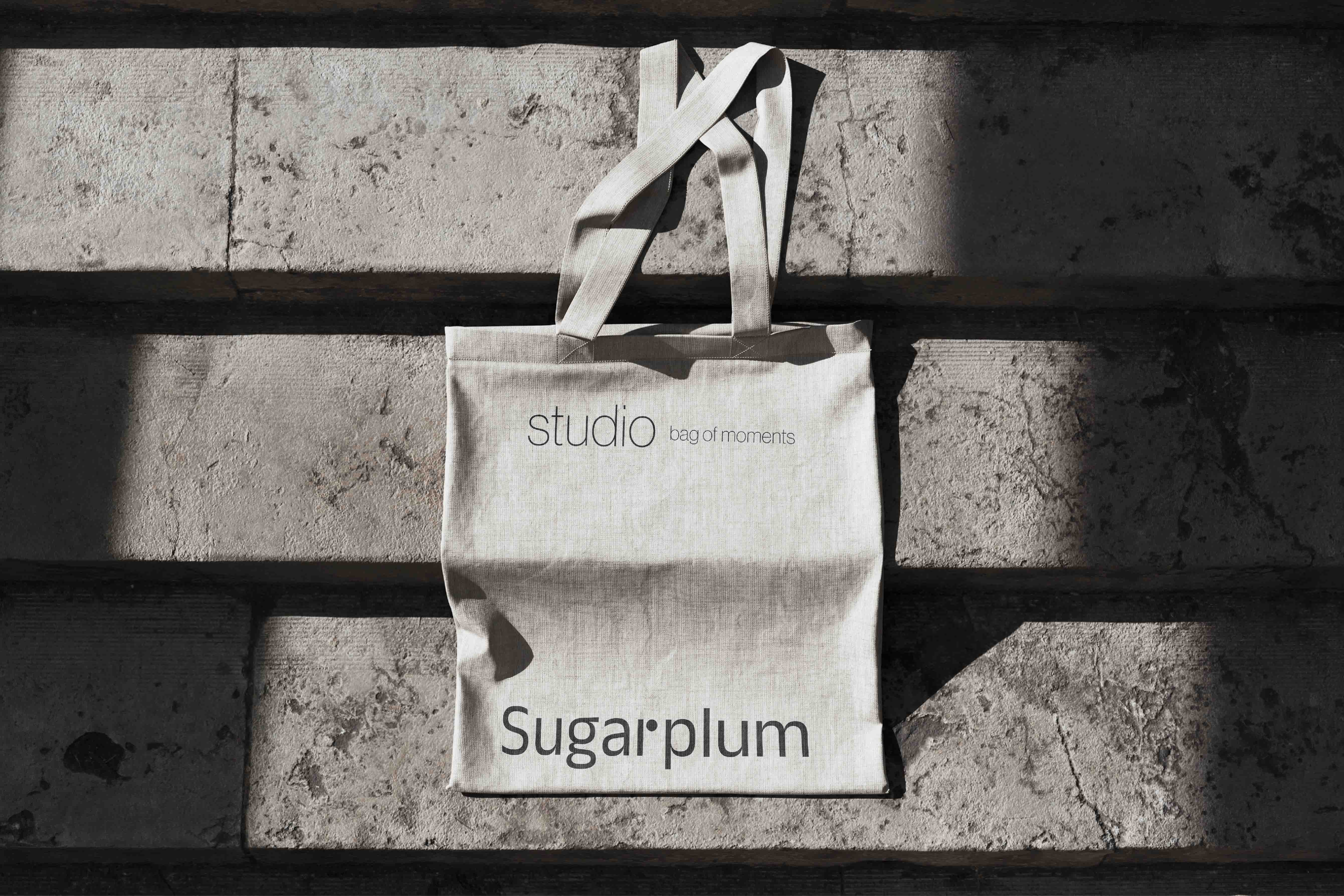
Sugarplum is a photography studio brand for young people in Da Nang city. Founder built the brand with passion and the motto: image is the only thing that preserves our youth. Just like its mission to help young people preserve wonderful moments, the studio will also become more memorable when aiming for minimalism, easy to remember, but no less warm, sophisticated, and especially inspiring. evoke emotions with contrasting states.
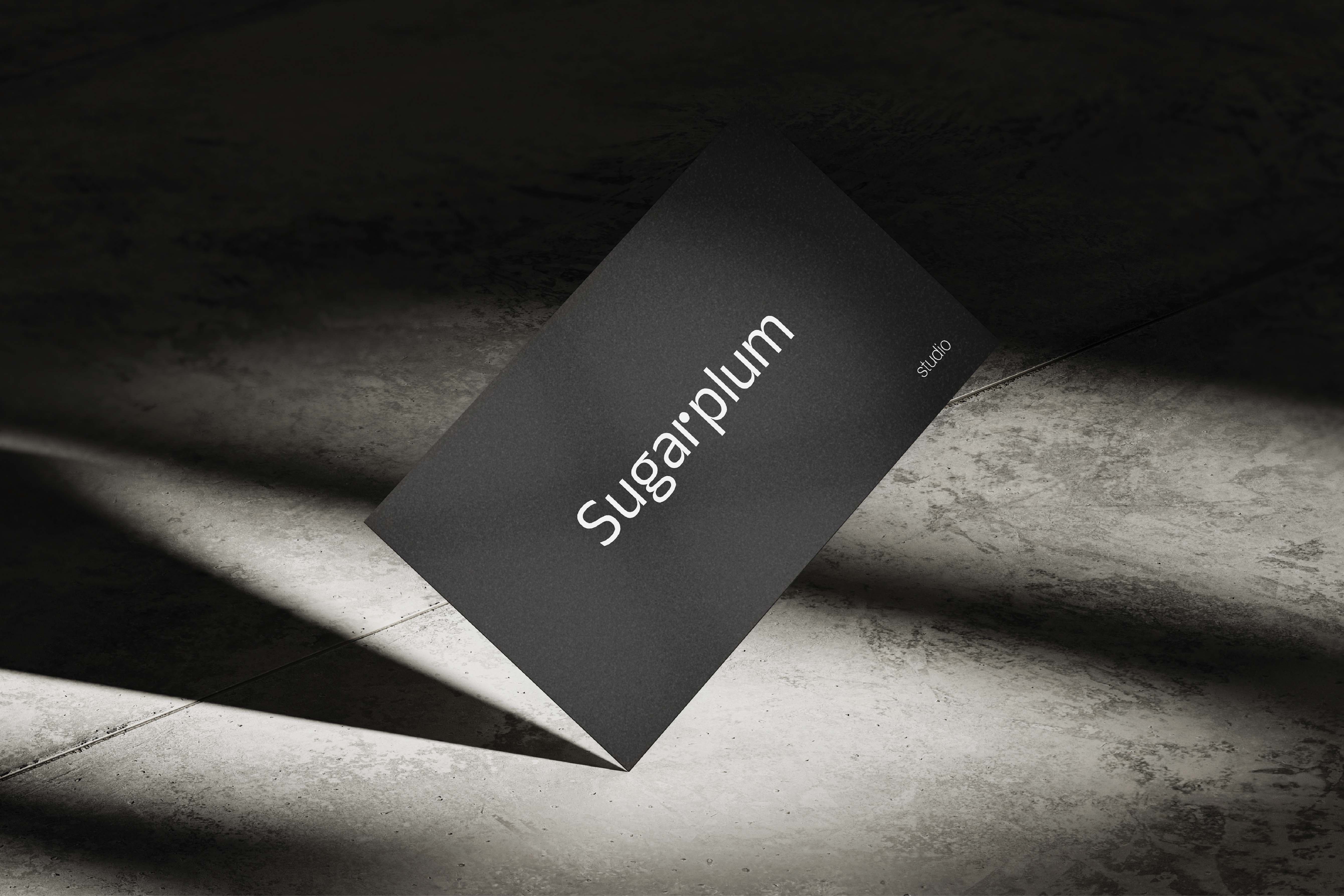
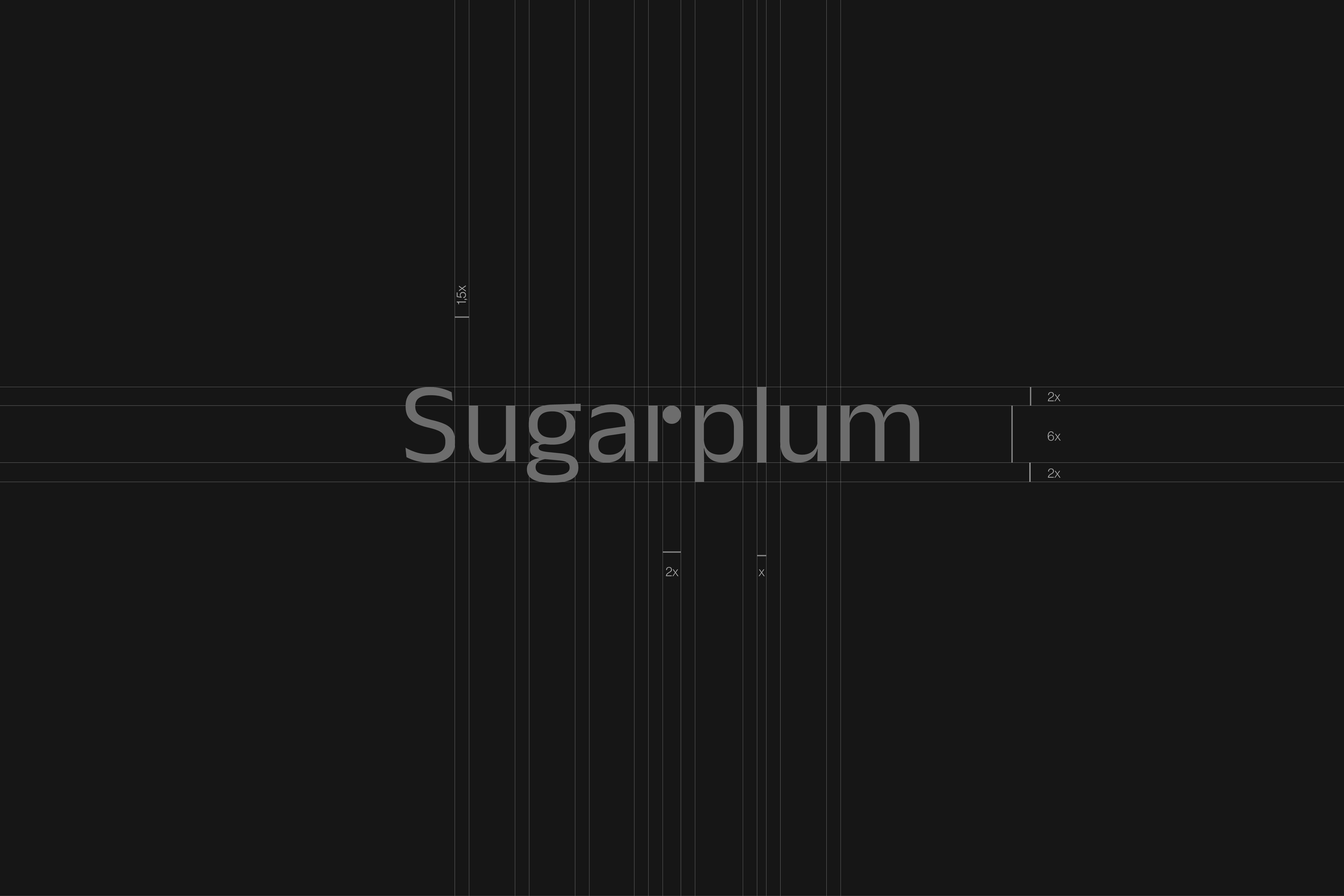
The logo is designed in the form of a logotype to enhance memorability and simplicity. The typeface chosen for the logo is sans serif, with the effect of enhancing modernity and dynamism, suitable for young customers. The highlight of the logo is the letter “r”, and this is also the center point of the logo. This is a favorable position to create memorable, pleasant to look at and does not lose the symmetrical structure of the entire logo. Here, the parenthesis of the letter “r” has been replaced by a circle. This circle creates attraction right in the middle of the logo. The circle is meant to describe the shutter button on the camera, the shape of the lens, and is related to many things in the field of photography. The thickness of the logo’s lettering is relatively even, creating a solid frame to evoke prestige, trust and sustainability for the logo. On the other hand, a little thin stroke in a few words creates a gentle, sweet feeling true to the name “sugarplum”.
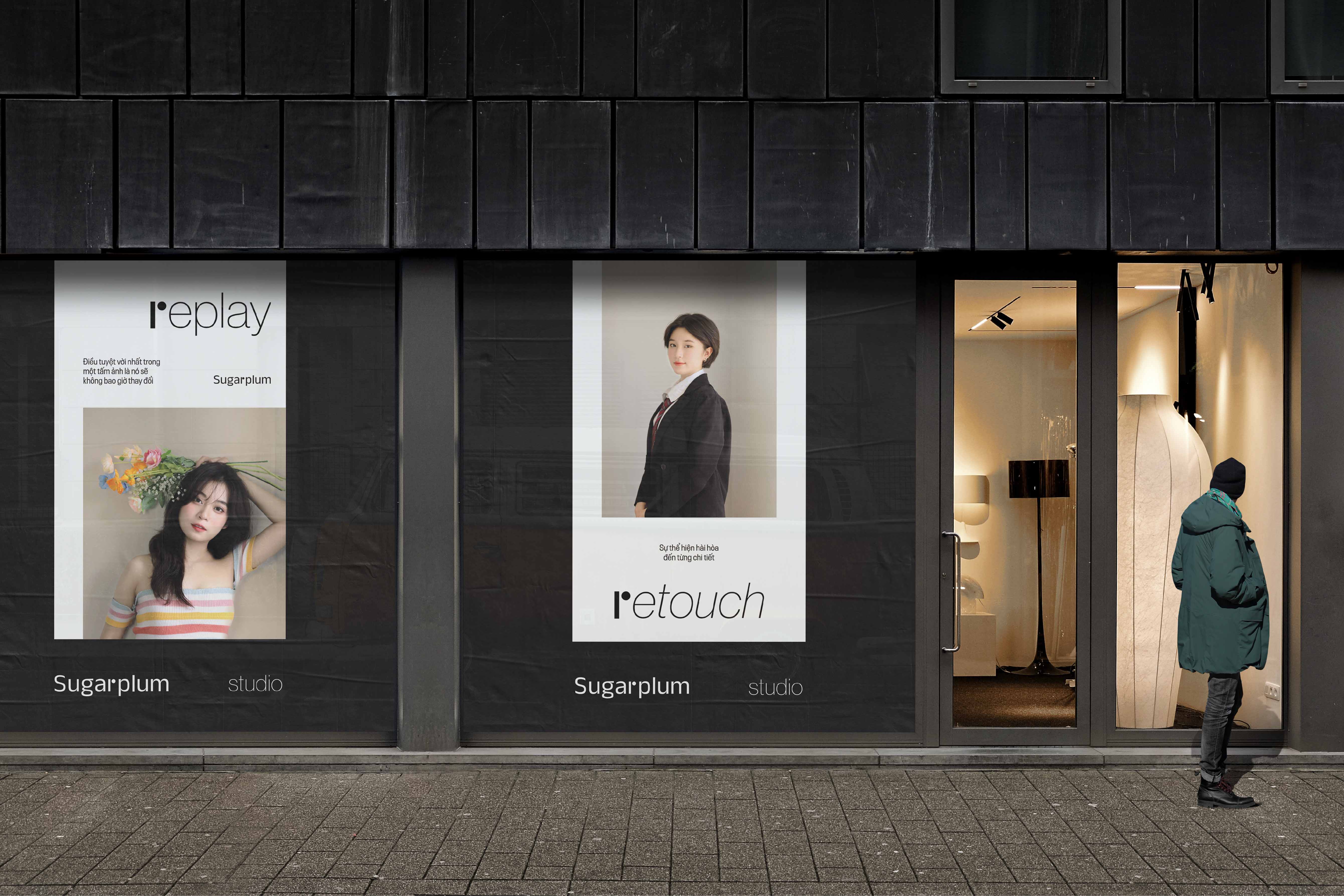
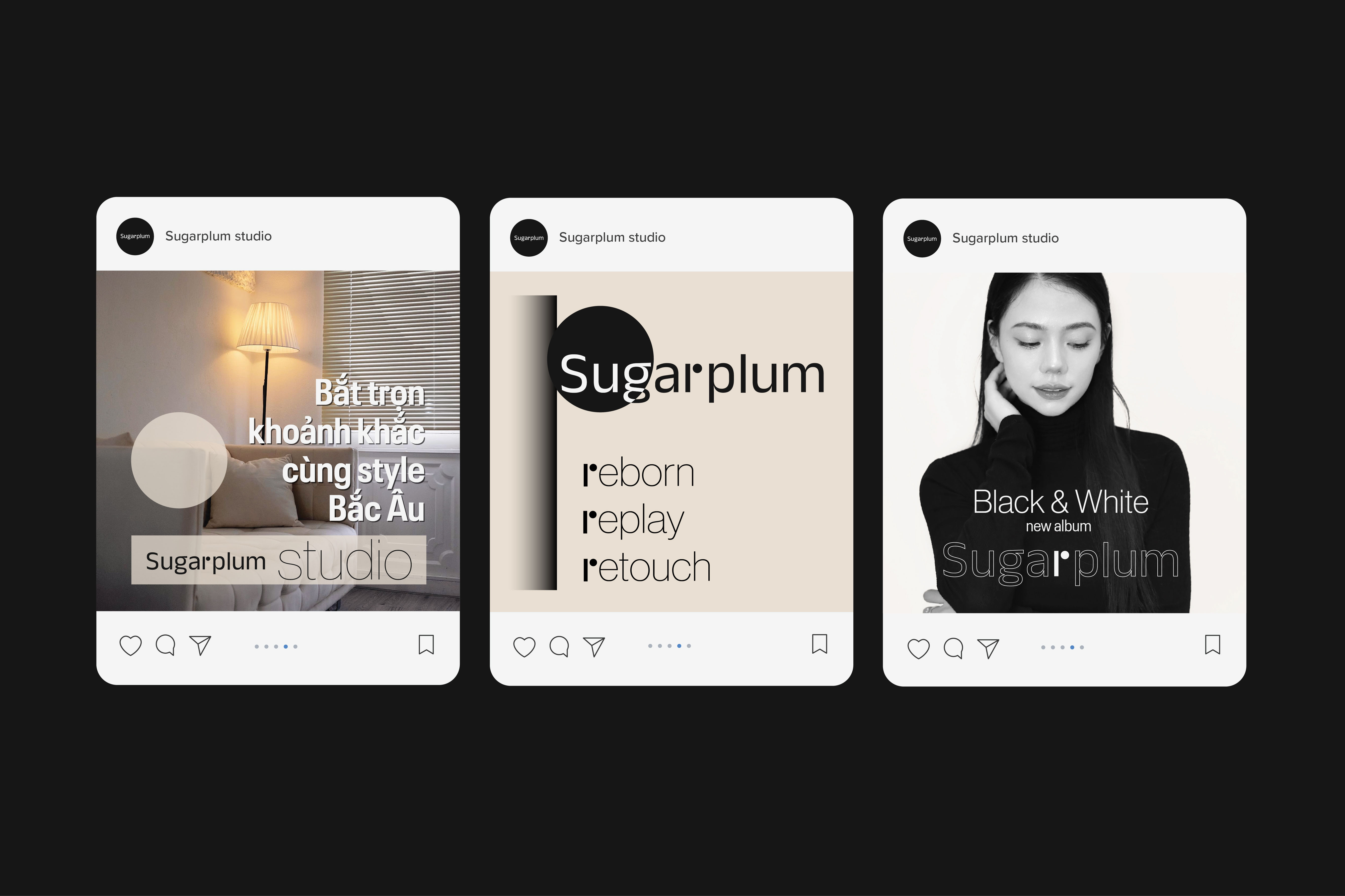
The color system is deployed with three colors: white, black and beige to express minimalism and modernity according to the founder’s wishes. The combination of white and black clearly creates a good contrast to showcase subtle features, making it more memorable. With that, beige is also arranged sparingly, to create a warm, nostalgic feeling, and plays a balancing role between the two strong contrasts caused by white and black.
The typography of the project with two typefaces are both sans serif to create a feeling of simplicity, modernity, dynamism and especially easy to combine with the letter “r” of the logo. These two typefaces also contribute to creating contrast, because one type is slightly round, the other type is square. This contributes to making the project more interesting.
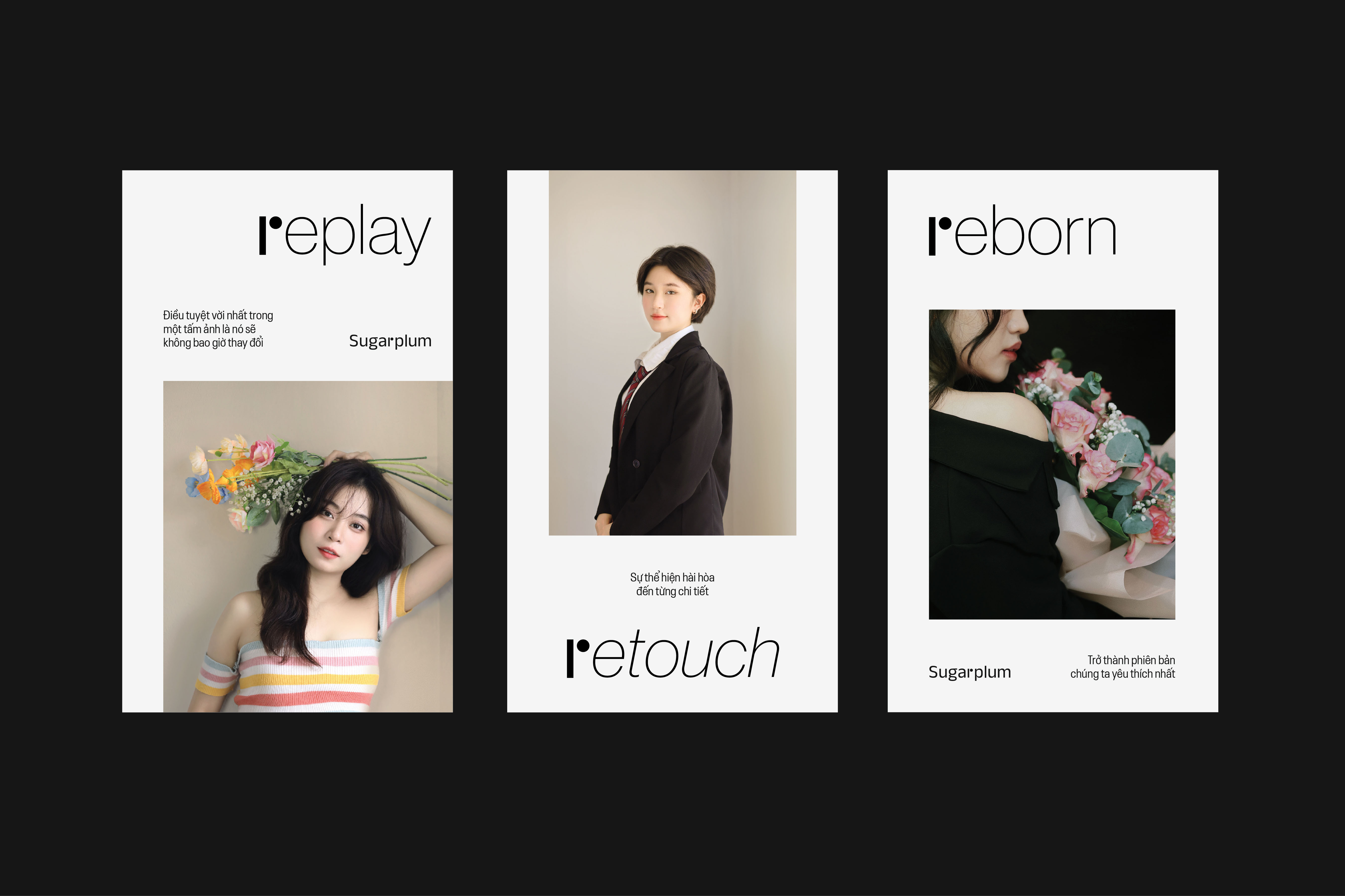
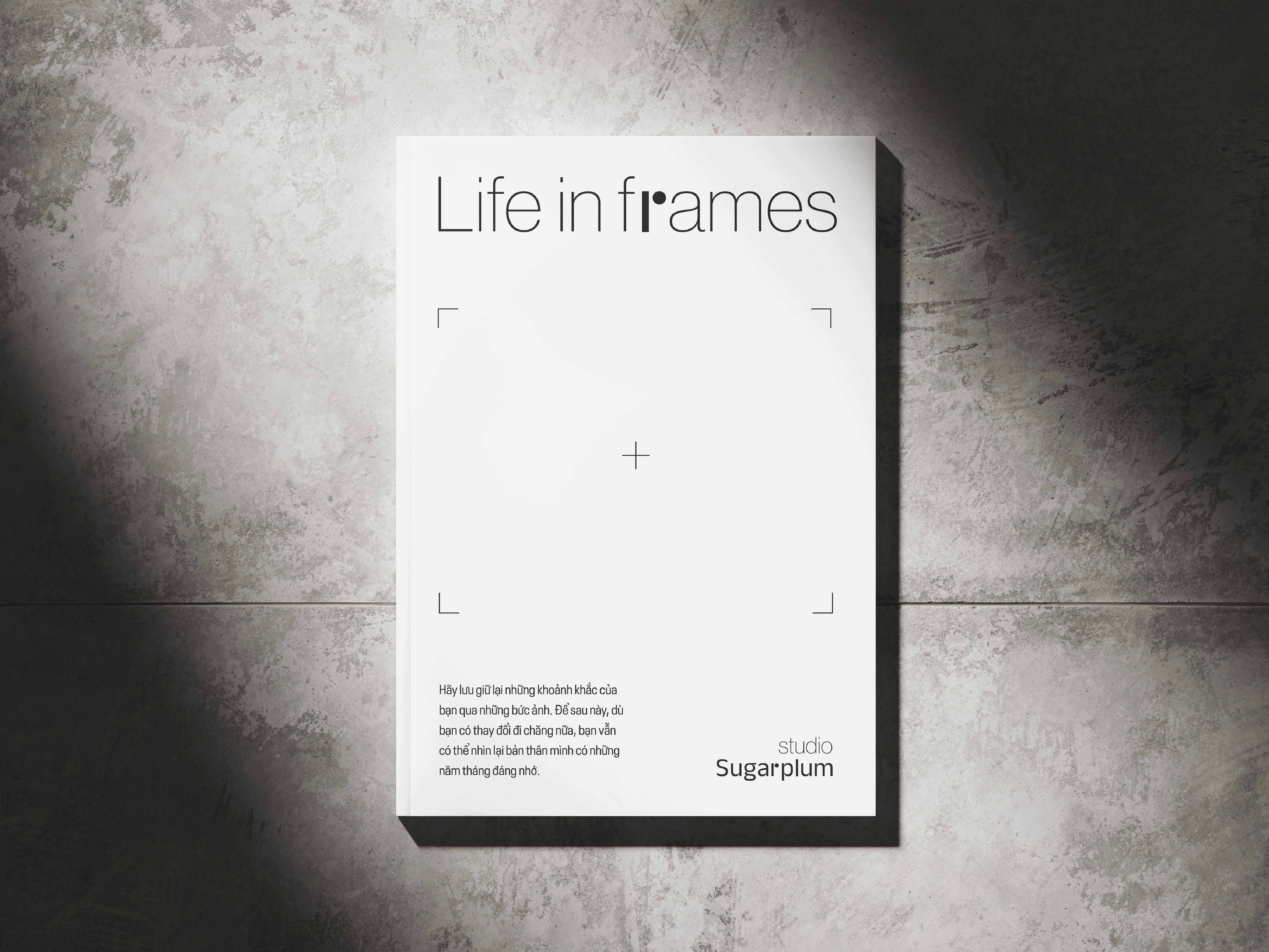
Visual brand identity is built around the letter “r” of the logo. With the brand’s mission, the letter “r” always fits and matches the missions: replay – rewatch your youth to be preserved, retouch is a post-production technique that makes the product more beautiful, and when beautiful More than that, we are reborn to become the versions we love the most, this is reborn… Furthermore, in the field of photography, many important things have the letter “r” in the name, For example: makeup artist, photographer, frames…
The overall design for the project is a design based on minimalist, sophisticated elements, mixed with contrasting extremes that evoke deep emotions.

CREDIT
- Agency/Creative: Callis Creative
- Article Title: Sugarplum Brand Identity Design by Callis Creative
- Organisation/Entity: Agency
- Project Type: Identity
- Project Status: Published
- Agency/Creative Country: Vietnam
- Agency/Creative City: Da Nang
- Market Region: Asia
- Project Deliverables: Brand Identity
- Industry: Fashion
- Keywords: Studio, photography, Callis creative, brand identity, production house
-
Credits:
Made at: Callis Creative
Designer: Tu Nguyen


