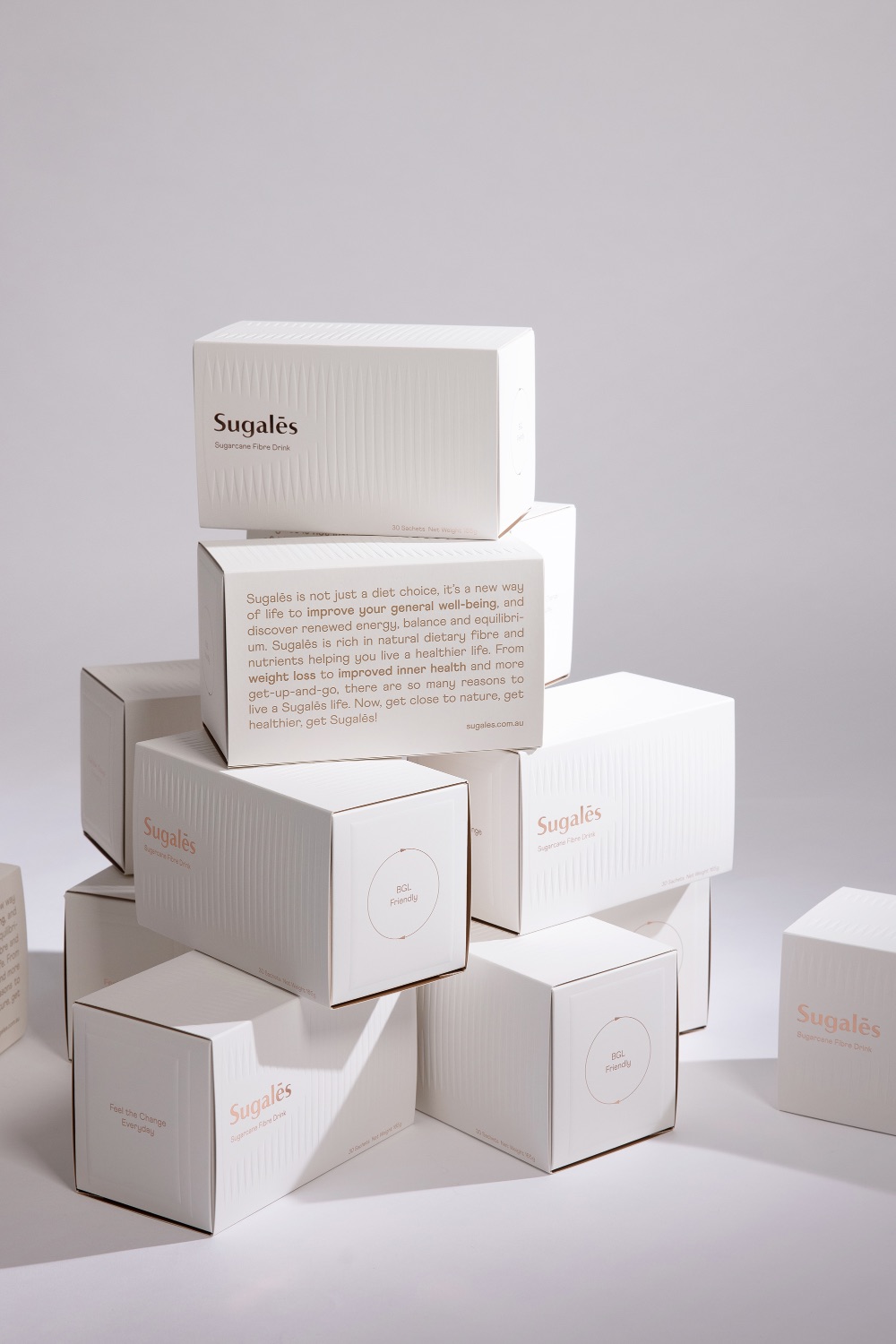
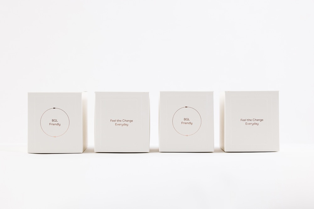
Sugalēs is not just a diet choice, but a new way of life to improve your general well-being and discover renewed energy, balance and equilibrium. This blood glucose level (BGL) friendly product is rich in natural dietary fibre and nutrients helping you live a healthier life. From weight loss to improved inner health, there are so many reasons to live a Sugalēs life.
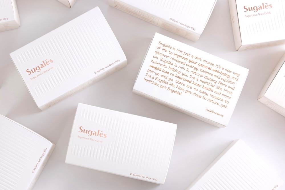
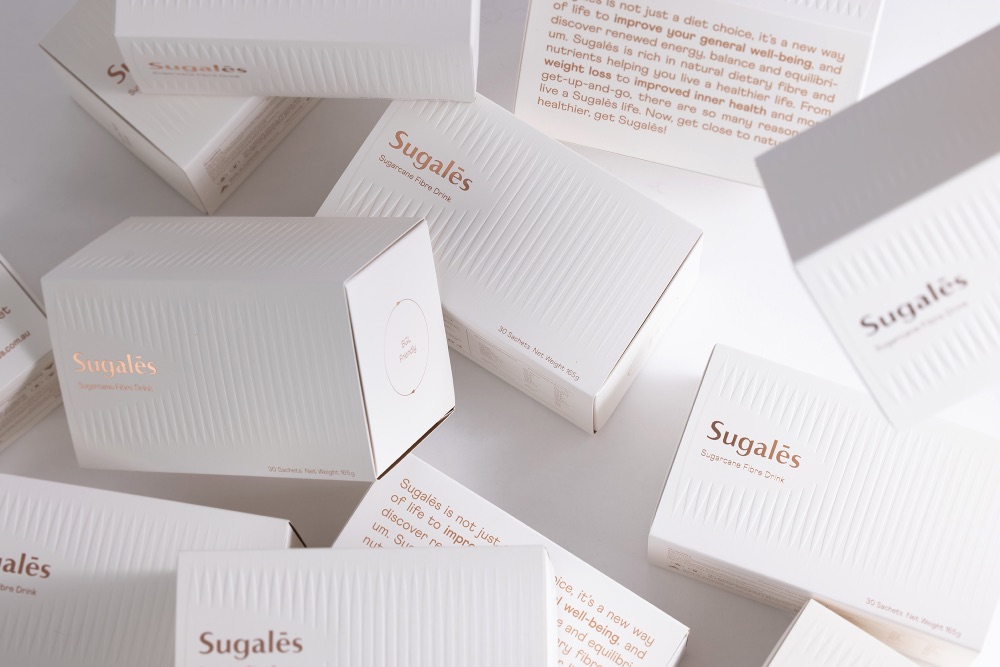
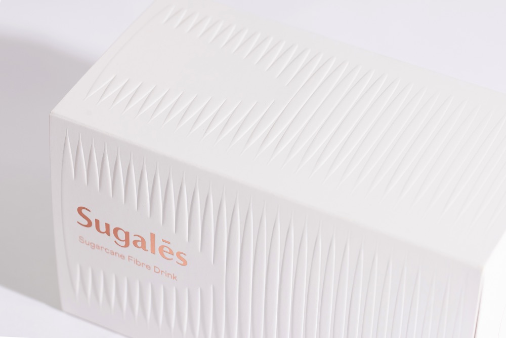
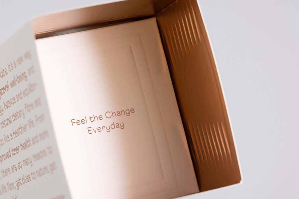
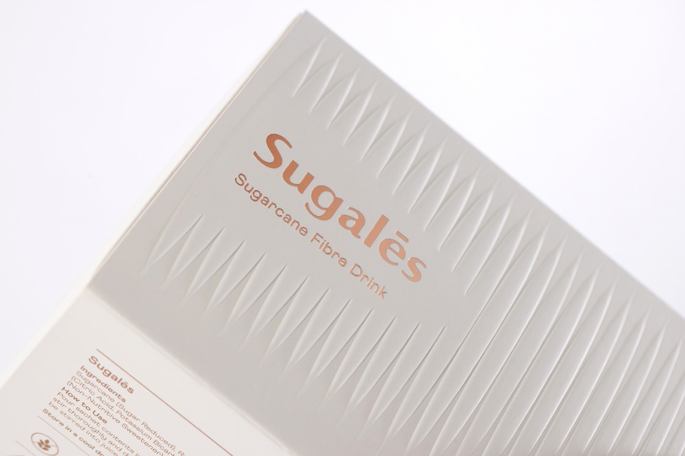
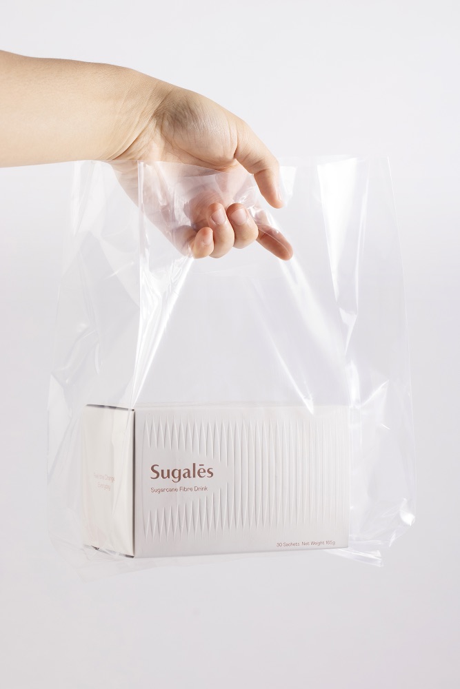
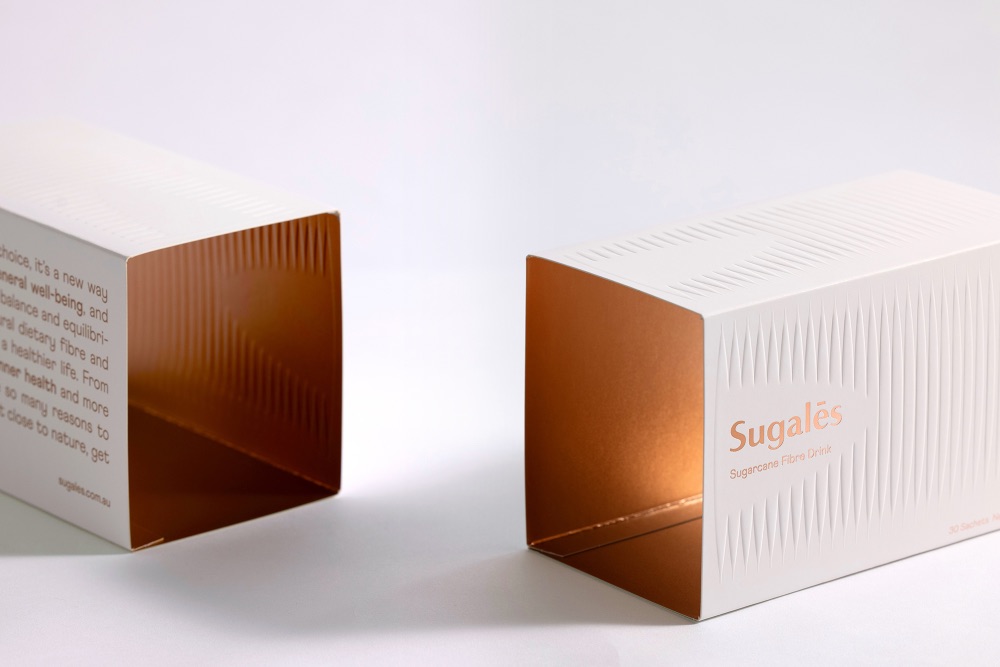
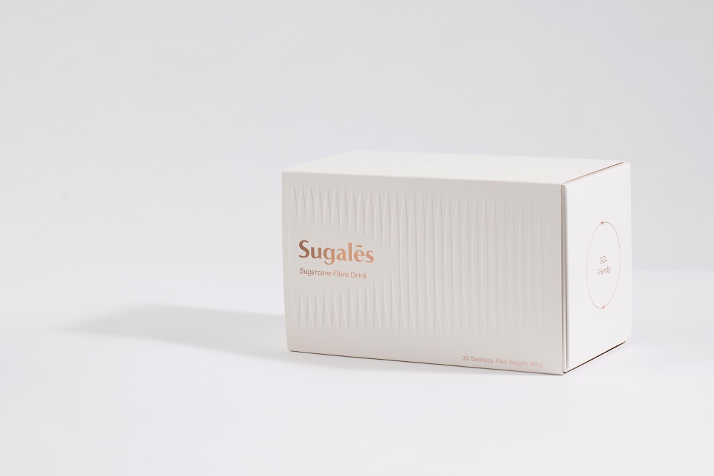
The whole light and fresh look of this packaging design answer the Design Challenge questions by visualising the sachets found inside the box through embossing technique on the pack – the sachet pattern gradually disappears from left to right representing both the weight loss and /or reduction in sugar level that a customer would experience in just 30 days. An introductory statement about the product with key features highlighted confidently stated at the back of the packaging to introduce this new product to the market.
The targeting audiences are intelligent, independent, educated, travelled and well-read. They are more sophisticated in their consumer behaviour. They appreciate products from every detail. Utilising strong minimalist design and sleek aesthetic, the product embodies the values of beauty, luxury, and cleanness through the natural, sharp, and clean look.
The design aims to enhance the sense of reduction in sugar level and/or weight loss via the use of embossing printing techniques – both visually and tangibly. By playing with light and shadow, the sculptured box shows different visuals to the customers – from one angle, the design may seem minimalistic as the embossing merges with the white background whilst from other angles, light and shadow enhance the 3D sculpture embossing. This effect not only showcases the premium quality of the product but it also reflects the brand philosophy – less is more. Through touching the box, the customers would feel the descending pattern, which enhances the function of the product, through a different sense, rather than just from the visual.
The desired price point being offered is set relatively high in comparison to other similar products that already exist on the market accordingly, the emphasis on design concept moves beyond its use as a supplement, it is intended to be seen as a healthier lifestyle choice. The design calls for supreme quality, luxurious lifestyle, and healthy diet which reflects and enhances the brand image of the company, thus aiming to increase its brand value.
CREDIT
- Agency/Creative: Meng Zhang
- Article Title: Sugalēs Packaging Design
- Organisation/Entity: Freelance
- Project Type: Packaging
- Project Status: Published
- Agency/Creative Country: Australia
- Agency/Creative City: Sydney
- Market Region: Global
- Project Deliverables: Packaging Design
- Format: Box
- Substrate: Pulp Carton
- Industry: Health Care
- Keywords: WBDS Creative Design Awards 2021/22
-
Credits:
Graphic Designer: Meng Zhang


