


Federation – Federation Branding Design
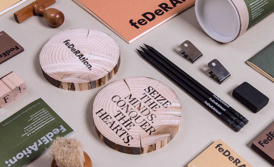
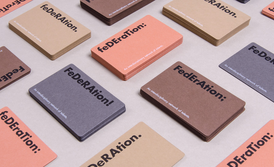
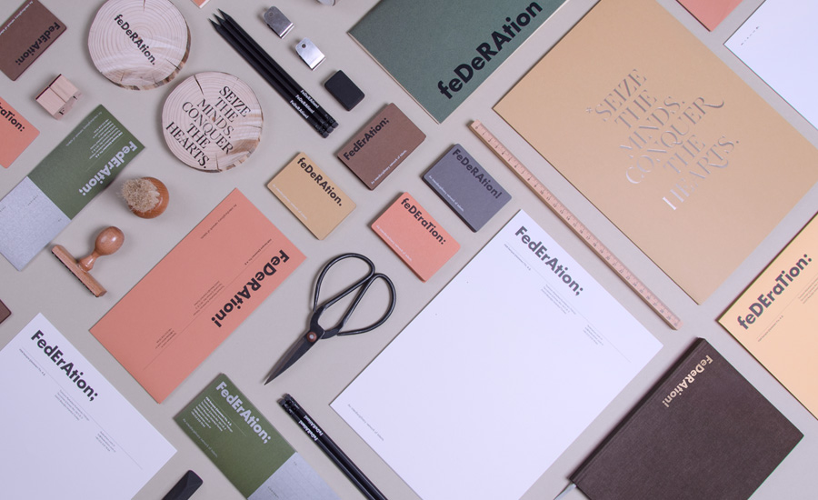
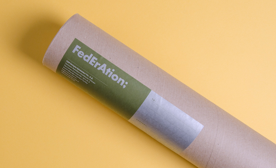
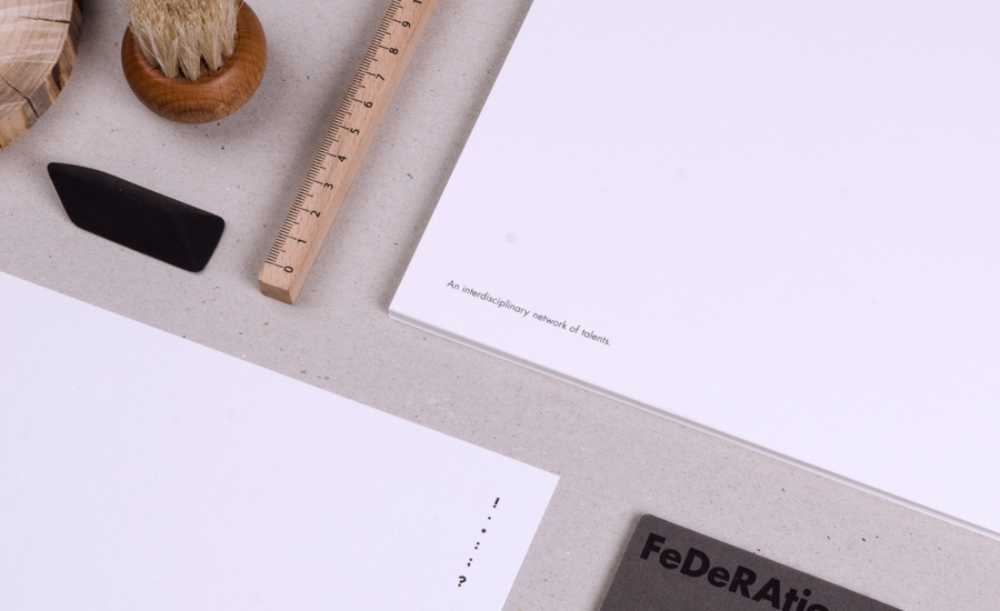
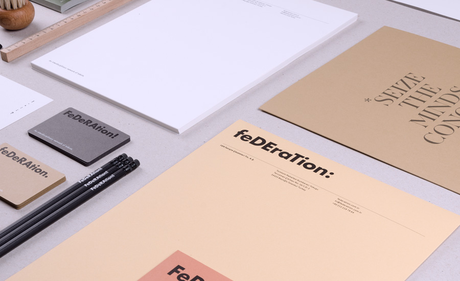
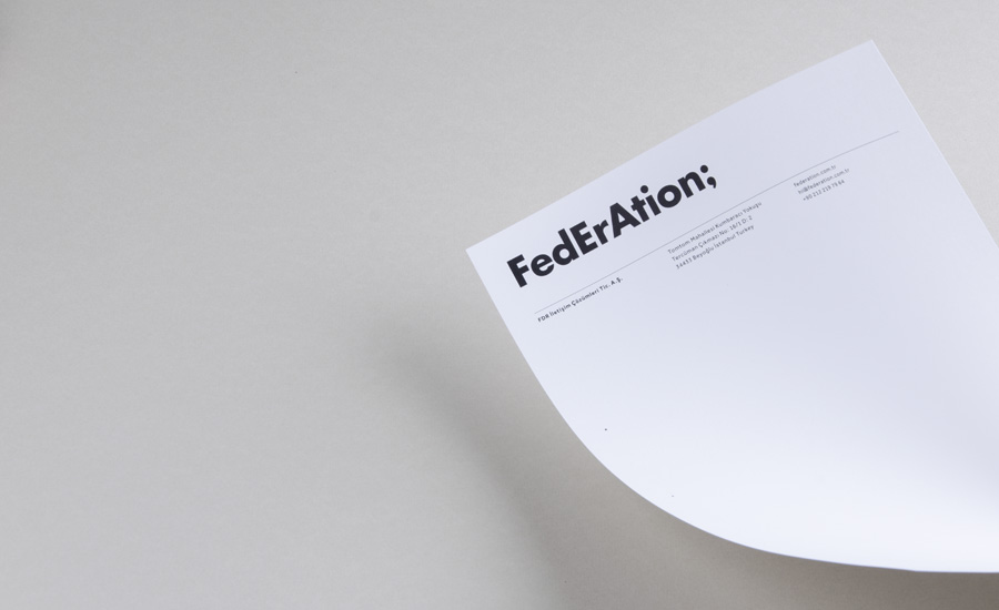
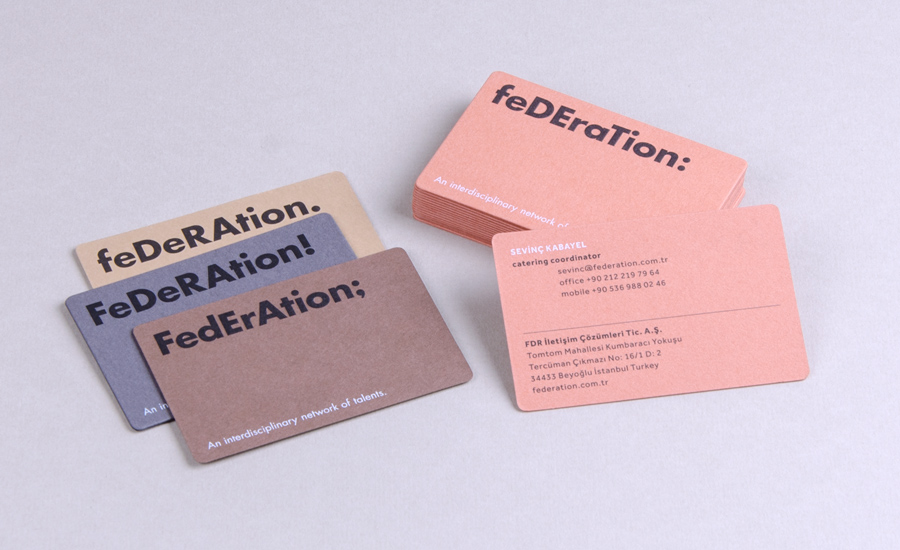
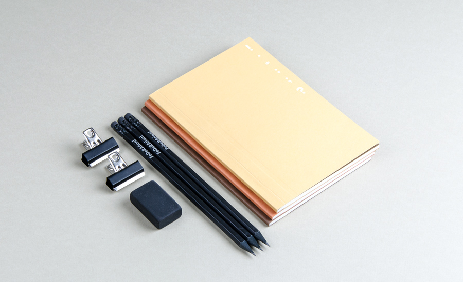
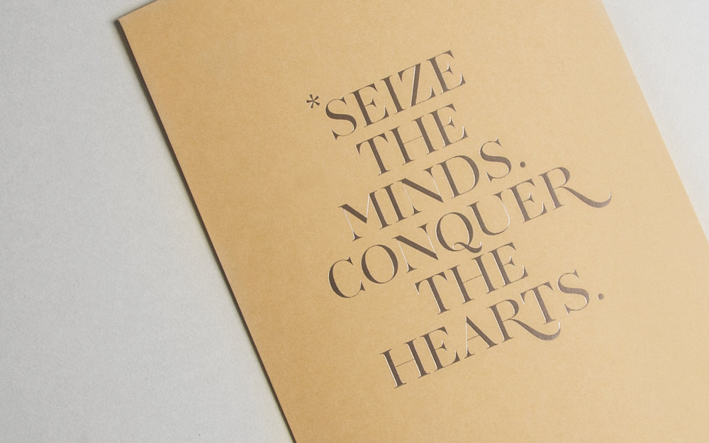
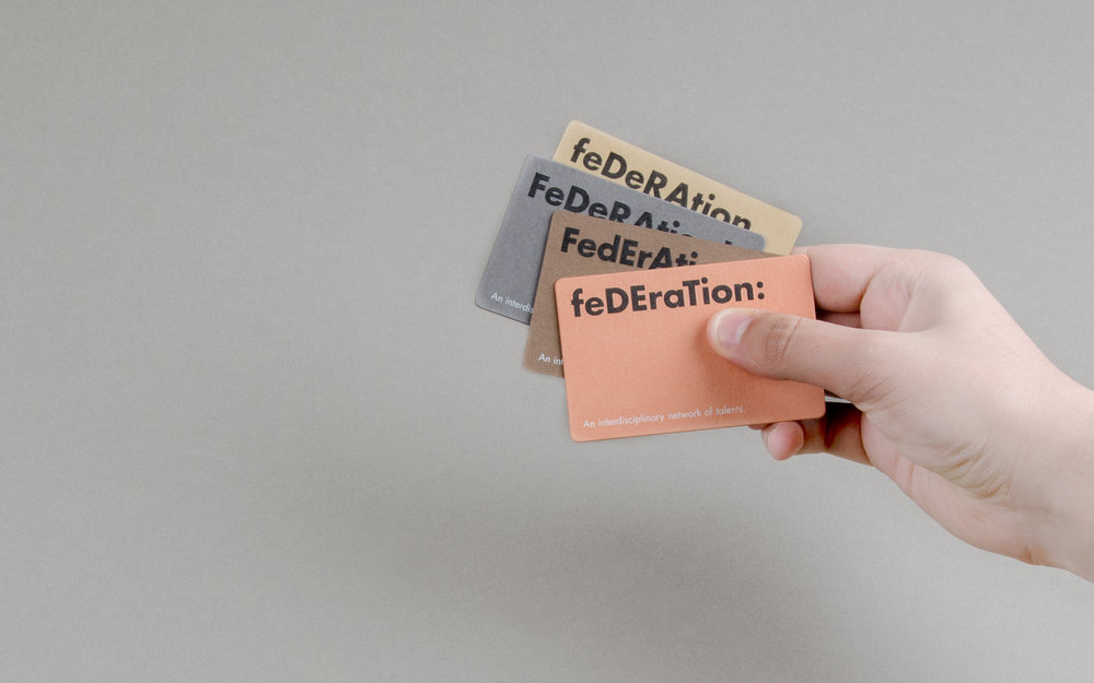
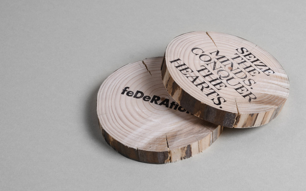
“We wanted to create a subtle & dynamic identity to represent different individuals, talents, and areas of expertise. Even while using a dynamic logo & identity, we wanted to maintain the trustworthy and calm attitude of the studio. Changing upper and lowercase letters together with the usage of different punctuation marks in logotype represent the variability of creative solutions under a solid philosophy. The colour palette also highlights the interdisciplinary and multidimensional character of the studio. Pale colours, together with earthy and natural materials communicate trust, confidence, and self-reliance. In corporate materials, the interaction between sans-serif and serif types creates a balance.”
CREDIT
- Agency/Creative: Federation
- Article Title: Subtle and Dynamic Brand Identity for a Interdisciplinary Creative Studio
- Project Type: Packaging
- Agency/Creative Country: Turkey
- Market Region: Europe
- Substrate: Pulp Paper
- Industry: Information
FEEDBACK
Relevance: Solution/idea in relation to brand, product or service
Implementation: Attention, detailing and finishing of final solution
Presentation: Text, visualisation and quality of the presentation


