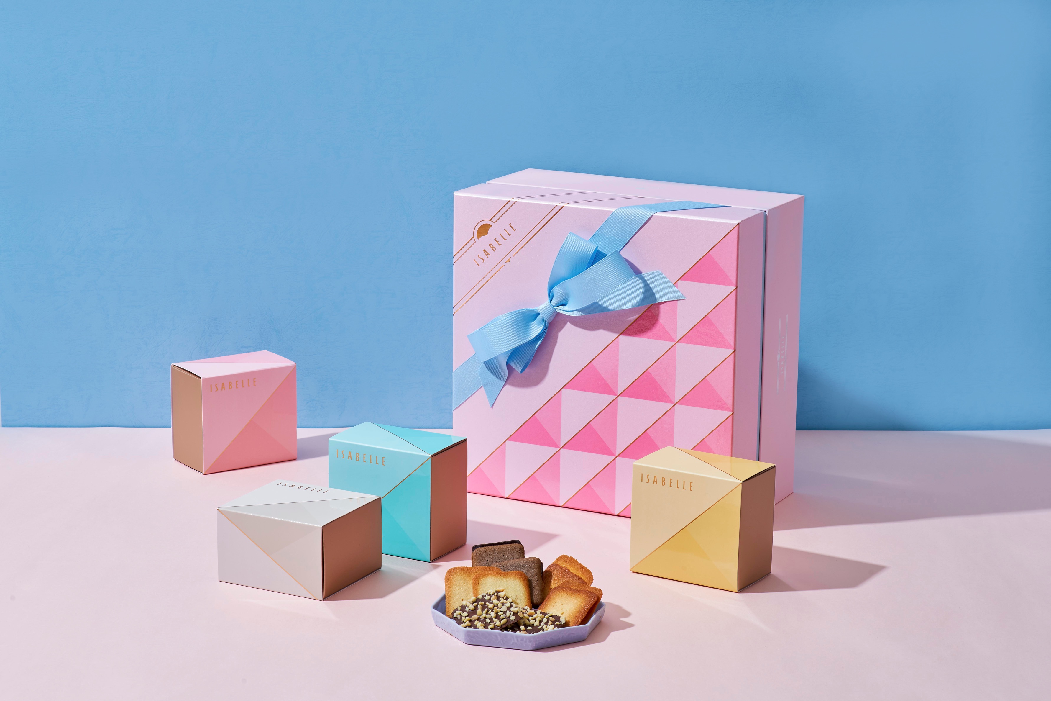
Simplicity x Premium quality x Stylish
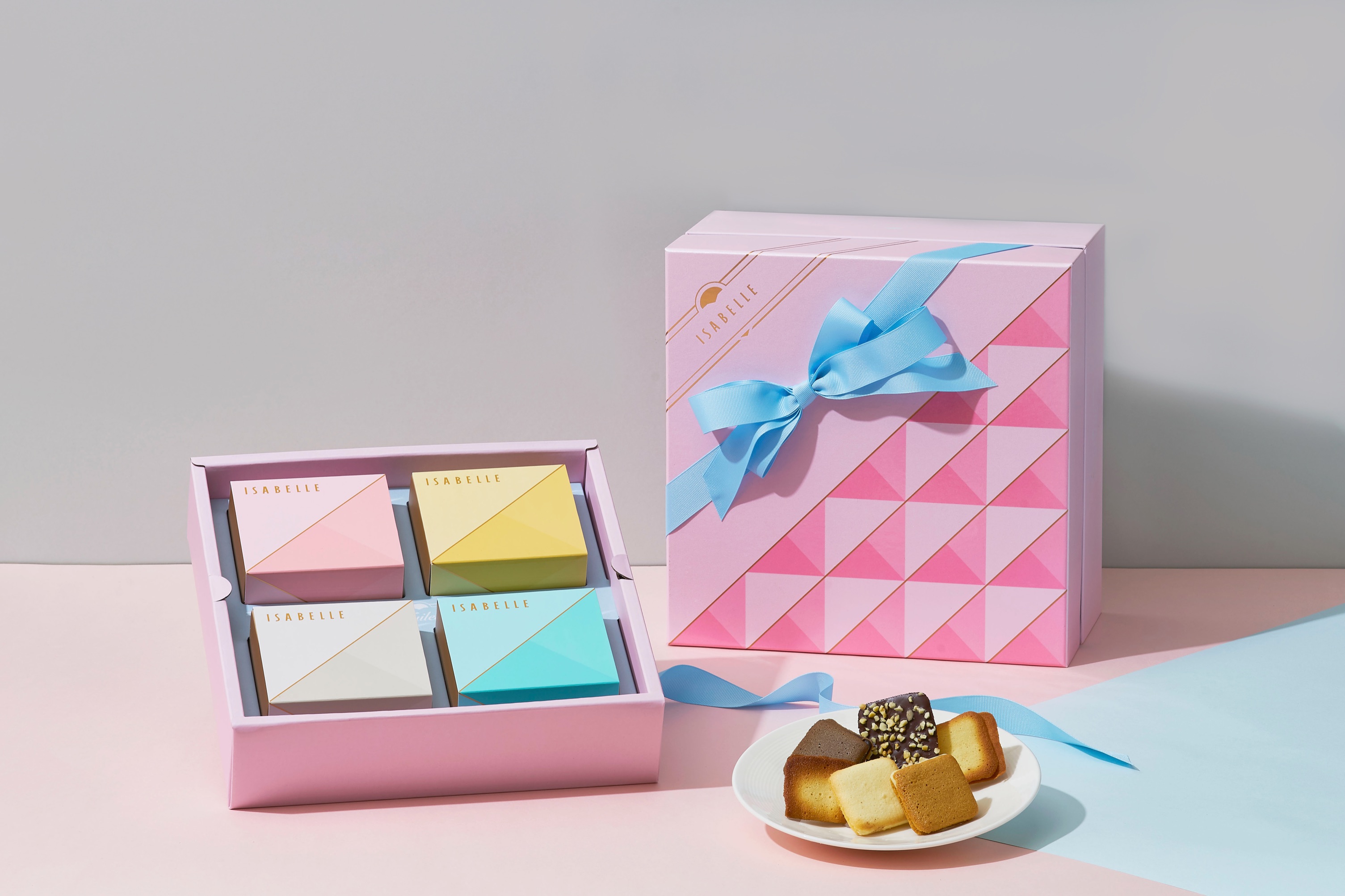
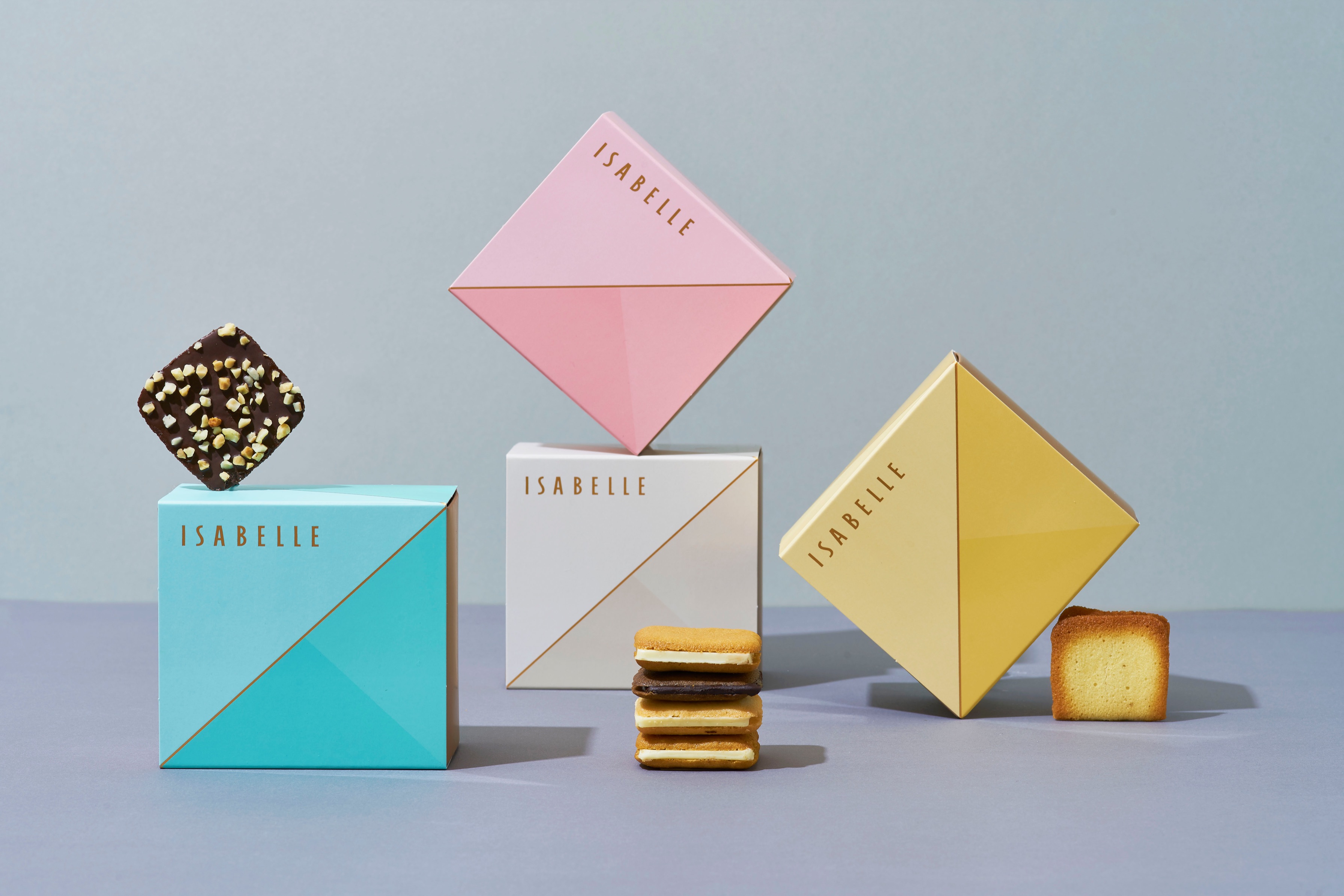
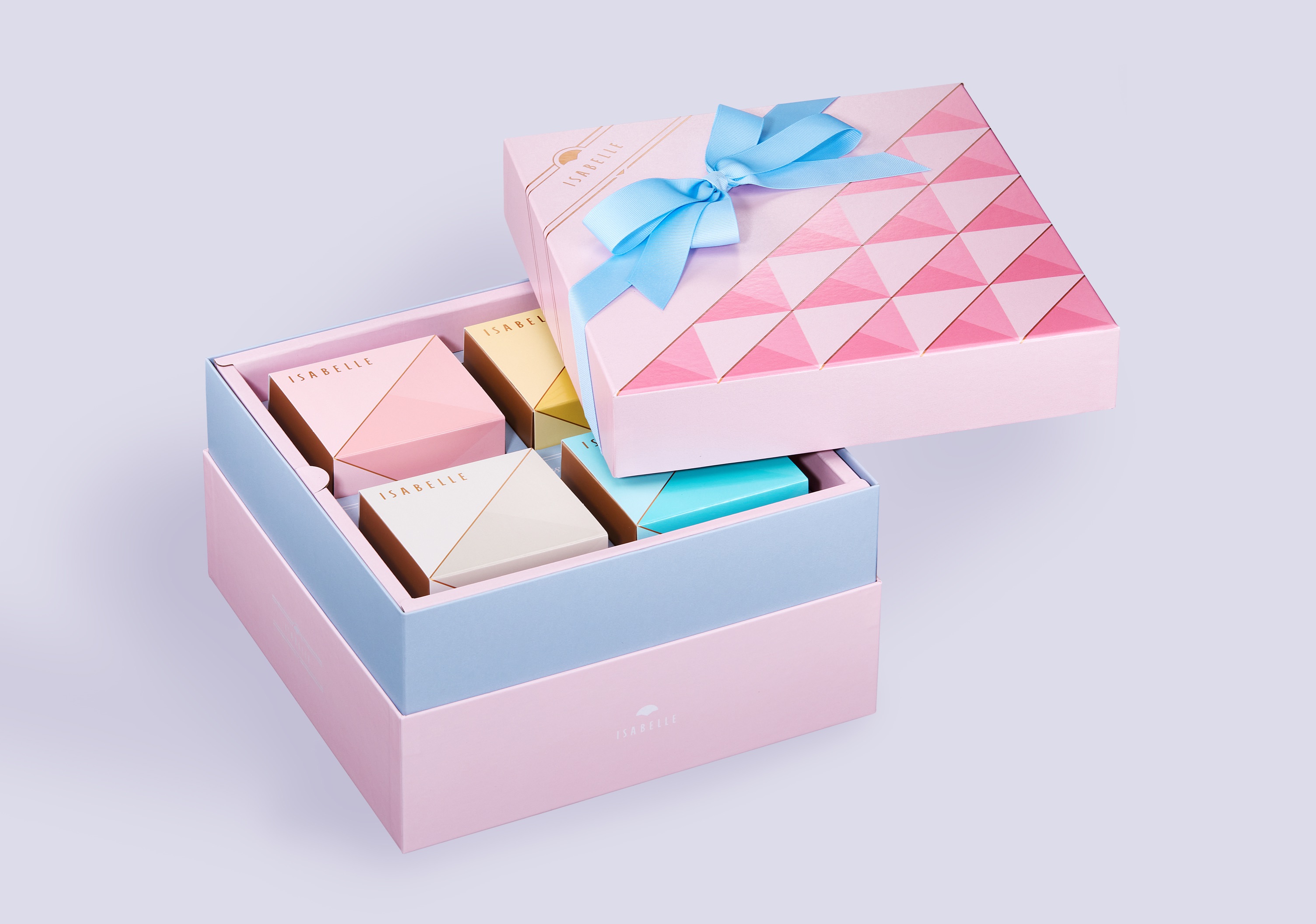
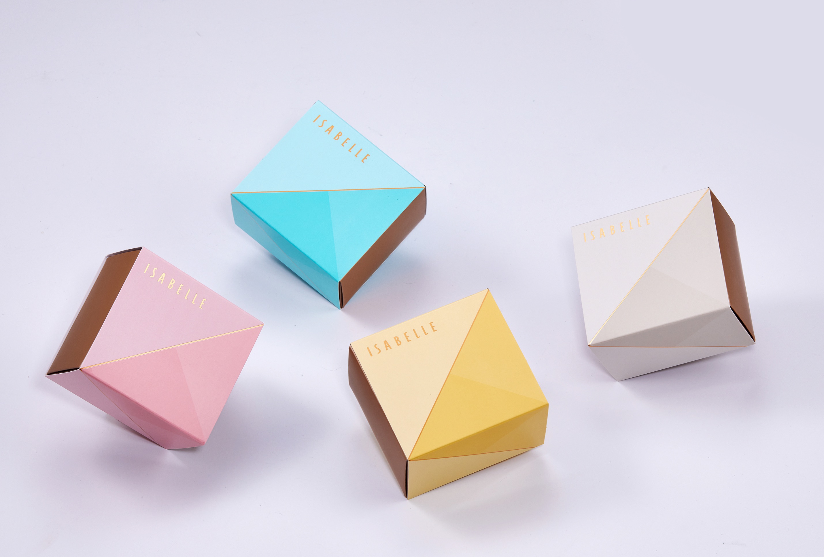
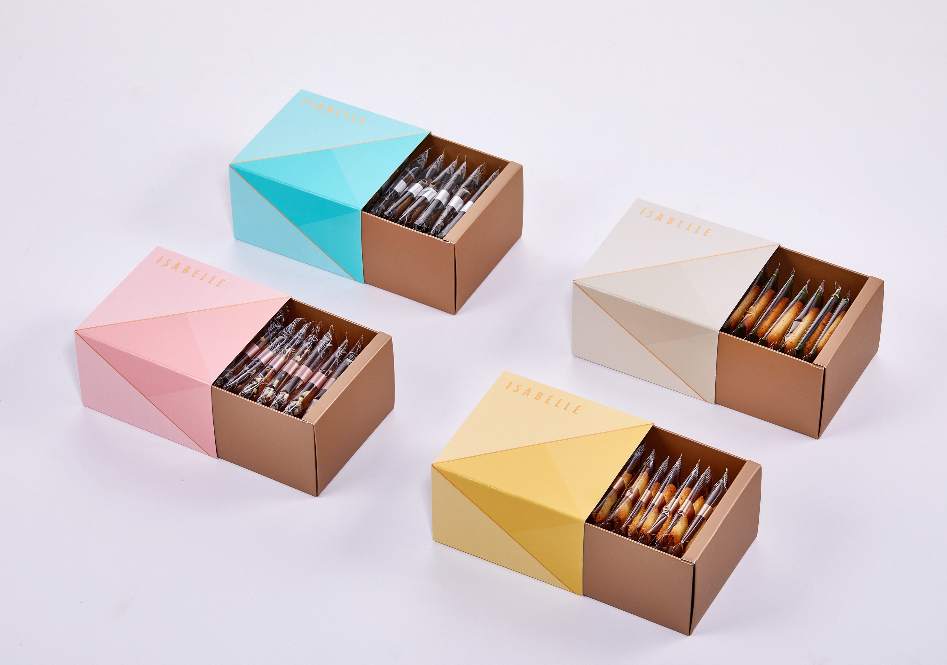
The joyful journey is represented by the pastel pink. The various shades of pastel colours combined with the chic blue bow bring out the uniqueness of the packaging. Golden elegant fine lines and the pearl-shine paper texture is used to give it a sophisticated and simplistic look.
These design elements strike the perfect balance between elegance and quality. Just like the Langue de chat which is exquisite and full of texture to tickle your taste buds.
CREDIT
- Agency/Creative: Styleplus Design
- Article Title: Styleplus Design Creates Packaging Design for Isabelle Marions-nous
- Organisation/Entity: Agency
- Project Type: Packaging
- Project Status: Published
- Agency/Creative Country: Taiwan
- Agency/Creative City: Taipei
- Market Region: Global
- Project Deliverables: Packaging Design
- Format: Box
- Substrate: Pulp Carton
- Industry: Food/Beverage
- Keywords: WBDS Awards, Agency
-
Credits:
Agency: Styleplus Design
FEEDBACK
Relevance: Solution/idea in relation to brand, product or service
Implementation: Attention, detailing and finishing of final solution
Presentation: Text, visualisation and quality of the presentation


