Tenny, the AI tennis app, offers professional-grade shot tracking, video analysis, and line calling whether you’re on clay, grass, or hard court. Tenny harnesses the power of your iPhone or iPad to elevate your gameplay experience to new heights.
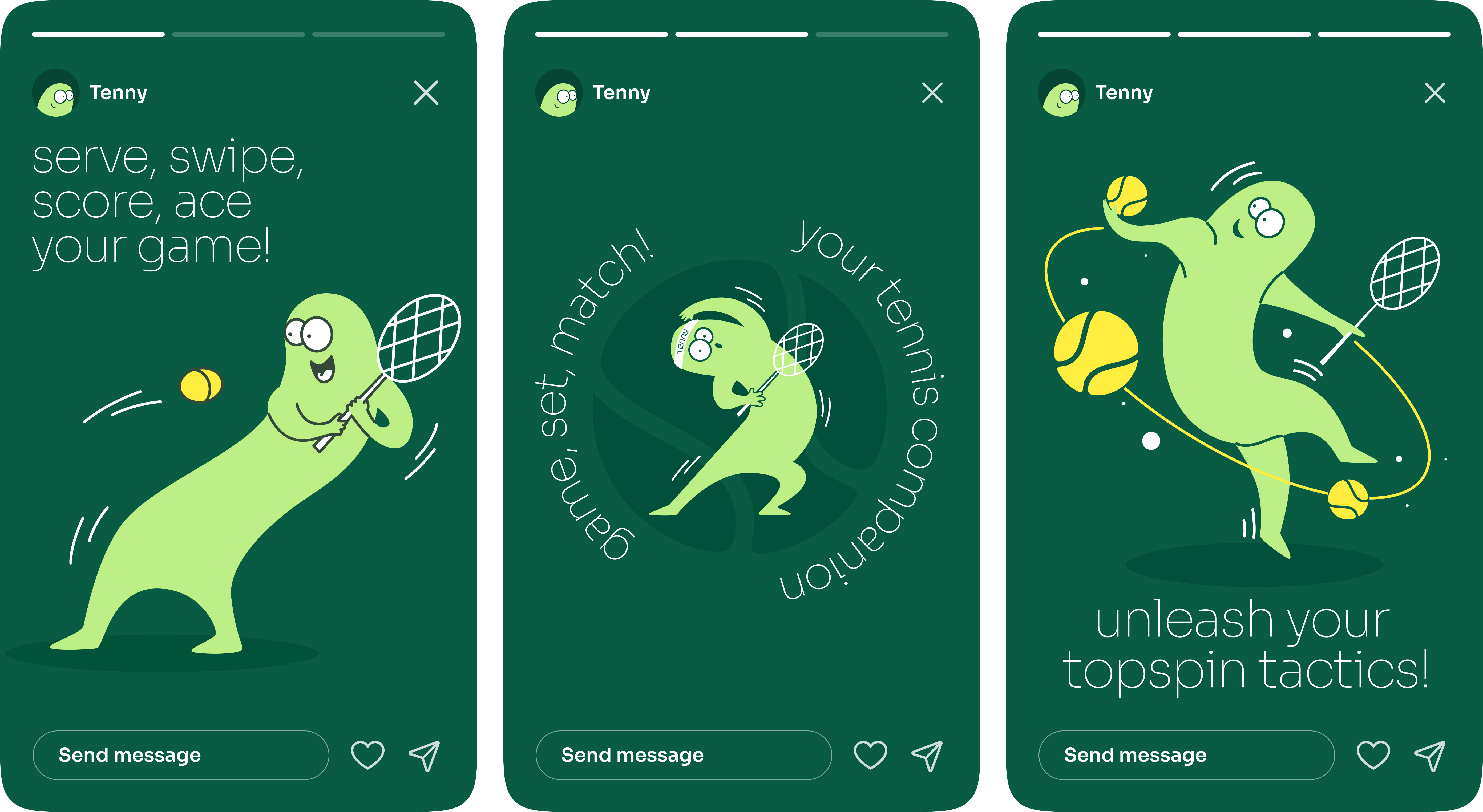
The brand identity of Tenny is meticulously designed to capture the vibrant essence of tennis through a playful and quirky lens. The color palette is thoughtfully selected, incorporating various shades of green that are reminiscent of lush tennis courts, alongside bright pops of yellow, evoking the iconic tennis ball. Accents of crisp white add a sense of clarity and freshness, creating a dynamic and visually appealing aesthetic.
Central to Tenny’s brand identity is its charismatic mascot, a tennis-playing character that brings the spirit of the game to life. This mascot is not just a figurehead but a central element that adds personality and charm to the brand, making it instantly recognizable and memorable. The character’s playful demeanor and energetic poses resonate with the fun and active nature of tennis, appealing to both avid tennis enthusiasts and casual players alike.
The creation of Tenny’s brand identity was a comprehensive process undertaken by Studuo, a creative agency known for its innovative approach to design. Studuo’s expertise is evident in the cohesive visual language they developed, which seamlessly integrates across various touchpoints. From the initial concept to the final execution, every detail was carefully considered to ensure consistency and impact.
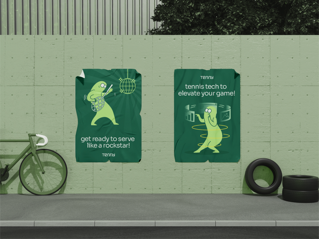
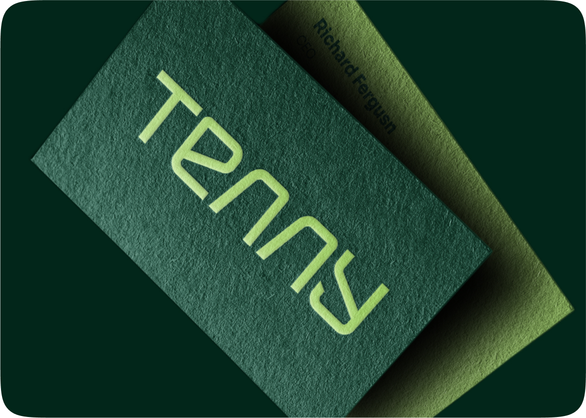
The visual language extends beyond the app itself, influencing the design of marketing materials and merchandise. Flyers, posters, social media graphics, and promotional videos all carry the distinctive Tenny look, ensuring that the brand message is clear and engaging across all channels. The merchandise, which includes items like apparel, accessories, and equipment, features the same vibrant colors and playful mascot, allowing users to connect with the brand on a tangible level.
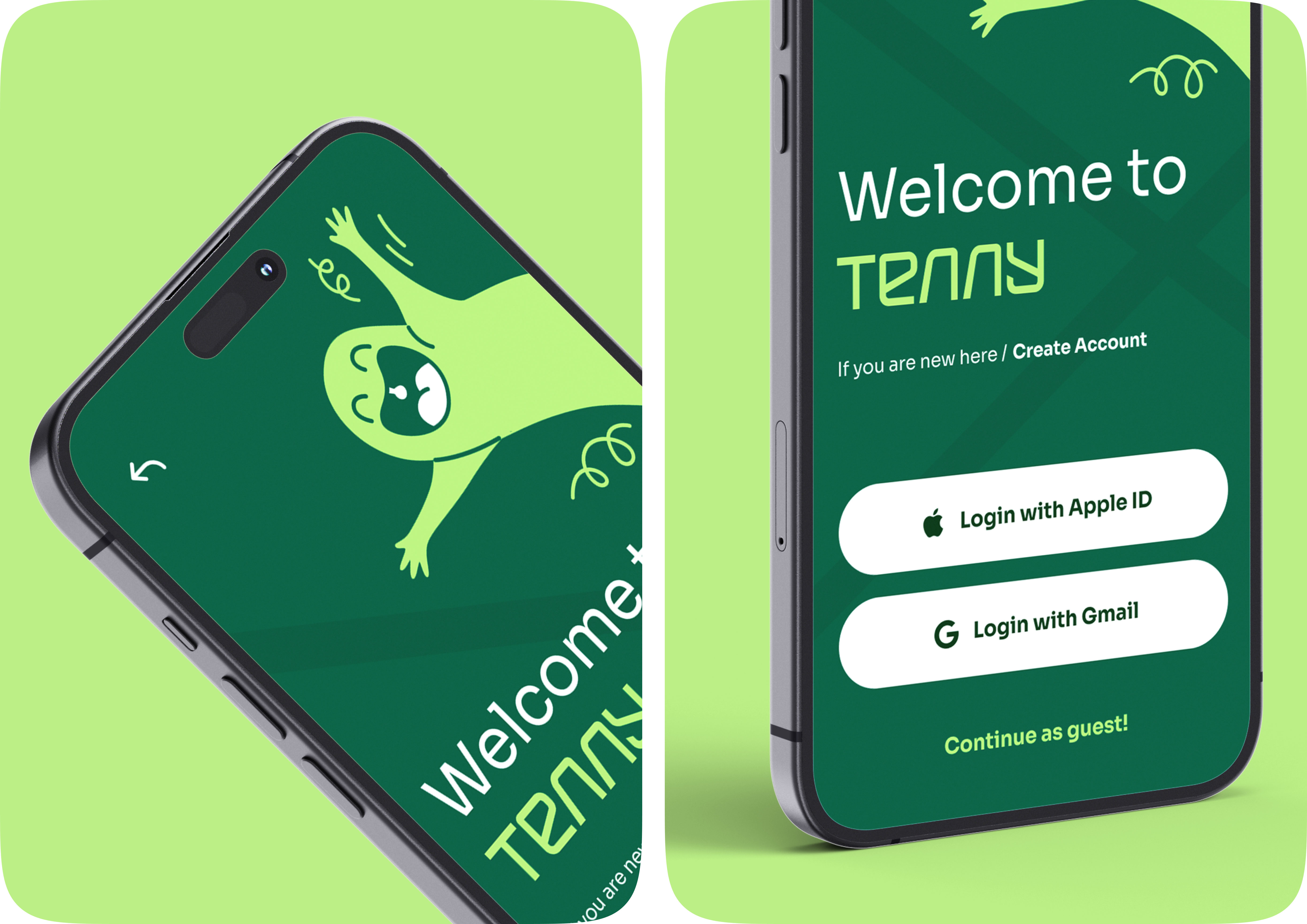
Studuo also played a pivotal role in the UI/UX design of the Tenny platform. The user interface is intuitive and user-friendly, designed to provide a seamless experience for players of all skill levels. The use of bright colors and engaging visuals not only makes the app aesthetically pleasing but also enhances usability, making it easy for users to navigate through features such as match scheduling, player statistics, and instructional videos.
In essence, Tenny’s brand identity is a harmonious blend of color, character, and design, all working together to create a memorable and enjoyable user experience. Studuo’s holistic approach ensured that every element, from the playful mascot to the vibrant color scheme, contributes to a cohesive and compelling brand narrative. Tenny stands out not just as a sports app, but as a celebration of the fun and dynamic spirit of tennis, inviting users to engage with the sport in an exciting and approachable way.


CREDIT
- Agency/Creative: Studuo
- Article Title: Studuo Brings Tenny’s Vibrant Tennis Brand to Life with Playful Design
- Organisation/Entity: Agency
- Project Type: Graphic
- Project Status: Published
- Agency/Creative Country: India
- Agency/Creative City: Ahmedabad
- Market Region: Asia
- Project Deliverables: 2D Design, App Design, Brand Design, Brand Identity, Creative Direction, Graphic Design
- Industry: Technology
- Keywords: sports, tennis, sports tech, branding, app design, tennis app, mascot, graphic design
-
Credits:
Designer: Drashti Vora
Designer: Saurav Pathak
Designer: Yuvraj Singh Rana
Designer: Aditya Dalal
Designer: Dhruval Mayavanshi


