


YOKŌ is a matcha café brand based in Tokyo, created for busy city people who are constantly running from one place to another but still crave a small pause, that one moment of calm in the middle of chaos. The idea behind YOKŌ started with a very simple observation: the city never slows down, and yet, in between the rush, people find their peace in the smallest rituals — a cup of coffee, a quiet bench, a few minutes scrolling, or simply staring at nothing. YOKŌ is for that moment, not the vacation kind of calm, but the 10-minute calm that fits between a meeting and the next train. I wanted the brand to capture that energy of a Tokyo morning, loud, fast, unapologetically alive and yet make it feel like a place that welcomes you to breathe. But instead of going the usual minimal, zen-inspired direction that most matcha brands follow, I wanted to have fun with it. I wanted to lean into the obsession people have with matcha these days, the over-the-top love for it, the trendy aesthetic, the endless Tiktoks and Reels of perfectly whisked green foam. Matcha has become more than a drink; it’s a personality, a culture, a daily ritual with its own fan base. So I decided to exaggerate that obsession in the most playful way possible, through loud typography, bold colors, and characters that feel both relatable and a little surreal. The visual language is bold but soft, playful but thoughtful, it doesn’t take itself too seriously, and that’s the point. I wanted YOKŌ to feel like a friend who says, “You’re doing great, now drink your matcha and keep going.”
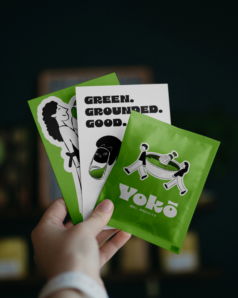
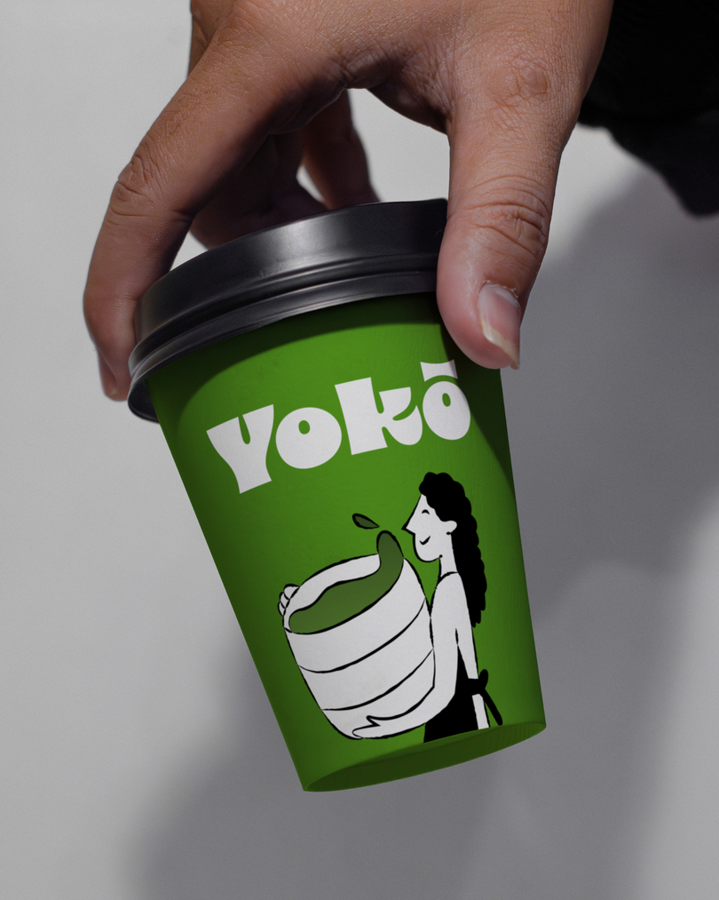
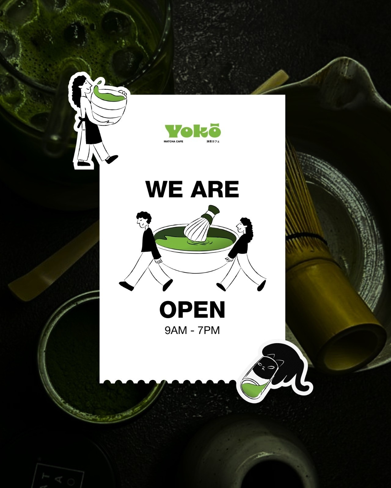
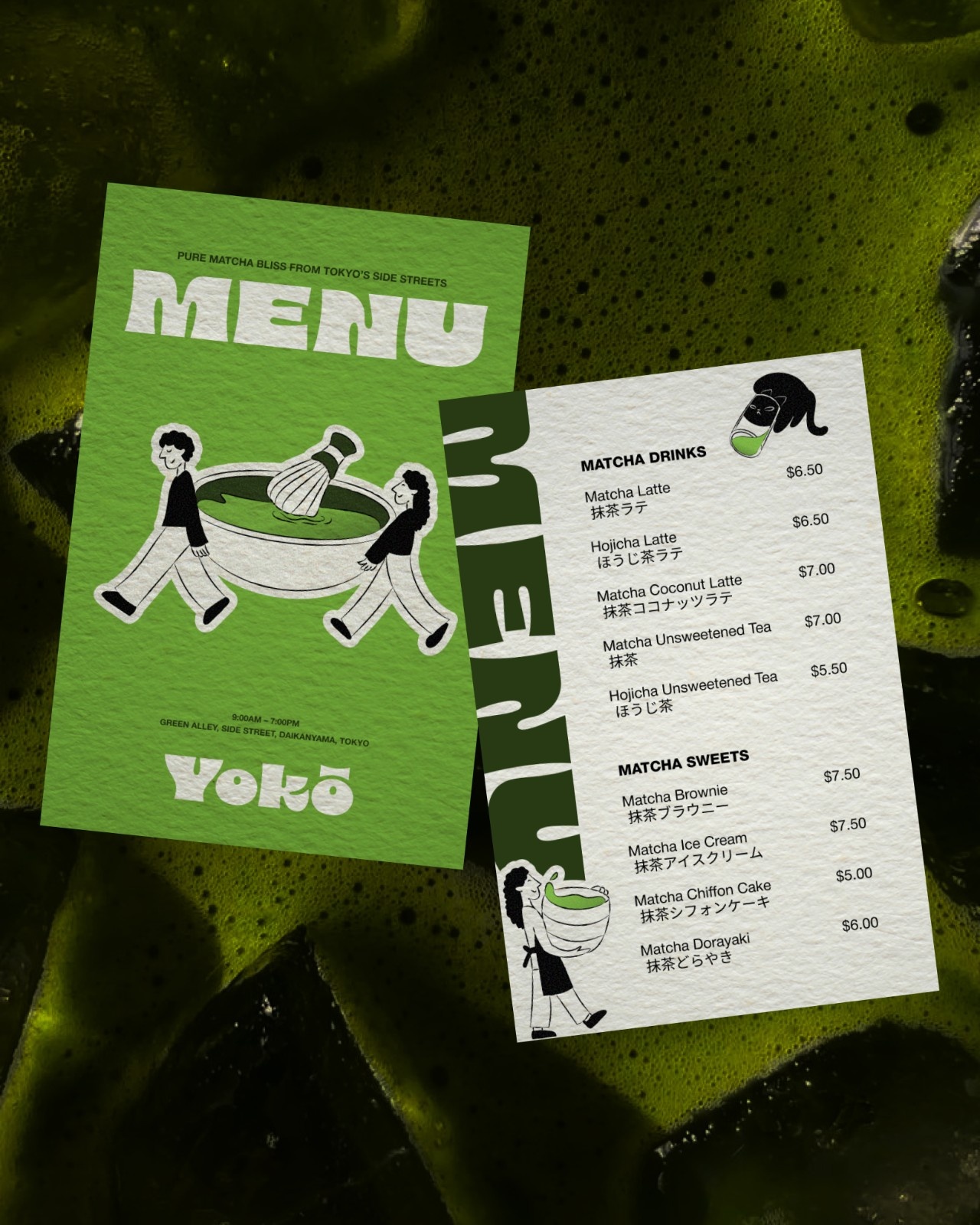
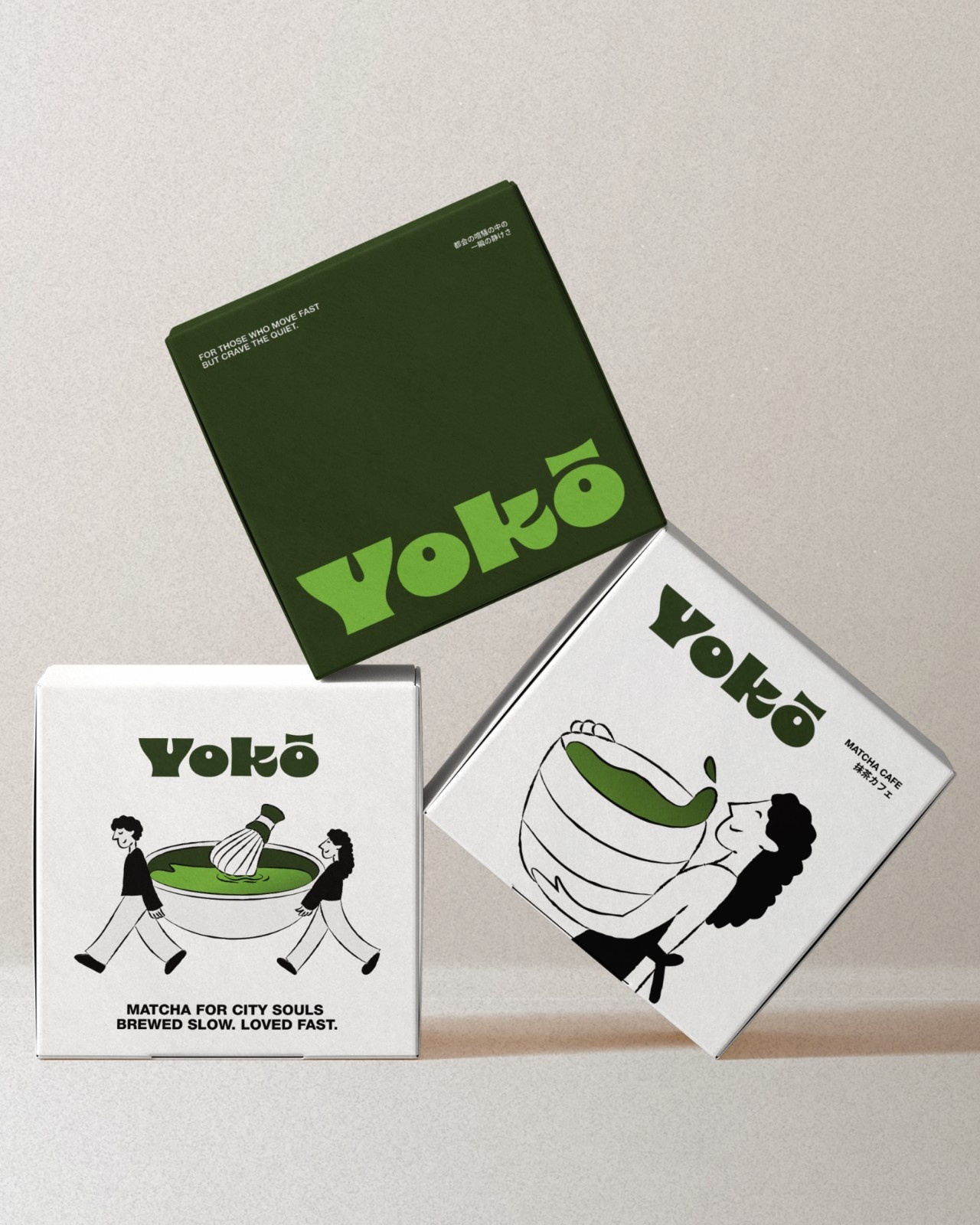
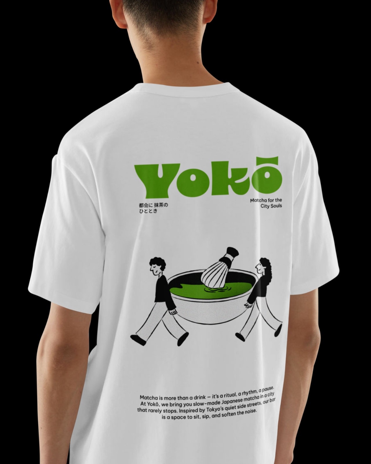
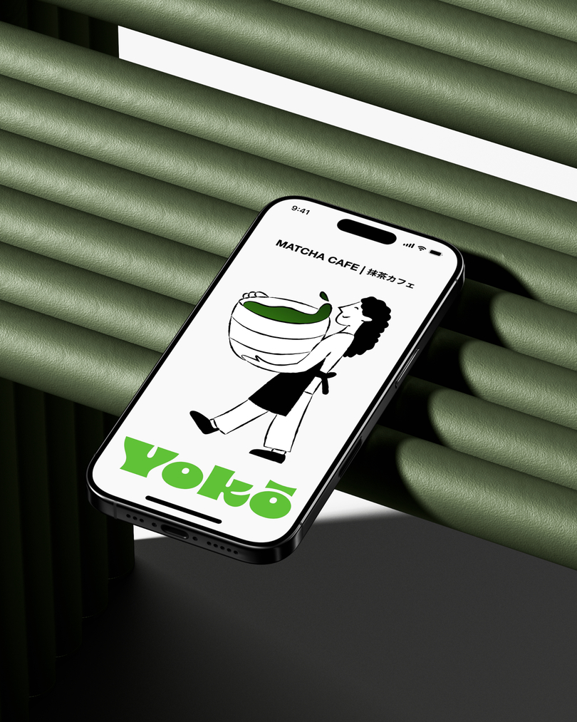
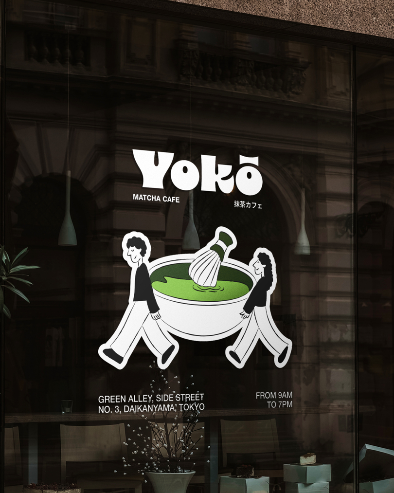
When I started designing the identity, I asked myself what “calm” would look like in a city that never stops and the answer wasn’t silence or stillness, but balance. The balance between motion and rest, between focus and flow. I imagined matcha as the connecting bridge, something that gives energy without chaos, something that keeps you centered even as you move through crowded streets. That’s why the wordmark and typography were designed to be bold, slightly curvy, and full of motion. It feels confident but not aggressive, much like the caffeine kick matcha gives you. The bright greens are complemented with warm neutrals, because calm doesn’t have to be boring. It can be expressive and full of life too. For the illustrations, I leaned into exaggerated human emotions and everyday matcha obsession scenes, people rushing through the city with huge matcha cups in hand, or taking dramatically huge matcha whisks with even bigger matcha bowls that feel like it’s a life-changing potion. Every character is drawn in a slightly surreal, quirky way — not perfect, but perfectly human. The goal was to make people see themselves in those moments, to feel like “yep, that’s me before my morning matcha.”
The tone of YOKŌ is intentionally self-aware. It knows that matcha has become a cultural trend, and it plays with that idea instead of resisting it. It doesn’t shy away from the aesthetic side of matcha culture, the matcha selfies, the pretty cups, the almost spiritual obsession, but turns it into humor, into an identity that embraces both the calm and the chaos. The name YOKŌ itself feels light, short, and punchy, it rolls off the tongue easily and feels both Japanese and universal at the same time. It’s not trying to imitate traditional Japanese tea culture, but to celebrate how modern life has reinterpreted it. It’s not about the ceremony, it’s about the energy of now.
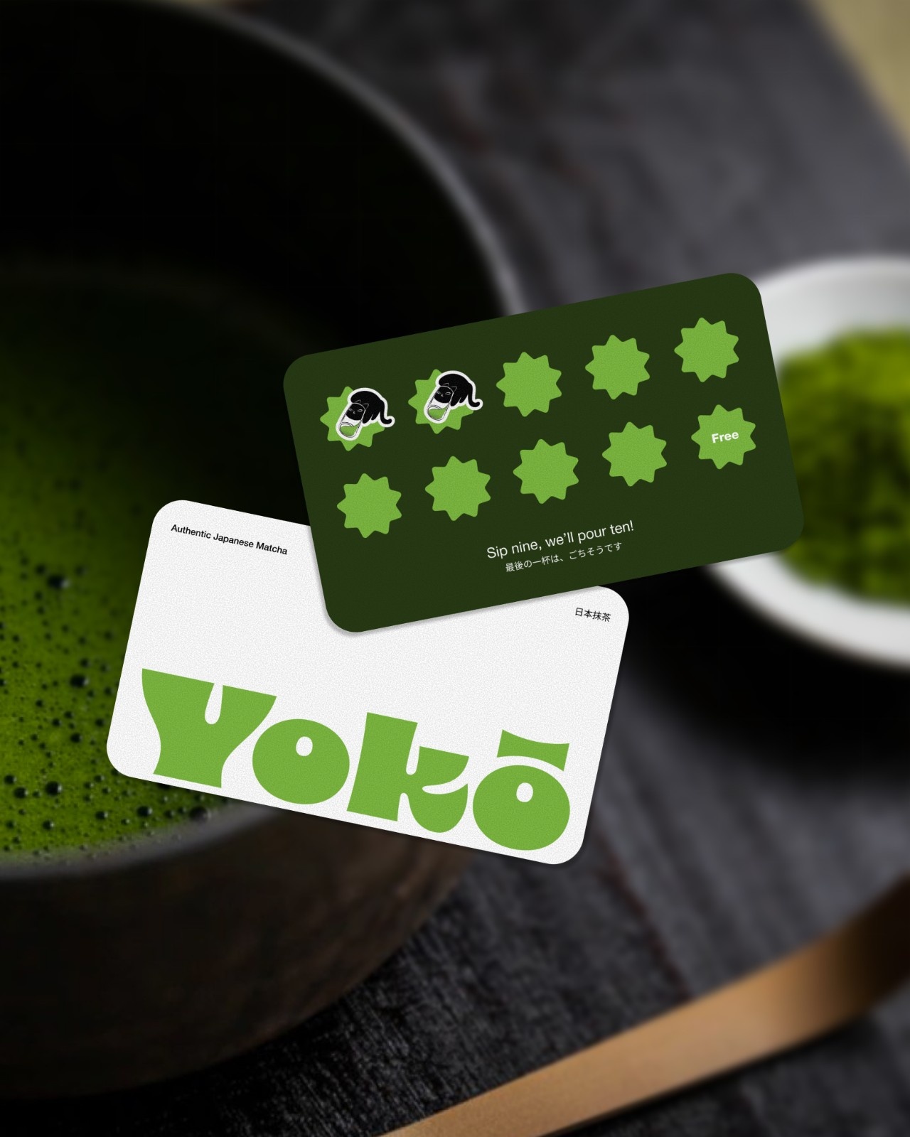
For the branding, I built a system that feels cohesive yet flexible. Every element including the logo, illustrations, tone of voice, and even the layouts carries a rhythm. There’s a sense of movement in everything, like the beat of a busy street but slowed down just enough for you to groove with it. The typography is big and confident because YOKŌ doesn’t whisper calm, it shouts it playfully. It says, “Take a break, but make it fun.” I used a bold, personality-rich font paired with a cleaner supporting sans-serif typeface to create contrast, a visual metaphor for balance. The color palette sticks to the essence of matcha but with a sharper, more urban edge, a punchy leafy green paired with a deep dark green, balanced by clean whites and bold blacks. The aim was to make it feel fresh, young, and relevant to the Gen Z and millennial audiences who romanticize their café moments and are always looking for the next aesthetic spot.
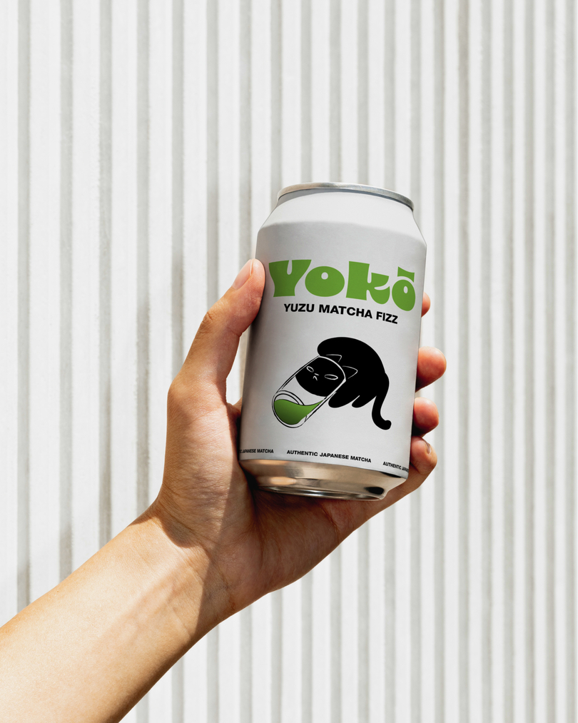
The illustrations are really the heartbeat of the system — loud, funny, and a little over-the-top. Each one captures a different kind of matcha obsession: someone clutching a giant cup that’s way too big to finish, two friends trying to balance an oversized matcha bowl and whisk, and a cat literally squeezing into a glass just to get the last sip. Every illustration dramatizes how deep this craze runs, playful exaggerations of real habits we all have. The lines are bold, the forms are simple, and the expressions are full of personality. They make you laugh first, then realize, “yeah, that’s kind of me.” It’s the human side of the brand — imperfect, fun, and a little unhinged in the best way.
This project was honestly one of the most fun I’ve worked on, because it allowed me to combine humor, culture, and design storytelling all in one space. It wasn’t about creating something perfectly polished, but something alive, a brand that breathes, blinks, and laughs at itself. I learned how to push contrast — visual, emotional, and conceptual and how to use exaggeration as a design tool to make something relatable. Through YOKŌ, I wanted to remind people that calm doesn’t always have to look quiet; sometimes it’s just being okay with the mess and finding rhythm in it. It’s about turning a simple everyday ritual into something that feels like self-expression.
YOKŌ, to me, is a reflection of modern calm — not the meditative, sit-still kind, but the kind that happens while you’re on the go. It’s about making space for yourself, even if it’s only for the few seconds it takes to sip your drink. It’s playful, ironic, slightly chaotic, and entirely human, much like the people it was made for.
CREDIT
- Agency/Creative: studiorevv
- Article Title: Studiorevv Creates Yoko Matcha Cafe Branding
- Organisation/Entity: Student
- Project Type: Identity
- Project Status: Published
- Agency/Creative Country: India
- Agency/Creative City: Pune
- Market Region: Global
- Project Deliverables: Brand Design, Brand Identity, Branding, Logo Design
- Industry: Food/Beverage
- Keywords: matcha, Branding, matcha branding, brand identity
-
Credits:
Brand Designer: Reva Anjalekar


