


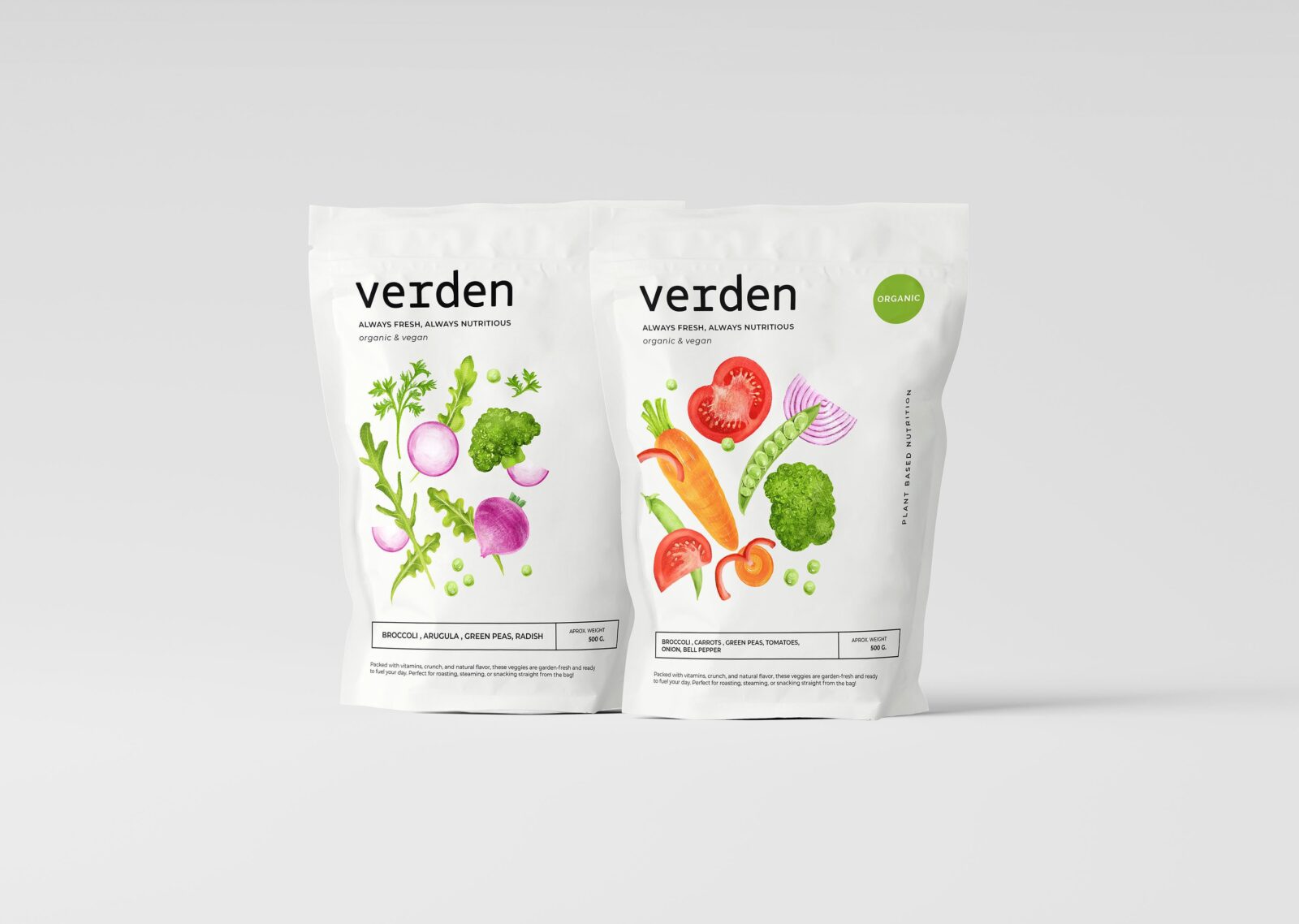
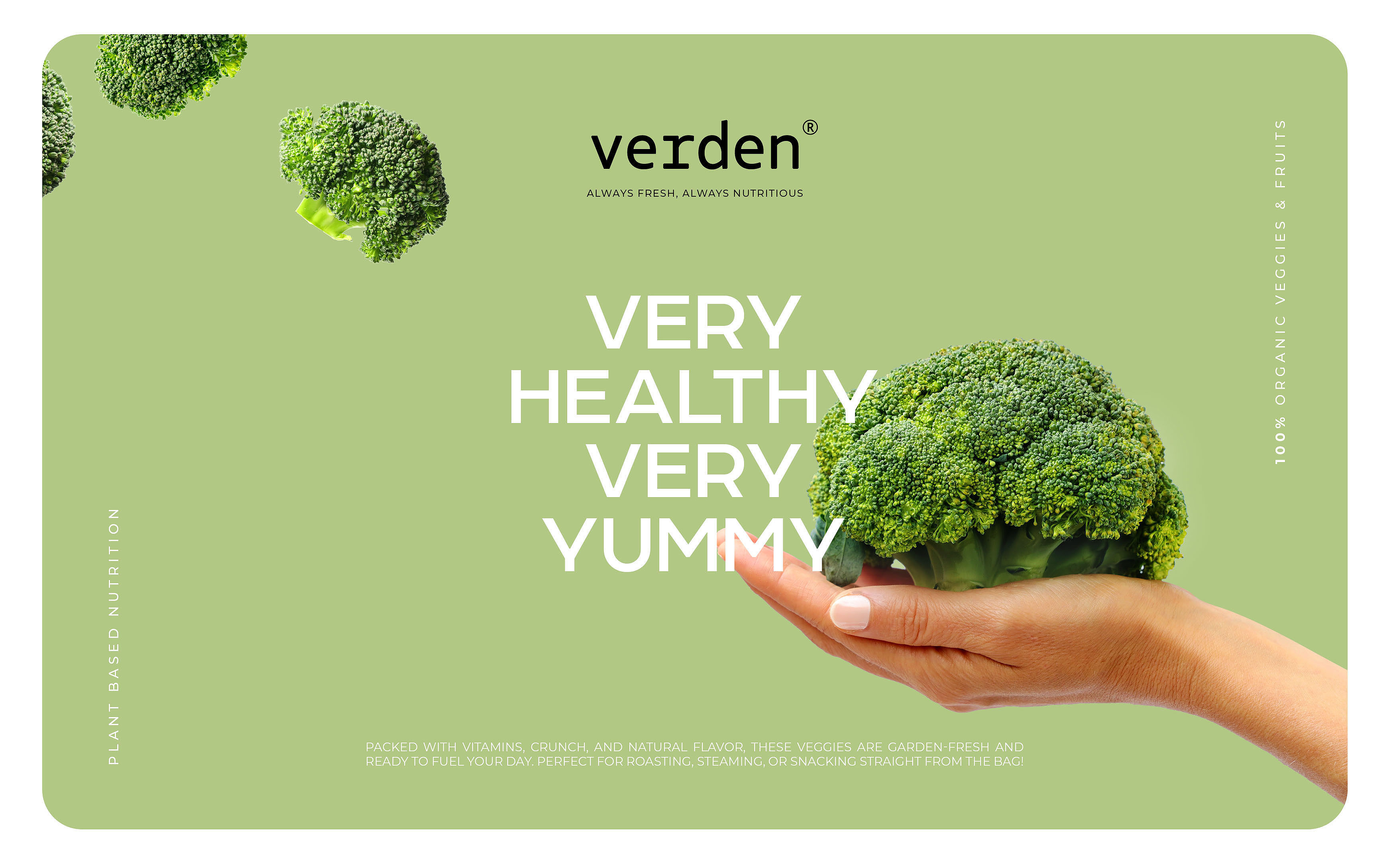
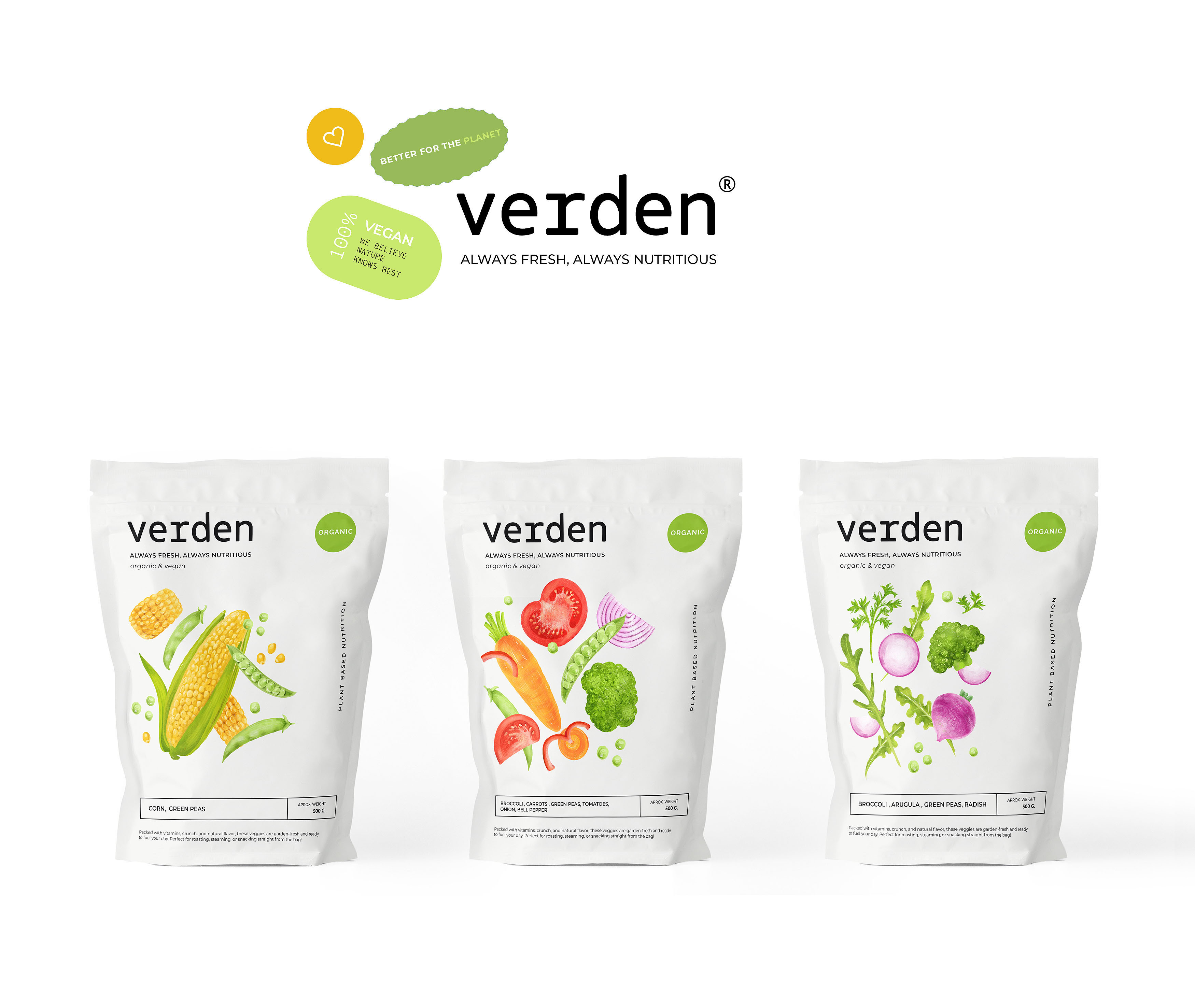
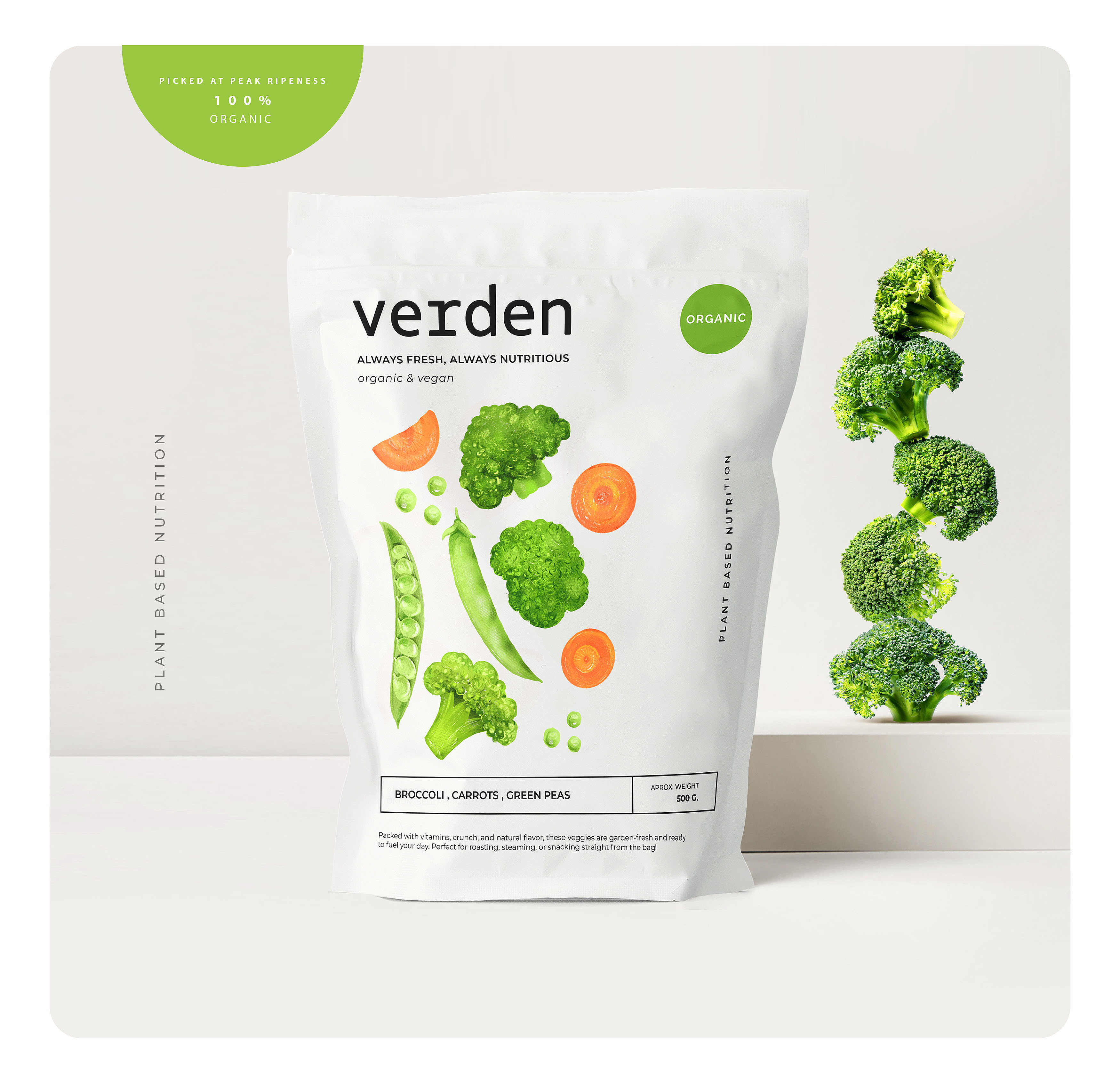
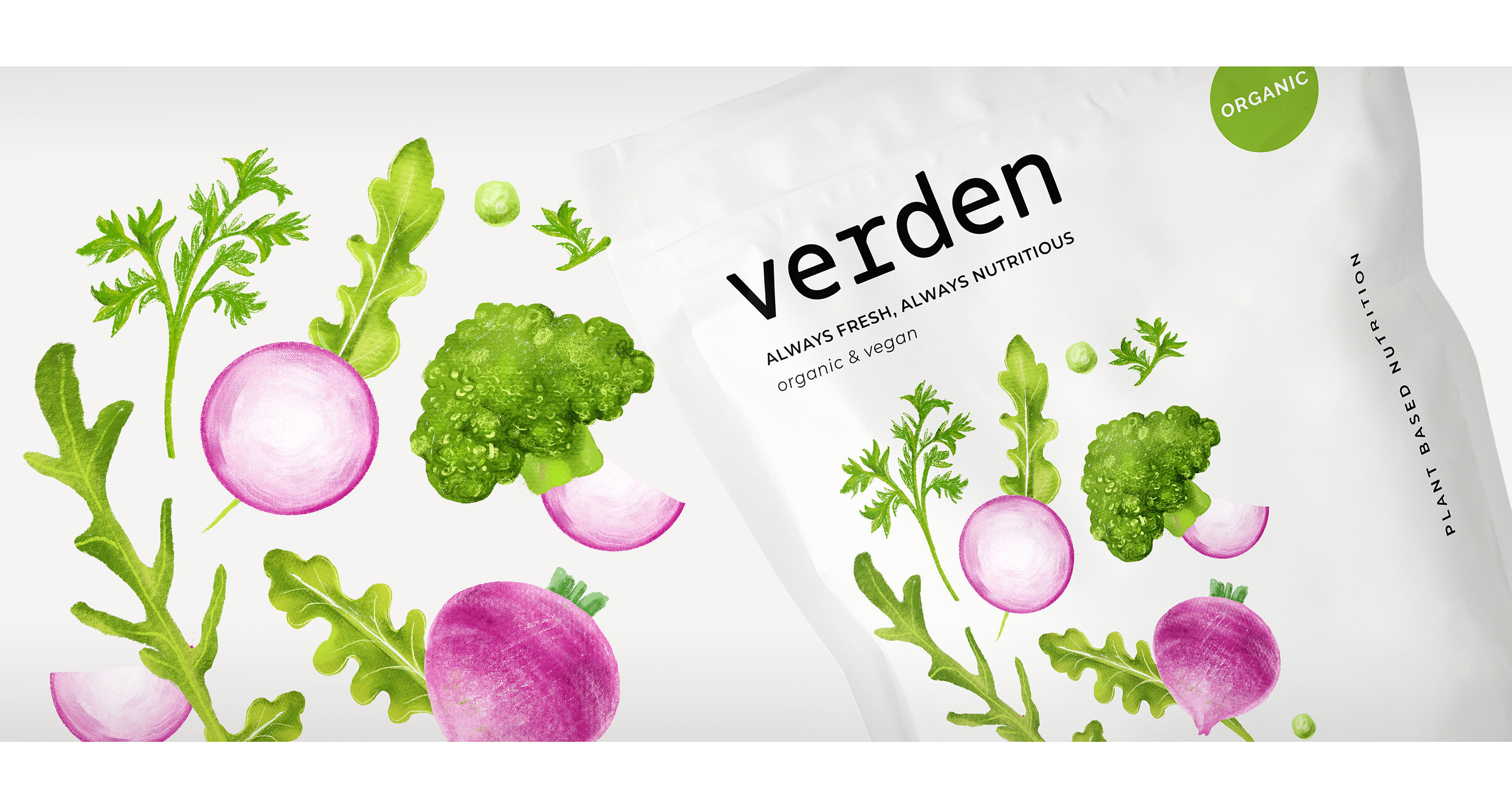
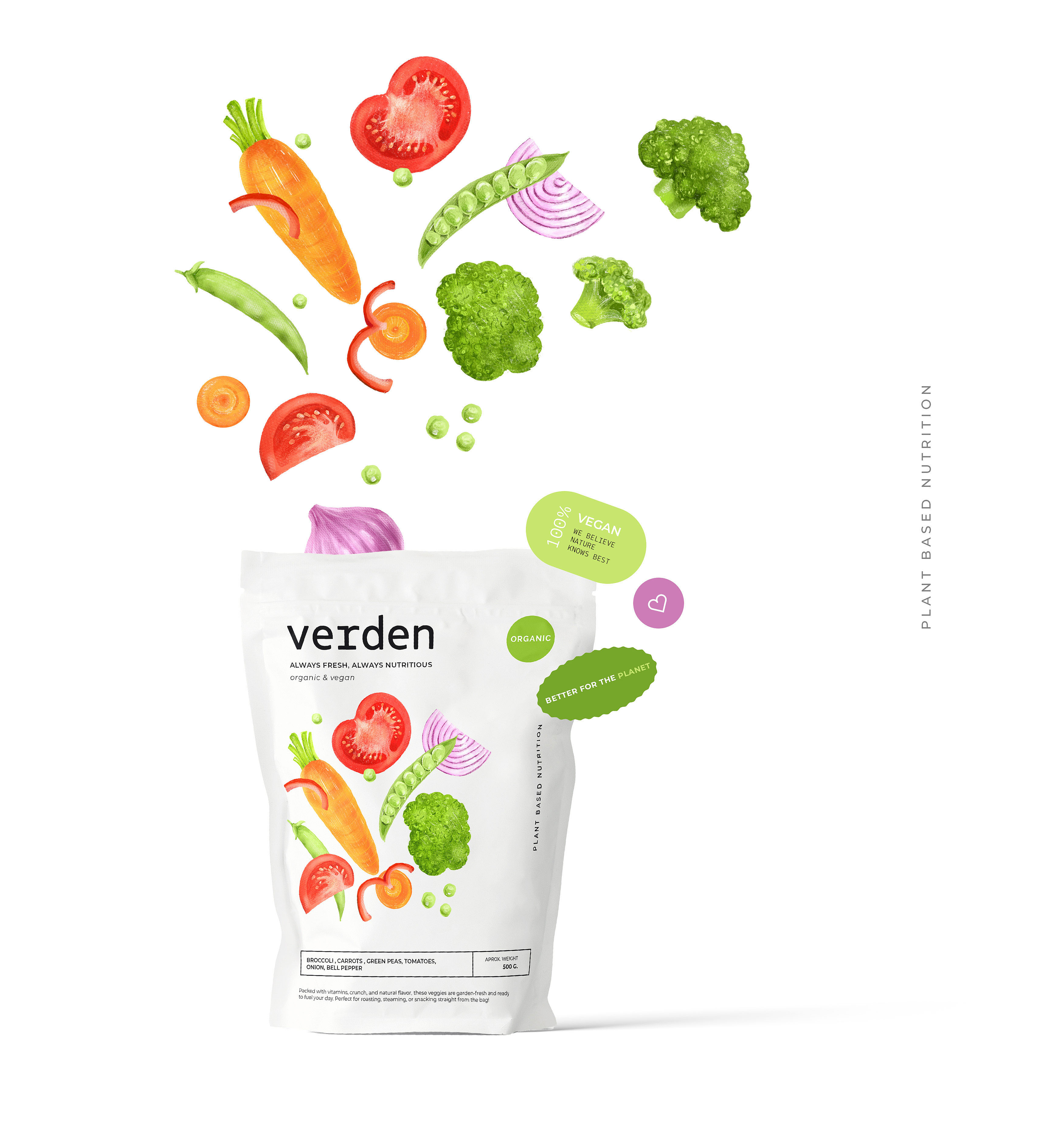
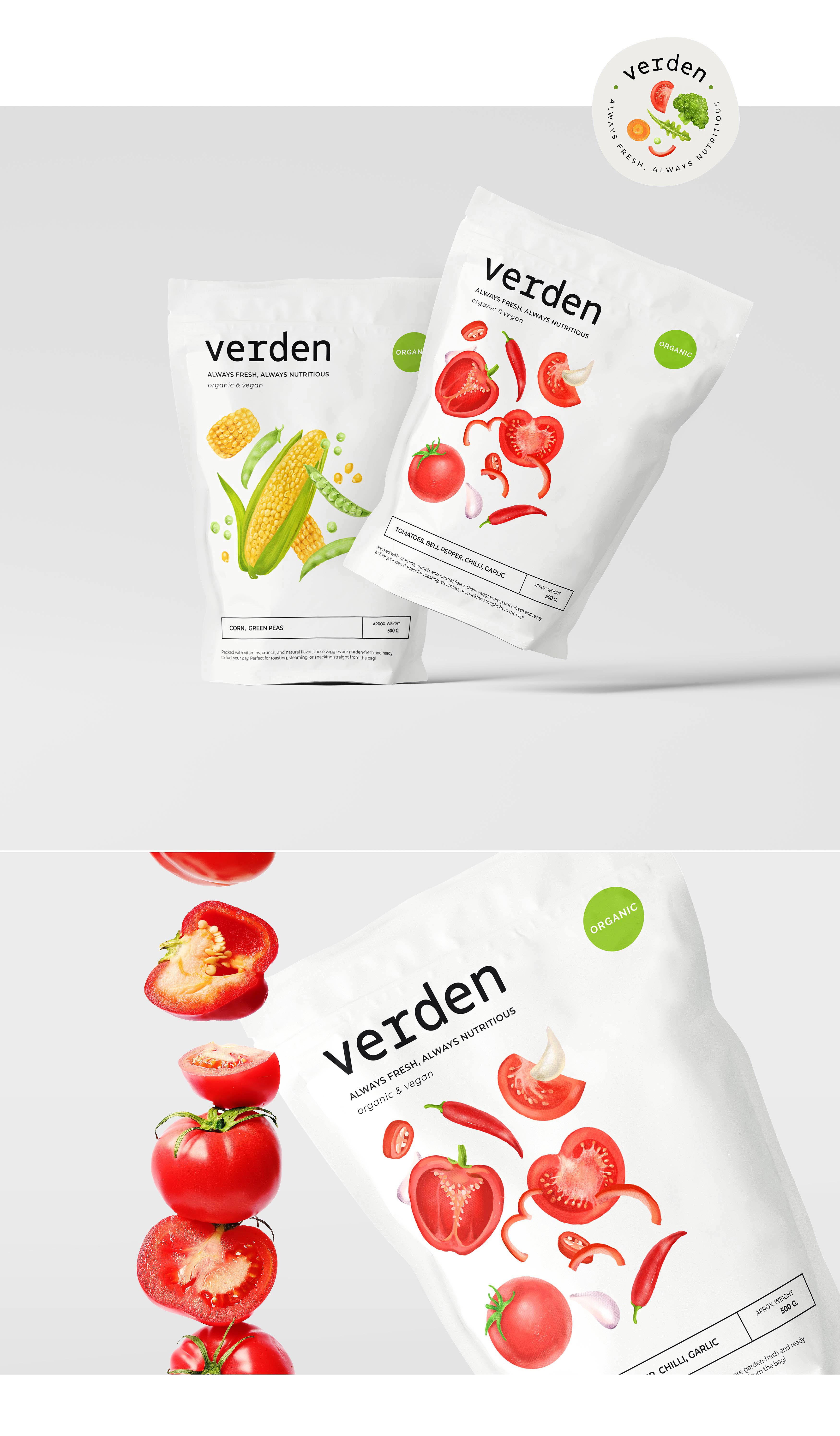
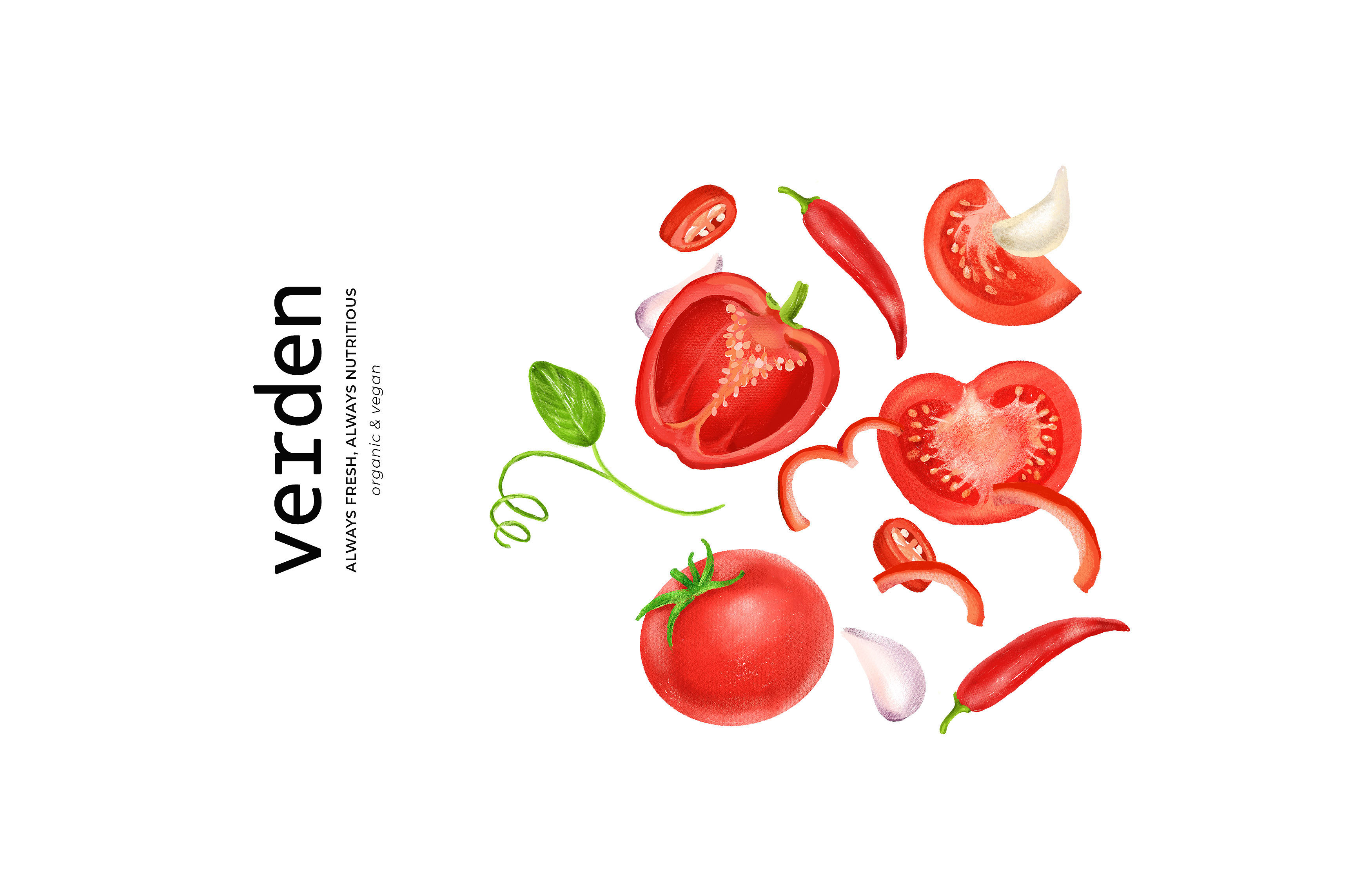
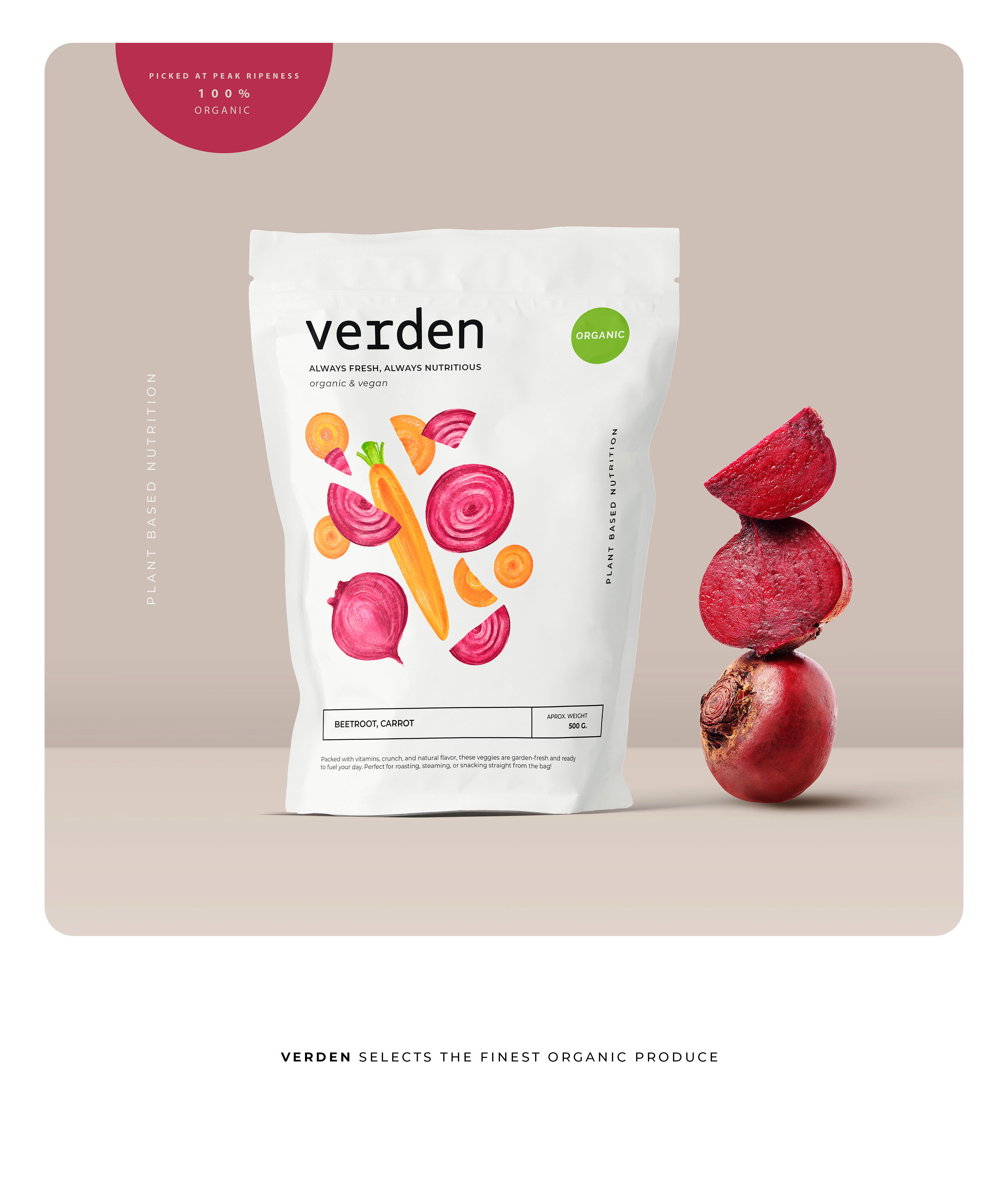
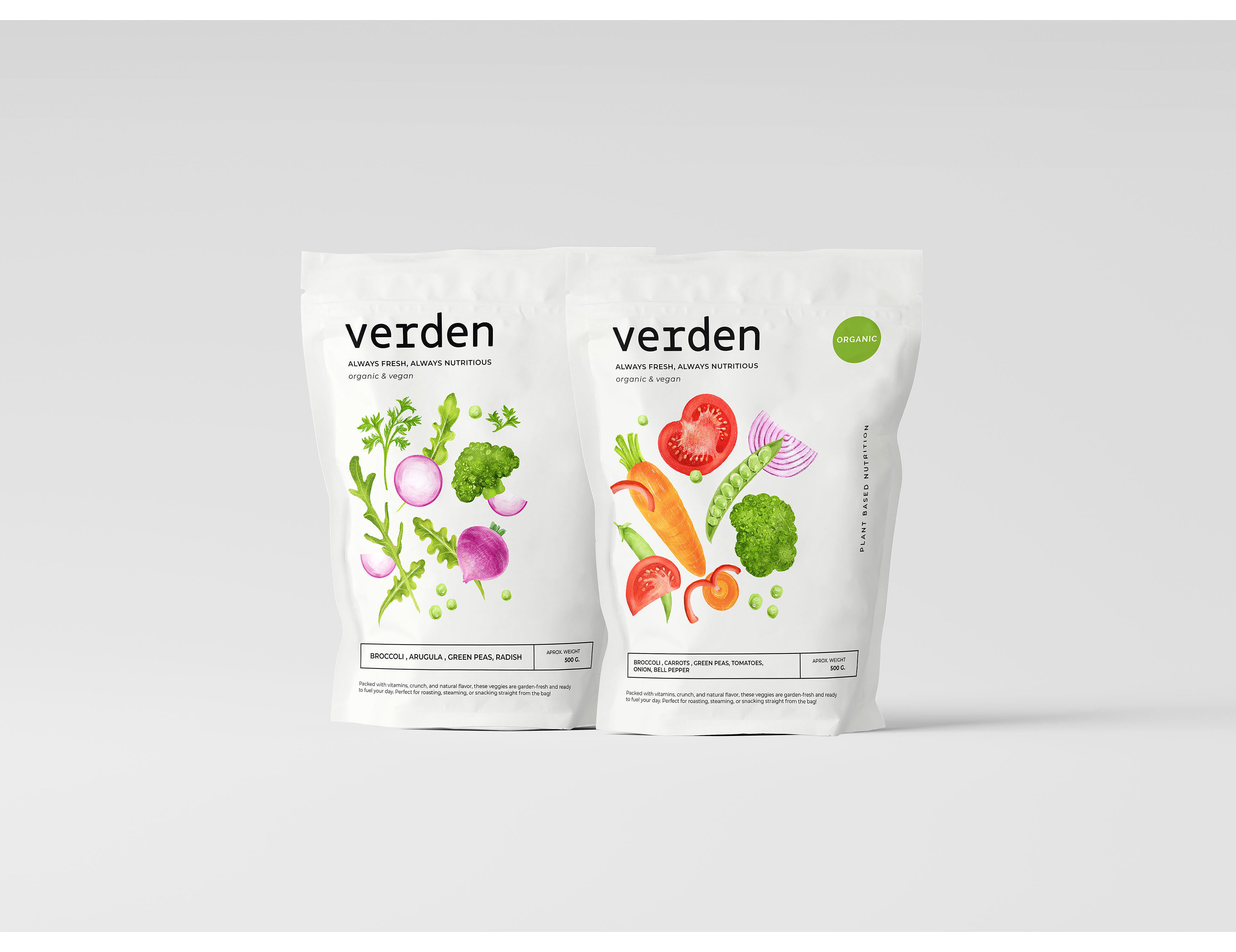
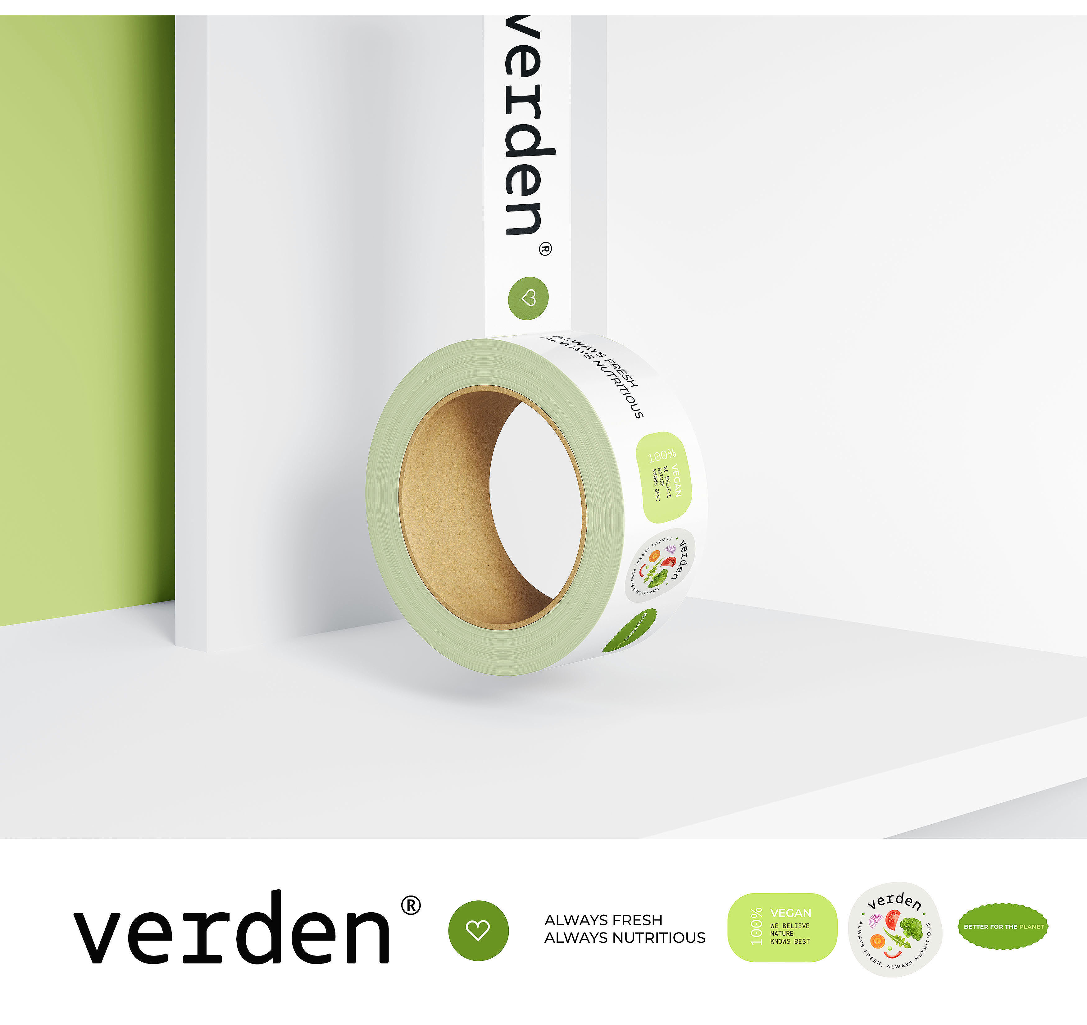
Verden’s packaging design embodies a philosophy of authentic simplicity, directly mirroring the brand’s commitment to pure, unprocessed quality. In a market saturated with visual noise, our goal was to create a clean, honest connection between the consumer and the product. We developed a minimalist architectural layout using a light, neutral background. This intentional canvas eliminates distraction, acting as a pristine stage that highlights the natural vegetables as the undeniable focus.
Moving beyond generic photography, we crafted a unique identity through bespoke hand-drawn illustrations. Each vegetable was meticulously sketched by hand to capture its organic imperfections and subtle textures—the asymmetry of a carrot, the delicate veins of a spinach leaf. This artisan approach infused the artwork with a tangible, human warmth that mass-produced visuals lack. These sketches were then digitally refined for consistency, and paired with a custom color palette derived directly from the produce at its peak freshness.
The resulting design harmonizes minimalist structure with handmade charm. It achieves a distinctive, ownable beauty that stands out on shelves through quiet confidence rather than loud graphics. The system ensures visual cohesion across all products, building a recognizable and premium brand family. Ultimately, the packaging doesn’t just contain – it communicates, reflecting Verden’s unwavering dedication to quality and natural integrity in every detail.
CREDIT
- Agency/Creative: StudioDFlorez
- Article Title: StudioDFlorez Designs Minimalist And Authentic Packaging Identity For Verden
- Organisation/Entity: Agency
- Project Type: Packaging
- Project Status: Published
- Agency/Creative Country: Colombia
- Agency/Creative City: Bogota
- Market Region: North America, South America
- Project Deliverables: Brand Design, Packaging Design
- Format: Bag, Flow-Pack
- Industry: Food/Beverage
- Keywords: packaging, vegetables, branding, illustration
-
Credits:
Designer: Yevheniia Hlova


