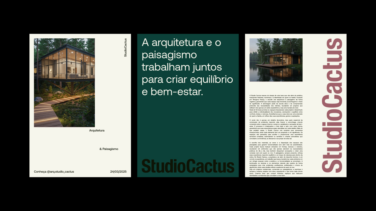
StudioCactus is an architecture, interior design, and landscaping studio founded by Morgana França in Brasília, with projects spanning across Brazil and abroad. The invitation to create the brand identity came from the studio’s own essence: sensitive, striking, and full of life. The central inspiration came from the cactus — a plant that endures, preserves life, and grows where few dare. From this, we developed a visual identity that conveys this universe with both subtlety and presence.
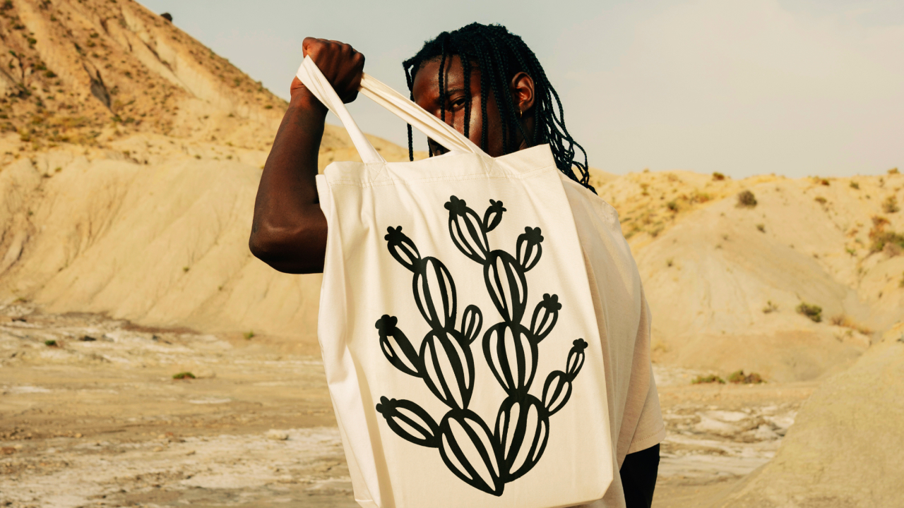
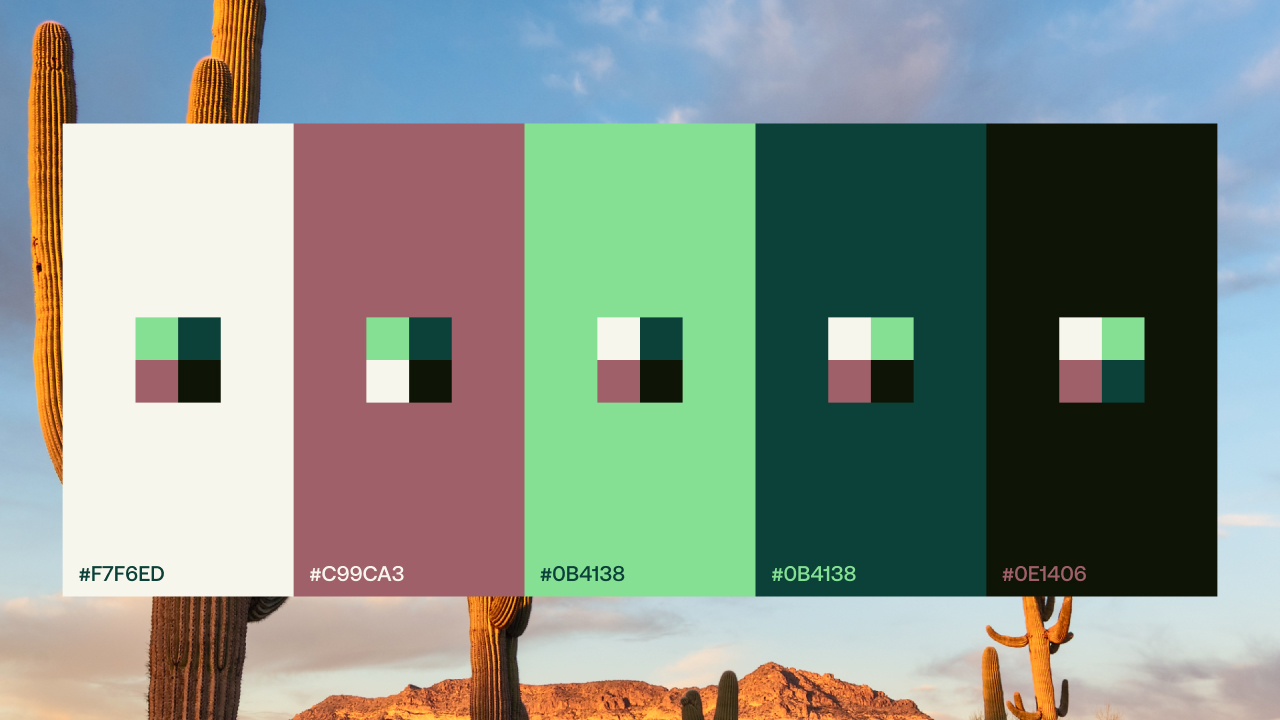
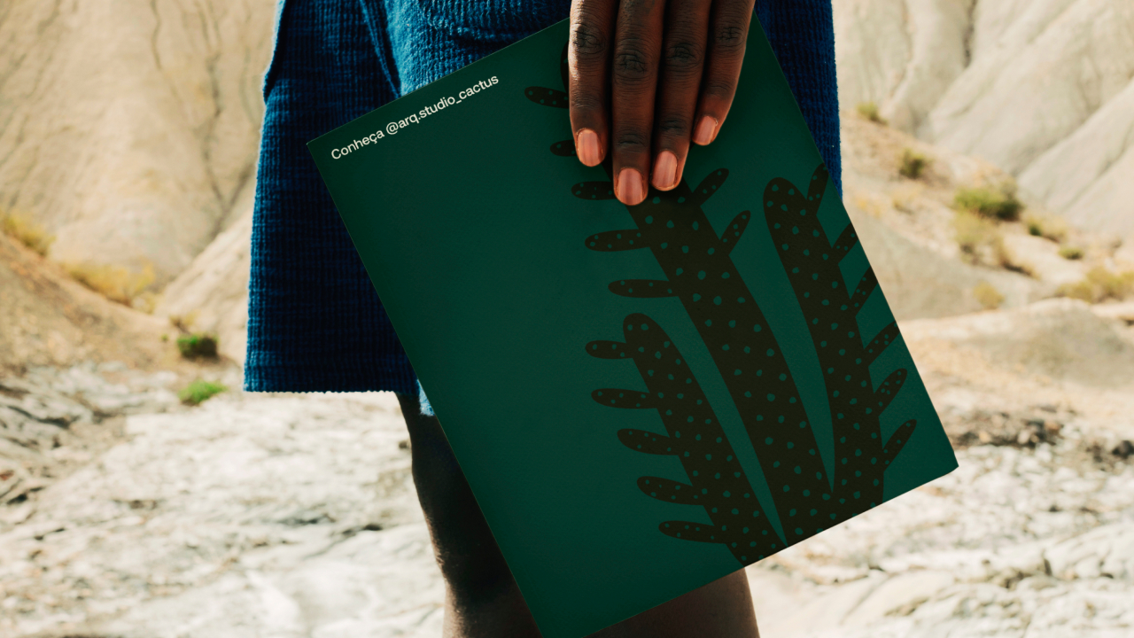
The color palette was built from the natural tones of cacti, reinforcing the connection to a hot and arid territory. We created eight graphic elements that represent the brand’s multiple layers, and from them, designed the main symbol — a minimalist version meant to work seamlessly across various applications and scales.
The visual identity doesn’t follow trends or ready-made formulas. Each detail reflects Morgana’s care in designing meaningful spaces, always respecting the story of those who will live there. The result is a functional, sensitive, and unique brand, aligned with StudioCactus’ mission to create experiences with true identity.
In photography, we started from the outside perspective — how people perceive a cactus. A plant that symbolizes warmth, strength, and resilience. That’s why the art direction features high-brightness and high-contrast imagery, emphasizing the brand’s sensory presence. StudioCactus doesn’t adapt to its environment. It transforms it.




CREDIT
- Agency/Creative: StudioCactus
- Article Title: StudioCactus Builds a Visual Identity Rooted in Nature and Expression
- Organisation/Entity: Agency
- Project Type: Identity
- Project Status: Published
- Agency/Creative Country: Brazil
- Agency/Creative City: Araranguá
- Market Region: South America
- Project Deliverables: Brand Identity
- Industry: Construction
- Keywords: Cactus, Green, Architecture
-
Credits:
Designer: Willian Gomes da Rosa


