Located in a rural area, the Fil brewery produces its own inputs and is one of the only companies in the country with its own hop plantation. However, despite its differentials, the brewery did not have a consistent strategic base, resulting in difficulties in sales and communication with the public. So the brand went through a strategic work in order to express its essence more effectively.
From this scenario, the company’s purpose became clear: the brand believes that living well is cultivating the relationship with the world we inhabit and with the people around us.
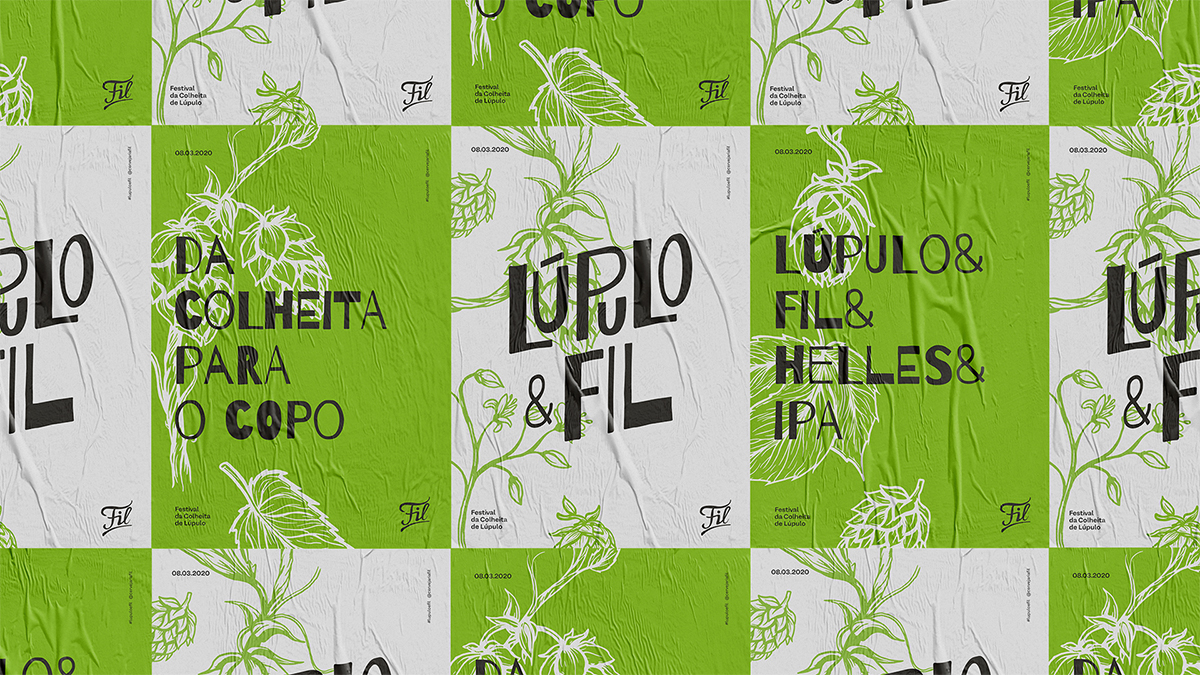
As a strategy to reinforce the brand’s value proposition, the “Lupulo & Fil Festival” (Hop&Fil Festival) was held, which aimed to gather friends for a collective hop harvesting experience at the brewery’s farm. This event resulted in the launch of two beers of the brand in a limited edition format.
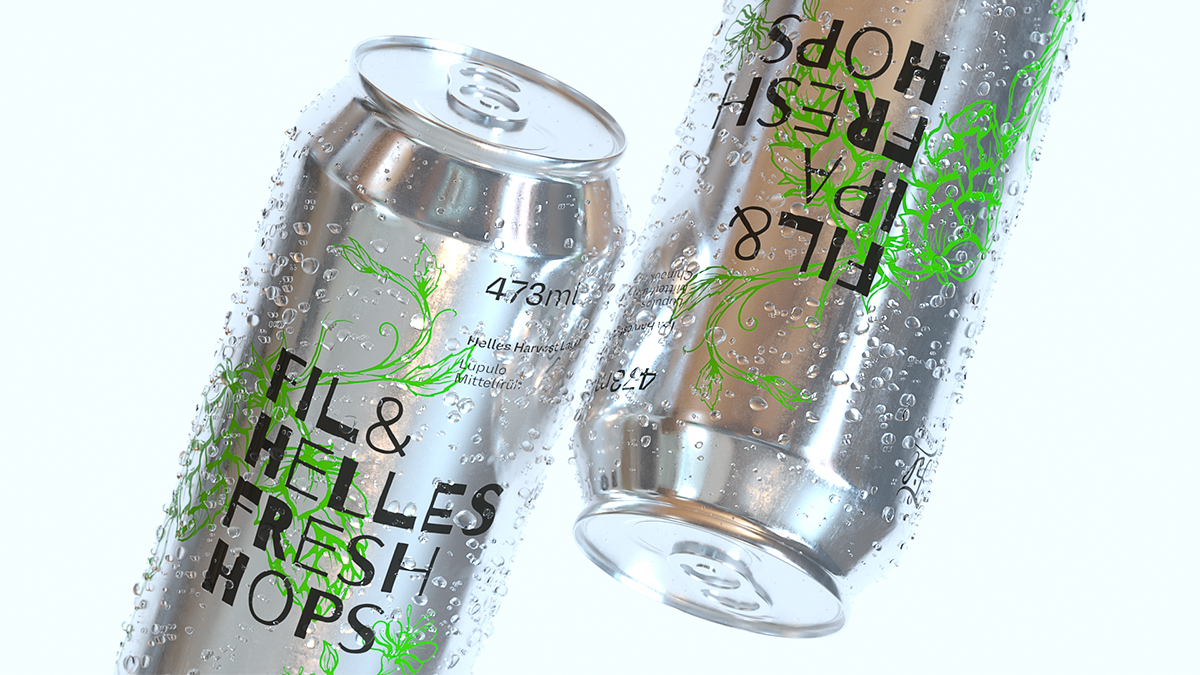
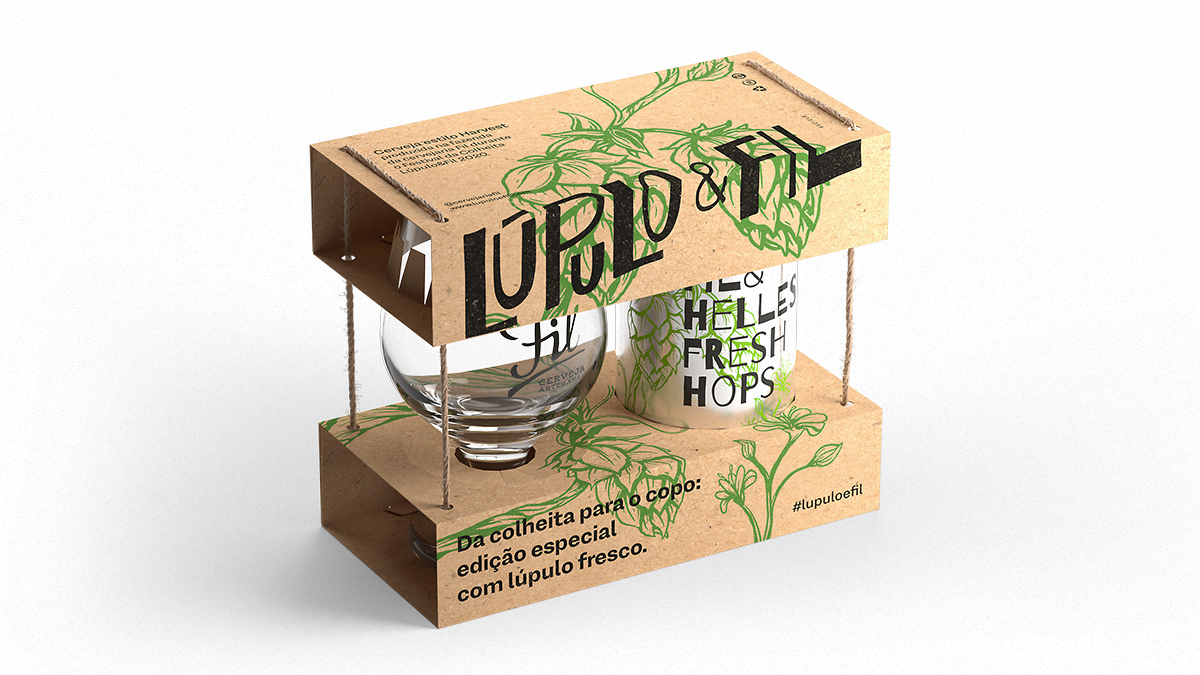
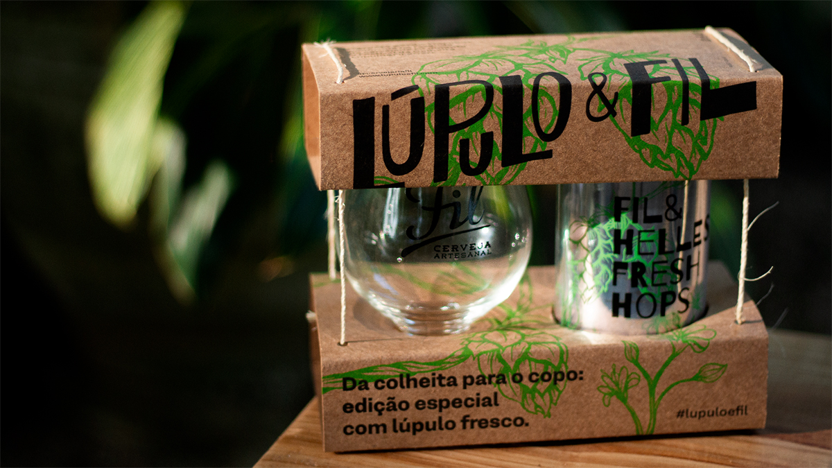
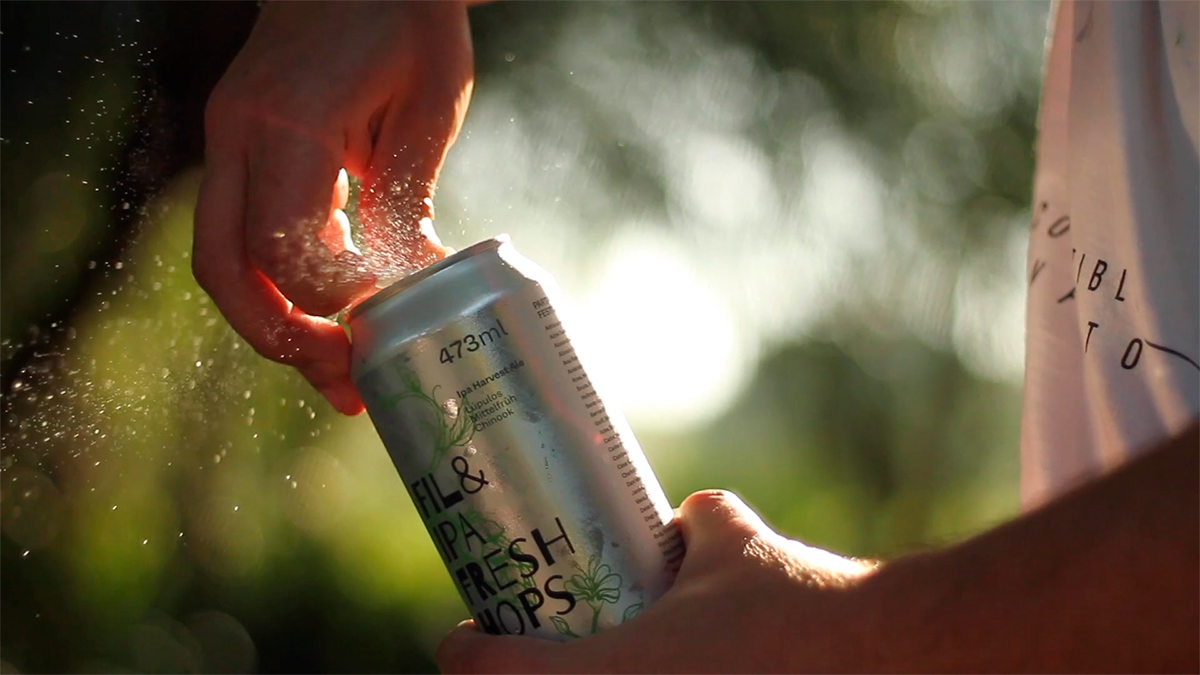
To launch the new beers on the market, a special kit was developed in which the label and packaging receive various characteristics of the company.
The development started with a change: until then, only glass bottles were used to fill Fil’s beers, but with aluminum being much more recyclable material than glass, the can was instituted.
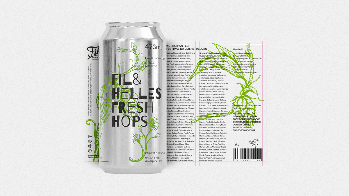
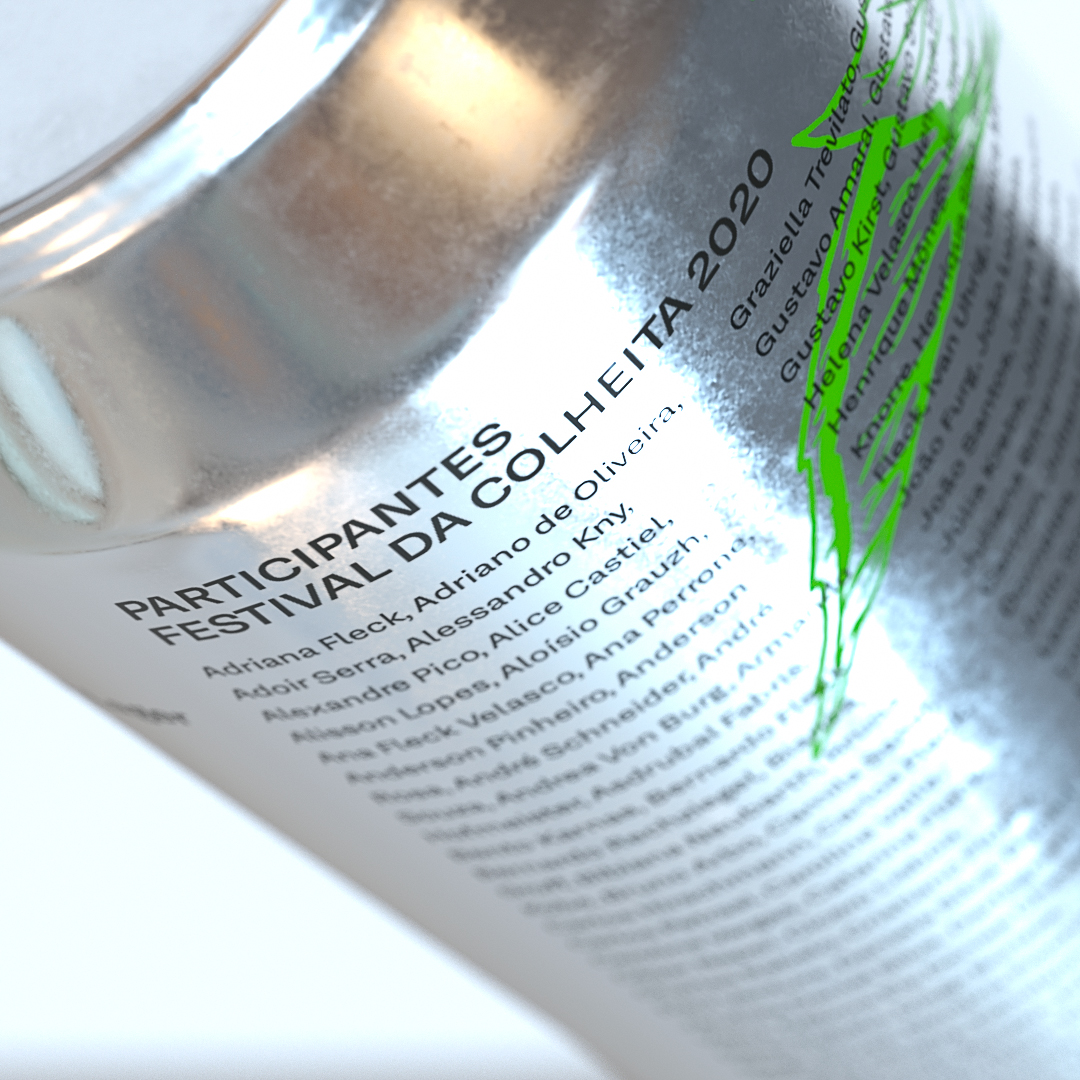
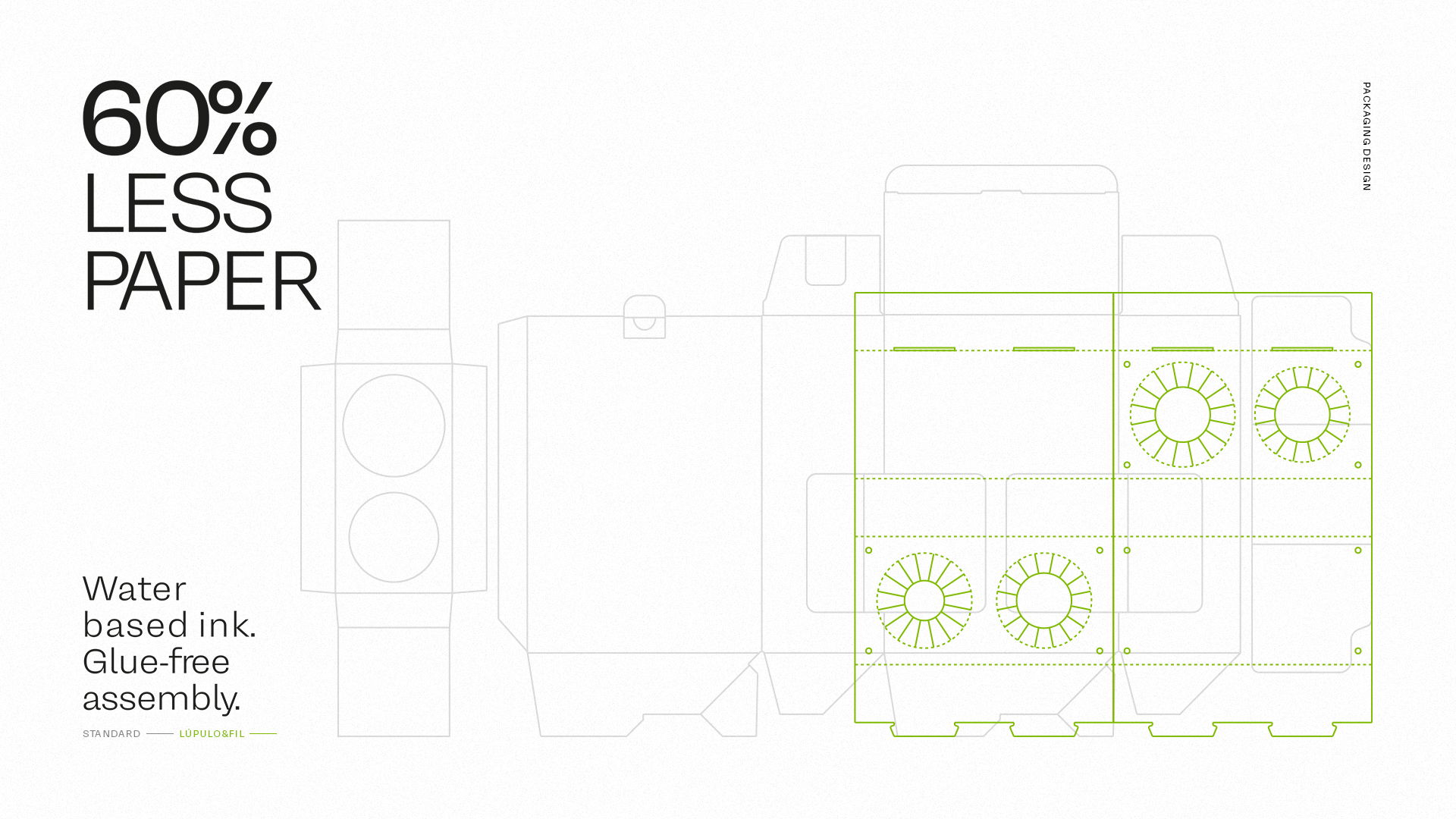
Also thinking of maximizing the positive impact on people and minimizing the negative on the environment, the packaging also fosters the relationship with people, containing the name of everyone present at the event. The kit reproduces sustainability points, valuing awareness and respect for nature, just as it is done on a daily basis in the brewery. Its composition has 60% less paper than traditional kits of the beer segment in Brazil, in addition to using only water-based ink and eliminating the use of glue, ensuring the recycling of the material.
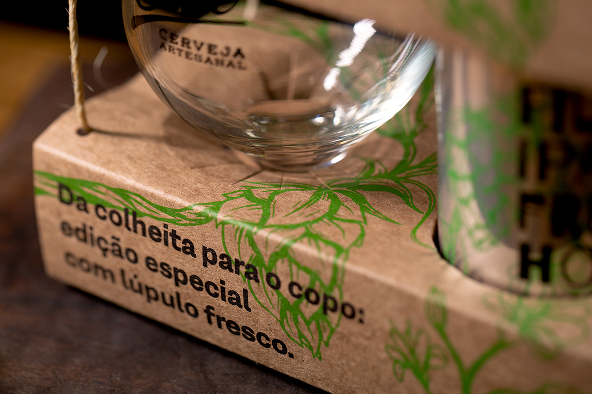
The verbal universe in the kit mentions the brand positioning and also encourages recycling. The hops present in the packaging’s identity were illustrated by hand, as well as the hop’s harvest was made. Typography seeks to bring less standardized forms, with a more organic character (such as handwriting).
With the festival taking place in early 2020, the brand started the path to be recognized as a farmhouse brewery: a brewery in the countryside that is supported by its own productions. In addition to the day-to-day experience, consumers began to understand the brewery’s content, which today shows its roots and the brand’s differentials in a more coherent way. The launch of the kit confirms the positioning and gives more strength to brand communication.

CREDIT
- Agency/Creative: StudioBah
- Article Title: StudioBah’s Brand Positioning Applied to Packaging Design for Farm House Brewery
- Organisation/Entity: Agency, Published Commercial Design
- Project Type: Packaging
- Agency/Creative Country: Brazil
- Market Region: South America
- Project Deliverables: Brand Experience, Brand Strategy, Brand World, Branding, Graphic Design, Packaging Design
- Format: Can, Case
- Substrate: Pulp Carton


