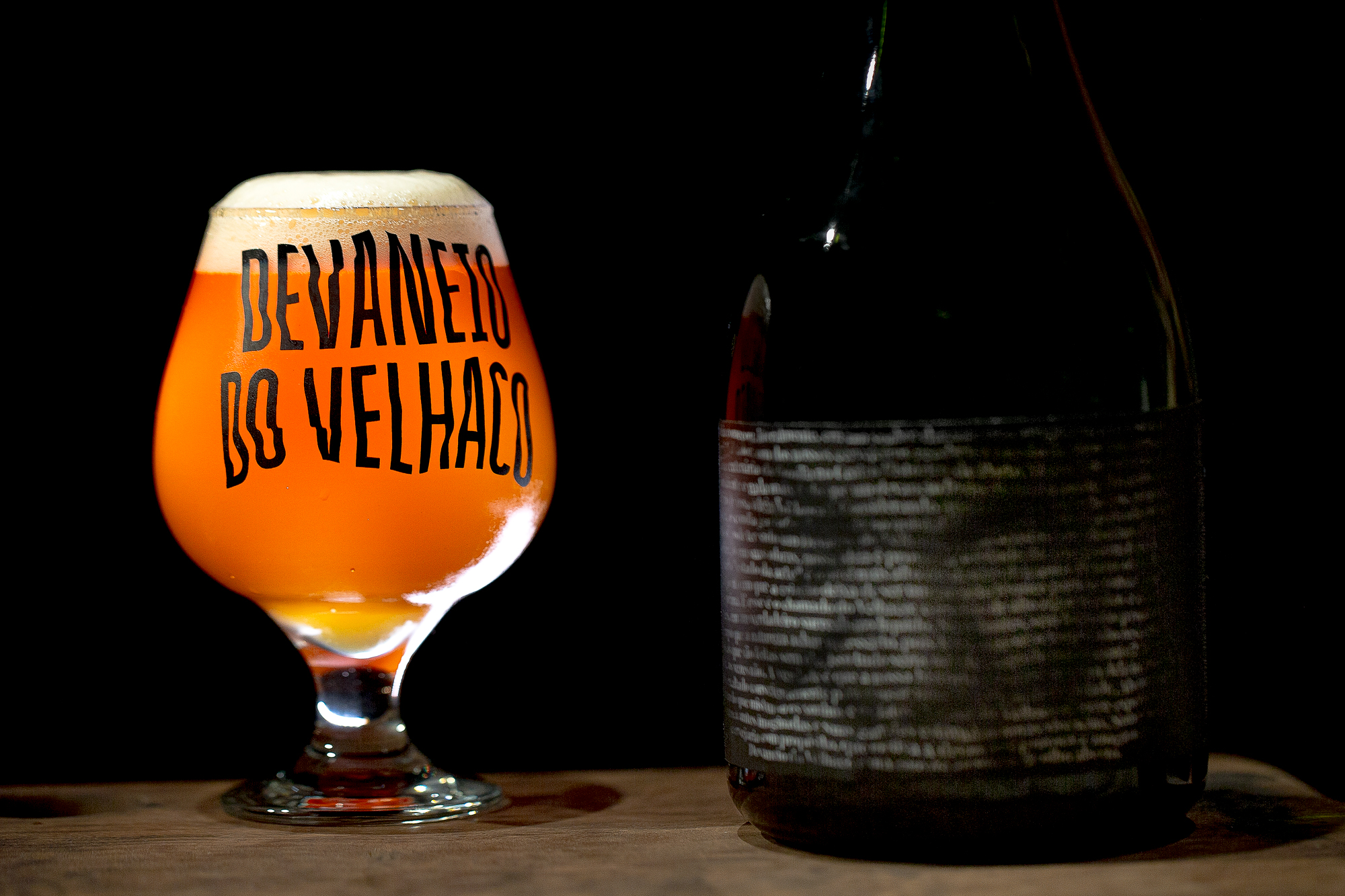
Devaneio do Velhaco [“Old Rogue’s Daydream”] is a brewery and bar in Porto Alegre / RS. The business’ idea began literally in a dream: in an imaginary conversation with his grandfather Salvador, one of the partners received the mission to open a brewery in the family’s old house in the historic center of the city.
Living a moment of expansion, the brewery began to bottle its beers to introduce the brand in other states of Brazil. Therefore, it was necessary to develop a packaging project that would expand and continue the brand experience outside the pub, the main brand touch point with the public until that moment.
So it was born the Old Rogue’s label, a packaging designed to represent the concept behind the brand and respect the needs of a business that recently completed its first year since the opening.
The initial project scenario had some particularities to consider:
1. seasonal beers that are usually only produced once;
2. each new recipe generates approximately 100 bottles for distribution;
3. the new beers releases happen 3 to 4 times a month.
Given the small production of each recipe in parallel with the constant releases, it would not be possible to create and to sustain a new label for each new beer, as it would slow down the company’s dynamics and would not be economically sustainable.
So, it was necessary a solution that would keep up with the subsequent releases, communicate the information of each new beer, and pass on the brand personality without burdening the company on production costs.
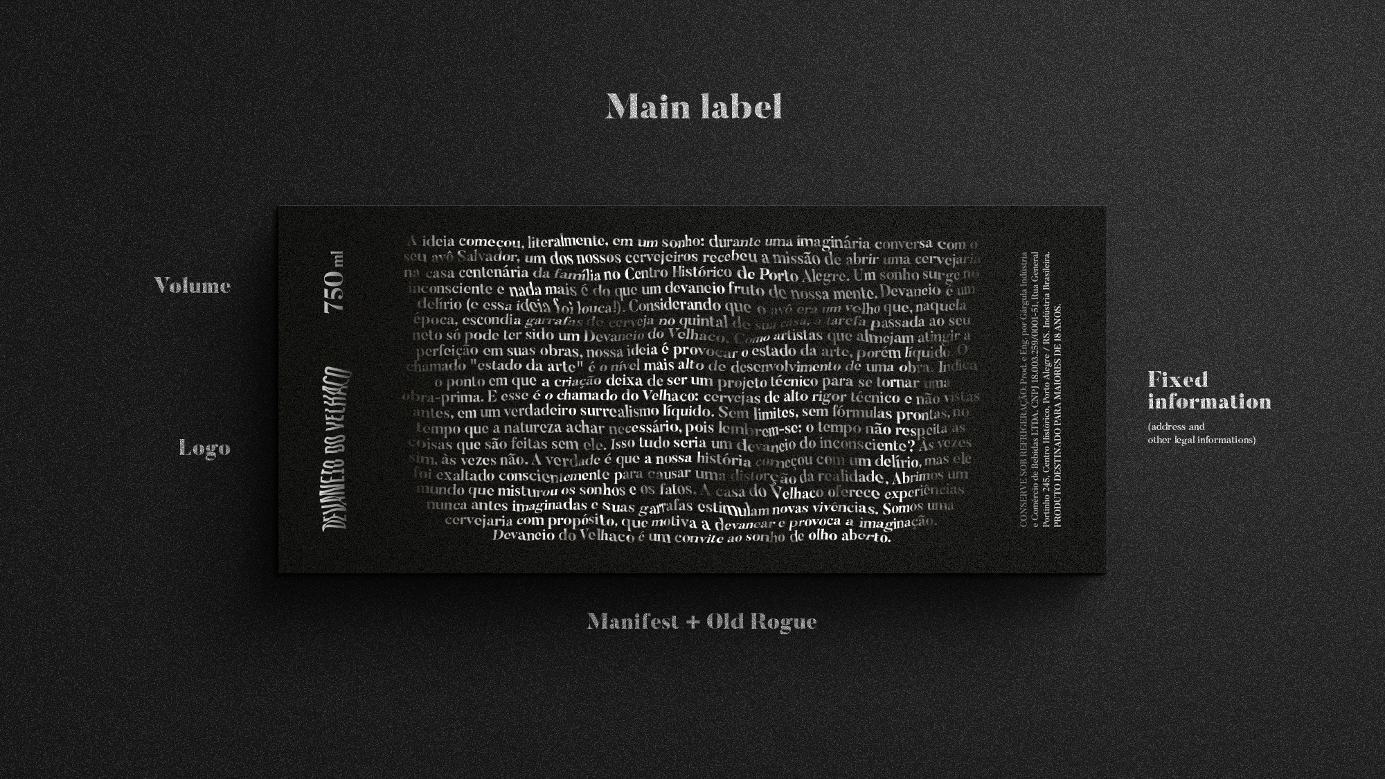
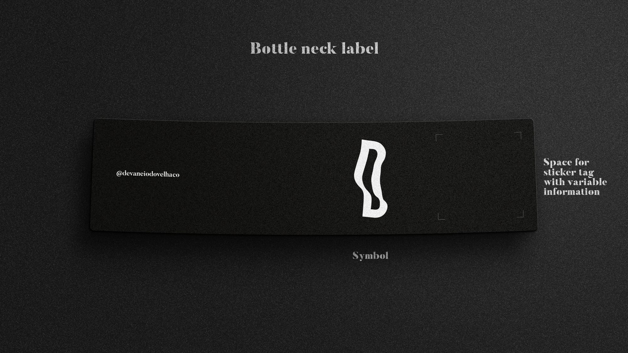
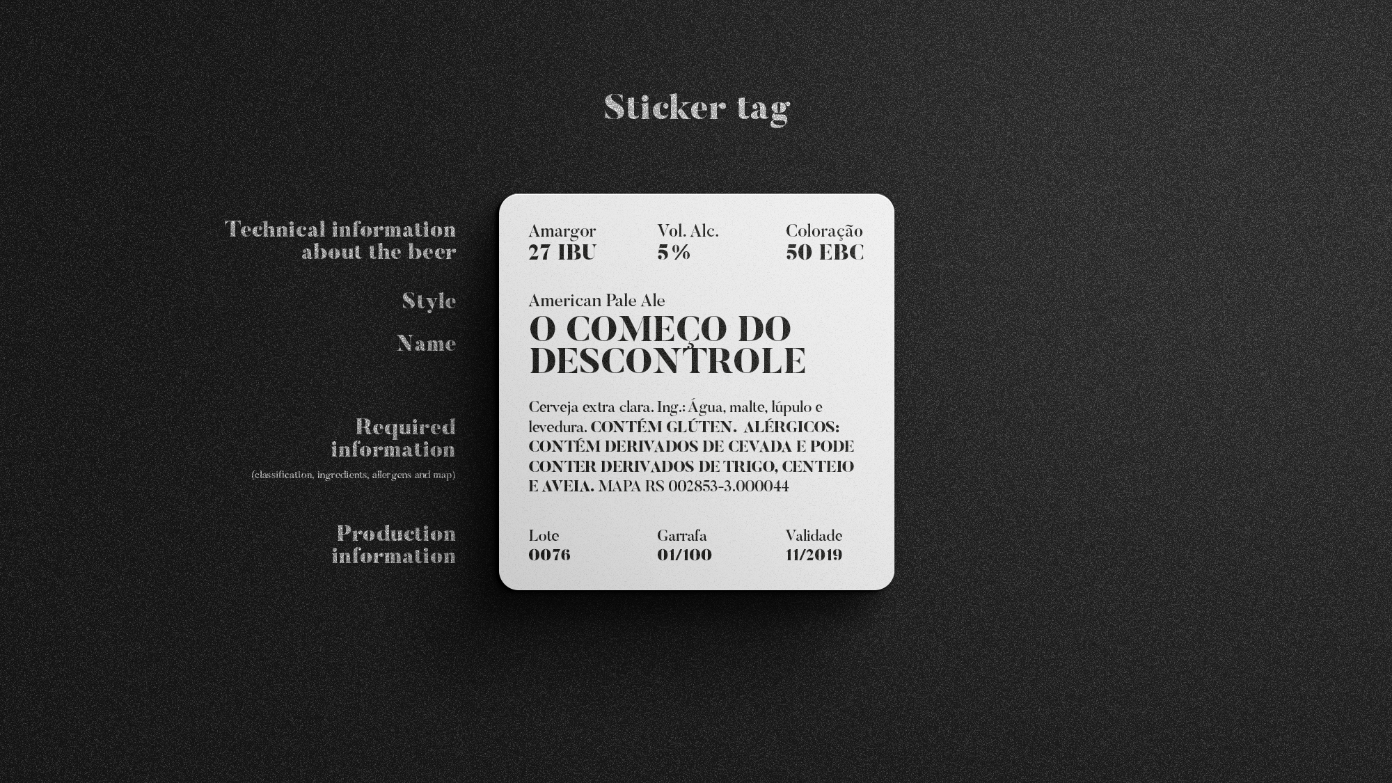
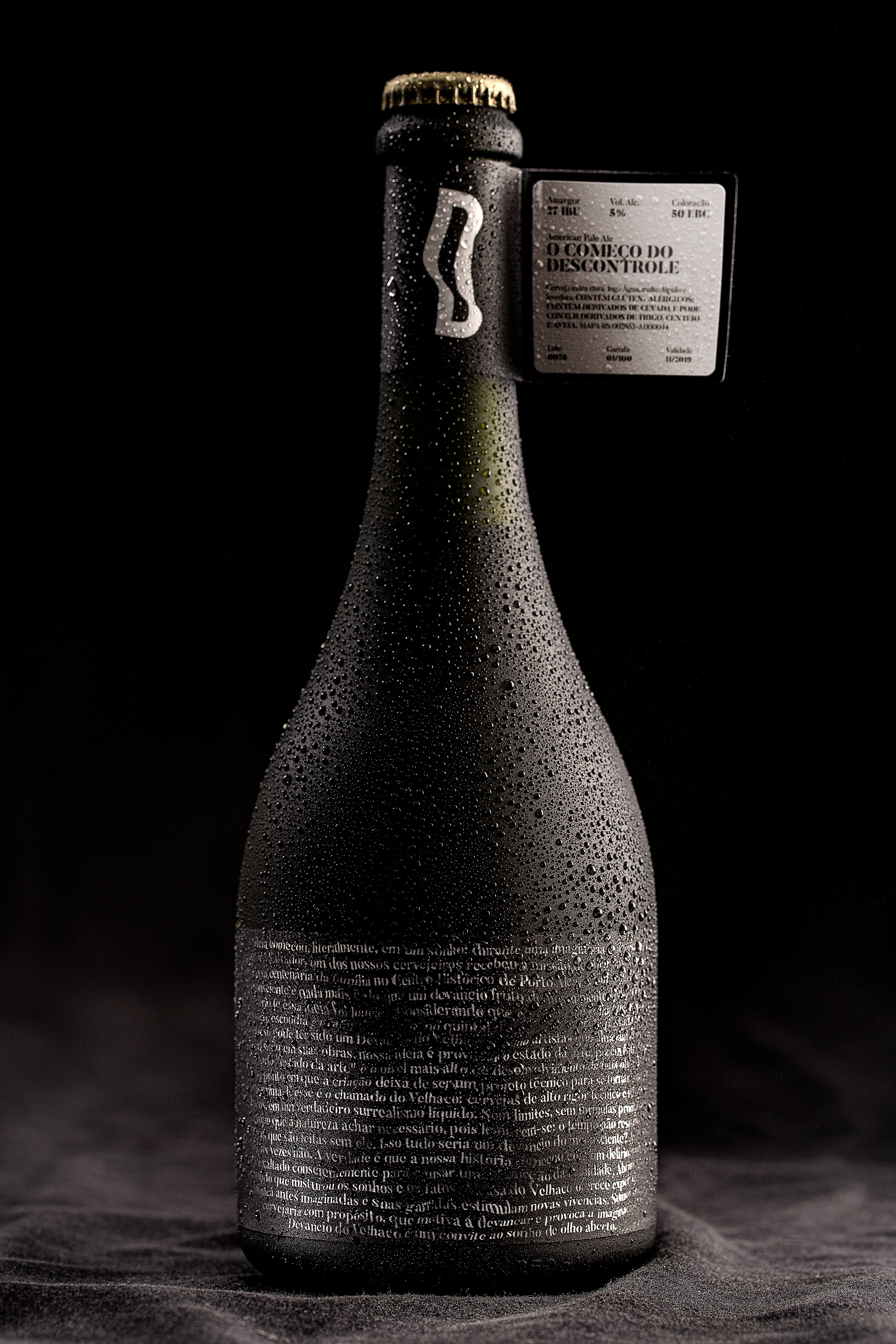
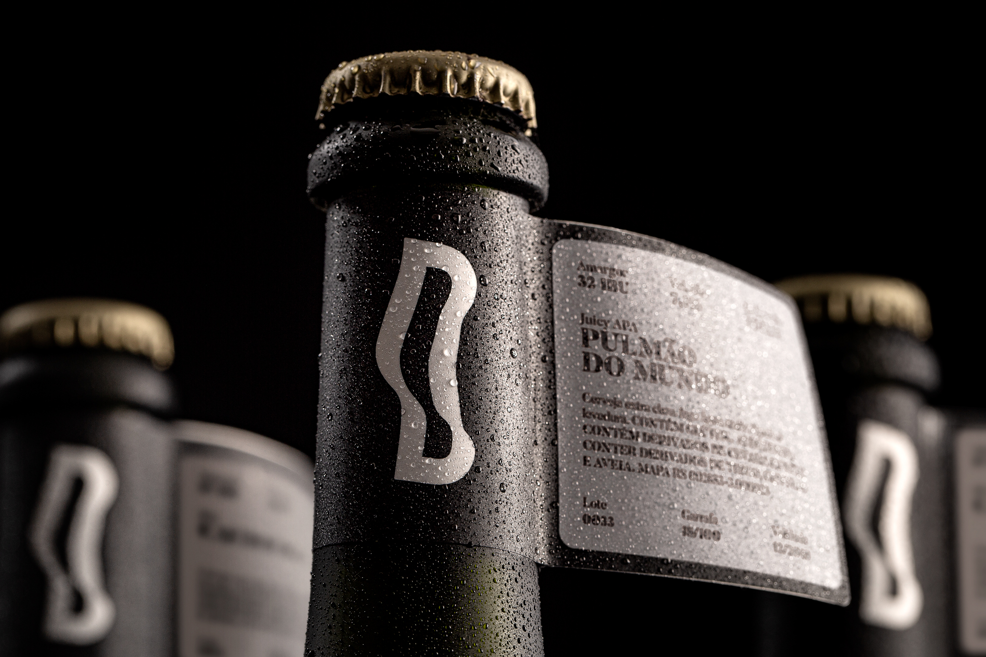
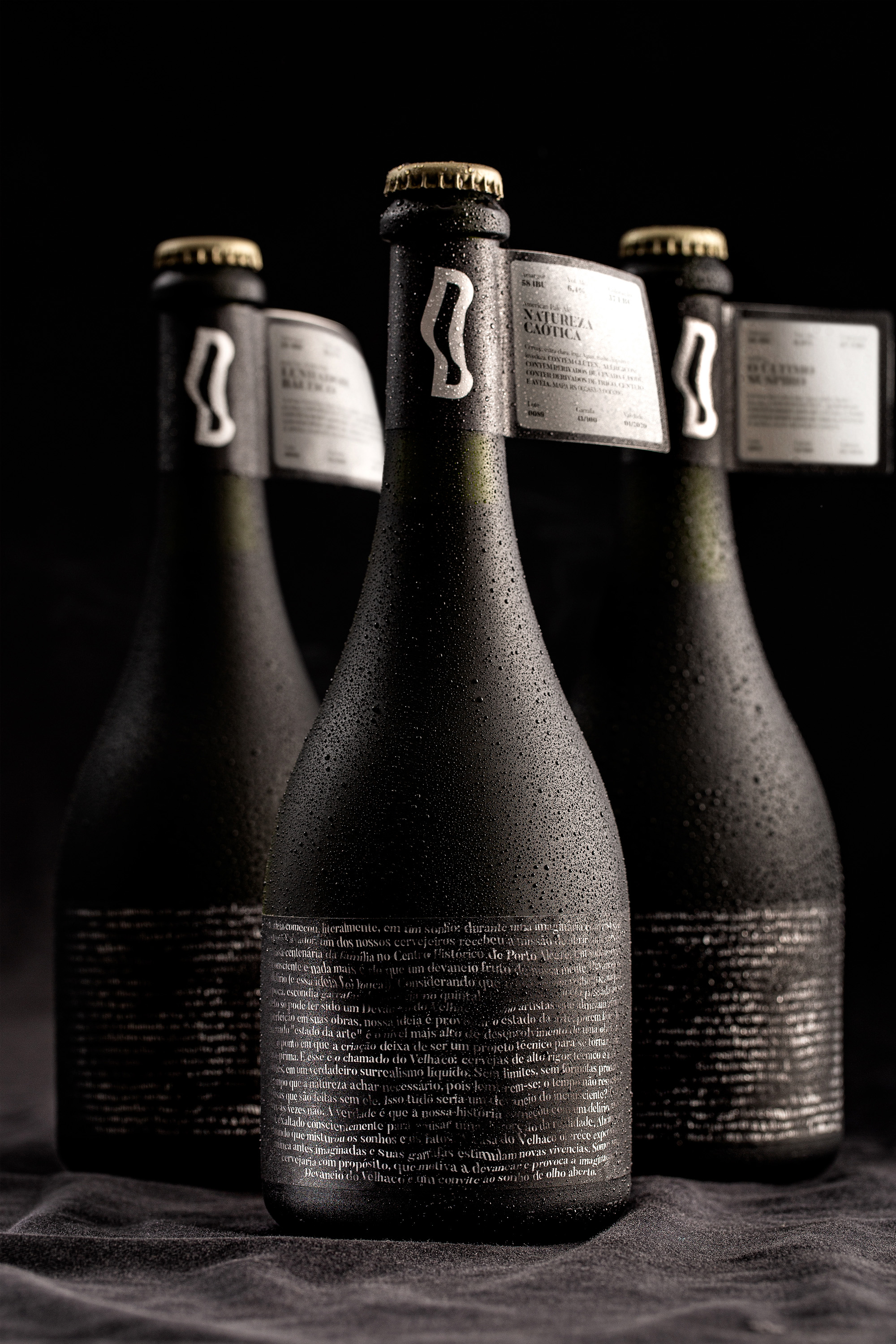
The idea has been to separate the label in 2 parts: the bigger one carries all the brand’s essence, and the smaller acts as a “flag” in the neck of the bottle. In this 2nd label is applied a sticker tag with technical information of each beer, being the only variable element of the project, allowing the packaging to follow the diversity of recipes.
As a solution to fill in the tag it was suggested the acquisition of a specific printer, so that the partners themselves can easily complete the information in a previously created graphic hierarchy and following the visual patterns.
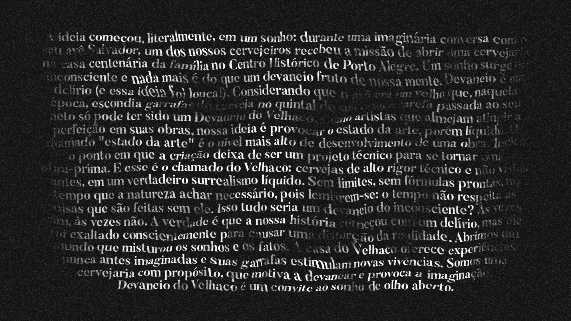
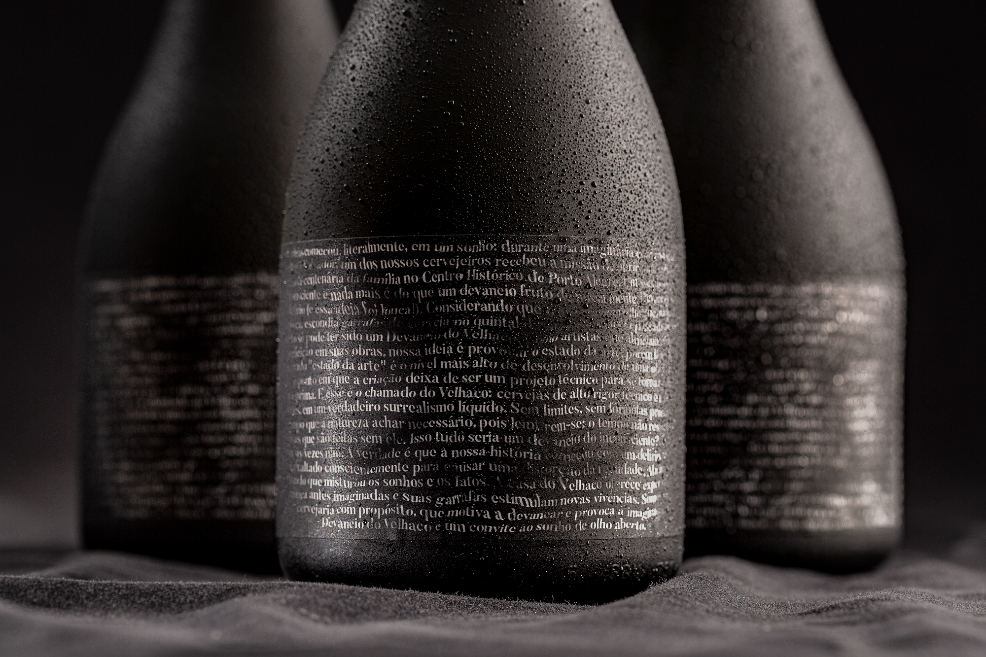
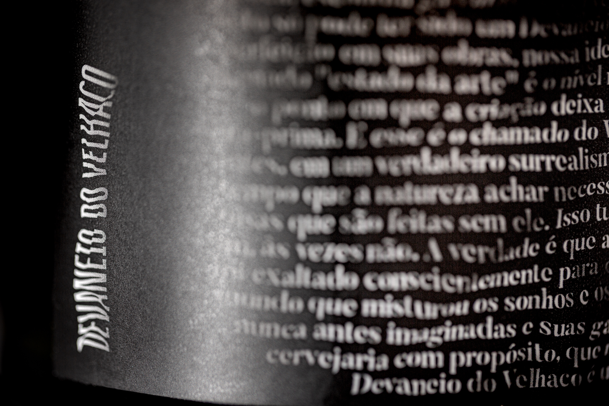
At the visual level, the brand is represented in different ways. Its story is told in the text, but there is an optical illusion when facing the label. Facing it closely, only words are read. But when it is viewed from afar, an old man appears formed by the distortions of the text itself.
The result meets different project needs: in addition to meeting the company’s expanding business demands, it also respects the launches logistics, avoiding the production of labels with each new beer, and also generates lower costs to the company, because the labels have been printed on large scale, which brought savings to the company in the unit price.
The solution also represents an expansion of the branding project to a new brand touch point. The packaging combined with the product continues to materialize the brand idea of liquid experiences never before imagined, stimulating curiosity. Nowadays, Devaneio do Velhaco is inserted in many states of Brazil with its bottles present in different events and stores.
CREDIT
- Agency/Creative: StudioBah
- Article Title: StudioBah Plays with Typography to Create Devaneio do Velhaco’s Label
- Organisation/Entity: Agency, Published Commercial Design
- Project Type: Packaging
- Agency/Creative Country: Brazil
- Market Region: South America
- Project Deliverables: Brand World, Branding, Graphic Design, Packaging Design
- Format: Bottle
- Substrate: Glass Bottle


