” DESCRIPTIONIdentity creation of a new a new craft beer that pursues the idea of liberation front industrialized beers. The identity should evoke the essence of the beer with soul in an irreverent way, talking to the paradigms of the brand and giving each label its own personality. Launched in June 2014.GOALSThe main objective of the brewery brand building was to make it a reference in the craft beer world and, above all, in the fight against the standards imposed by the large industries when bringing a product to the market with much higher quality. An alive beer, which remains chilled from the beginning of its logistics until the consumer, produced with care and emphasis on the real taste, being the opposite of the great brewers industries. The transgression of rules and the will to make something different became clear. The pillars of the brand were therefore defined: freedom, innovation, integration and irreverence.”
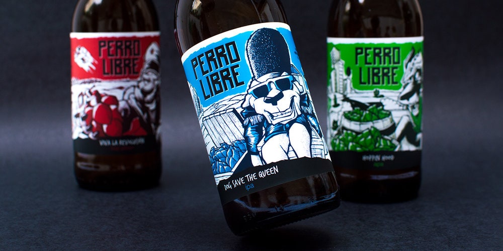
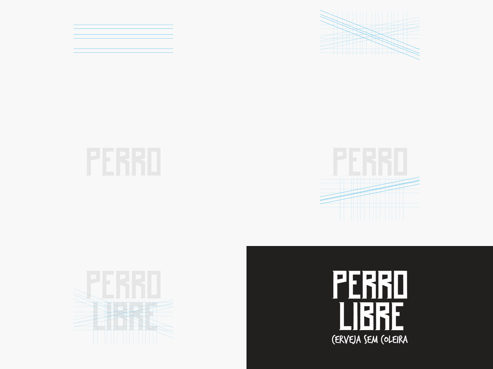
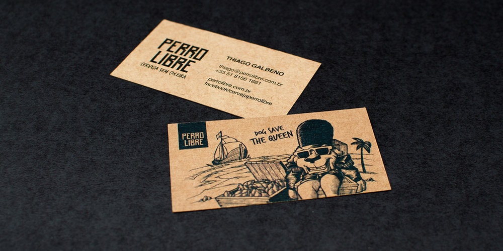
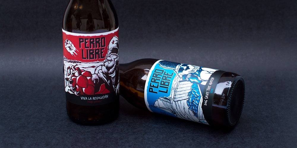
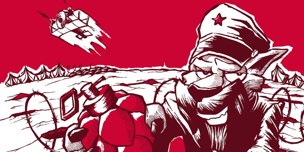
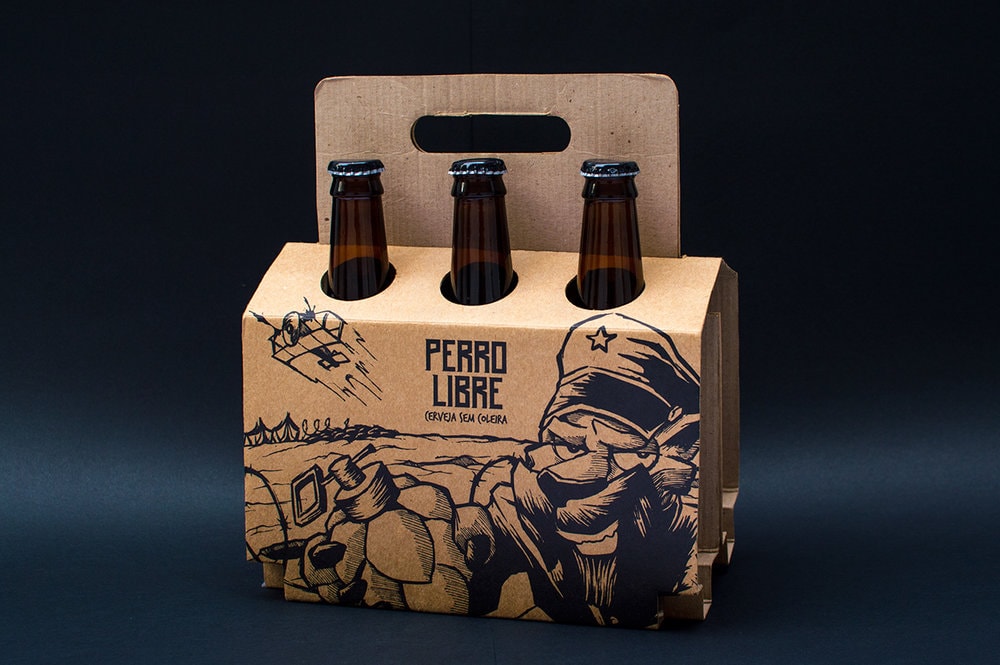
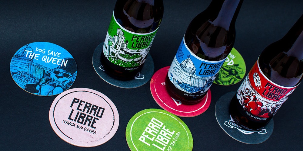
“RESULTSThe definition of strategies and brand positioning initiated the project, which guided the entire development of the product labels.The naming process defined the most relevant points to the brand and indicated Perro Libre as the name for two reasons: 1) to maintain the reference to the dog, already present on the first brand name, and rely on man’s best friend image assigned to the animal; 2) the word “free” refers to a rogue, irreverent and ownerless animal. From that arose the position of “drop the leash,” which reinforces the idea of liberation front industrial beers.The identity should evoke and reiterate the essence of beer with soul, and each label should have its own personality. It was traced, then, a visual and verbal line to talk to the paradigms of the brand, especially with regard to the idea of being free from conventionalities present in the positioning and communication of other products from brewing segment. It was decided that each of the beers should tell a story and bring itself the image of the dog. Illustrations were chosen to translate this concept and build the brewery identity. The figure of Perro Libre came to life.”
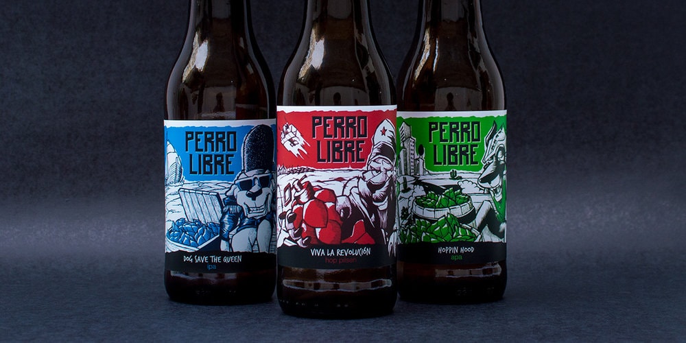
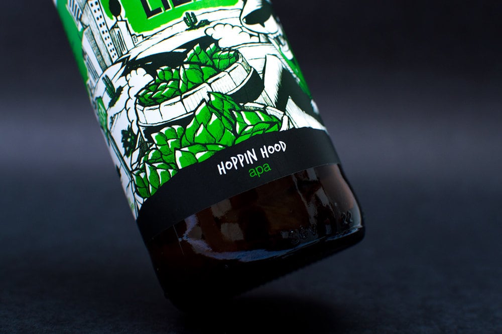
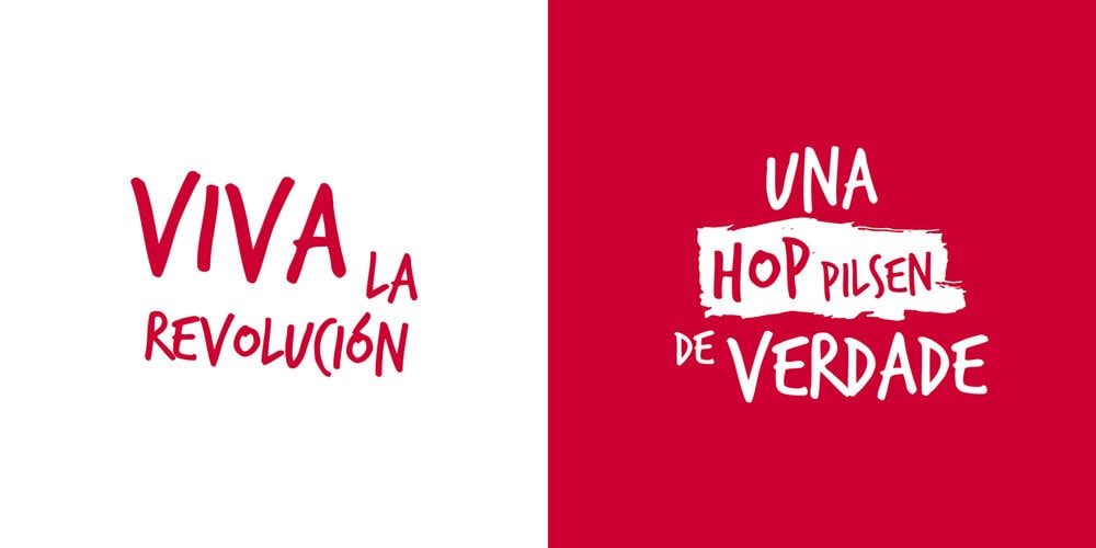
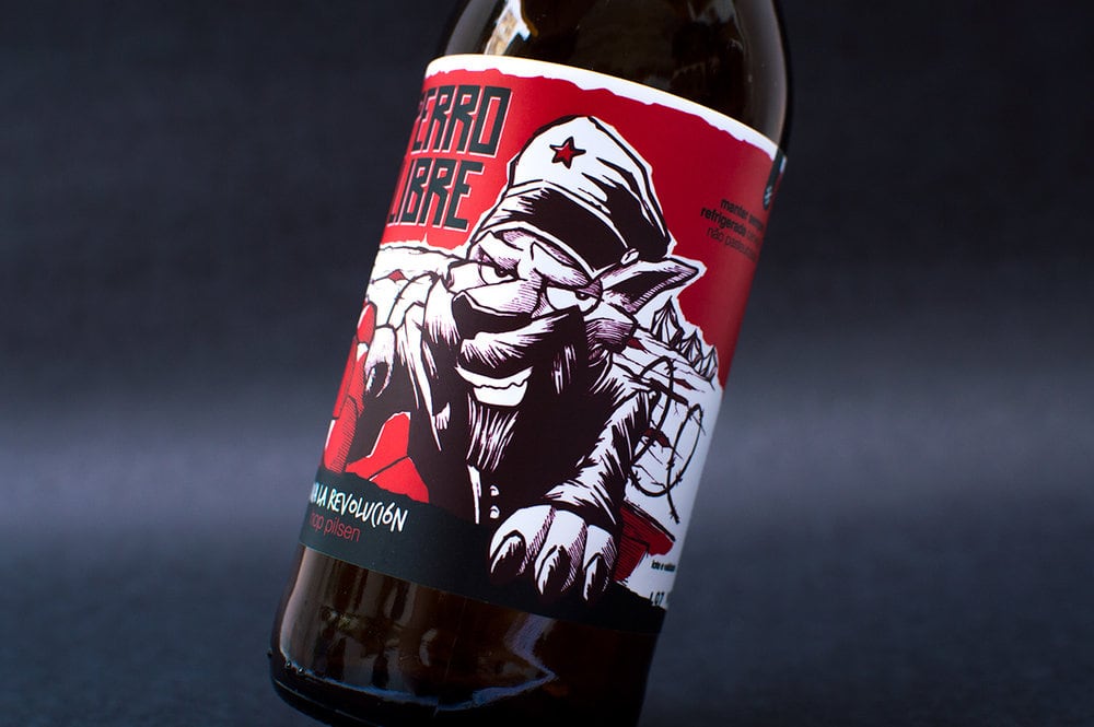
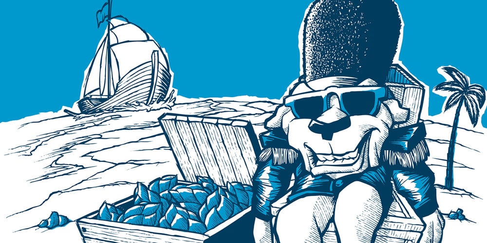
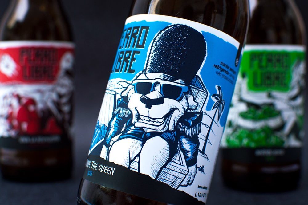
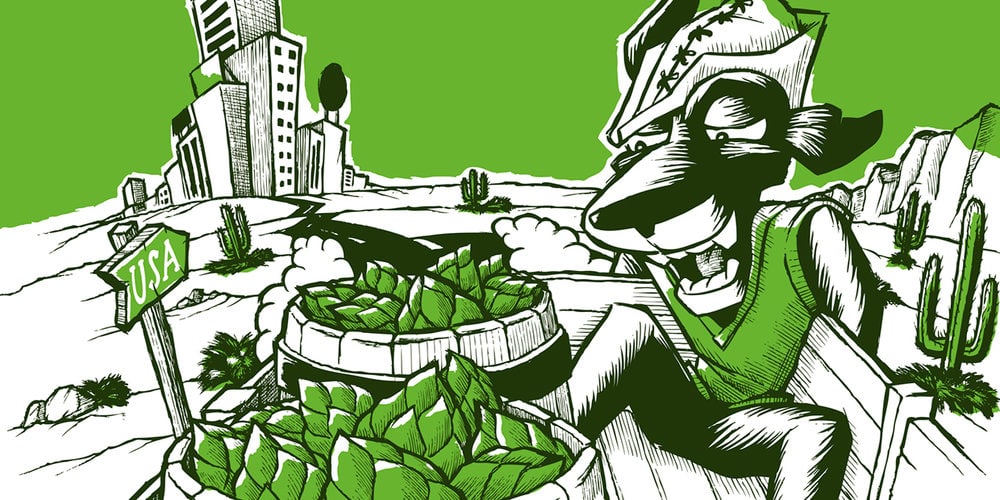
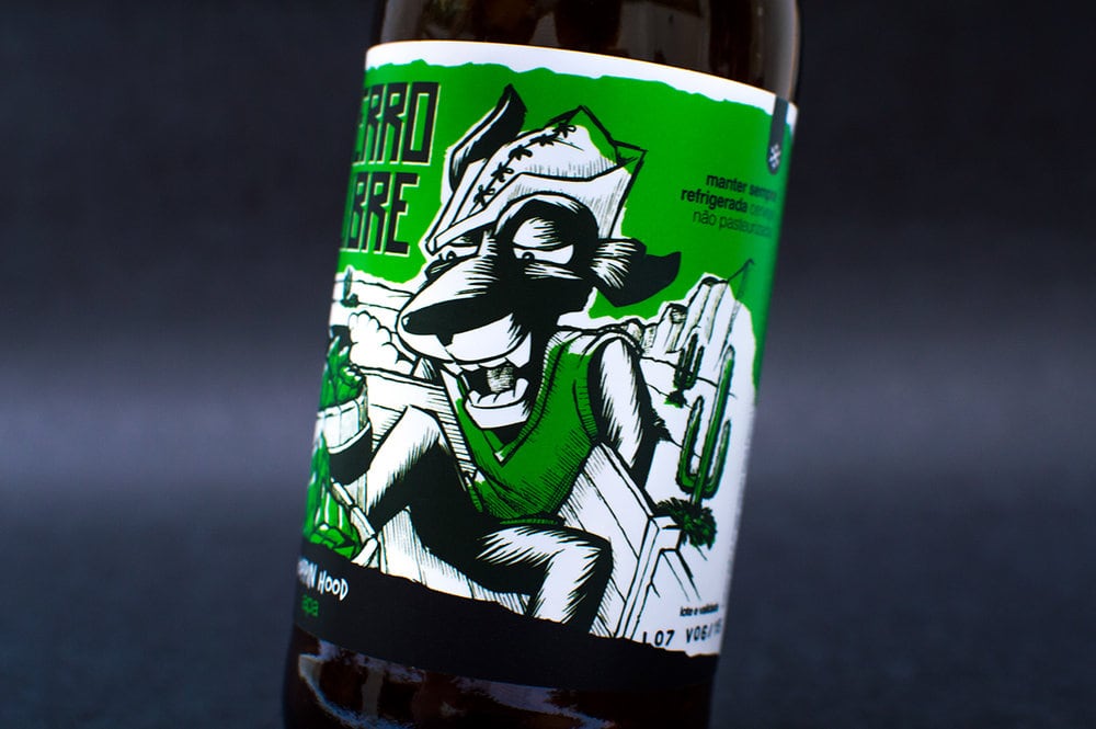
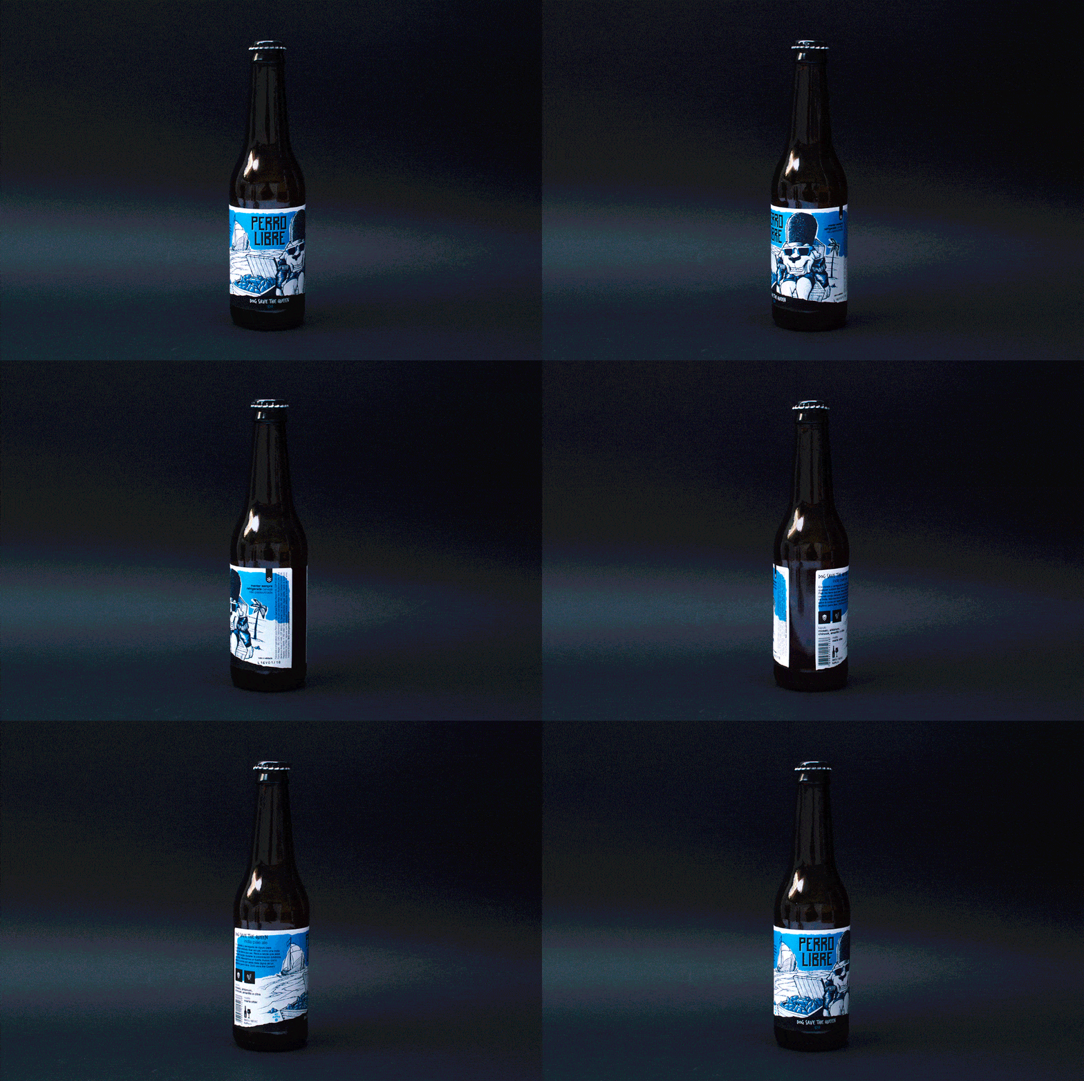
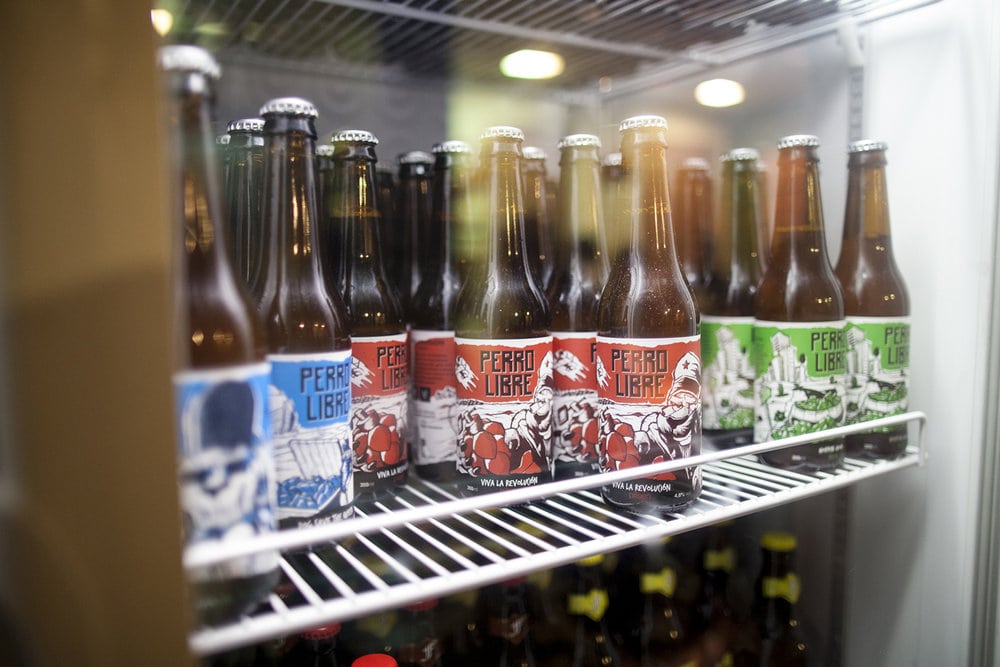
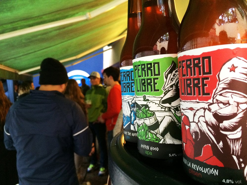
“From the three styles of beer, names were created for each label. The Pilsen – most common style among breweries – became “Viva la Revolución”, strongly marking the position to revolutionize the industry with a different and daring version of a recipe theoretically traditional; the India Pale Ale – beer that appeared to be sent to the British army during the colonization of India – has resulted in “Dog Save the Queen”, mixing the brand personality with the known saying of the english people. Finally, the American Pale Ale – north-american revenue marked by the strong presence of american hops – gave life to “Hopping Hood” and the figure of Robin Hood Perro, who crossed the US border in search of the best American hops for your beer.The labels were created to give freedom to create and adapt to each style, which distance, once again, Perro libre from the traditional brewing formats of a single surrounding label covering almost the entire perimeter of the bottle. The illustrations with “dirty” and simplified traces completed the irreverent and revolutionary tone that was sought for the brand, as dictated by the dog figure, the word games and ideas present in the names of each beer and also in the concept of “drop the leash”, reaching thus the main objective of the project.”
