We live in a society where females learn to feel shame and even disrespect their bodies. But this can no longer be the reality, even more so when we talk about women’s health.
Yuper was born, therefore, to prove that women deserve more. It starts with “menstruation without taboo” as its embryonic concept. Transforming the way we deal with menstruation, the brand promotes the reeducation and liberty to talk about the subject, as well as rethinking habits and concepts around the menstrual period. The new company sells products like menstrual cups and discs that collect menstrual flow in a healthy way for the body.
The branding concept begins with a positioning strategy, unfolding in different ways to verbally and visually materialize the brand’s purpose, with the packages as the brand’s main touch points to the audience.
The presentation of the brand’s positioning starts with the name. A neologism was created in which Yuper is the combination of the words “Your+Period”. Thus, the brand’s declared speech about menstruation is implicit, since the beginning, just like the encouragement for women to assume “Your Period”. The tagline, on the other hand, brings an intentional and provocative ambiguity when exploring the word “periods”. On the one hand, it talks about living in new times with new concepts around menstruation. On the other hand, it brings the idea of a whole new relationship with the menstrual period.
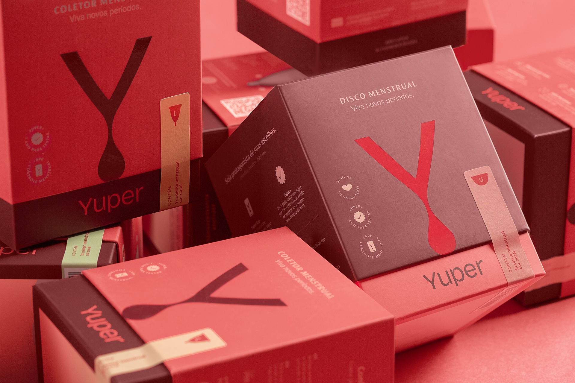
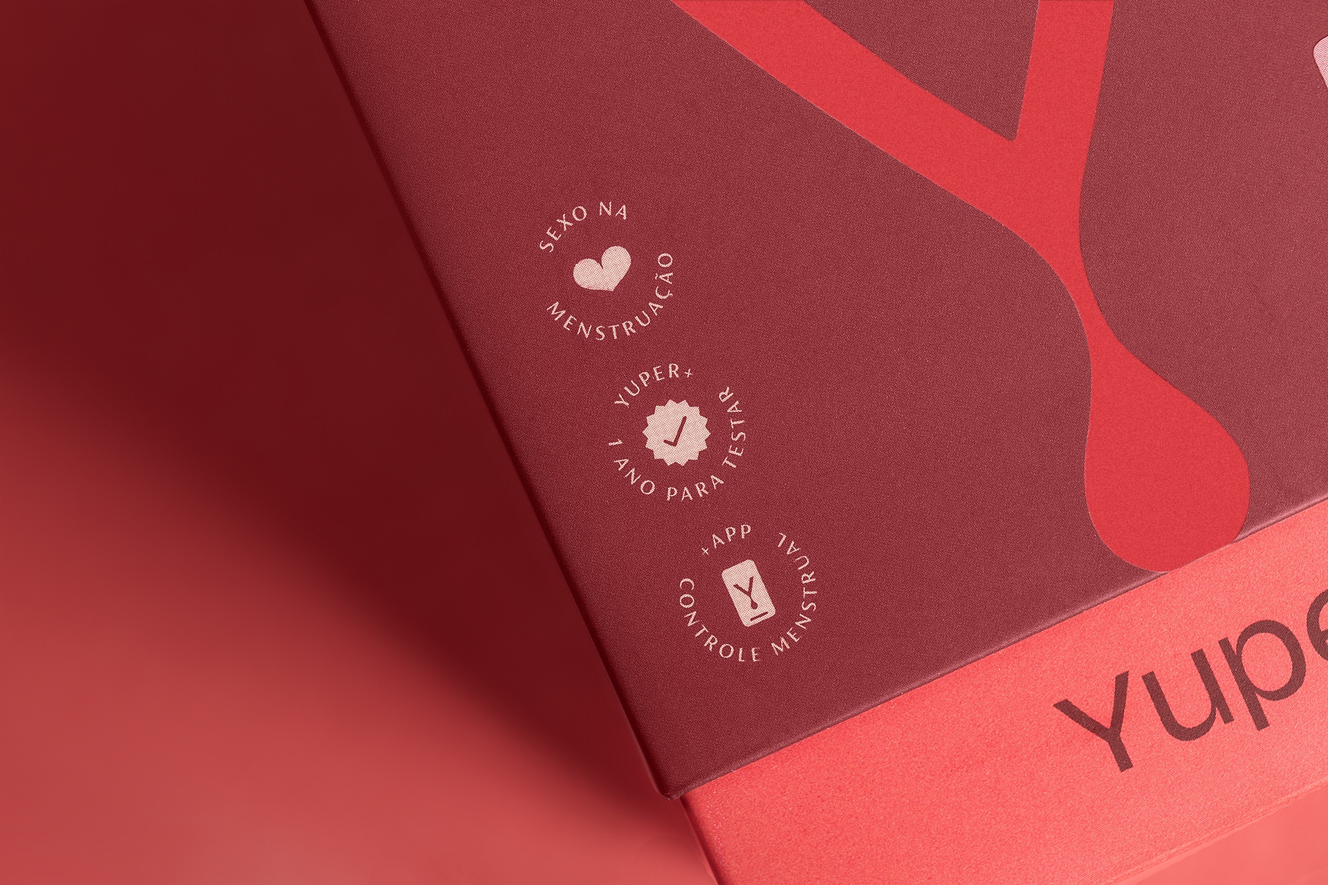
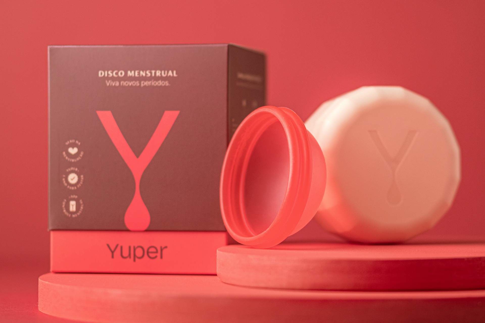
During the creation process, there was a clear association of the 1st letter of the brand (Y) with the silhouette of the region of the female body in vogue. From there, a symbol is created that experiences the menstrual cycle through the integration of a drop of blood that flows from the Y. Thus, a powerful form emerges that synthesizes the essence of the project: women as protagonists, facing the natural flow and treating menstruation without taboos.
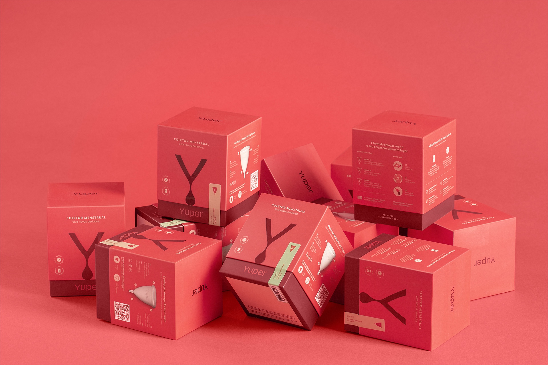
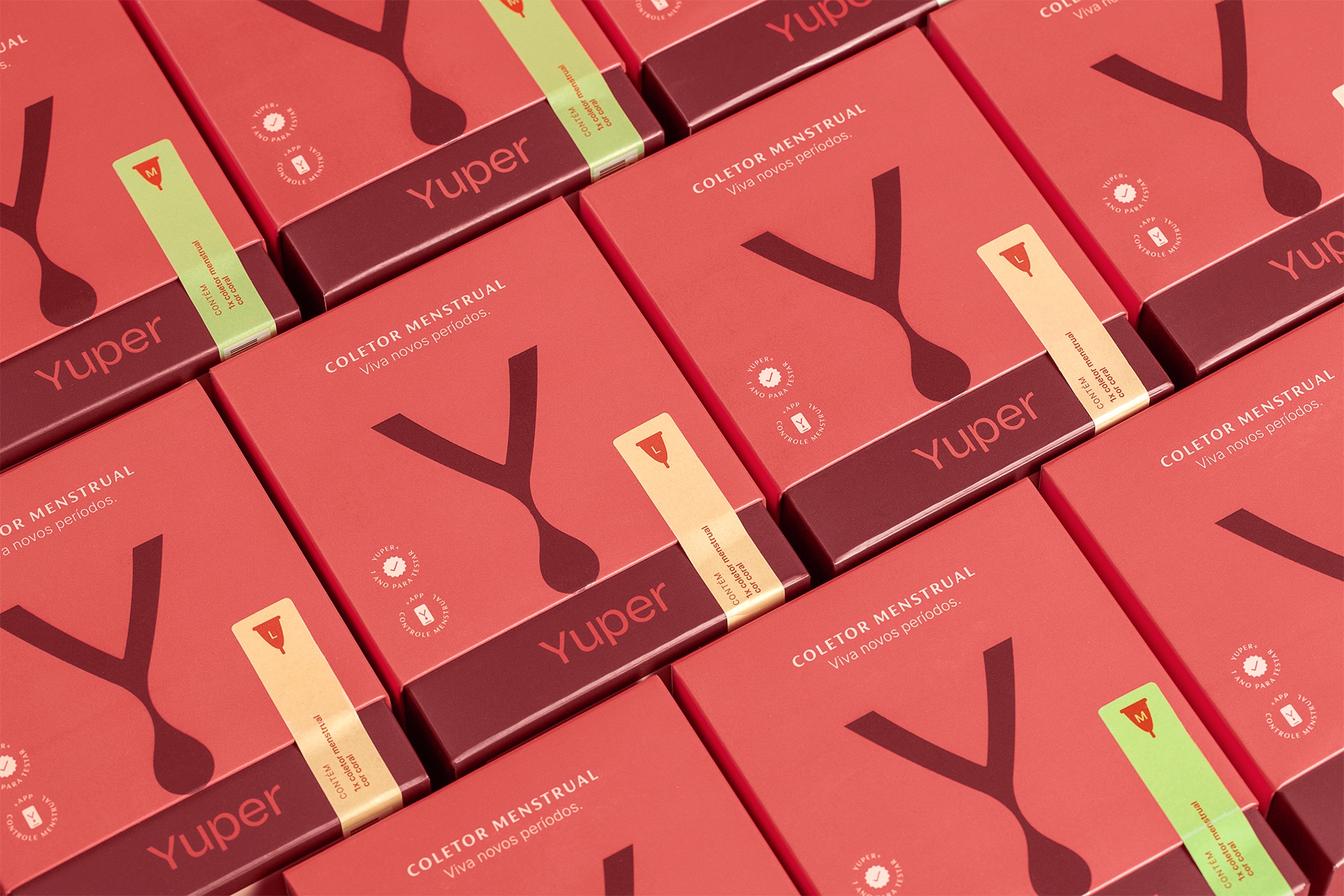
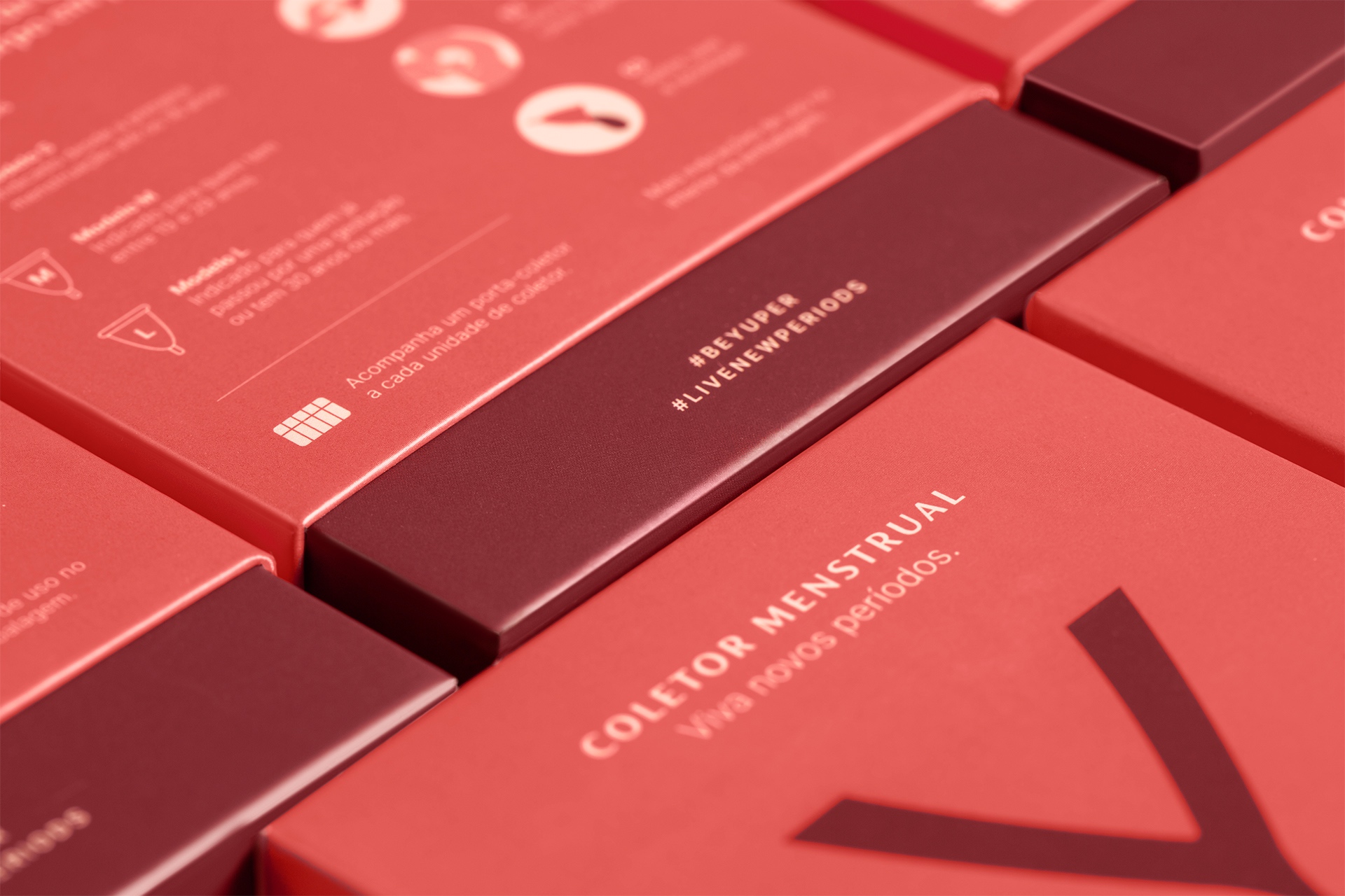
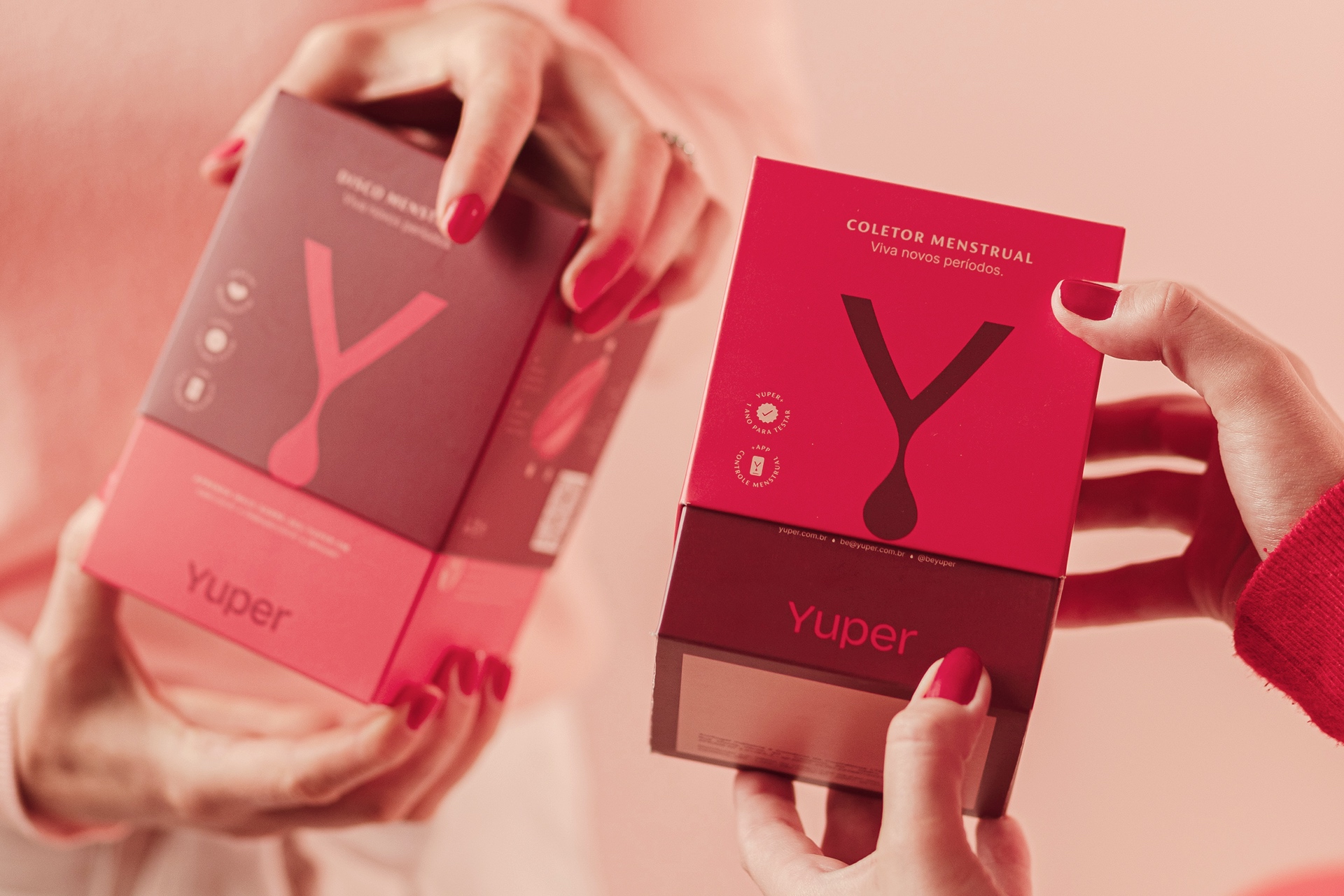
This synthesis achieved in the Y enabled its use as a central element in the construction of the packaging’s visual system, the brand’s main communication materials. The homogeneity generated by the application of the symbol in the family of materials enhances the highlight on the shelves. The shades of red are striking to the eye and make the packaging differ from the more “feminine” colors of the brands in the same segment.
The use of the verbal universe in an evident way in the packages is another strategy to emphasize the brand’s positioning, while the identity system as a whole reinforces the purpose.
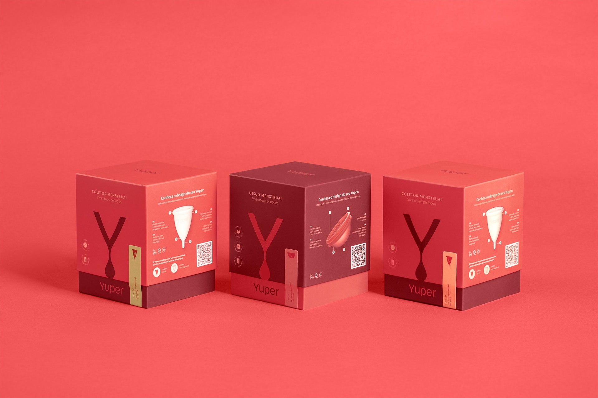
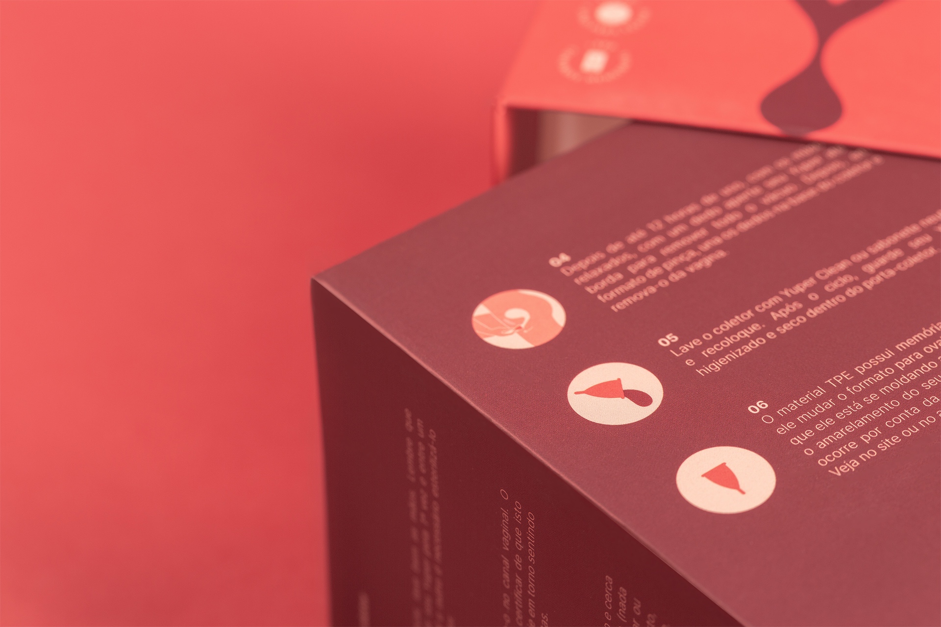
For sustainability purposes, all technical information and product use are projected on the boxes, without the need for a manual – which helps to ensure that they are not discarded, but reused for other purposes.
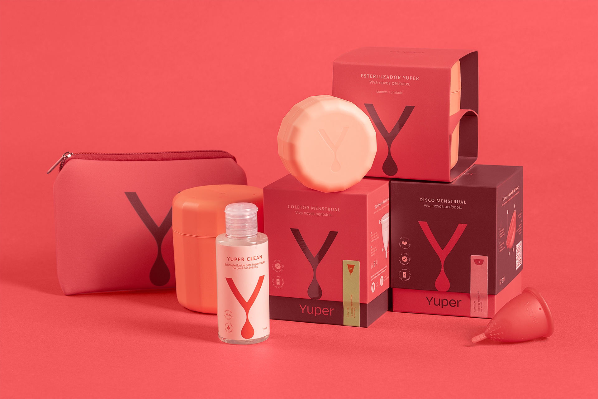
The chromatic palette was conceived from the phases of menstruation, as the tones of the blood change according to the intensity of the flow, with the intention of making the theme explicit once again, without softening it. The color hierarchy is applied in such a way that the packaging of the main products (cups/discs) receives the brand’s primary colors, while the complementary products assume the secondary colors.
There is also the detail of the symbol touching the lower edge of the box. As the Y always receives the same color as the base of the box, the unboxing represents the blood coming down and filling the collector/disk.
A versatile packaging is also generated, where the same format is capable of receiving different variations and combinations of products, identified through an informative label that also fulfills the role of sealing.
As a result, the project’s objectives are met: 1) to provide an unboxing experience that generates a connection between the user and the brand; 2) highlight on store shelves; and 3) reuse intention.
In a context in which the society needs to rethink menstruation scenarios, the project directly contributes for Yuper to promote the review of concepts on the subject and to deliver informative content about the female universe. Through consistent, coherent communication and clear positioning, Yuper starts to encourage women to take their place as the protagonist in their relationship with themselves, being the central motivation of their choices for a lighter life around menstruation.
The brand was launched in June/2021 and today it already has expressive and growing numbers of followers on social media, resulting in the consolidation of sales and a strong relationship with the female community, represented and embraced by relevant Brazilian digital influencers.
CREDIT
- Agency/Creative: StudioBah
- Article Title: StudioBah Design Branding and Concept for Yuper a New Menstruation Product Experience
- Organisation/Entity: Agency
- Project Type: Packaging
- Project Status: Published
- Agency/Creative Country: Brazil
- Agency/Creative City: Porto Alegre
- Market Region: South America
- Project Deliverables: Brand Design, Brand Naming, Branding, Graphic Design, Packaging Design, Photography, Product Architecture
- Format: Box
- Substrate: Pulp Carton
- Industry: Health Care
- Keywords: Health Care; Women Health; Menstruation; Period; Menstrual Care; Menstrual Cups; Blood
-
Credits:
Strategic Direction:: Natália Athayde Porto
Creative Direction:: Felipe Bernardes Amaral
Strategy Team:: Bianca Groff
Naming:: Felipe Bernardes Amaral, Natu00e1lia Athayde Porto
Design Team:: Ana Beatriz Nunes, Bianca Groff, Maria Laura Jeremias
Verbal Universe:: Natália Athayde Porto
Illustration:: Alícia Camejo
Typography:: Sauê Ferlauto
Photography:: Duda Bussolin
Retouch:: Carlo Barros


