


Petras Agroindústria is a family-owned business with more than 25 years in the market, specializing in eucalyptus wood treated in autoclave, barbecue charcoal, and cut wood for the construction industry. Sustainability is central to their operations, with every harvested tree replanted. Their barbecue charcoal is known for its quality and longevity compared to cheaper alternatives. Seeking to elevate their corporate and consumer-facing image while maintaining strong recognition among loyal customers, Petras undertook a comprehensive redesign of both corporate branding and barbecue packaging.
The Challenge
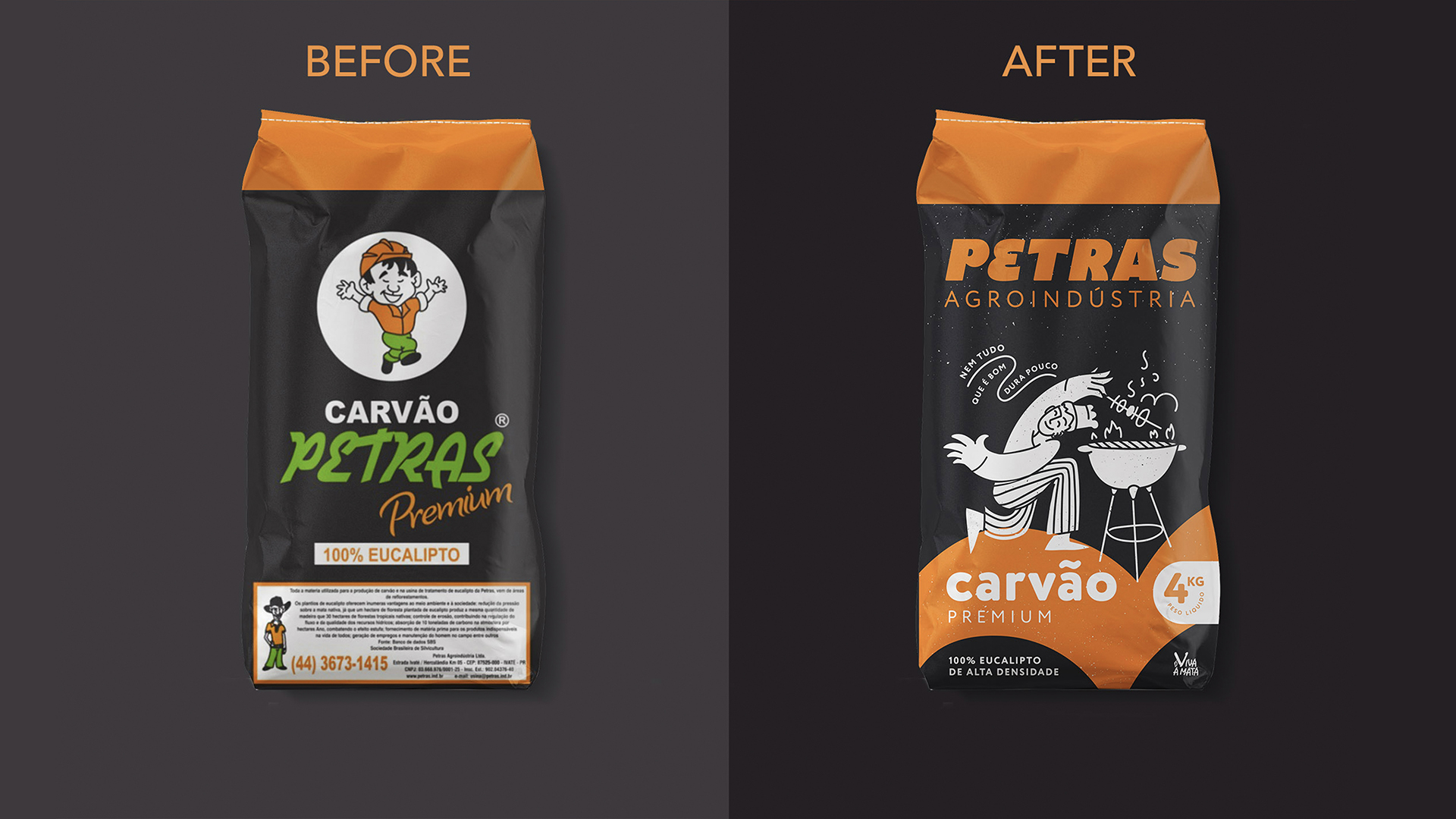
While highly recognizable, the existing branding had become dated. The font choice and mascot a cartoon-style illustration no longer aligned with the premium, sustainable positioning of the brand. The redesign needed to modernize the identity while retaining core elements familiar to long-time customers, bridging heritage with a contemporary look and feel.
Corporate Identity
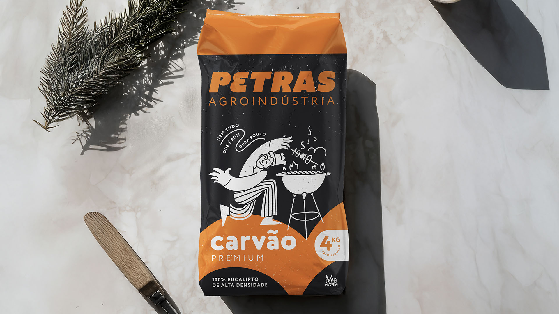
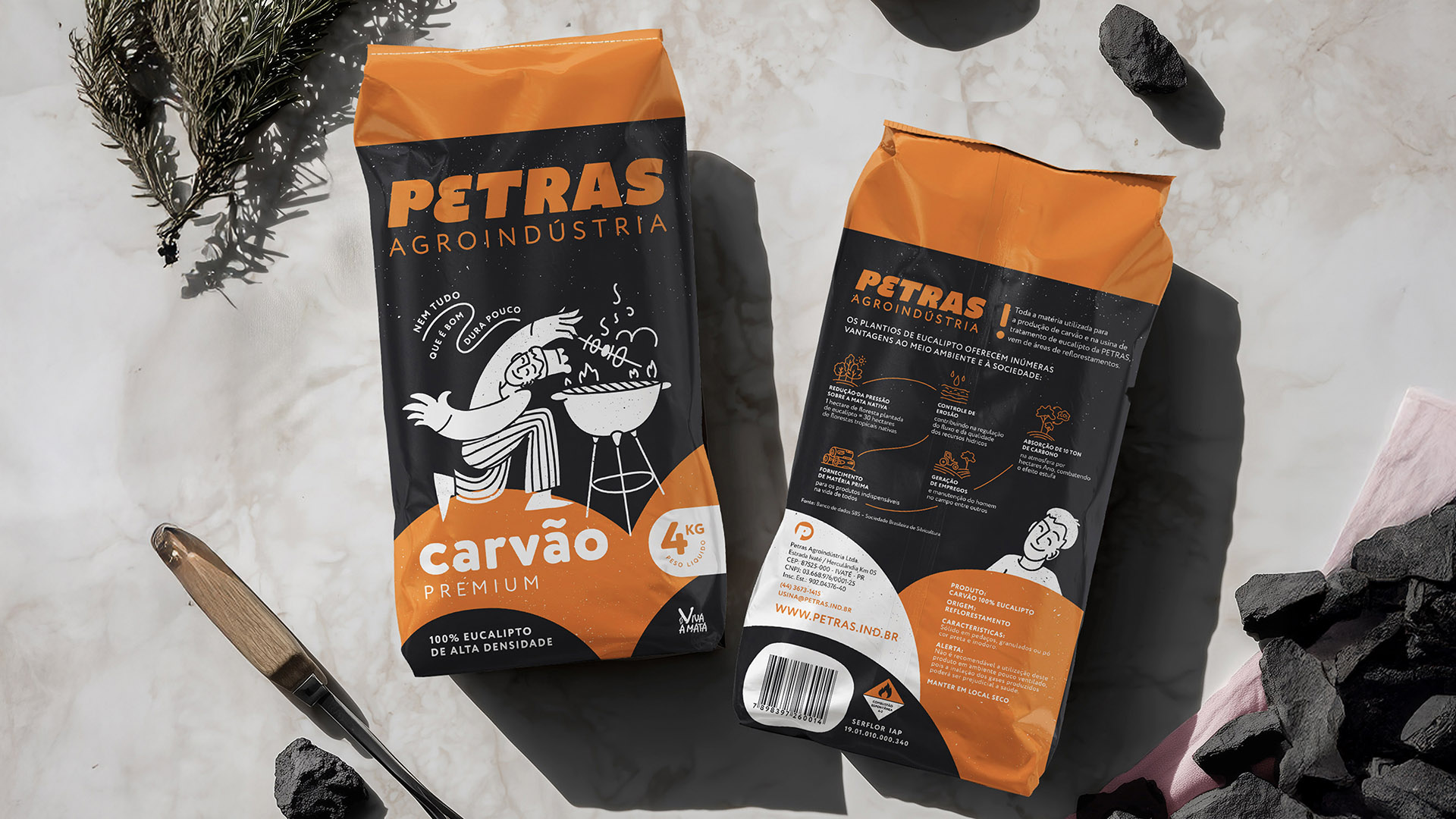
The logo was refined, keeping the distinctive tilted typography and iconic “E” while modernizing its overall appearance. This maintained a clear visual connection to the original identity while introducing a more contemporary and balanced design.
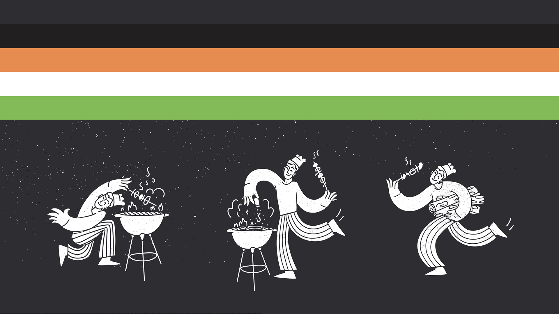
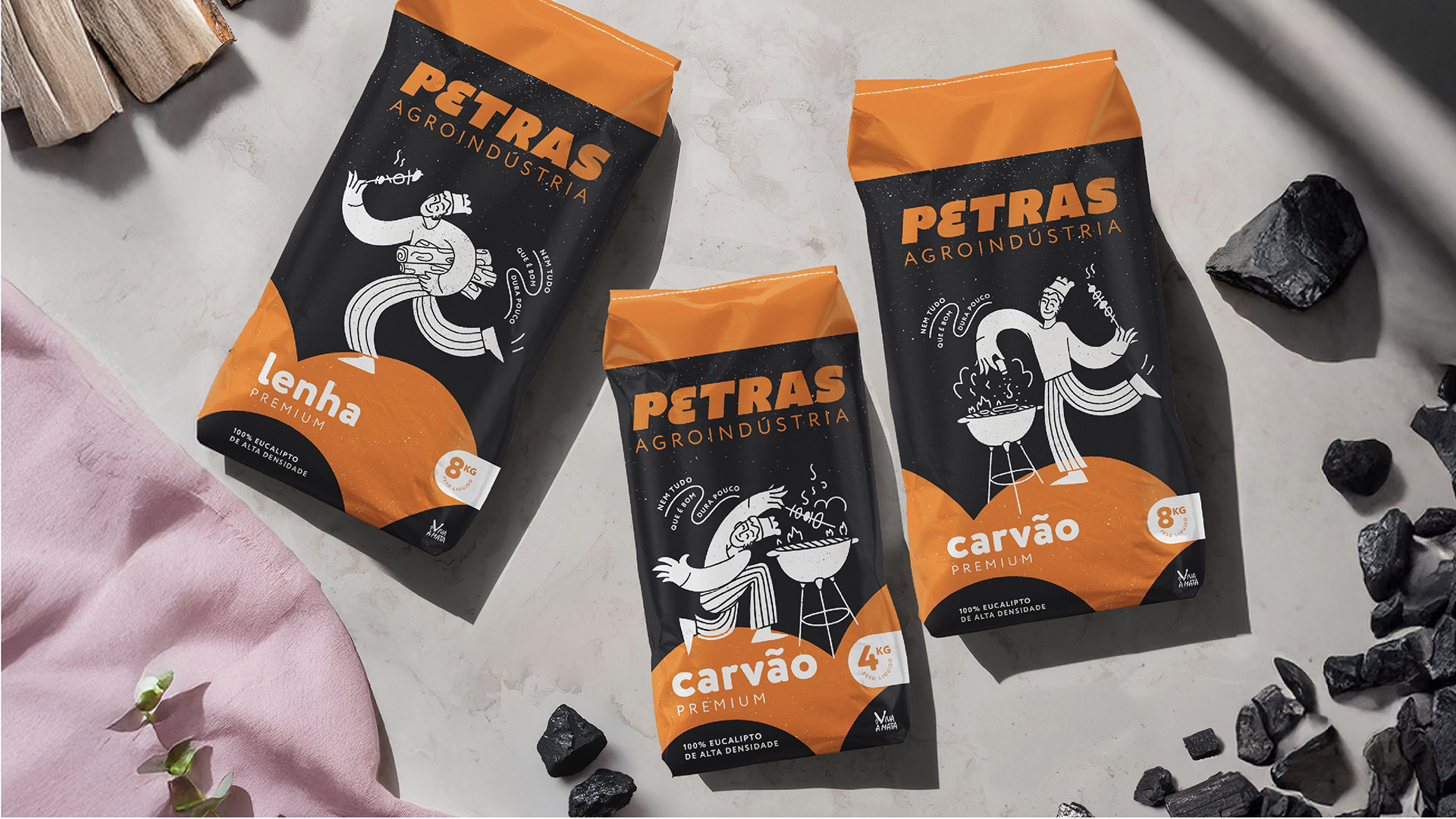
Mascot Redesign
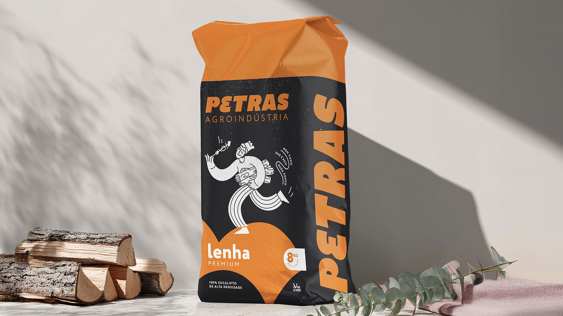
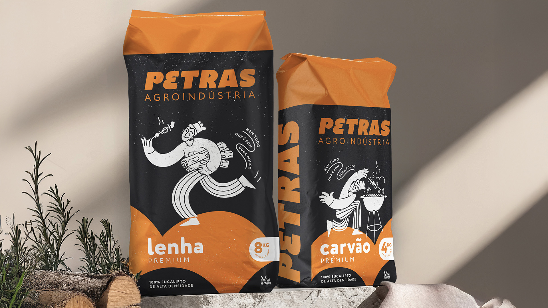
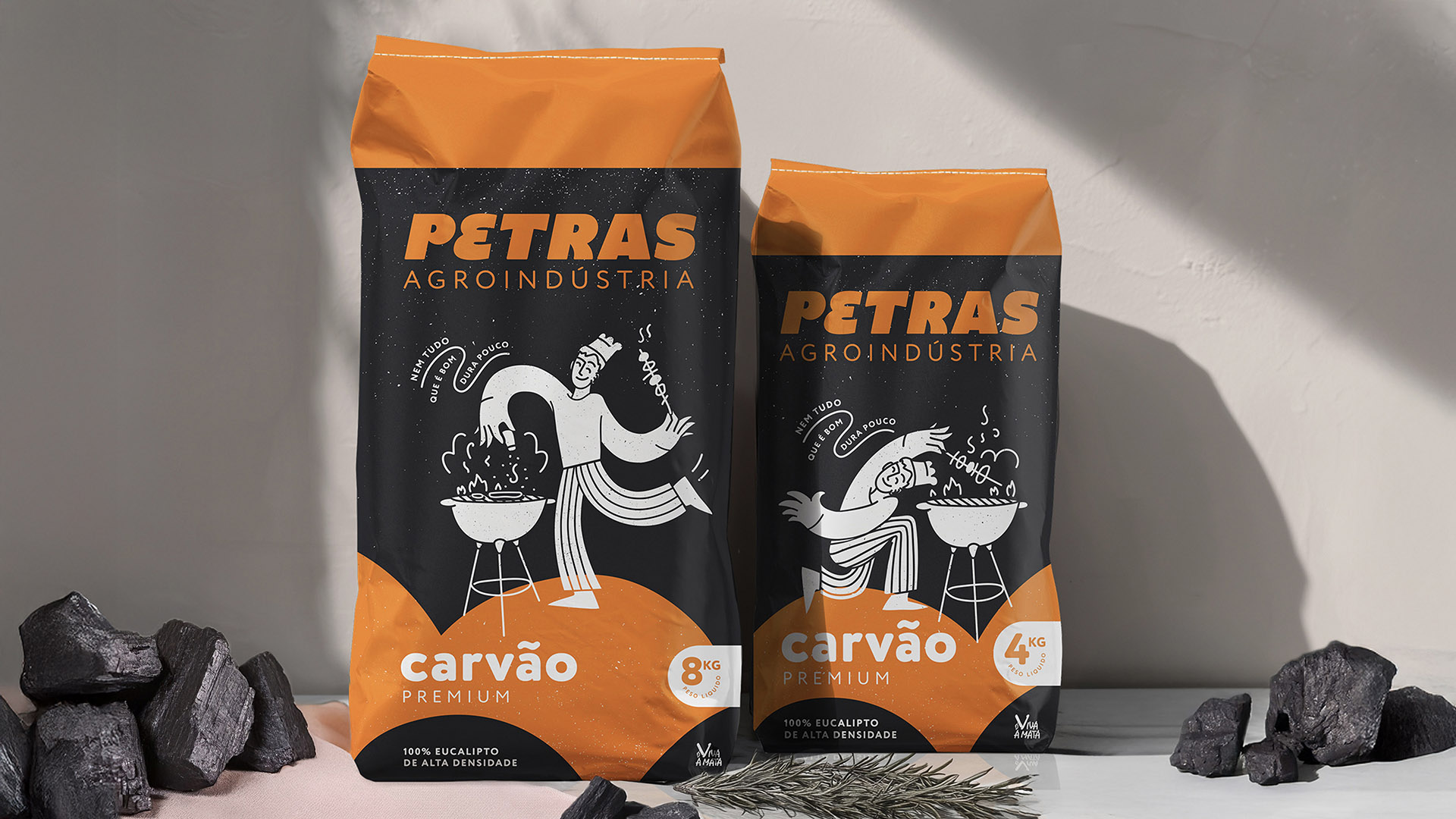
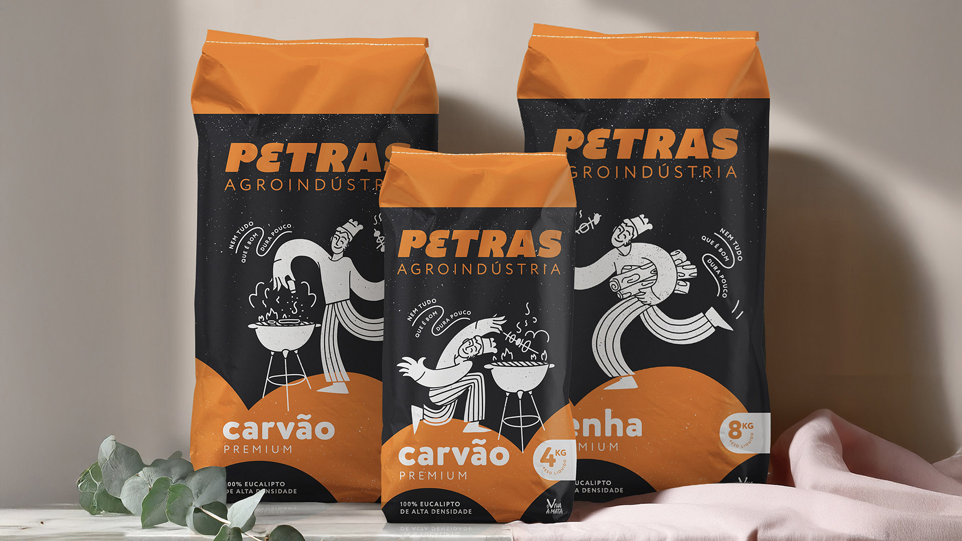
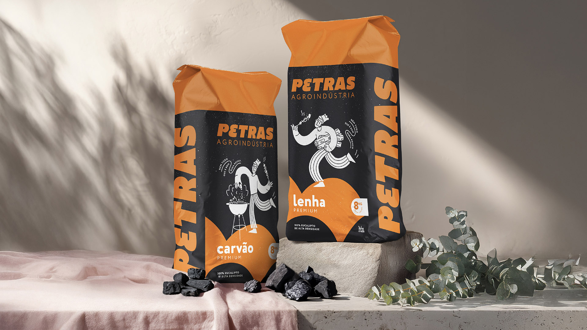
The mascot was completely reimagined, evolving into a versatile, contemporary character. While the corporate identity remained serious and business-focused, the mascot brought a playful touch to the packaging. It was illustrated interacting with the product in humorous, “impossible” positions, adding personality without compromising brand recognition.
Packaging Update
Key elements the orange strip, dark background, and mascot were retained for continuity, ensuring immediate recognition on shelves. Practical enhancements included a black background resistant to charcoal stains, printed with white, an unusual but visually striking choice in this category. This elevated perceived quality and shelf presence, signaling durability and premium positioning in a market often dominated by lower-cost competitors. Logo placement on the sides and bottom of the bags ensured visibility even when products were stacked.
Key Takeaways
Modernized Recognition: Refined logo and mascot modernize the brand while preserving core elements familiar to customers.
Playful Packaging: The mascot illustrations create a memorable, eye-catching consumer experience while maintaining a professional corporate look.
Practical Premiumization: Black-and-white printing elevates perceived quality, durability, and shelf presence.
Strategic Placement: Thoughtful logo positioning ensures brand visibility in retail environments.
The redesign of Petras’s corporate identity and barbecue packaging successfully balances heritage and modernization. The resulting brand system is cohesive, presenting a serious, reliable image on the corporate side and a playful, engaging presence on the consumer side. Petras now communicates a contemporary, sustainable, and premium identity that resonates with long-time customers and attracts new audiences alike.
CREDIT
- Agency/Creative: Studio Zak
- Article Title: Studio Zak Unveils a Modernized Visual Identity for Petras Agroindústria
- Organisation/Entity: Agency
- Project Type: Packaging
- Project Status: Published
- Agency/Creative Country: Italy
- Agency/Creative City: Rome
- Market Region: South America
- Project Deliverables: Brand Design, Brand Guidelines, Logo Design, Packaging Design, Packaging Guidelines
- Format: Bag, Pouch, Sachet
- Industry: Manufacturing
- Keywords: packaging, packaging design, charcoal, barbecue, illustration, character
-
Credits:
Creative Director: Paula Pozza


