


Originally from Brazil, Cha Cha Club’s name is a playful twist on “chá” (tea in Portuguese) and the lively cha-cha dance, giving the impression you’re joining an exclusive club—or even a cult—for tea lovers. This sense of belonging is at the heart of the brand, turning the daily tea ritual into a joyful escape with a bold, approachable attitude that feels like a small celebration in your day.
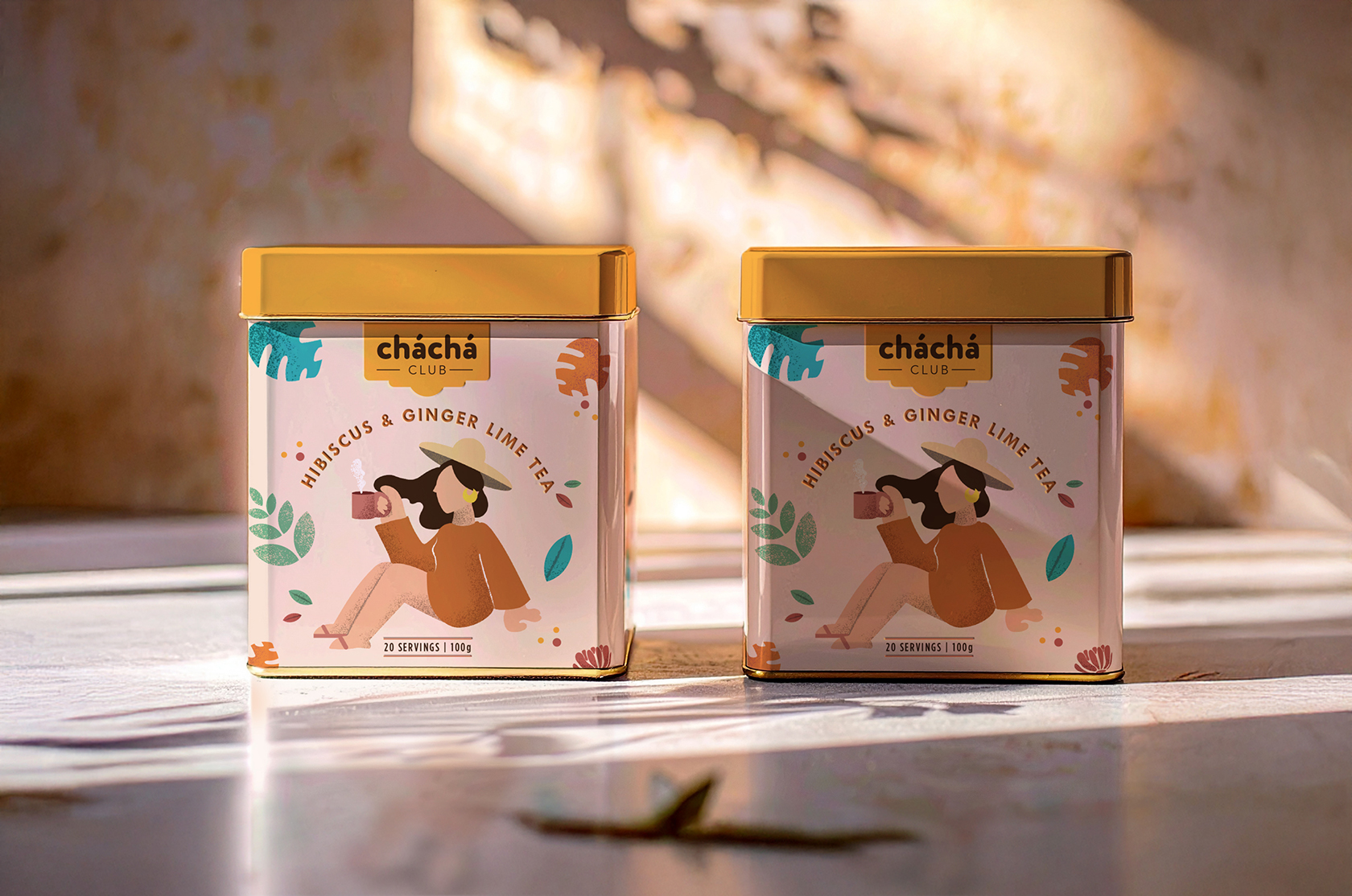
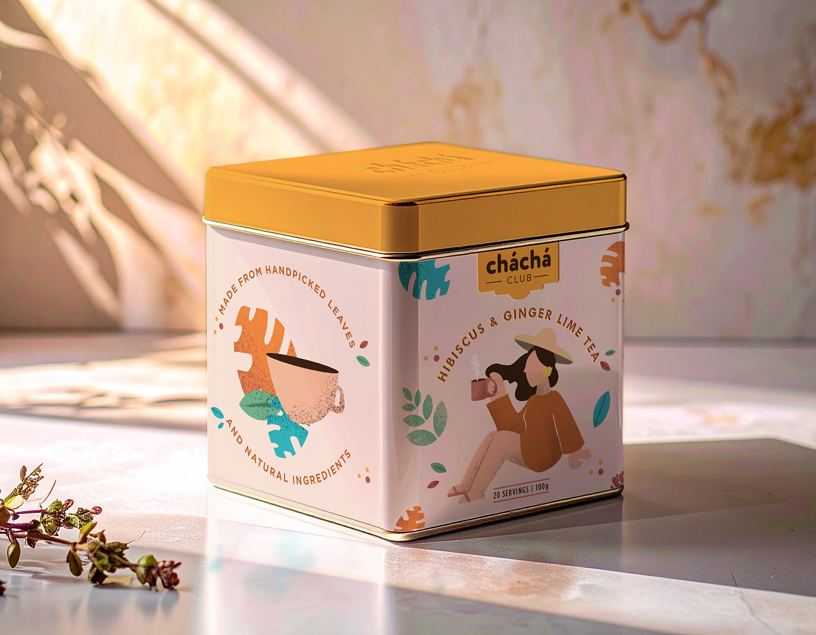
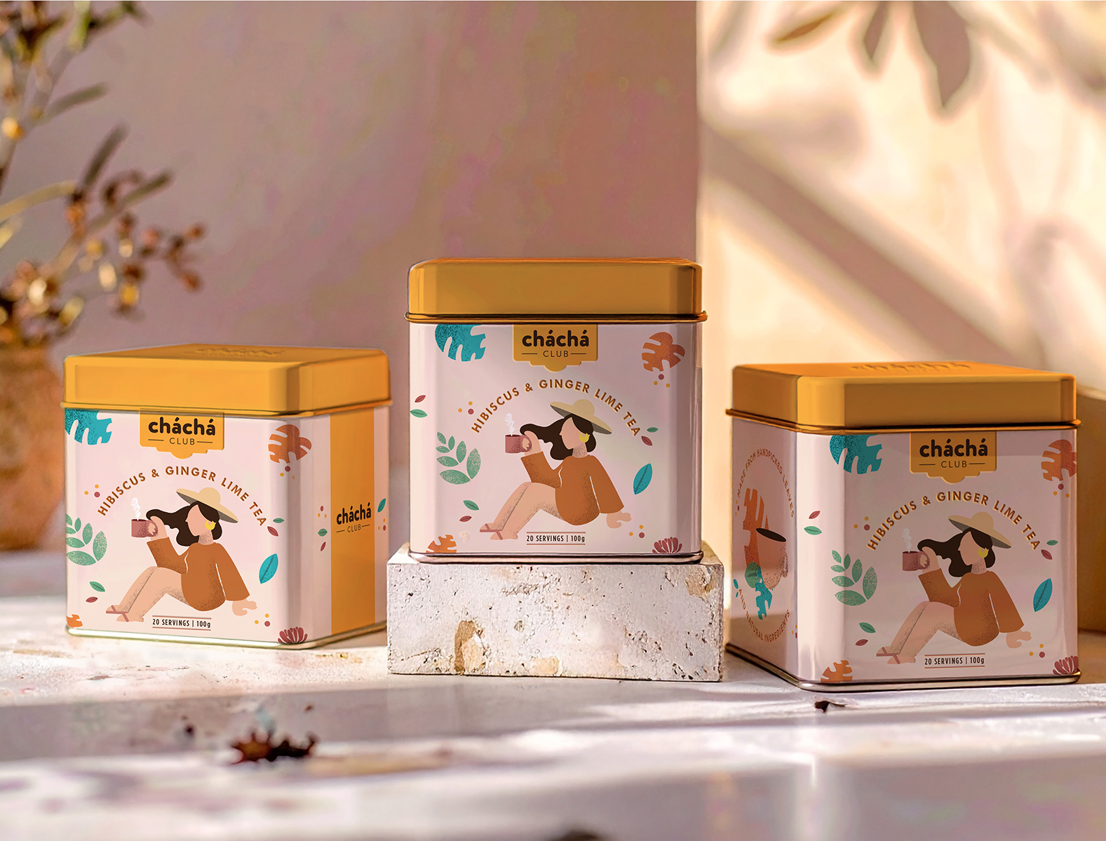
The visual identity embraces the neo-vintage trend in a luxurious yet modern way. A framed logo inspired by vintage nightclub signs anchors the system, setting a warm, inviting tone. The illustration style is modern yet textured, creating a nostalgic atmosphere while remaining minimal and easy to connect with. Layered elements taken from the tea itself add depth and discovery to the illustrations, crafting a visual narrative that rewards a second glance.
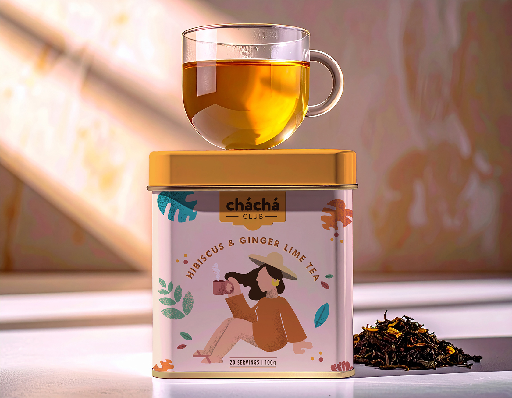
The muted, sophisticated colour palette contrasts with a bright yellow focal point on the tin’s lid, ensuring the packaging stands out on your kitchen countertop as a display-worthy object you’ll want to keep within reach. The tea is presented in a luxurious tin featuring relief typography, providing a tactile unboxing experience that elevates the ritual of opening your tea and enhances the anticipation of brewing your cup.
At the centre of the storytelling is an illustrated character drinking tea, softly inviting you into the Cha Cha Club universe and reminding you to pause. Cha Cha Club transforms a simple cup of tea into a joyful moment of pause and connection, making your daily tea ritual feel like a small but meaningful celebration worth savouring.
CREDIT
- Agency/Creative: Studio Zak
- Article Title: Studio Zak Infuses Cha Cha Club with Neo-Vintage Charm and Joyful Ritual
- Organisation/Entity: Agency
- Project Type: Packaging
- Project Status: Published
- Agency/Creative Country: Italy
- Agency/Creative City: Rome
- Market Region: South America
- Project Deliverables: Packaging Design
- Format: Tin
- Industry: Food/Beverage
- Keywords: tea, food and beverage, tin, illustration, vintage
-
Credits:
Creative Director: Paula Pozza


