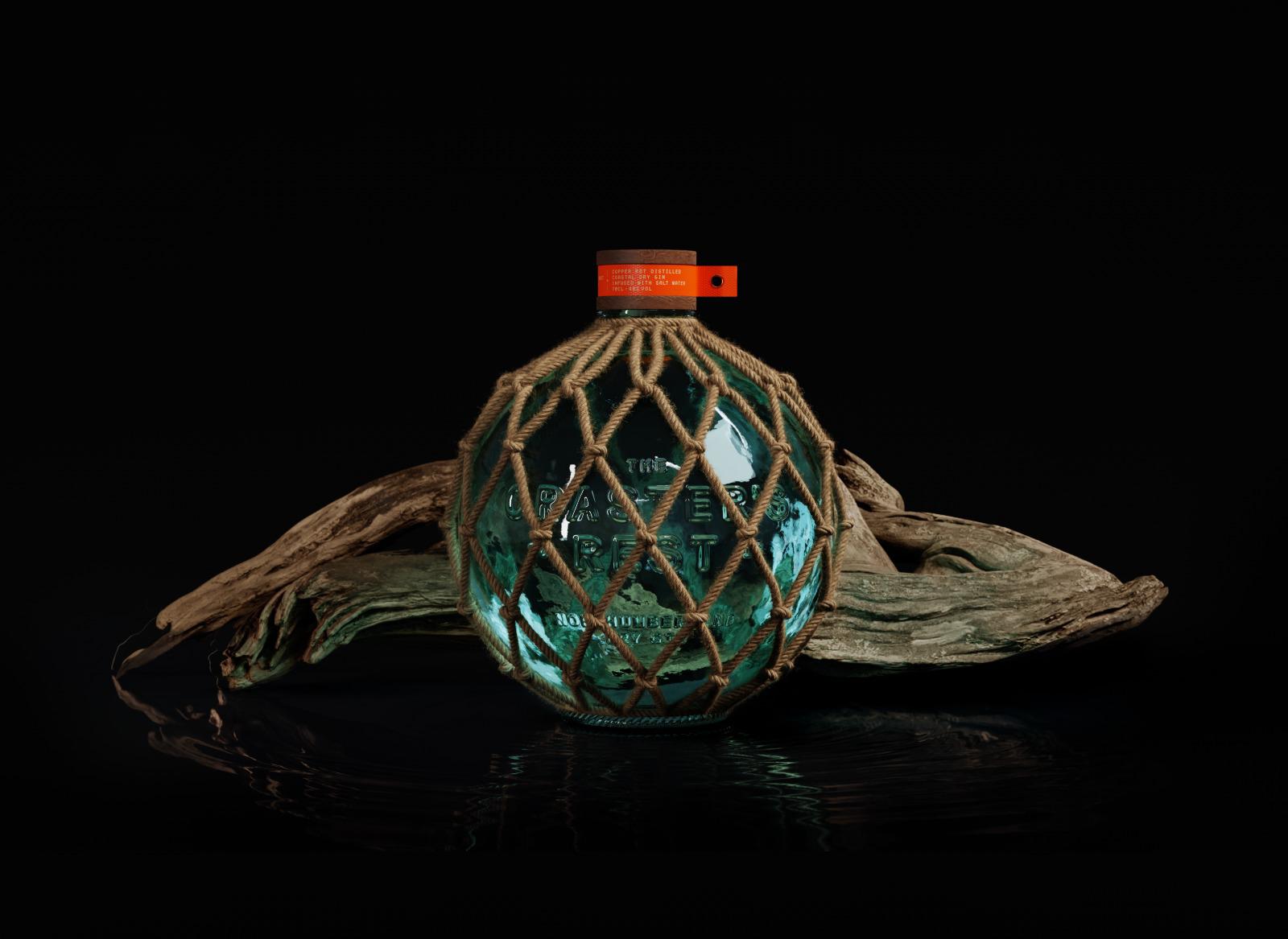
Studio Unbound were approached by a crew of northern fisherman to help them share their secret brew with the world, a refined recipe passed down through generations of town folk. The Craster’s Rest is a coastal dry gin crafted in a copper pot distillery and beautifully infused with salt water.
Craster is a quaint town on the English coast of Northumbria with a long lineage of fishing tradition. The Craster’s Rest gin began life from local fishermen in the area who brewed their own gin to bring them a bit of ‘dutch courage’ when facing the infamous and incredibly dangerous North Seas. The name ‘The Craster’s Rest’ represents the relief the men would have when they returned home, and according to the old sailor fable, when the town welcome the men home safe, it would put the town to rest.
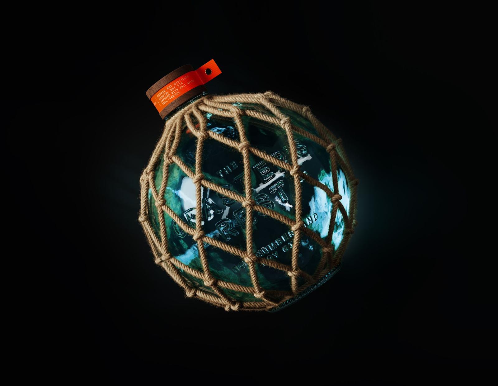
Studio Unbound was inspired by glass buoys that were in use during the early 1900s, long before the invention of their modern-day plastic kin. These glass buoys were sewn to the fisherman’s lines to keep their nets afloat in the ocean and encased in rope so they would have some protection from any knocks.
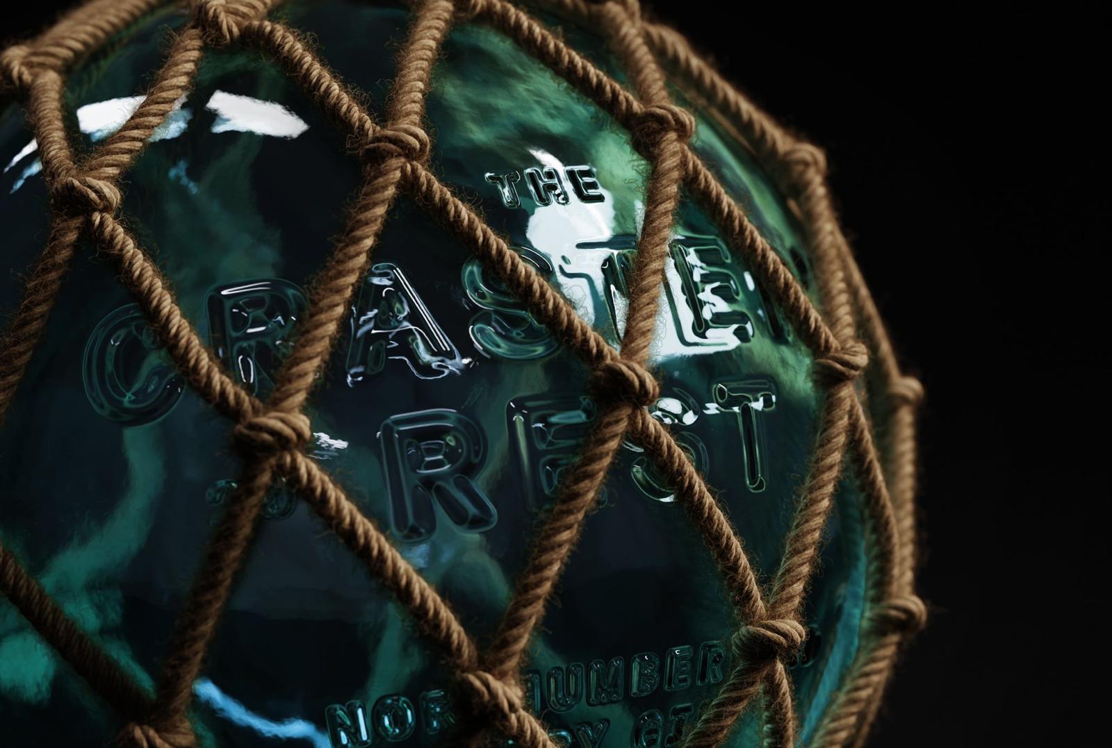
The typography is heavily embossed into the surface of the glass so that the bottle can stay as true as possible to the original shape and structure, as well a common finish associated with packaging from the time-period. Deploying an old-fashioned bottling technique to maintain the original aesthetic of the buoys enclosed in heavy knotted rope, which creates quite the showstopper aesthetic on shelves. The glass of the bottle has a blueish greenish hue, which is blown mimicking the ocean depths.
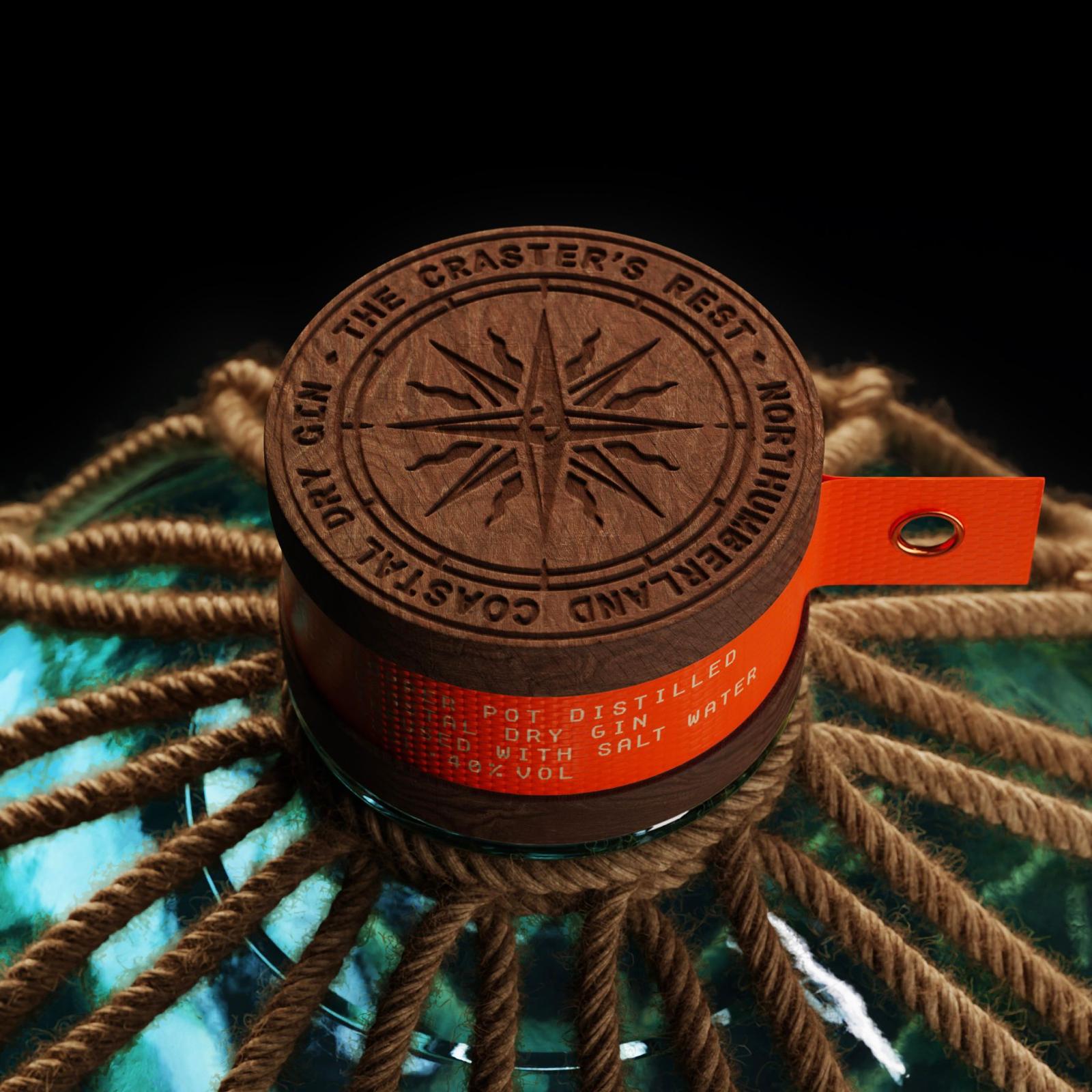
Studio Unbound chose a weathered driftwood cap, which has a traditional sailor’s compass engraved into the top to make sure the fishermen always make it home. Deeply set into the cap is also a thick high vis vinyl, finished with a copper rivet, inspired by a fisherman’s coat.
The overall outcome is an eye-catching bottle design that is a perfect blend of modern and tradition, as well as being in drenched in its town’s history.
Studio Unbound is a small-but-mighty branding studio that works with aspiring founders of FMCG brands. They always try to deliver work that’s a little different, breaks the mould, and demands to be noticed.
CREDIT
- Agency/Creative: Studio Unbound
- Article Title: Studio Unbound Creatively Land The Craster’s Rest Gin Packaging Design
- Organisation/Entity: Agency
- Project Type: Packaging
- Project Status: Published
- Agency/Creative Country: United Kingdom
- Agency/Creative City: Glasgow
- Market Region: Europe
- Project Deliverables: Brand Design, Packaging Design
- Format: Bottle
- Substrate: Glass Bottle
- Industry: Food/Beverage
- Keywords: Packaging, Glass Bottle, brand design
-
Credits:
Creative Lead: James Fishlock


