Studio Unbound is proud to unveil a new brand identity for The Karma Tea Co, a direct-to-consumer speciality tea brand that launched this month. The Karma Tea Co. was created to shine a light on artisanal loose-leaf teas produced by small-holder tea gardens in India, Sri Lanka and Nepal. This is a region mostly associated with commodity grade tea (the type used in tea-bags), but where a growing number of independent tea makers are sustainably producing high-quality crafted teas that cover a range from black, green, white and oolong. By sourcing finely crafted teas directly from single gardens across South Asia, the Karma Tea Co. ensures higher-than-average income generation for the tea farmers, while in return consumers enjoy the purest, freshest leaves which have not been blended with other sources.
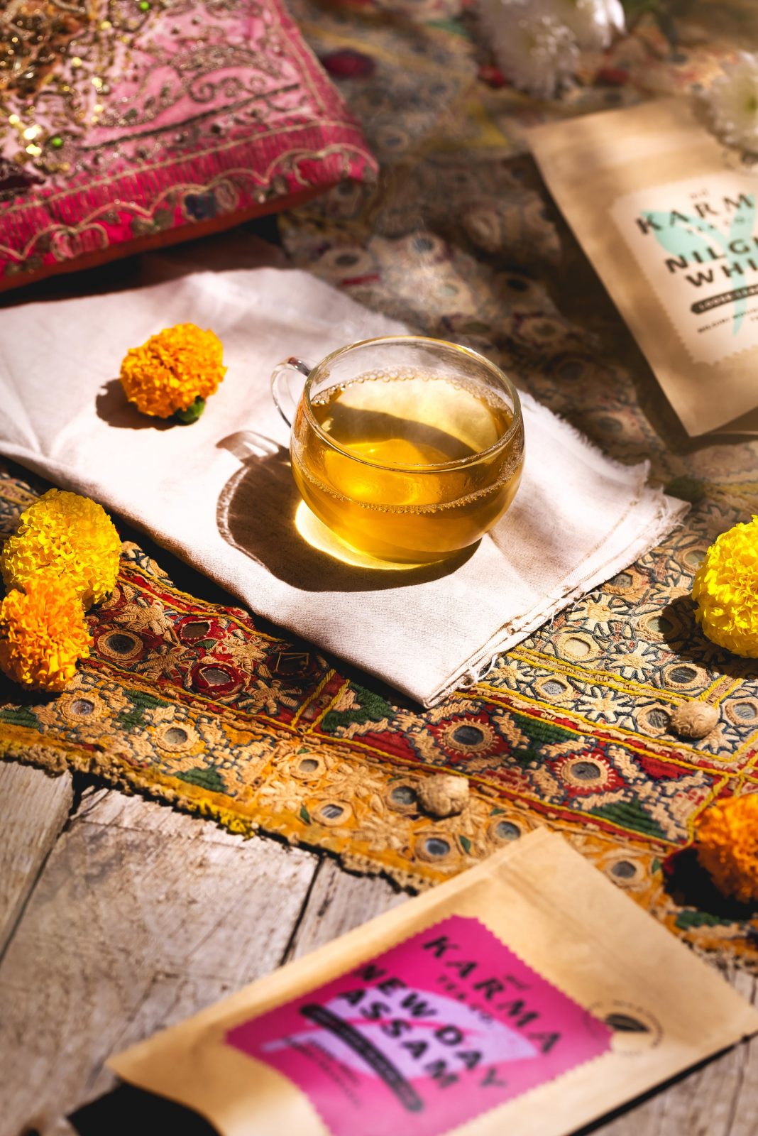
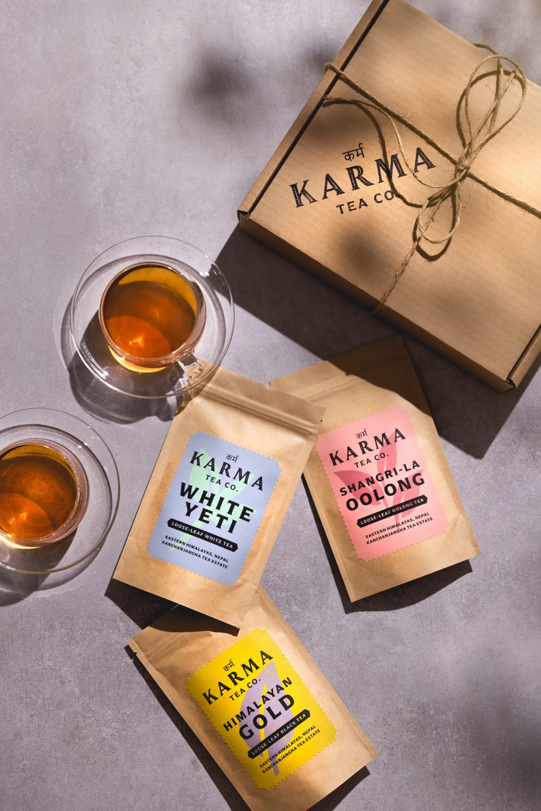
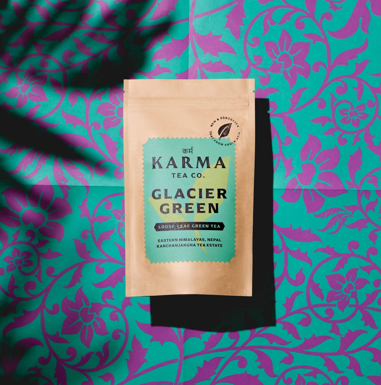
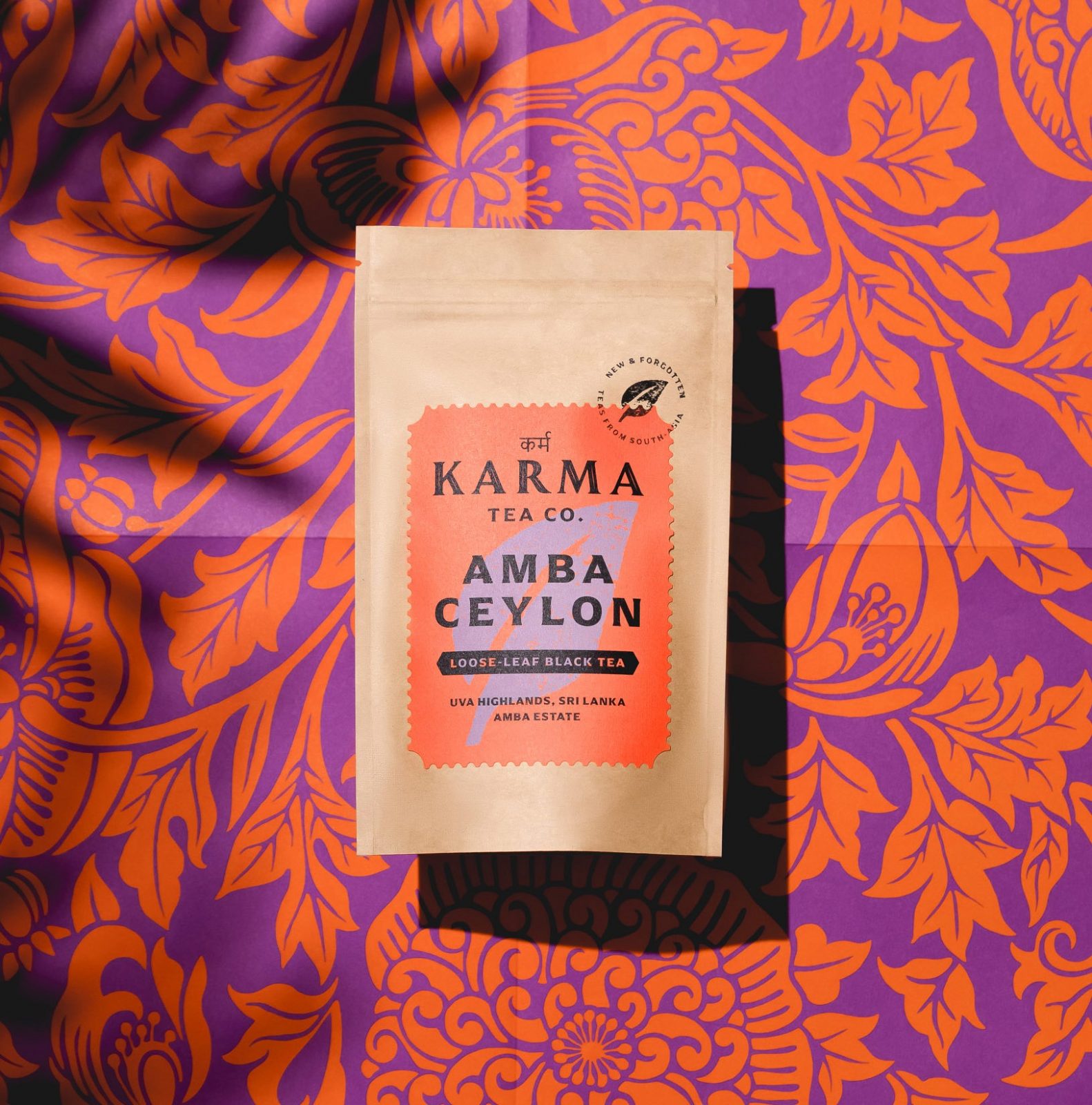
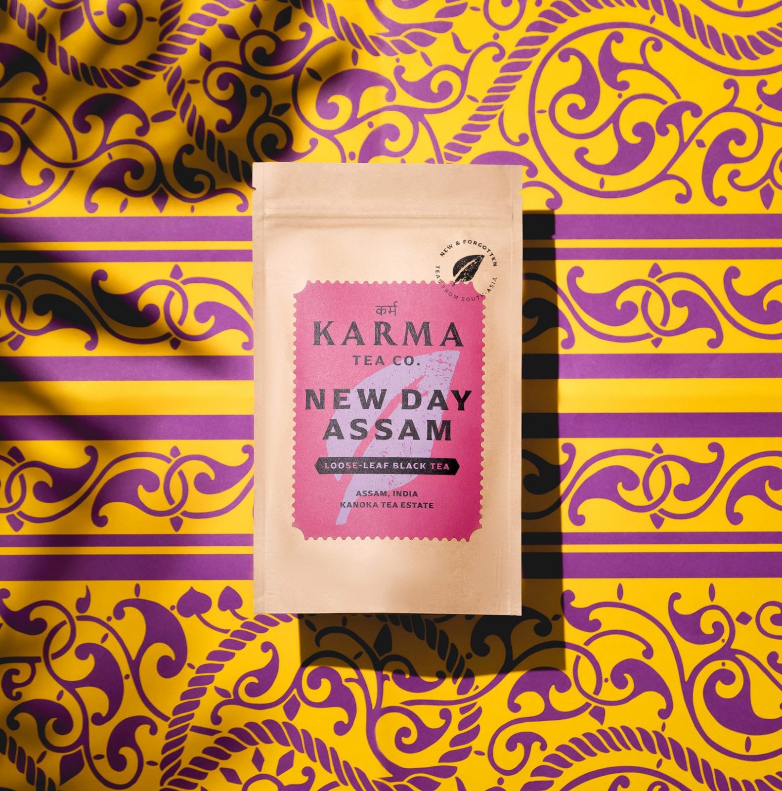
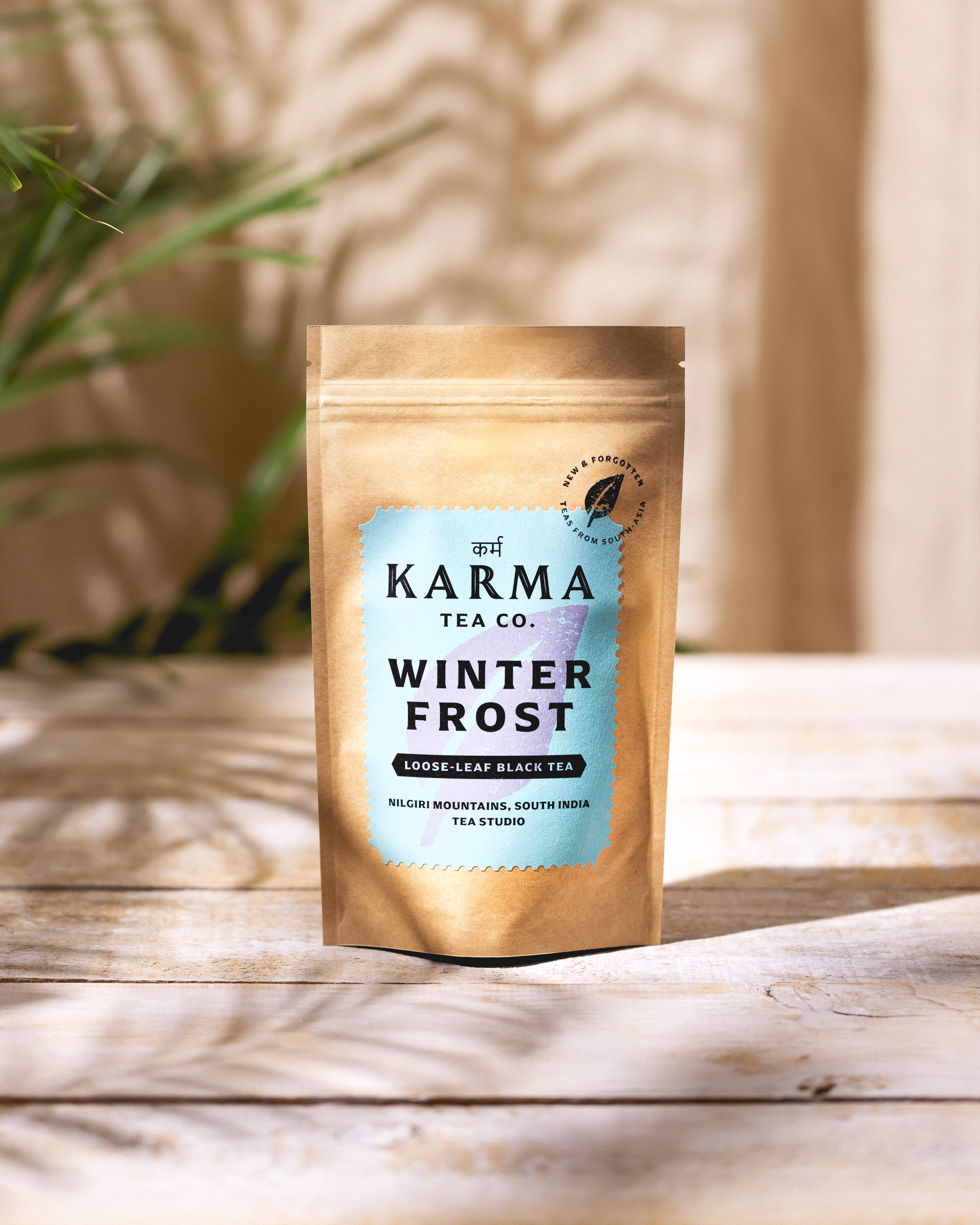
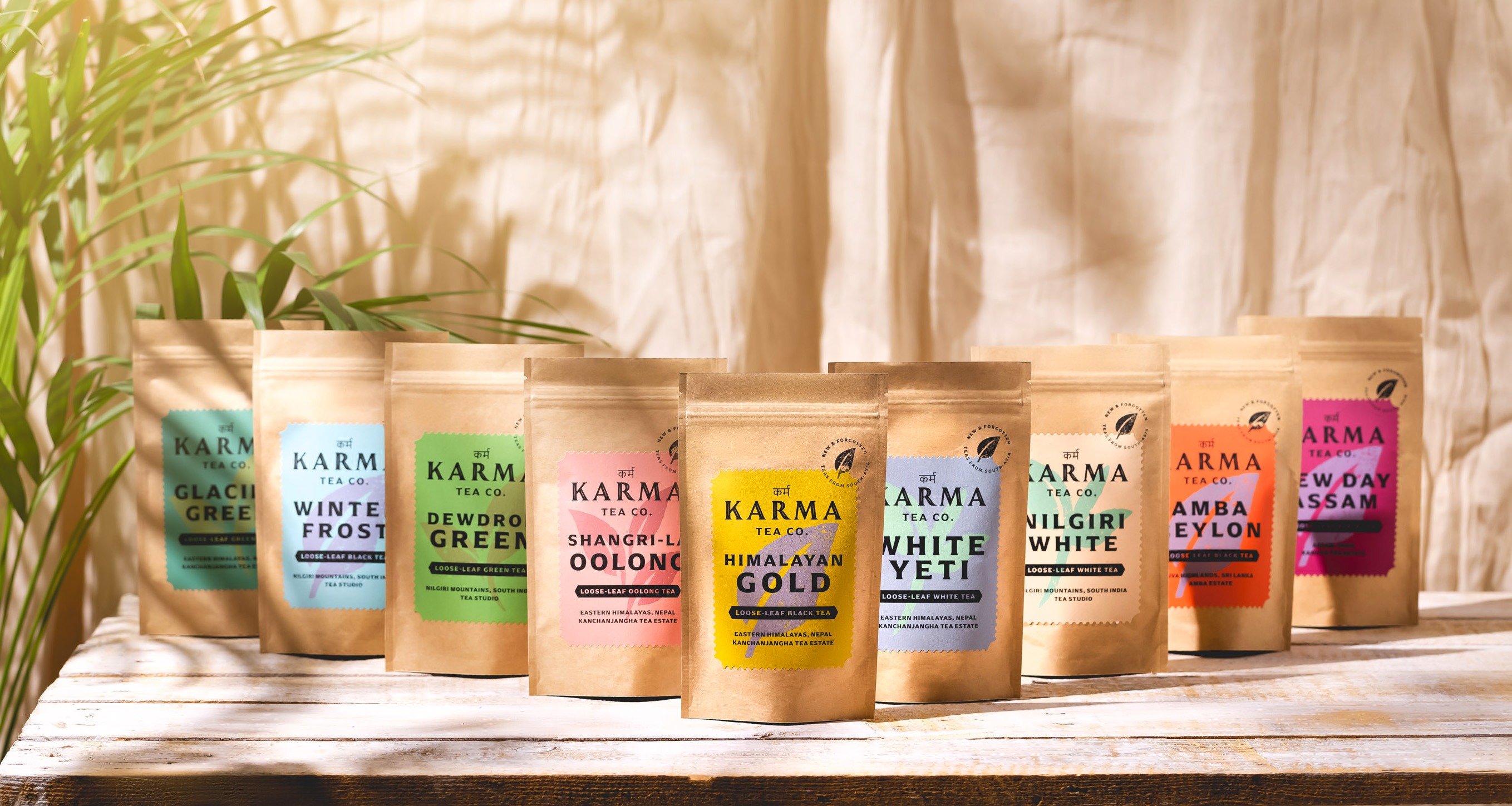
The Karma Tea Co. approached Studio Unbound with a vision to elevate the experience of tea from South Asia from a commodity to a crafted product, and convey a strong sense of provenance, whilst paying homage to the heritage of craft in the region and so bring more meaning to the brand identity. To convey the key message of “direct from source”, Studio Unbound created a label for each different type of tea in the shape of a postage stamp with perforated styled edges, each one in a vivid colour tone evocative of the region. The addition of a hand-applied franking stamp is designed to amplify this key message; it’s almost as if the tea maker had applied the stamp themselves and sent it directly.
Studio Unbound took inspiration from the tradition of block printing that is present in textiles from north India in particular. Each label features a woodcut illustration in the form of a tea leaf, with a slight variation to represent each different type of tea (i.e. white, black, green, and oolong). This touch is aimed to highlight the hand-made, artisanal quality of the tea itself, and gives a nod to the sophisticated craft heritage of South Asia.
The on-pack design features the logo with the script for “karma” in Devanagari, or the Hindi/ Sanskrit script. The rest of the copy is pared back and states in bold typography the particular name of the tea, the tea maker, and the specific location of the tea garden. The aim is to provide full transparency on the origin of each tea. This is in contrast to the vast majority of tea from South Asia on the UK market which typically passes through several hands before reaching the end consumer and so the exact provenance is often concealed, and branding is generic. Full transparency here helps to elevate these teas to the level of a fine wine, a single origin coffee, or a bean-to-bar chocolate where provenance is all important.
The element of transparency is further highlighted on the ecommerce website, also designed by Studio Unbound, which tells the story of each tea garden, the makers, and the history of the region, all pages beautifully colour coded in line with the on-pack designs. The website offers a visually rich experience which immediately transports the viewer to the tea gardens, taking the viewer on an exciting journey of tea discovery.
CREDIT
- Agency/Creative: Studio Unbound
- Article Title: Studio Unbound Creates New Brand Identity for Ethical Artisanal Tea Brand
- Organisation/Entity: Agency
- Project Type: Packaging
- Project Status: Published
- Agency/Creative Country: United Kingdom
- Agency/Creative City: Glasgow
- Market Region: Europe
- Project Deliverables: Brand Design, Branding
- Format: Pouch
- Substrate: Pulp Paper
- Industry: Food/Beverage
- Keywords: Branding agency, Design, Artisanal tea, loose leaf tea
-
Credits:
Founder and Creator: Martyn Garrod


