Fads in healthcare, specifically the ones marketed at women, can be very confusing to keep up with. It seems every year there is a new ingredient that is at the forefront of the headlines as the best supplement to take for you to live a healthy life. Unfortunately, a lot of these ingredients are not clinically proven to have the desired effect; and sometimes it can feel like you need a degree in nutrition to work out exactly what you need. Clara is out to change that – to give women all the information and the supplements that they need to make informed and confident choices about their health.
Clara approached Studio Unbound and Becca Magnus to bring this vision to life. Becca, strategist and copywriter, helped with brand positioning, naming, and copy writing for this new venture. The name ‘Clara’ is a slight abbreviation on the word ‘clarity’ which is the driving force behind the brand, whilst giving the brand a more human and approachable feel.
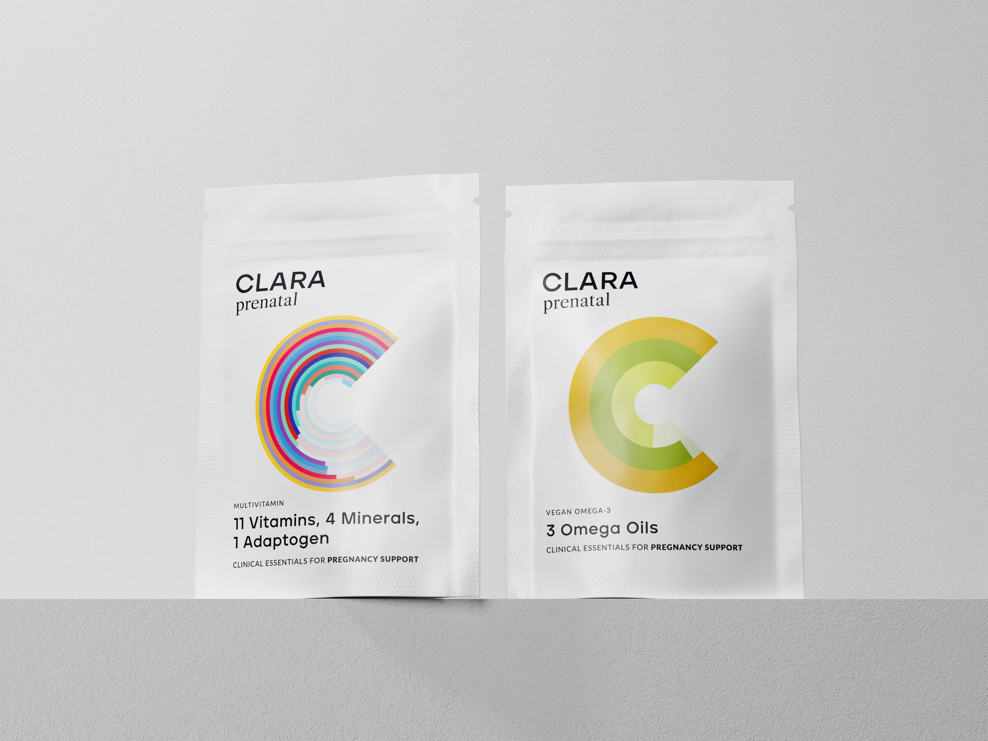
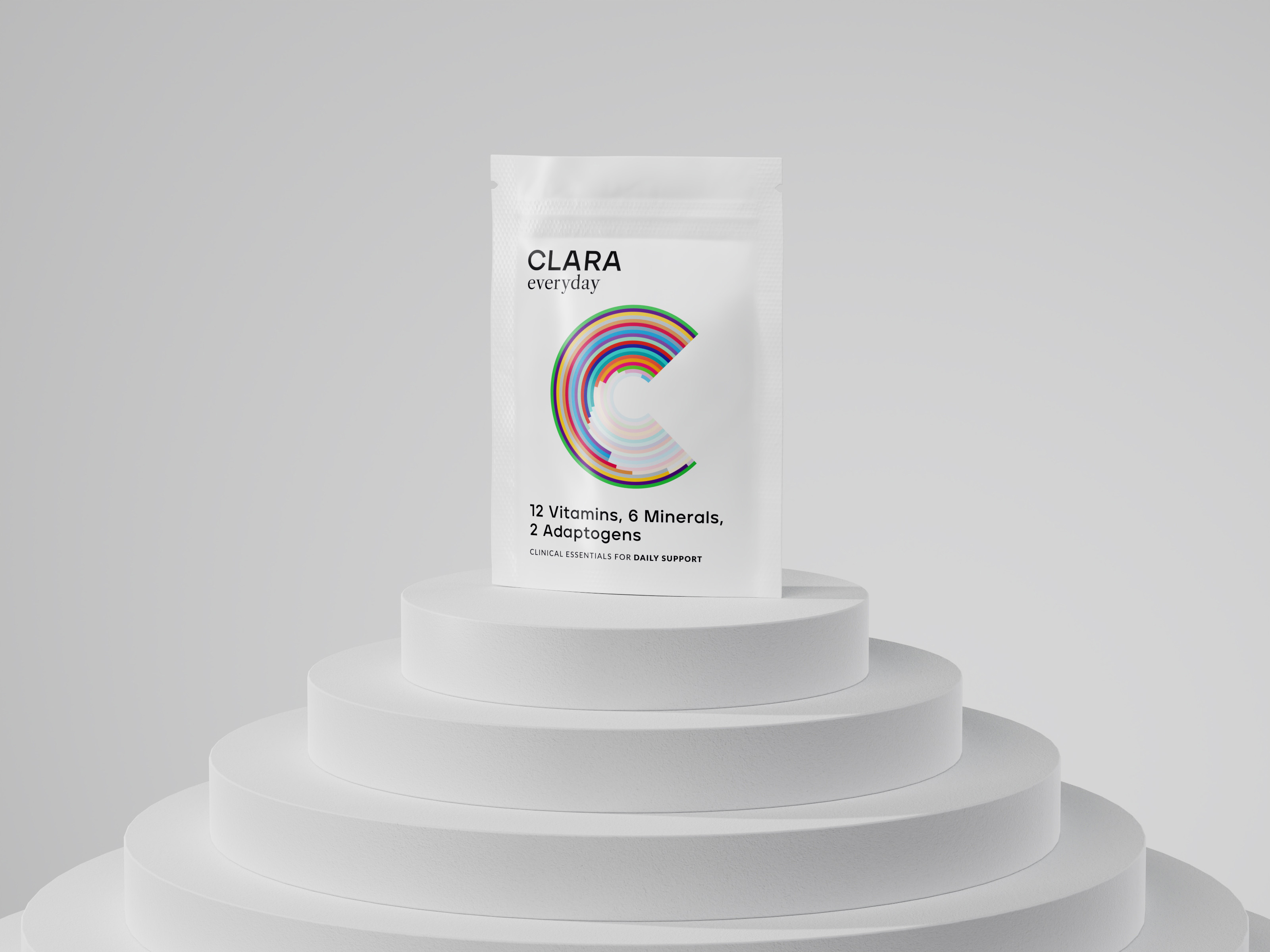
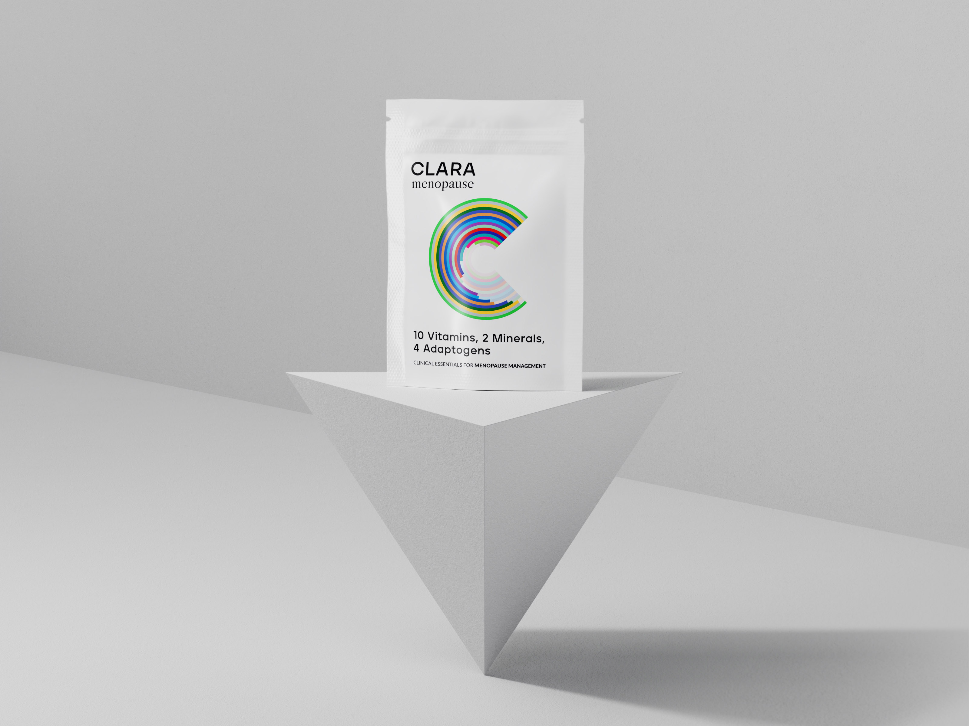
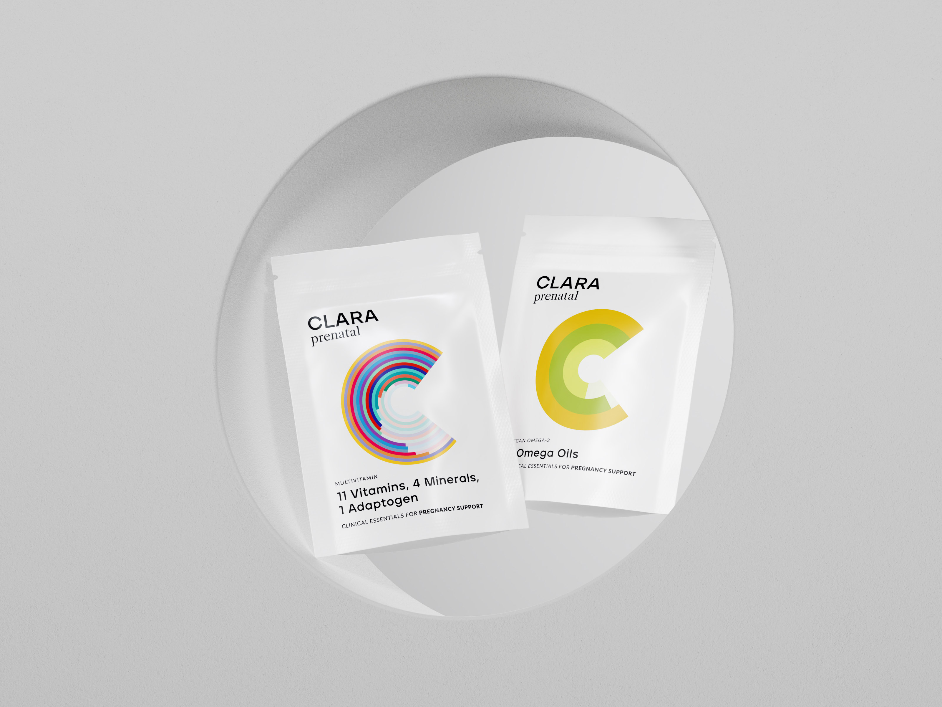
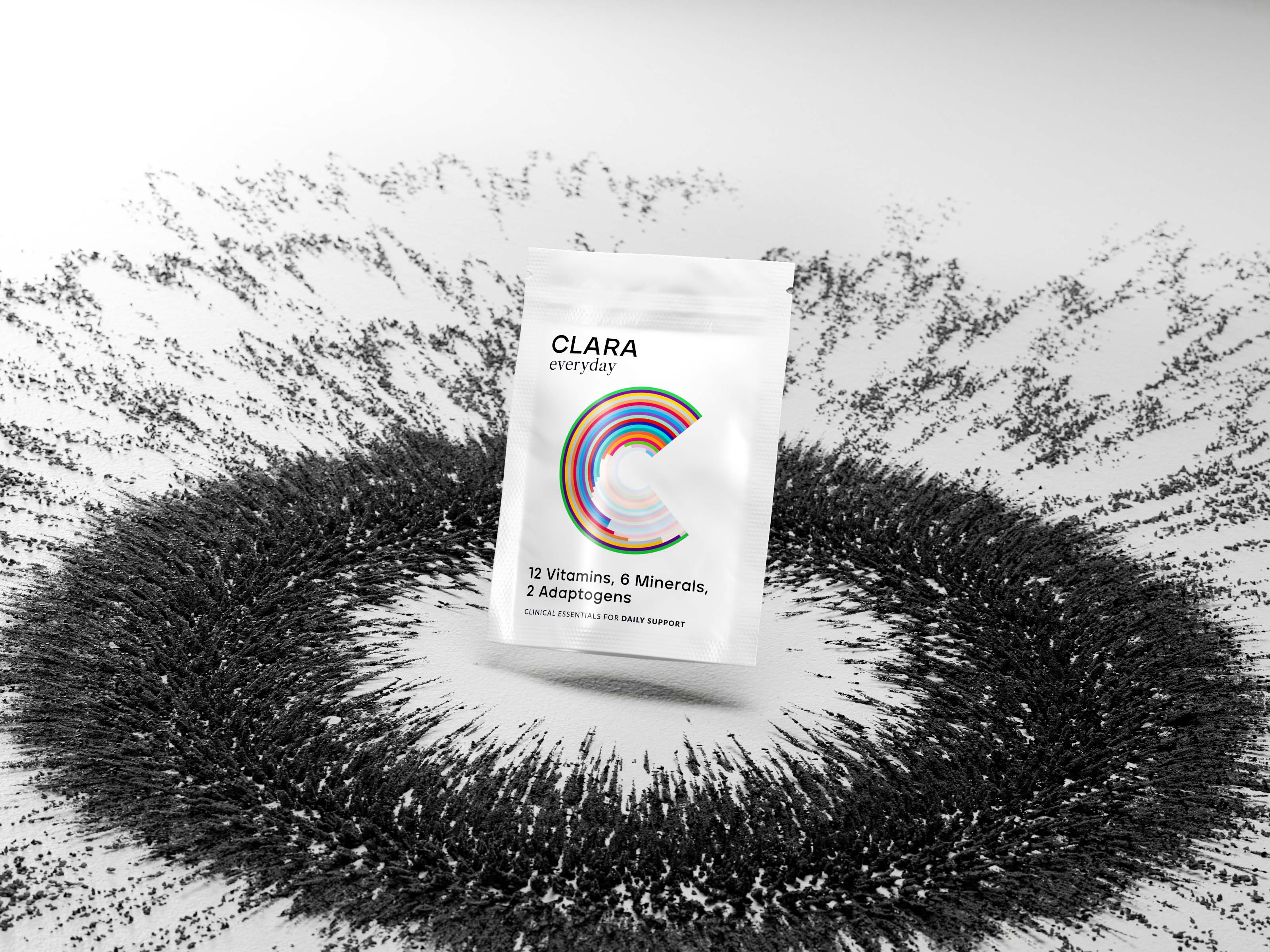
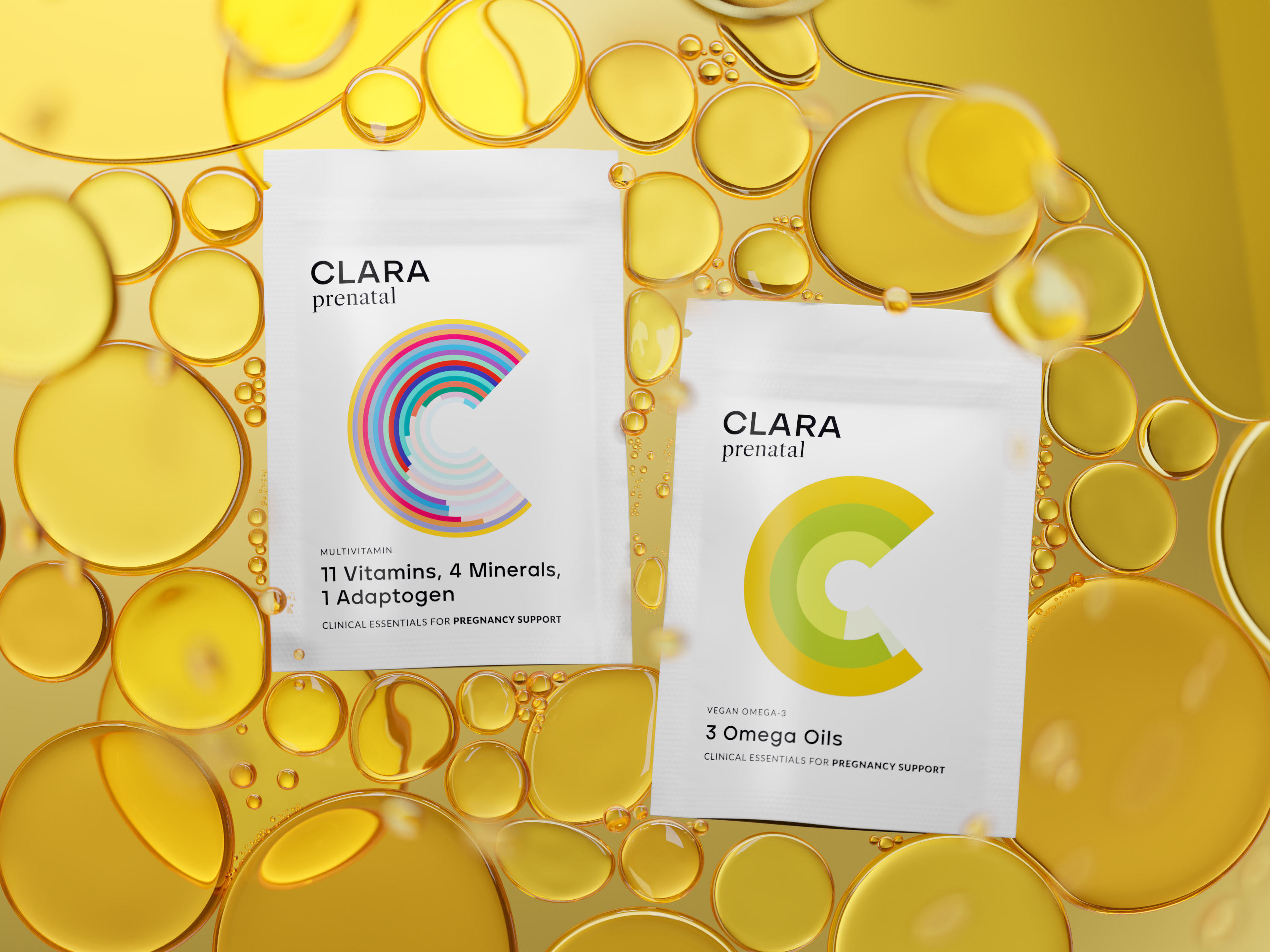
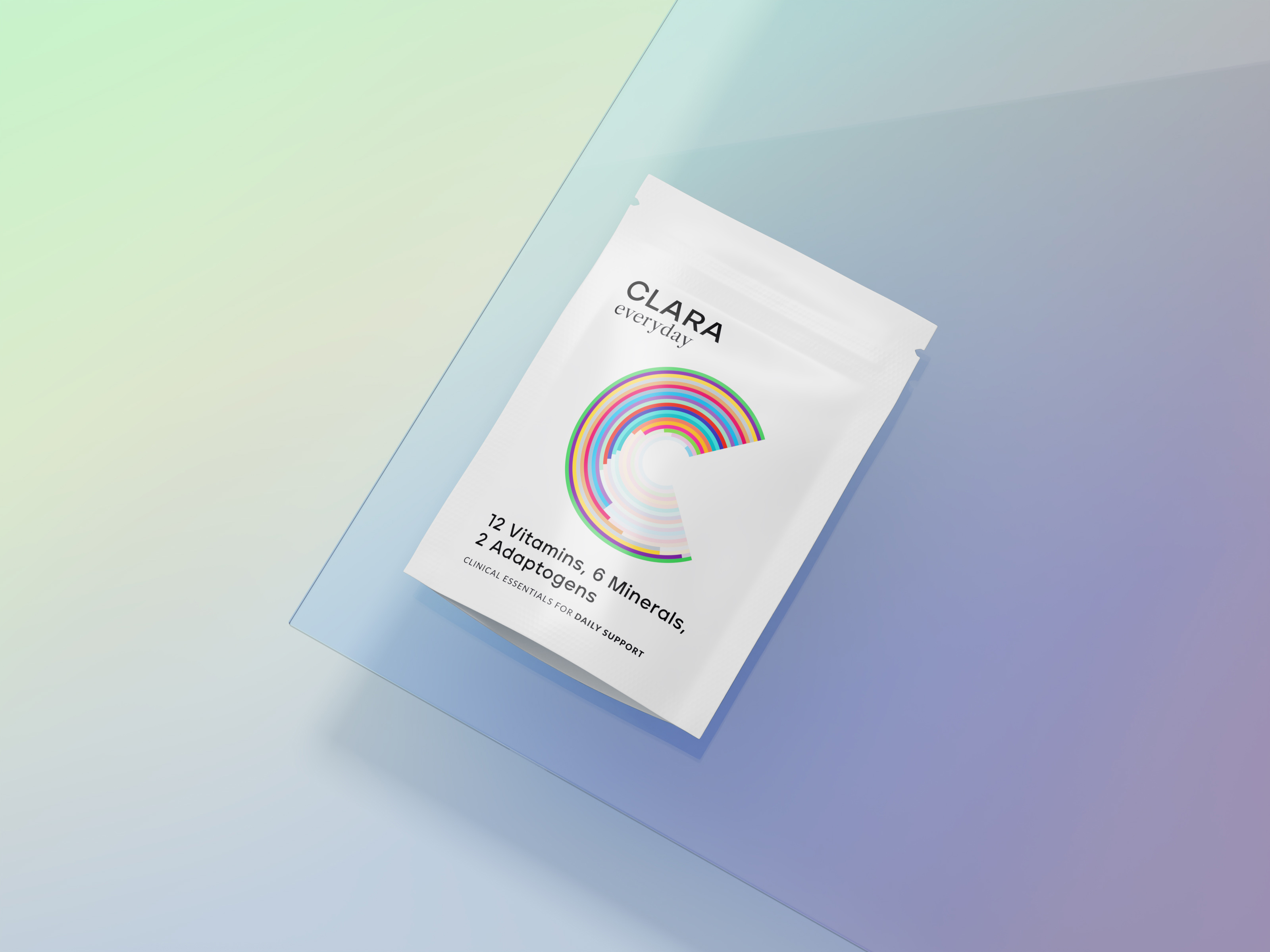
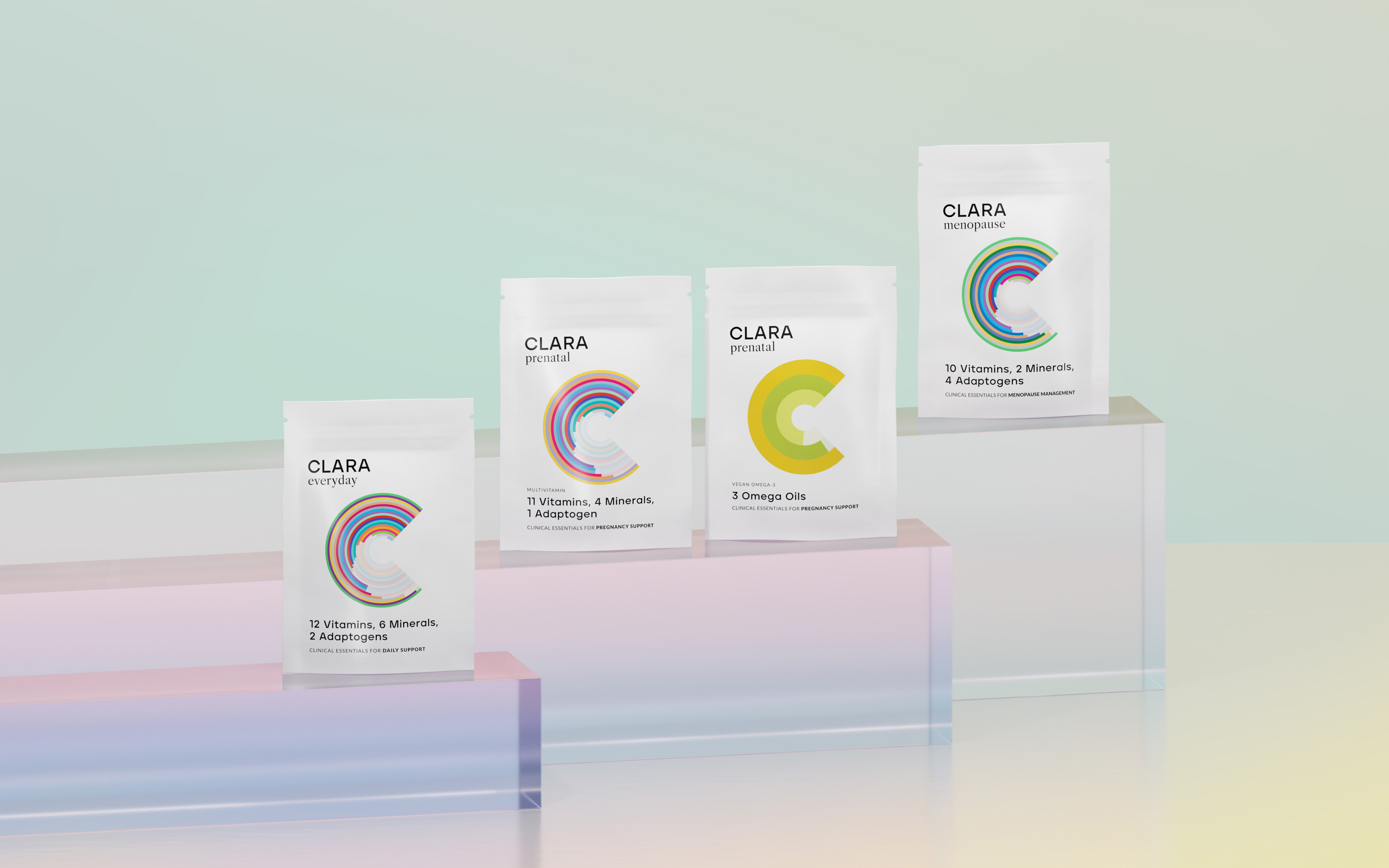
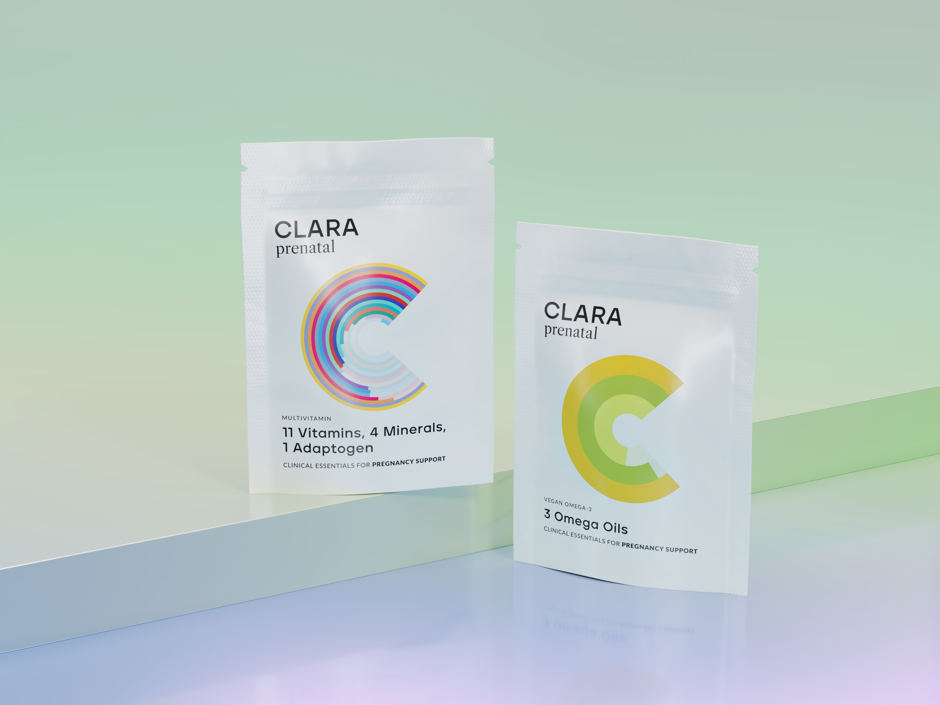
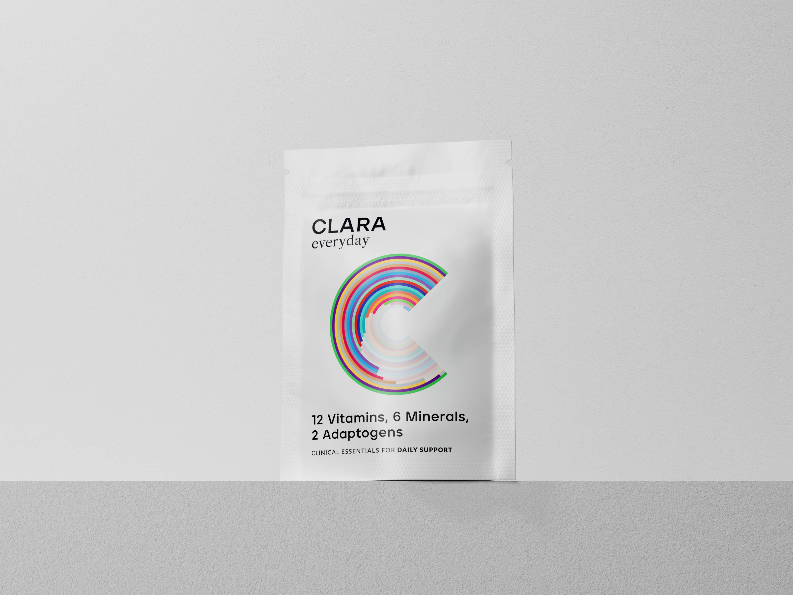
The brand needed to cut through the needlessly confusing landscape of women’s nutrition and provide one simple multi-vitamin tablet which contains exactly what the average women needs at different stages of their life. With that in mind, Clara has launched with three different products: Clara Everyday (18+), Clara Prenatal; and Clara Menopause. The Clara Prenatal packet contains two daily pills, this is to make sure they get the right amount of oil and multivitamins, while the other two contain one daily pill.
Once the brand direction was set, Studio Unbound worked to turn this groundwork into a visual identity. With the products being backed with science and the brand being about making information more accessible, Studio Unbound used infographics as the basis of the branding. Each multivitamin now hero’s its own ‘C’ (for Clara) infographic that breaks down the amount of each ingredient in that pill. With a colour coded key on the back of pack and a postcard insert, the consumer can see how much of each ingredient they are getting and what it does for them. This is further supported on the website where they can dig into more information about each ingredient and the science that backs it up.
The rest of the brand is monochromatic and minimal to make these infographics the focus. This is further backed with a photographic style that is minimal and scientific, with colour coming through the ingredients themselves. Studio Unbound deliberately avoided too much lifestyle imagery in the brand to pull it further away from competitors that tend to lean into lifestyle quite heavily. Enforcing the brands values of clarity with no smoke and mirrors.
The outcome is a striking brand that uses design to break down barriers, empower women and make information accessible – with none of the fluff.
Studio Unbound is a small-but-mighty branding studio that works with aspiring founders of FMCG brands. They always try to deliver work that’s a little different, breaks the mould, and demands to be noticed.
CREDIT
- Agency/Creative: Studio Unbound
- Article Title: Studio Unbound and Clara Are Working Together to Bring More Clarity to Women’s Health
- Organisation/Entity: Agency
- Project Type: Packaging
- Project Status: Published
- Agency/Creative Country: United Kingdom
- Agency/Creative City: Glasgow
- Market Region: Europe
- Project Deliverables: Brand Design, Packaging Design
- Format: Pouch
- Substrate: Pulp Carton
- Industry: Health Care
- Keywords: multi-vitamin, women's health,
-
Credits:
Creative Lead: James Fishlock
Founder and Creative: Martyn Garrod


