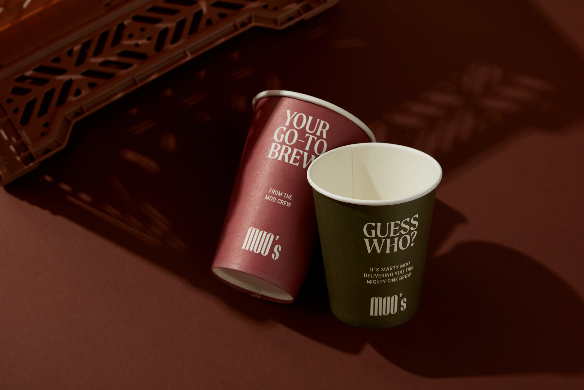
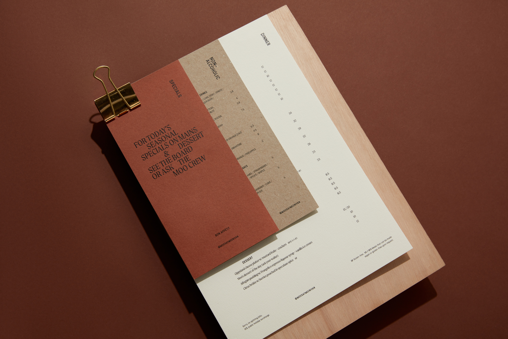
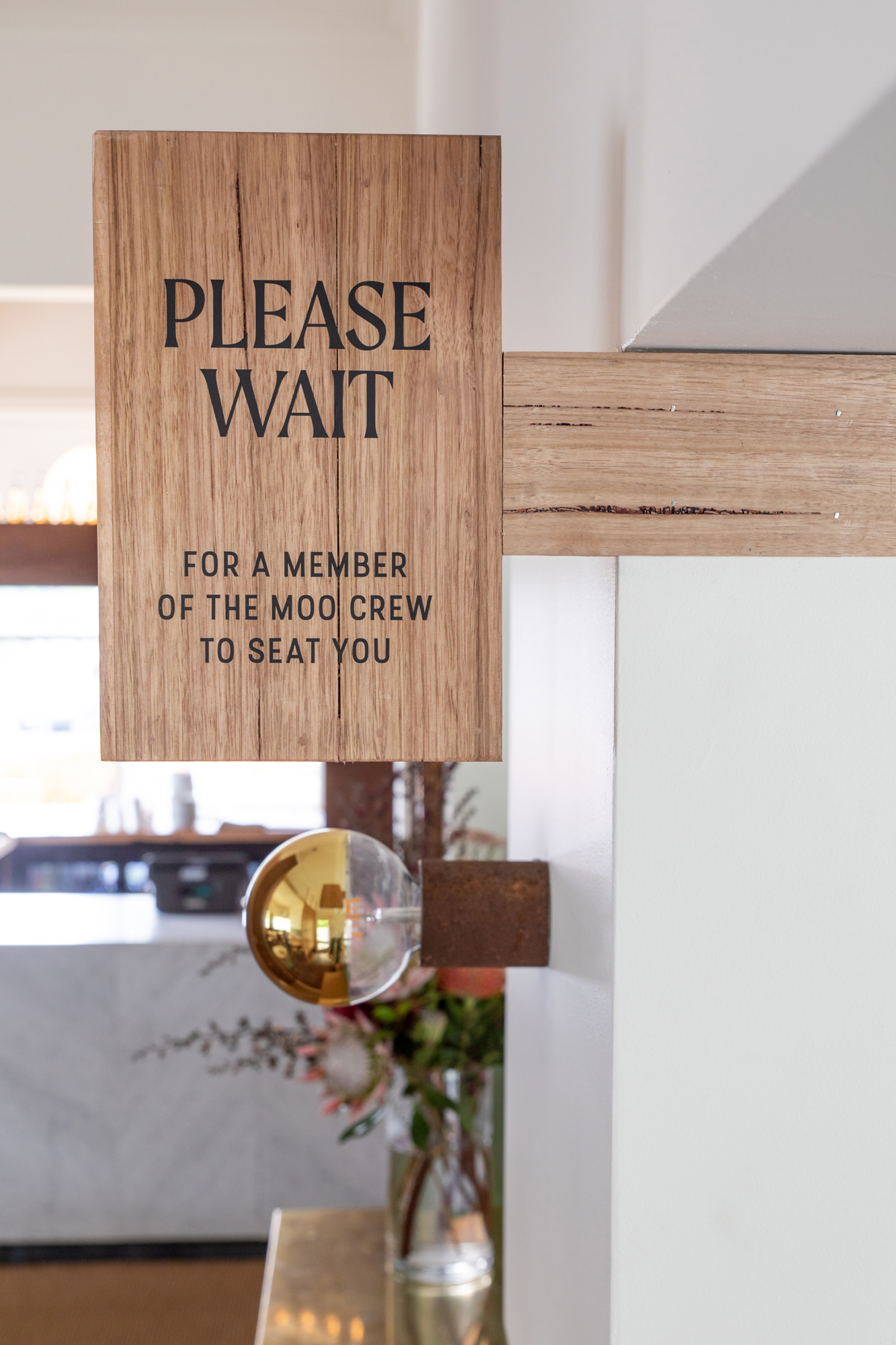
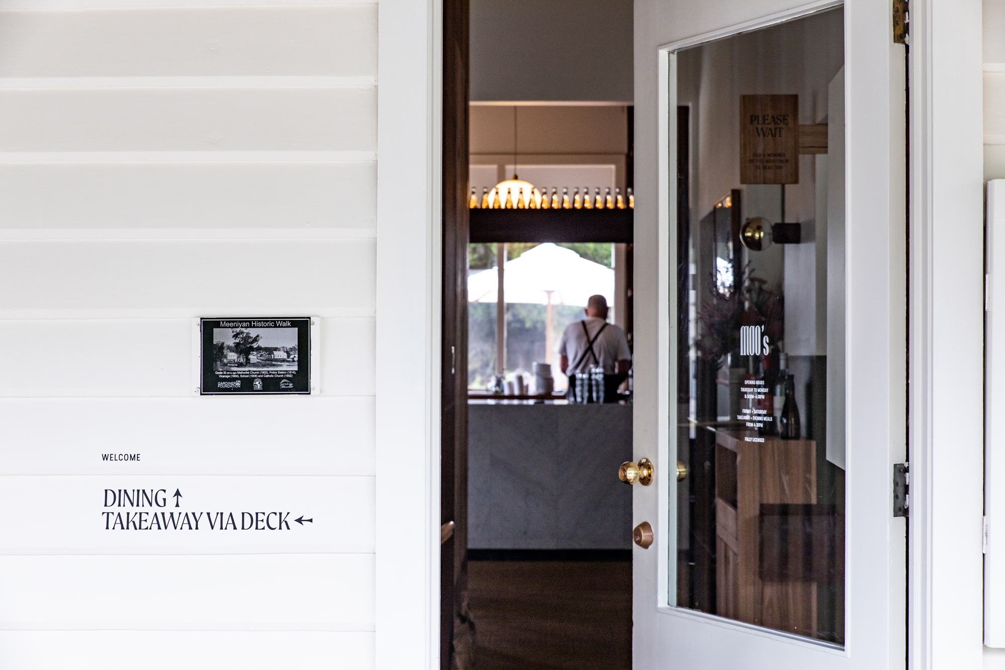
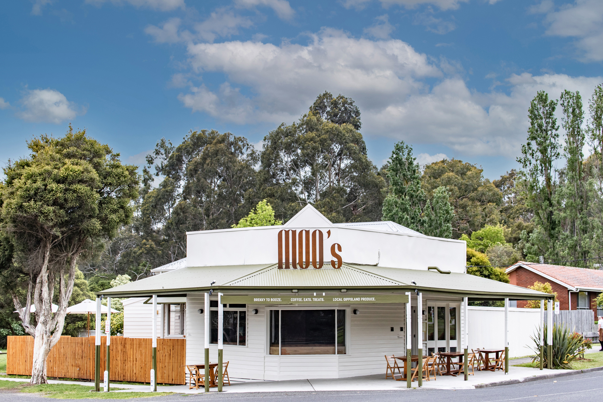
Moo’s is a favourite haunt in Gippsland and they recently underwent a huge renovation of both their dining space and brand identity. We were tasked with capturing the infectious personality of founder Marty aka Marty Moo.
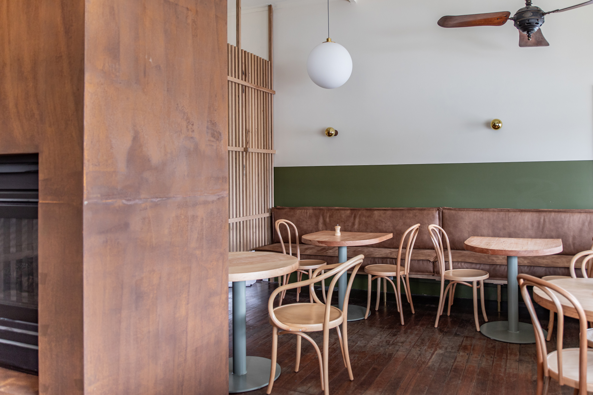
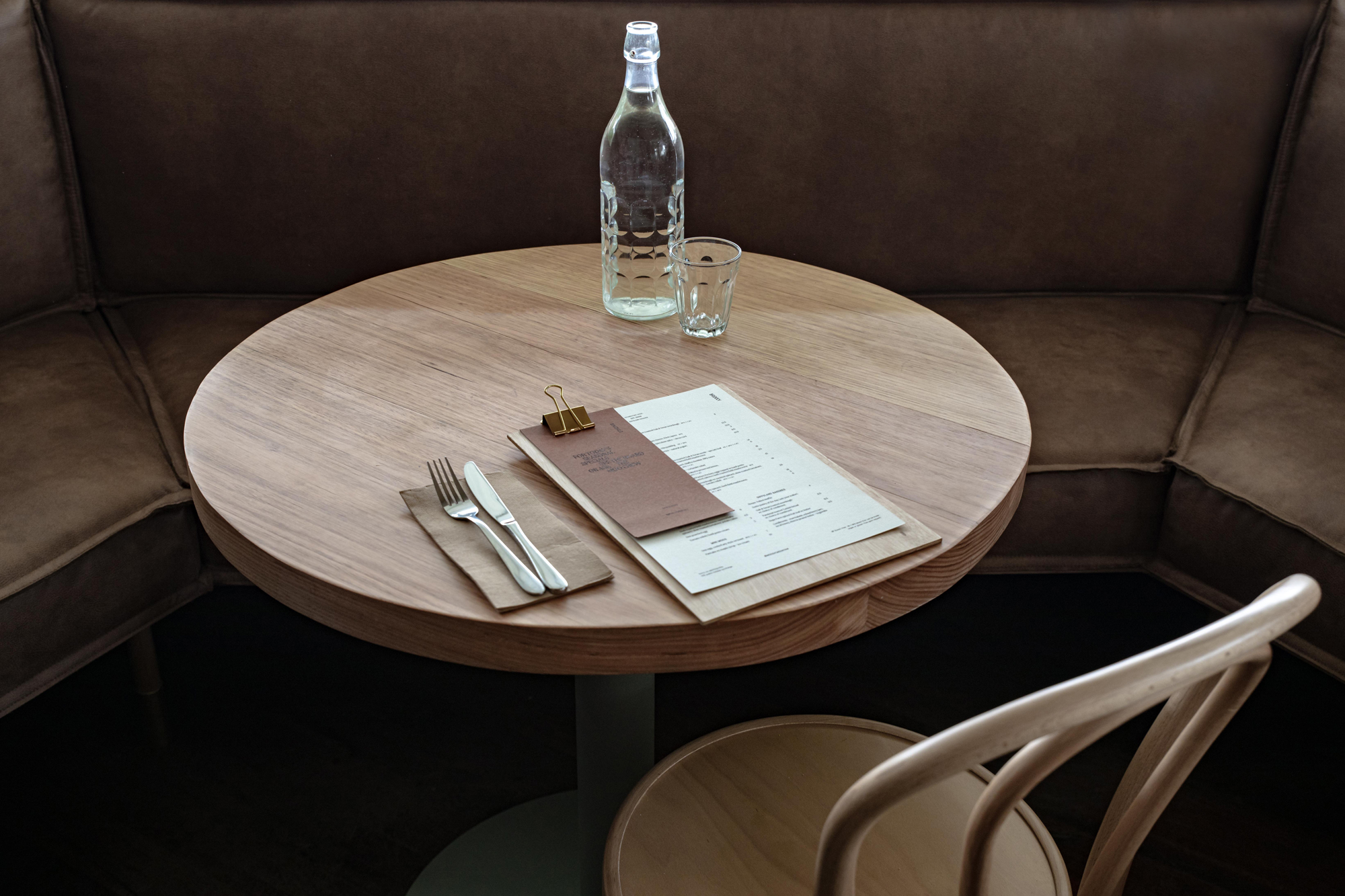
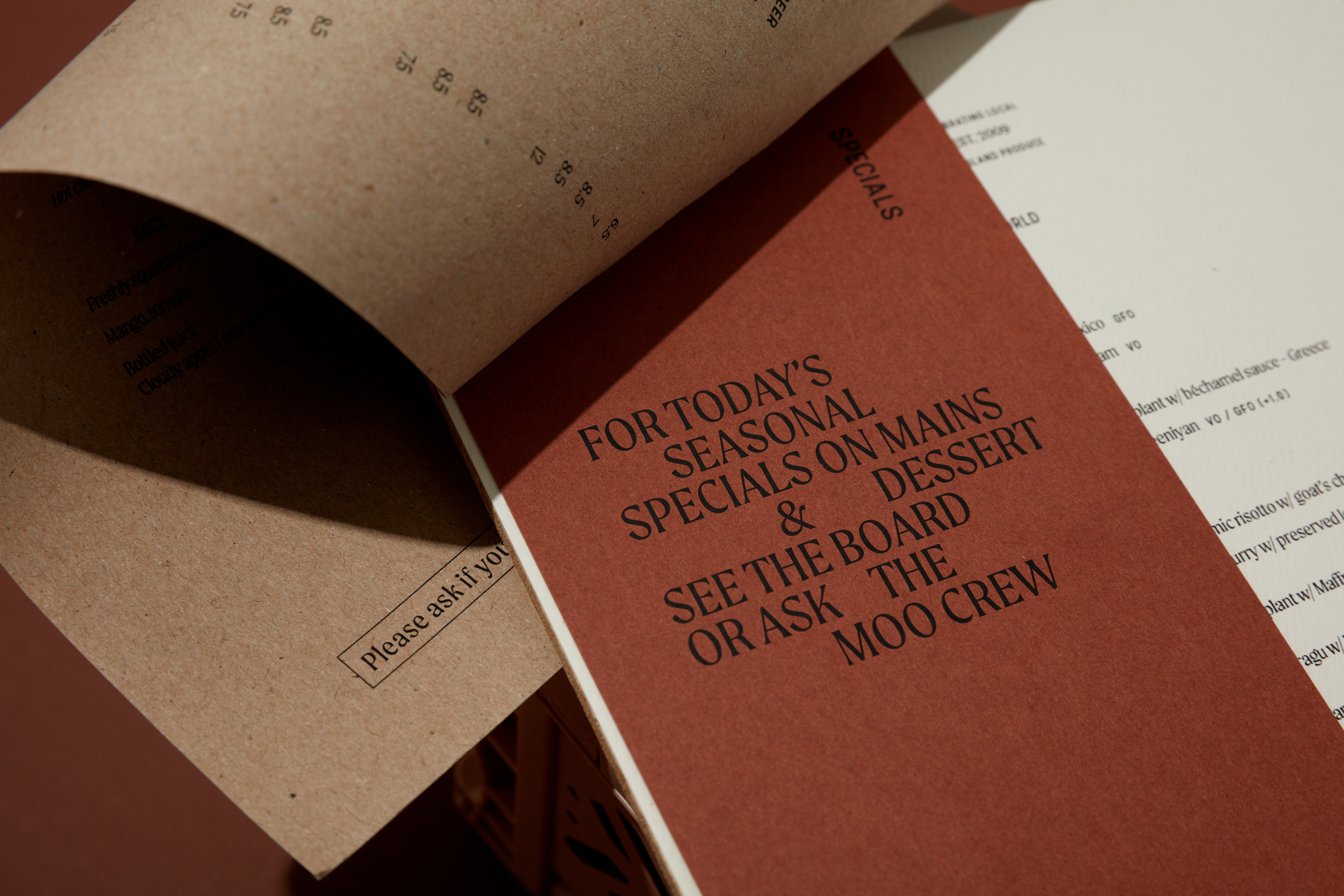
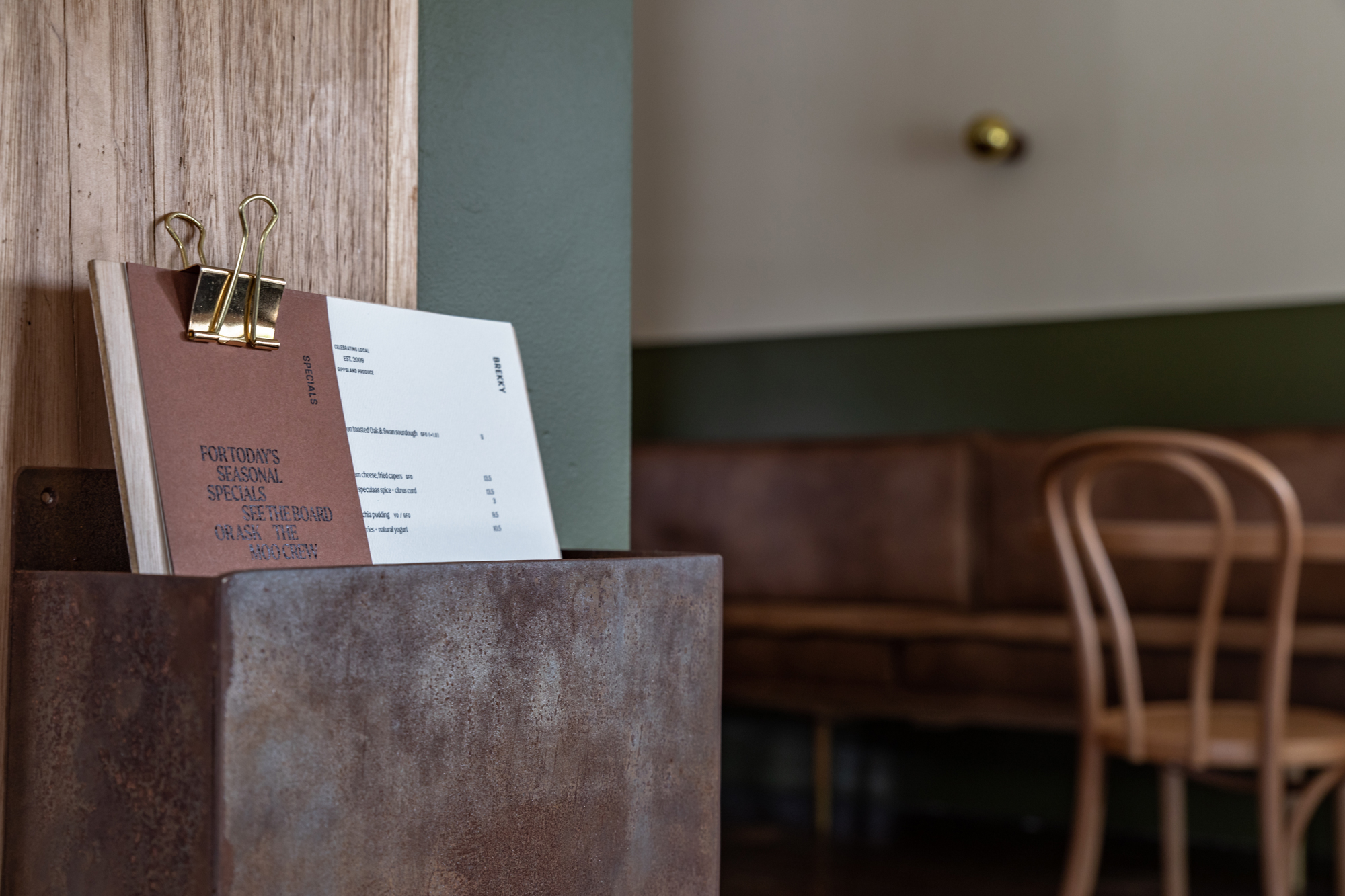
Collaborating with interior designer Andy from Studio Moore on our third project, our initial development took cues from Andy’s design in highlighting Gippsland’s natural landscape with rich and natural tones.
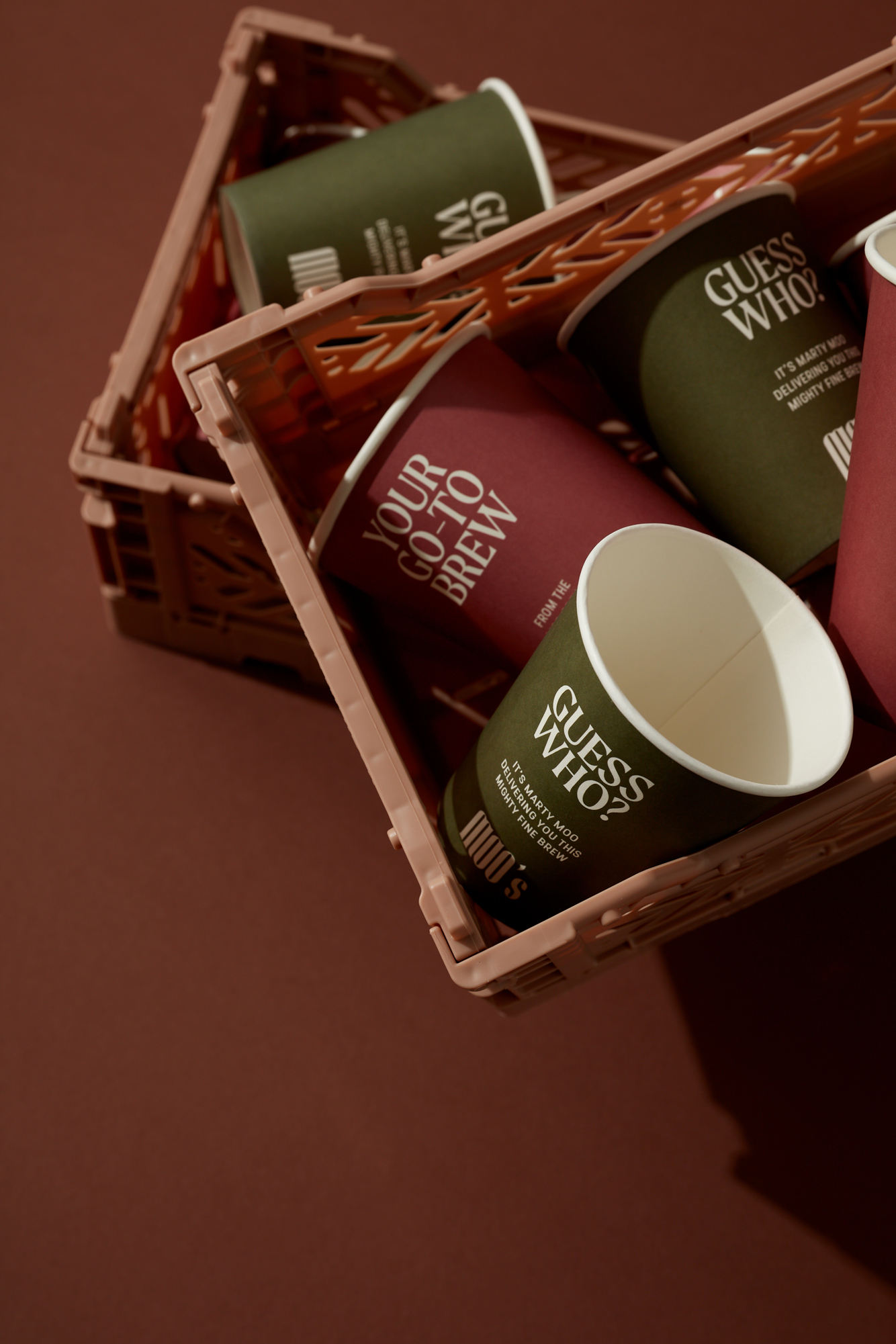
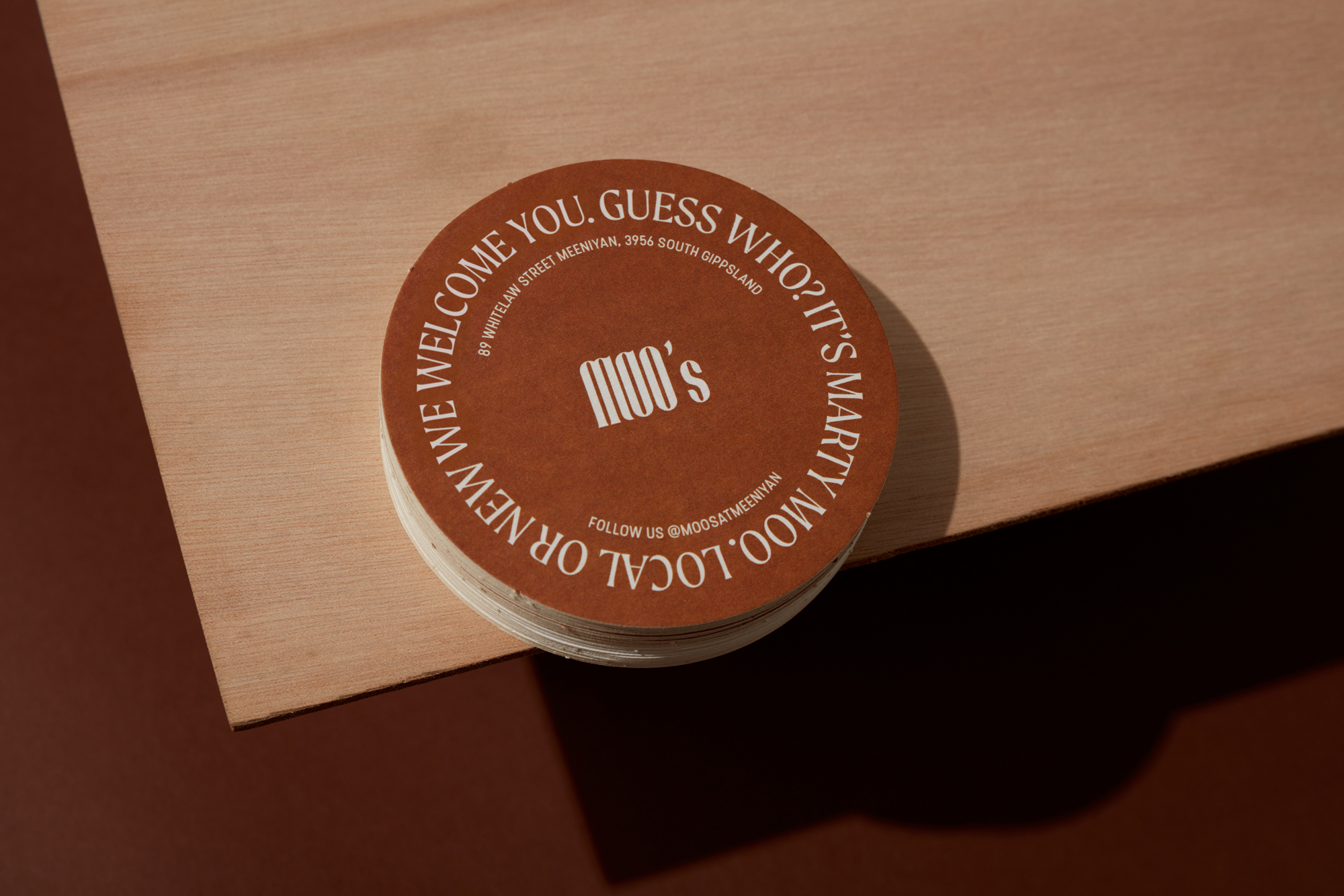
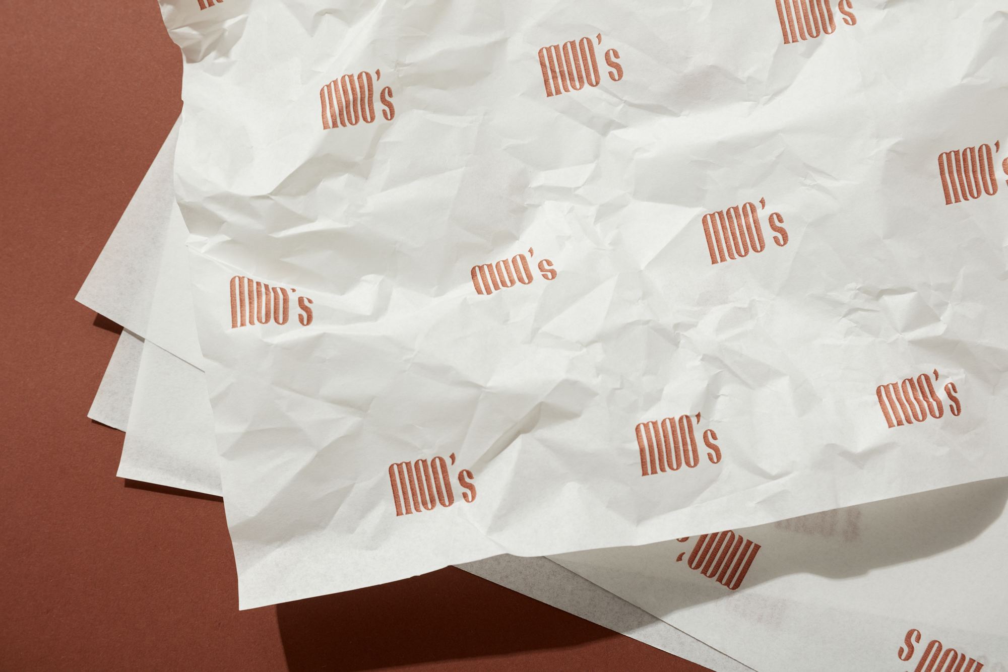
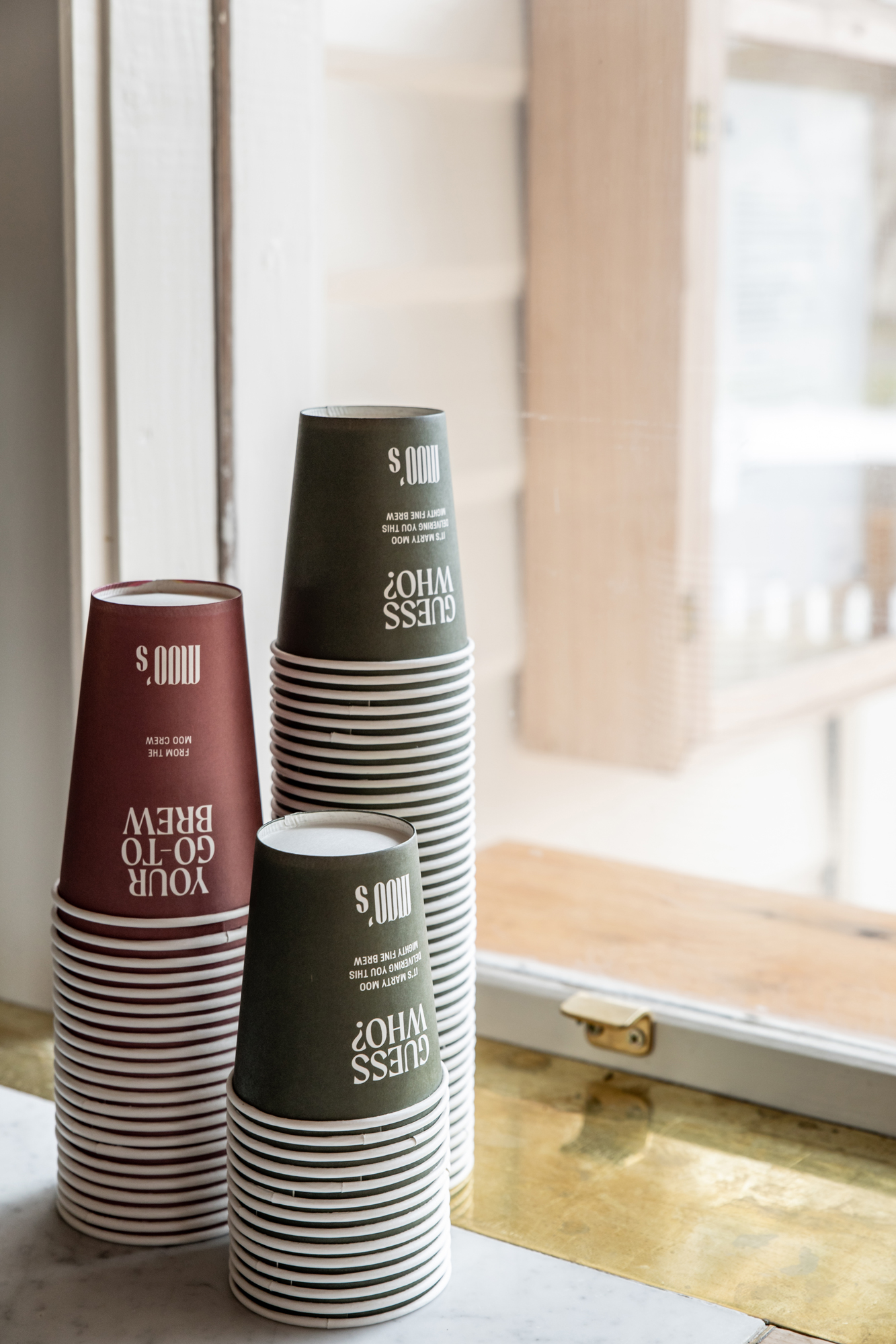
The visual identity was formulated with equal measure of crafted type and lighthearted wordplay which plays big a role in delivering the brand’s personality. Logotype was drawn from scratch using a cow horn shape from the apostrophes which reference the dairy region, merged with elongated Art Deco lettering to evoke a sense of nostalgia.
CREDIT
- Agency/Creative: Studio Sly
- Article Title: Studio Sly Create Moo’s Cafe Redesign and Brand Development
- Organisation/Entity: In-house, Published Commercial Design
- Project Type: Packaging
- Agency/Creative Country: Australia
- Market Region: Oceania
- Project Deliverables: Brand Redesign, Branding, Graphic Design, Identity System, Packaging Design, Tone of Voice
- Format: Cup
- Substrate: Pulp Paper
- Industry: Hospitality


