


Unlike many consultancies based in either business consulting or unproven design thinking methods, Phenomenons was built from the ground up to be focused on statistically significant data interpreted through the lens of psychology.
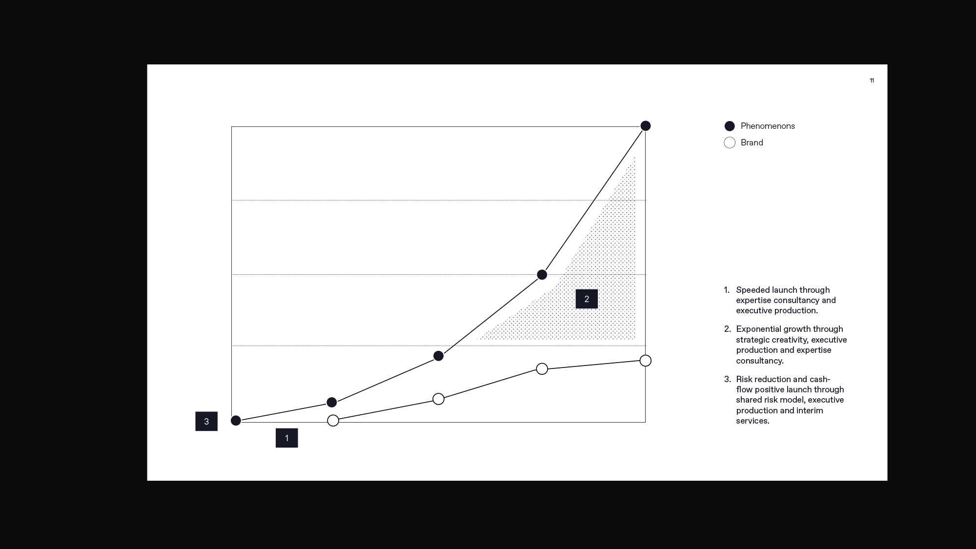
Phenomenons was well-equipped to help navigate the tensions between the known present and the ambiguous future.
The push-pull friction of unknown futures is a common theme for the firm’s clients, who often want to limit their risk while investing or creating something of value for the future.
It was this tension between the known and the unknown that create the overall brand essence – a sense of ambition while trying to peer into the future, beyond the horizon line of what can be predicted.
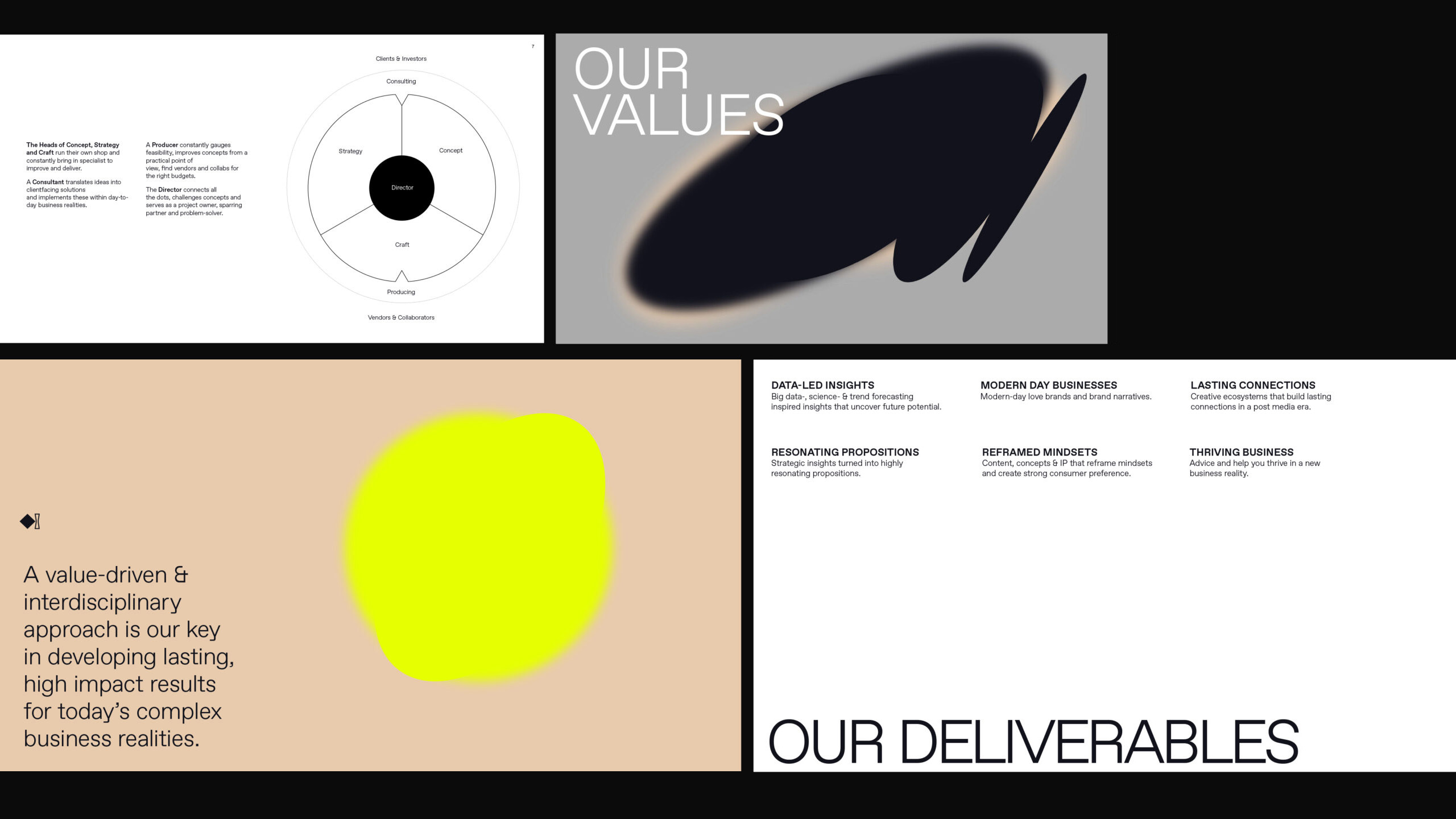
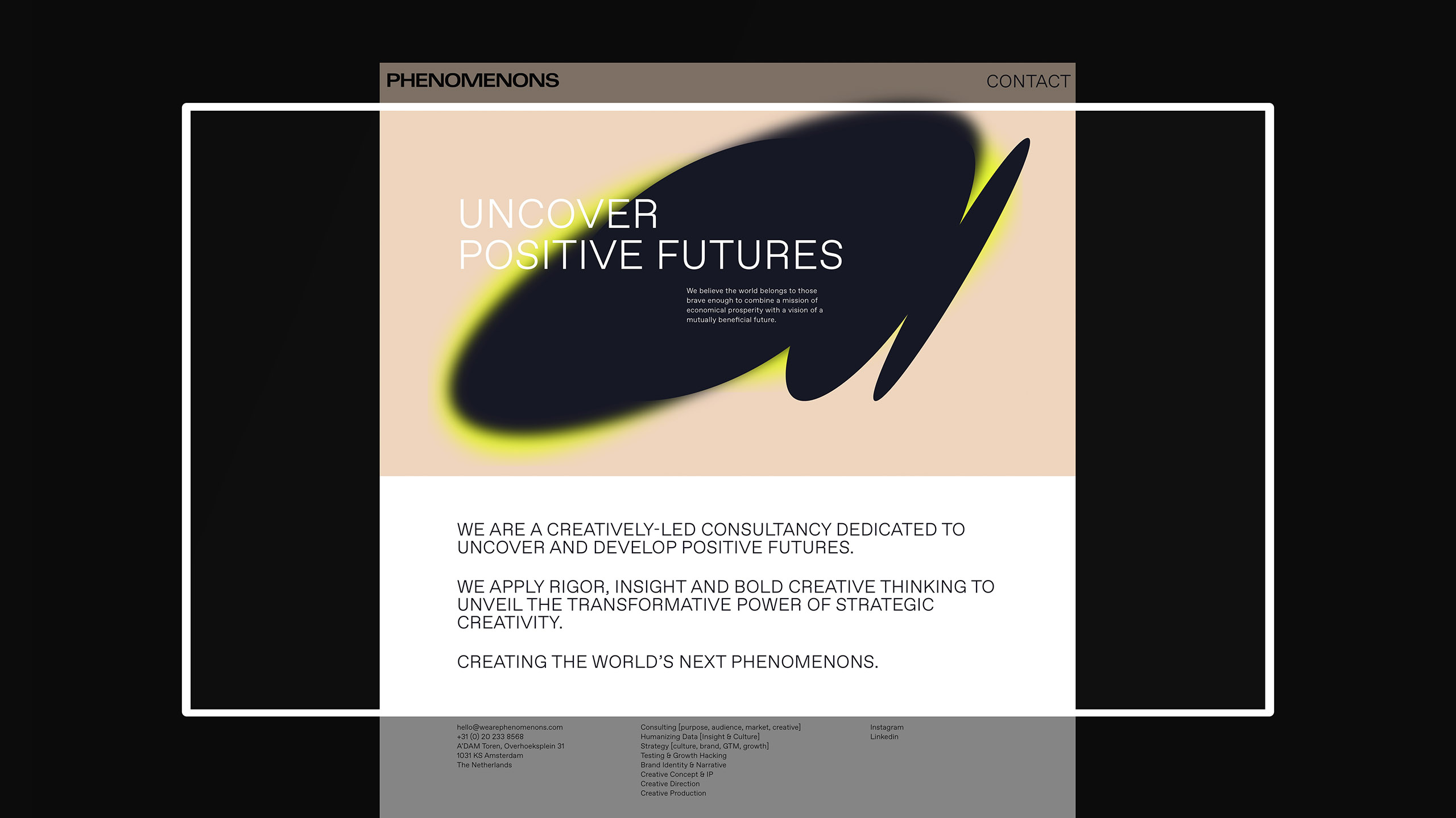
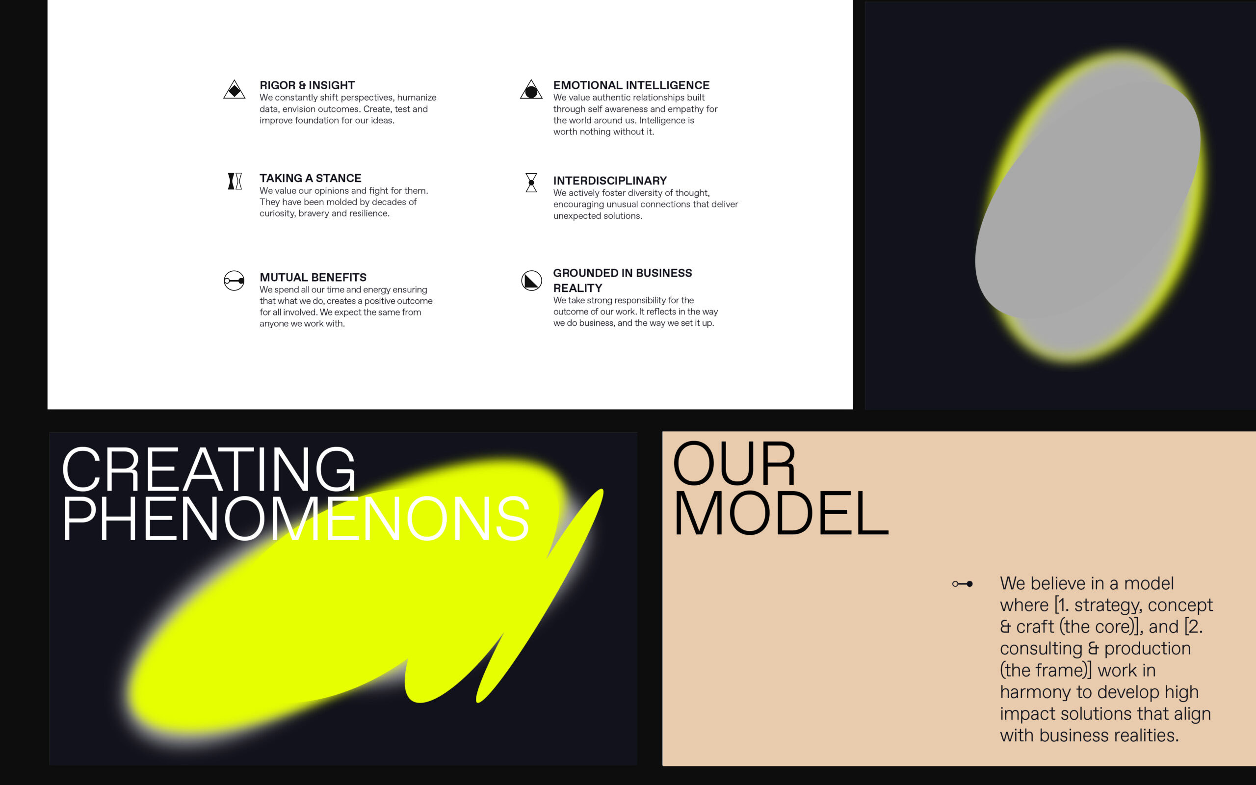
Black holes and the pull of gravity inspired the brand language, rooted in the idea of a phenomenon being a rare but important shift. This graphic expression created a tense and mesmerizing supernova motif – one that feels expansive and growing, softening and sharpening all at once.
A challenging mix of acidic and soft colours create supernova elements that play with foregrounds, backgrounds, and forward motion. The colours supported a sense of tension – and a punk “daring” attitude.
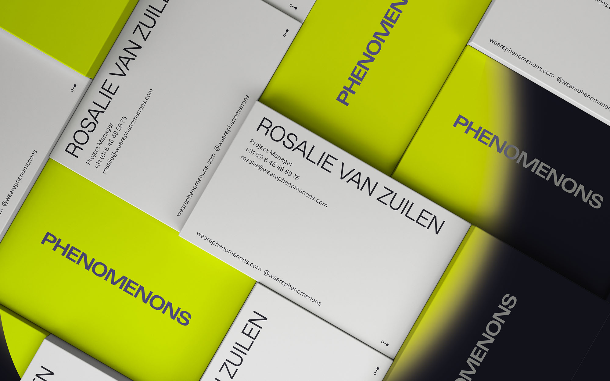
The customized wordmark adds a blocky, unapologetic and precise style of communication, with the word PHENOMENONS rendered in all capitals. Special attention was paid to the overall rhythm of the letters, with the “OMENONS” portion being of particular interest to make sure the widths and proportions allowed easy reading.
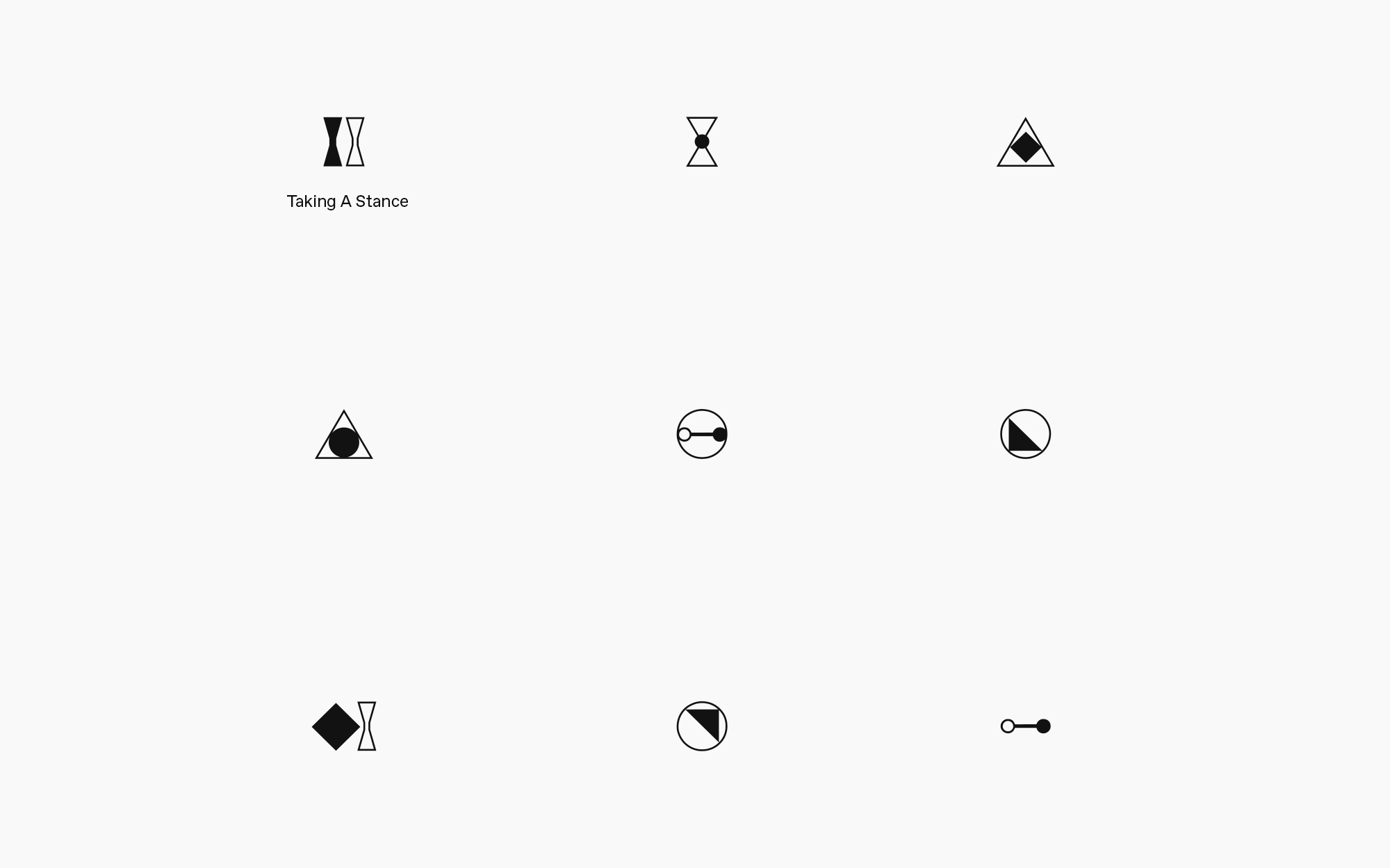
The technical precision of the company—based on their data science background—was brought forward in icons representing different types and ways of working. Inspiration for these icons came from mathematical symbols and marks.
Finally, the typeface Favourit is used throughout the brand system, adding a blocky and unique twist to the usual sans-serif typefaces.


CREDIT
- Agency/Creative: Studio Otherness
- Article Title: Studio Otherness Creates Branding for Phenomenons
- Organisation/Entity: Agency
- Project Type: Identity
- Project Status: Published
- Agency/Creative Country: Netherlands
- Agency/Creative City: Rotterdam
- Market Region: Europe
- Project Deliverables: 2D Design, Art Direction, Brand Creation, Brand Design, Brand Experience, Brand Identity, Brand Mark, Branding, Creative Direction, Graphic Design, Identity System, Research
- Industry: Information
- Keywords: Consulting, Innovation, Design Thinking, Consultancy, Agency
-
Credits:
Creative Director: Joel Derksen


