


Okse is a small independent UX-agency based in Stavanger, Norway. Their goal is to make good user experiences available to as many people as possible. Their projects spans multiple industries, everything from public transportation to universities.
We were tasked with renewing their visual identity to better reflect the personality of the agency. It became clear early in the process that Okse’s down-to-earth and straight-forward approach was what set them apart from other UX agencies. While competitors are flashing VR-headsets and complex node illustrations they are choosing the simplest and most effective solution to problems they are tasked with. UX is all about people not about tech, it was the only approach that felt right.
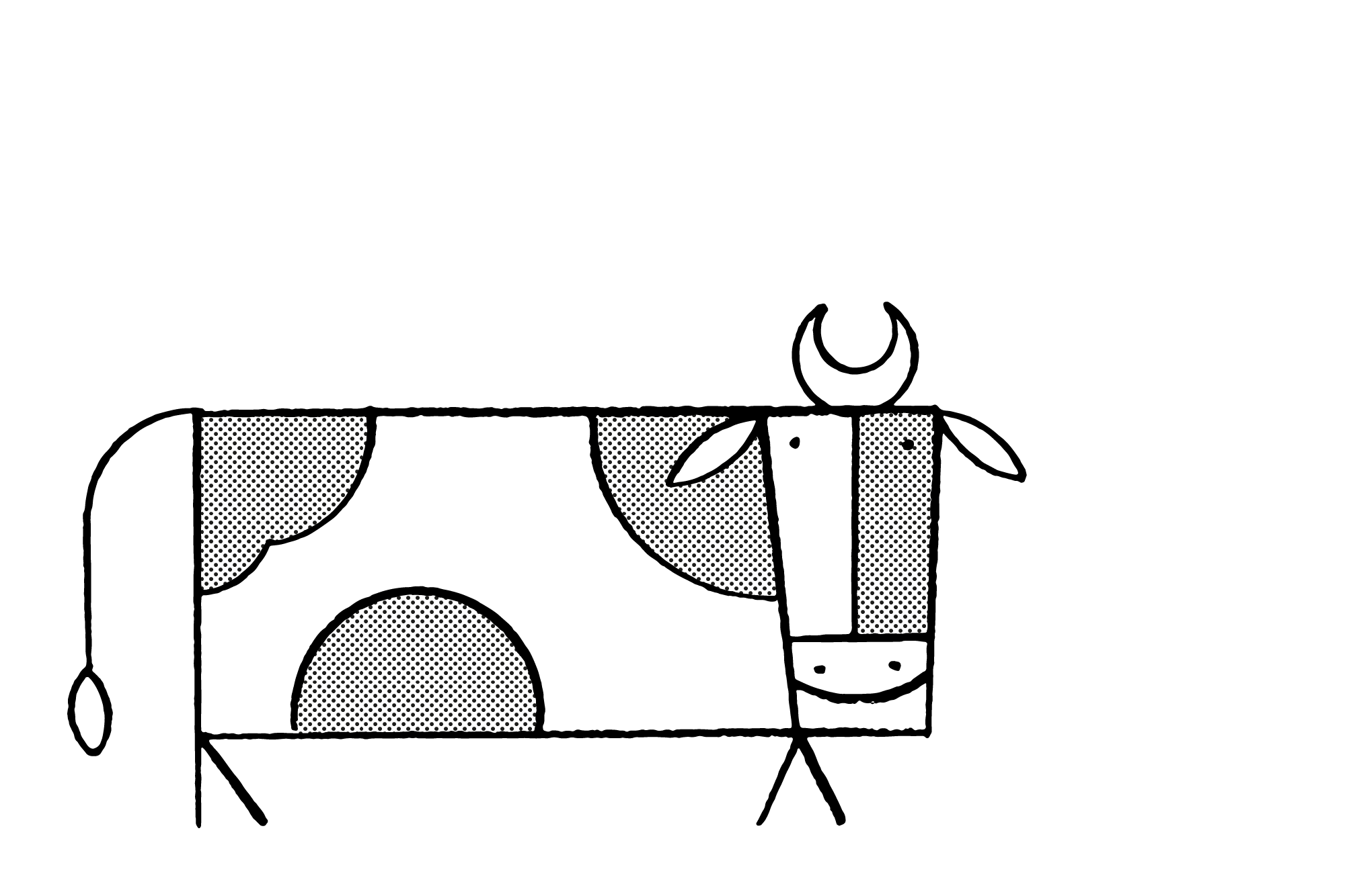
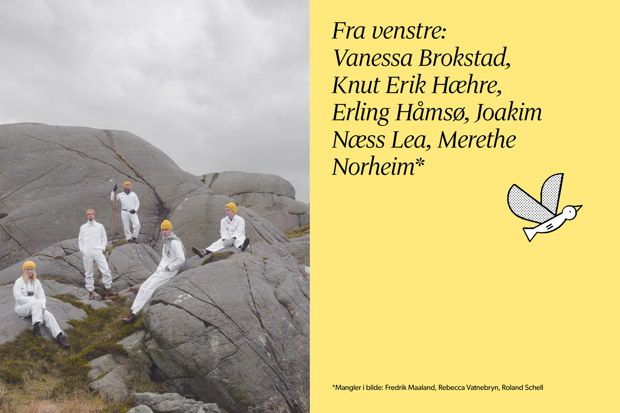
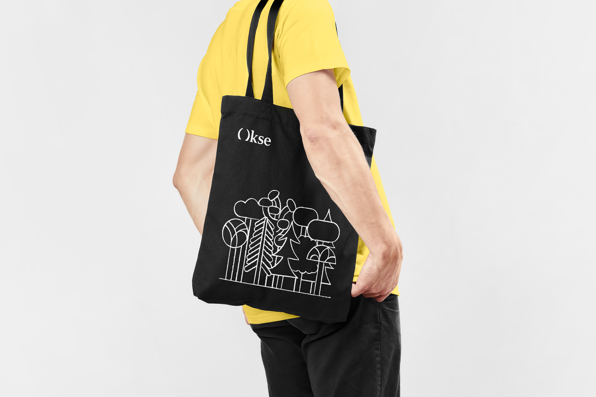
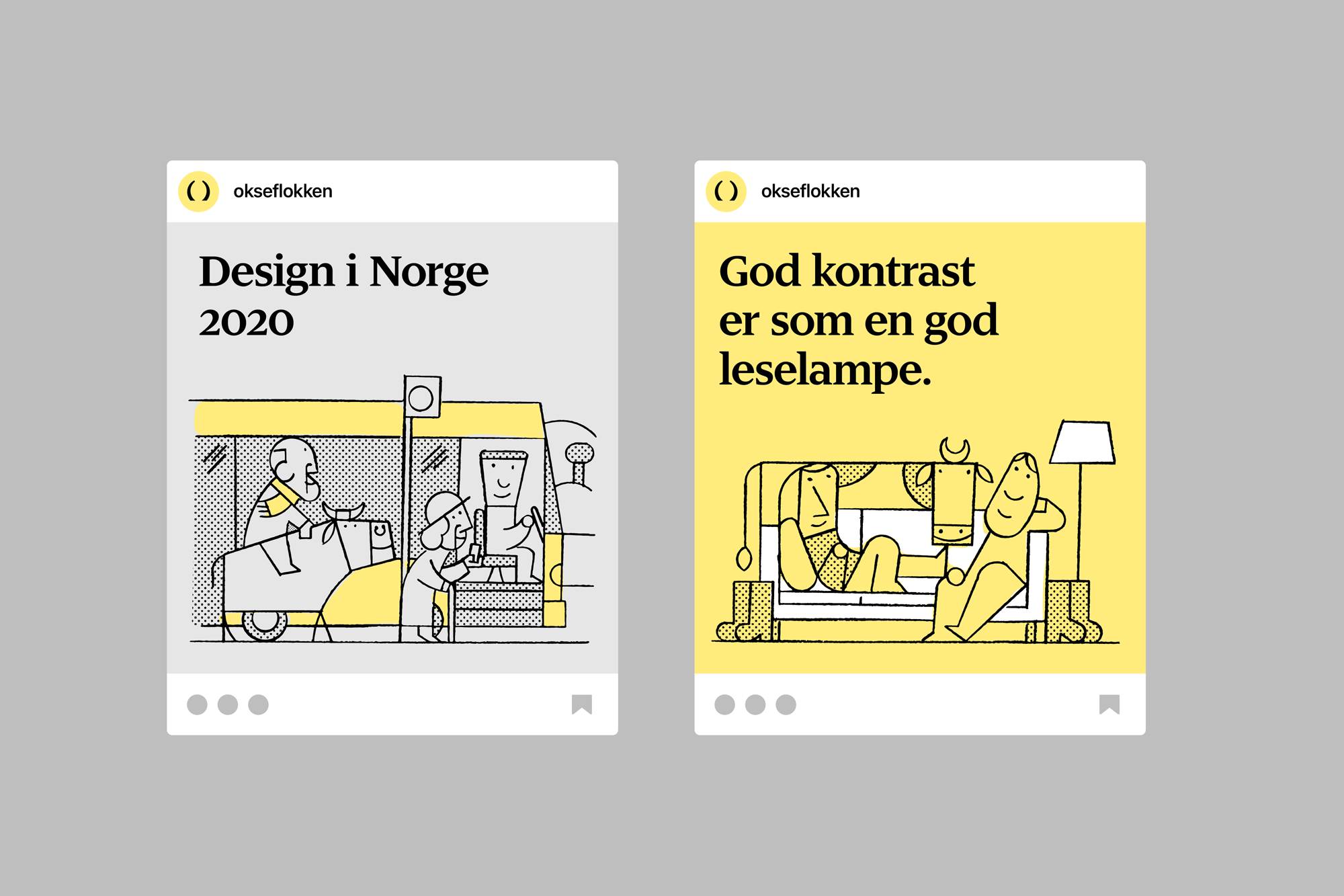
An important aspect was also to incorporate Jæren, a large flat lowland area in Norway and it is where Okse is located. It is one of the most important agricultural areas of Norway, known for its rough climate and its hard working, straight forward and stubborn farmers. Both the ox and the farmer are dependent on good soil to have a good life. Okse uses this as a metaphor to describe the company’s personality and culture, since soil is the foundation of any good farm. To do this we collaborated with Jay Cover to create illustrations with motives set in the rural landscape of the west-coast of Norway, Jæren.
When we were considering what illustrator that could fit with the identity Jay came as a natural choice. His illustrations strike this balance between being witty, reflecting the light-hearted tone, and at the same time quite geometric and precise, which we felt was necessary to maintain the balance. We also felt that the fact that his illustrations are hand drawn added a personal quality that enriched the identity.
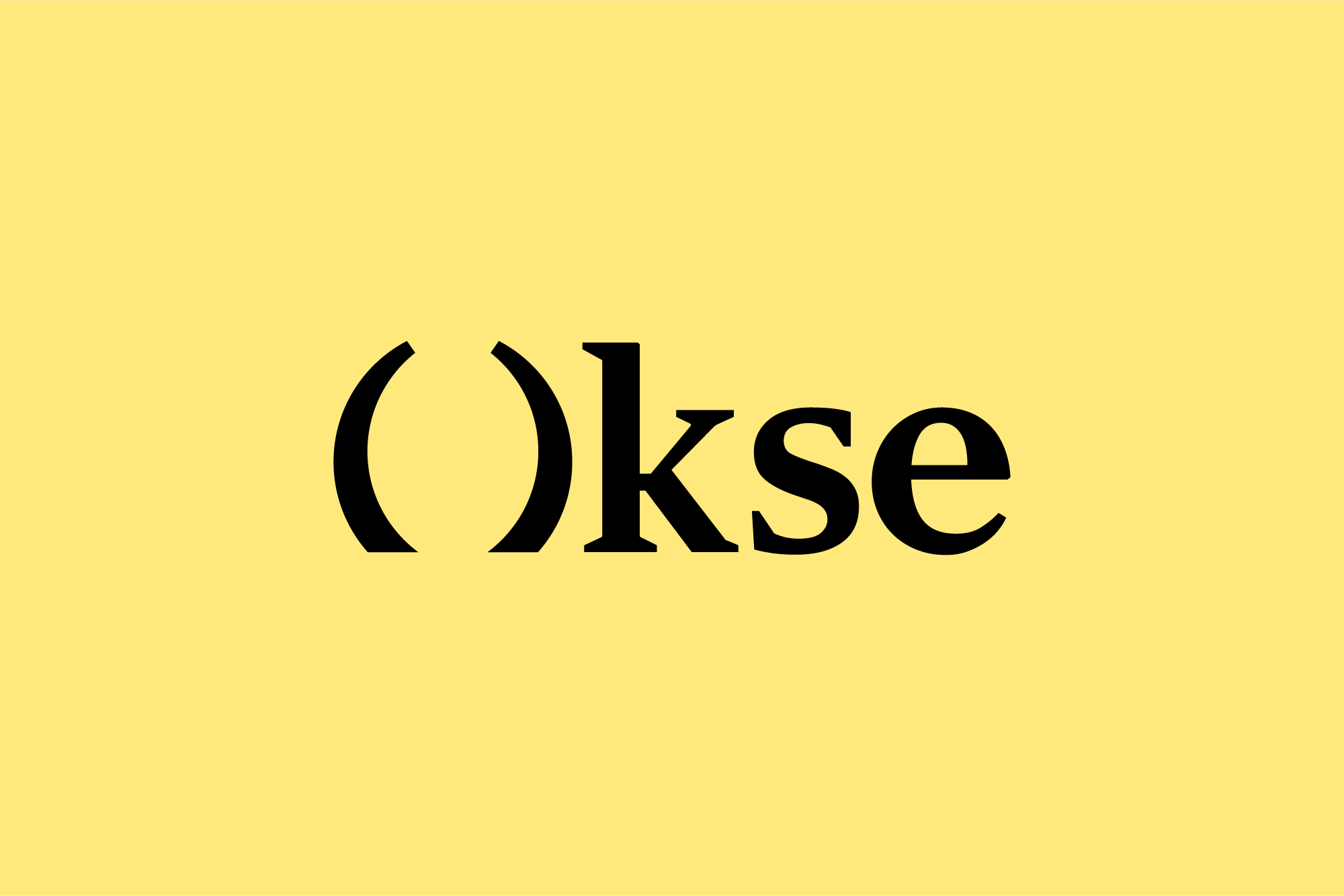
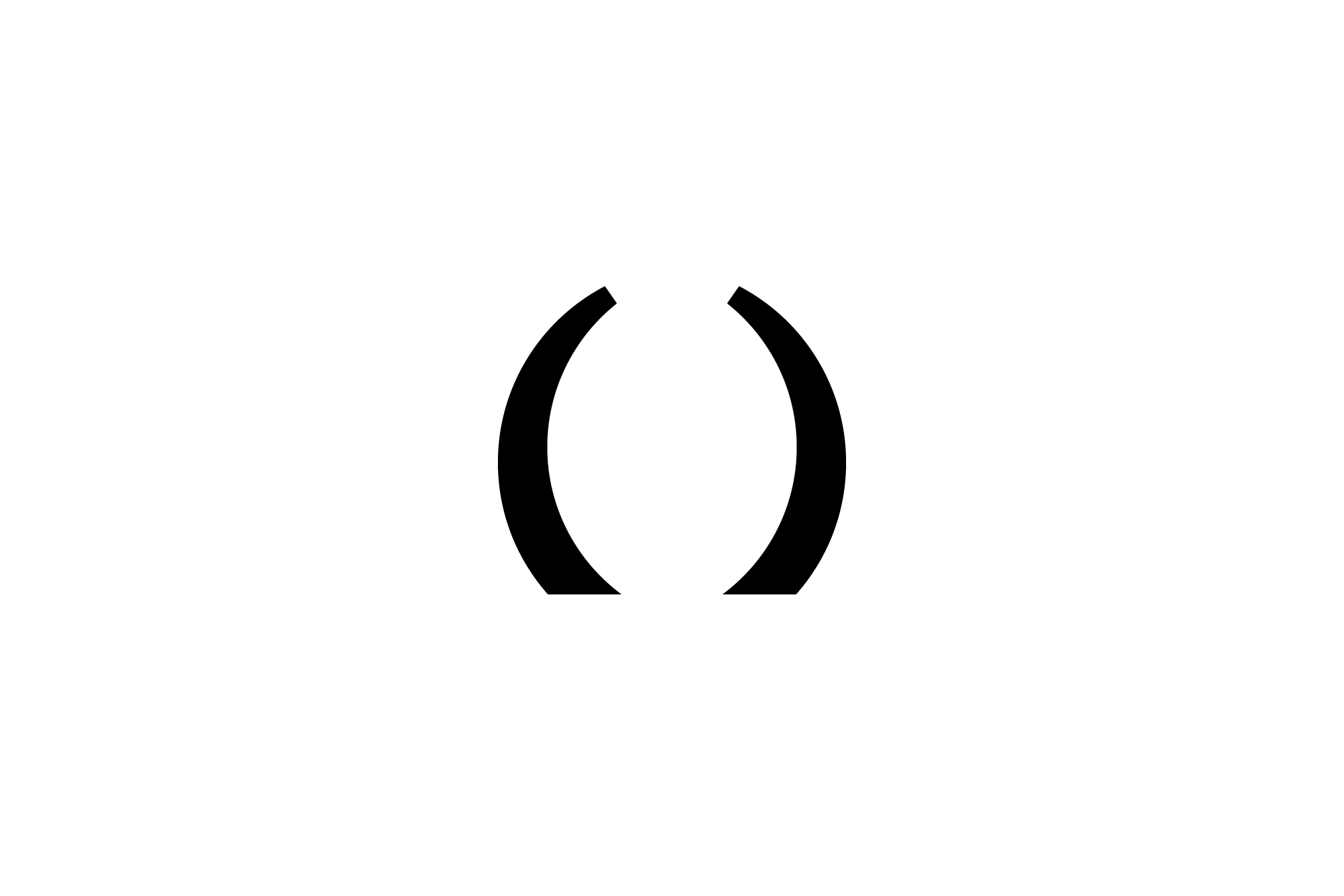
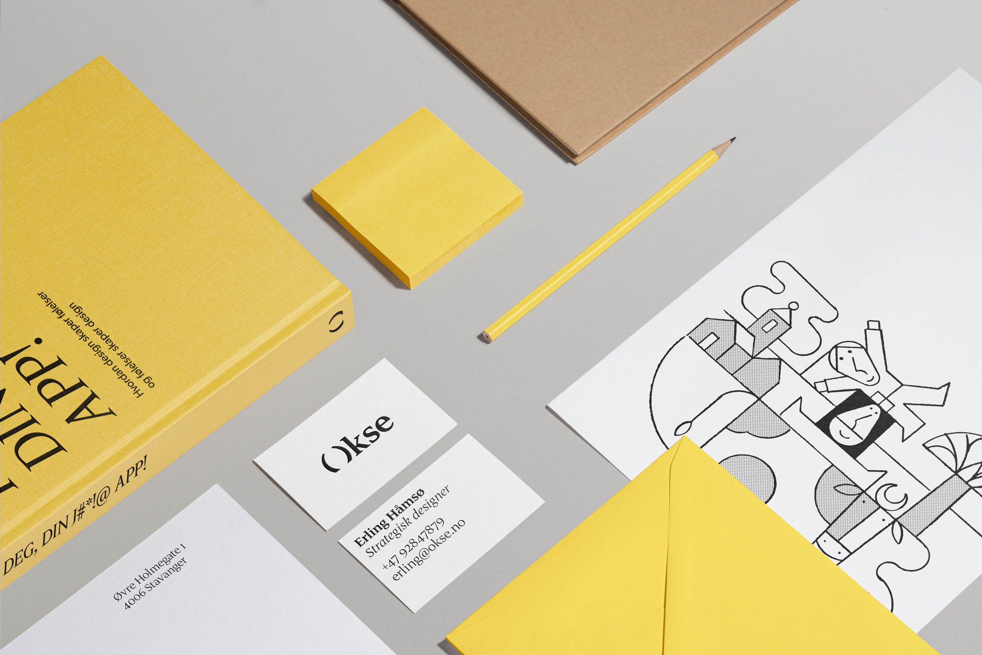
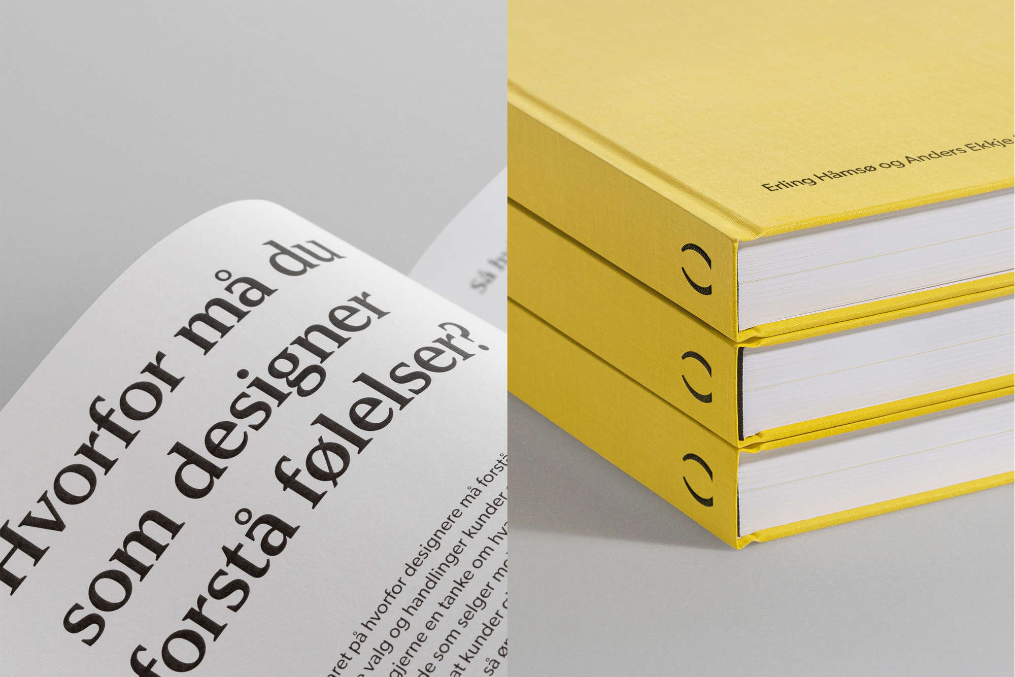
The symbol construction combines three elements: O for Okse, the most iconic part of the bull; the horns and a parentheses. The parentheses signifies their understanding of languages used by developers, a vital part of creating good user experiences.
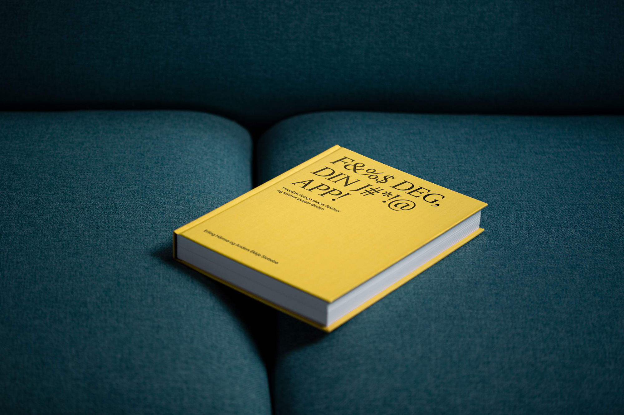
To accompany the symbol, the typeface Dignitas from Commercial Type was chosen for it’s distinct sharp serifs, extending the horn reference while giving them a more academic expression which distinguishes them from competitors.

CREDIT
- Agency/Creative: Studio Oker
- Article Title: Studio Oker Creates a New Identity for Okse
- Organisation/Entity: Agency, Published Commercial Design
- Project Type: Identity
- Agency/Creative Country: Norway
- Market Region: Europe
- Project Deliverables: Brand Identity, Brand Redesign, Brand Strategy, Branding, Graphic Design, Identity System, Illustration, Photography, Rebranding, Research, Tone of Voice
- Industry: Technology
- Keywords: UX, Brand design, Visual identity, Logotype, Typography, Serif


