


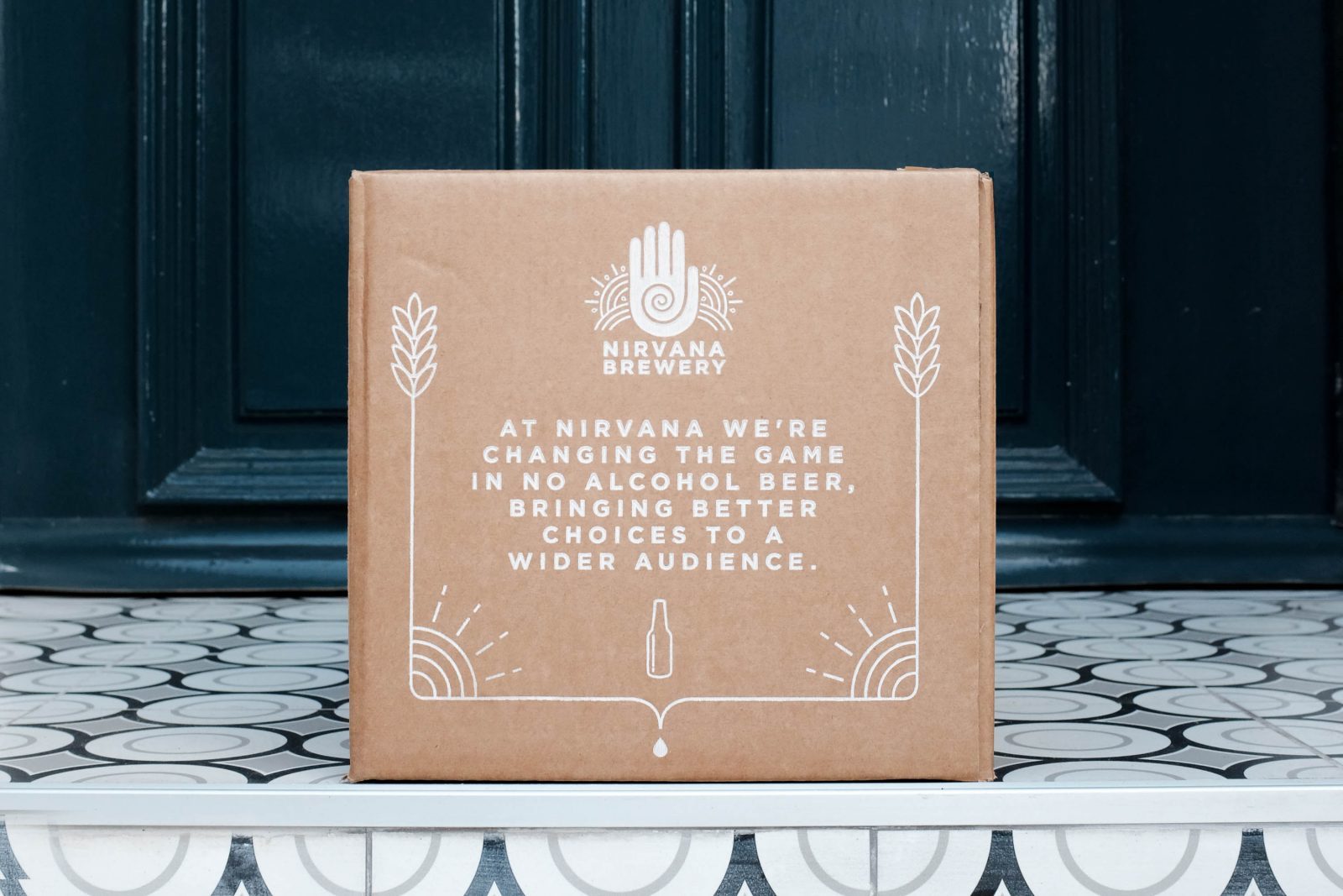
Nirvana brewery makes low- and no-alcohol beers, ales and lagers. Proud of their focus on quality and natural ingredients, they needed a unifying master brand and product designs to support their growing portfolio. The new branding also needed to embody the brewery’s zest for life and passion for achieving a balanced lifestyle, and increase their appeal to both drinkers and non-drinkers.
They approached Studio More for some strategic thinking to help deliver a striking brand expression and solve the conundrum of how to integrate their existing bestselling lager, which was well-known to stockists and consumers under the previous branding.
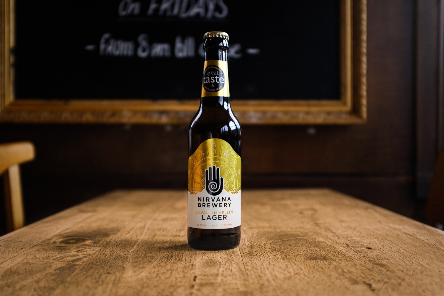
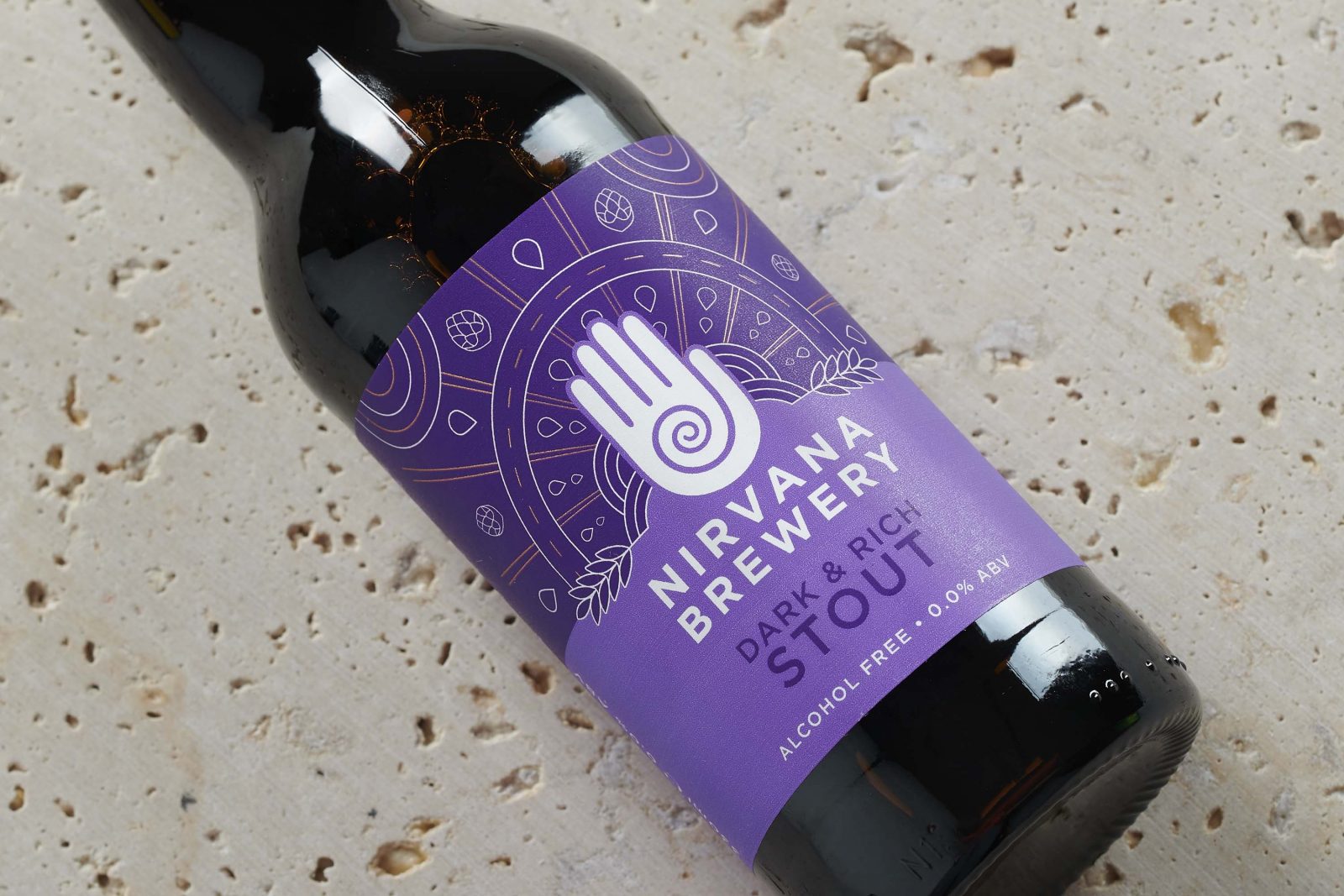
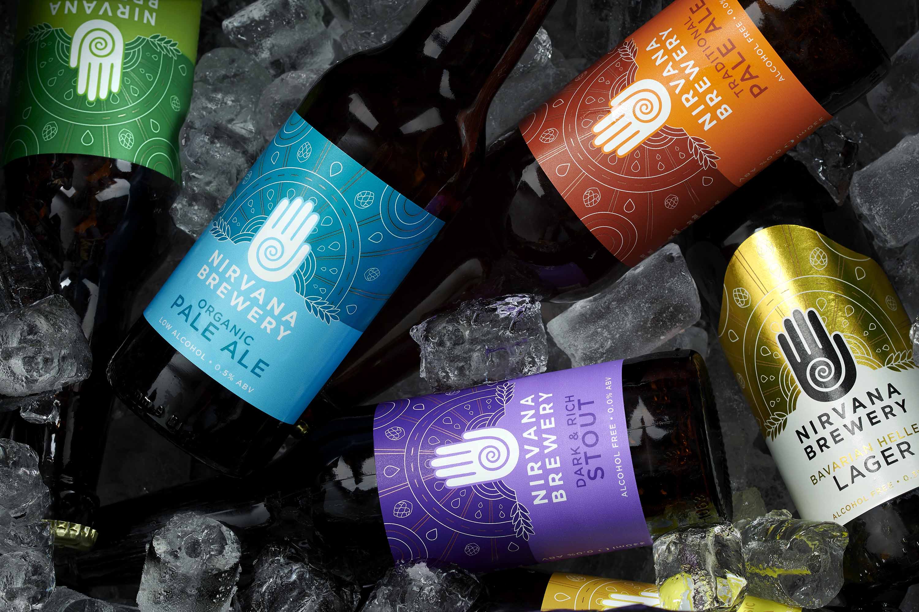
Dan Wilson, creative partner at Studio More, said, “We created a masterbrand and new design toolkit using a rich, flexible visual language that tells the brand’s story, conveys the ‘perfect beer’ journey –inspired by the ‘perfect state’ of Nirvana – and the unique brewing process. With roots in the original branding, the design toolkit evolves certain key equities, such as the ‘transcendental’ hand logo. The work not only gave them a masterbrand strong enough and striking enough to support growth, it also seamlessly integrated their bestselling lager without sacrificing brand recognition.”
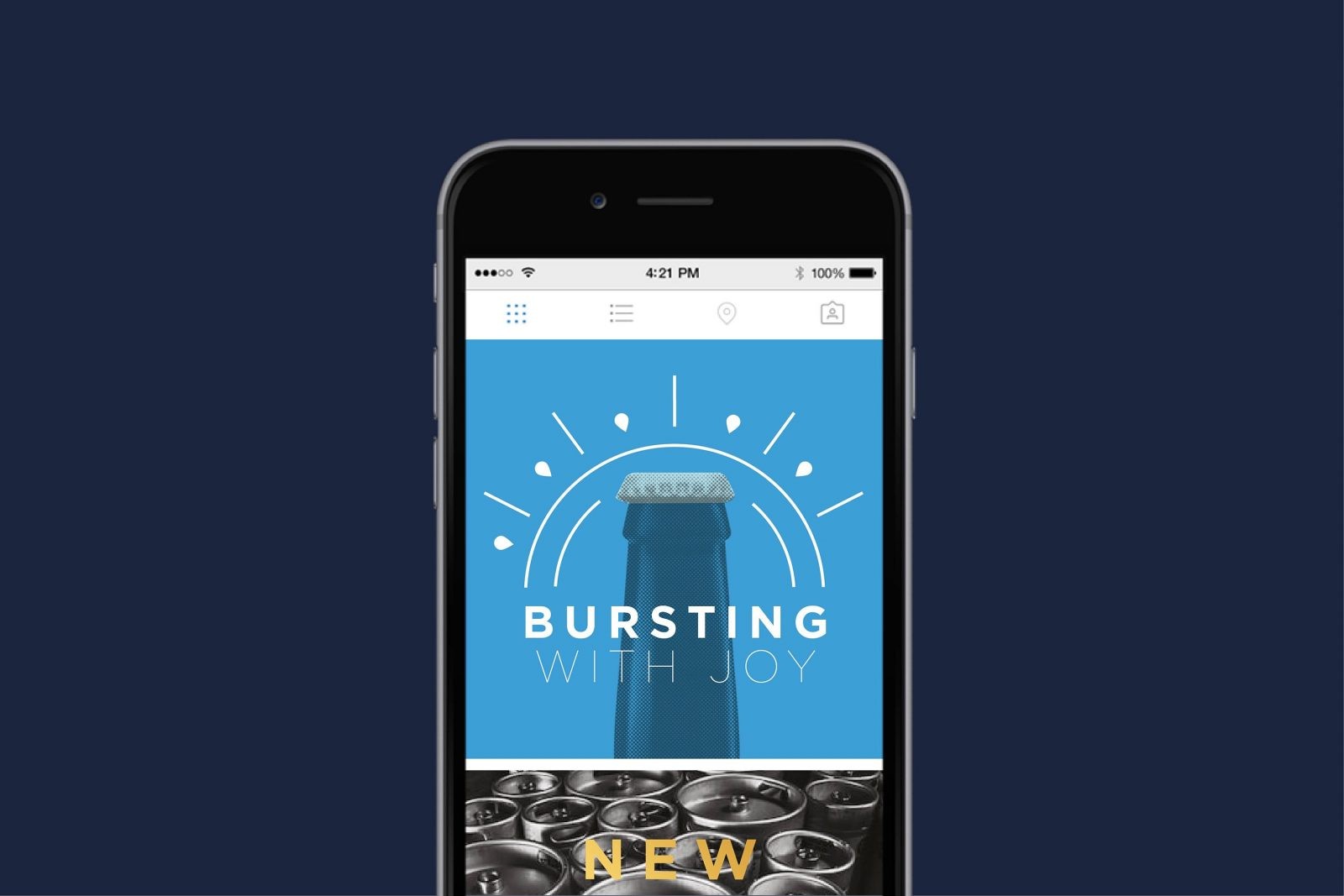
‘Balance’ was a key theme. The design’s perfect symmetry, radiating out from the hand, represents finding your perfect state, while the illustrative arrows and dotted lines convey the ‘life is a journey’ message. Rather than being just another no-alcohol brand in a growing market, Nirvana stands out as a celebratory lifestyle choice brimming with positive vibes. The gender-neutral aesthetic works beautifully across social media, presentations, trade stands and more. Add a new brand story, brand values and tone of voice, and Nirvana is ready to ‘make the good times last’.
A recent winner in the World Beer 2020 Awards, the brewery’s strengthened brand, unified product range and eye-catching visual expression is opening doors to a fresh world of growth potential. Rebecca Kean, co-founder and brand owner, said, “Studio More united two brands to create one big Nirvana family, helped define our positioning, and gave our brand a sharper commercial focus. No mean feat. The results were a single, beautiful look and feel with engaging lifestyle messaging. We now have an amazing brand presence with collateral that can translate from the bottle across any media.”
![]()

CREDIT
- Agency/Creative: Studio More
- Article Title: Studio More’s Measured Redesign for Nirvana Brewery
- Organisation/Entity: Agency, Published Commercial Design
- Project Type: Packaging
- Project Status: Published
- Agency/Creative Country: United Kingdom
- Market Region: Global
- Project Deliverables: Brand Creation, Brand Identity, Brand Strategy, Brand World, Branding, Graphic Design, Packaging Design, Product Architecture, Retail Brand Design, Tone of Voice
- Format: Bottle
- Substrate: Glass Bottle


