


London based Studio More has redesigned the James White parent brand, marking the company’s first significant change in look in over 30 years of business.
James White, founded in 1989, includes treasured drinks brands such as Big Tom which holds a royal warrant, and Thorncroft, the first elderflower cordial makers in the UK. The parent brand redesign is rolling out at present into on trade and retailers, including Waitrose, Tesco and Sainsbury’s. It marks part of a longer ranging relationship between Studio More and James White, and an exciting new look for many brands in the portfolio will follow in forthcoming months.
Aware that there has never been a unifying brand expression for their drinks’ ranges, the management at James White approached Studio More to apply some strategic thinking to deliver the brand articulation that this cherished company deserves.
Dan Wilson, creative partner at Studio More comments, “James White needed to tell their story, clarify their values, purpose and USPs, and appeal to buyers and stockists, but without starting from scratch: Evolution not revolution. With this in mind, we created the brand strategy, Bold By Nature. Strong and inspiring, this approach set the scene for subtle changes with significant impact.”
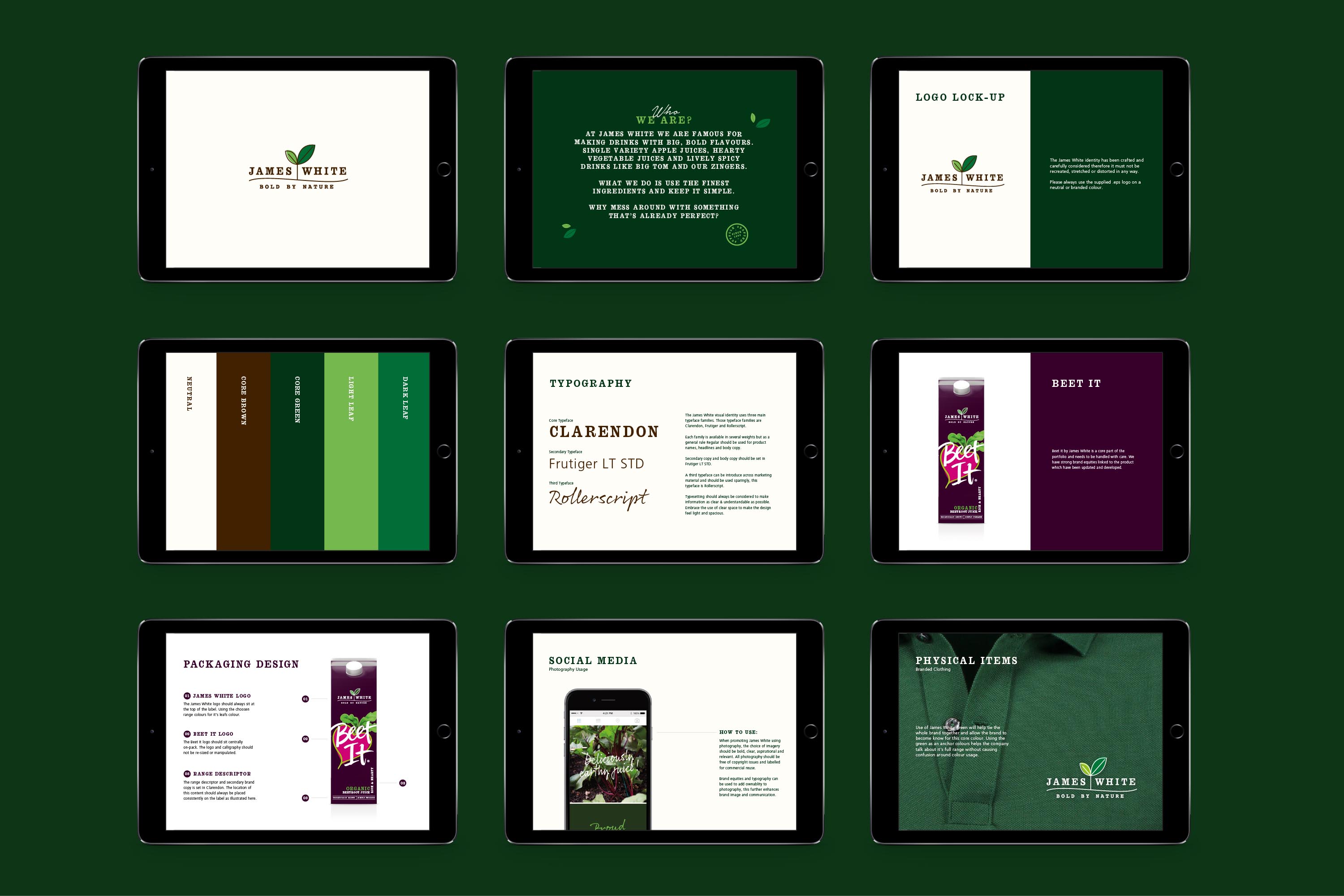
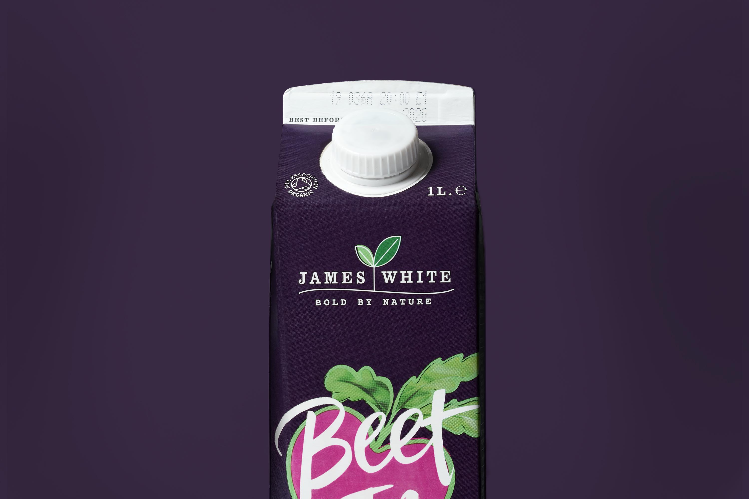
The new master brand logo features a leaf rooted firmly in the ground, to suggest the longevity of James White’s success. Below this sits the ‘Bold by Nature’ strapline which conveys the drinks’ punchy flavours and uncompromising ingredients. Clean and fresh with simple colourways, the logo unites the ranges without dominating packs.
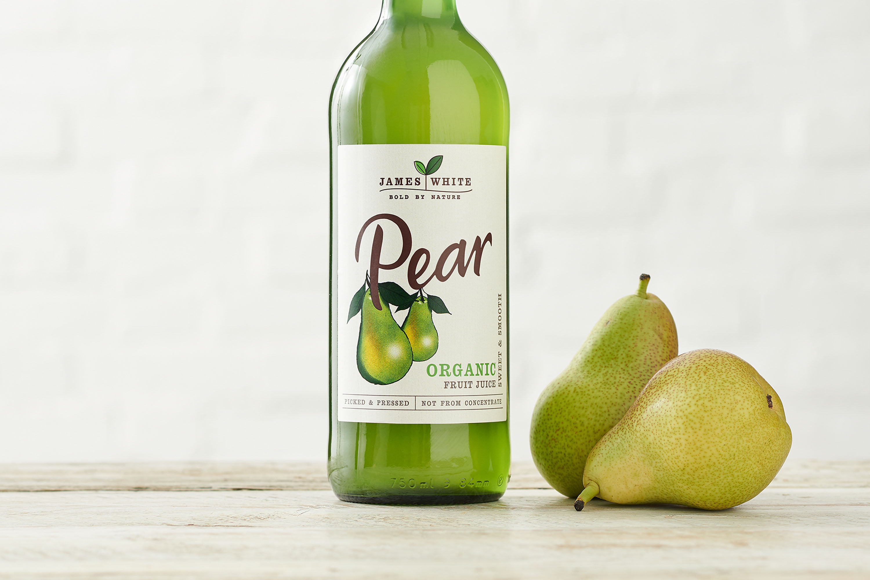
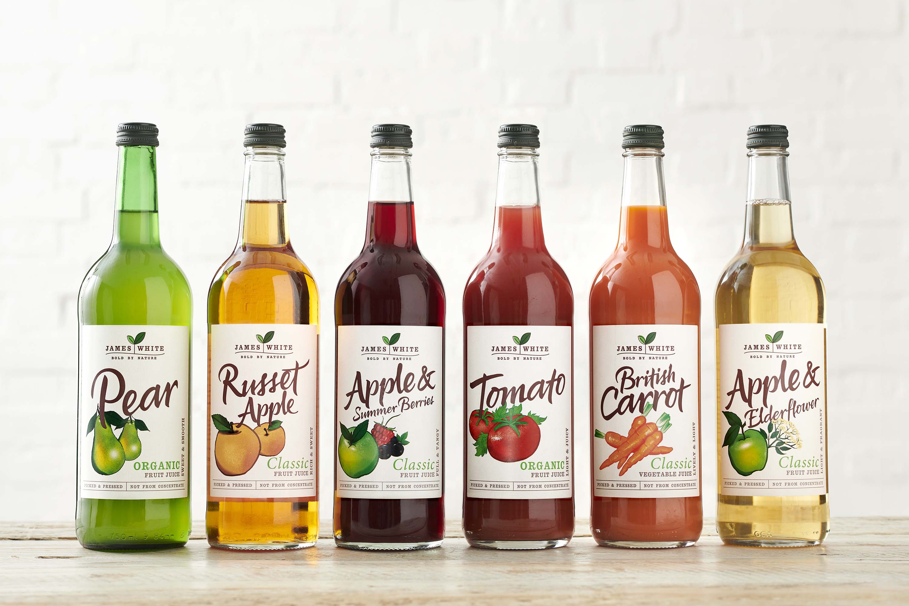
After clarifying the brand blueprint, Studio More updated designs for their multiple ranges including the bestselling Beet It, Organic and Classic Juice ranges, creating consistencies without changing the styling, layout and colours that consumers are familiar with.
For the ranges themselves, the agency elevated on-pack illustrations, making them more contemporary by using finer touches on colour, shape and stroke lines, and updated the typography. Thanks to a flexible and robust brand strategy, thoughtful design and careful refinement of existing brand equities, the new look now tells the whole delicious story.
Lawrence Mallinson, founder of James White comments, “Working with Studio More has established a firm base for our brand to grow confidently. The agency delivered exceptionally well against our objectives to make our portfolio more visible at the fixture, and to enable us to launch NPD with ease. We’re excited to continue this collaboration with our valued strategic brand design partner.”
CREDIT
- Agency/Creative: Studio More
- Article Title: Studio More Takes James White Refreshingly True to Its Roots
- Organisation/Entity: Agency, Published Commercial Design
- Project Type: Packaging
- Agency/Creative Country: United Kingdom
- Market Region: Europe
- Project Deliverables: Brand Architecture, Brand Creation, Brand Design, Brand Guidelines, Brand Identity, Brand Redesign, Brand Refinement, Brand Rejuvenation, Brand Strategy, Brand World, Branding, Graphic Design, Identity System, Illustration, Packaging Design, Product Architecture, Product Naming, Rebranding, Research, Retail Brand Design, Structural Design, Tone of Voice
- Format: Bottle
- Substrate: Glass Bottle


