Rhino is a modern company in the field of preparation, production and packaging of seafood, many of the company’s devices and machines are equipped with world-class methods, this has made the quality of Rhino’s products much better than its competitors in Europe.
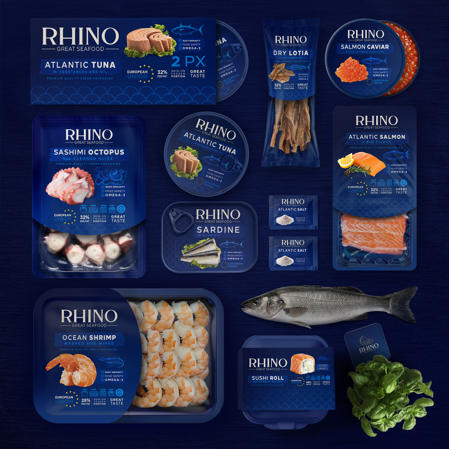
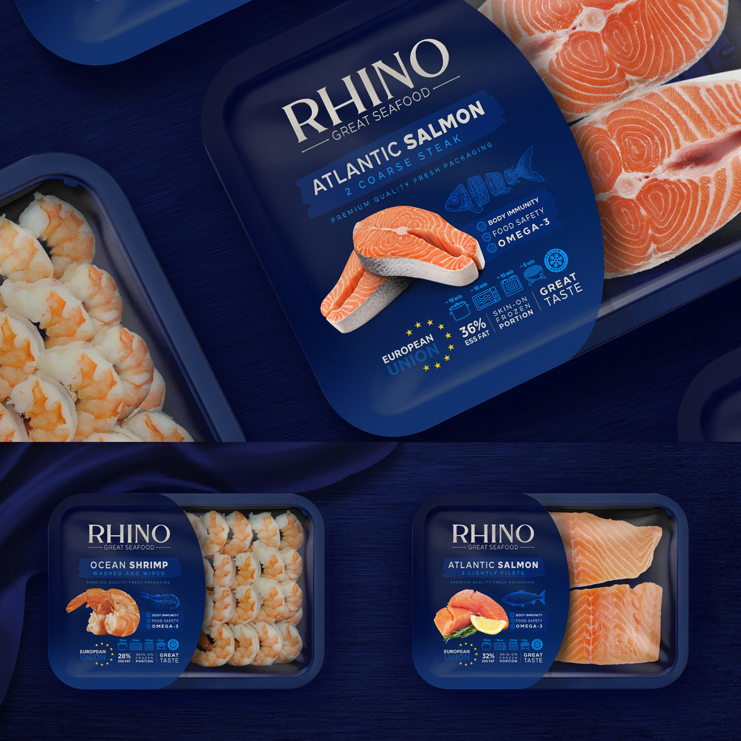
Until today, Rhino company offered products in traditional packaging, without labels and specifications to restaurants, now that it was decided to introduce diverse and high-quality products to markets and grocery stores, we should think about packaging and We were luxury branding.
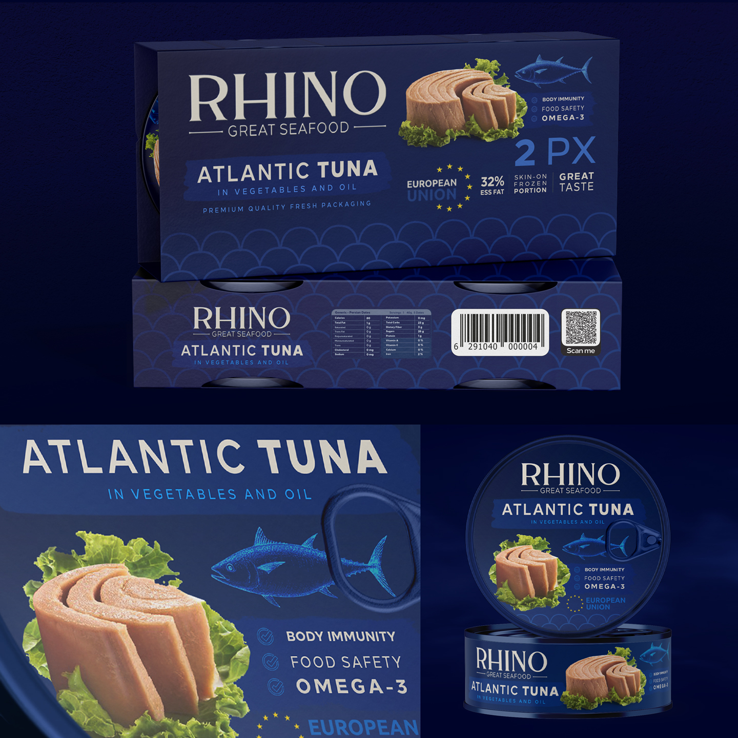
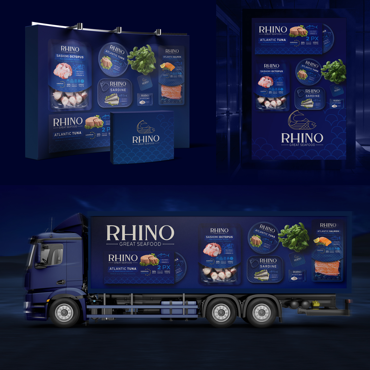
The first priority of Metis design team for ideation and branding design was luxury along with simple and stylish concept.
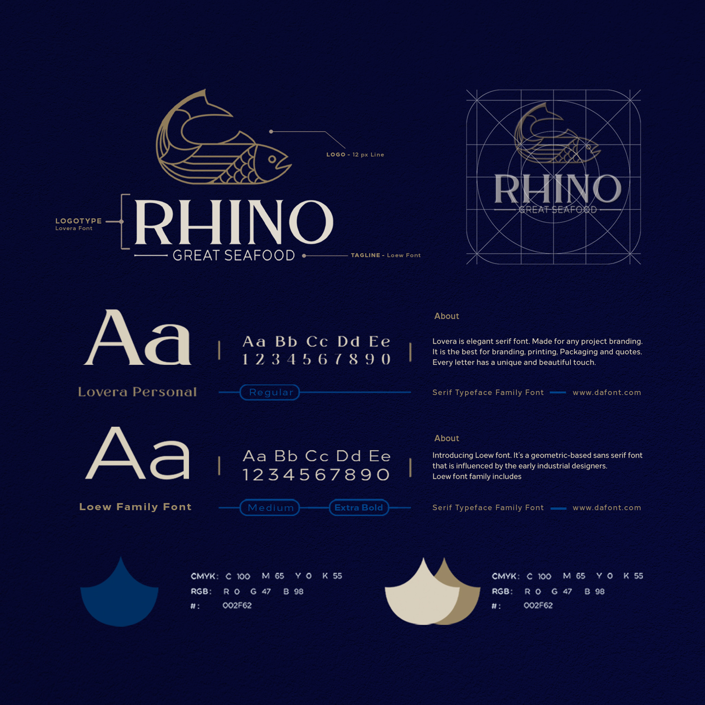
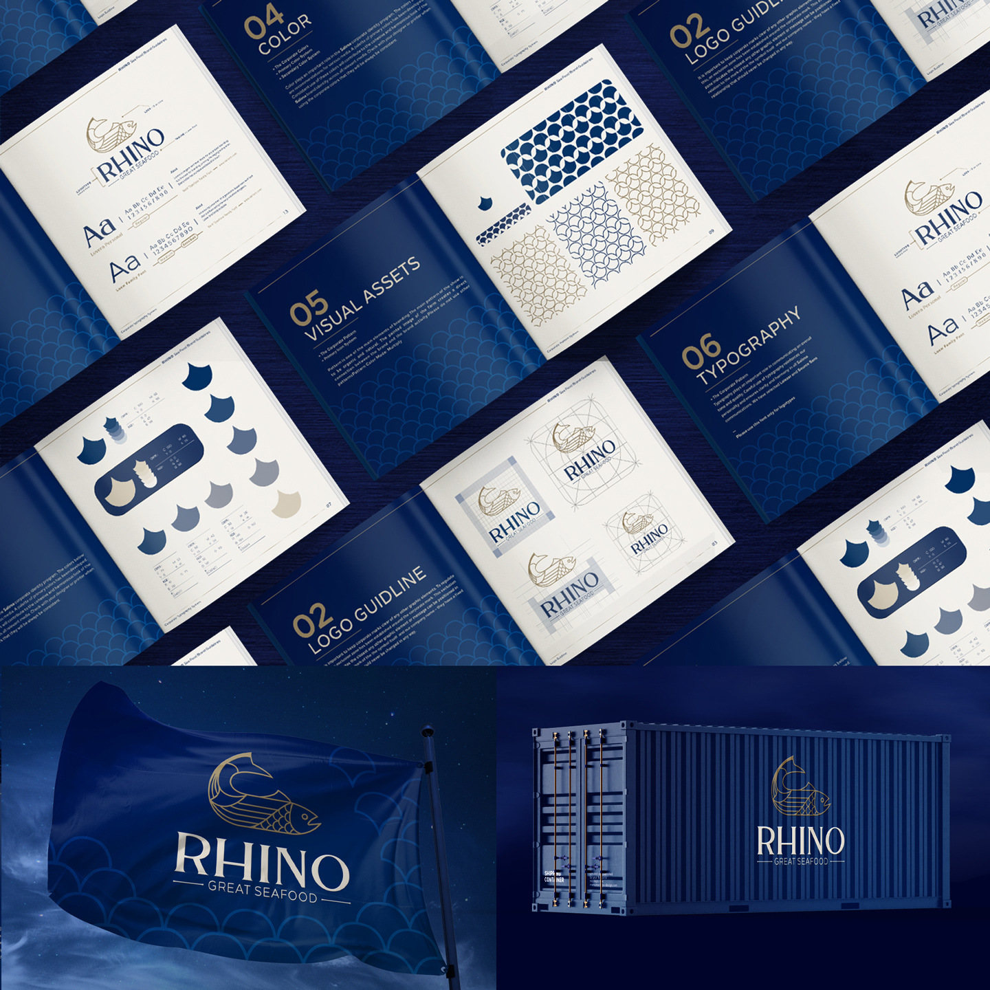
Regarding the use of blue as the main color, it represents the sea and is also the main color scheme of European countries. Also, the use of cream color as a complementary color was part of the original and previous color scheme of Rhino company.
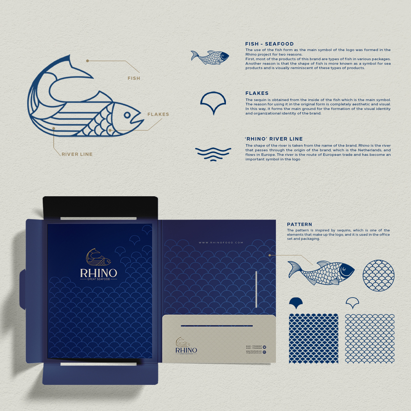
– The use of the fish form as the main symbol of the logo was formed in the Rhino project for two reasons.
First, most of the products of this brand were fish (salmon) and they are also in various packages.
Another reason is that the shape of fish is more known as a symbol for marine products and is visually reminiscent of these types of products. It also allowed us to implement all the elements requested by the employer.
– The use of sequins is obtained from the inside of the fish, which is the main symbol. The reason for using it in the original form is completely aesthetic and visual. In this way, it forms the main basis for the formation of the visual identity and organizational identity of the brand.
– The shape of the river is taken from the name of the brand. Rhino is the river that passes through the origin of the brand, which is the Netherlands, and flows in Europe. The river is the route of European trade and has become an important symbol in the logo.
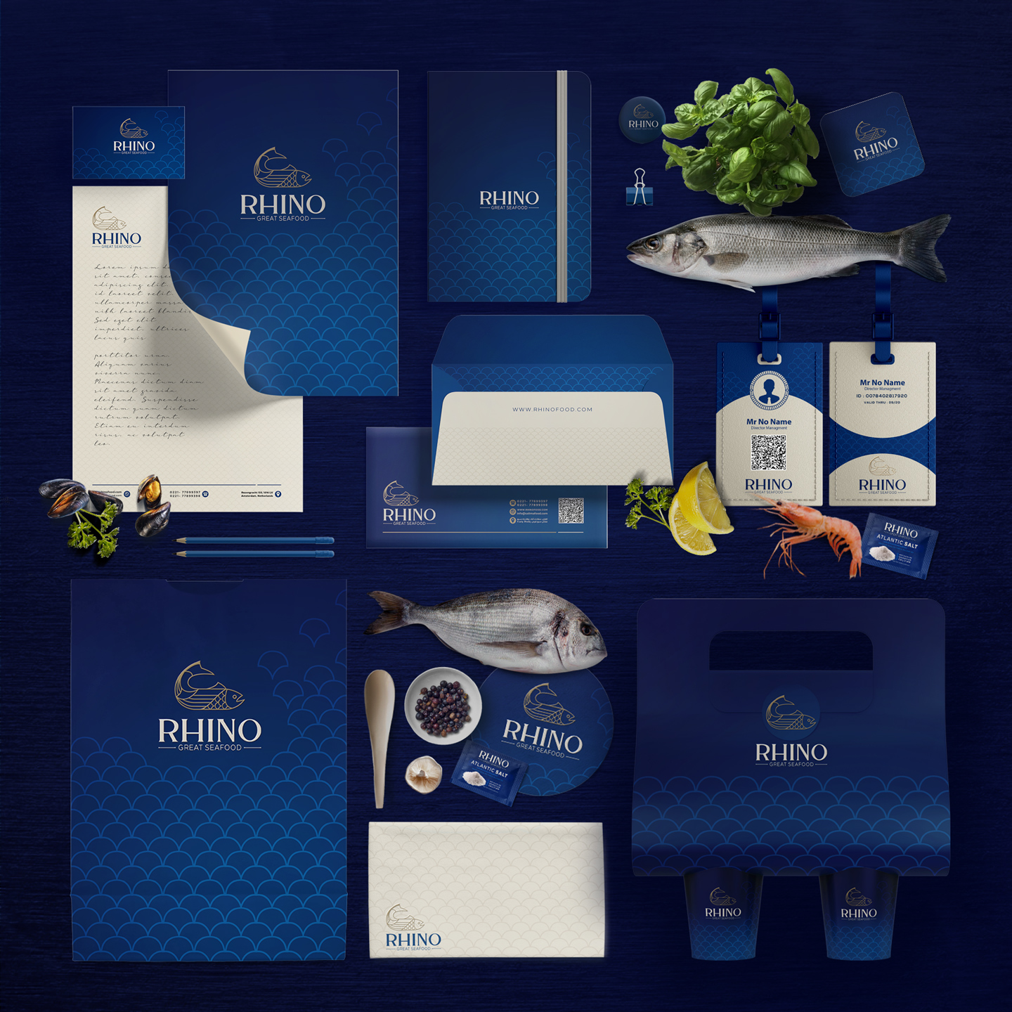
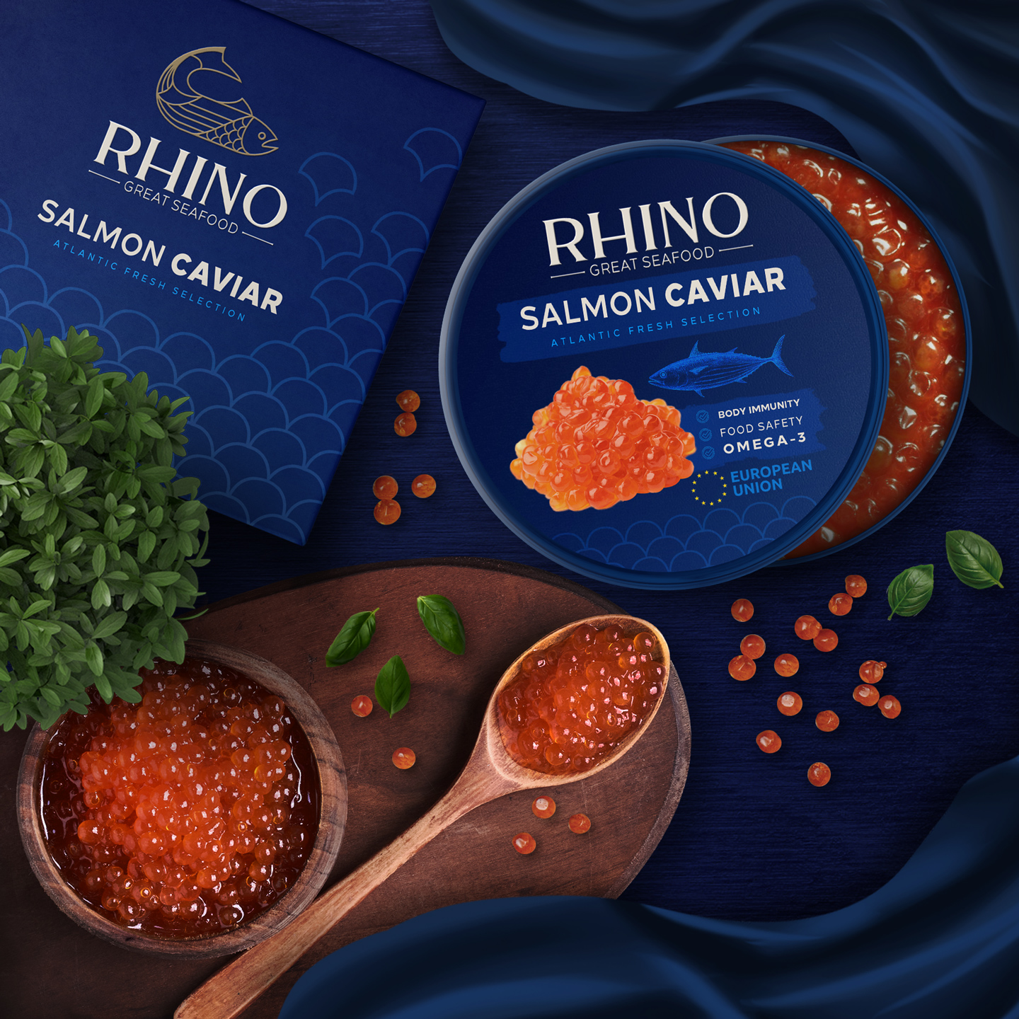
The pattern is inspired by sequins, which is one of the elements that make up the logo, and it is used in the office set and packaging.
CREDIT
- Agency/Creative: Studio Metis
- Article Title: Studio Metis Creates Rhino Seafood Branding and Packaging
- Organisation/Entity: Agency
- Project Type: Identity
- Project Status: Published
- Agency/Creative Country: Netherlands
- Agency/Creative City: Tehran
- Market Region: Europe, North America
- Project Deliverables: Brand Guidelines, Brand Identity, Branding, Food Photography, Illustration, Packaging Design
- Industry: Food/Beverage
- Keywords: caviar, seafood, fish, packaging, brandbook, branding
-
Credits:
Creative Director & Design: Vahid Khezrian
Idea & Graphic: Nazanin Hedayati


