


As part of the project adapted to the strategy formulated for the purpose of rebranding, all the previous graphic language was replaced and replaced by a new and broad brand language that includes: a unique logo design that upgrades stability and classicism, accompanied by a new slogan “all good inside”. which means that we put all the good stuff in so that your body thanks you every time you try our products and from there we paved the way for the new branding.
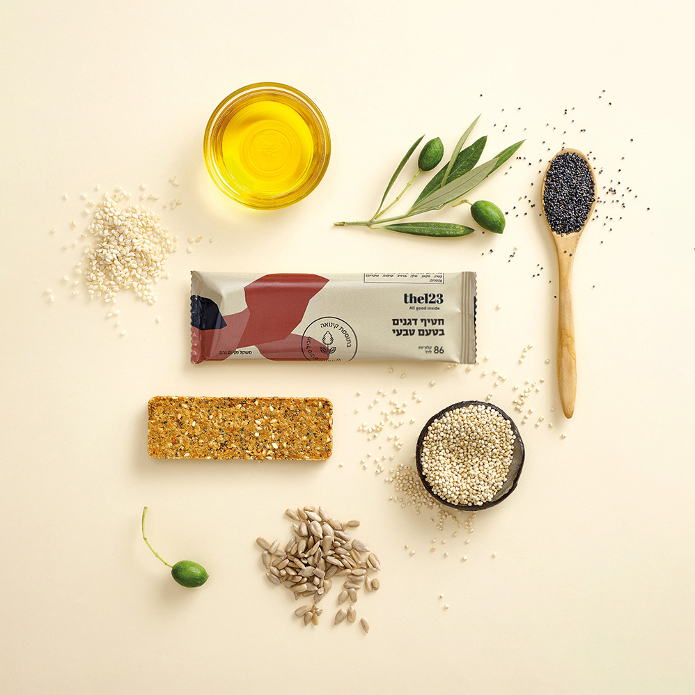
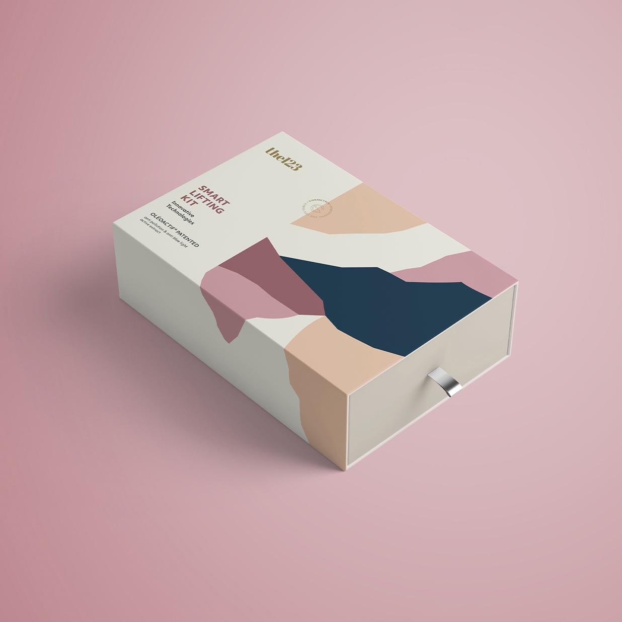
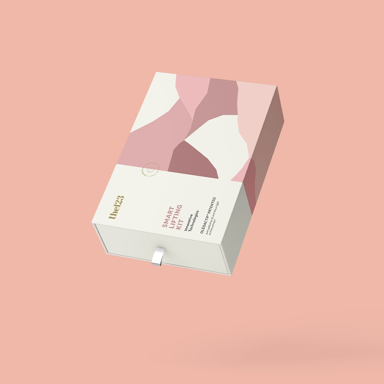
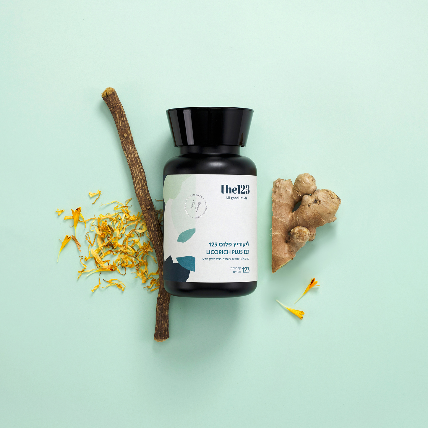
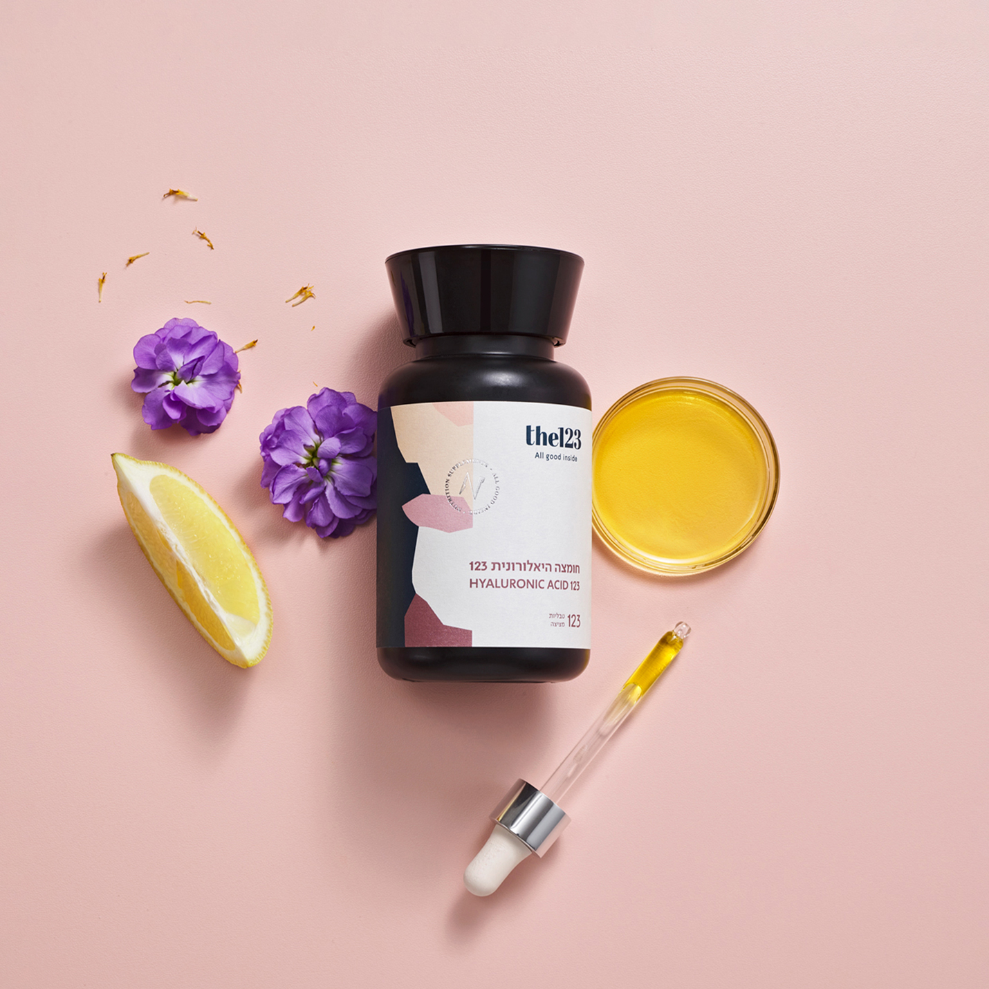
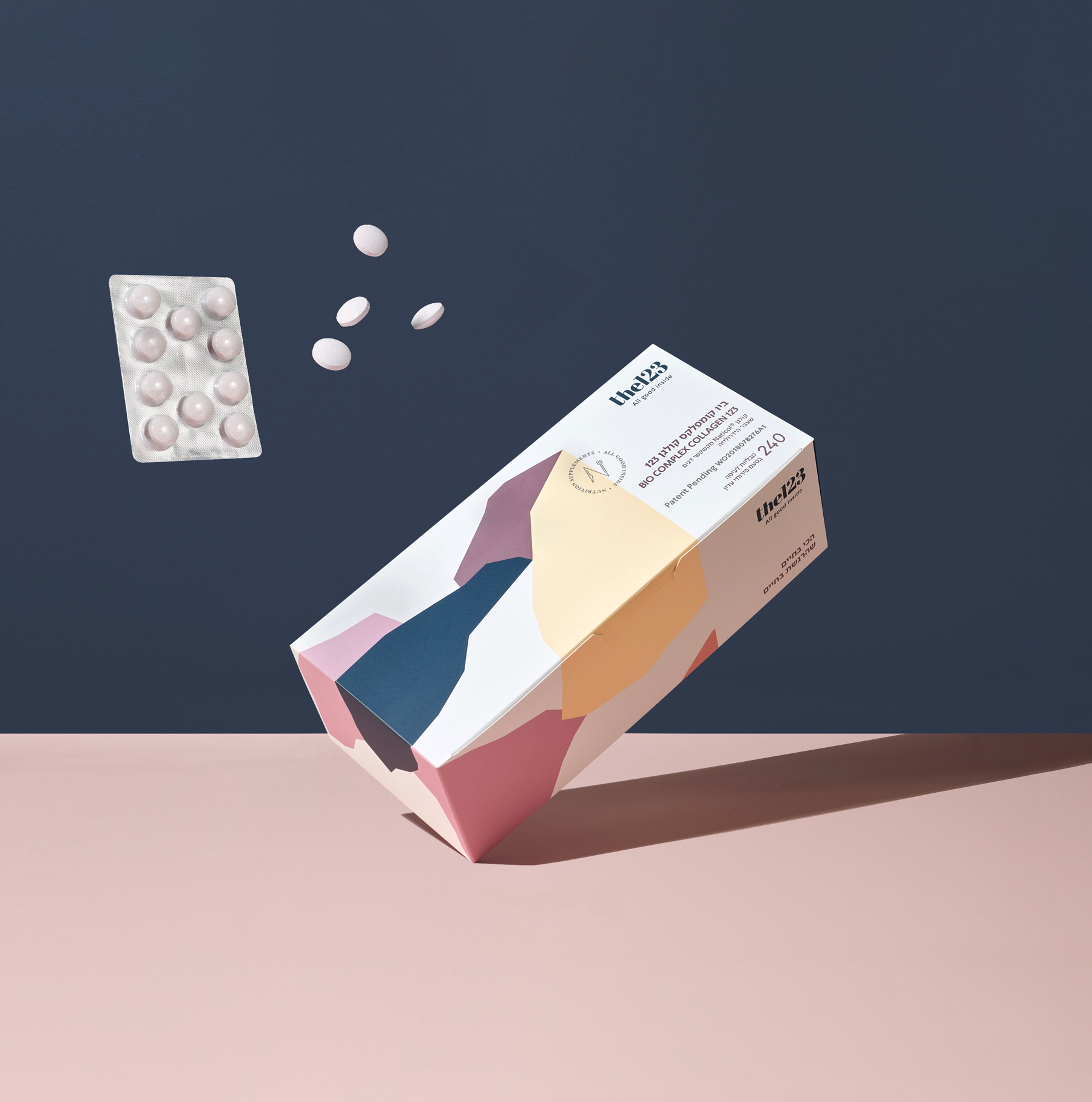
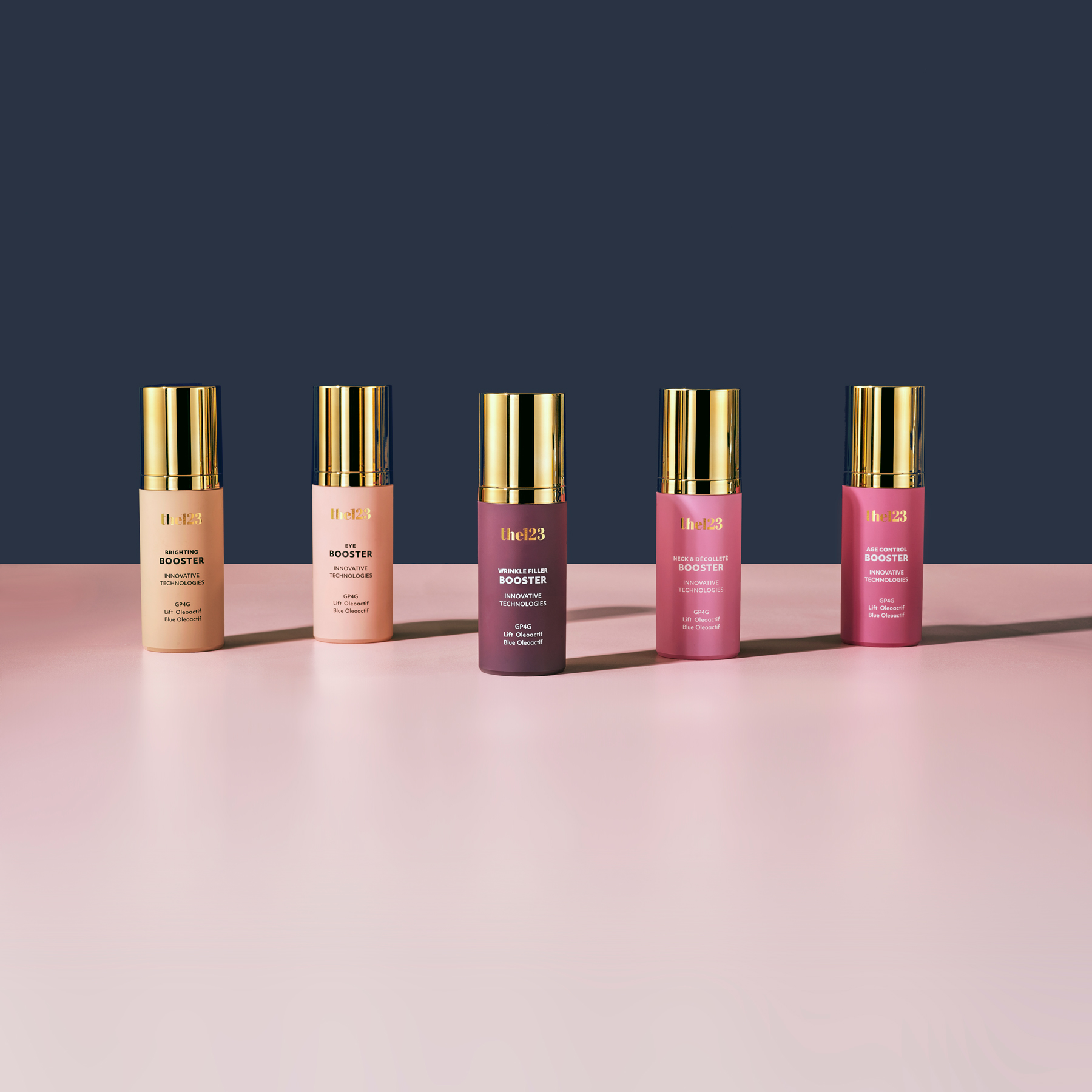
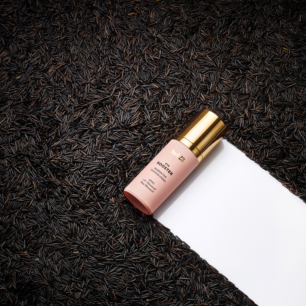
The patches that look like wild mountain nature characterize the graphic language throughout. The main colour palette has been adapted for vitamins and nutritional supplements in greenish-bluish shades that transmit health, freshness, calm and self-confidence, secondary colour palettes for a series of boosters and anti-ageing products for cosmetics in pink and elegant Nude colours and a natural colour palette for a series of 4 different healthy snacks.
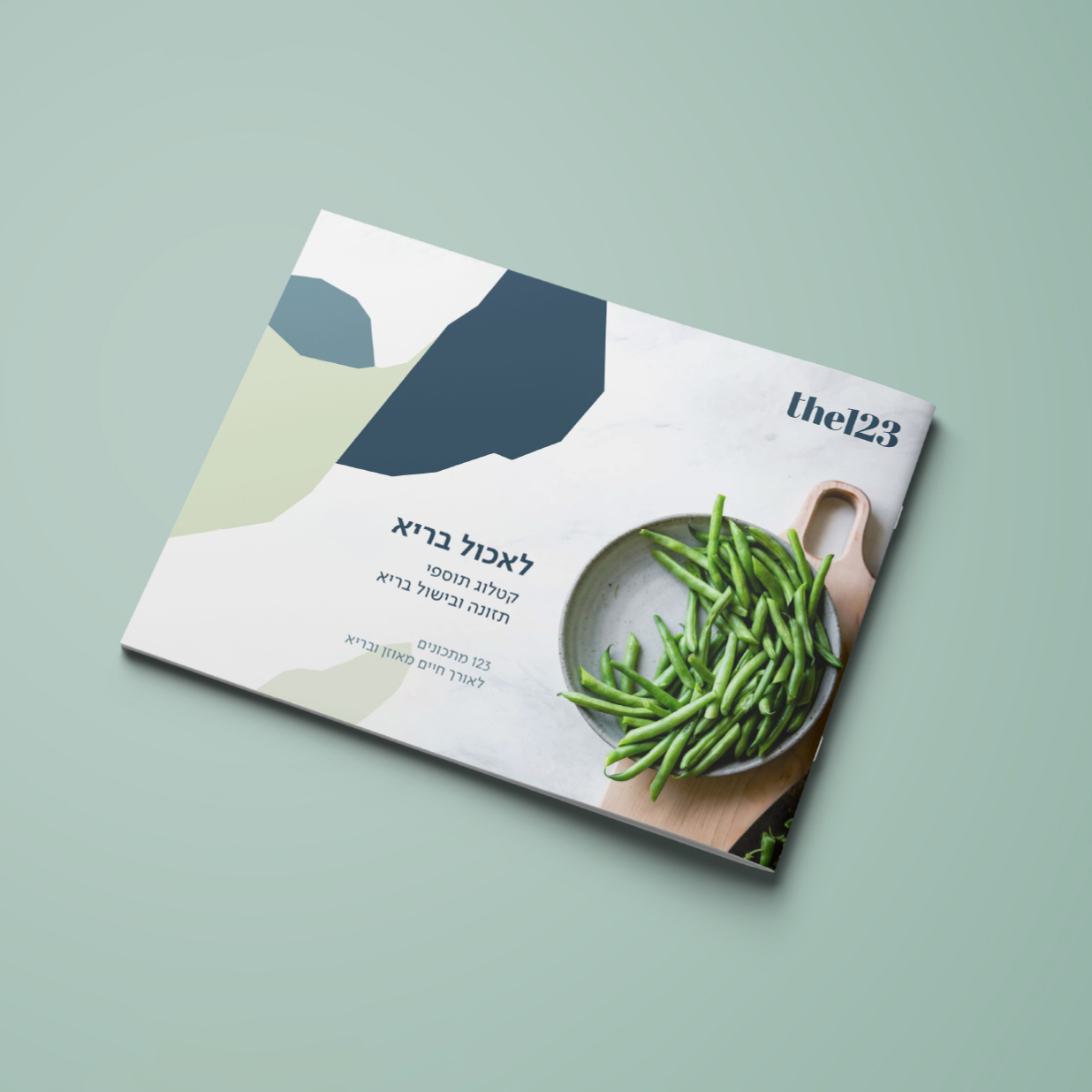
A bilingual font was chosen for all products and products of the company, a uniform photographic language was formulated for image photography for the various products, as well as atmosphere photographs unique to the company. Designed different packages in different sizes with colourful tulips from different companies, strengths of 24 labels for packaging vitamins and supplements, designed 2 series of care products, cosmetics and anti-ageing and designed a series of 4 health snacks sometimes different sweet and savoury.
The graphic language has been assimilated in the various marketing channels, including a new commercial website, a series of leaflets, posters, shelf occupiers for the various pharmacies, design for social media, design of landing pages and more.
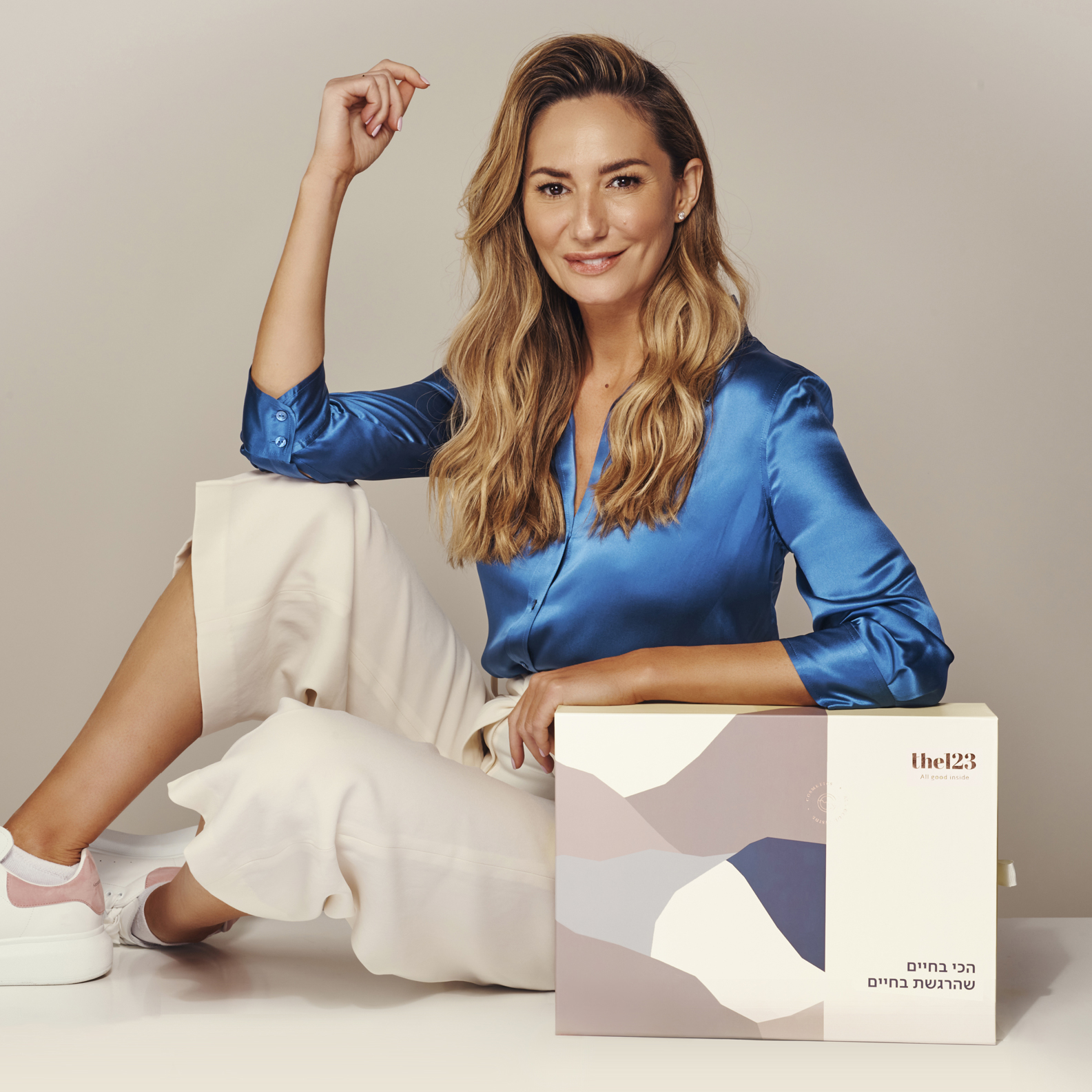
As part of the creative services we provided, several days of photography and video and stills were produced in which we assimilated the brand language. An extensive advertising campaign on social media was produced with an Israeli presenter named Michal Ansky, gastronomic, food journalist and Israeli TV presenter who matches the company’s values. Interior and beauty that match the company’s values and are adapted to the new brand language.
CREDIT
- Agency/Creative: Studio Lilach Rozman
- Article Title: Studio Lilach Rozman Create the Rebranding for the123
- Organisation/Entity: Agency
- Project Type: Identity
- Project Status: Published
- Agency/Creative Country: Israel
- Agency/Creative City: @the123il
- Market Region: Middle East
- Project Deliverables: Advertising, Art Direction, Beauty Photography, Brand Creation, Brand Design, Brand Identity, Brand Naming, Brand Strategy, Creative Direction, Design, Food Photography, Graphic Design, Rebranding, Web Design
- Industry: Health Care
- Keywords: Graphic Design, Branding Agency, Health Care, Design, Creative Agency, Creative Design, Art Direction, Marketing Strategy, Brand Manager
-
Credits:
Owner: Lilach Rozman


