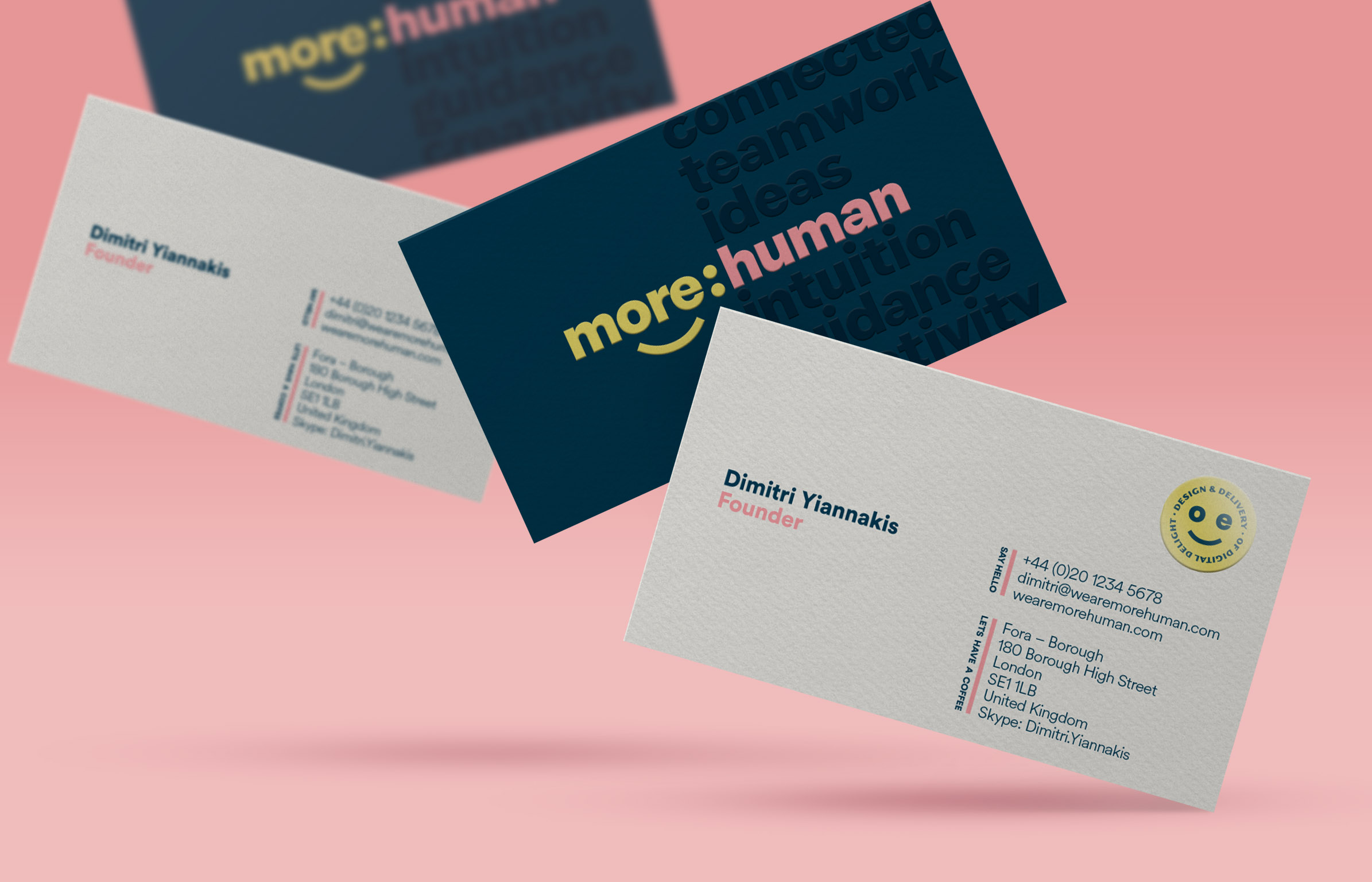
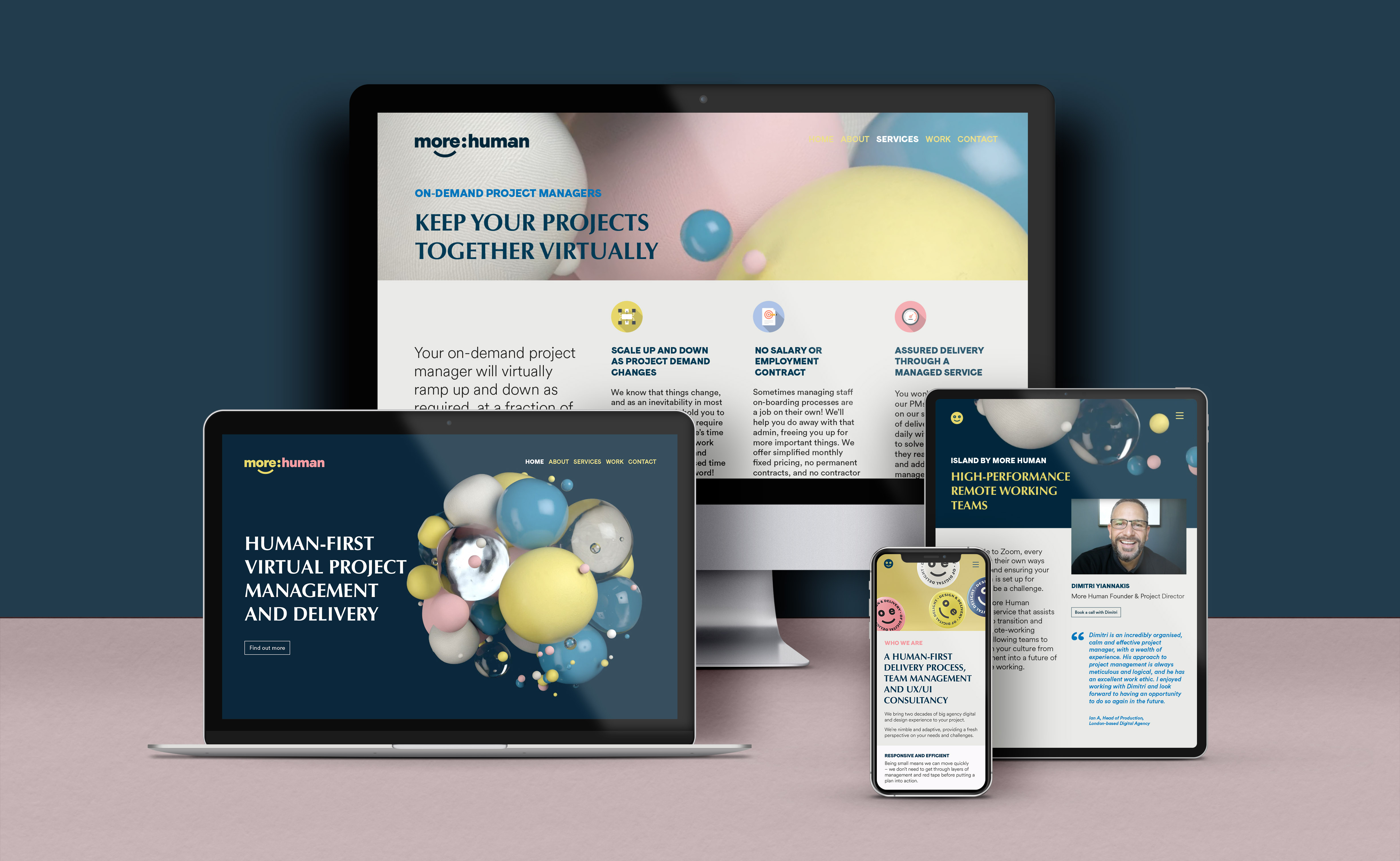
More Human is a London-based project management consultancy that specialises in remote teams and digital project delivery. Our aim was to create an identity that felt fresh and contemporary – born of the digital universe, while still making sure that it felt personable and approachable.
The client also has particular experience managing projects and teams within digital agencies, so the design also needed to feel considered, professional and expertly crafted.
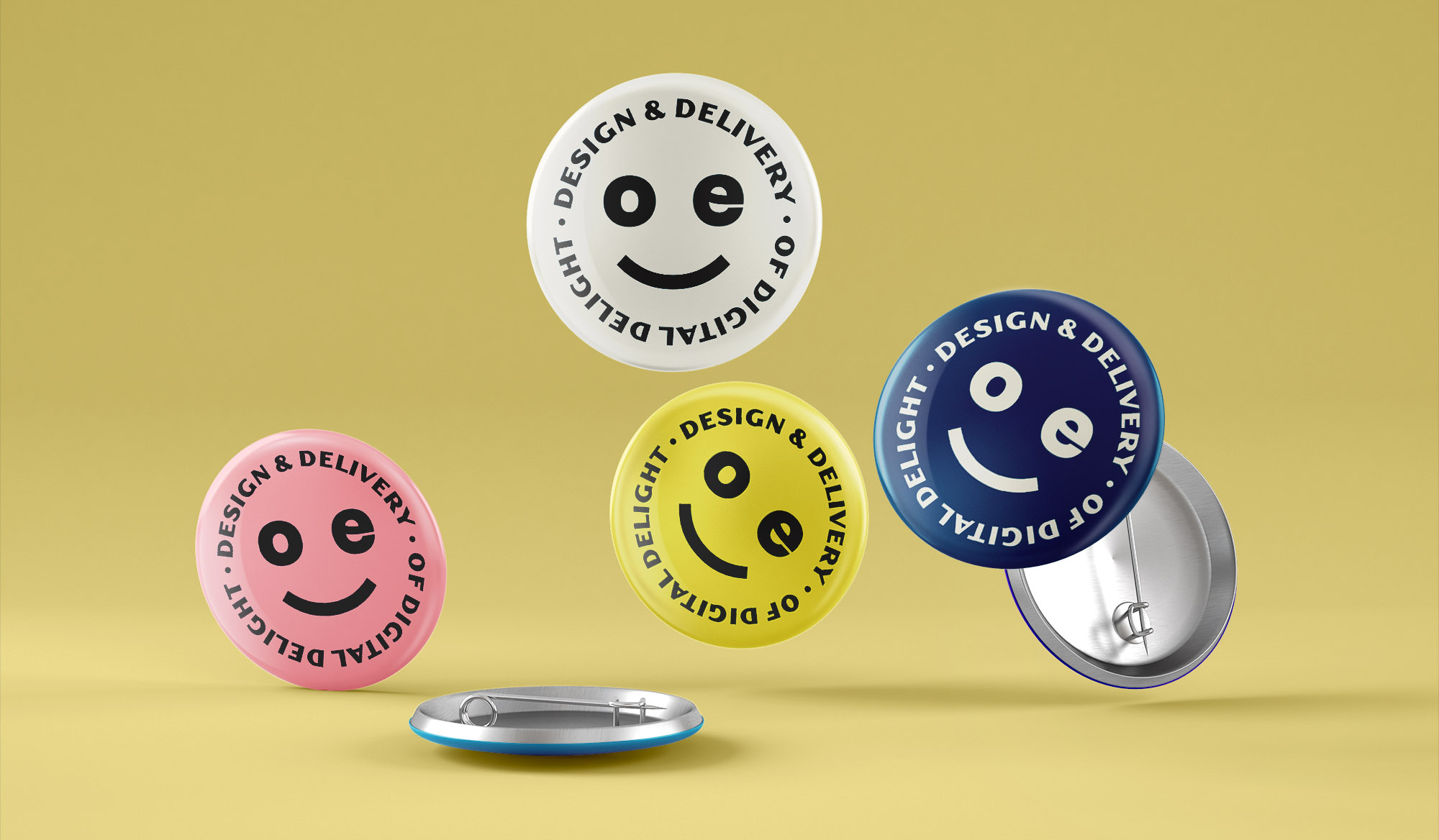
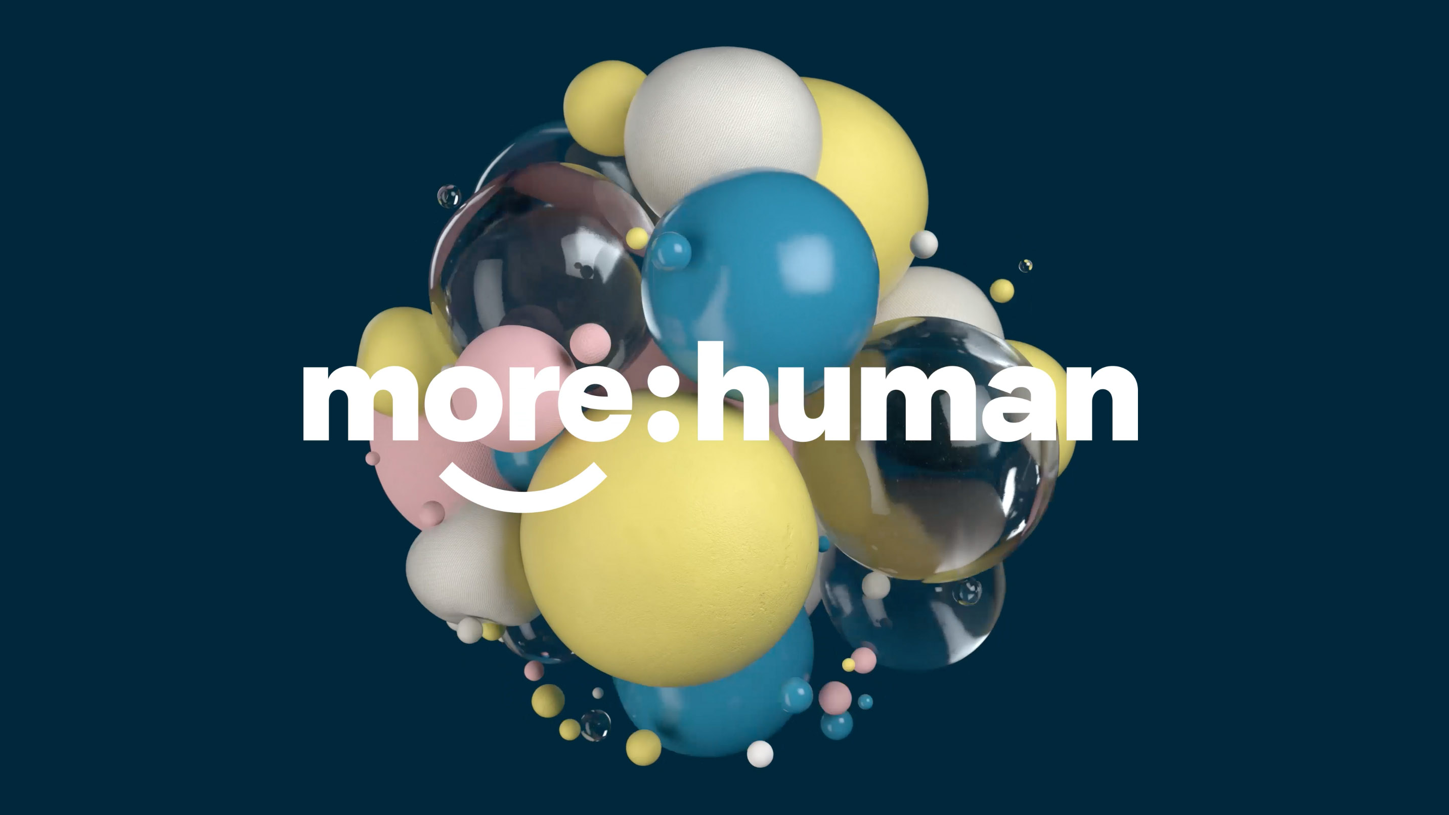
Our friendly, lower-case logotype, with a small wink, becomes a playful device which creates a shorthand for the brand and a ‘sticker’ device that can be used in multiple applications. In addition, we developed a 3D animated “atom” or nucleus that represents the underlying planning and control of a seemingly complicated, chaotic system – a visual analogy of the concept of project management. This visual also allows for a multitude of crops and combinations that highlight the various offerings. The colour palette combines trustworthy blues and greys, with a pastel palette of yellow and pink that brings warmth, humour and personality to the design.


CREDIT
- Agency/Creative: Studio Kempen
- Article Title: Studio Kempen Creates Atom-Inspired Identity for Digital Consultancy
- Organisation/Entity: Agency, Published Commercial Design
- Project Type: Identity
- Agency/Creative Country: Netherlands
- Market Region: Global
- Project Deliverables: Brand Design, Brand Identity, Brand Redesign, Brand Refinement, Brand World, Branding, Graphic Design, Rebranding
- Industry: Technology
- Keywords: Brand Identity, Corporate Identity, Project Management, Virtual Teams, Remote Working, Web Design


