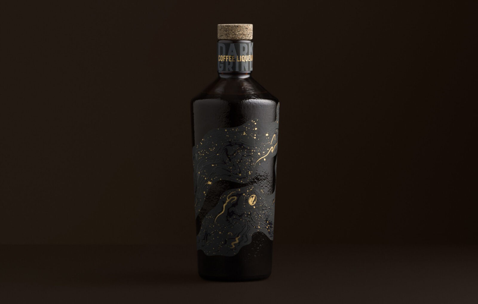
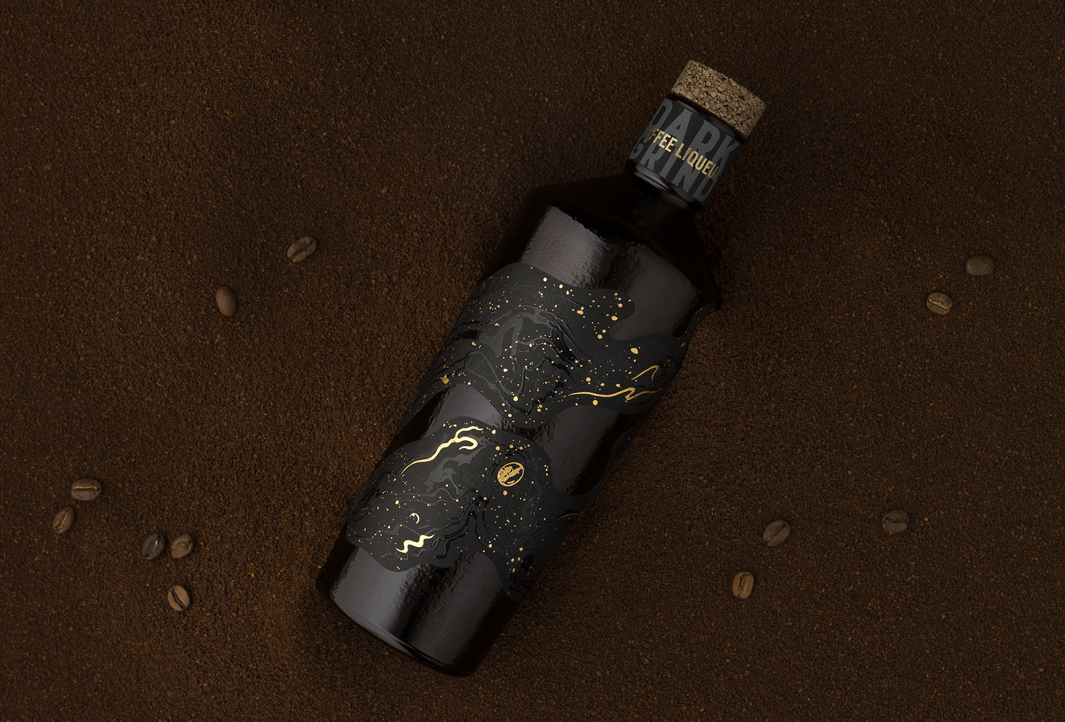
Espresso Martinis are enjoyed all over the world and will, most likely, never go out of style. Appealing to global demand, Studio Guild created his luscious, curvy and sexy, Coffee Liqueur oozing in dark, molten, richness. Fitting for a dimly lit, velvety, cocktail bar, Studio Guild created the brand name ‘Dark Grind’ to playfully communicate two meanings – firstly, the idea of the rich coffee ground flavour inside, but also to create a flirtatious, sexual name, that draws attention to the younger ‘night club’ consumer this offer appeals to. Perfect for that hens night out!
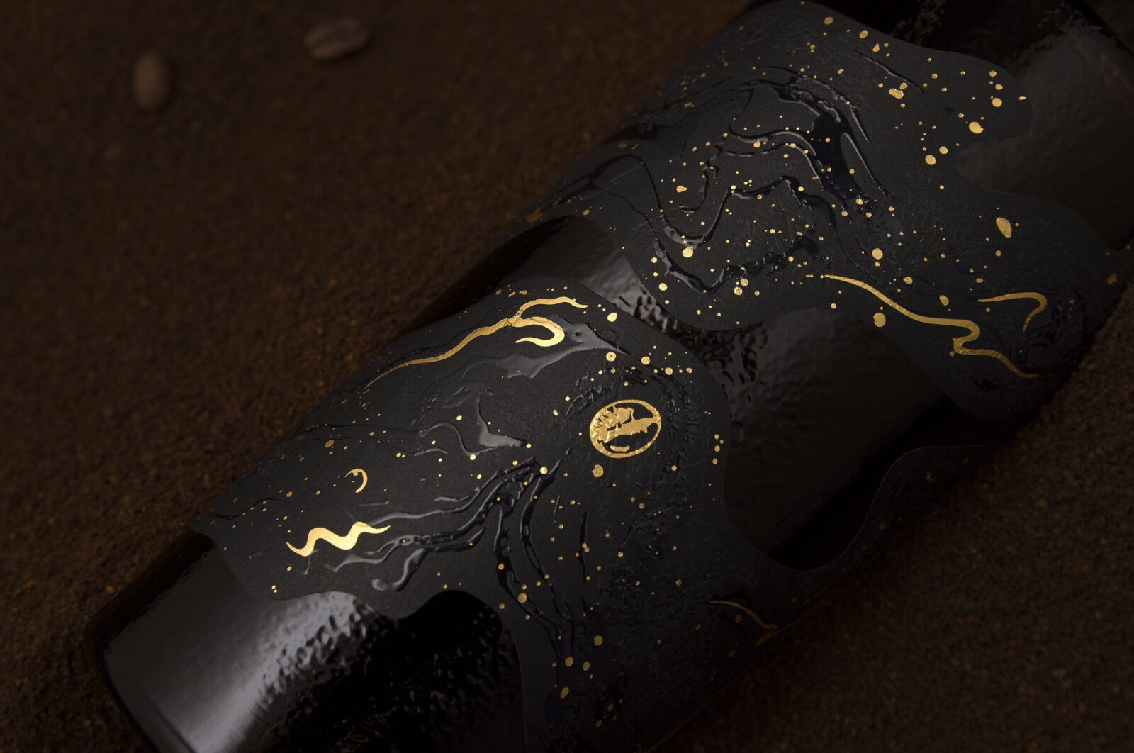
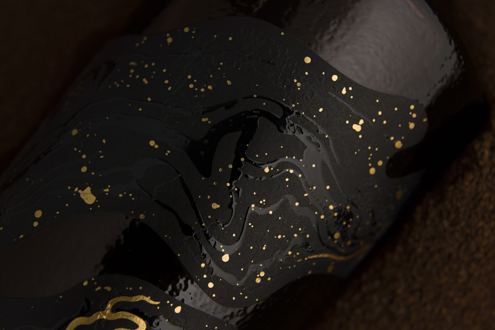
The organically shaped, black textured, label wraps around the cocktail shaker-shaped bottle. The black label stock was chosen so there would be no white edging to the label that would disrupt the seamless connection of ‘label to bottle’. The label is separated into two pieces, randomly meeting, purposely unstructured to create flow. The main label is highlighted with embellishments of textural emboss, high-build gloss varnish and gold foil, to add a sensory experience hard to resist. The choice of using the imperfect, recycled Estal bottle also adds to the artisan nuancing of the label with its multiple textured finishes.
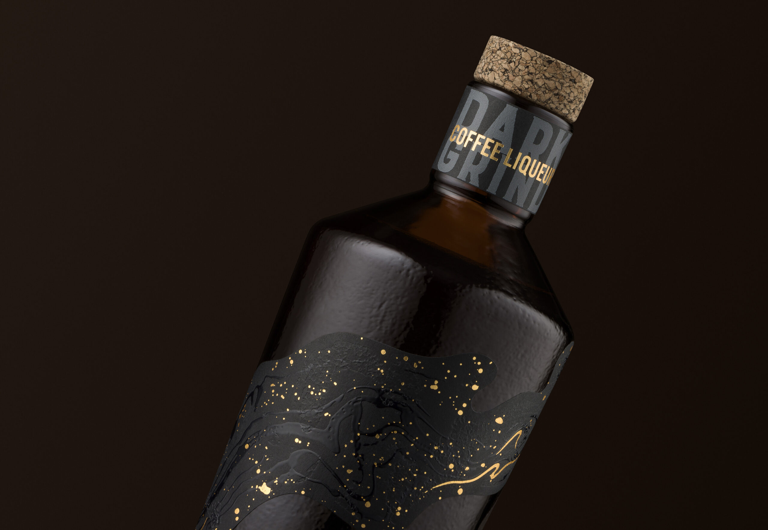
Making sure that all the impact came from the main label, our branding was placed on the neck label. Adding to the story, our tagline also has a flirtatious tone-of-voice – “Awaken Your Senses” again, playfully tempting the consumer. The choice of the corkcoal stopper not only adds to the artisan look but the black charcoal specks could also reflect the dark coffee grinds.
‘Dark Grind’ is part of the ‘Find my Flavour’ series Studio Guild created for a leading printable materials distributor, Ball & Doggett. The outcome needed to inspire and engage agencies, studios, creatives and brand owners working within the drinks industry about the capability of the label facestock. In such an over-crowded market, we embraced the opportunity to think outside the box, educating brand owners on the positive impact this can have on consumer engagement – be brave or stand still!
CREDIT
- Agency/Creative: Studio Guild
- Article Title: Studio Guild’s Dark Grind Packaging Captures the Allure of Espresso Martinis
- Organisation/Entity: Agency
- Project Status: Published
- Agency/Creative Country: Australia
- Agency/Creative City: Fitzroy
- Market Region: Australia
- Industry: Food/Beverage
- Keywords: WBDS Agency Design Awards 2024/25 ,Packaging design, label design, drinks, drinks industry, coffee liqueur, spirits design, spirits label ,
- Keywords: Packaging design, label design, drinks, drinks industry, coffee liqueur, spirits design, spirits label , WBDS Agency Design Awards 2024/25
-
Credits:
Creative Director: Trish Dunsotne
Designer: Rose Williams
Illustrator: Rose Williams


