


Studio Guild was honoured to be chosen as 1 of 12 studios to participate in the 2025 edition of the Make-a-Mark project. The project exists as a platform where the most visionary design studios from around the globe, explore, question and reimagine the role of packaging in our world.
This year’s theme explored sustainability, luxury, innovation and connectivity.
CONCEPT:
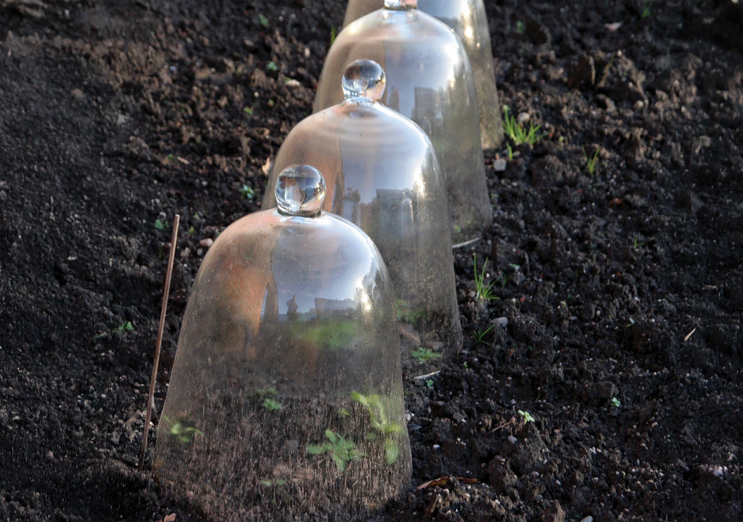
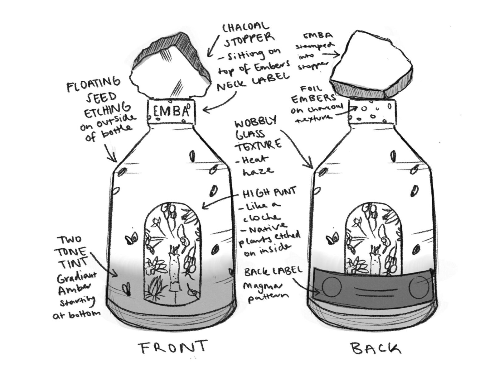
Our concept began with a glass cloche, a glass bell-shaped cover first used in the 1600s to shield delicate plants from frost damage.
We’ve reimagined that idea into a story about environmental protection, not just of a single plant, but of an entire ecosystem.
There are many Australian native plants that depend heavily on fire for regeneration. These species which retain seeds within woody capsules, remain closed until stimulated to open by heat to scatter and regenerate.
Most plants require a number of years following germination before they reach maturity and are able to flower and set seed. If fire occurs more frequently than the time that the plants take to mature, the plants may be eliminated from that particular area.
Our objective was to illustrate how nature, despite its intricate systems, consistently demonstrates resilience and the capacity for regeneration in the face of challenges.
APPROACH:
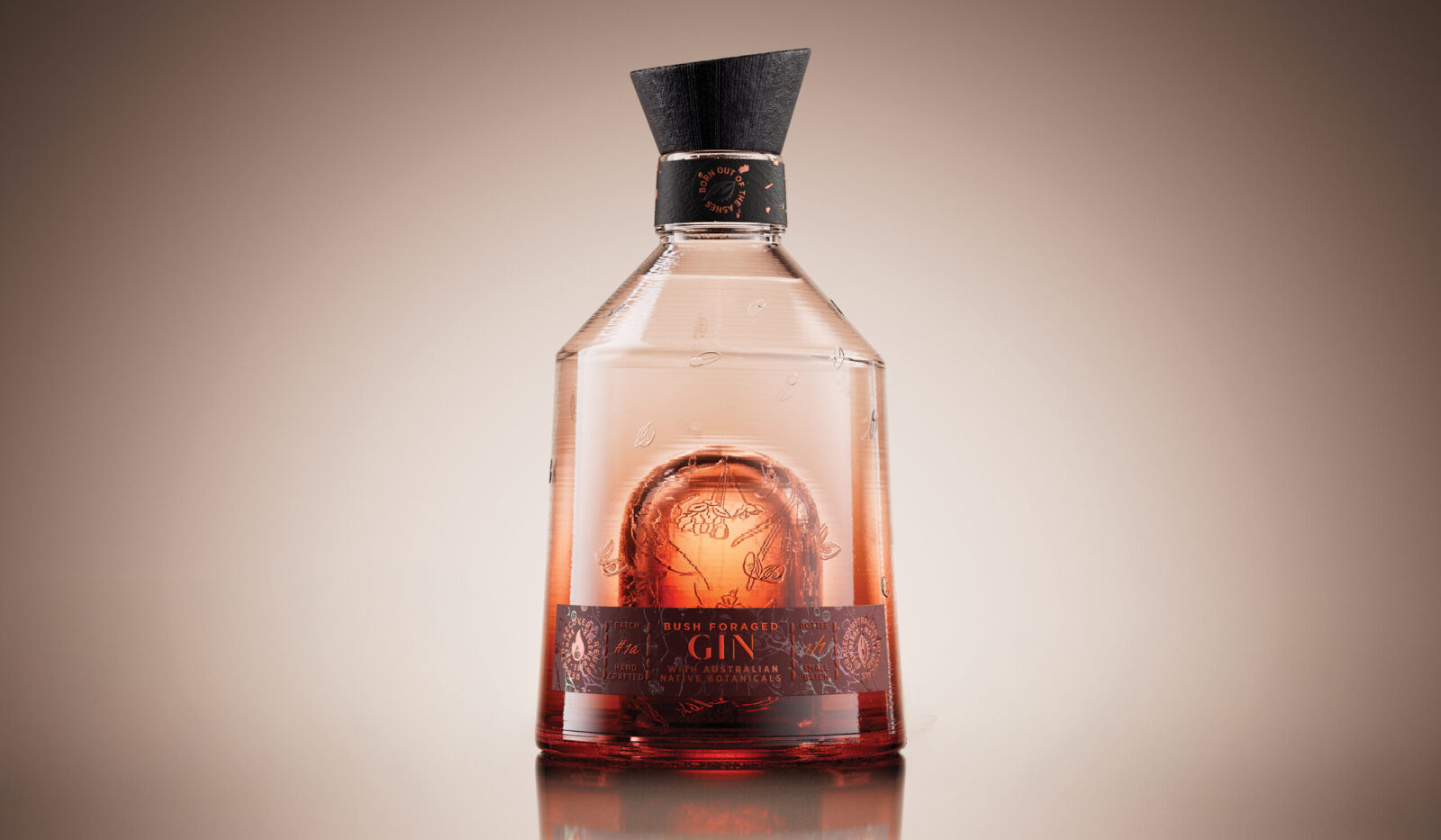
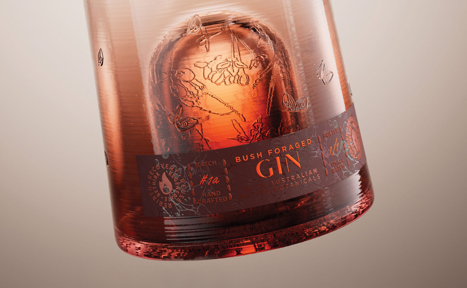
At the heart of this design lies a symbol of resilience: the punt, cloaked in endangered native Australian flora that depend on fire not just to survive, but to thrive. Shaped like a traditional cloche, the punt becomes a guardian of renewal, sheltering both the earth and the life it holds.
As warmth rises from the earth, seeds embedded on the bottle’s surface begin to open and release into the air with the promise of regeneration. The textured glass mirrors nature’s raw, organic imperfections, echoing the unpredictable beauty of fire and growth.
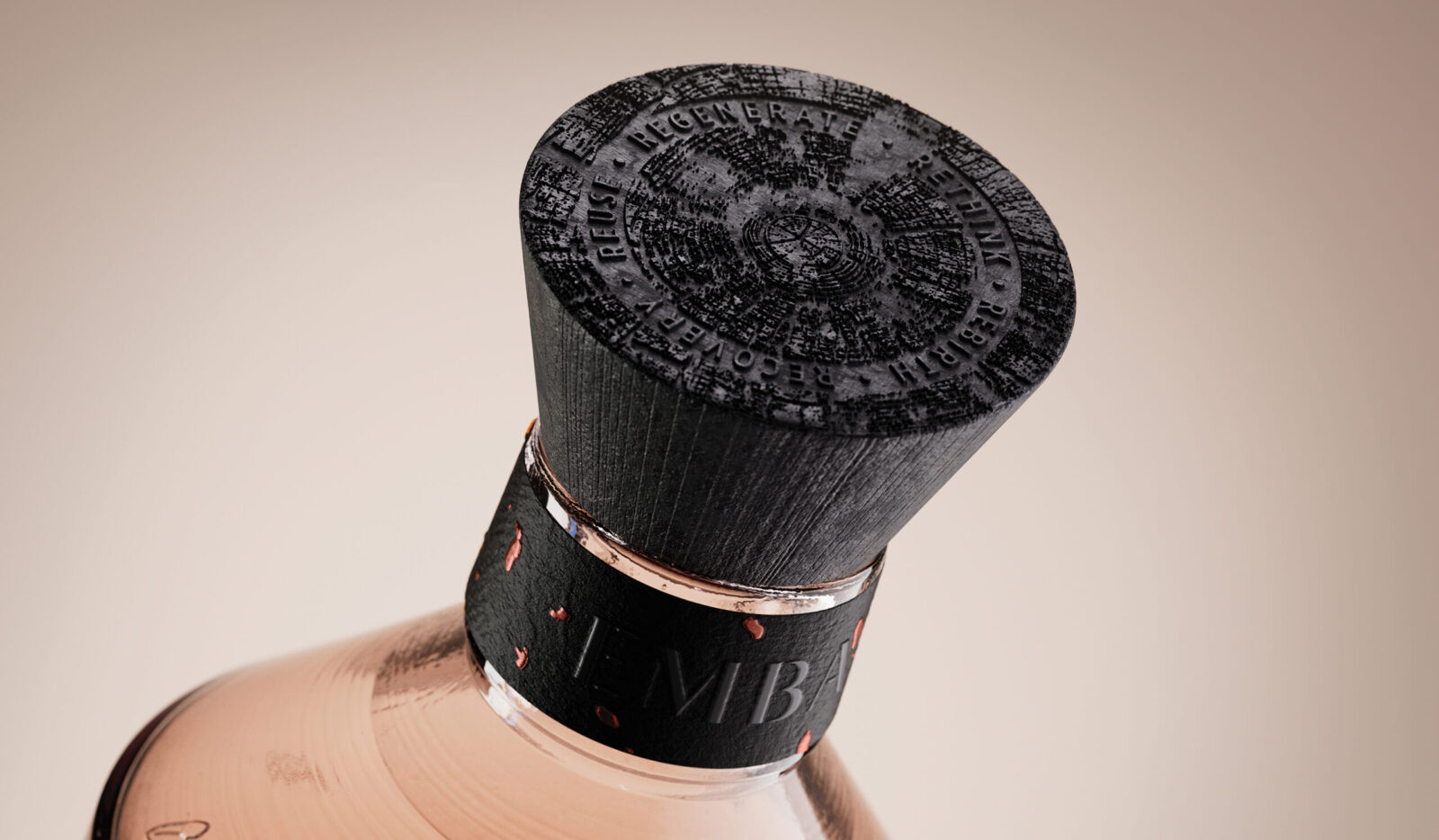
Named EMBA, drawn from the word ’ember’, the brand is a quiet spark that speaks of fire, transformation, and revival. Around the neck, the label is debossed with the scorched texture of charred wood, with flickering glowing, foil embers.
The charred wood closure holds the brand’s message, also etched into the bottle’s base: recovery, reuse, regenerate, rethink, rebirth. A mantra of renewal whispered through every detail.
The main label glows with light: foils and embossing ripple like rising heat, a clear foil forming a mirage of movement, hinting at the power of transformation through fire.
Our message is simple: technology connects, but emotion endures to leave a lasting impression long after the first discovery.

CREDIT
- Agency/Creative: Studio Guild
- Article Title: Studio Guild Unveils Emba as a Symbolic Packaging Design Exploring Fire, Renewal and Regeneration
- Organisation/Entity: Agency
- Project Status: Non Published
- Agency/Creative Country: Australia
- Agency/Creative City: Fitzroy, Melbourne
- Project Deliverables: 2D Design, 3D Art, 3D Modelling, Art, Art Direction, Brand Architecture, Brand Creation, Brand Design, Brand Identity, Brand Mark, Brand Naming, Brand Strategy, Brand Tone of Voice, Branding, Creative Direction, Design, Graphic Design, Identity System, Illustration, Insight, Label Design, Lettering, Logo Design, Packaging Design, Packaging Guidelines, Product Architecture, Product Design, Product Naming, Research, Tone of Voice, Type Design, Typography
- Industry: Food/Beverage
- Keywords: WBDS Agency Design Awards 2025/26 drinks, spirits, label, brand,
-
Credits:
Creative Director & Lead Designer: Trish Dunstone
Designer and Illustrator: Rose Williams
Designer: Bella Goodwin-Galea
CGI renders: Tricycle


