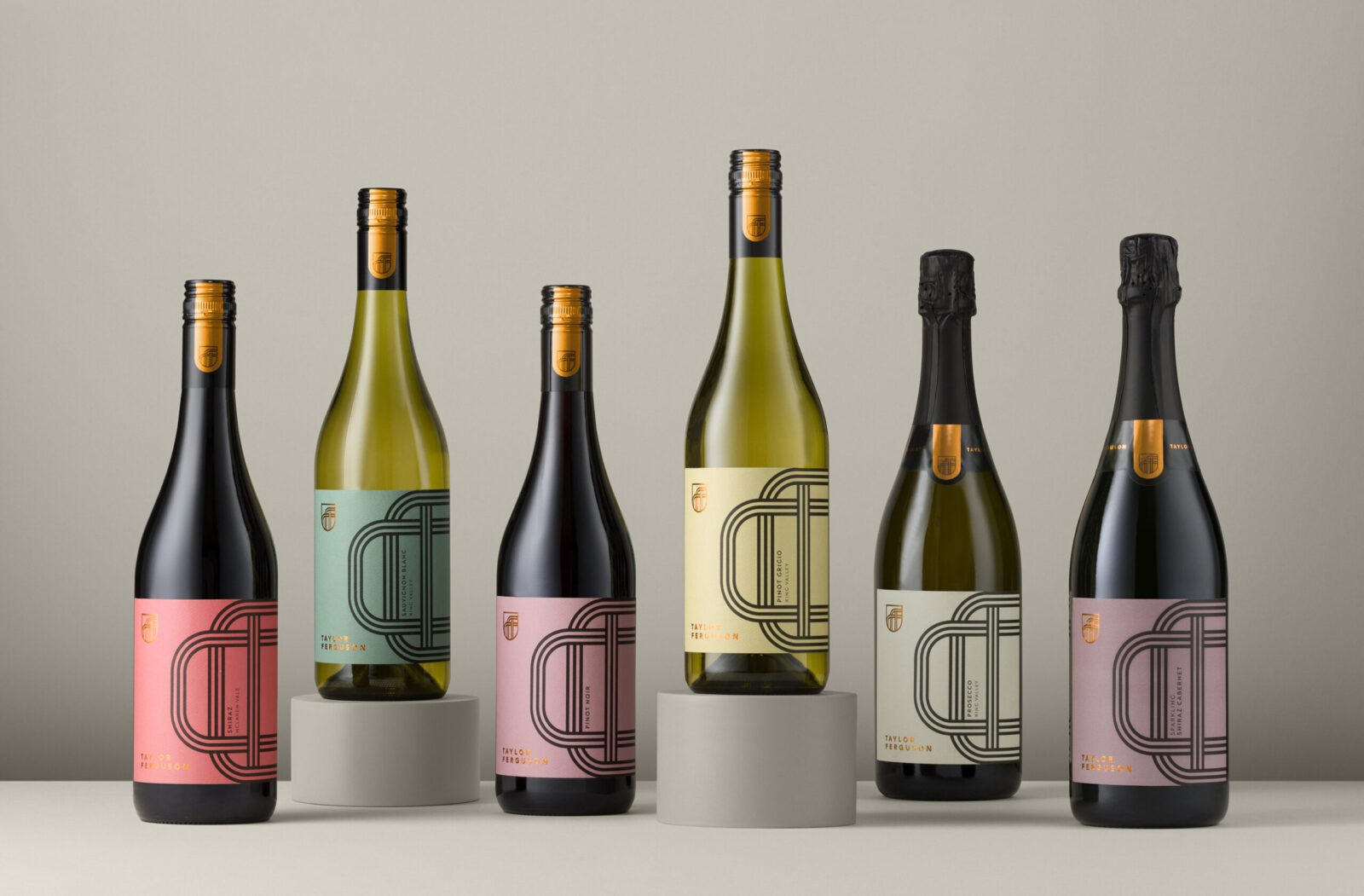
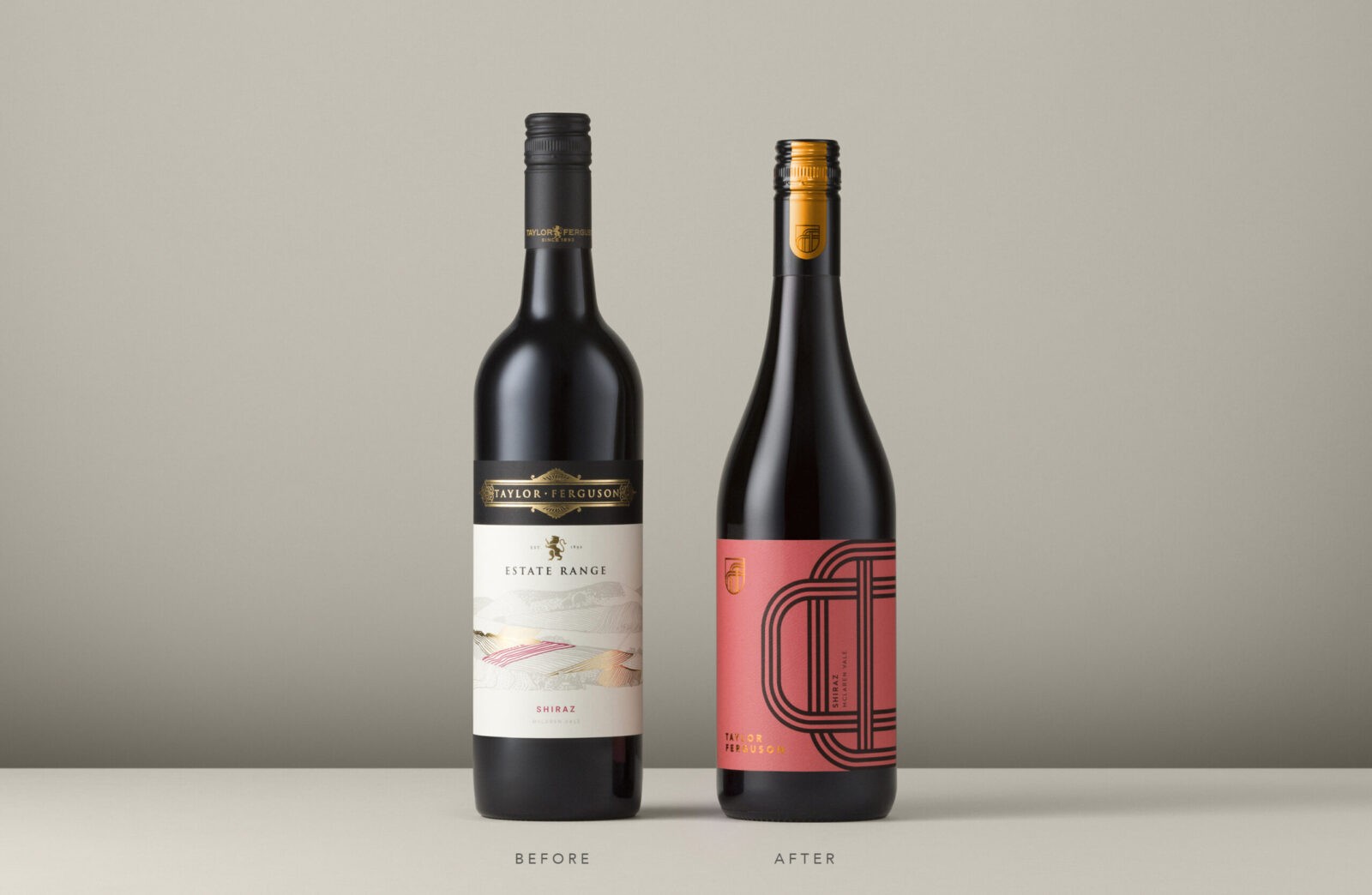
The need to stand out in the current wine market is paramount. Wine distributor, Alepat Taylor, reached out to Studio Guild again after the market success of other brand refreshes we have created for them. This time the brief was to bring new life to the Taylor Ferguson range, which was lacking in engagement and sales. The previous branding was tired and dated with little support or engagement from trade or on-premise, so we set out to create a brand with better shelf impact to regenerate consumer interest.
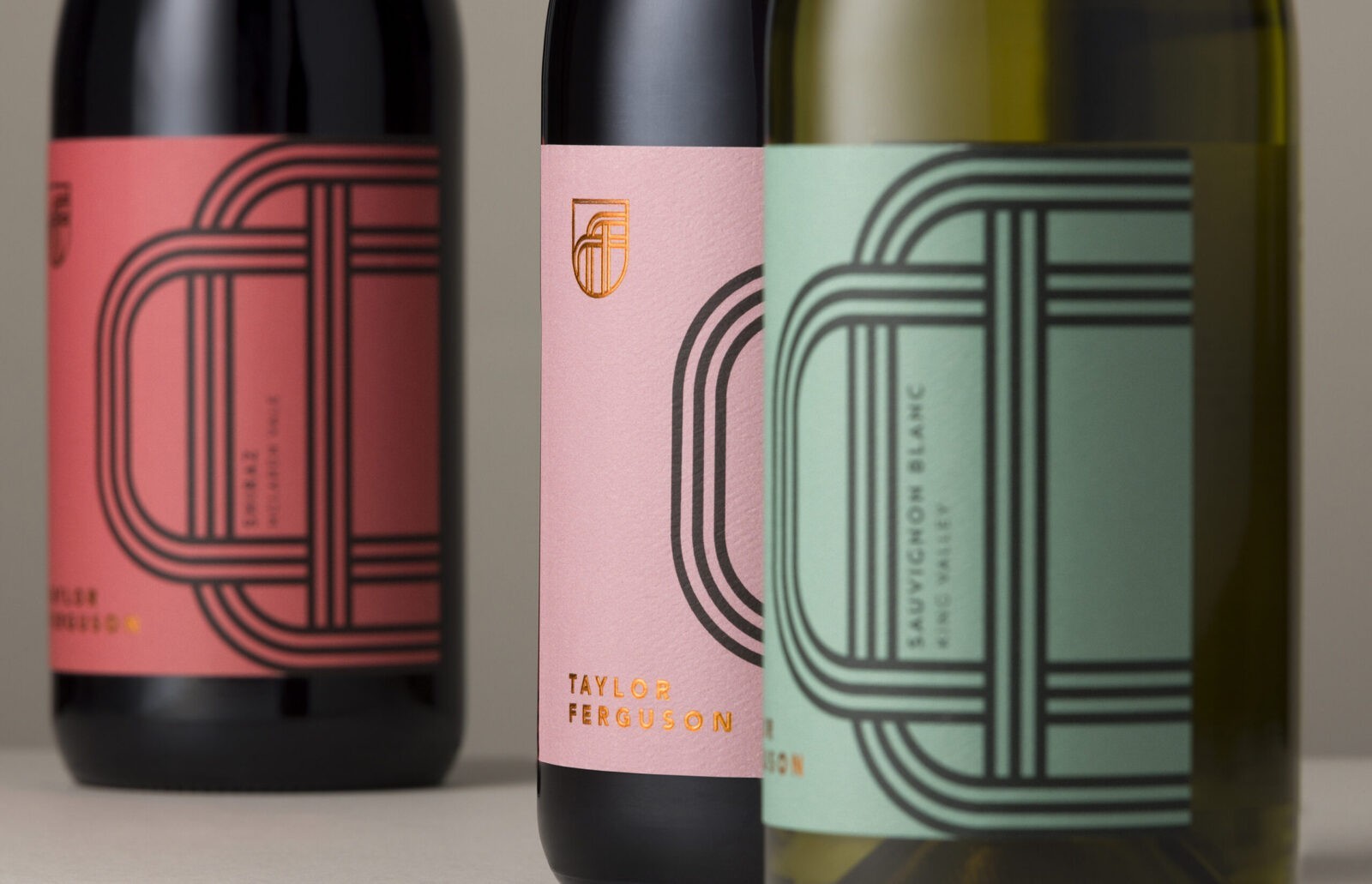
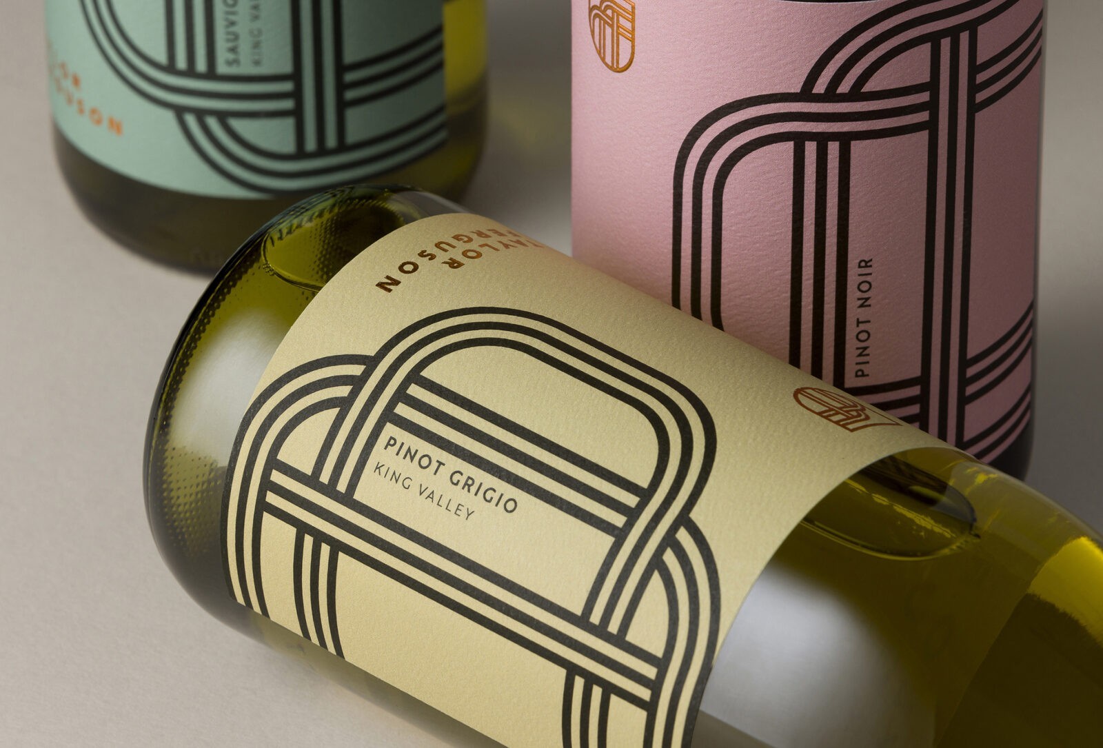
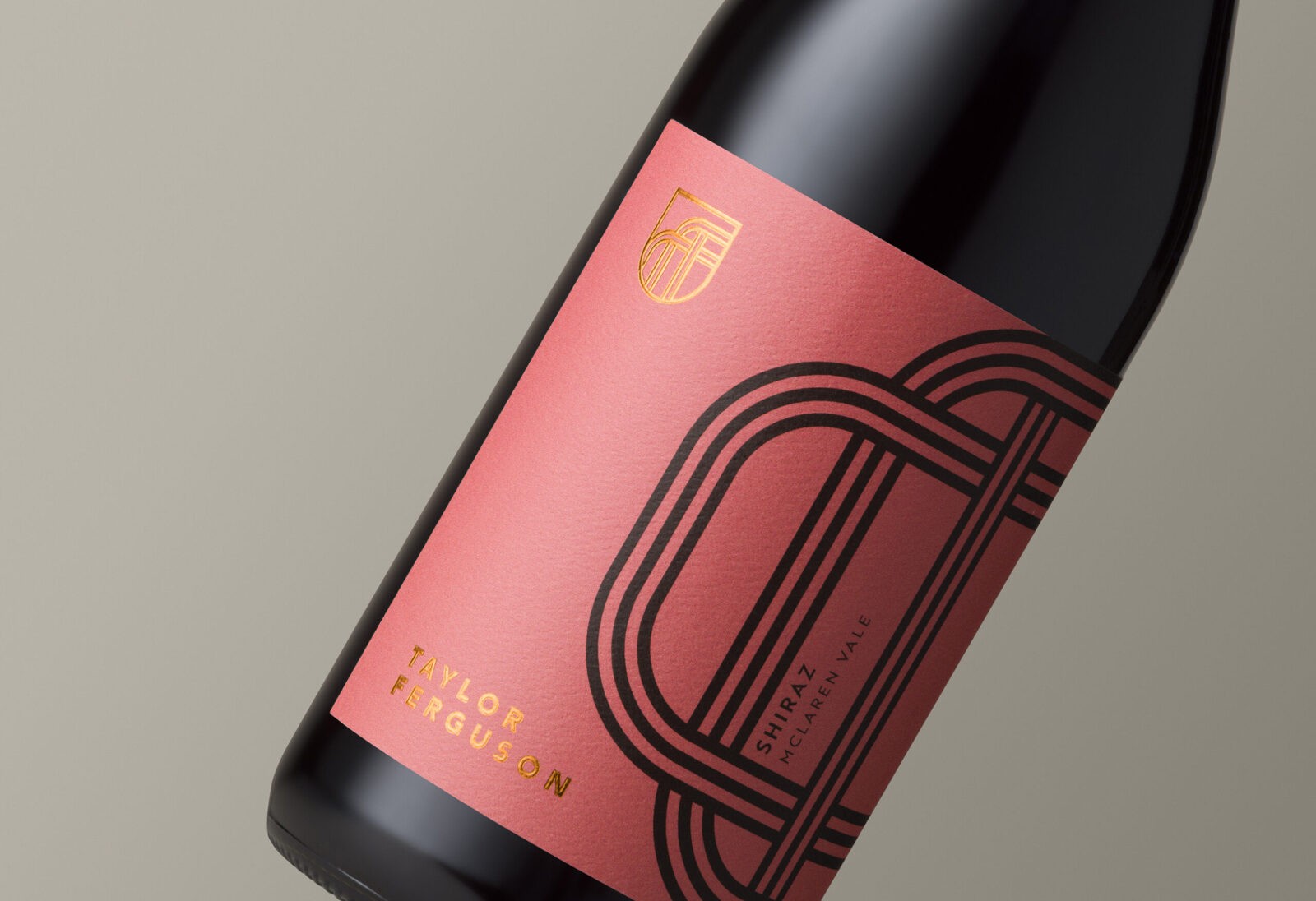
The old range had the typical vineyard themed imagery. We believe every successful brand should include concept and strategy, no matter what the brief, so our aim was to weave a story around the regionality of the range, but in a more contemporary and impactful way. To tell this story, we created a graphic label and brand that is based on rows of vines and separated vineyard blocks. The strong black lines contrast against the muted tones of the background colours to create a disruptive formation on the shelf.
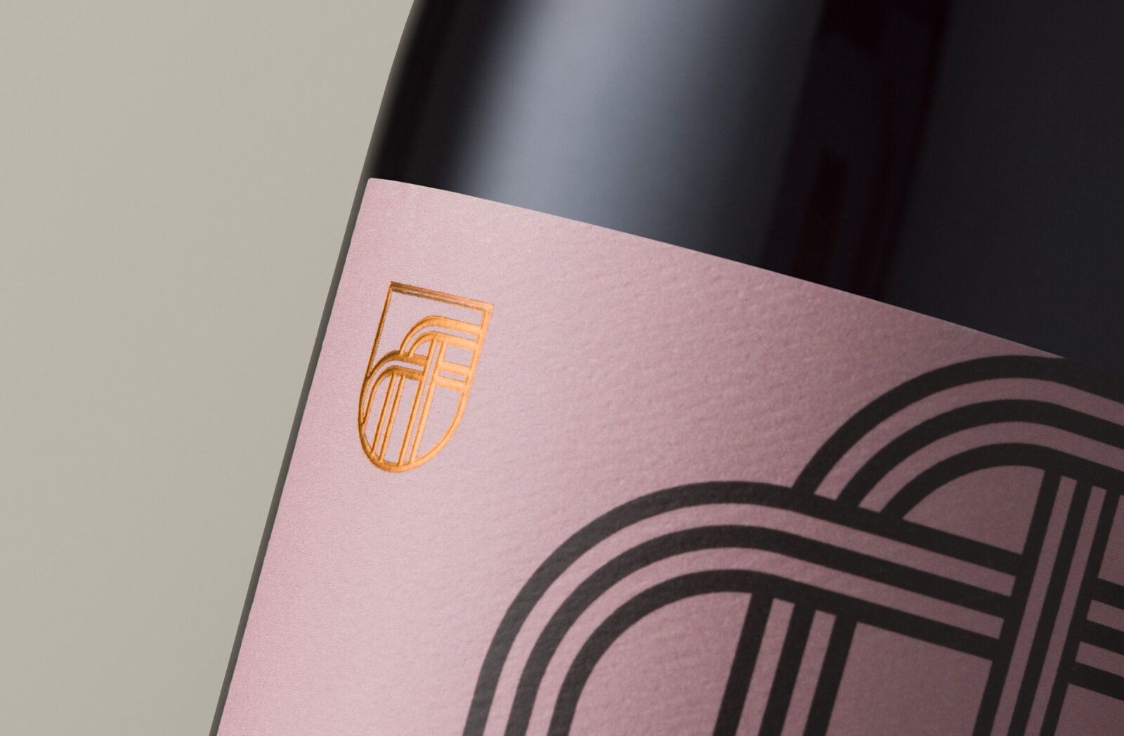
The new Taylor Ferguson brand mark is a nod to the traditional shield mark with a simplified, modern interpretation. The mark follows the aesthetic of the label graphic to form the “TF” initials. This branding has then been extended into a branded capsule. Though the branding looks graphic and simple, it’s the secondary assets that allows the brand to adapt beyond the packaging ie. assets to use on socials, tasting notes, clothing, advertising.
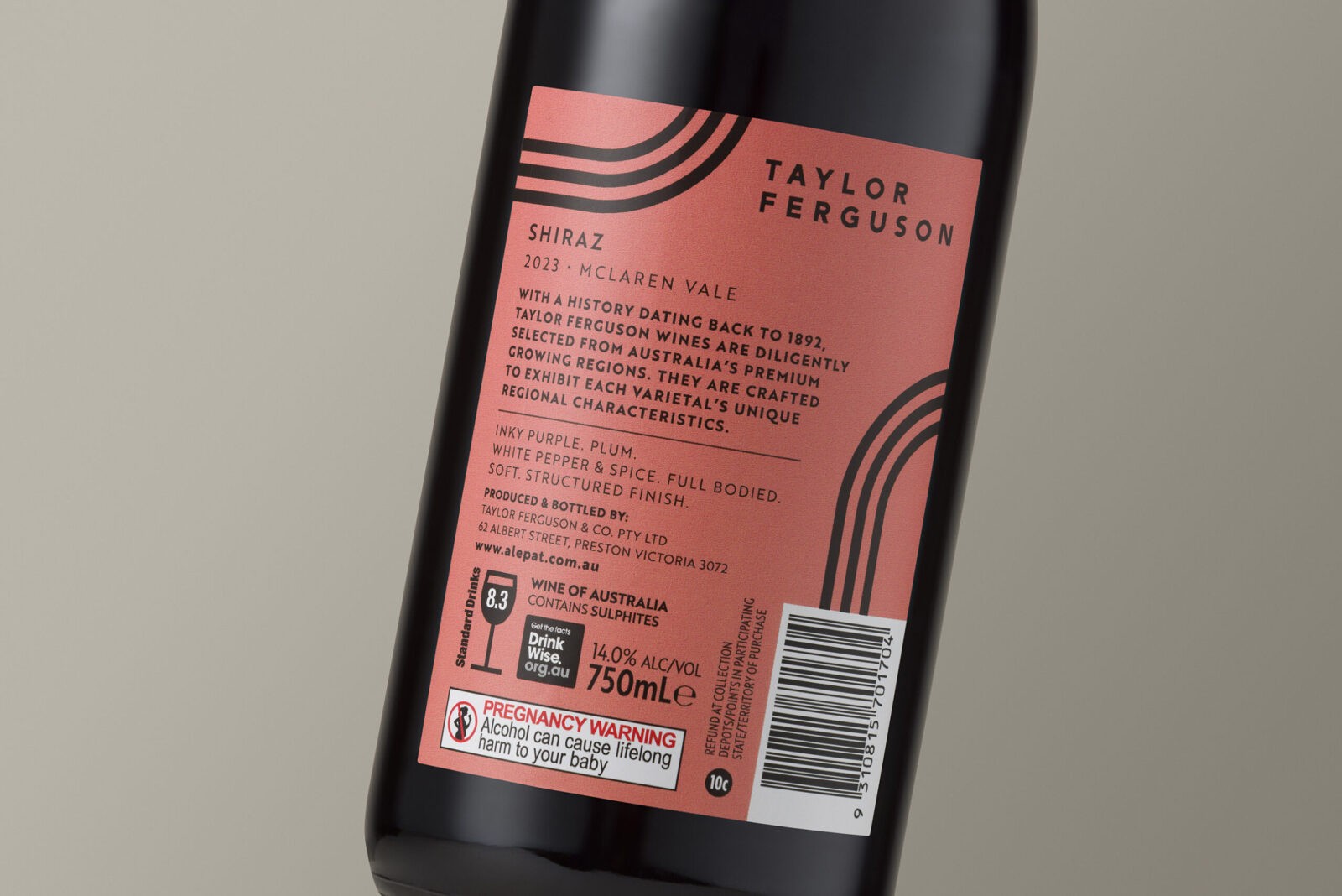
The back label has been developed with these design assets in mind. Though there is loads of information to house, we feel the back label design should always be considered. You never know if a consumer will see the bottle for the first time from the front view, or back view.
The chosen colours are disruptive on shelf without being too contemporary and risk losing relevance in future years. They create a warm, sophistication to the brand over delivering to the consumer for the price point.



CREDIT
- Agency/Creative: Studio Guild
- Article Title: Studio Guild Redesigns Taylor Ferguson Packaging for Maximum Shelf Impact
- Organisation/Entity: Agency
- Project Status: Published
- Agency/Creative Country: Australia
- Agency/Creative City: Fitzroy, Melbourne
- Market Region: Australia
- Industry: Food/Beverage
- Keywords: WBDS Agency Design Awards 2024/25 - Packaging Design, Product Redesign , label design, drinks, drinks industry, wine, wine label design, wine label, drinks branding, rebrand, rebranding
- Keywords: WBDS Agency Design Awards 2024/25 - Packaging Design, Product Redesign , label design, drinks, drinks industry, wine, wine label design, wine label, drinks branding, rebrand, rebranding
-
Credits:
Creative Director: Trish Dunstone
Creative Direction/Design: Bella Galea Goodwin


