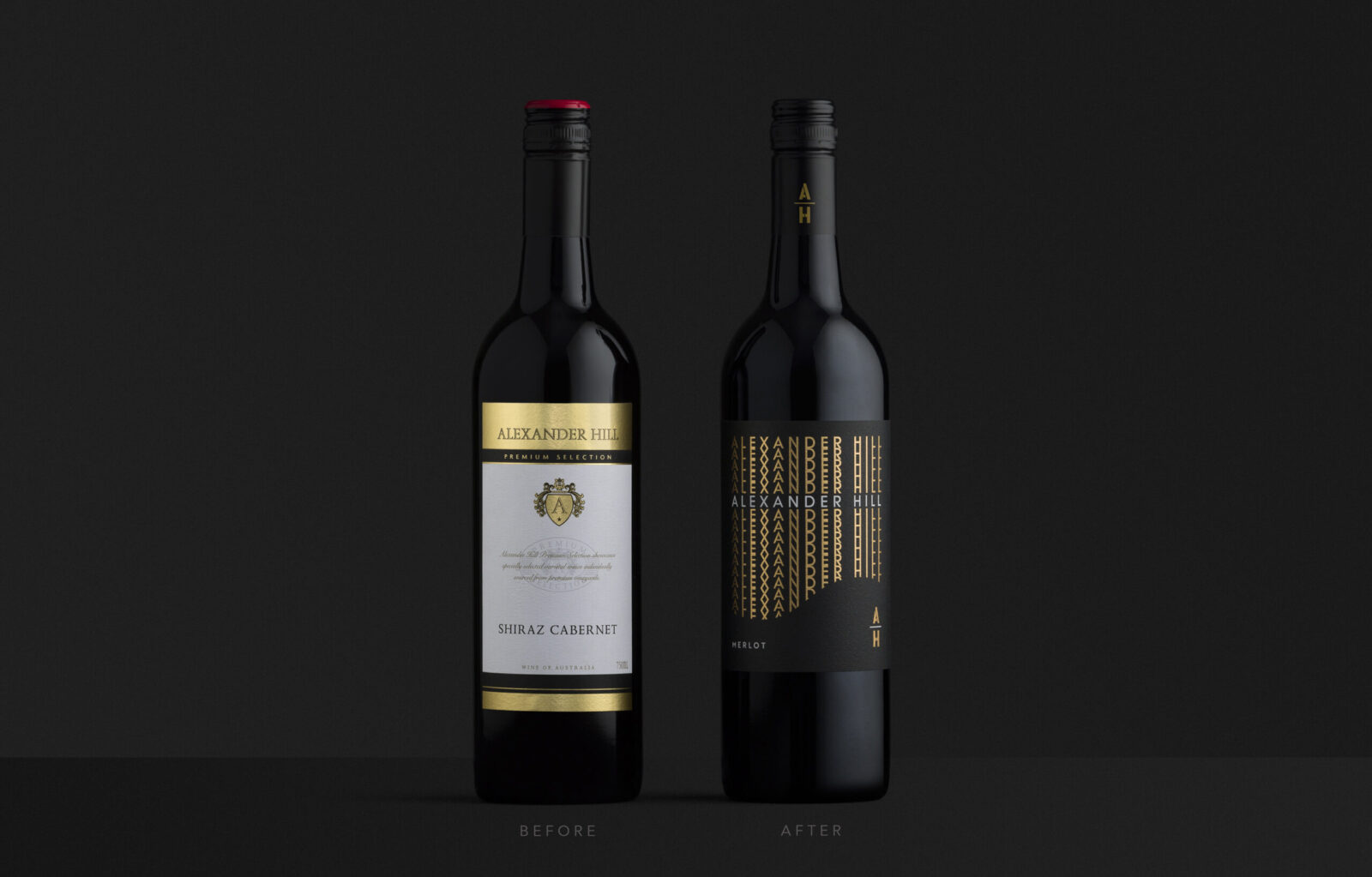
Studio Guild was tasked with rebranding the Alexander Hill range for wine distributor, Alepat Taylor. Though this range punched above its weight for its price point, the branding was tired and old-fashioned with little support or engagement from trade or on-premise and lacking any kind of impact on shelf. Ideally when we work on a brand, we come up with a brand name to create a brand story where the visuals and imagery support each other. Given the name we had to work with was old-fashioned and evoked a more traditional style ‘vineyard’ label, our challenge was to strategise on how to tell the brand story in a more modern and eye-catching way, but still retain the brand name and be relevant.
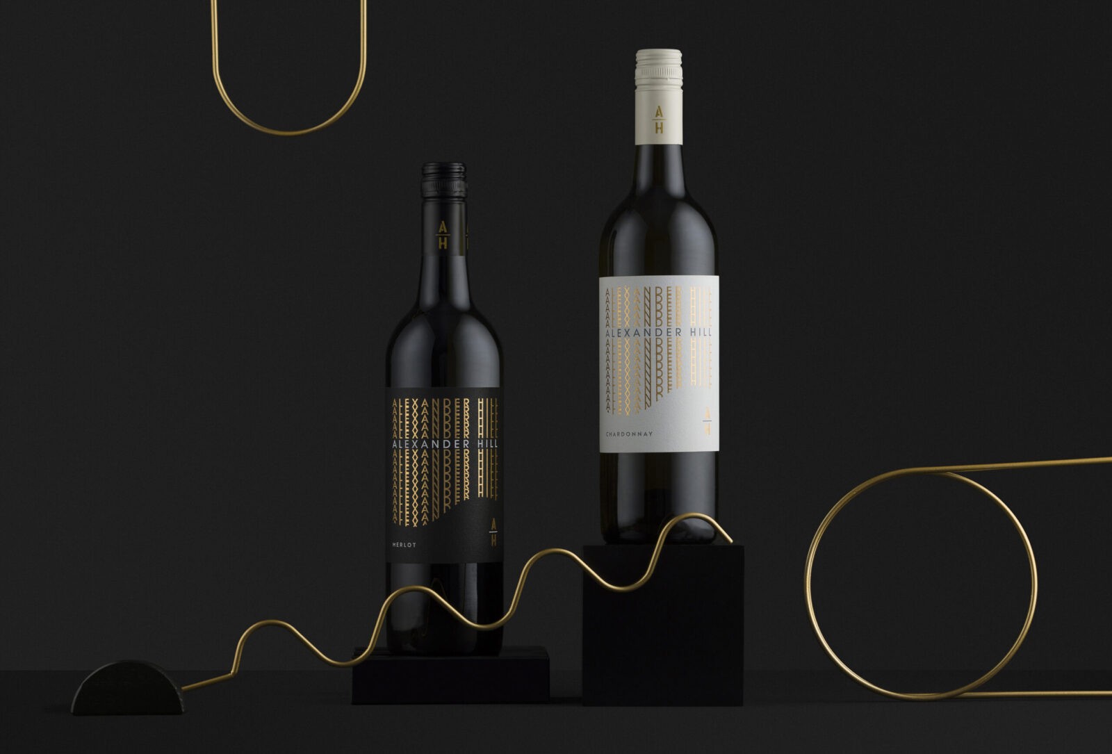
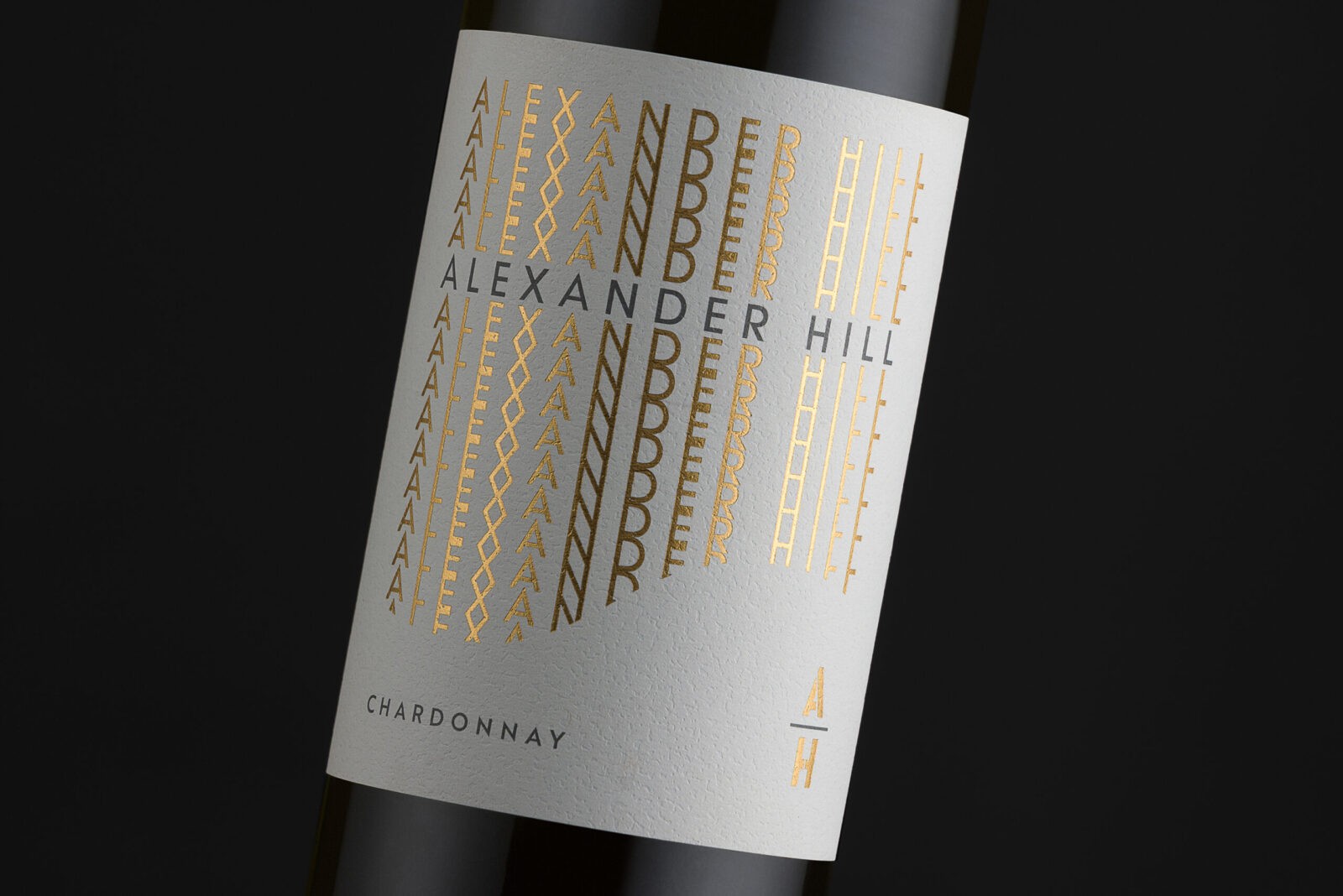
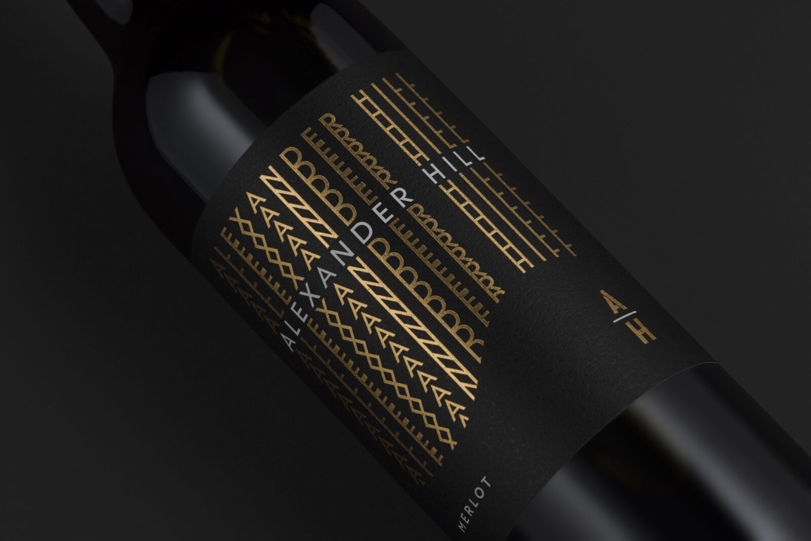
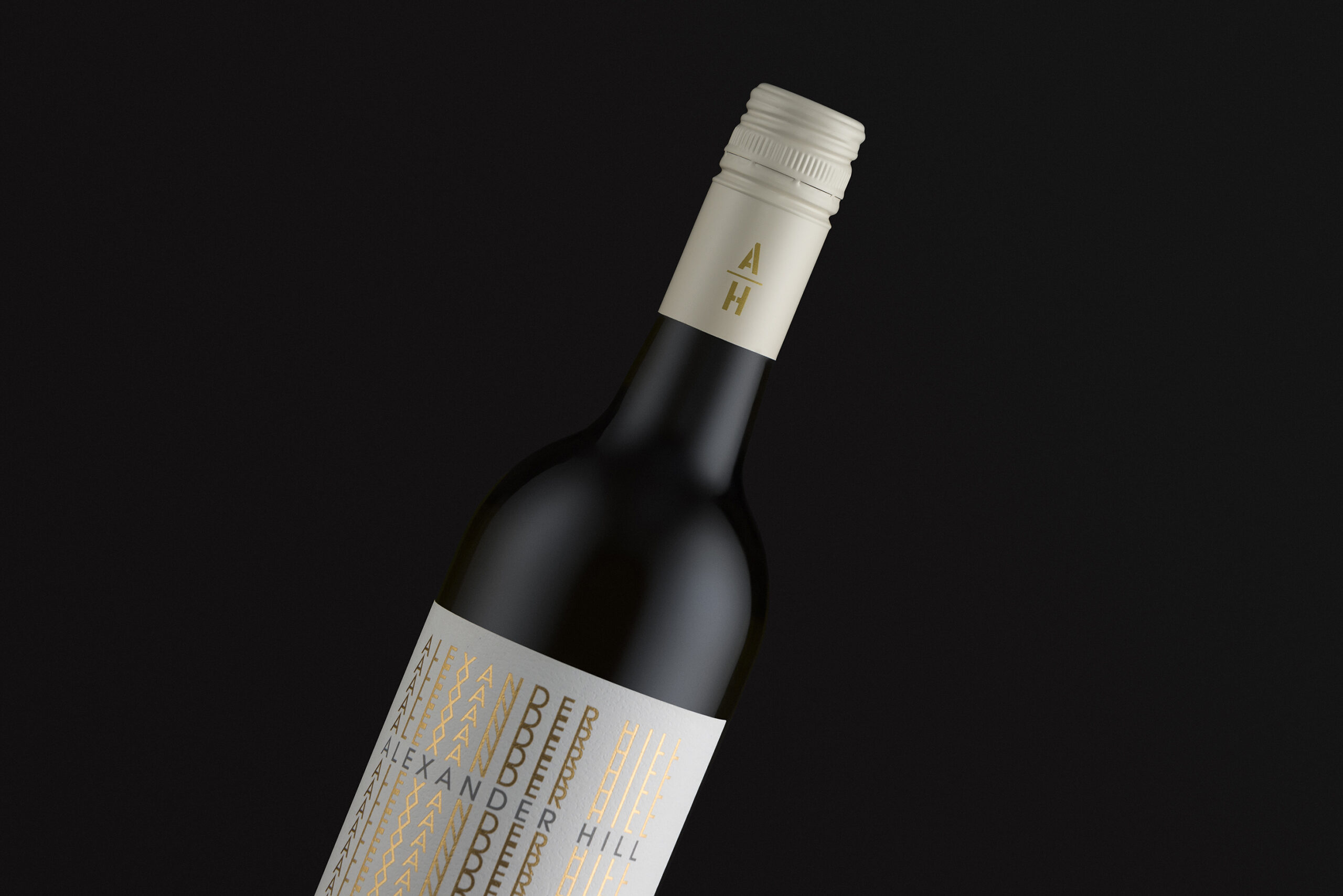
The repetitive lines of the logo type creates an overall pattern, but we have cleverly tucked in the “hill” within the negative space, which is not immediately obvious to create that “aha” moment. This then creates a memorable brand for the consumer to connect with. The negative space of the hill seamlessly creates a scene as though the lines of type are the background sky.
The minimal colour palette with textural stock and effective gold foiling, was chosen to create a premium looking brand with low production costs to help increase the client’s margins. As well as creating an impactful label we also created a clean, effective brand lock-up – used both on the label, branded cap and other marketing collateral.
This type of contemporary branding is very different to the client’s brand portfolio, but by pushing the boundaries of the client’s thought process, we have made a positive impact.
“Thank you for your assistance and practical experience in our undertaking to revamp our Alexander Hill range. After internal discussion it was plainly obvious that we had a sensational product in daggy old packaging. It was suggested internally that we change or evolve the brand only slightly. Contrary to this we threw out not only the baby, the bath water, but also the soap!
Shortly after briefing Studio Guild we had a series of options – all great solutions, but one of those stood out head and shoulders above the others. A classic yet clean and fresh modern look and feel, with a great twist to portraying the “hill”.
Since introducing the refreshed brand to the trade three things have occurred; sales have basically tripled, our margin has grown, and clients that would not have approached the old daggy version have jumped on board. I’d call that a resounding success! Thank you.” – Alepat Taylor.


CREDIT
- Agency/Creative: Studio Guild
- Article Title: Studio Guild Brings Modern Sophistication to Alexander Hill’s Wine Packaging Design
- Organisation/Entity: Agency
- Project Status: Published
- Agency/Creative Country: Australia
- Agency/Creative City: Fitzroy, Melbourne
- Market Region: Australia
- Industry: Food/Beverage
- Keywords: WBDS Agency Design Awards 2024/25 , Packaging Design: Product Redesign, label design, drinks, drinks industry, wine, wine label design, wine label, drinks branding, rebrand, rebranding
- Keywords: WBDS Agency Design Awards 2024/25 , Packaging Design: Product Redesign, label design, drinks, drinks industry, wine, wine label design, wine label, drinks branding, rebrand, rebranding
-
Credits:
Creative Director: Trish Dunstone
Designer: Trish Dunstone


