


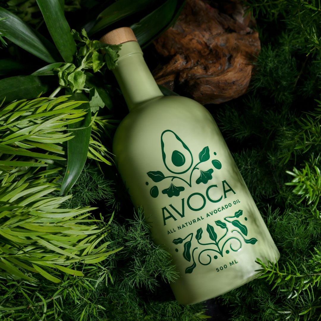
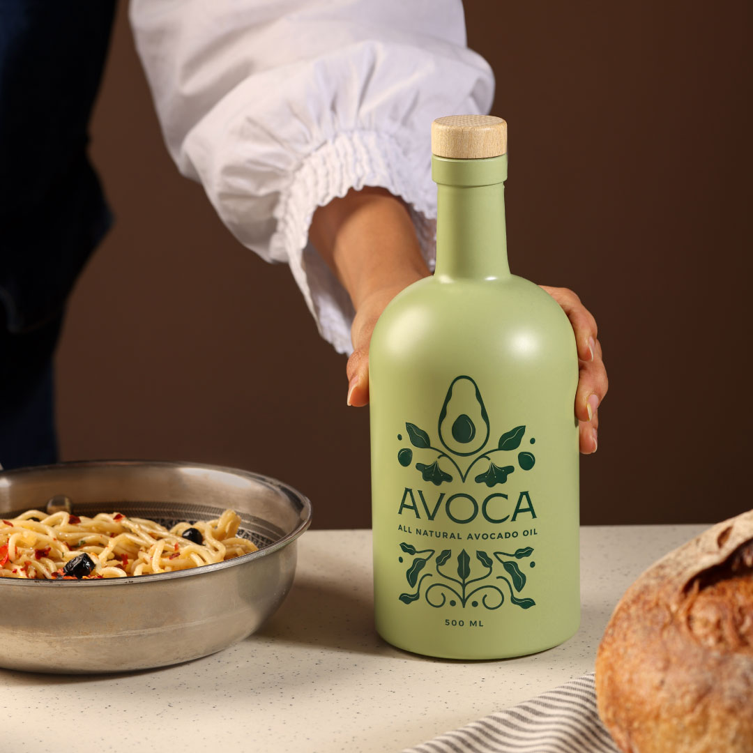
We recently had the pleasure of working on Avoca’s comprehensive branding, packaging, and website design. Avoca is a premium farm-to-table avocado oil brand that sources 100% pure and unrefined avocado oil from Mexico. To reflect the brand’s authentic and high-quality roots, we devised an illustration inspired by Mexican folk art, highlighting the different parts of the avocado plant and tree. These designs are enriched with the natural colors of avocados, creating a vibrant and organic feel. We also used the colors from the avocado itself and incorporated elements of the avocado plant in the Mexican motif. The overall vibe we aimed for was one of silent luxury, a premium look and feel that speaks to the quality of the product. The glass bottle truly brought the design to life, with subtle highlights that drew attention to key elements without overpowering the overall aesthetic. The combination of vibrant colors, intricate illustrations, and refined typography with luxurious accents resulted in a packaging design that was both beautiful and functional.
Brand Essence and Identity
Avoca’s essence lies in its dedication to purity, quality, and the farm-to-table philosophy. The brand sources its avocados from carefully selected farms in Mexico, known for their rich soil and ideal climate for avocado cultivation. This meticulous sourcing process ensures that only the highest quality avocados are used, resulting in an oil that is 100% pure and unrefined. The brand’s promise of authenticity and health is not just a selling point but a core value. Our task was to encapsulate this essence visually and communicatively, making sure it resonated with consumers and reflected the premium nature of the product.
Inspiration from Mexican Folk Art
To truly capture Avoca’s spirit, we turned to the rich cultural heritage of Mexico. Mexican folk art is vibrant, intricate, and deeply rooted in the country’s traditions and history. It often features detailed illustrations of flora and fauna, which perfectly aligns with Avoca’s focus on natural purity and the avocado’s botanical origins. Our design team embarked on an in-depth exploration of Mexican folk art, studying its patterns, colors, and motifs. We were particularly drawn to the traditional illustrations that depicted plants and trees in a stylized yet recognizable manner. These elements provided a perfect foundation for creating an illustration that would represent Avoca’s product authentically.
The illustration we devised was a celebration of the avocado plant in its entirety. From the roots that anchor it firmly in the rich Mexican soil to the branches that bear the precious fruit, every part of the avocado plant was depicted with care and artistry. This not only highlighted the natural origins of the oil but also paid homage to the traditional art forms that have been a part of Mexican culture for centuries.
Color Palette and Visual Identity
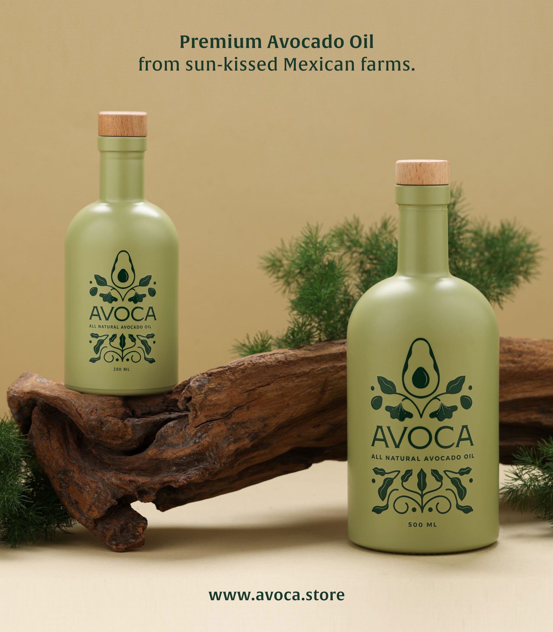
Choosing the right colors was crucial to conveying the natural and premium qualities of Avoca’s avocado oil. We opted for a palette that included various shades of green, representing the different parts of the avocado plant – from the dark, lush leaves to the lighter, almost yellow-green hues of the fruit’s flesh. This green spectrum was complemented by earthy tones to represent the soil and the avocado pit, grounding the design in natural elements.
Incorporating these colors into the design was not just about aesthetics; it was about creating a visual language that communicated the product’s purity and natural origins at a glance. The vibrant greens and earth tones evoke a sense of freshness and health, aligning perfectly with the product’s benefits and Avoca’s brand promise.
**Typography and European Elegance**
To balance the vibrant and intricate illustration inspired by Mexican folk art, we chose a refined European font. This decision was strategic, aimed at adding a touch of sophistication and elegance to the overall design. European typography is often associated with luxury brands and high-end products, and incorporating it into Avoca’s branding helped position the product as a premium offering in the market.
The contrast between the detailed, colorful illustration and the clean, elegant typography created a harmonious balance. It ensured that the packaging was eye-catching and distinctive while maintaining a sense of refinement and exclusivity. This blend of Mexican cultural elements with European design principles resulted in a unique and compelling visual identity for Avoca.
Packaging Design
The packaging design for Avoca’s avocado oil was where all these elements came together seamlessly. Our goal was to create a package that not only protected the product but also told a story – a story of quality, authenticity, and cultural heritage.
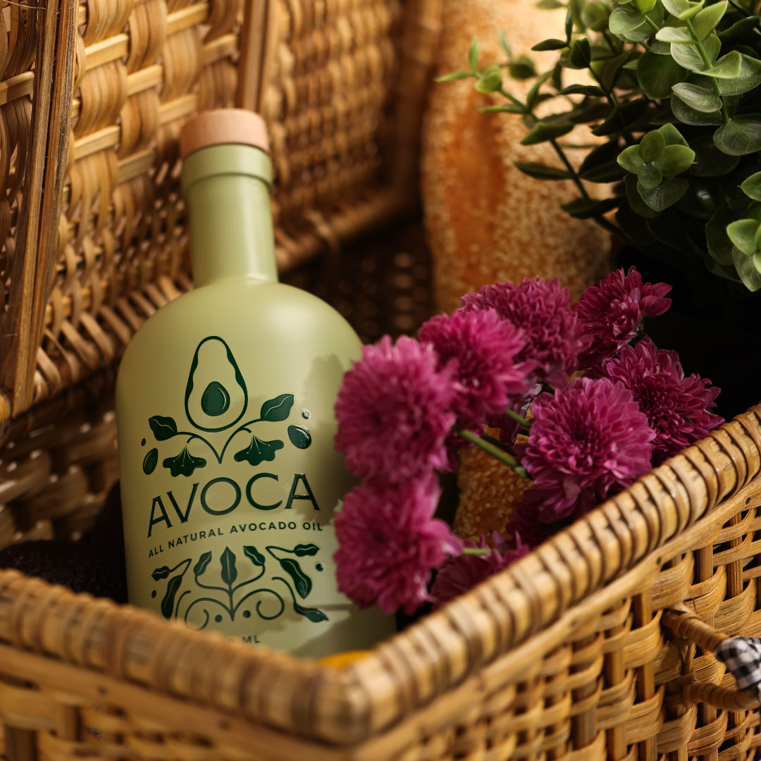
We opted for a sleek, dark glass bottle to preserve the oil’s quality and protect it from light, which can degrade its nutritional properties. The bottle’s shape was carefully selected to reflect a sense of elegance and ease of use, ensuring that it would stand out on store shelves and be convenient for consumers.
The illustration inspired by Mexican folk art wrapped around the bottle, creating a 360-degree visual experience. As consumers view the bottle, they would see the different parts of the avocado plant, enhancing their connection to the product’s natural origins. The European typography was used for the brand name and product information, ensuring clarity and readability while maintaining a premium look.
To add an extra touch of luxury, we incorporated gold foil accents into the design. These subtle highlights drew attention to key elements without overpowering the overall aesthetic. The combination of vibrant colors, intricate illustrations, and refined typography with luxurious accents resulted in a packaging design that was both beautiful and functional.
Website Design
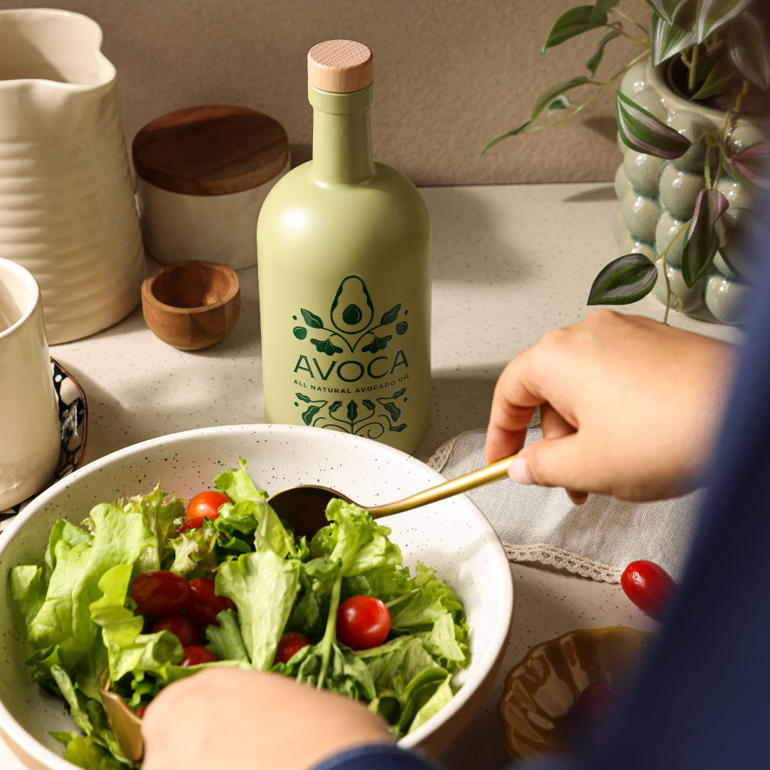
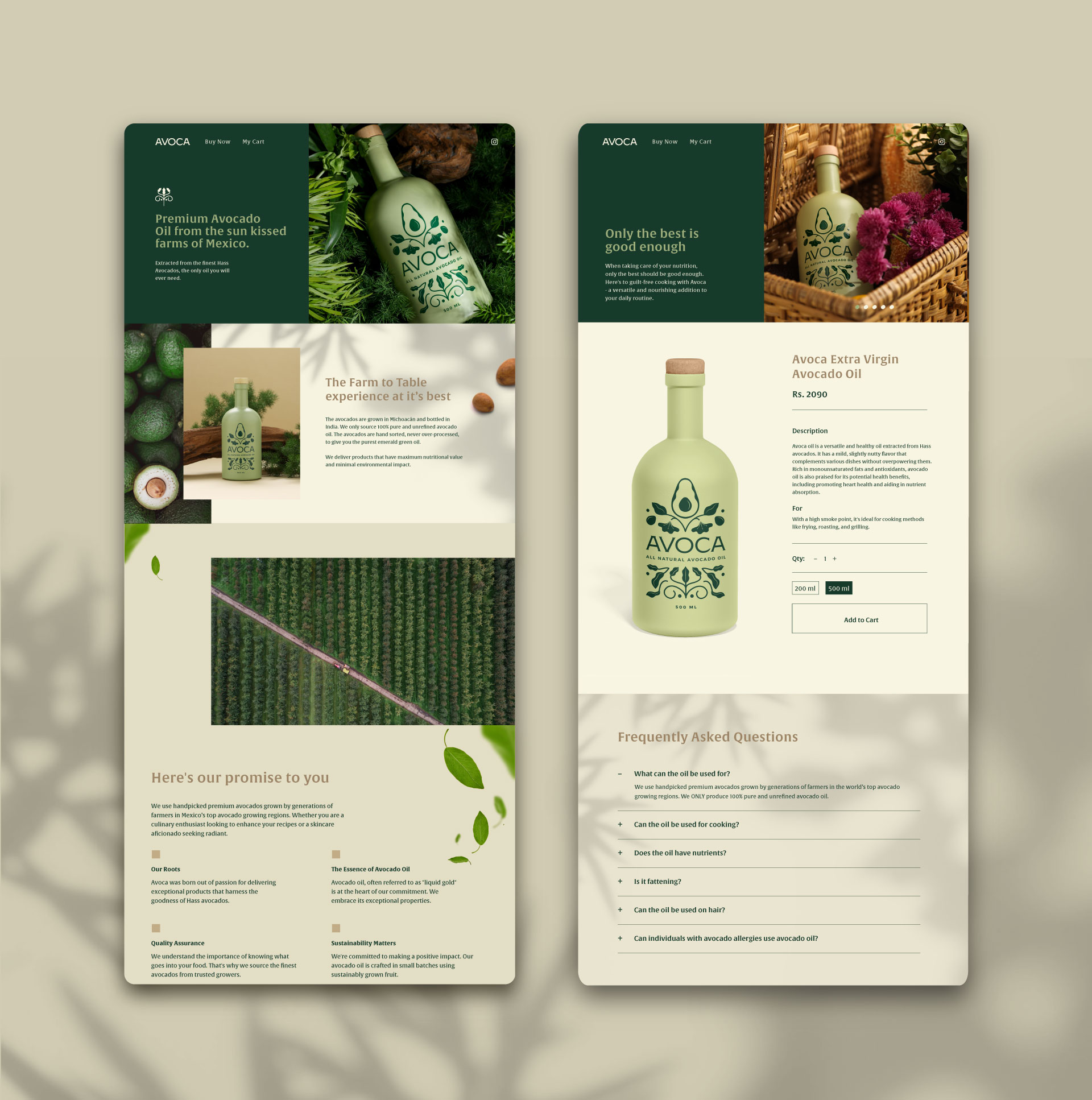
In today’s digital age, a strong online presence is crucial for any brand. For Avoca, we wanted the website to be an extension of the visual identity we created for the packaging, providing a seamless and immersive experience for visitors. The website design was built around the same principles of purity, authenticity, and sophistication. The landing page features images of the avocado plant prominently, creating an immediate connection to the product’s natural origins. The color palette from the packaging was carried over to the website, ensuring brand consistency and reinforcing the product’s vibrant, healthy image.
High-quality images and videos were used throughout the website to showcase the product in various settings – from gourmet kitchens to beauty routines. These visual elements helped to illustrate the oil’s versatility and premium nature. The microsite was an extension of this identity, and we added small avocado elements to it too. The leaves of the avocado plant, along with the seeds as separate elements, were added to enhance the visual appeal and maintain consistency with the overall branding.
We made sure to use clear and beautiful imagery as part of our one-pager layout. This approach not only kept the design clean and elegant but also made the user experience straightforward and enjoyable. The visual storytelling throughout the website ensured that visitors could easily understand the product’s benefits and the brand’s commitment to quality.
Navigation on the website was designed to be intuitive and user-friendly, with clear sections for product information, health benefits, recipes, and the brand story. We wanted visitors to not only learn about Avoca’s avocado oil but also to understand its superior qualities and versatile uses. High-quality images and videos were used throughout the website to showcase the product in various settings – from gourmet kitchens to beauty routines. These visual elements helped to illustrate the oil’s versatility and premium nature.
Marketing and Communication
Beyond the visual design, our collaboration with Avoca extended to crafting a cohesive marketing and communication strategy. The goal was to create a consistent message across all touchpoints, reinforcing the brand’s values and highlighting the unique qualities of the avocado oil.
We developed a series of marketing materials, including brochures, social media content, and email campaigns, all aligned with the visual identity we created. Each piece of content was designed to tell a part of Avoca’s story, whether it was the sourcing process in Mexico, the health benefits of the oil, or its versatile uses in cooking and beauty.
Social media will play a crucial role in our strategy, allowing us to engage directly with consumers and build a community around the brand. We created visually appealing posts and stories that highlighted the product’s natural origins, superior quality, and premium feel.
Email marketing campaigns are being crafted to educate consumers about the benefits of avocado oil, share exclusive recipes, and offer special promotions. Each email will be visually consistent with the brand’s identity, ensuring a cohesive experience across all platforms.
Visual Storytelling and Social Media
Our social media strategy for Avoca was designed to create a visual narrative that would captivate and inform our audience. We focused on high-quality imagery and engaging content that highlighted the versatility of the avocado oil. Posts showcased the oil in a variety of settings, from gourmet dishes to beauty applications, reinforcing the product’s multifunctional nature.
We are also leveraging the power of storytelling by sharing the journey of the avocados from Mexican farms to the final product. This behind-the-scenes content helped build a deeper connection with our audience, showing them the care and dedication that goes into every bottle of Avoca avocado oil.
CREDIT
- Agency/Creative: Studio Fable
- Article Title: Studio Fable Transforming Avocado Oil Packaging with Authentic Mexican Design
- Organisation/Entity: Agency
- Project Type: Packaging
- Project Status: Published
- Agency/Creative Country: India
- Agency/Creative City: Kolkata
- Market Region: Asia
- Project Deliverables: Brand Identity, Packaging Design, Web Design
- Format: Bottle
- Industry: Food/Beverage
- Keywords: Branding, Packaging, Web Design, Avocado Oil, Premium Branding, Luxury Packaging, Elegant
-
Credits:
Creative Director, Designer: Sakshi Jalan
Illustrator: Anvita Tekriwal
Logo Designer: Rithvika Reddy
Photographer: Harshika Tantia
Stylist: Vidushi Singhania


