


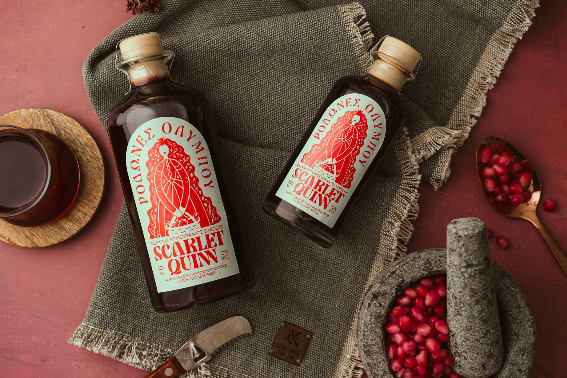
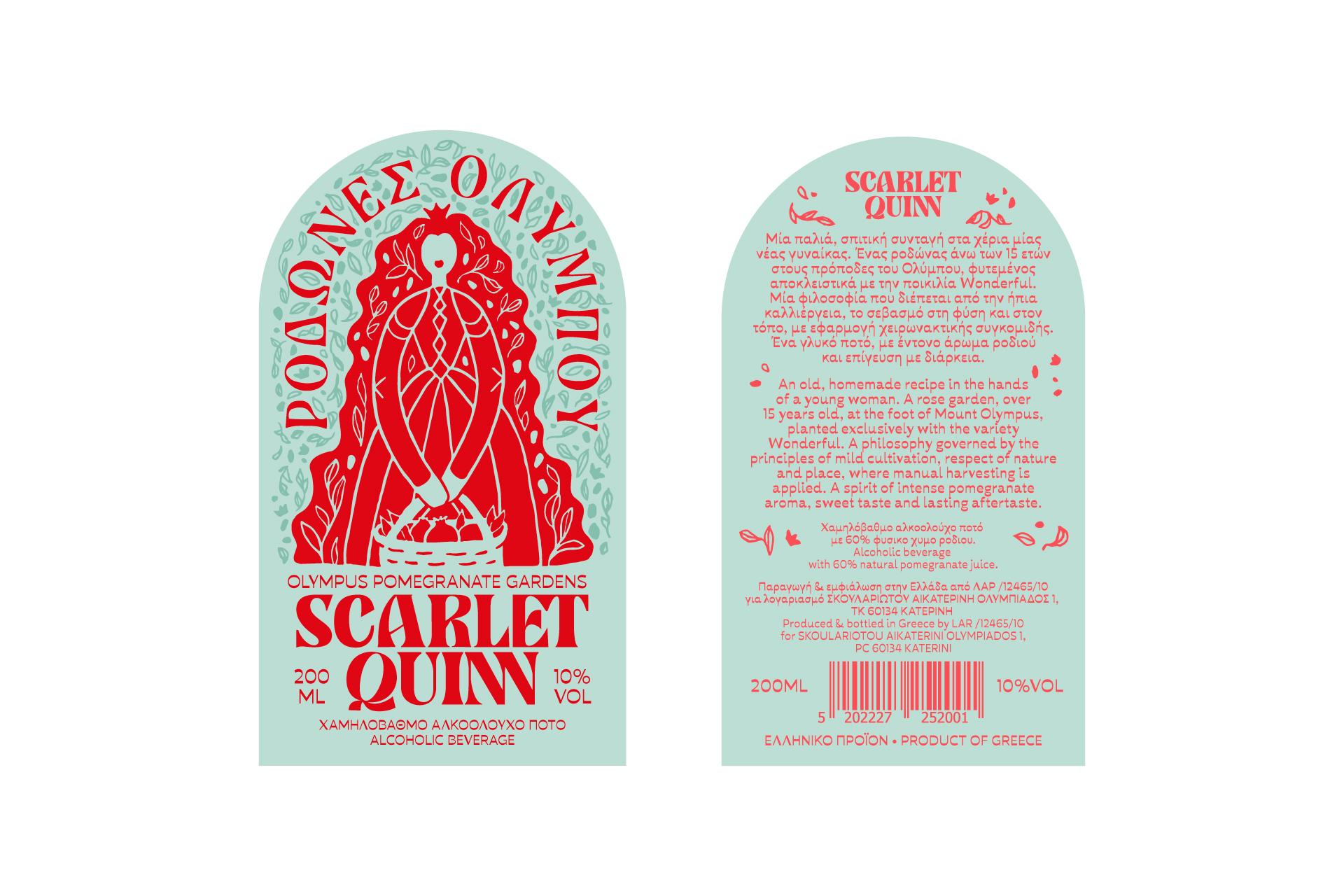
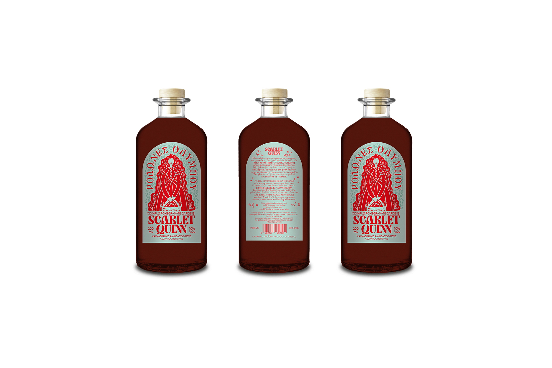
The Scarlet Quinn packaging was designed for 200ml and 500ml bottles, capturing the uniqueness of an artisanal beverage inspired by the pomegranate itself. The name Scarlet derives from the deep red hue of the fruit, while Quinn evokes a noble yet grounded figure—the imagined owner of the pomegranate orchards, a woman deeply connected to the land and its harvest.
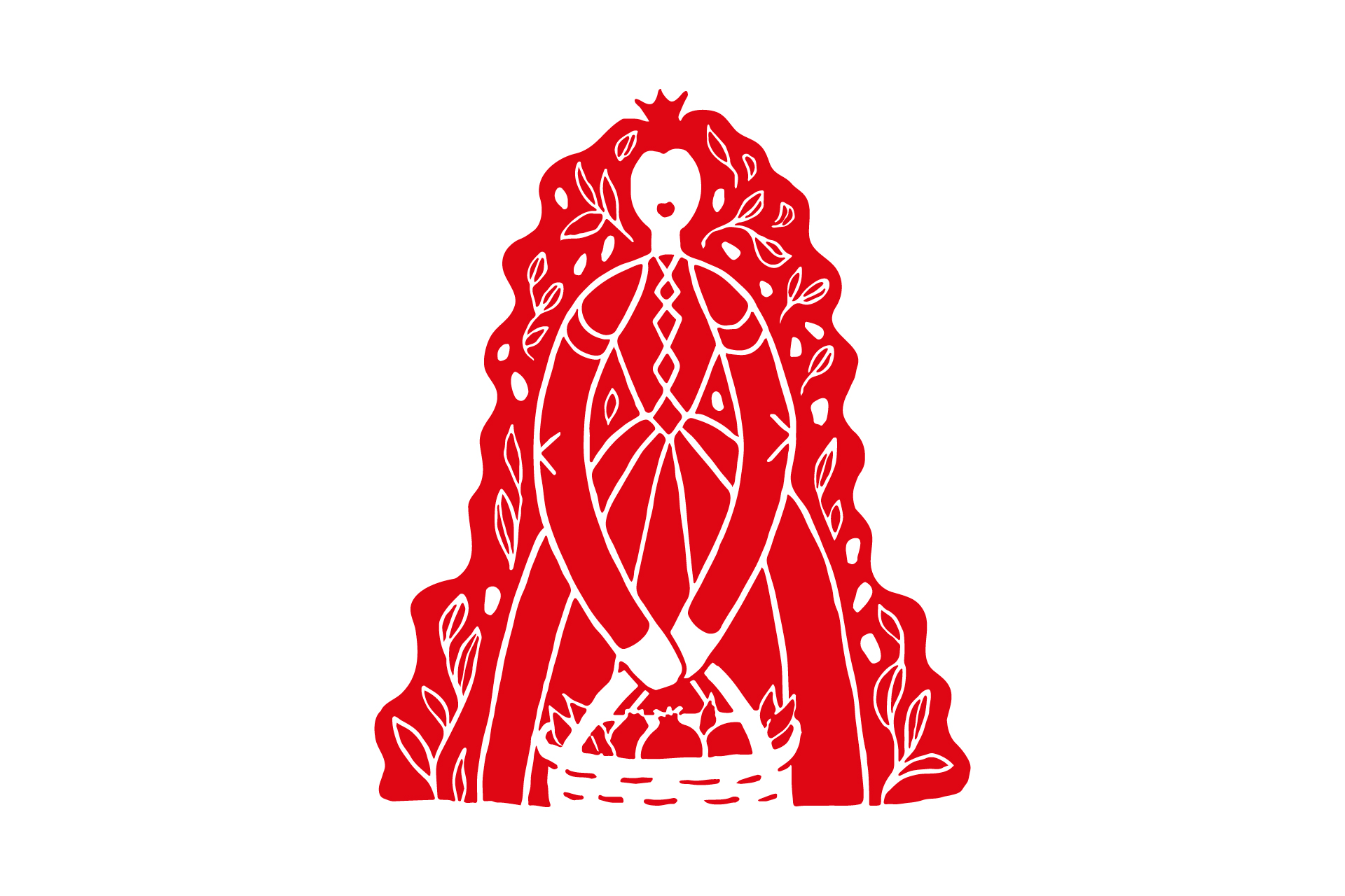
At the heart of the design is an illustration that personifies the product itself. The central figure is not merely decorative; she is the queen of the pomegranate fields, the caretaker who nurtures and offers its fruit with pride and devotion. Her striking red hair dominates the composition, drawing inspiration from the vibrant color of the pomegranate, while the basket brimming with fruit reinforces the connection to the drink’s artisanal nature. The flowing lines of her form and the intricate details within the illustration emphasize the handcrafted essence of the product, elevating it beyond a simple beverage to a story of passion and expertise.
Designed with influences from folk art and lino printing techniques, the illustration exudes authority without arrogance, serving as a symbol of authenticity, tradition, and craftsmanship. The hand-rendered elements reflect a sense of personal touch, highlighting the meticulous care that goes into both the product and its branding.
The label strikes a balance between tradition and modernity, blending hand-drawn illustration, distinctive typography, and a bold, pop-inspired color palette. The interplay of colors, textures, and materials creates a multi-layered visual experience that captures attention while conveying depth and heritage. The bottle and typography were carefully selected to reflect a subtle retro aesthetic, enhancing a sense of nostalgia while connecting the drink to both heritage and a contemporary, playful perspective.
The result is a design that radiates the warmth of the handmade, remaining bold and distinctive while honoring the rich story behind the product. More than just packaging, it serves as an invitation to experience a beverage rooted in history, passion, and the artistry of its creation.

CREDIT
- Agency/Creative: Studio Dolphins
- Article Title: Studio Dolphins Elevates Scarlet Quinn with a Folk-Inspired Packaging Design
- Organisation/Entity: Agency
- Project Type: Packaging
- Project Status: Published
- Agency/Creative Country: Greece
- Agency/Creative City: Studio Dolphins/Thessaloniki
- Market Region: Europe
- Project Deliverables: Label Design
- Format: Bottle
- Industry: Food/Beverage
- Keywords: Label Design, Packaging Illustration
-
Credits:
Creative Director: Thanasis Tsaboukas
Graphic Designer: Alexandra Tasia


