


The nectar of darkness…
Originating from the burning lands of the West Coast of the United States, the “wine from hell” might be one way of nicknaming this red wine from San José, California.
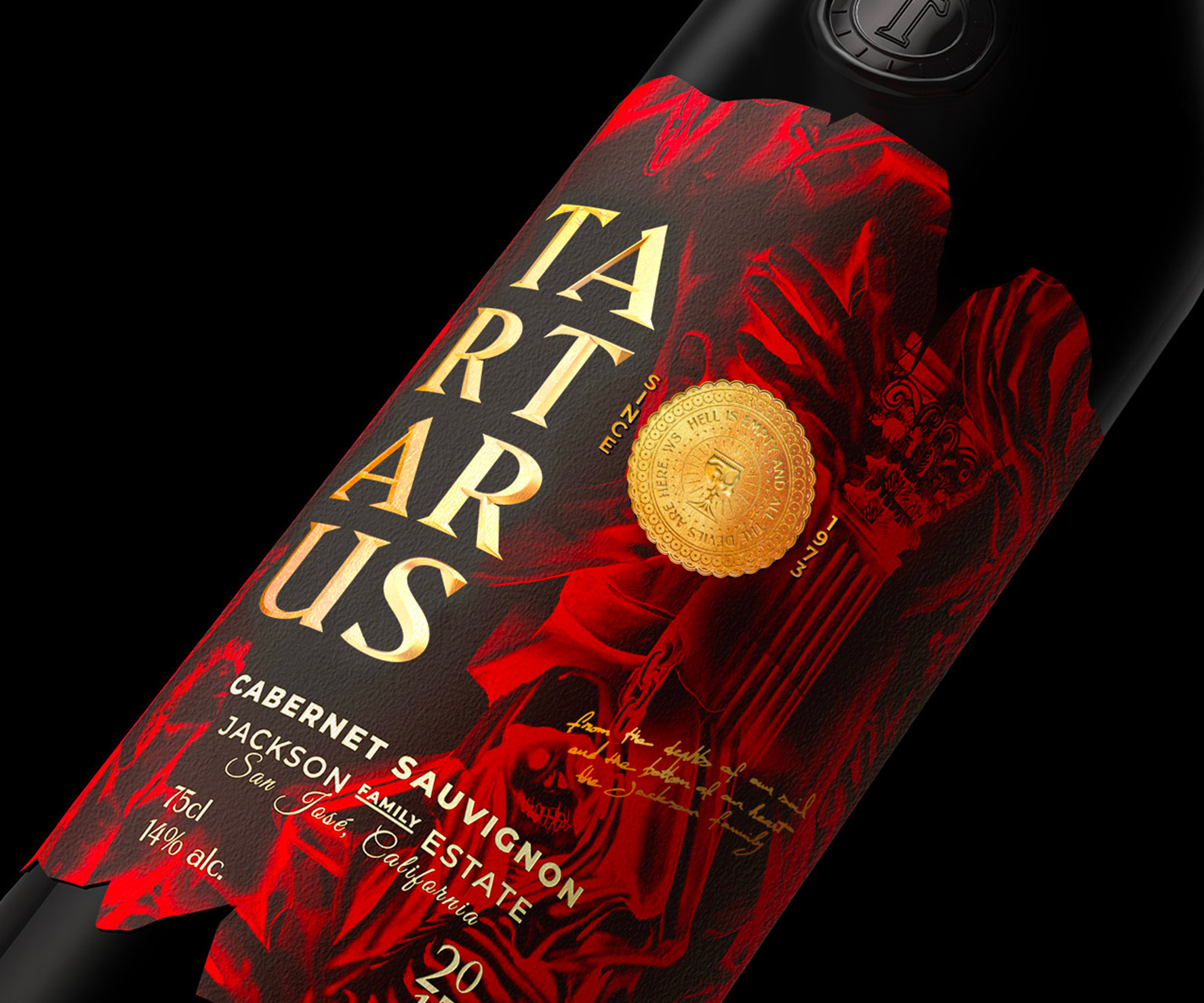
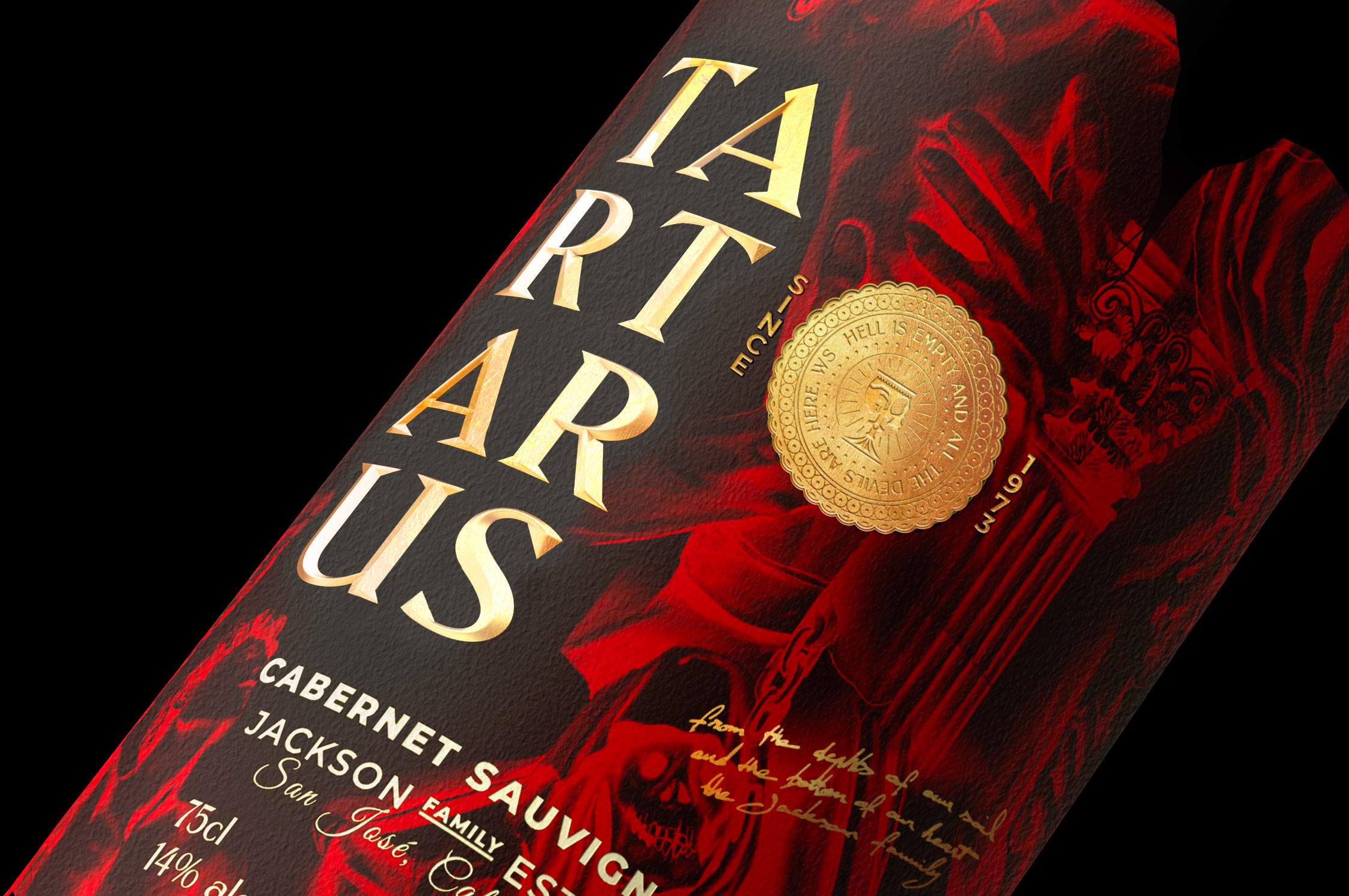
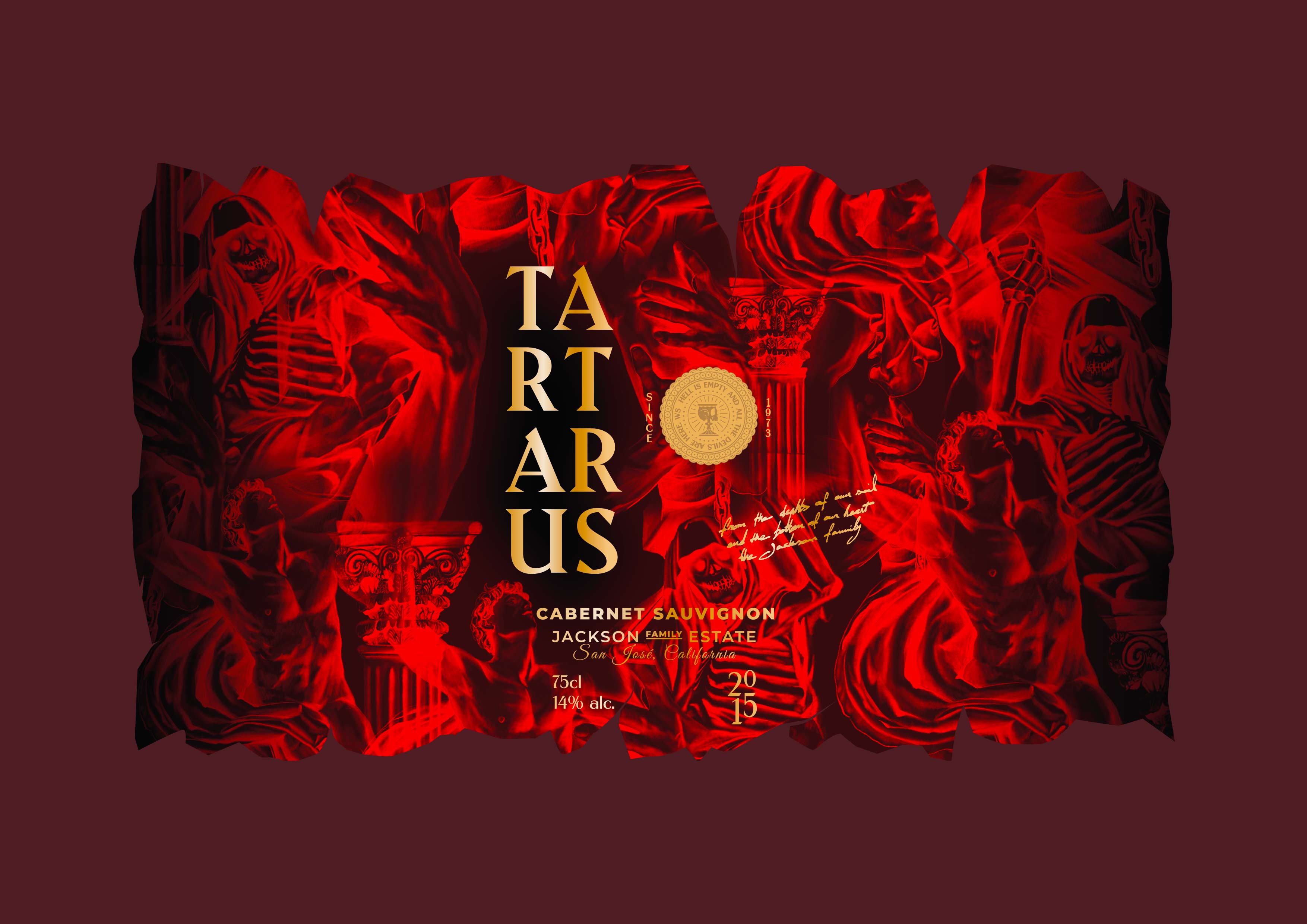
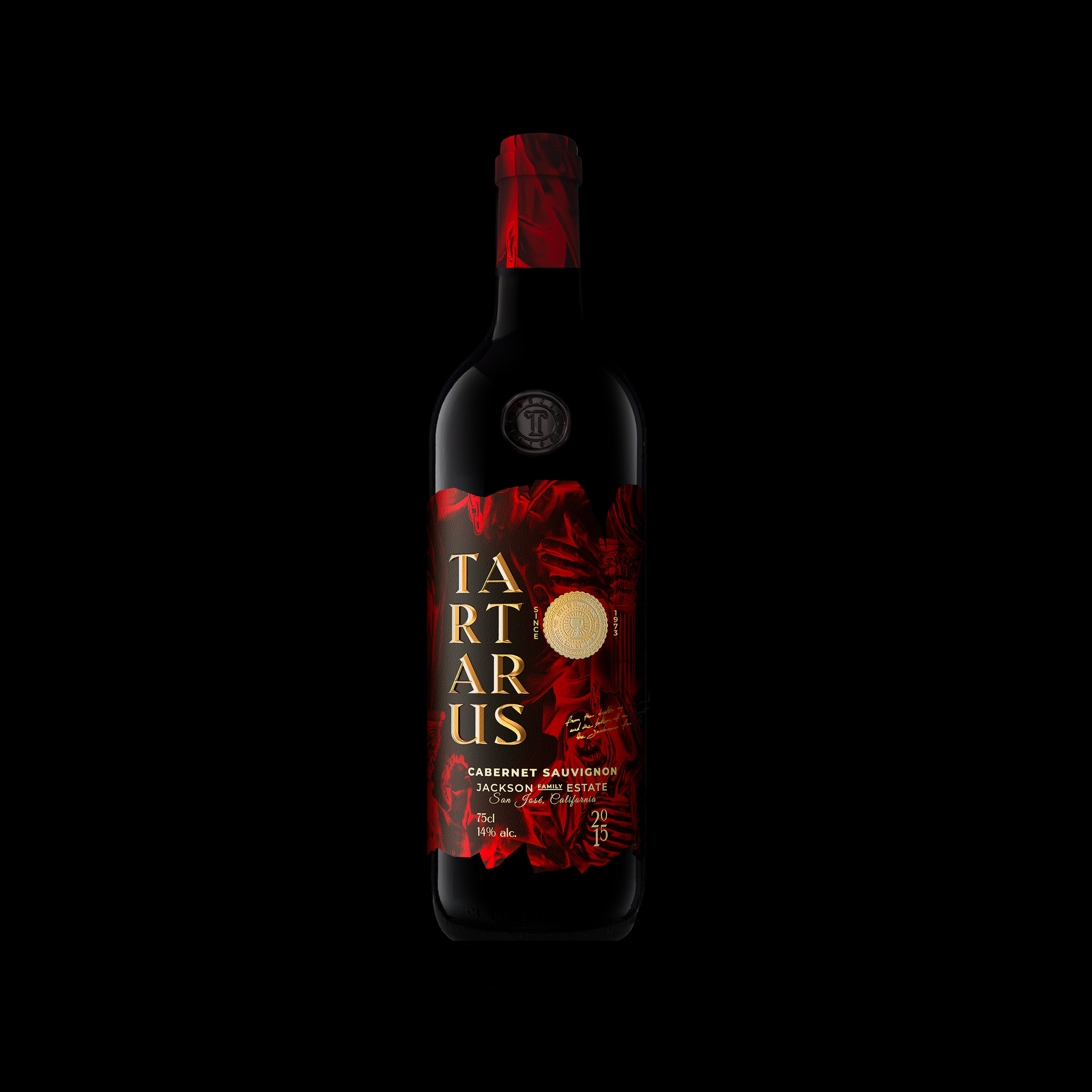
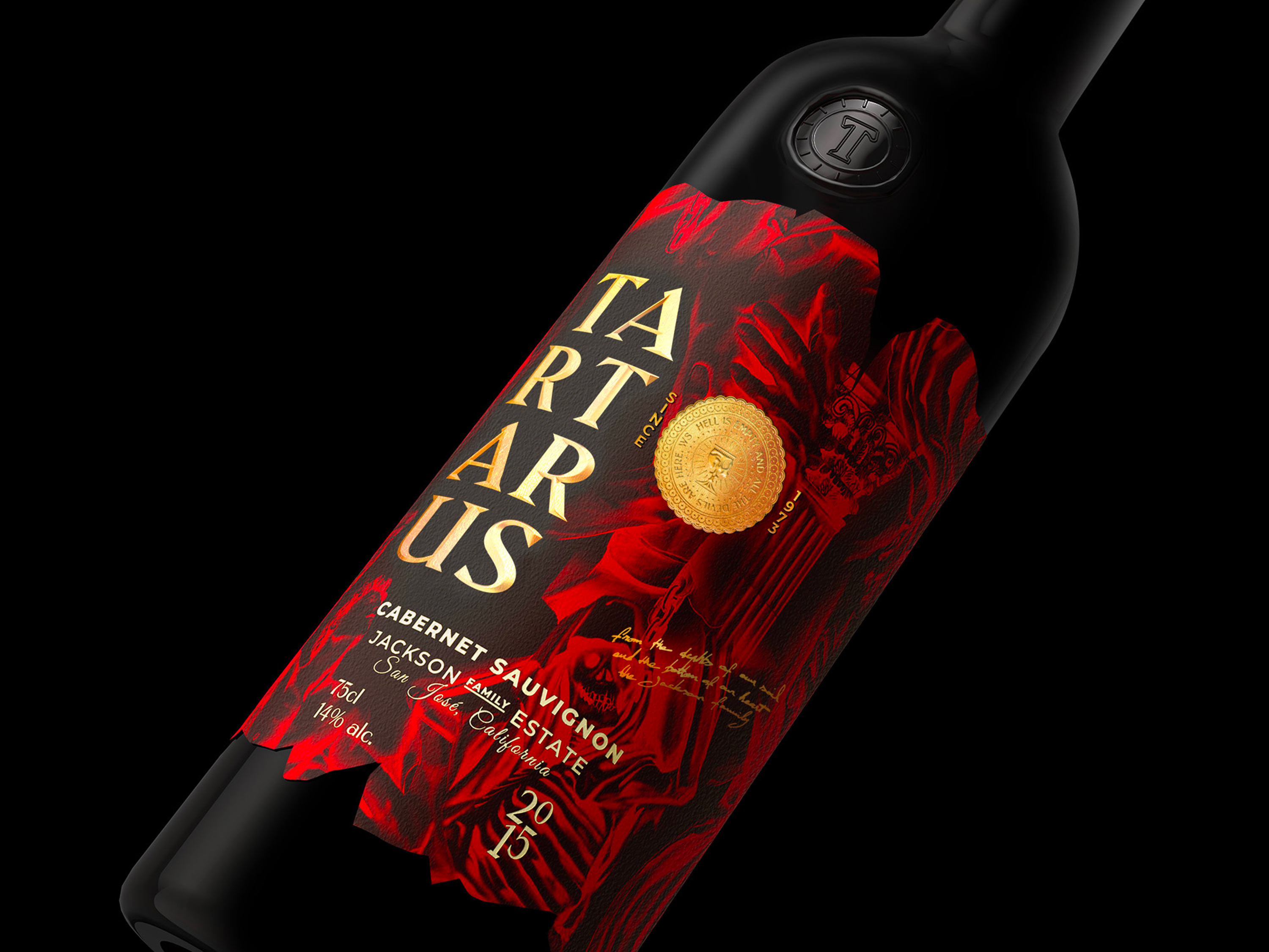
This custom-made bottle accommodates the classic stigmata associated with visions of hell. Here on the glass, the label and the headdress, the darkest of darkness reigns supreme.
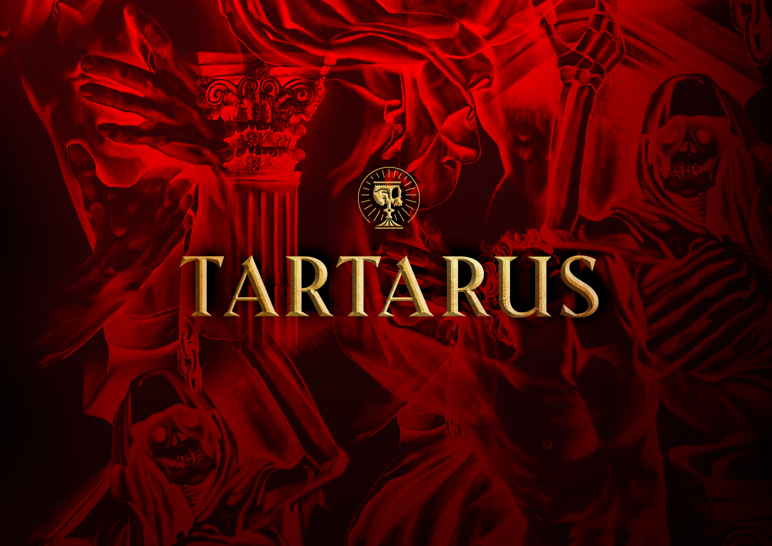
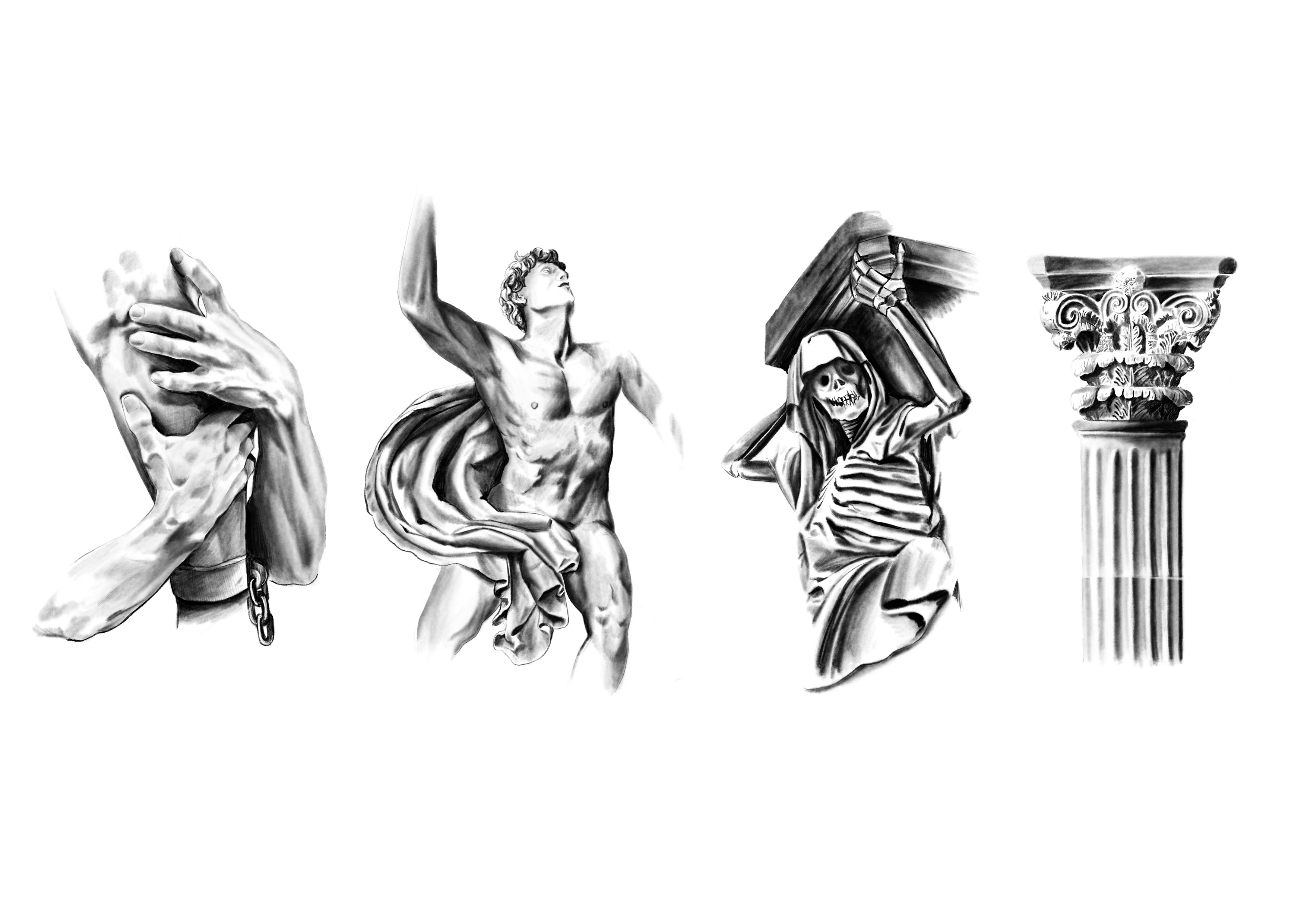
Behind a somewhat flashy and ostentatious overall aesthetic, the label, edges apparently torn, plunges us directly into the main creative scene, the gates of hell. Here a set of violent sketches illustrated by tortured, bent and emaciated bodies intertwined by artefacts specific to themes of torture such as heavy metal chains are combined in an ancient setting. The consumer is plunged into the depths of hell, into the Tartars, an analogy of the depths in which the roots of the vines sometimes plunge, several meters deep into the earth.
The entire red and black dual tone treatment here is a way to visually and sensorially intensify the evocation of hell and the sense of violent menace that inhabits it.
In the middle of this KO there is writing and graphic signage. In the interstices of the dark decoration, as if in opposition, the imposing TARTARUS lettering is inscribed in diamond point with a light gold finish and classic Impasto subtly emerges, creating a balance between light and dark. This ornaments and reinforces the creation detail and the market positioning of the product. A fully gilded stamp reveals hellish new graphic signs with a mystical inscription.
The chalice with the skull becomes the monogram of the brand and is a strong accompaniment to the typography that we now use across all the printed pieces. A way to give future consumers the “Mark” if they dear let the pleasures of this beverage of darkness pass their lips.
CREDIT
- Agency/Creative: Studio Boam
- Article Title: Studio Boam Creates Tartarus Wine Label Design
- Organisation/Entity: Agency
- Project Type: Identity
- Project Status: Published
- Agency/Creative Country: France
- Agency/Creative City: Paris
- Market Region: Europe
- Project Deliverables: Art Direction, Brand Identity, Branding, Illustration, Label Design, Logo Design
- Industry: Food/Beverage
- Keywords: #wine #alcohol #california #cabernetsauvignon
-
Credits:
Art director: Alex Arzuman


