


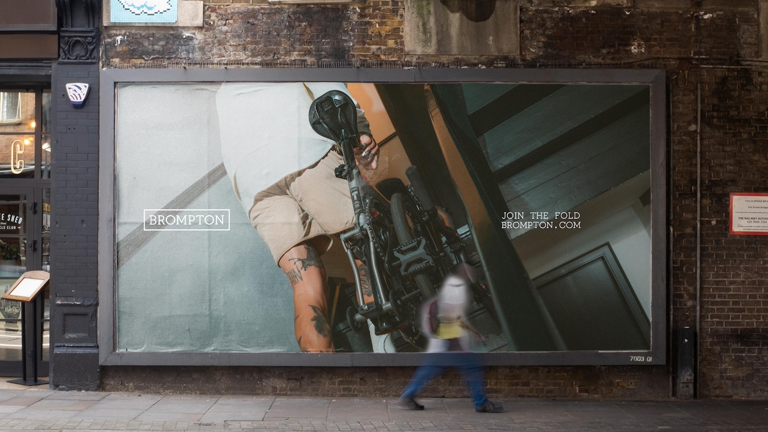
London-based brand agency Studio Blackburn has partnered with Brompton, the iconic folding bike, to mark its 50th anniversary with a striking new brand expression and toolkit. The refresh sets out to capture the essence of the brand while uniting its growing global community.
At a turning point
Founded in London, Brompton is a British success story, synonymous with style, ingenuity and portability. But as the brand has expanded into new markets and product categories, it’s faced the challenge of evolving its identity for the next phase of growth without losing the essence that made it iconic.
“At Brompton, we’ve always believed our super-portable folding bikes represent more than transport – they not only help people navigate their city differently, they also help them see their city differently. And, beyond that, especially in Asia they have great cultural cachet” said Dimitri Hon, Senior Creative at Brompton. “We needed a refreshed branding system that could unify the Brompton brand worldwide whilst offering enough flexibility to reflect local nuances.”
Into the fold
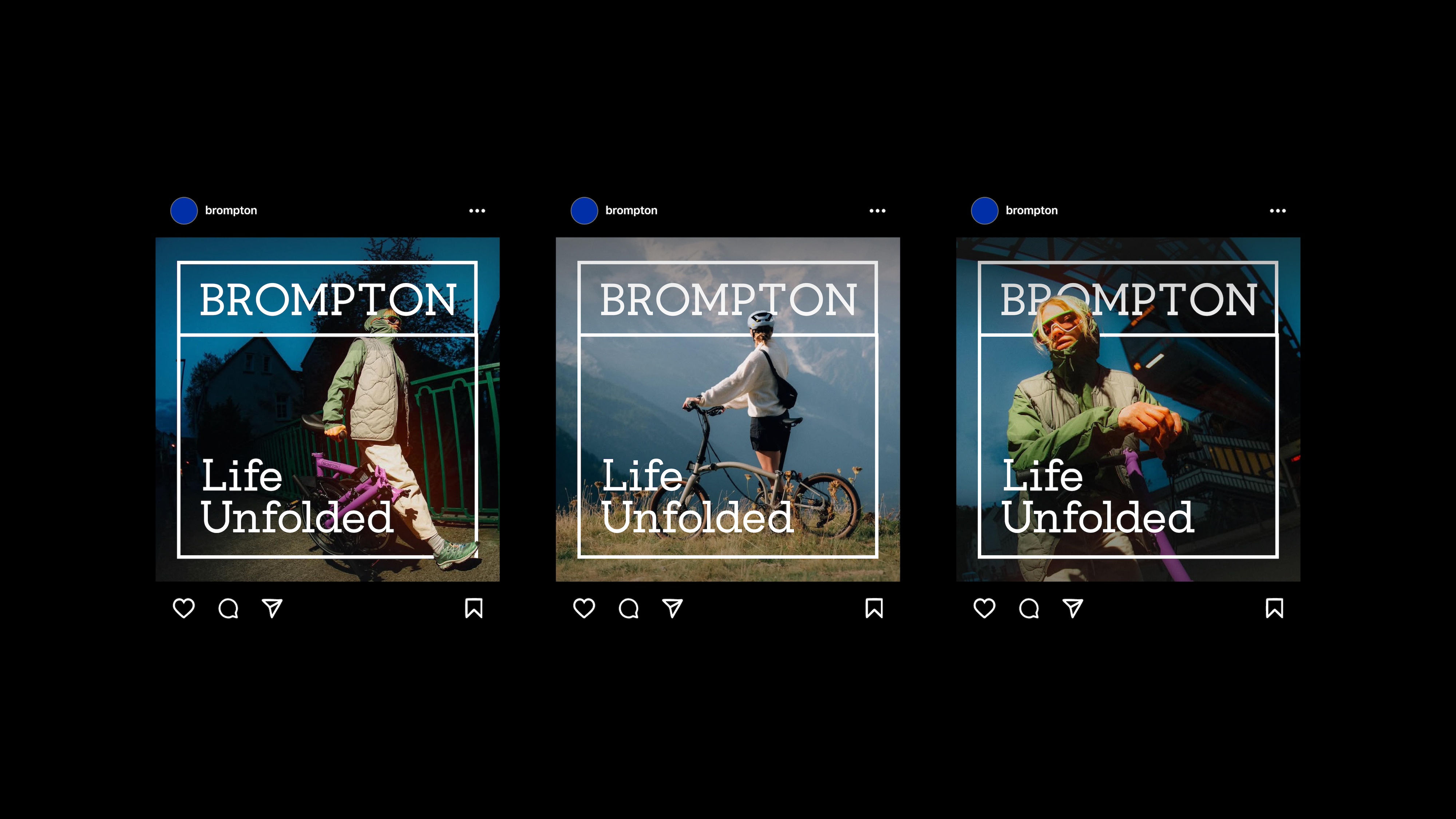
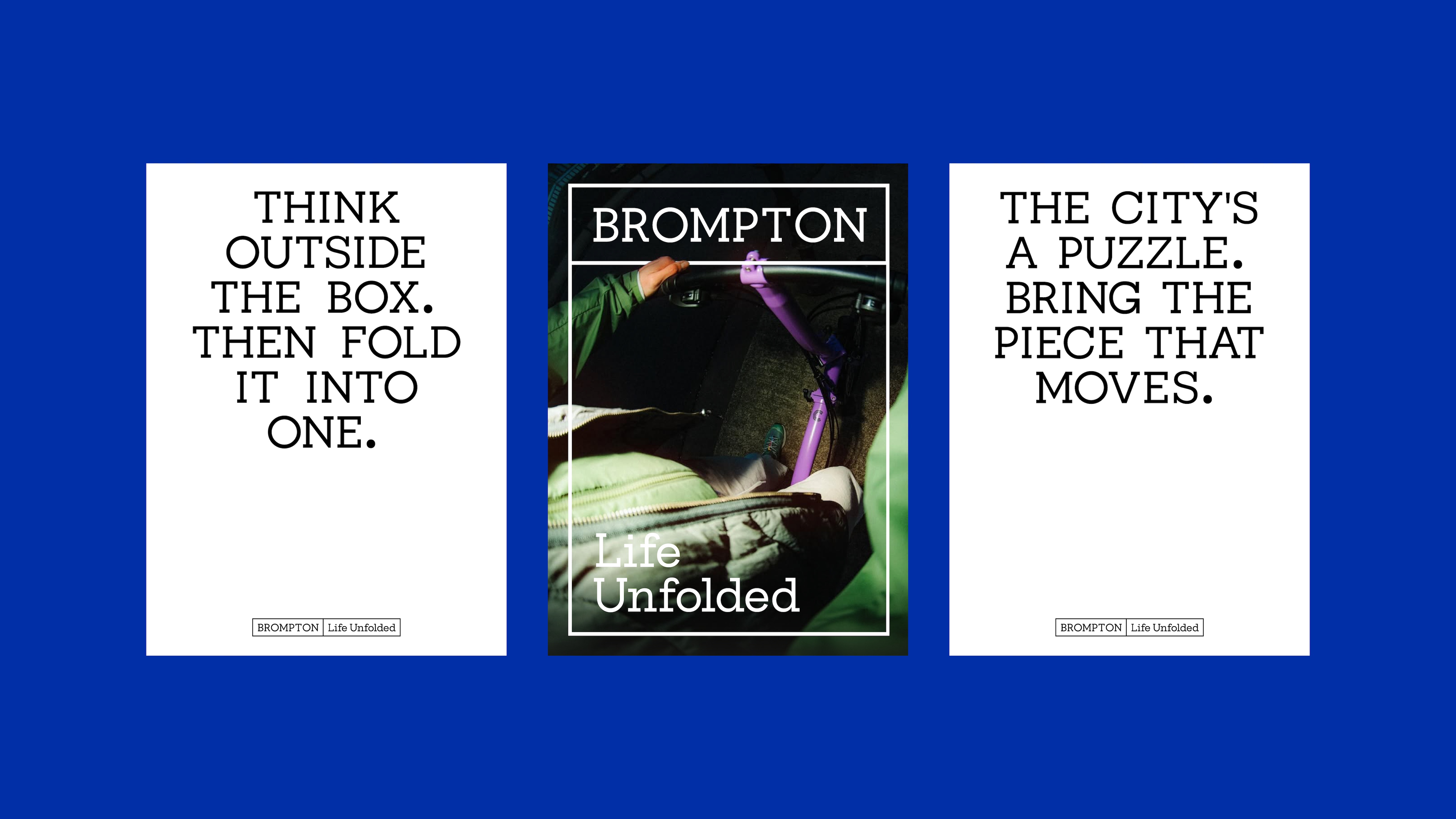
Studio Blackburn partnered with Brompton to translate this ambition into a bold new expression built around the concept of “Life Unfolded.” Just as the Brompton bike transforms through its fold and unfold, the brand needed an identity that could move, flex, and adapt, while always remaining recognisably Brompton.
More than just a design gesture, the concept captures both function and emotion, balancing lifestyle aspirations with the practical reality of the product. Importantly, the new system was designed to flex for different cultural contexts. For example, in the UK, the emphasis is more on urban convenience, while in China, Brompton has become a lifestyle status symbol.
Moving product, moving brand
To achieve this, motion was placed at the heart of the new brand expression. The unfolding action of the bike became the foundation for a broader motion language, shaping how the brand moves and behaves across all assets.
“Brompton is more than a bike, it’s a lifestyle and a community. But at its heart, it’s a moving product, so it needed a moving brand,” said Paul Blackburn, Founder at Studio Blackburn. “We set out to design an identity that’s as intelligent, flexible and dynamic as the bike itself, giving Brompton’s teams worldwide the tools and confidence to bring the brand to life.”
Just like Brompton’s gearing system, Studio Blackburn created assets that could move and shift in intensity – from smooth two-speed transitions to more dynamic six- and twelve-speed options. This creates a flexible but consistent way for Brompton to show motion across multiple touch points, including digital, film and retail.
A distinctive visual system
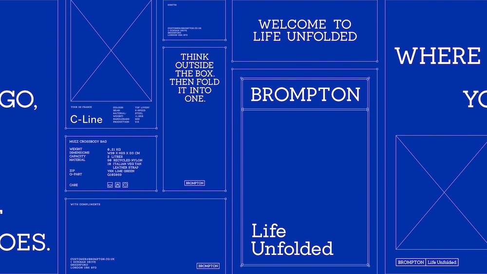
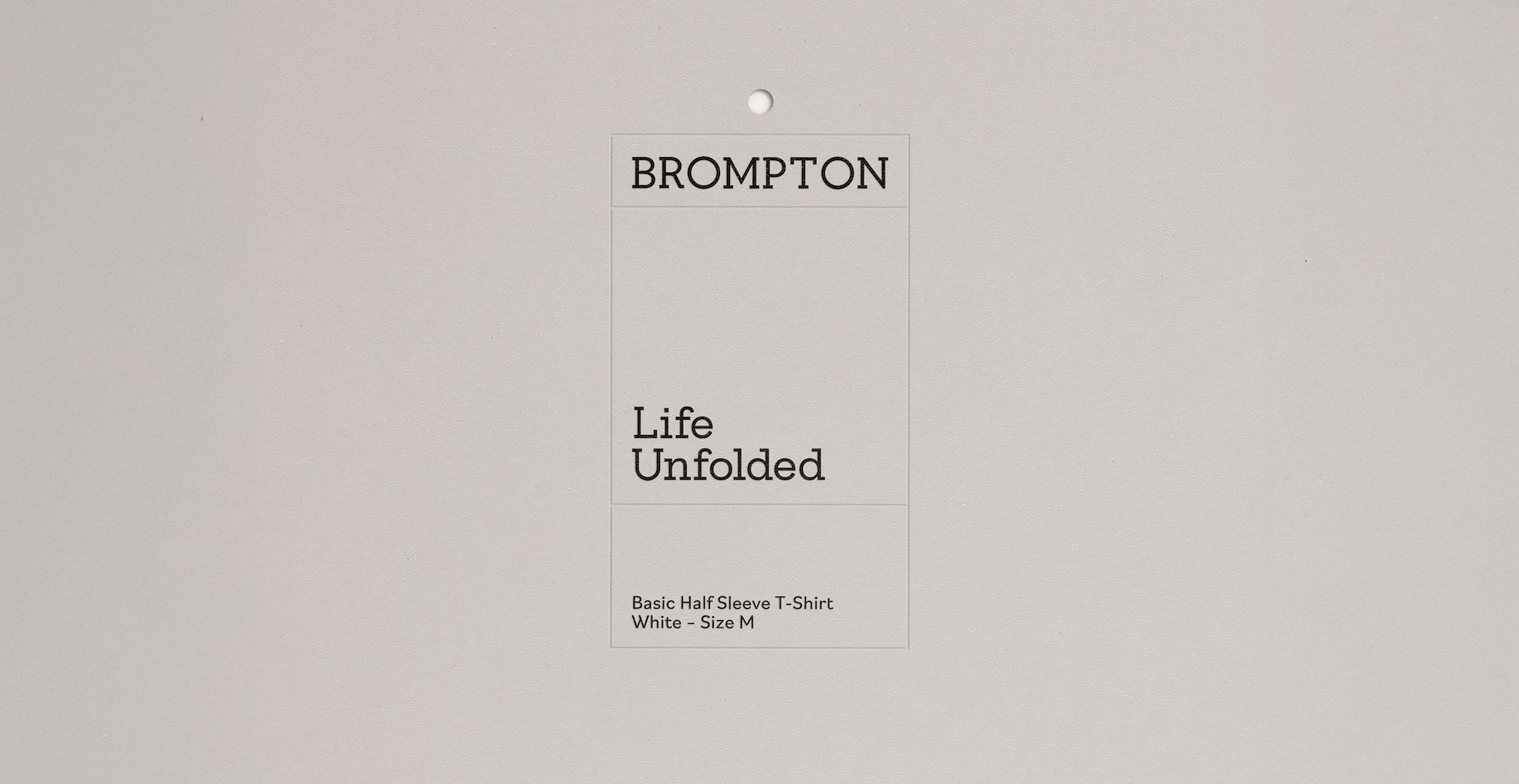
The refreshed logo system further embodies ‘Life Unfolded’ and its motion concept, designed to unfold from a simple box into multiple variations that mirror the core folding action of the bike.
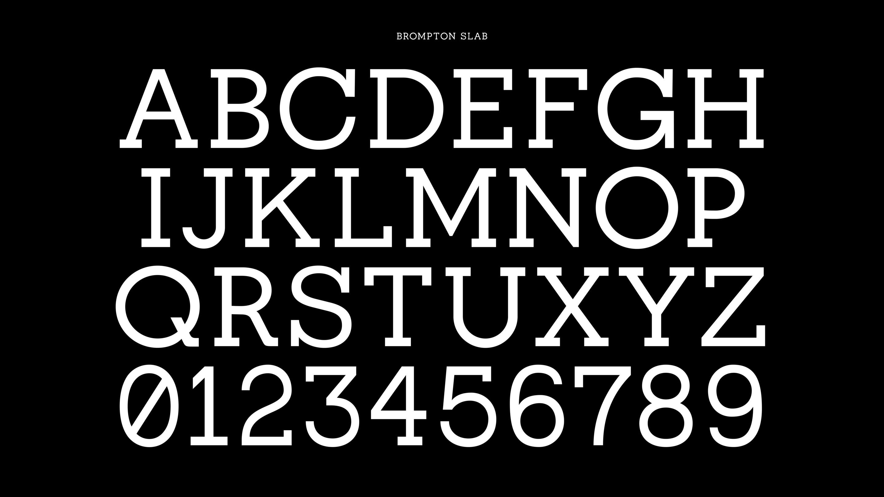
Studio Blackburn also designed a bespoke typeface, created in-house from the geometry of Brompton’s logotype. With the original mark containing only eight letters, the studio expanded it into a complete alphabet to extend its use across every channel.
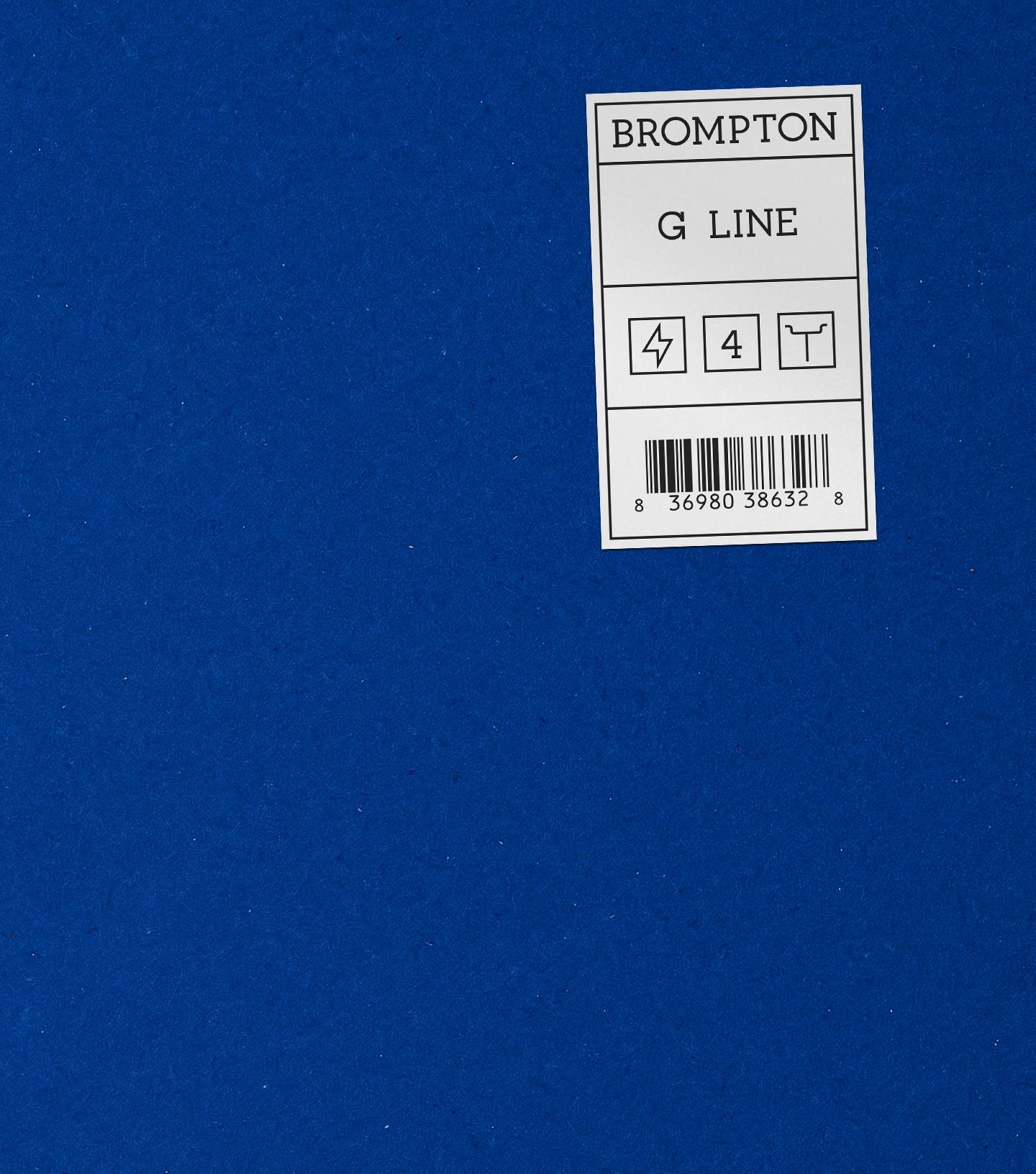
Colour played a crucial role in unifying the identity. At the centre is a custom Klein blue, a shade that is bold, urban and instantly recognisable, much like the bike itself. Instead of relying on a busy palette, the focus was on creating one strong universal accent colour that Brompton could own. In a crowded market, the confidence to stand behind a single defining colour was key.
The visual system is further enriched by icons, passport-style stamps, and geometric shapes derived directly from the bike’s components. Designed to reinforce Brompton’s authenticity while celebrating urban freedom and sense of belonging to a worldwide community.
“Studio Blackburn were very quick to understand the Brompton brand and how it needed to evolve globally” said Chris Willingham, Brompton’s CMO. “The new branding system that they’ve developed fuses the craft and ingenuity that exists within the four walls of our London factory with the joy and freedom that the bike provides for our million plus riders around the world. It’s the ideal expression of our Life Unfolded platform and will help us on our next phase of growth” .
The new identity will roll out globally, supporting Brompton’s growth strategy and reinforcing its position as one of Britain’s most beloved exports.
CREDIT
- Agency/Creative: Studio Blackburn
- Article Title: Studio Blackburn Marks Brompton’s 50th Anniversary and Launch of Life Unfolded Positioning With Bold New Global Brand Expression
- Organisation/Entity: Agency
- Project Type: Campaign
- Project Status: Published
- Agency/Creative Country: United Kingdom
- Agency/Creative City: London
- Market Region: Global
- Project Deliverables: Brand Identity
- Industry: Retail
- Keywords: Cycling Bike Brompton
-
Credits:
Founder: Paul Blackburn


