


Welcome to the home of the world’s largest and most comprehensive Olympic collection, featuring nearly 100,000 fascinating treasures spanning more than 2,000 years of history. We partnered with the Olympic Museum to refresh their brand, striking a balance between honouring the museum’s heritage and embracing its future. Our goal was to create a strong emotional connection and generate excitement around the experience and its artefacts, in the museum in Lausanne as well as internationally through their website.
One of the key aspects of the brief was to provide enough differentiation from the Olympic Master Brand while giving the Museum its own identity.
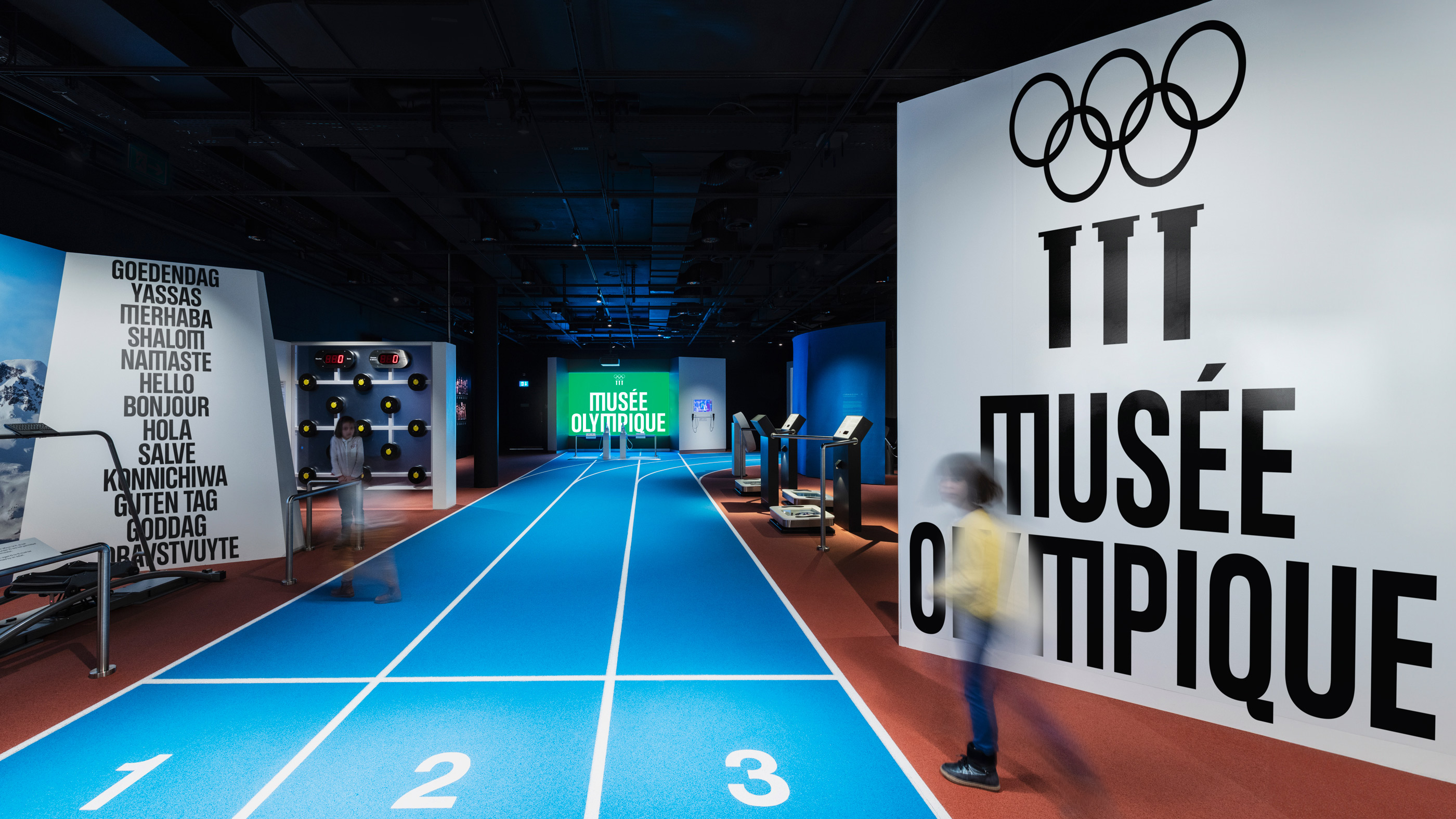
TV allowed a global audience to experience the Olympic Games. The internet is performing a similar role for museums. The majority of the future audience for the Olympic Museum will experience it remotely. It was crucial that we approached this with the concept of a museum that lives locally and thinks globally.
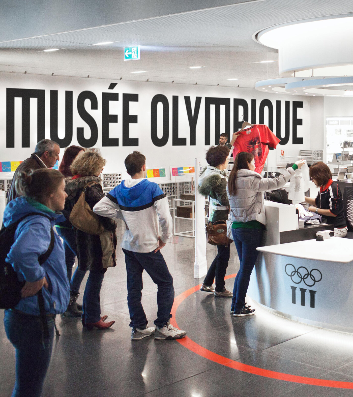
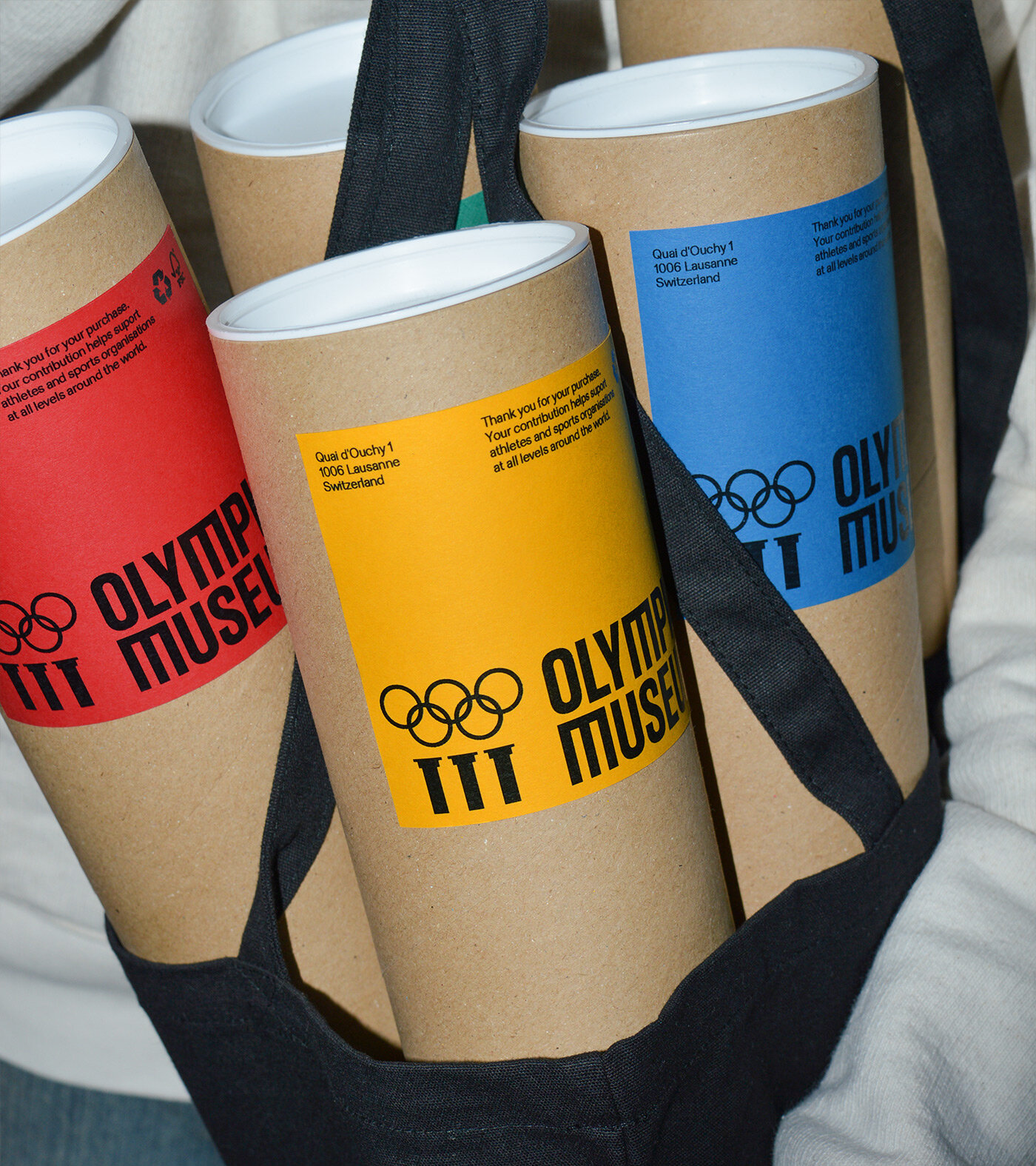
Aided by a rationalisation of the existing brand architecture, there was a clear move away from the Olympic Museum’s previous acronym of ‘TOM’ and a decision to no longer use the word ‘The’ in the logo. The identity needed to ensure that the Museum maintains its influence within the cultural world and emphasises its significance beyond sports.
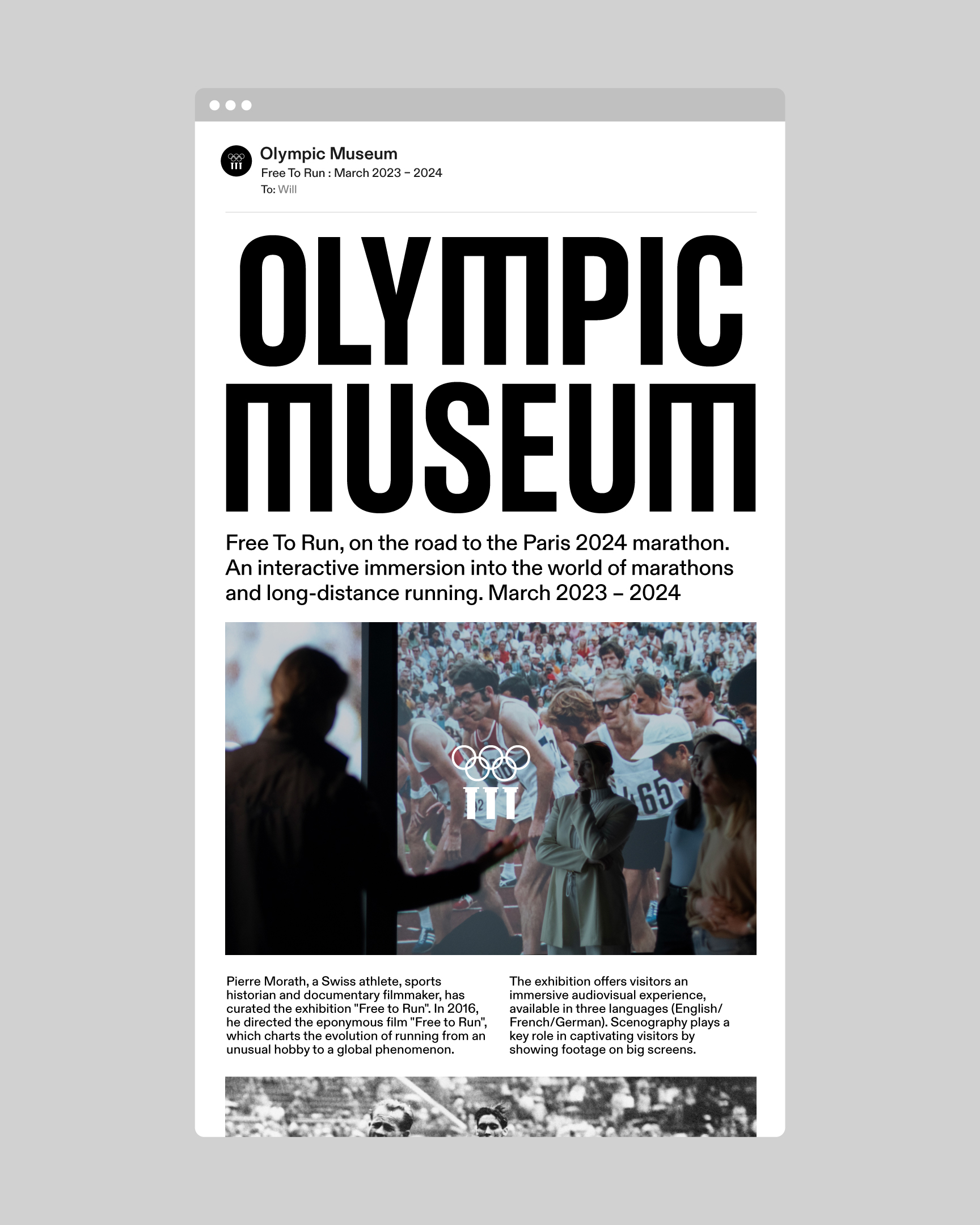
To capture the power and emotion of Olympism, we created an identity system that is expressive and iconic, whether in motion or in static form. It had to work and adapt to the three languages of the Museum: English, French, and German. This was supported by a flexible brand system that stretches from sophisticated to playful. A distinctive feature of the new look is the customised ‘M,’ a subtle contemporary twist on the Olympic Museum Symbol, which has also been refreshed and redrawn.
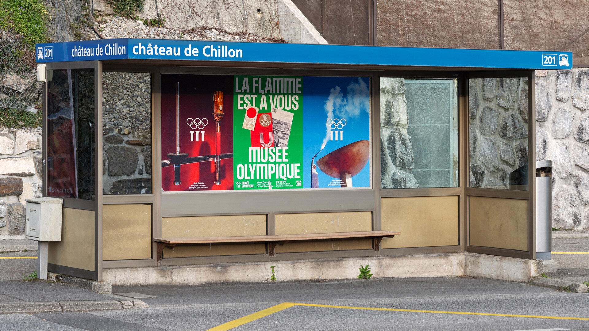
Using the rebrand to its full potential, we generated an ongoing poster series for use when there are no temporary exhibitions to facilitate advertising space. The posters celebrate a wide range of Olympic artefacts, using the colours of the Olympic rings as a backdrop. They needed to work across Europe, offering a glimpse into the Museum’s many artefacts, we want the world to know that the Olympic flame is for everyone.
CREDIT
- Agency/Creative: Studio Blackburn
- Article Title: Studio Blackburn Gives the Olympic Museum a Brand Refresh
- Organisation/Entity: Agency
- Project Type: Identity
- Project Status: Published
- Agency/Creative Country: United Kingdom
- Agency/Creative City: London
- Market Region: Global
- Project Deliverables: Art Direction, Brand Design, Brand Guidelines, Brand Identity, Brand Strategy, Branding, Creative Direction, Graphic Design, Logo Design, Rebranding, Typography
- Industry: Education
- Keywords: Olympic Museum
-
Credits:
Founder and CEO: Paul Blackburn
Creative Director: Mark Jones
Account Manager: Visnja Milošević
Senior Designer: Adam Moore
Middleweight Designer: Will Cooper
Junior Designer: Jen Wong


