


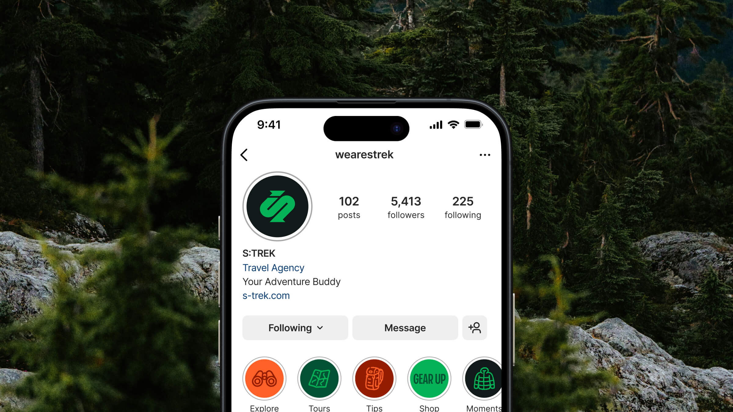
S:TREK™ is a Vietnamese travel agency dedicated to crafting unique trekking experiences. From their inception, the agency has pursued a singular purpose: to connect individuals with the raw beauty of Vietnam’s captivating landscapes, ensuring every journey is transformative and safe.
Driven by a genuine love for adventure, they embrace authentic discovery and making friends with nature, weaving these values directly into the fabric of their work – from meticulously planned trips to reliable gear. We partnered with S:TREK to ensure this heartfelt, grounded approach to adventure was vividly reflected in their brand’s visual and verbal identity.
The Logo
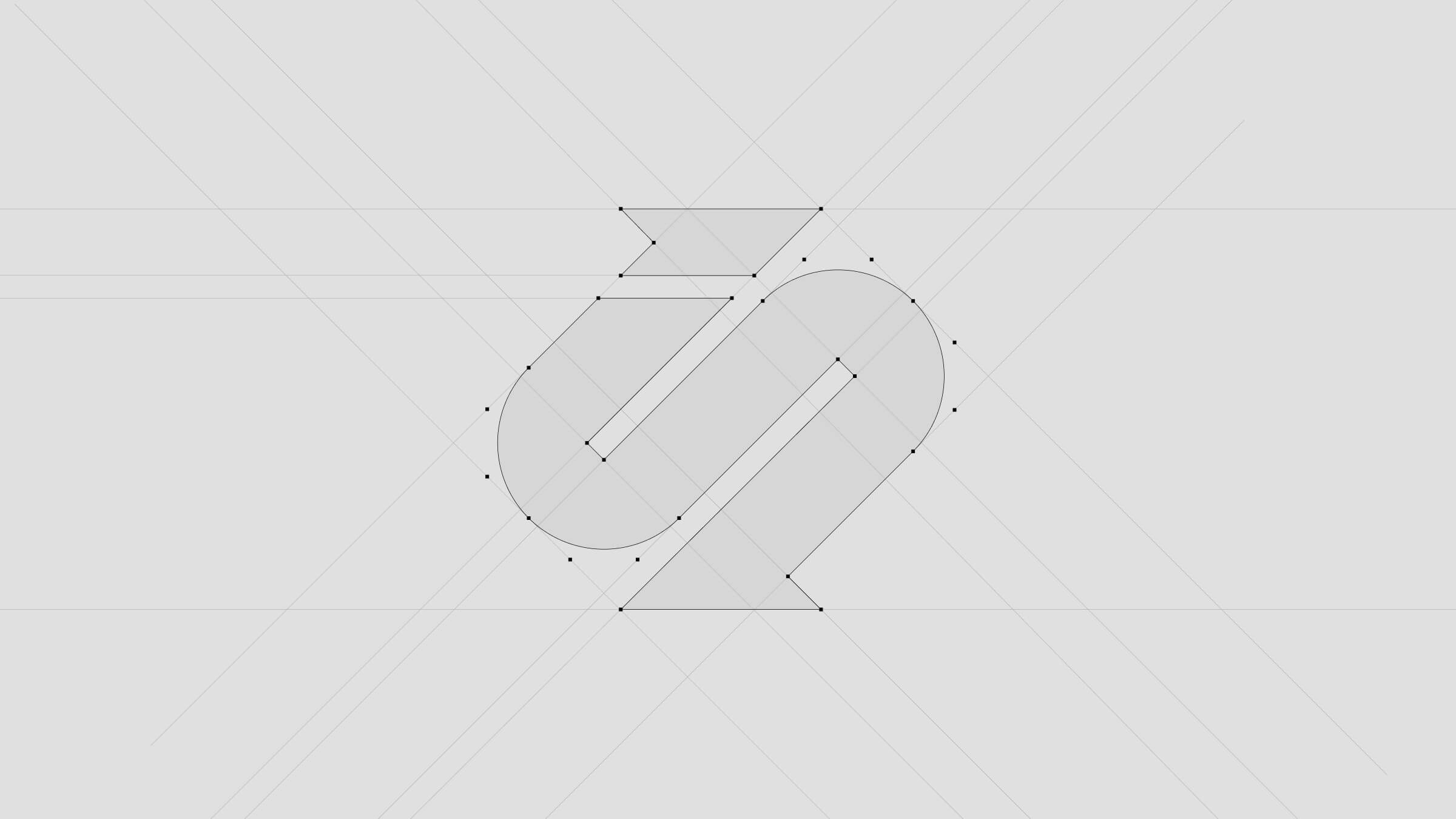
When we started working on the S:TREK logo, the goal was to create something that immediately felt like adventure, while still being deeply rooted in their unique story.
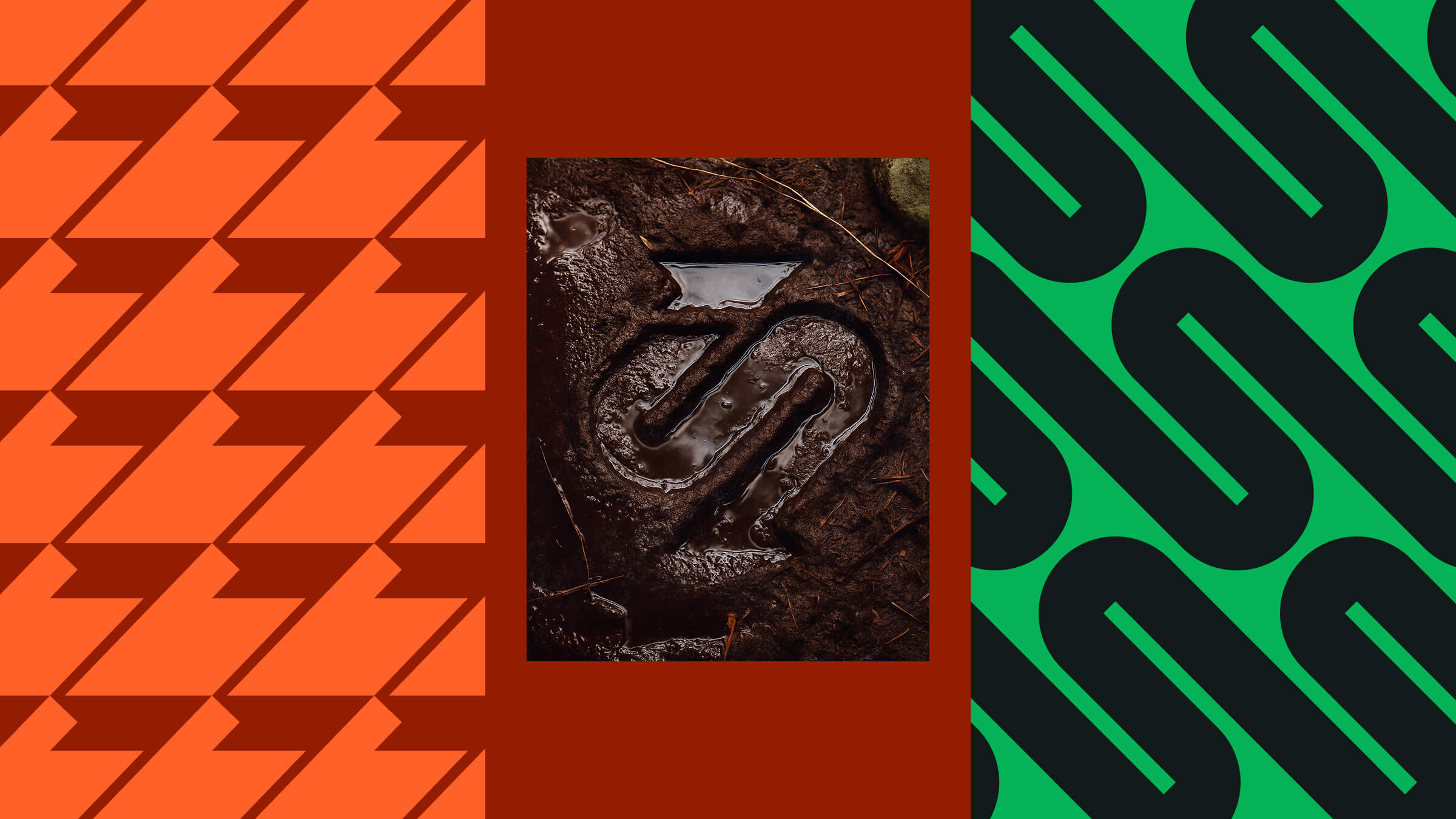
The symbol directly embodies Vietnam’s S-shaped iconic map, representing not just geography but the very spirit of its winding trails and diverse landscapes. Within this form, a flag at the top symbolizes victory and the joy of achievement. The clever integration also sculpts the shape of a human leg, symbolizing the enduring strength and determined stride required for every challenging journey into the wild.
The Colors
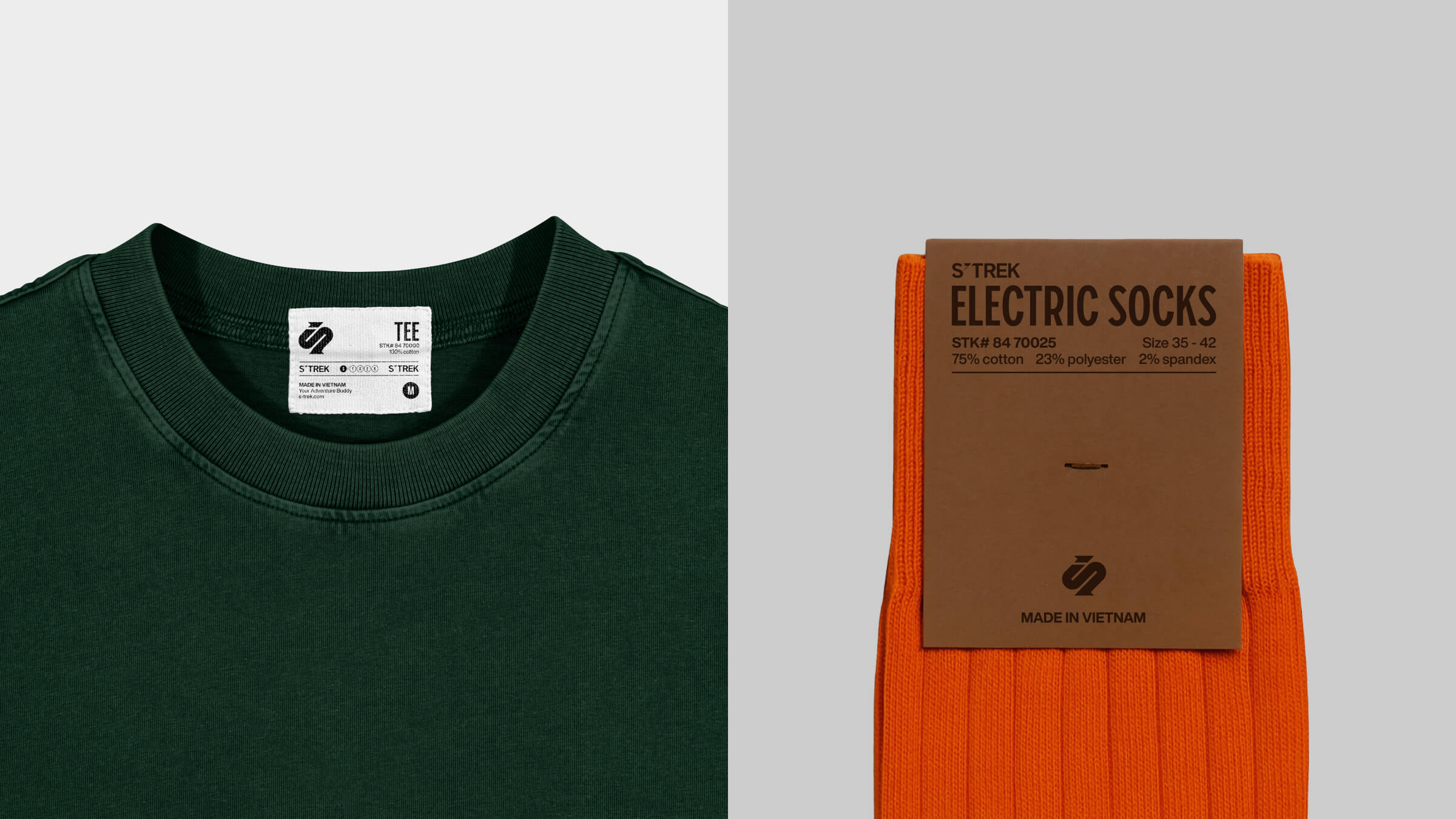
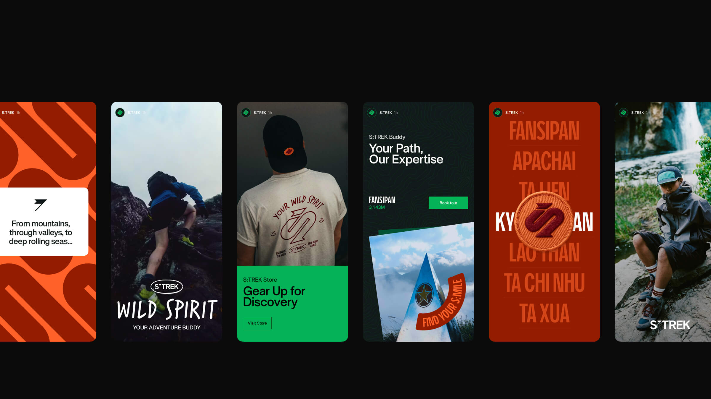
The brand’s color palette is designed to reflect the raw, untamed beauty of Vietnam’s diverse landscapes. It draws inspiration from the vibrant energy of nature and the grounding strength of the terrain, capturing the essence of the trekking experience.
The primary colors express the spirit of adventure. Deep greens evoke lush forests and a strong connection to nature, while vibrant orange tones, inspired by earthy trails, bring warmth, energy, and movement. Together, they reflect the excitement and wonder of exploring the wild.
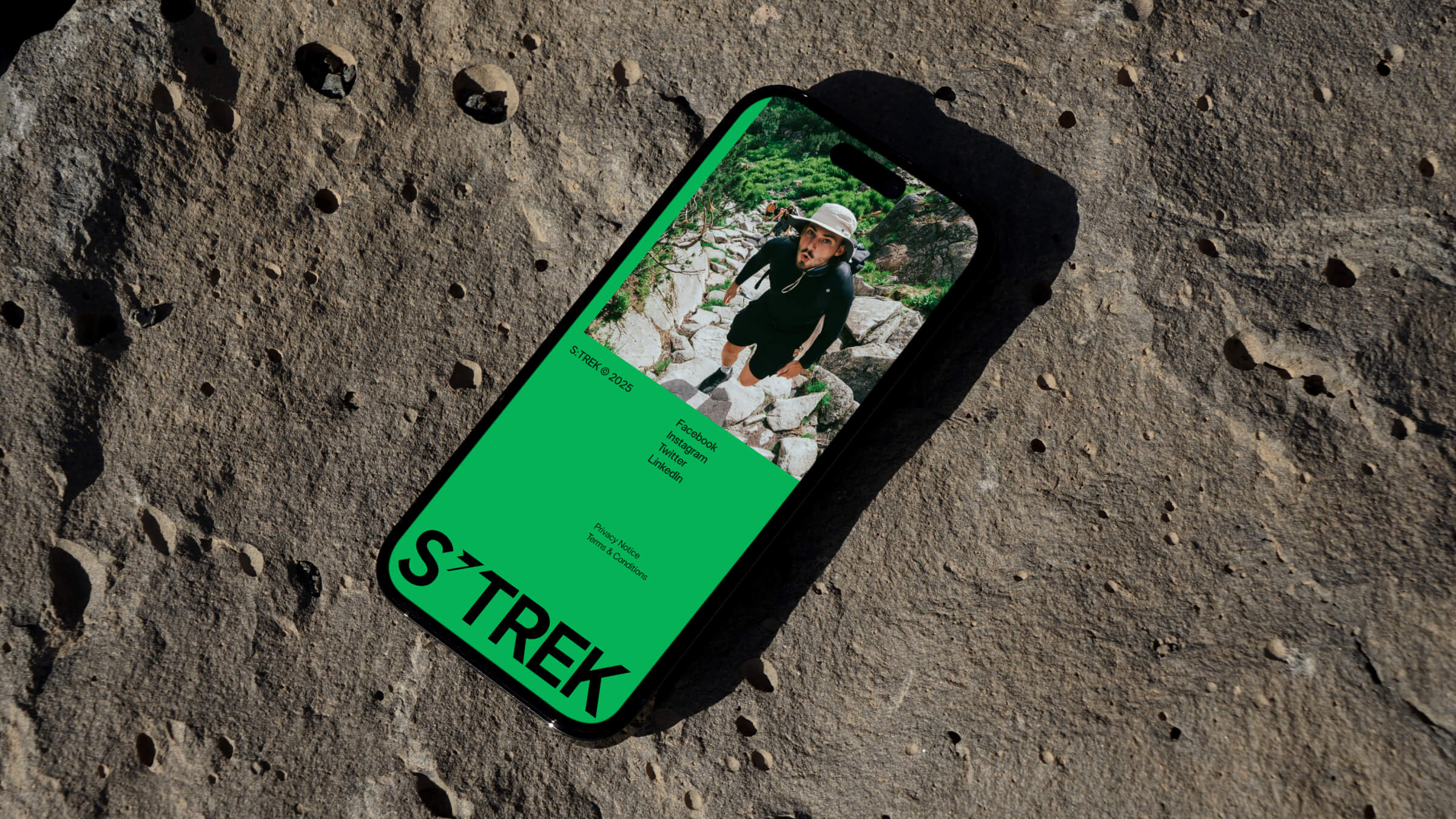
The neutral palette brings balance and clarity. Crisp white suggests open skies and fresh air, adding lightness and space. Mountain gray, drawn from rugged stone, adds stability and calm. Bold blacks and deep earthy tones anchor the palette with strength and resilience.
Typography and Iconography
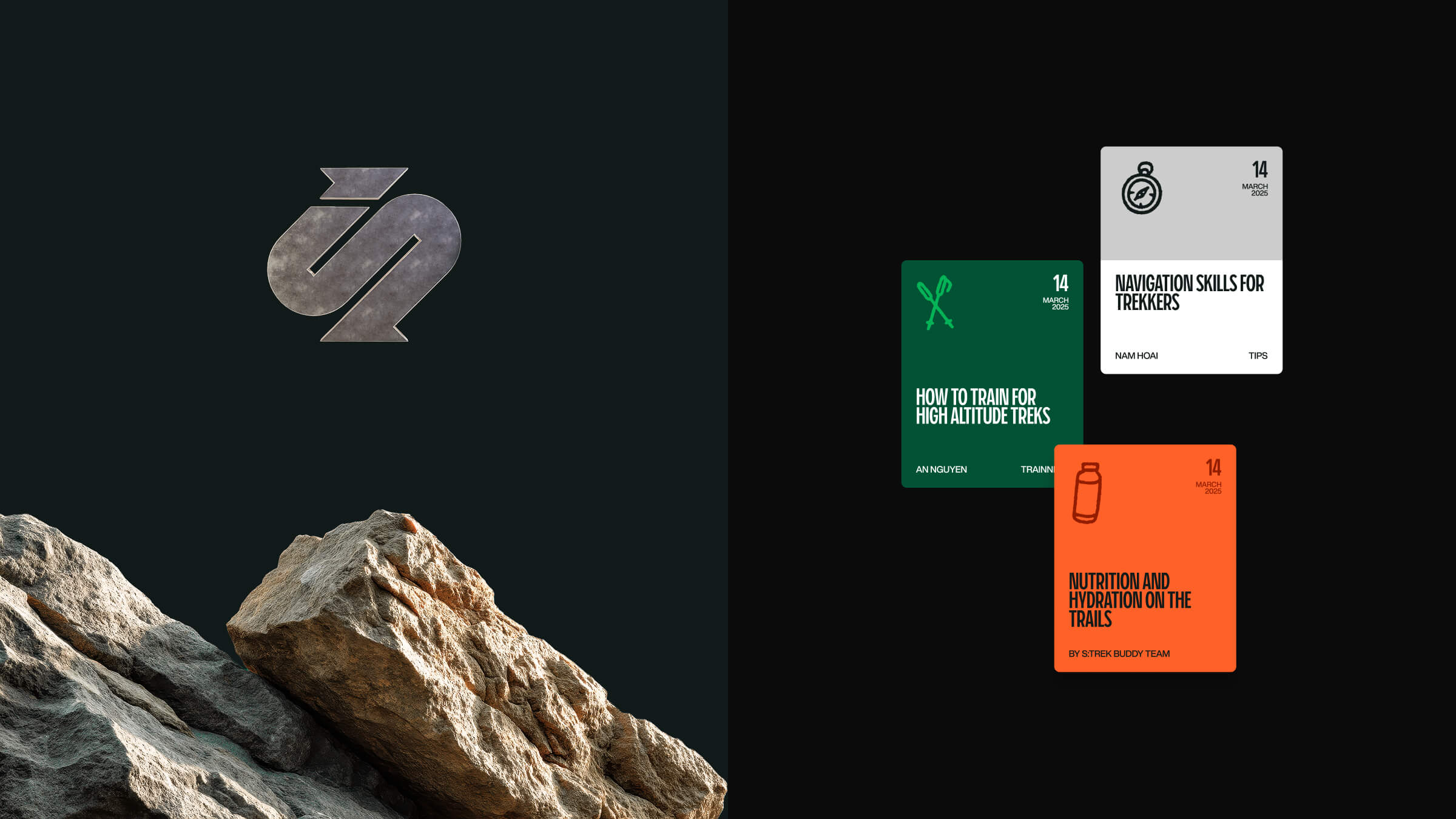
The selection of Piscolabis as the primary typeface for headlines and titles is a strategic choice. This bold and condensed display typeface, inspired by hand-painted signs, offers a touch of unique character without being overly decorative. Its distinct personality, marked by high ascenders, ensures brand messaging command attention and convey a sense of accomplishment.
For the body typeface, Helvetica Now was chosen for its exceptional readability and modern versatility. As a reinterpretation of the classic Helvetica, it has been optimized for clarity across various platforms and sizes. This ensures that detailed information about journeys and experiences is communicated with maximum legibility and comfort for the reader.
The clean and neutral aesthetic of Helvetica Now provides a harmonious contrast to the more expressive Piscolabis, establishing a balanced visual hierarchy that prioritizes both impactful branding and clear, accessible content.
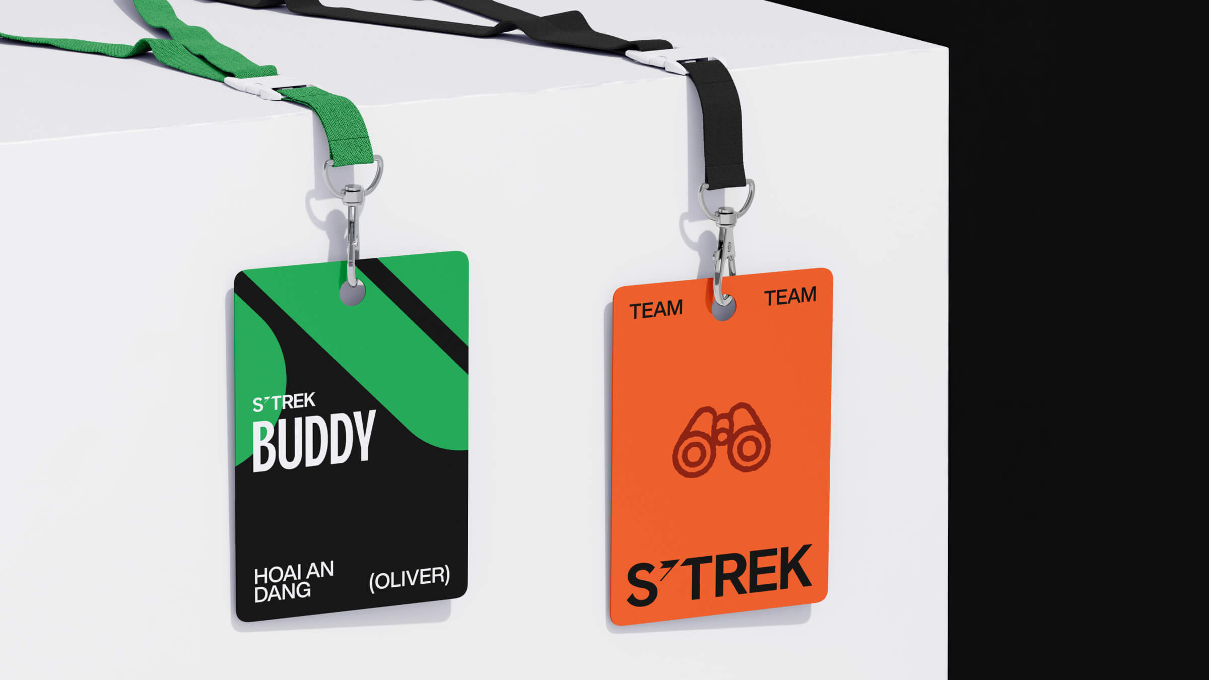
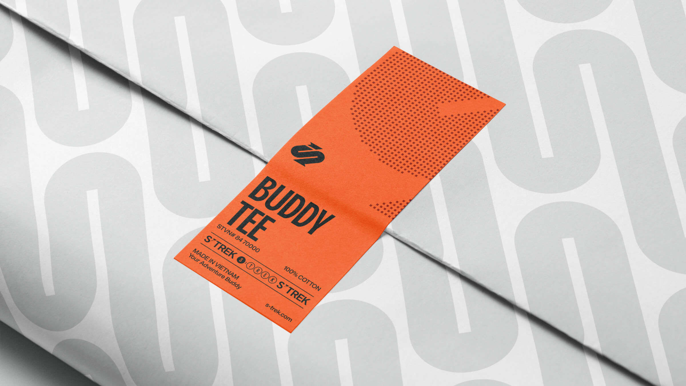
We chose hand-drawn icon style to soften the overall brand identity, bringing a more human, approachable tone. Their natural, imperfect lines add warmth and relatability, balancing the structure of the visual system. This style reflects the kind of travel S:TREK promotes — personal, grounded, and deeply connected to nature.
Reflection
Throughout this project, our main challenge was translating S:TREK’s deeply personal and grounded approach to trekking into a brand identity that felt both distinctive and emotionally honest. We needed to strike a balance between professionalism and warmth, while ensuring the visual language stayed rooted in nature.
We addressed this by building a design system centered on texture, imperfection, and clarity. Every element was crafted to reflect the brand’s core promise: meaningful, safe, and transformative journeys through Vietnam’s wild landscapes.
The key lesson learned was the value of restraint and authenticity in brand storytelling. By remaining true to S:TREK’s values and allowing the natural environment to guide our creative direction, we shaped an identity that feels personal, credible, and deeply connected to the experience it represents.
CREDIT
- Agency/Creative: Studio Alt
- Article Title: Studio Alt Crafts the S:TREK Brand Identity for Unique Trekking Experiences
- Organisation/Entity: Agency
- Project Type: Identity
- Project Status: Published
- Agency/Creative Country: Vietnam
- Agency/Creative City: Ho Chi Minh City
- Market Region: Asia, Global
- Project Deliverables: Art Direction, Brand Guidelines, Brand Identity, Copywriting, Editorial Design, Identity System, Web Design
- Industry: Hospitality
- Keywords: brand identity, logo design, travel, branding experiences
-
Credits:
Creative Director / Designer: Joe Nguyen
Naming and Concept: Studio Alt


