


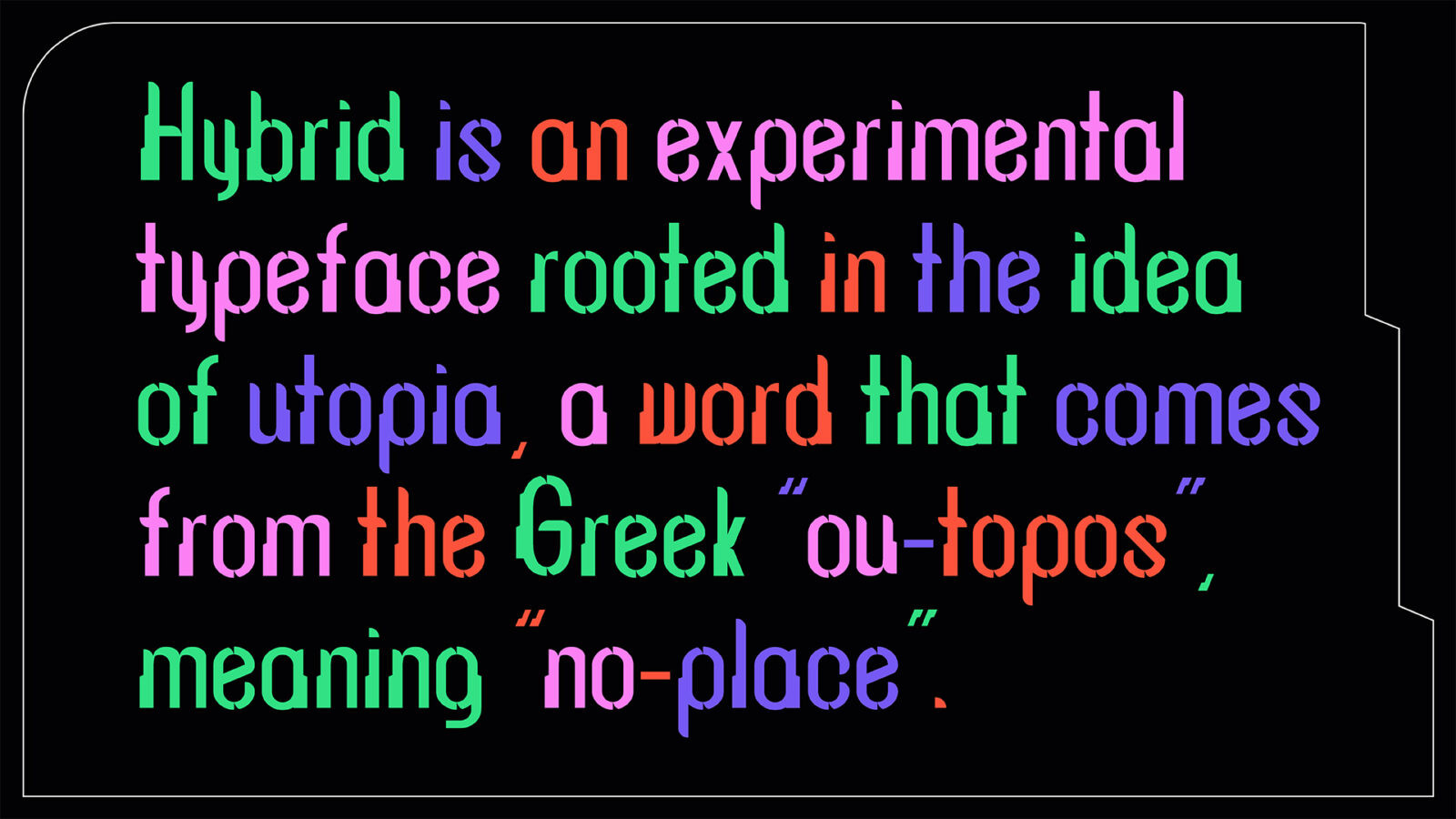
Hybrid is an experimental typeface rooted in the idea of utopia — a word that comes from the Greek ou-topos, meaning “no-place.” Thomas More coined the term in the 16th century to describe an ideal society that, by definition, does not exist and perhaps never will. Over time, many thinkers have reinterpreted utopia not just as a perfect world, but as a way to imagine new possibilities for the future. With this in mind, Hybrid was born from exploring different visions of utopia, bringing together visual form, philosophy, and technological speculation.
1. Briefing
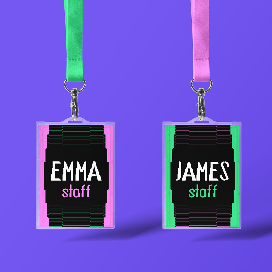
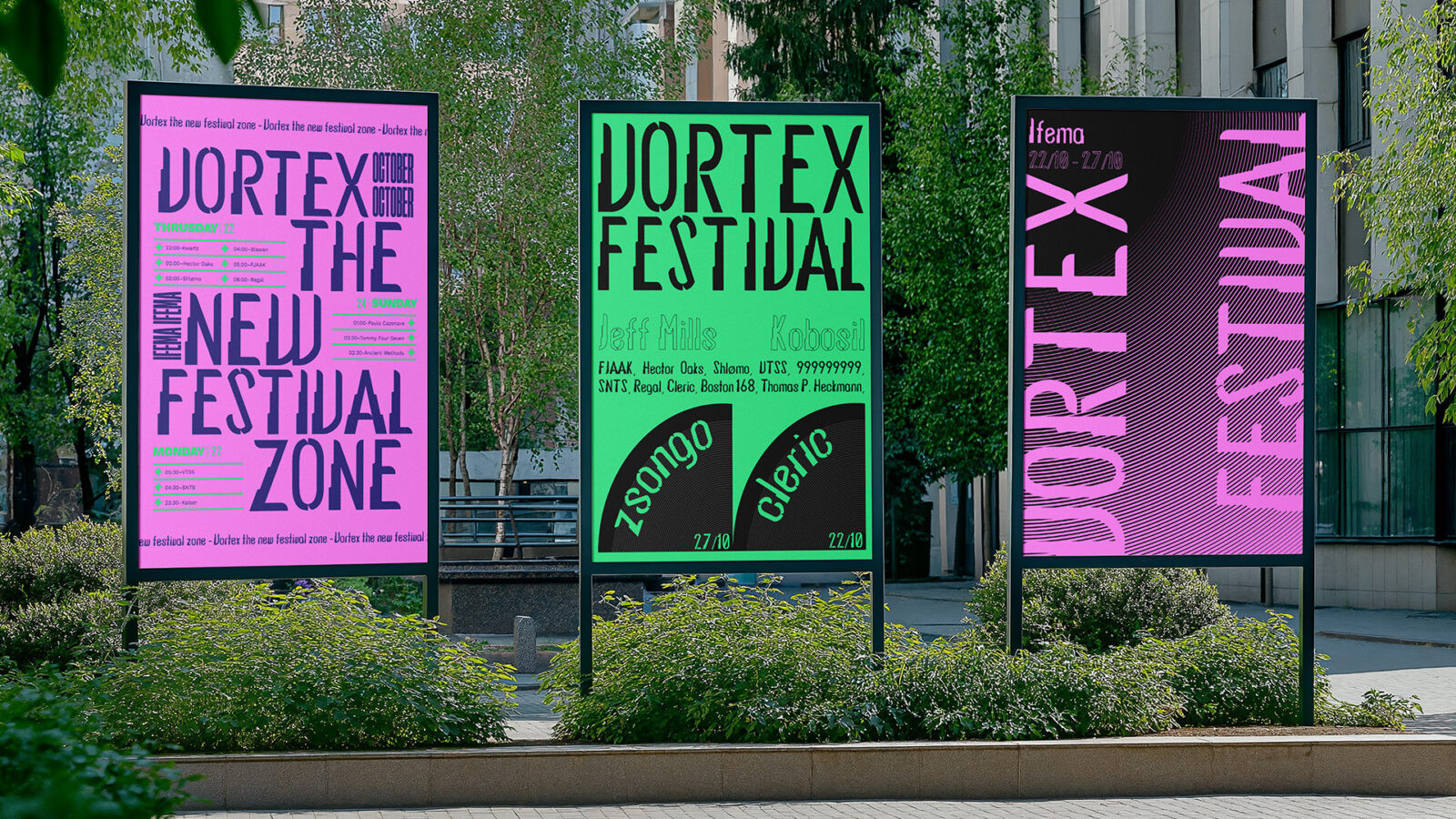
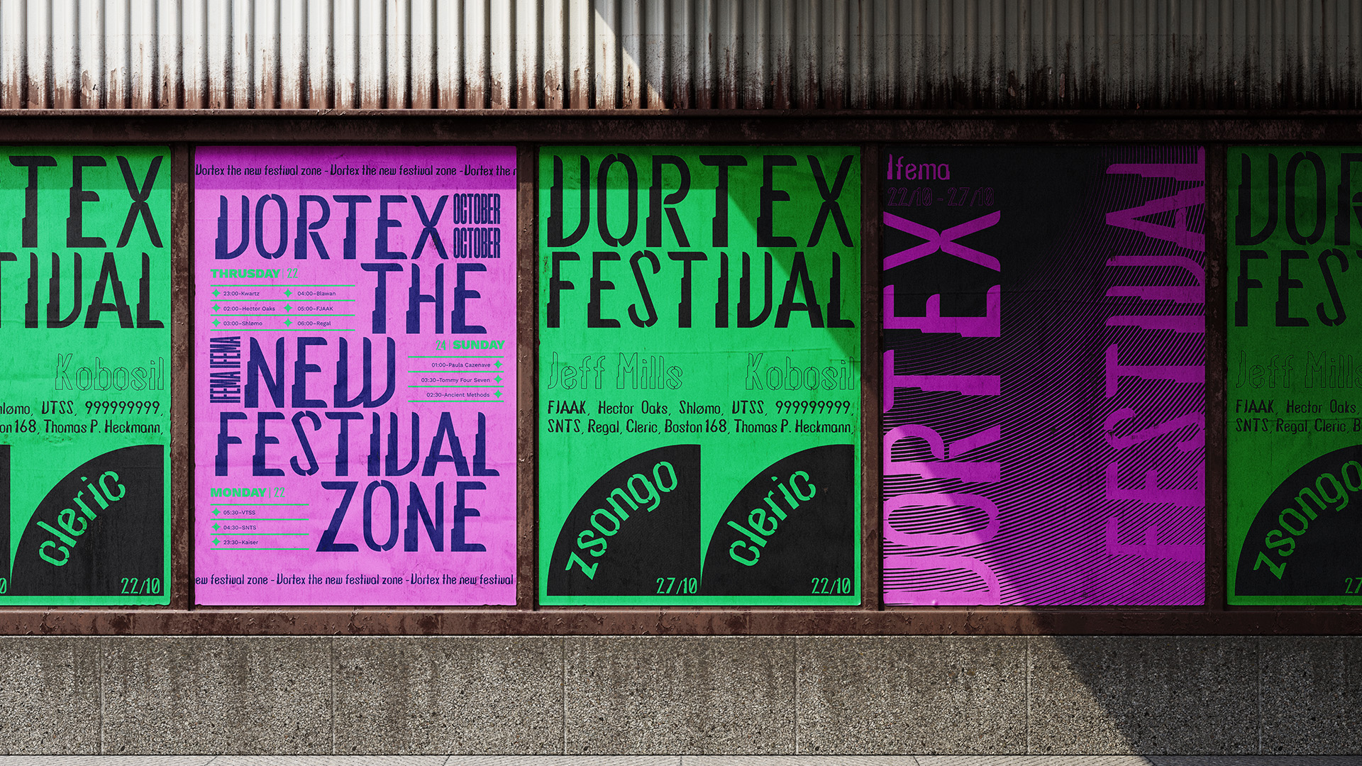
The project consisted of designing a display typeface in pairs, inspired by Thomas More’s concept of utopia, and then digitizing and installing it as a functional font.
We had to analyze how Thomas More defines utopia: its values, social structure, ideals, and symbols.
We also had to identify the conceptual elements that would influence the typographic forms (harmonious, ideal, rigid, complex, etc.).
This was a paired project, in which we divided the tasks of sketching the uppercase letters, lowercase letters, and symbols, and then proceeding to digitize them in Illustrator and create the font in Glyphs.
2. Background Information
One of the starting points for this project is Francis Bacon, the English philosopher known as the father of modern scientific method. In The New Atlantis (1627), Bacon describes a society built around knowledge, research, and technological innovation. For him, a “perfect” society is achieved not through strict politics, but through the pursuit of scientific discovery. Institutions like the House of Solomon oversee advanced studies in medicine, engineering, and biotechnology, guiding society toward collective well-being. Bacon’s utopia is structured, rational, and highly organized — a place where science drives progress, but always within an ethical framework.
On the other hand, Donna Haraway offers a radically different take. In her Cyborg Manifesto (1985), utopia is no longer a fixed destination, but a hybrid, ever-changing landscape. Haraway questions traditional boundaries — human vs. machine, nature vs. culture, male vs. female — and imagines a future where identities are fluid, incomplete, and deeply intertwined with technology. Instead of picturing a flawless or perfectly ordered world, she proposes a utopia built on multiplicity, diversity, and the breakdown of rigid limits.
Both thinkers place their trust in science and technology as forces capable of transforming society, but their visions diverge: Bacon imagines an orderly, knowledge-driven world; Haraway imagines a dynamic realm of hybrid identities.
Hybrid blends these two perspectives — the structured progress of Bacon with the fluid posthuman identity of Haraway — and translates them into a typographic voice.
2. Conceptual strategy
The main approach behind the project was to merge both utopian ideas into a single visual concept: an open, hybrid, and constantly evolving world where scientific logic coexists with flexible, shifting identities.
From Bacon, Hybrid borrows the ideas of structure, hierarchy, and vertical construction. From Haraway, it takes fluidity, organic shapes, and the sense of expansion. When these two currents meet, the result is not a “perfect” world, but one that is always redefining itself.
In this imagined future, technology doesn’t only improve life — it reshapes what it means to be human. Identity evolves like a cyborg: continuously adapting, never fully fixed, guided by knowledge and framed by an ethical awareness that adjusts rather than imposes.
Hybrid embodies this idea of ongoing transformation. It represents a place that could exist someday, but hasn’t been built yet — a true “no-place.”
3. Development of the typeface
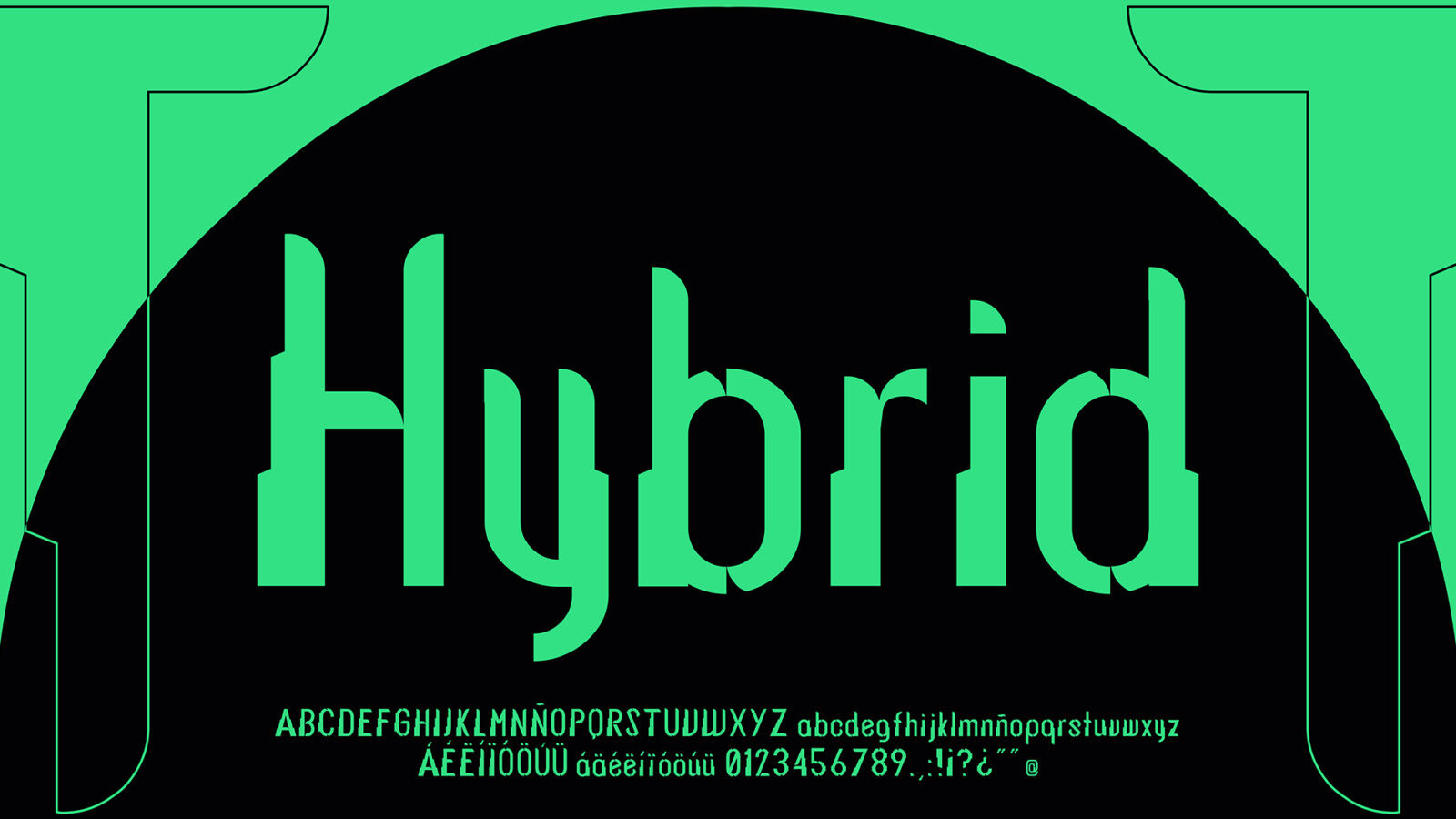
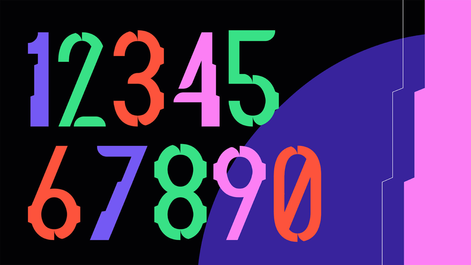
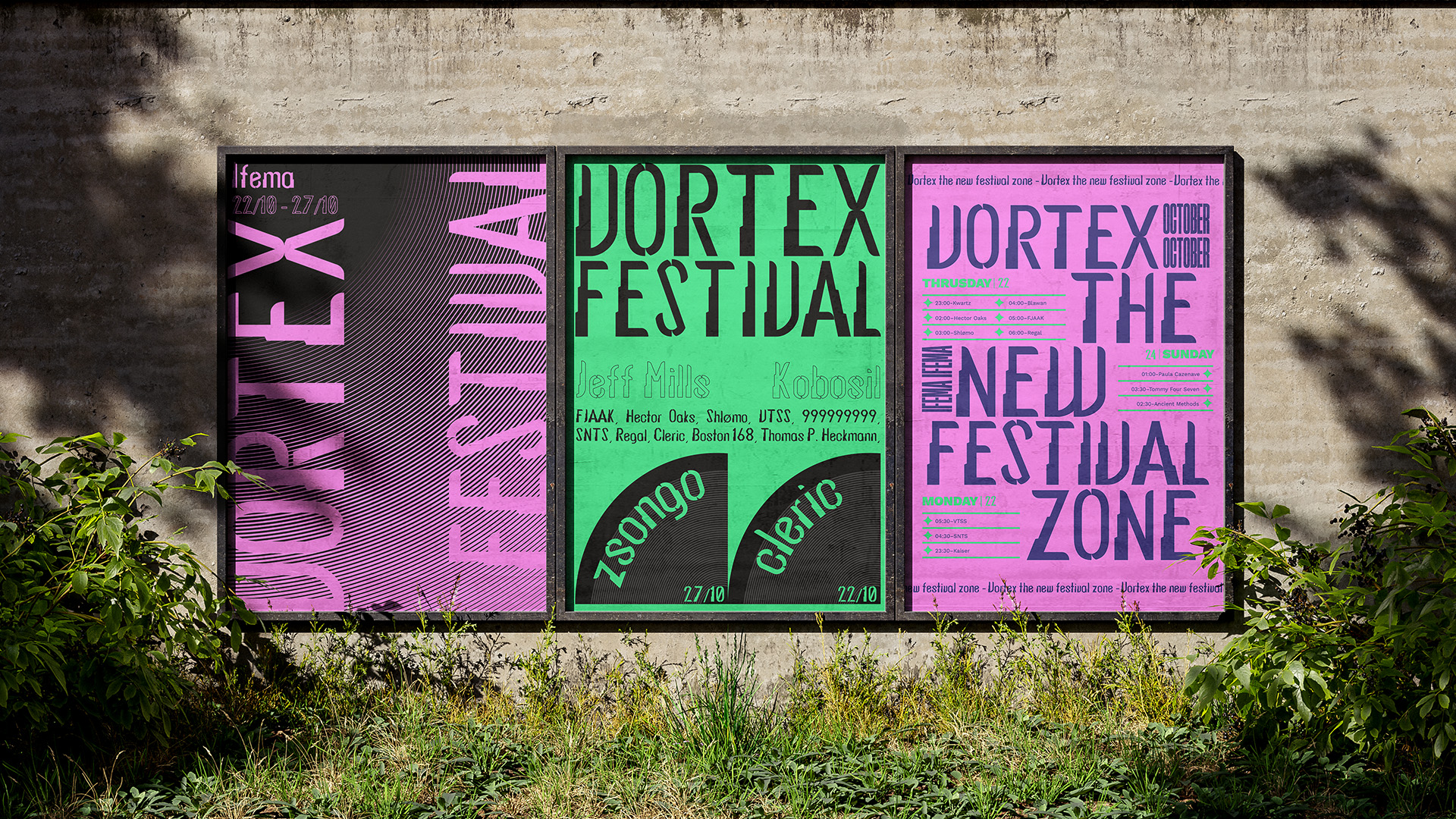
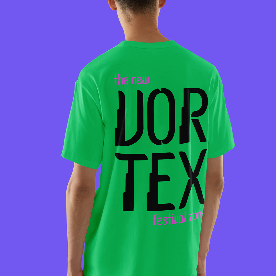
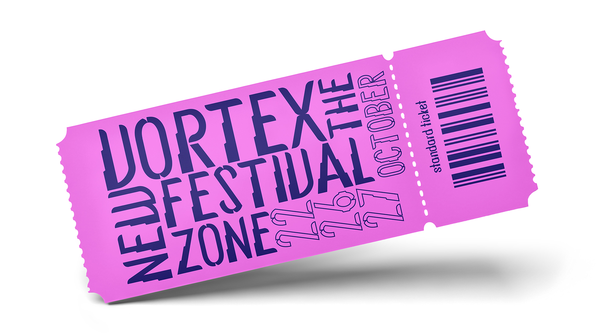
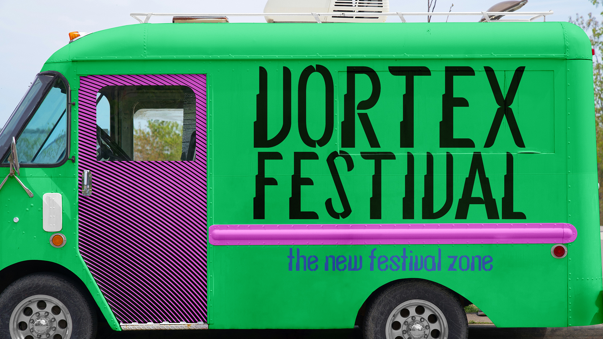
The development of the typeface started with hand drawn sketches and then uploaded to the Glyphs App, where we used the sketches as a starting point to begin building the typeface. We started by building the uppercases with the word “HOV”, and with the lowercases with the word “nova”, and then replicating the same modules with the rest of the alphabet.
The uppercase letters are built on a stepped vertical structure inspired by futuristic skyscrapers and high-tech architecture. This modular “stair-like” shape symbolizes growth and human advancement, echoing Bacon’s belief in progress through knowledge. Each step hints at layers of development, research, and collective ascent toward the future.
To balance this rigidity, the typeface incorporates rounded finials, a gesture toward Haraway’s organic and hybrid character. These soft, circular endings introduce movement and warmth into the structure, creating a visual dialogue between the mechanical and the human. The coexistence of sharp geometry and gentle curves reflects the merging of machine and organism.
The lowercase letters use a simplified version of the stepped structure, limiting it to a single form to maintain readability and avoid visual overload. The circular terminals remain, preserving stylistic continuity and reinforcing the idea of a shared typographic “DNA” between upper- and lowercase. These rounded forms act almost like a metaphor: the human softness inside a technological system.
Even though the overall construction is rational, Hybrid has an expressive personality. Diagonal cuts, modular shapes, and the interplay between rigidity and fluidity contribute to its voice. This contrast creates the sense of a visual “non-place,” where multiple identities and ideas coexist — much like the hybrid utopia that inspired it.
CREDIT
- Agency/Creative: Valeria Navas, Elisabeth Vaqueros
- Article Title: Students Valeria Navas and Elisabeth Vaqueros Present Hybrid as a Utopian Experimental Typeface
- Organisation/Entity: Student
- Project Status: Non Published
- Agency/Creative Country: Venezuela, Bolivarian Republic of
- Agency/Creative City: Caracas
- Market Region: Madrid
- Project Deliverables: Graphic Design, Poster Design, T-Shirt Design, Type Design, Typography
- Industry: Entertainment
- Keywords: WBDS Student Design Awards 2025/26 , technology, typography, utopia, font, design, type, graphic, illustration, poster, concert, festival, glyph, glyphs
-
Credits:
Educational institution: Universidad Europea - Creative Campus
teacher: Pilar Terron


