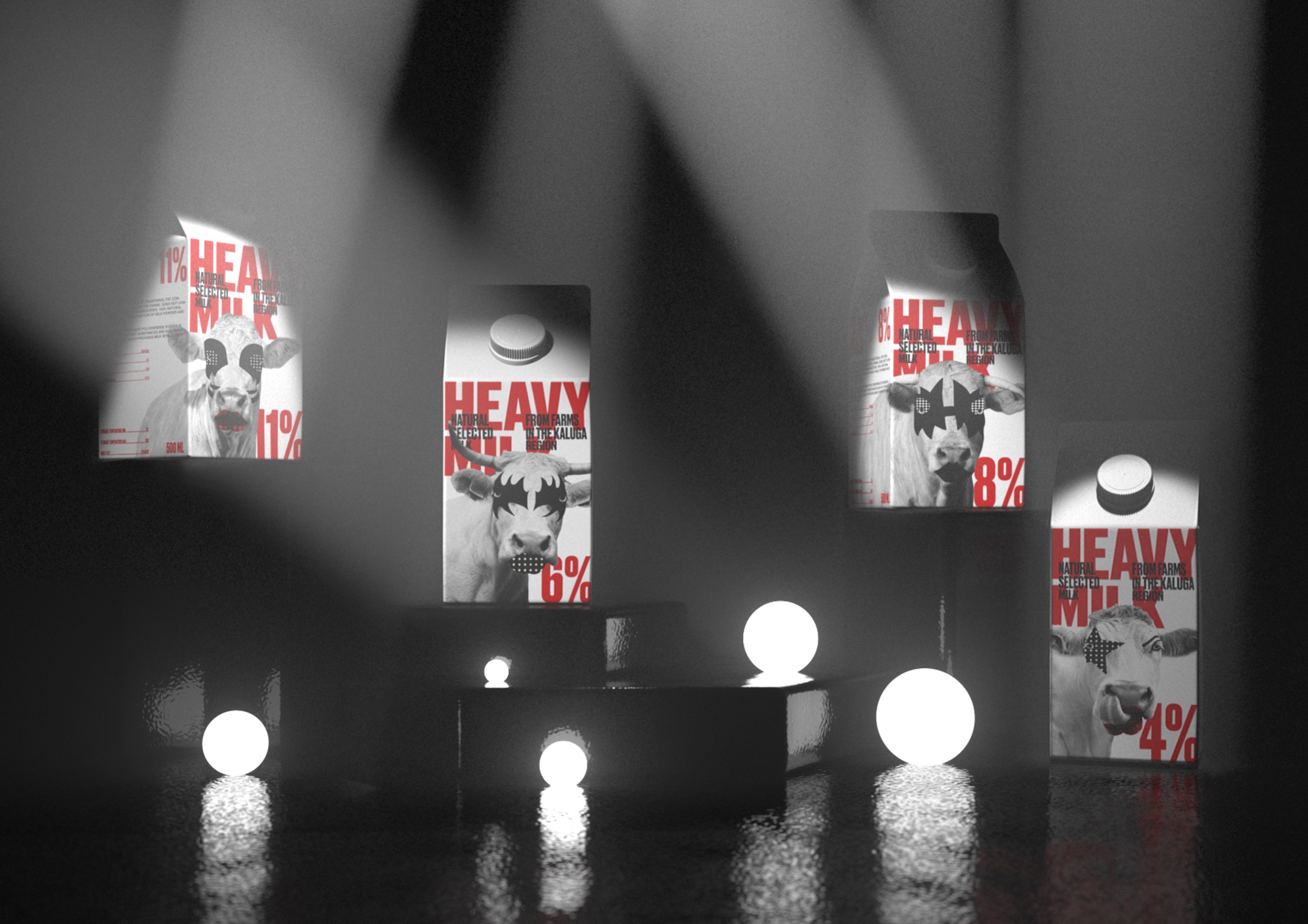
Heavy milk – packaging for milk with a high percentage of fat content.
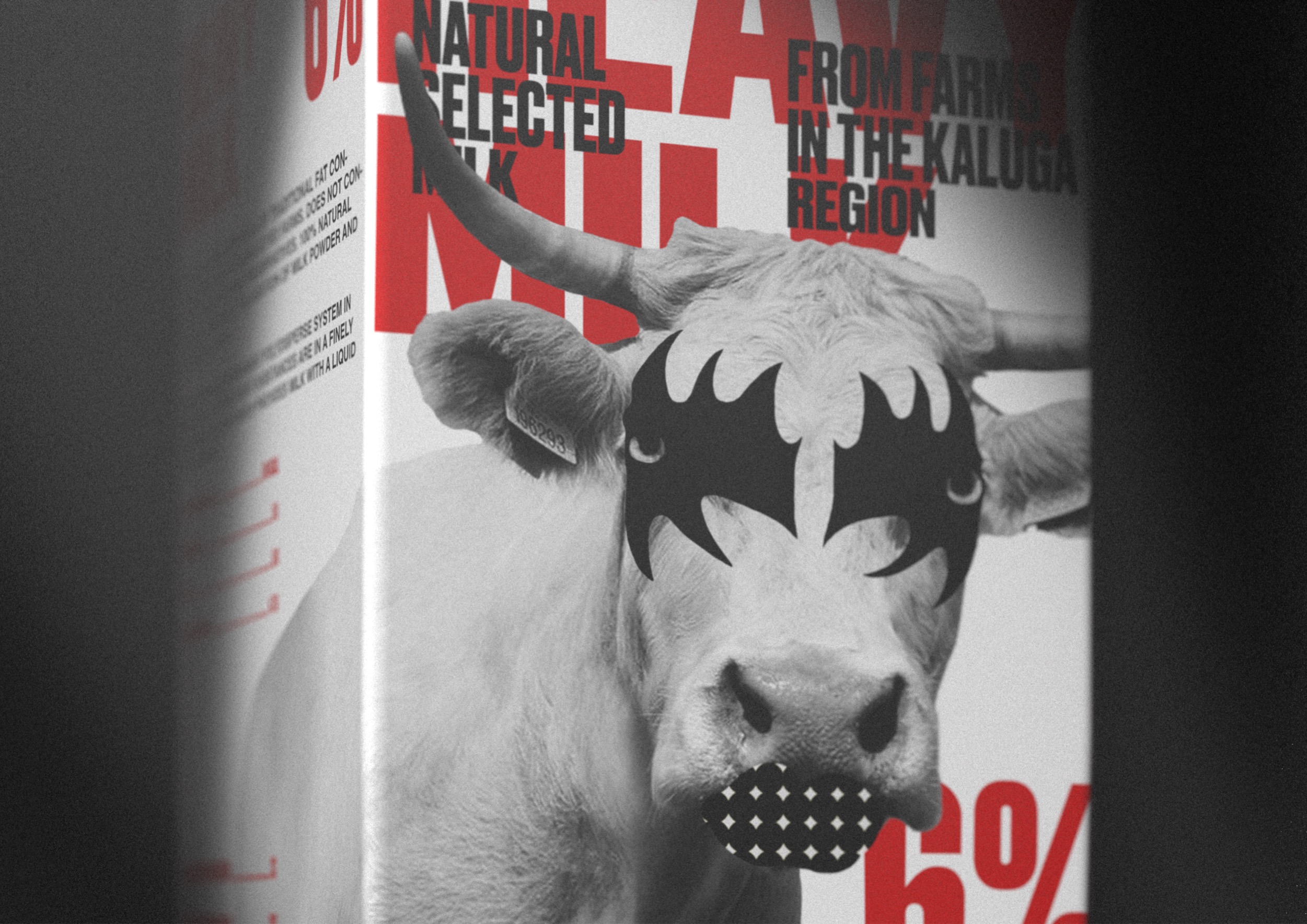
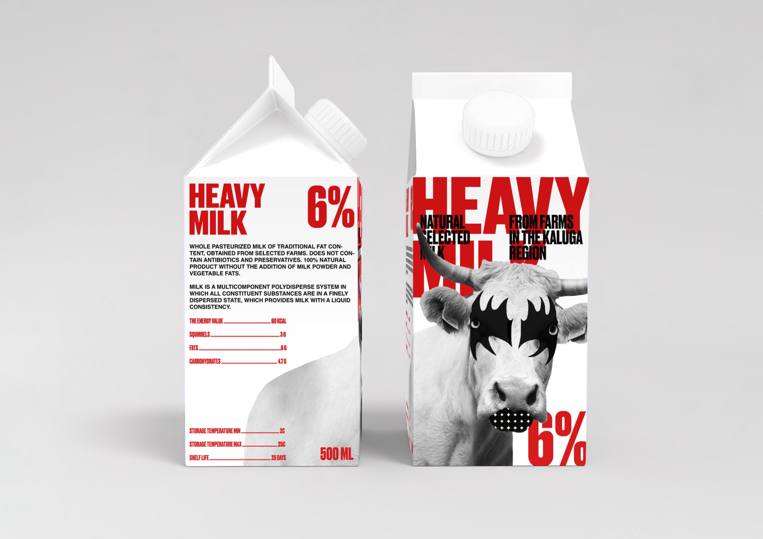
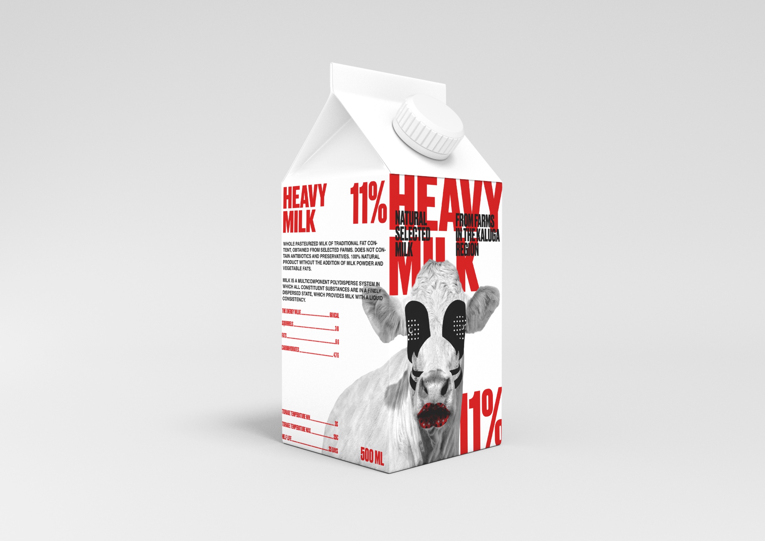
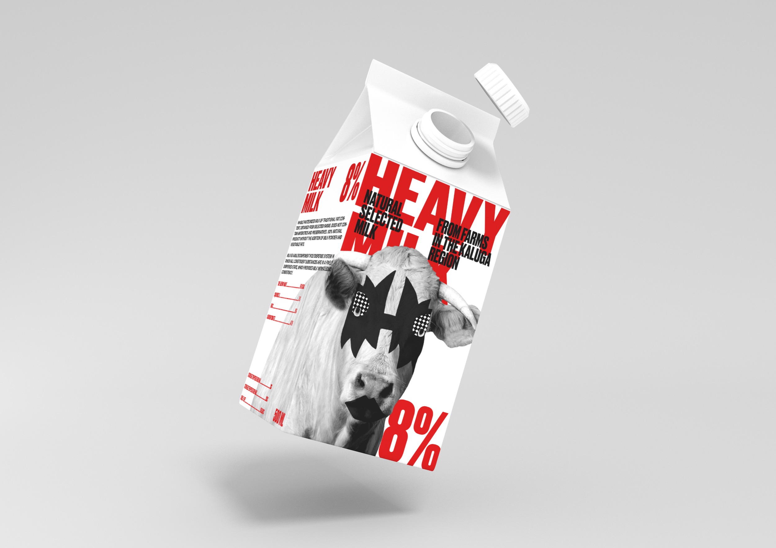
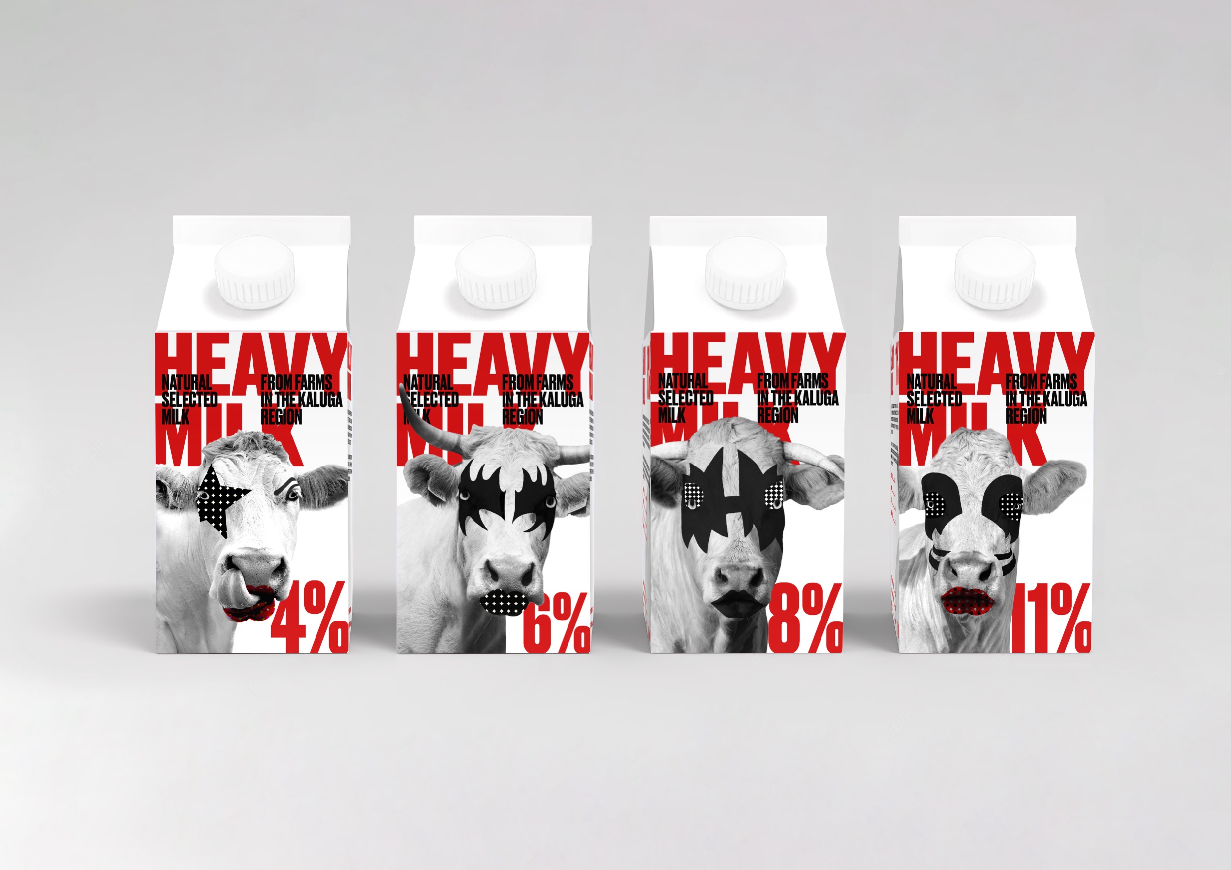
For full fat milk, a visual metaphor was found with the heavy metal genre of music, namely the hard rock band Kiss. The milk brand line includes four product SKUs – corresponding to the four soloists of the group. The fatter the milk, the more makeup on the cow itself.
The makeup itself is stylized and simplified in color combinations, but at the same time remains invariably recognizable.
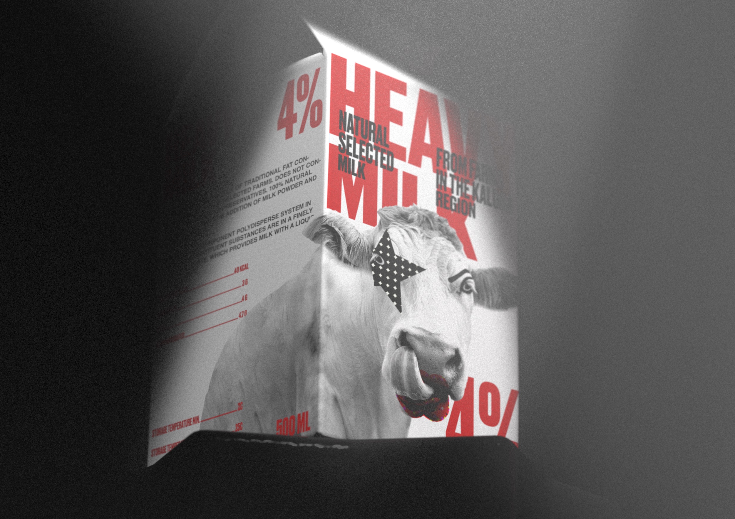
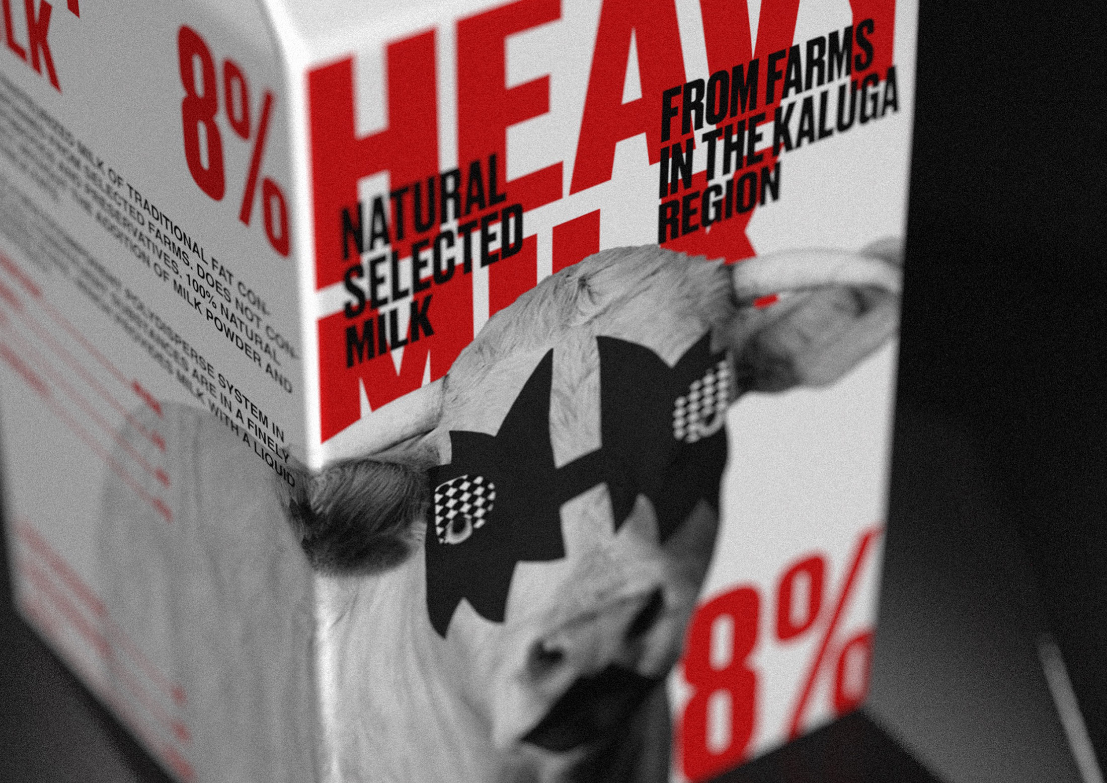
It is also important to note that the image of the cow is continued on the sides of the package, thus the brand has more opportunity to “capture the shelf”. The name of the brand continues the metaphor of heavy metal and has an analogy with the genre of music – heavy metal. Red accent color is designed to attract the attention of buyers with its brightness. Also, the red color helps to focus on the fat content of milk, so that buyers do not make a mistake with the choice of the product. The white color of the milk category helps to focus on the most important thing – the name and percentage of fat content. The lid of the package is also white.
Rigid and slightly rough typography enhances the “heavy” feel.
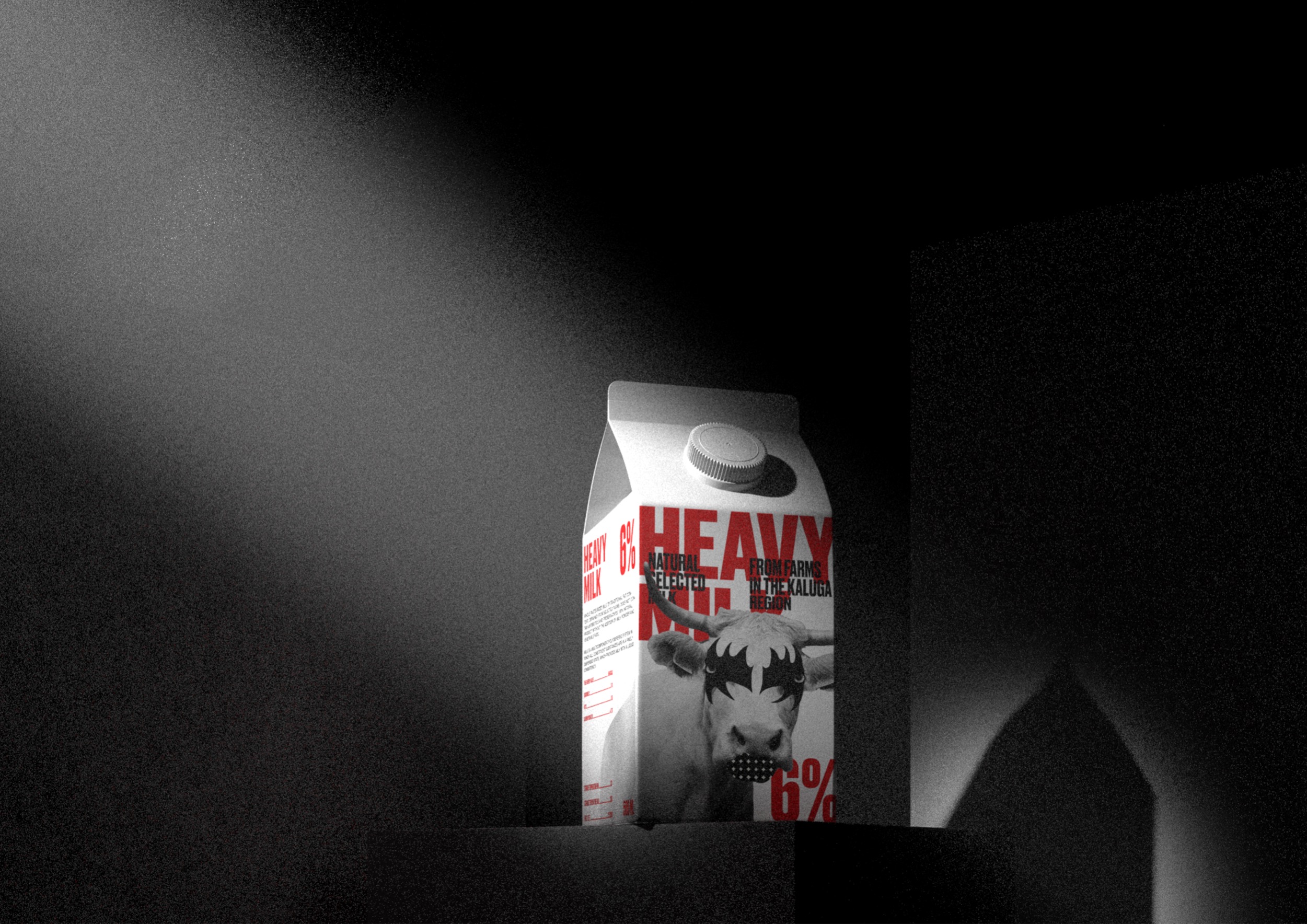
With a visual presentation, I wanted to “finish” the metaphor of a rock band by placing a carton of milk on a stage with spotlights. It seems to me that this technique could be used in product advertising.
The category of milk packaging on the market is presented in a huge number, but only a small part is devoted to the packaging of full-fat milk. In my concept, I tried to solve this problem by finding the right and understandable graphic image.
CREDIT
- Agency/Creative: Kseniia Ovchunnikova
- Article Title: Student’s Milk Packaging Concept Heavy Milk
- Organisation/Entity: Student
- Project Type: Packaging
- Project Status: Non Published
- Agency/Creative Country: Russia
- Agency/Creative City: HSE Art and Design School
- Market Region: Europe
- Project Deliverables: 3D Modelling, Art Direction, Design, Packaging Design
- Format: Box
- Substrate: Pulp Paper
- Industry: Food/Beverage
- Keywords: WBDS Student Design Awards 2022/23
- Keywords: Milk packaging, milk, art direction, packaging design
-
Credits:
Design and art direction: Kseniia Ovchinnikova
3D-artist: Andrew Polukhov
Curator: Leonid Slavin


