


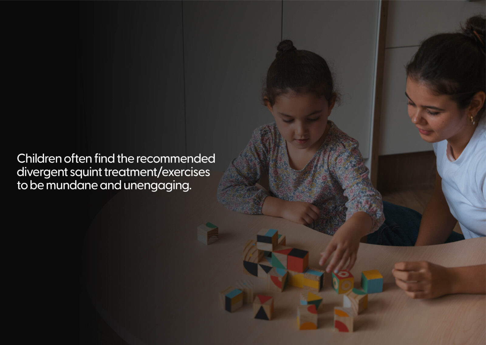
Looksee was created to address a common challenge faced by young children with alternating divergent squint—a condition that requires daily vision-strengthening exercises. Traditional treatments, like wearing an eye patch, can feel repetitive, isolating, and hard to sustain, especially for children aged 4 to 6. As a result, many parents find it difficult to keep their child motivated and consistent with the routine.
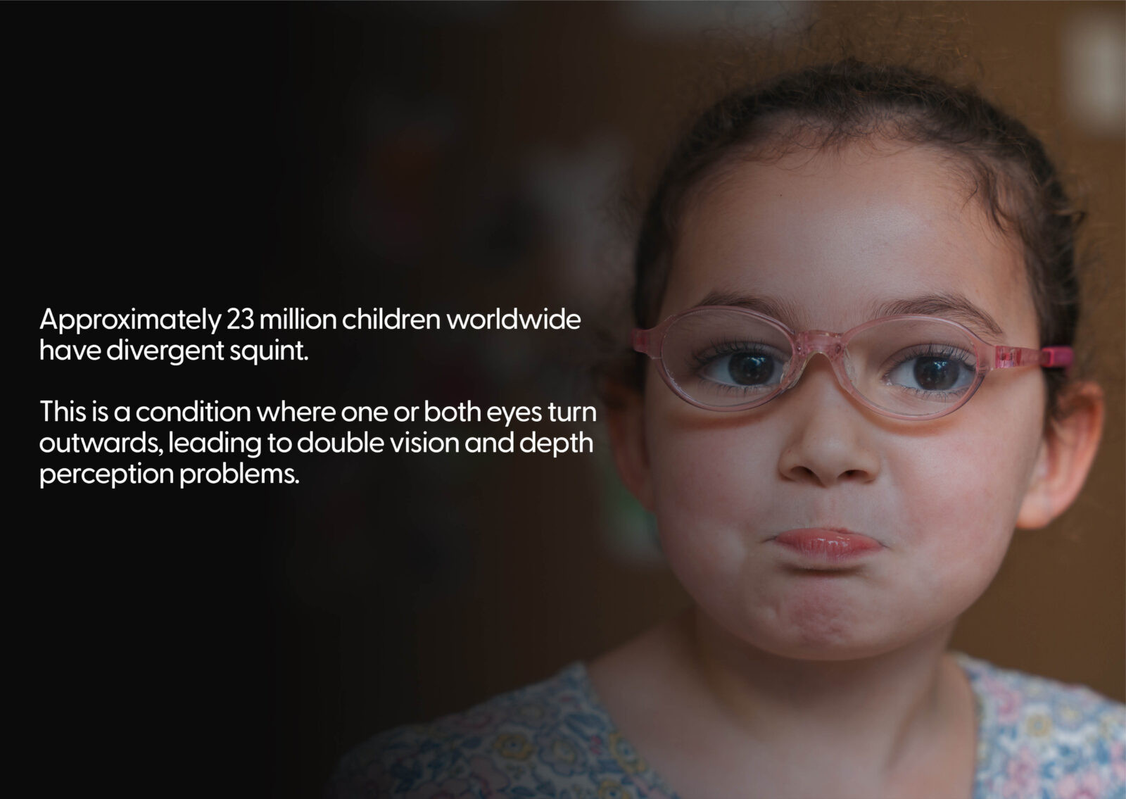
Research shows that more than 20% of children worldwide have a vision condition that needs treatment, highlighting the need for a more engaging and accessible solution. Looksee responds to this by turning frustrating therapy into joyful play, helping children and parents build positive, consistent habits. On a social level, the project reduces the stigma often associated with treatment and encourages shared, supportive experiences between children and caregivers. Environmentally, it uses durable, sensory-friendly materials that are safe for repeated use and support circular design principles. The wider goal is to encourage behavioural change by replacing forced routines with voluntary, child-led participation—reframing healthcare as a creative, collaborative journey.
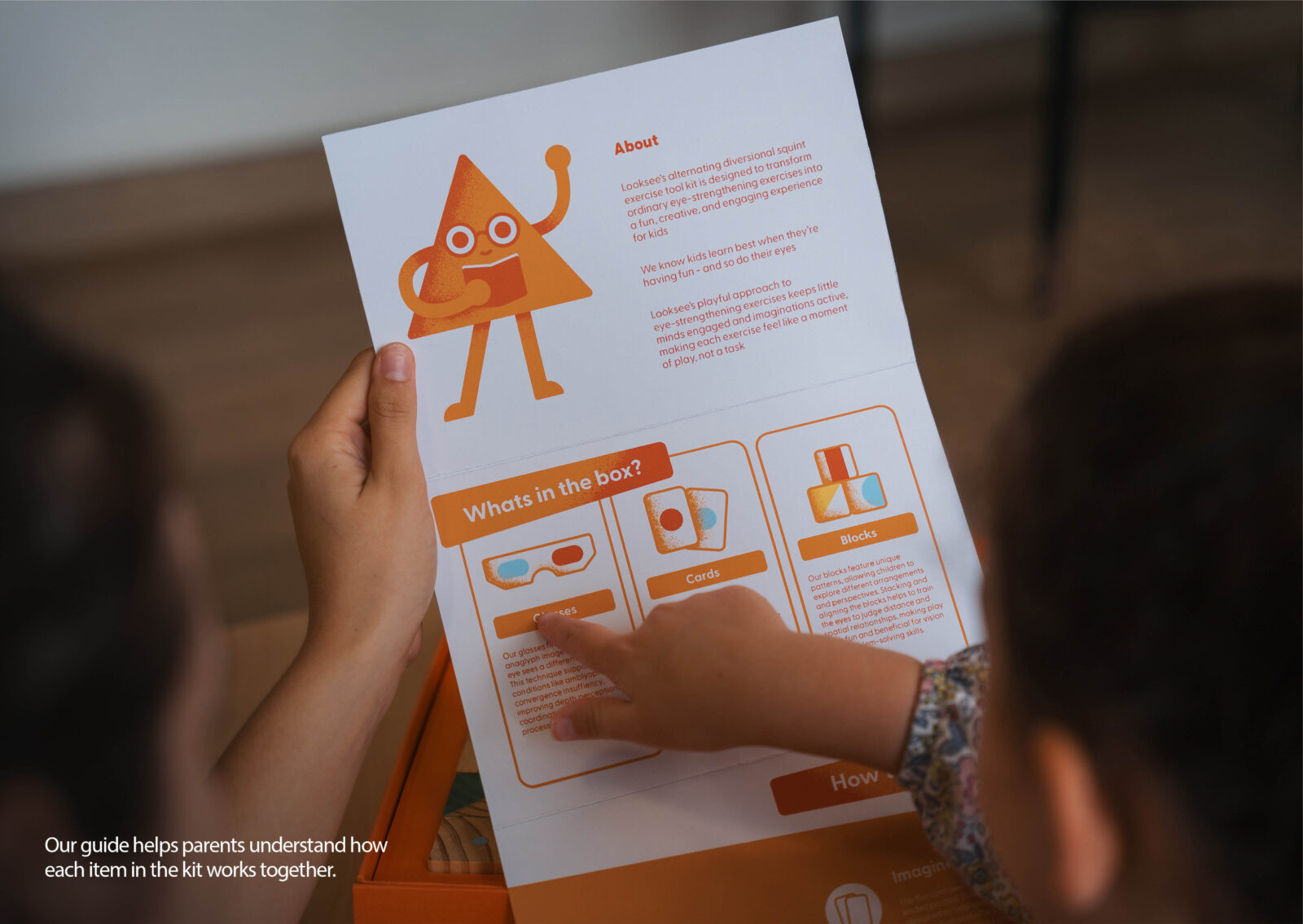
The core concept behind Looksee is to transform eye treatment into a story-rich, gamified experience that fosters curiosity and creativity. The strategy was grounded in user-centred thinking—putting the child’s enjoyment and autonomy at the forefront, while subtly embedding the necessary visual therapies within play.
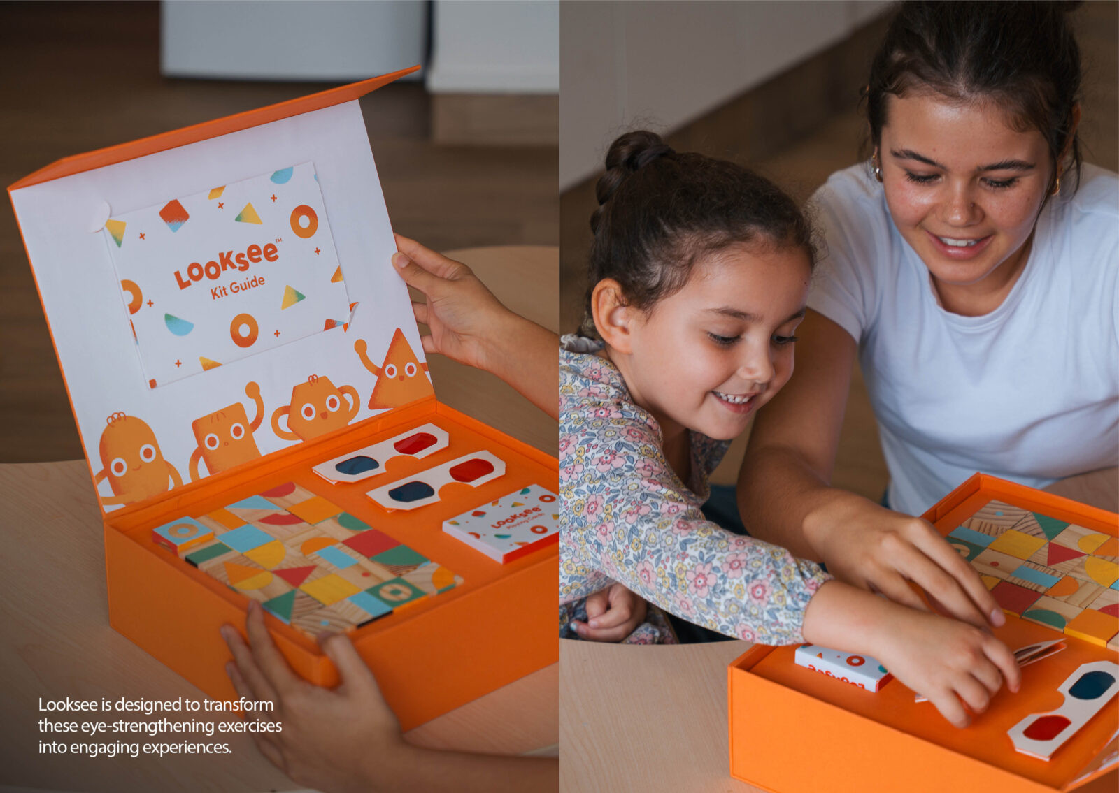
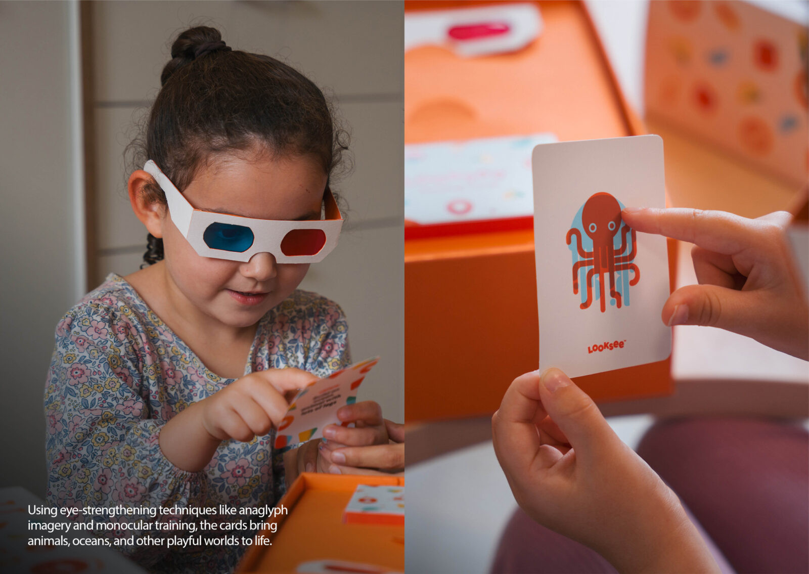
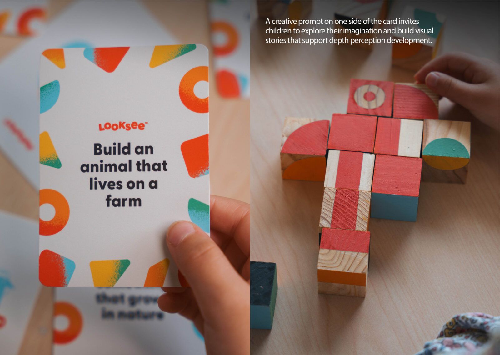
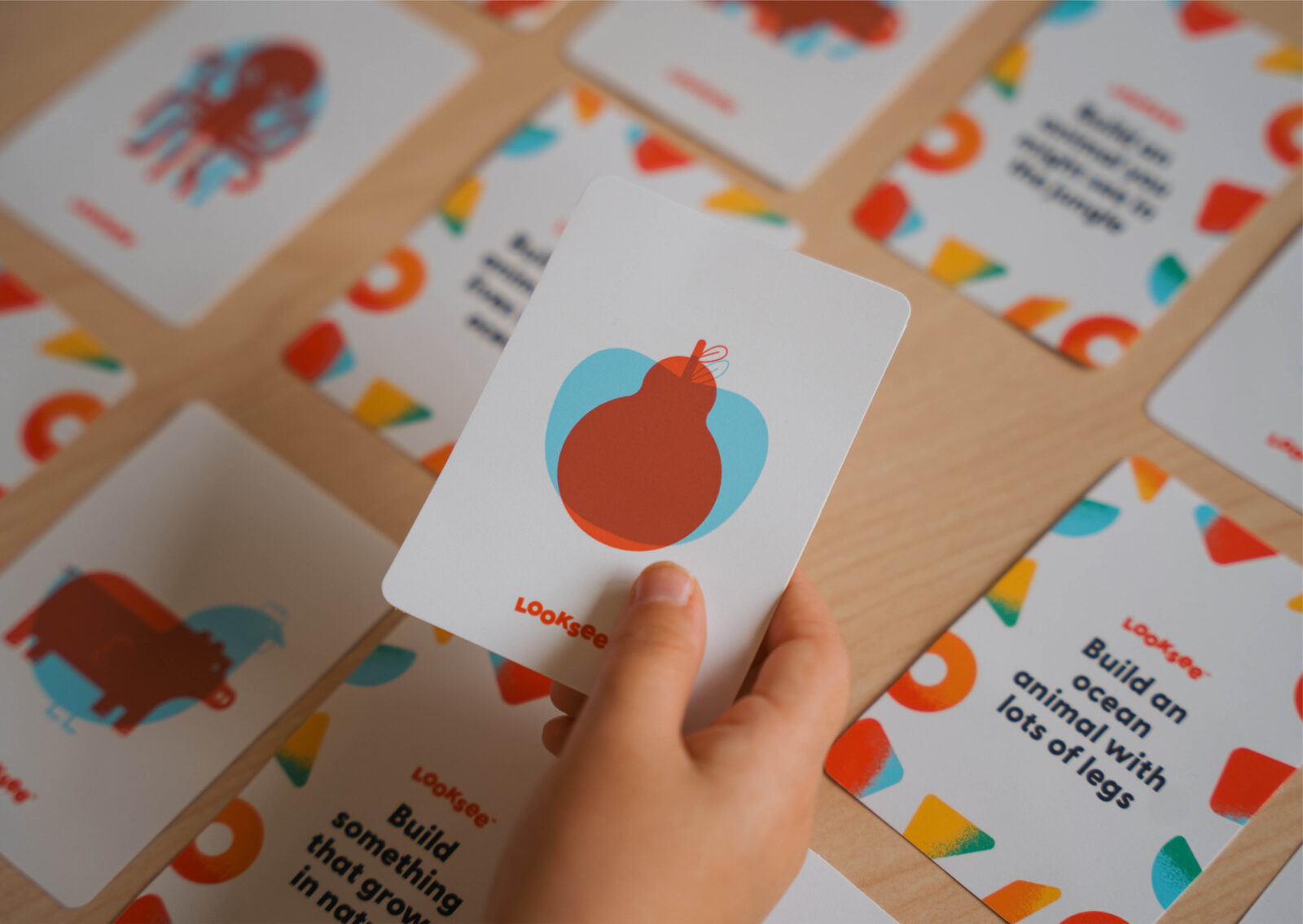
By replacing patching with red/blue anaglyph glasses, Looksee subtly targets monocular eye use. Illustrated prompt cards reveal hidden images, encouraging narrative building and spatial play using patterned blocks. Each component is carefully aligned with clinical exercises, while remaining non-prescriptive and accessible. The storytelling dimension is central: characters and prompts are used to develop visual narratives, engaging children emotionally and cognitively, thereby reinforcing the therapeutic outcomes. The strength of the idea lies in its alignment with behavioural change through joyful experience, blending clinical function with emotional design. It is an innovative reframing of a healthcare intervention through imaginative design.
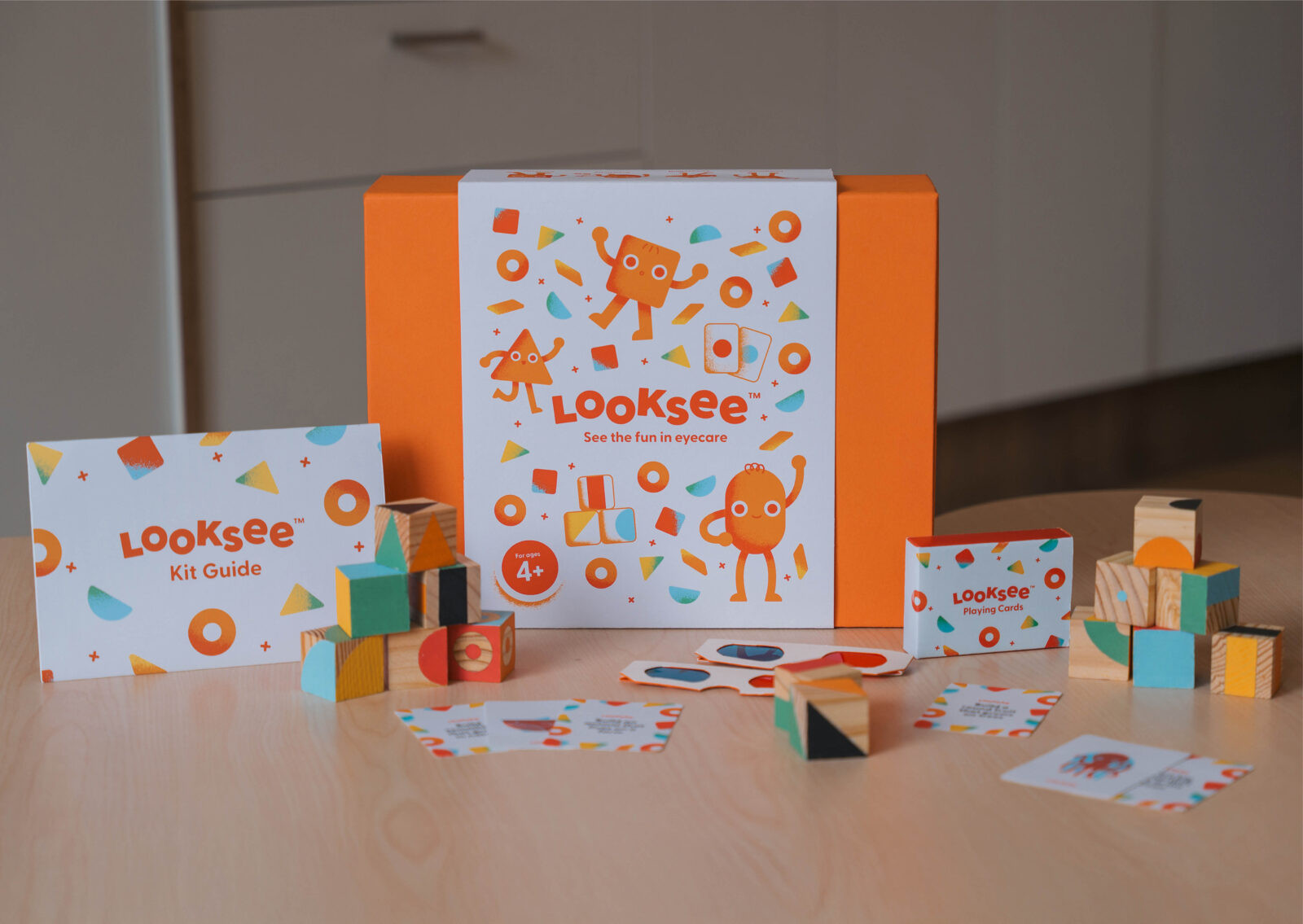
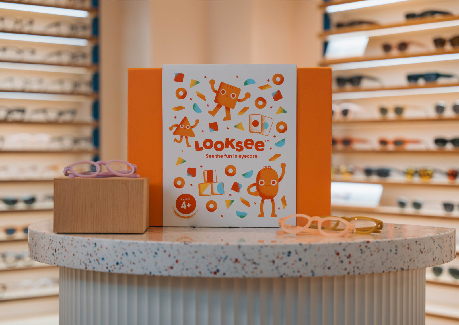
Looksee’s design execution is tactile, playful, and technically precise. It uses bold colours, simplified shapes, and thematic illustrations (animals, space, and fantastical worlds) to stimulate engagement and visual development. The red/blue glasses, sized for young children, work seamlessly with anaglyph prompt cards to isolate each eye, enhancing visual therapy through dynamic imagery.
Patterned wooden blocks support depth perception and hand-eye coordination, designed with distinct patterns to invite endless combinations and encourage storytelling. The kit components are housed in a compact, travel-friendly box that supports routine use at home or on the go. Materials were selected for durability, safety, and sensory comfort, ensuring high usability and sustainability. The overall aesthetic reflects Looksee’s brand values—imagination, exploration, and empowerment—resulting in a cohesive, delightful, and technically robust product that elevates medical treatment into a crafted user experience.
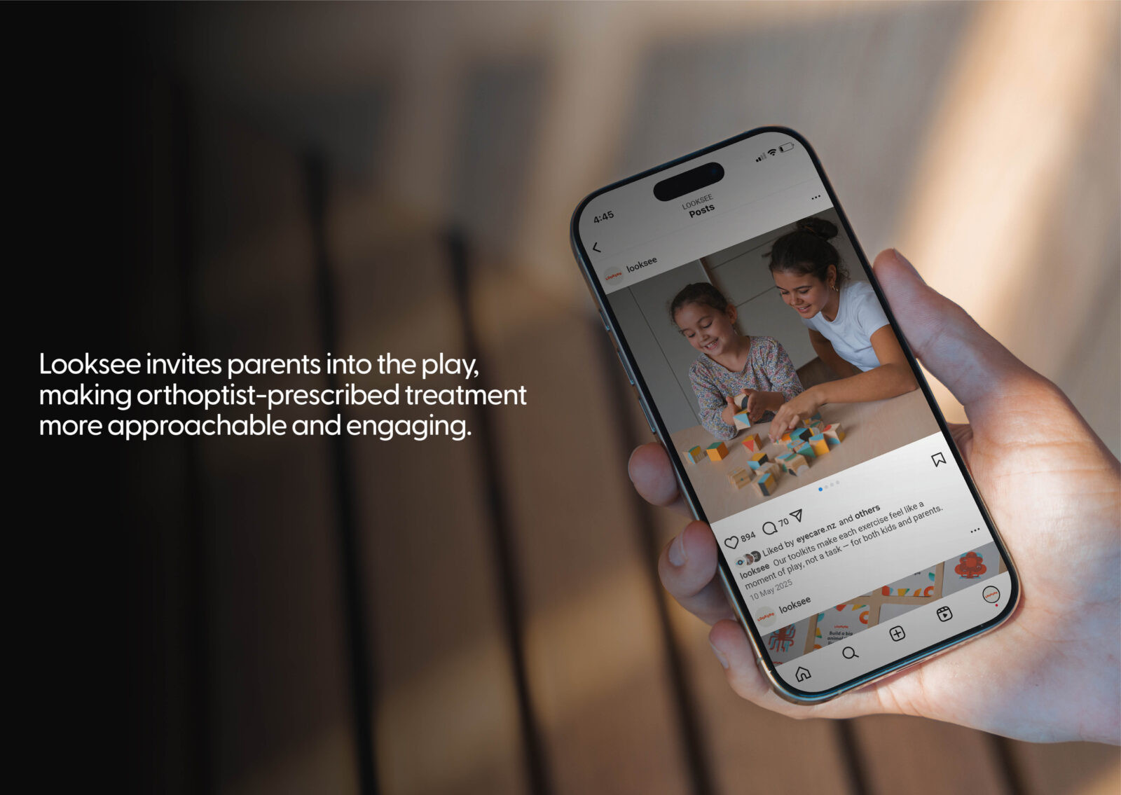
Looksee has the potential to improve the experience of vision therapy for young children significantly. Turning treatment into play reduces resistance and builds more consistent routines, encouraging positive behavioural change. Parents shift from enforcers to partners, strengthening their bond with their child through shared moments. Socially, Looksee helps normalise eye care, easing the stress and stigma often linked to treatment. It offers a non-digital, low-cost alternative that is easy to use, share, and access globally. Its thoughtful physical design, paired with storytelling and creative engagement, redefines treatment as something joyful and empowering. Though still in its early stages, Looksee has been well-received by clinicians and families, showing strong potential for wider adoption through orthoptists and online channels.
CREDIT
- Agency/Creative: Ryen Muir , Amy Wood , Aston Gregory , Matthew Jackson
- Article Title: Students From Media Design School Reimagine Children’s Vision Therapy With Looksee
- Organisation/Entity: Student
- Project Type: Graphic
- Project Status: Non Published
- Agency/Creative Country: New Zealand
- Agency/Creative City: Auckland
- Project Deliverables: App Design, Brand Design, Graphic Design, Motion Graphics, Packaging Design, Product Design
- Industry: Health Care
- Keywords: WBDS Student Design Awards 2025/26 , App Design, Brand Design, Graphic Design, Motion Graphics, Packaging Design, Product Design , divergent squint, vision, health , social good, children, eye treatment, design, packaging
- Keywords: WBDS Student Design Awards 2025/26
-
Credits:
Educational Institution: Media Design School - Bachelor of Media Design


