Overview
FFA, formerly known as Future Farmers of America, was established in 1928 and remains the only inter-curricular agriculture education program for high school students in the United States. FFA has a long and storied history, playing a crucial role in educating young people about agriculture and preparing them for careers in this vital industry.
The Problem
As technology increasingly permeates our daily lives, there is a growing movement to return to a slower pace of living, with an emphasis on learning how to grow and cultivate one’s own food. This cultural shift presents a challenge for FFA: how to honor its rich history and brand equity while appealing to a younger generation. The organization needs to increase membership and boost donations, making it imperative to update its image and connect with today’s youth.
Solution
A complete brand overhaul was implemented to address these challenges. The project began with an internal brand audit, where existing brand assets were gathered and analyzed to determine the strengths and weaknesses of the current brand. This process led to the development of a new brand personality with attributes such as dependability, inclusiveness, adaptability, and nurturing, all of which align with FFA’s mission and values.
In addition to the internal audit, a competitive audit was conducted to analyze similar and aspirational brands. The insights gained from these audits informed the rebranding strategy, which aimed to modernize FFA’s image while preserving its core identity.
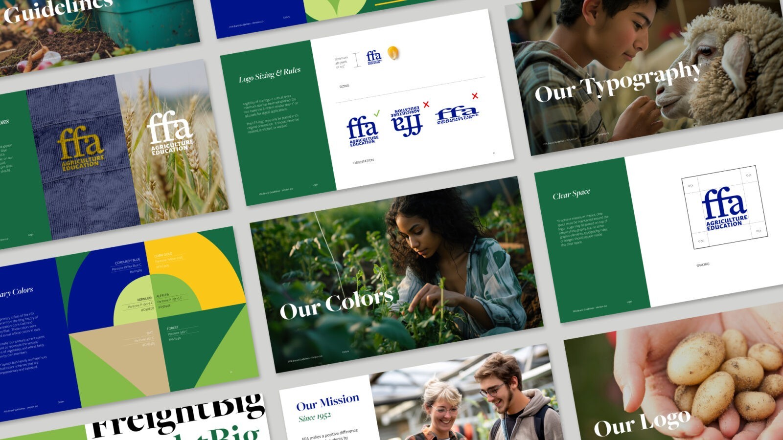
One of the key changes was the redesign of the FFA logo. The new logo moves away from the capital letters of the original design, which made the organization feel too much like a government or law enforcement agency. Instead, the new logo features lowercase letters with a subtle ligature, paired with the descriptor “agriculture education” for better clarity. This change makes the brand feel more approachable and relevant to today’s students.
The color palette was also updated, balancing the traditional blue tones (carried over from the previous brand to preserve equity) with greens, yellows, and neutrals. This combination creates a more approachable and trustworthy look, appealing to a younger audience while maintaining a connection to FFA’s history.
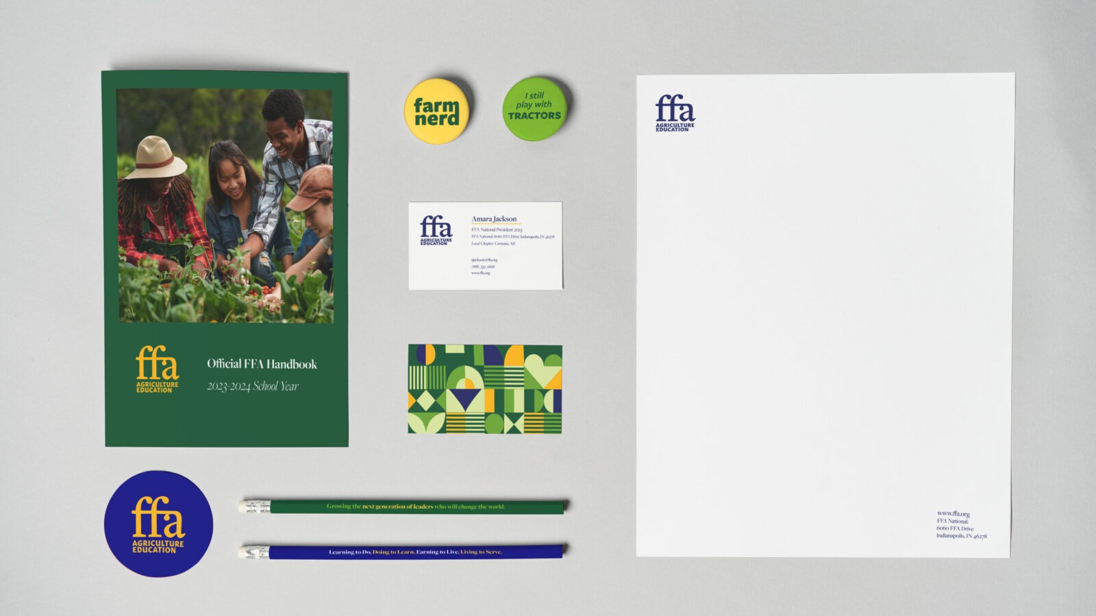
To further engage with today’s youth, the new brand incorporates playful messaging, such as “Farm Nerd” and “I still play with tractors,” which lightens the mood and adds a fun, relatable element to the brand. The refreshed visual language and brand elements are thoroughly documented in brand guidelines, covering everything from typography to color usage to messaging. This ensures consistency across all brand communications.
The rebranding effort also included new merchandise, a website refresh, and a social media campaign, all designed to better reflect the students of today and to reinvigorate the FFA brand for the future.


CREDIT
- Agency/Creative: Whitney Shay
- Article Title: Student Whitney Shay Brand Redesign for Future Farmers of America (FFA)
- Organisation/Entity: Student
- Project Status: Non Published
- Agency/Creative Country: United States of America
- Agency/Creative City: San Diego
- Project Deliverables: Brand Redesign
- Keywords: WBDS Student Design Awards 2024/25 , Identity, Brand Redesign
- Keywords: WBDS Student Design Awards 2024/25
-
Credits:
Educational Institution: San Diego City College
Educator's Name: Sean Bacon & Bradford Prairie


