


InSec Disinfect is a range of highly effective products designed to completely eliminate a wide range of malware in your premises. The brand’s products provide reliable protection and cleansing of your premises from uninvited guests.
The main task was to develop a compelling brand identity and packaging design for InSec Disinfect, a new range of powerful insect control products. Building on the parent brand InSec’s reputation for unrivaled effectiveness, the design had to clearly communicate the product’s purpose: not just to kill, but to completely cleanse premises from unwanted pests. We aimed to create a modern, effective and instantly understandable visual language.
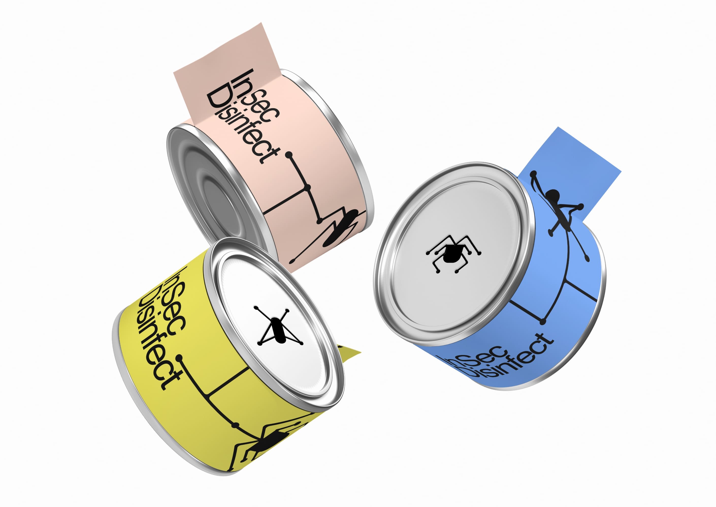
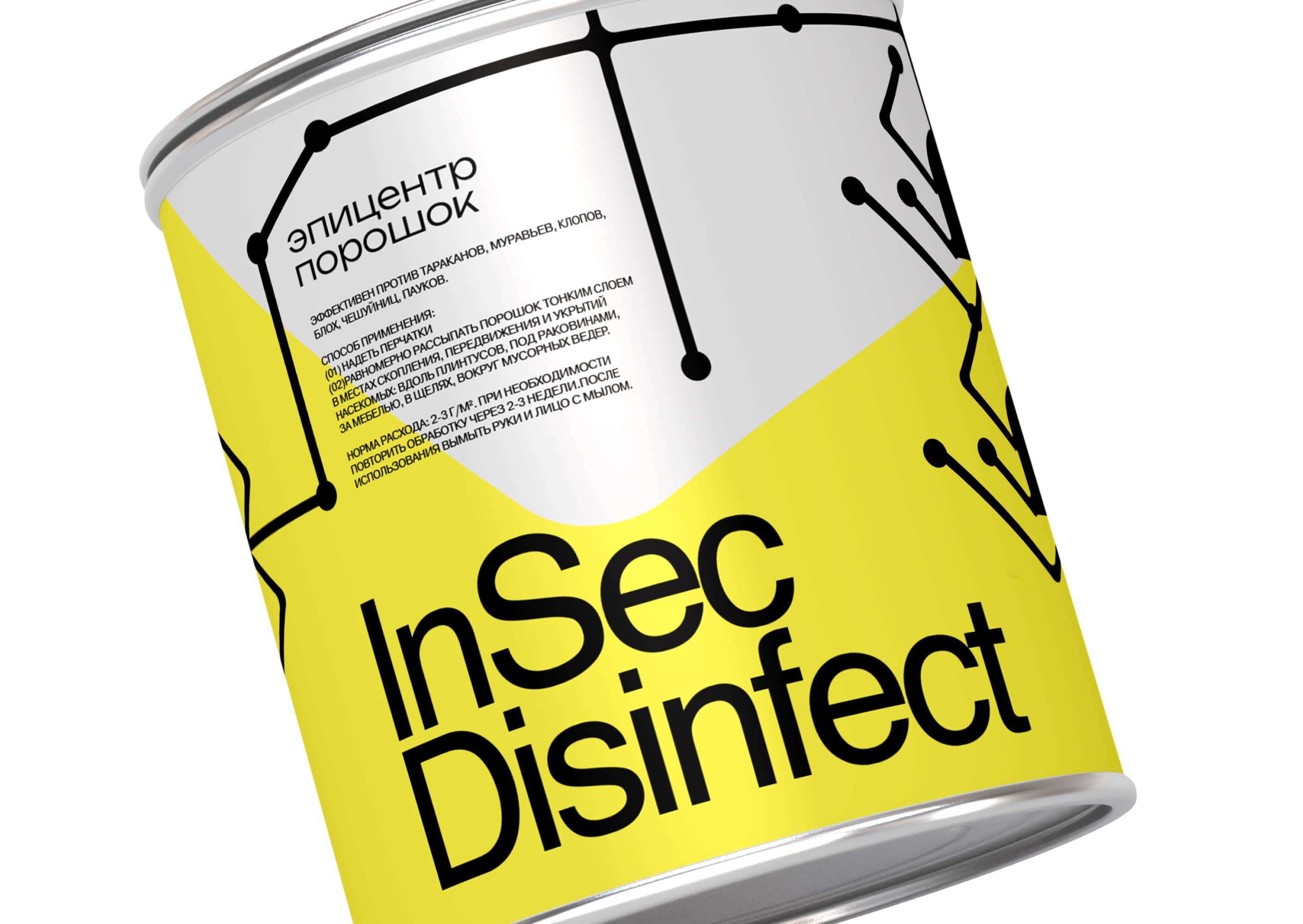
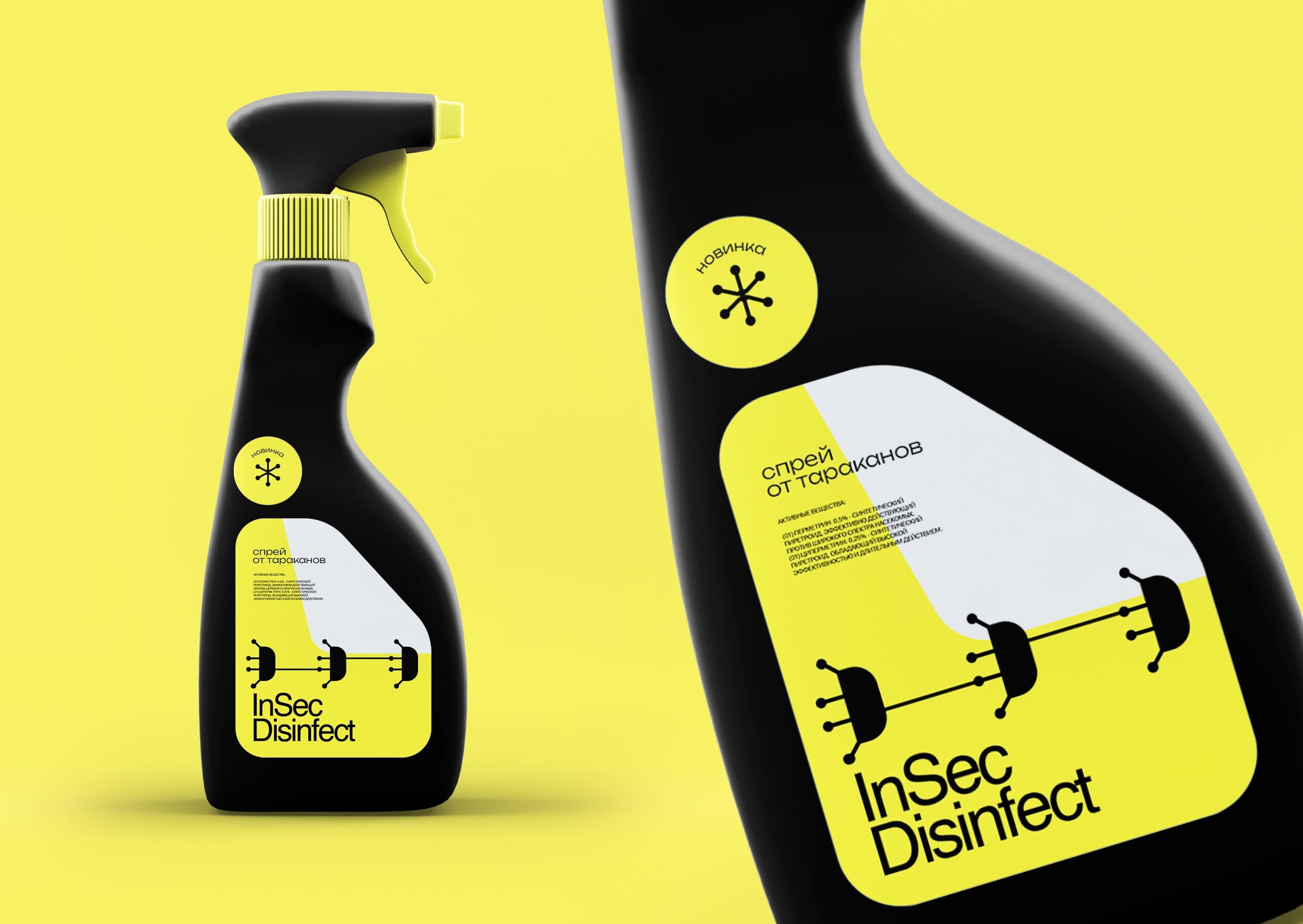
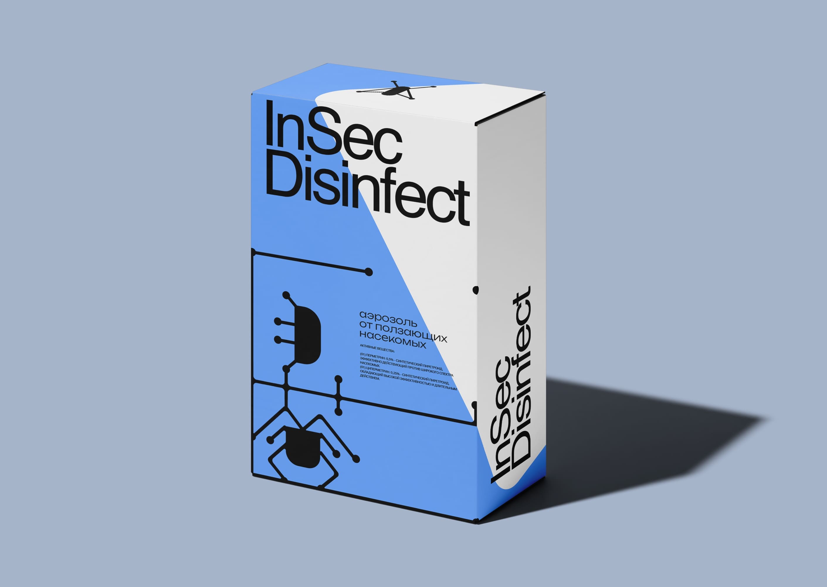
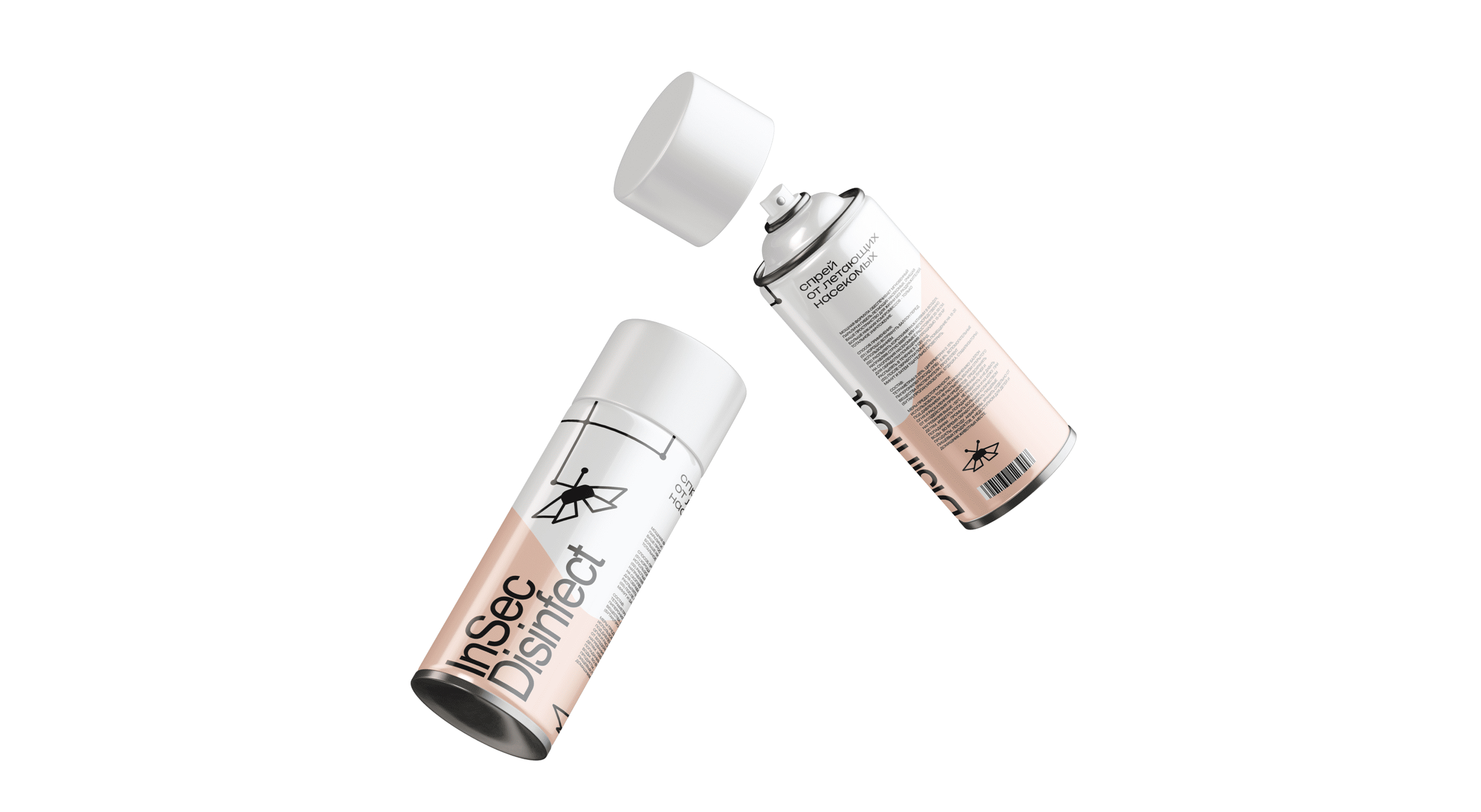
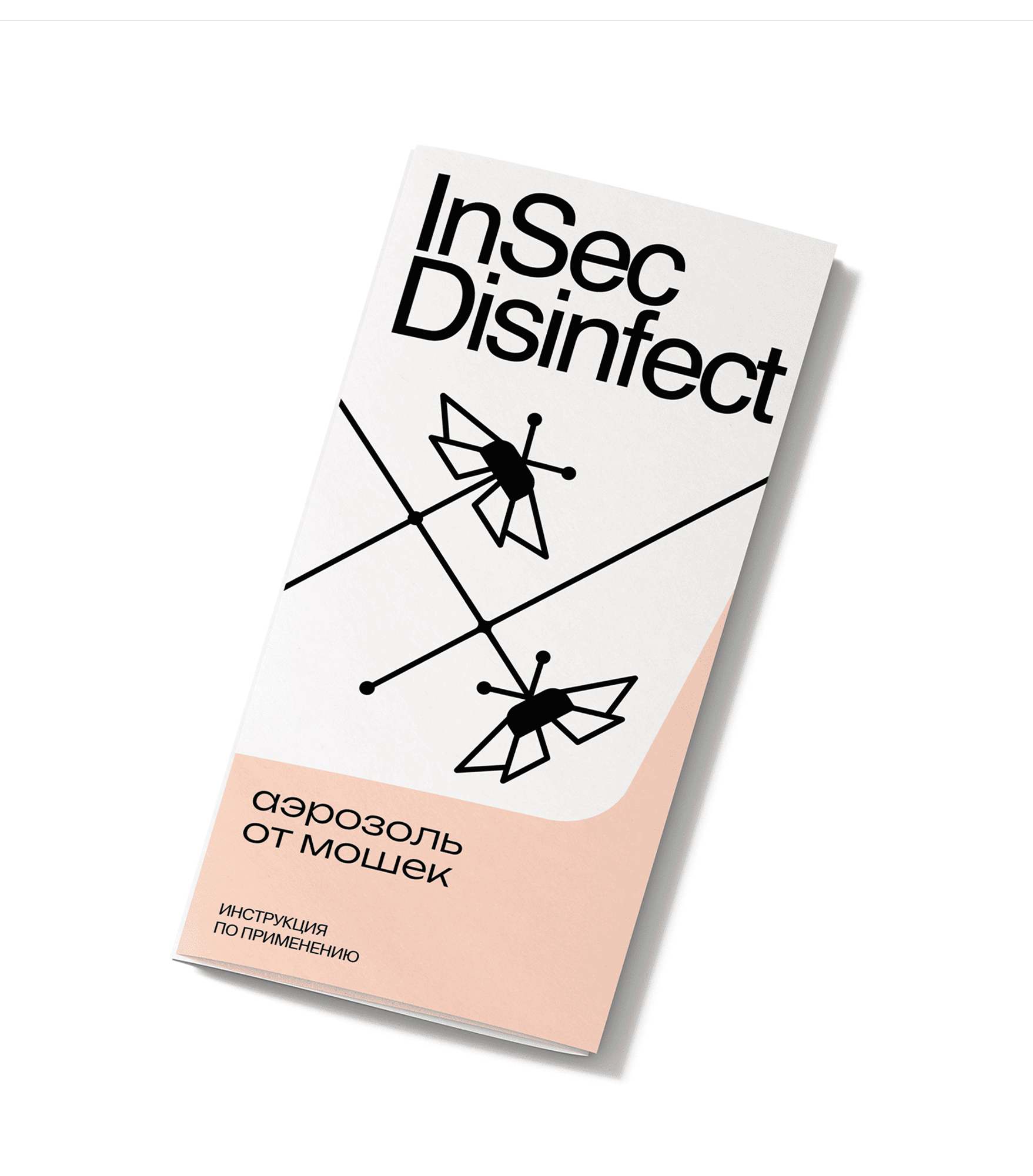
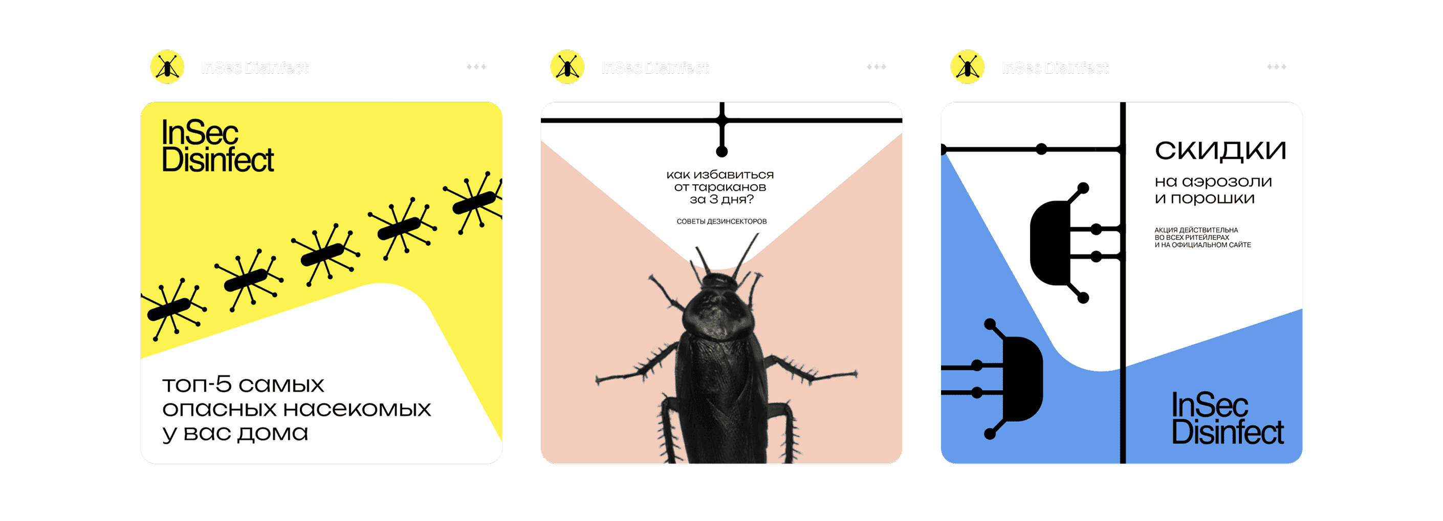
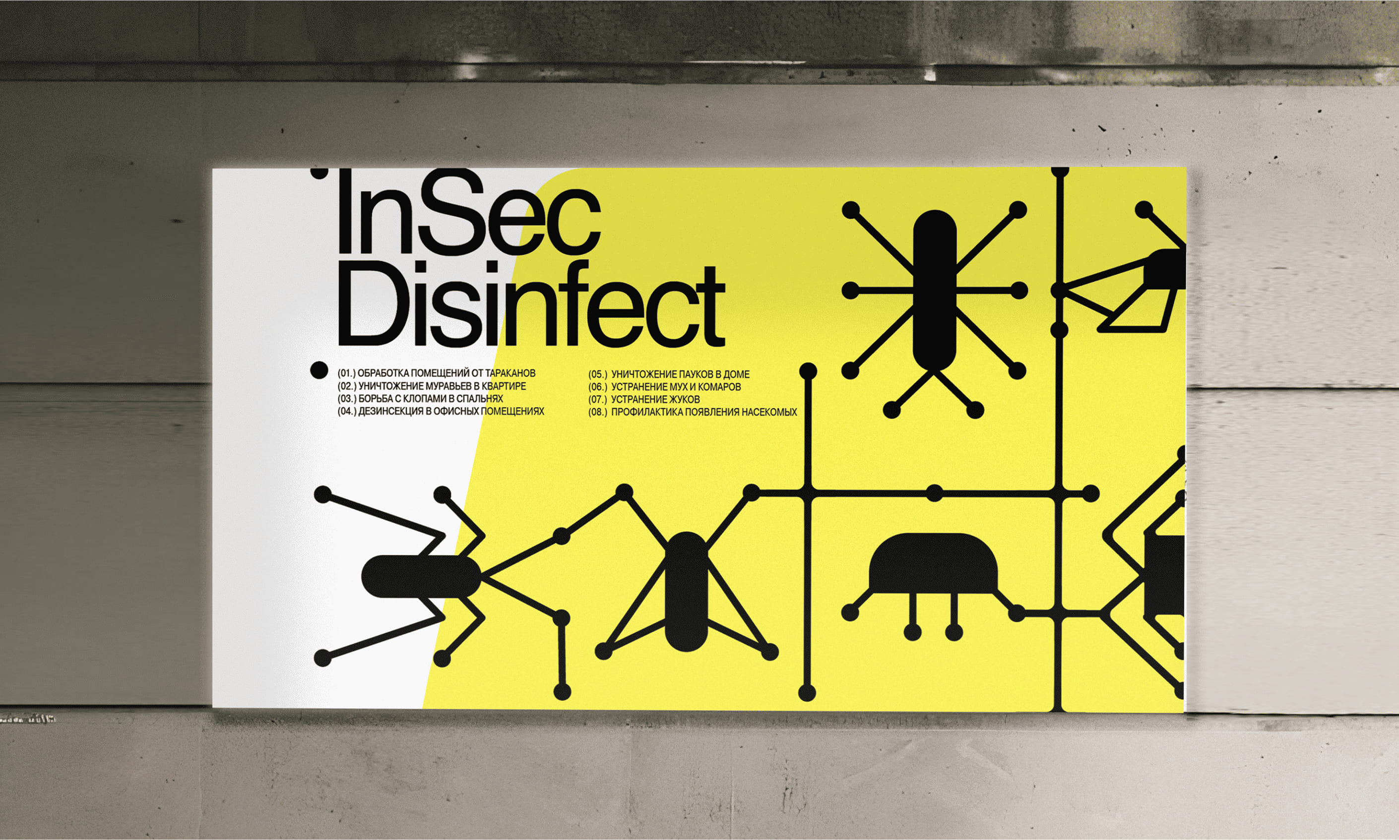
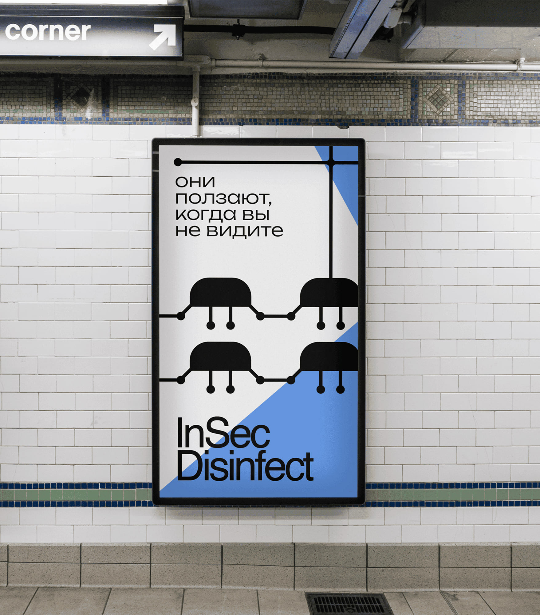
The visual strategy was based on a dynamic metaphor. It was decided to represent the problem with minimalist, almost abstract pictograms of the target insects, such as a simplified ant or a smooth silhouette of a mosquito, which did not necessarily have to be realistic or repulsive, but instantly recognizable symbols. These icons are often accompanied by thin stylized lines depicting their chaotic movements or infestation paths, visually indicating the spread and nuisance of the pests. The most distinctive element is the use of a bold, clearly defined, vibrant color shape. This shape dynamically overlays or intersects the “infested” area, unambiguously demarcating the “cleaned” or “pest-free” area – a haven created by the product’s effectiveness, serving as a visual promise of a clean, controlled environment.
The overall aesthetic is clean and assertive. A palette was chosen that combines a sense of strength and efficiency with colors that evoke purity and relief for the “pest-free zone” shape. Contemporary sans serif typography provides clarity and legibility, reinforcing the businesslike, professional performance of the product. The packaging design strategically uses the “pest-free zone” color shape as the primary focal point, often containing key product information or the brand name, making the benefit immediately apparent.
The resulting InSec Disinfect identity tells a clear visual story. It acknowledges the pest problem through minimalist iconography and movement, and then convincingly demonstrates the solution by carving out a defined, clean, and desirable pest-free space.

CREDIT
- Agency/Creative: Tatiana Myravyova
- Article Title: Student Tatiana Myravyova Brings Strategic Impact to InSec Disinfect Packaging Design
- Organisation/Entity: Student
- Project Type: Packaging
- Project Status: Published
- Agency/Creative Country: Russia
- Agency/Creative City: Moscow
- Market Region: Europe
- Project Deliverables: 2D Design, Art Direction, Packaging Design
- Format: Box, Jar
- Industry: Retail
- Keywords: Insects, home, package
-
Credits:
Curator: Pavel Borisovsky


